
When most beginners start with conversion rate optimization, they get carried away by the rosy picture of A/B testing. Let’s test button colors! Or maybe call to action text! That should get us a win of at least 30-50%…I think.
Unless you’re a giant like Amazon, you need to go beyond the random let-us-change-button-color-today kind of tests to move the needle through A/B testing. It’s not about tactics. It’s about the reaction your design creates in the mind of your visitors.
There are three areas specifically that I’ve found beginning conversion rate optimizers completely miss the mark on.
Table of contents
1. They’re Missing a Logical Thought Sequence
Click on any random sidebar link on Google or Facebook ad, and it becomes pretty clear that an overwhelming amount of businesses are approaching landing pages as stand-alone marketing collateral.
There is no scent, symmetry or storytelling that’s happening as the visitor travels from some other platform to a landing page on your site. You click on an ad saying one thing, and land on a page that may or may not resemble the ad that got you interested.
Like where this ad…
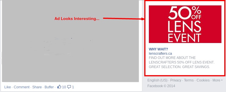
…leads to this page.
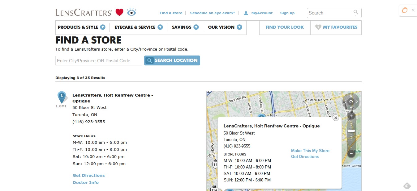
Establishing a clear thought sequence is about taking the initial excitement that got the visitor to click the ad through to the landing page, then carrying that momentum through the rest of the visual & text copy on the landing page itself.
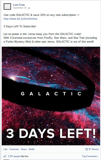
Tommy pointed out to me one of his new favorite sites, Loot Crate, that does this extremely well with targeted Facebook ad copy & imagery that very much stands out to the target audience…
…followed up by a landing page that answers every logical question a serious buyer might consider.
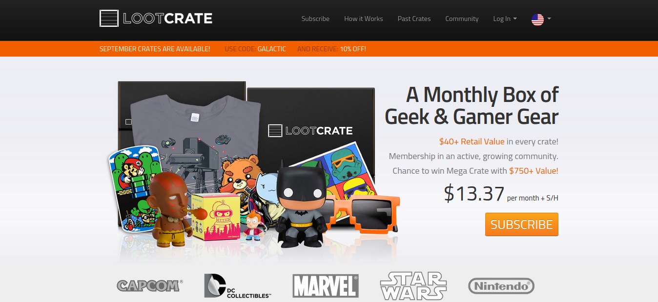
As you scroll down the page, it’s very easy to see:
- Brands included in the crates
- Pricing information
- Urgency
- Video & Text testimonials
- A like box for their Facebook page boasting over a million fans (some of which are likely your friends due to smart ad targeting)
- The logos of major news outlets that have been mentioned.
(Please note, this image was taken after September’s offer was sent out.)

In other words, if the ad got you excited, the page answers the questions you have to make you comfortable buying:
- What is it exactly? (A monthly box of geek & gamer gear)
- How much does it cost? ($13.37/ month)
- What kind of stuff might I get (Featured logos are Marvel, Capcom, DC etc & a sample box)
- How long do I have to order the next crate? (Countdown shows the exact days/hours/minutes left)
- Can I get more than one? (Tiered pricing gives multiple subscription options & discounts for long term subscriptions)
- Do people actually like what they get? (robust testimonial area featuring video, text & Facebook)
- Has this gotten any press? (Authority logos w/ quotes when hovered over)
If you need to know more, like what exactly has been sent in the past, it’s not difficult to find previous crates in the footer & persistent header navigation, as well as links to the community page, a clearly marked “How it works” page & a FAQ page.
When done well, the page feels more like a conversation than a pitch, and that’s certainly the case with Loot Crate’s page. Thing is, you can’t have a conversation without actually talking to your customers.
It’s easy to look at a page like Loot Crate’s and think the “conversation” has always been there, But when I was looking at a older version of this page, I found this:
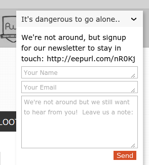
An Olark powered chat & feedback box that enabled them to have real conversations with people on the page.
While the spirit of the original page remained intact, it wasn’t always clear what they did.
Noticeable additions to the newer version of the page are the “Past crates” & “Community” pages, two things I would be consider to be major sticking points for a subscription service that’s essentially asks you to pay up front for a mystery box.

Other changes between the two designs are the clearer “hero photo” that displays the Loot Crate more clearly & persistent navigation makes the Past crates & Community pages easier to find
The “how it works” section is taken off the main landing page, likely because it was already covered on a deeper page on the site. The language under the main value proposition changes from “6-8 products” to “over $40+ retail value in every crate.”
How Exactly Do You Arrange Page Elements To Be In A “Logical Thought Sequence?”
Of course, when you’re a beginner optimizer, it can be hard to know what order to arrange the elements on a page to make a “logical thought sequence.”
One method of determining this is to conduct a in person usability test and ask visitors to “think aloud” as they navigate from a mock ad to the landing page. As you’re observing, take note of the common questions they have, then create a hierarchy of those questions & pre-emptively answer them in a future iteration of the design.
Alex Turnbull of GrooveHQ did this by asking several experts and their most active customers their thoughts on an older version of their landing page. After collecting the opinions of nearly a dozen experts and several customers, they created a set of wireframes that would focus solely on addressing those common questions, in order, through the subheaders on the page.
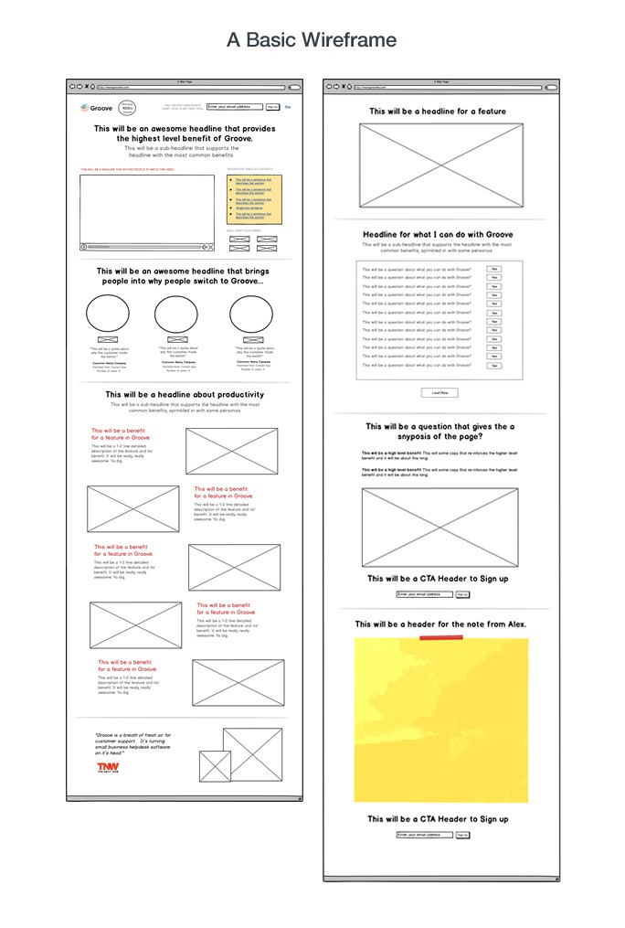
Read the full case study here.
If you need a more “official” framework on how to organize this kind of feedback, Marketing Experiments came up with an optimization sequence you could use:
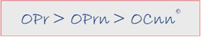
- Optimize Product Factor (Opr)
- Optimize Presentation (Oprn)
- Optimizing Channels (Ocnn – covered later)
The sequence above shows the sequence you should follow to arrange information on a web page to form a logical case for your product.
Optimizing The “Product Factor” (Opr)
According to this sequence, a landing page should first optimize the product factor (Opr). This is mainly about clarity. Do the images clearly show what the product is or does, who it’s for, or the results it can bring? Does the text clearly describe the various benefits, the value of each feature, and preemptively answer common concerns or at least make it clear where to find the information?
This isn’t just for the above the fold content area either.
Everything on the page needs to be making some aspect of the product clearer. If better selection or client education are all selling points, for example, make sure that’s clear, without slipping into jargon.
Even with something intangible, like a music download, this can be done, as long as you’re treating the music, the band & how you purchase the music like a product.
Optimizing The Presentation (Oprn) Of The Value Proposition
This includes optimizing the typography, copy, readability, color contrast, button size, directional cues and scannability of the most critical elements of what’s on the page to reinforce the characteristics of the page as well as highlight key selling points.
Give design emphasis to every point according to how much they can influence the purchase decision of your visitors.
HOWEVER, do not fall into the trap of thinking that making buttons bigger, or just having someone look at the call to action area is the “trick” that’ll always make the difference. These things need to reinforce and enhance a clear & well thought out value proposition, not direct visitors to a bad one.
2. Beginning Optimizers Don’t Understand How Their Target Demographic Use The Internet
The combination of a visitor’s age, gender, zip code, education & income level, can all have a huge influence on how a page or tactic might perform.
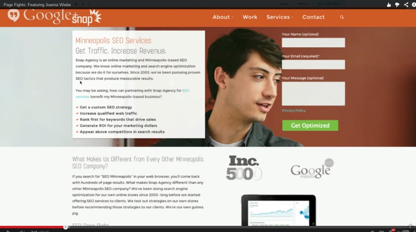
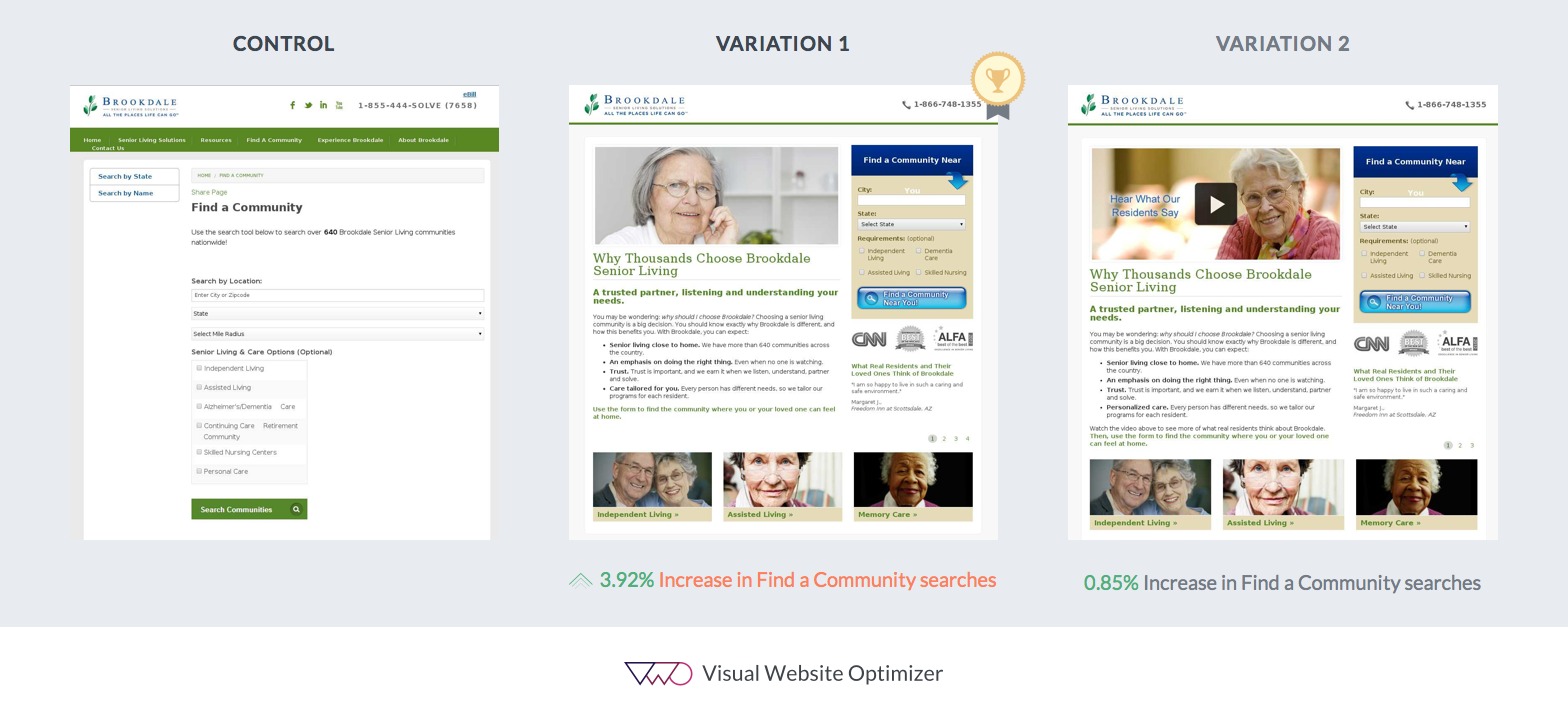
Take Brookdale Living’s case study, for example. Their website offers an array of community living solutions for senior citizens, therefore, getting people to use their “Community Search” function is an important conversion goal for them.
Their original search community page was rather drab containing only the search filters, and nothing else.
Brookdale hired conversion agency Fathom to conduct an A/B test in VWO to see which version performs better.
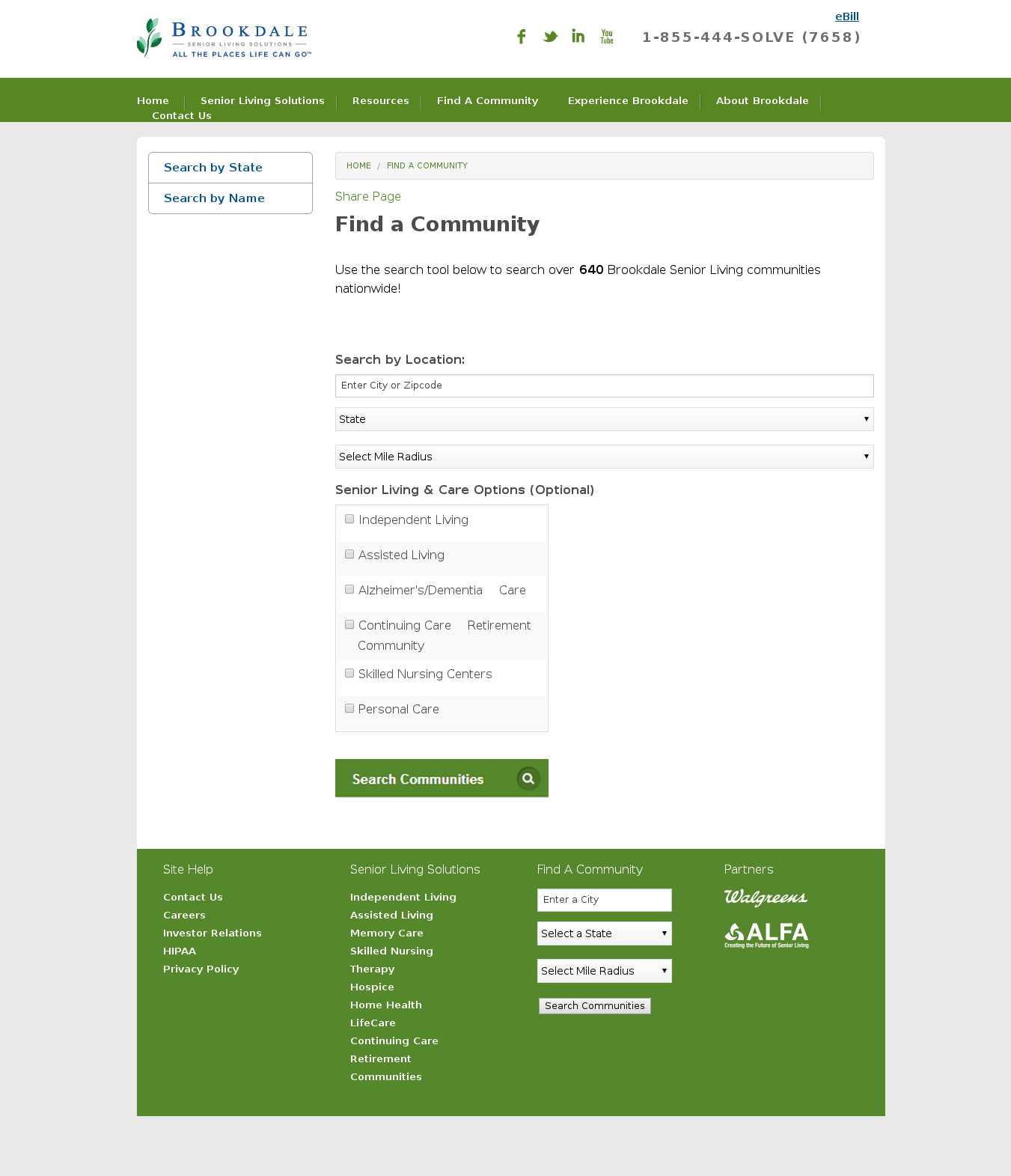
Two variants using Fathom’s “most successful” landing page template were created to challenge the original page. Both challenger pages were designed using the Eisenberg buyer modalities found in their 2006 book “Waiting For The Cat To Bark?”:
- The methodical consumer
- The spontaneous consumer
- The humanitarian consumer
- The competitive/comparison shopping consumer
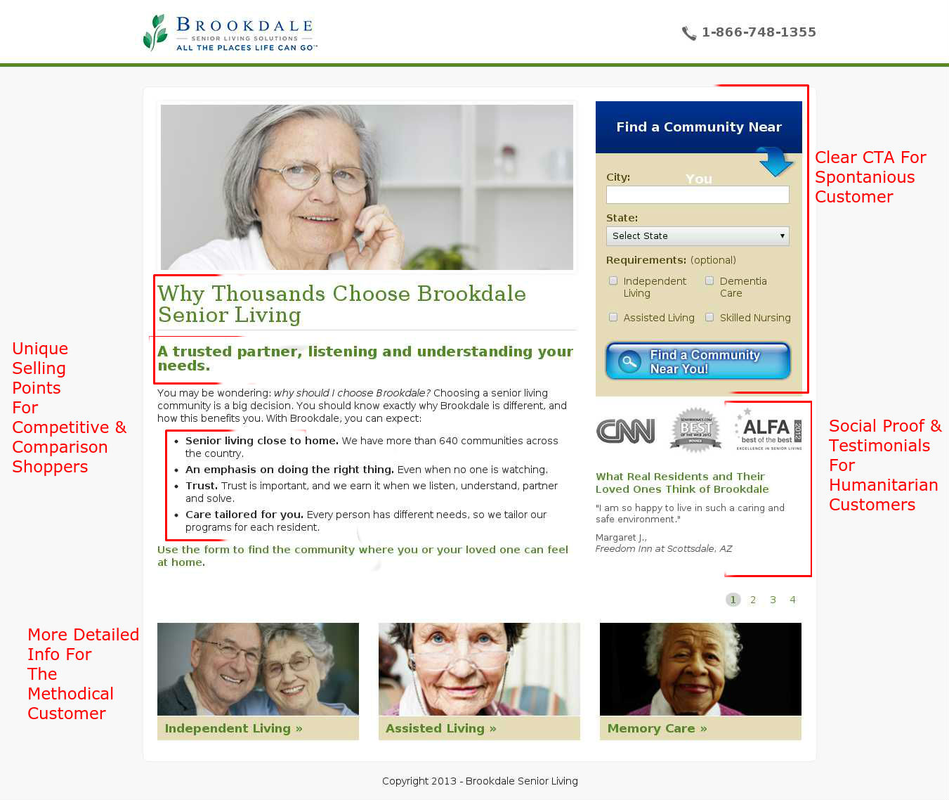
The only difference between the challenger pages, however, was that the first variation displayed a static image of an elderly woman,while the second variation used a testimonial video featuring satisfied customers giving glowing reviews for the Brookdale community.
Internally, because of the amount of case studies suggesting explainer videos can increase conversions, Fathom predicted the video variation would win.
However, to their surprise, the version which used the static image outperformed the video version by quite a bit!
Now, instead of shrugging our shoulders and accepting these results at face value, let’s see if our demographic data might reveal some insight as to why the static image outperforms the video.
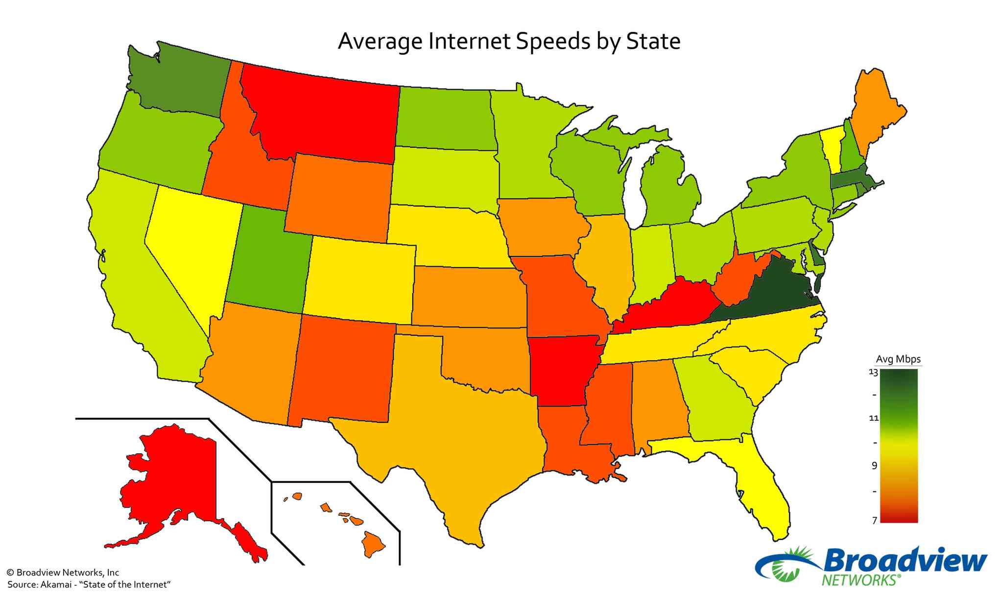
According to Alexa data, you’ll find that Brookdale’s target audience are mostly women who browse the Internet from home, many of which have not attended college.
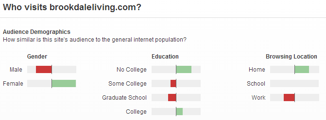
According to Pew Research there is a strong correlation in the U.S where internet users without a college education are also less likely to have broadband at home.
Now Alexa data by itself can be flimsy at best, but if this were verified by Brookdale’s internal data, we could connect the dots and hypothesize that the video was beat by static image simply because video might be too cumbersome to watch.
This hypothesis would need to be validated through additional customer interviews or surveys, but if it turned out to be true, future tests might be designed to decrease page load times, bring even clearer emphasis to the “Find a Community” feature, or draw more attention to attracting phone calls.
Some of this seems to be exactly what’s happened in iterations of the site since this original set of tests have been launched.
They might also experiment with a “slow” page for geographic areas known for slower internet speeds, and a more robust, feature rich pages in the areas where broadband speeds are not a big factor.
Read the complete case study here
Optimizing The Channels (OCnn) From Where Your Visitor Is Coming From
The value proposition, the CTA, and in many cases the entire design strategy, needs to match the motivations of visitors coming from varied traffic sources or devices.
Take for example this case study on Marketing Sherpa, where Alex Corzo of the Ritz-Carlton was able to boost conversion rates by 40% by sending email subscribers checking emails from their iPhones to mobile optimized landing pages.
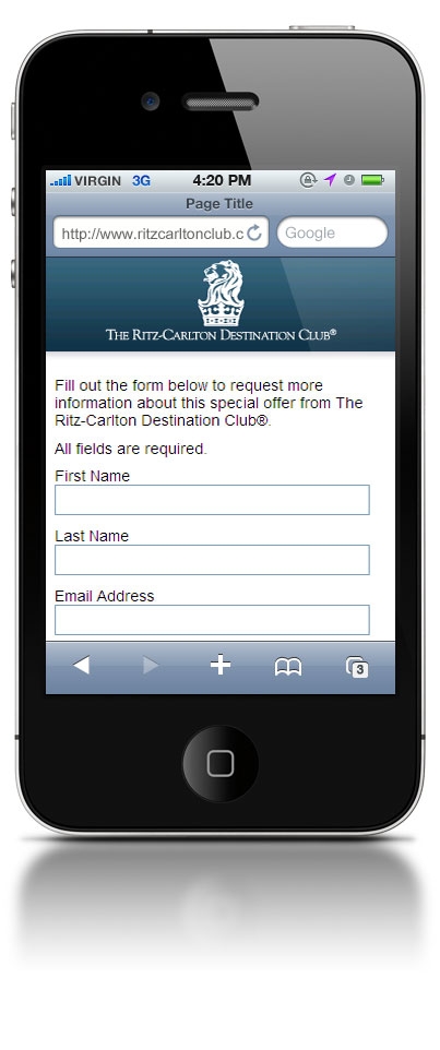
When Alex recognized that he checked his email from his phone quite a bit back in 2012, he asked his analytics team to see how many people were checking email from their phone. Sure enough, 2.8% of email traffic came from mobile devices & 90% of that traffic was from iPhones.
Even though “best practices” recommended you optimize single pages to adapt to a variety of devices, Alex’s team didn’t have time for that. Instead, they created a page for the majority of their users, that focused on two key areas:
- Being smaller & simpler due to the decreased screen size, while still maintaining all necessary information.
- Optimizing for faster loading times, because mobile broadband is slower than desktop internet.
The initial page converted well, and to ensure it wasn’t an anomaly, they launched four more pages in subsequent email campaigns, which ultimately resulted in a 40% lift in average conversions for iPhones.
His team decided to take the experience further by including more media in future iterations, but ultimately found there was “no substantial difference” between the rich media, and simple pages on mobile devices – going to show, you never really know unless you test.
Read the full case study here.
3. Beginning Optimizers Include Things That Don’t Push A Conversion Goal
Betfair is a widely known online betting platform that used VWO to test their landing page & increase registrations for their website.
Their conversion team decided to challenge the control with three variations – Each replacing the section that asked people to download Betfair’s mobile app.
The team guessed that downloading the mobile app might be distracting people from website registration (which is their main conversion goal), so replacing it with something that used a persuasion tactic might reinforce the main value proposition more.
The results spoke for themselves. All the variations beat the original page and the version using social proof stood out as a clear winner.
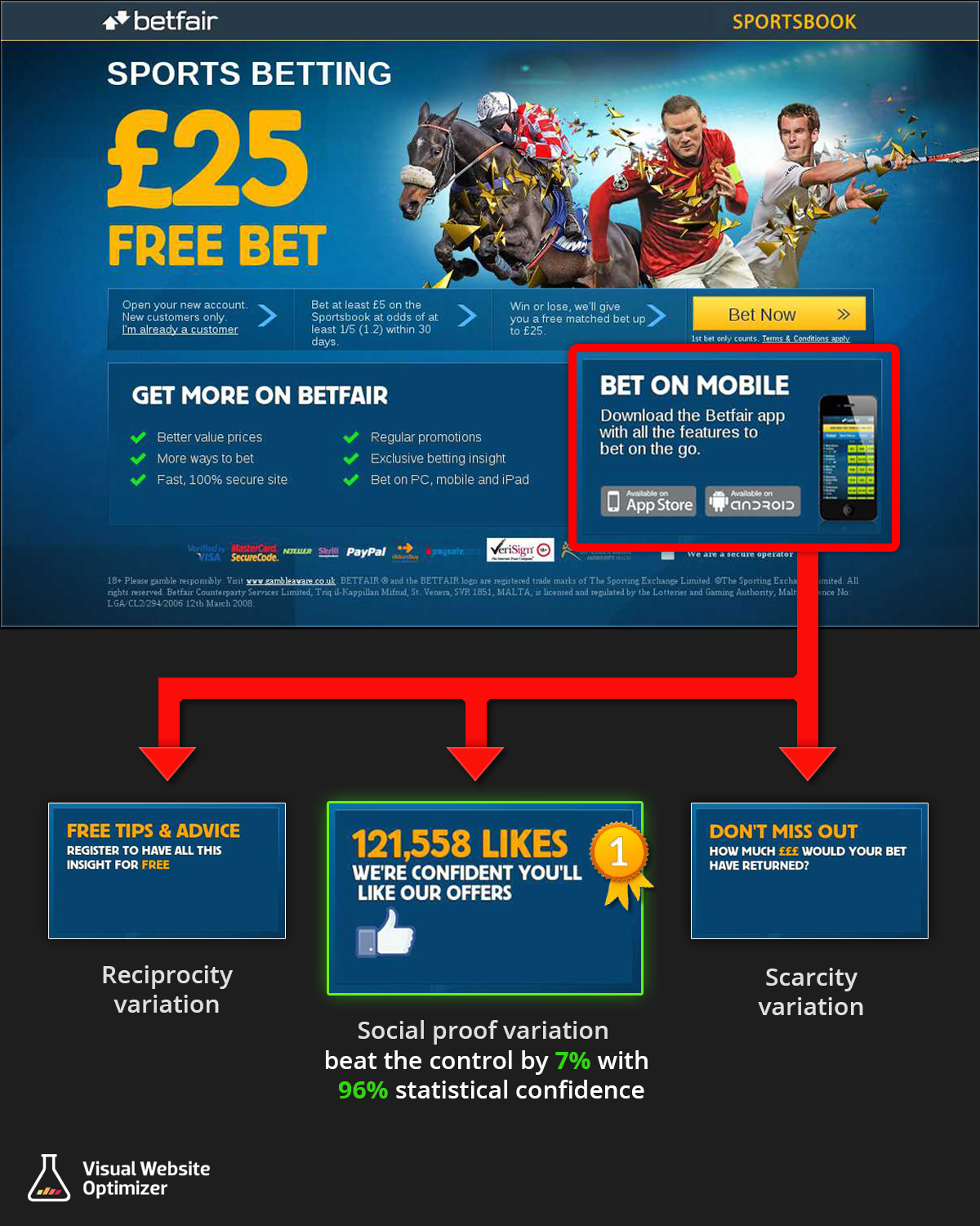
Unfortunately, I’m not at liberty to reveal site data or revenue figures. But this seemingly modest win could easily interpret to hundreds of additional leads per day when you have a high-traffic site like Betfair’s.
Read the complete case study here
Conclusion
Don’t blur the line between “hypothesizing” and “guessing”.
The studies where the most significant & sustainable lifts take into consideration both quantitative and qualitative data to inform design choices that move the right visitors through the page and get them excited to take action.
Without respecting the data, you’re spaghetti testing, with no understanding of how or why the lift came about.
Related Posts
-

If I were to tell you - what would you do with that information? Honestly,…
-
What's a good conversion rate? A conversion rate that's better than the one you currently…
-
While mediocre people are dime a dozen, good people are always in demand. But good…
-
While SEO and PPC are saturated markets that are getting harder and harder (while PPC…


Wow, this is a beast of an article, jam packed with great insight. If your in a slump creating winning tests, it’s time to read this through a few times!
Glad you enjoyed it, Josh.
Thanks for sharing useful visual information. Yes, many people missed these listed things while doing A/B testing. It will definitely help me to check in my next website. Once again thanks
Thanks for reading, Manash.
Good job on this article! I really like how you presented your facts and how you made it interesting and easy to understand. Thank you.
Brilliant article, huge and has been saved as there is no way I’ll remember all this!! Thank you.
Hope it helps you in your optimization, Hannah!
Great post followed by a great conclusion. Could not agree more with “Don’t blur the line between “hypothesizing” and “guessing”” as this is where so many fall short. One thing not mentioned is customizing content, offering and overall experience based on data. Meaning, if you are a female with a certain income level and of a certain age, you might need a completely different experience than a teenage boy.
Check out https://www.freedemographicsnapshot.com/ to get a better understanding of your customer data at any given moment, like age, gender, household, and so much more. This makes it easier for you to keep your brand, the products you sell, and your communications on target and relevant to the people who really visit your site and buy from you.
Optimizing for your demographic is definitely very important. Thanks for adding that, Kelly.
Many details to take into consideration. I do not pay much attention to many of those mentioned in the article as an example of typography or expectation of reaching customers Show ad. Thank you very much!
Glad you found the article useful.
Thanks for an interesting article.
Thanks for dropping by, David.
Thanks Smriti, some good advice there. I love the idea of bringing in story telling into a page (much like the old long form sales page would tell a story). The question is have is that the pages you are giving as an example are all selling something… but what about a blog where the main focus is on content? http://australiapropertyclassified.com – I can see that I still have a purpose (ie getting subscribers) and can test different versions of a signup box but it doesn’t leave much scope for a consistent story since the page updates with the latest blog posts… anythoughts? subject for your next excellent article?
Hey Vern,
That’s a very good point, and I see where you’re coming from there. The truth is though, it’s both.
The blog is about capturing people’s attention & building the readership, but in the context of the landing page (what this article is really focusing on) it’s all about discussing the benefits of whatever the action is you want your visitor to take.
In the case of testing the signup box, it’s a good start, but there will eventually be diminishing returns, because it’s one of many calls to action on a blog post (read the blog, share the the article, leave a comment)
However, maybe you should try creating a landing page that discusses the benefits of the guide. Right now, there’s a CTA to “Download the guide” but think about how many other people online are using the EXACT same call to action.
Why should I download the guide? What do I learn? What knowledge do I gain if I do?
And really, who is this guide for? Is it for a beginner trying to figure out how to break into investment properties? Or is it someone who’s been doing this for a while, and they want to get a more competitive advantage?
Honestly, before you go about testing that signup box, I think you should hit linkedin and ask a few people who would be ideal for that guide what they’d be looking for out of something like that. That way, you can position everything (not just future forms, but also individual landing pages) in a way that will be enticing to others who might be looking for the same stuff.
As you mentioned, storytelling is trickier in the case of a blog than a landing page. In addition to what Tommy mentioned here, I’d like to add that having a powerful About Us page that talks about you/your brand’s story can help in engaging people more (To get this right, you’ll need to research well about your ideal customers first).
Mentioning the mission statement or your beliefs for starting the blog in clear words will help people decide if your blog will add value to the goals they’re trying to achieve. Here’s one example: http://www.katenorthrup.com/about-contact/. Don’t forget to add a subscription box and some testimonials to add credibility.
Once you have the page ready with you, you can emphasize it in your sidebar design to drive more clickthroughs and get storytelling work for your blog.
Hope this helps.
Great Article thanks, highlighting the importance of the generating a testable hypothesis, but most importantly, testing and not guessing.
Thanks for reading.
Thanks for very good article. The wireframe example image is too blur and I couldn’t see the details of it, higher res image would be appreciated.
Thanks
Unfortunately that’s the image that was shared on the blog it is referenced from. For better clarity, you can follow this link: http://groovehq.com/blog/long-form-landing-page
One of the sweetest posts on CRO I have read in a long time. Most only talk about split-testing but these are all do-able steps even for total newbies. Also the examples like the betfair one hit the spot.
What I always recommend people that just want to get a bit into CRO is this: They should ask someone they know above 50 years old to use their website and try to reach a conversion goal. Why? The site has to be crystal clear for them to get anywhere. This already solves boatloads of issues.
Going to the mom always helps. That’s a great add-on, Alexander. Thanks for mentioning.
Hi,
Great article with a detailed explanation! I liked the way you have explained each point with the help of an image / graph. This helps me in gaining a clear understanding of of your findings. Thanks for sharing.
Yes! Great great articleª
I appreciate this insightful article. Conversion optimization needs a lot of analysis and research. In the beginning, do not focus completely on conversion, go step by step, systematically. CRO is a time consuming process. Make them realize the product is worth not the price.