A good user experience equals more money. But how do we measure user experience? How do we know if it’s getting better or worse?
Table of contents
Why measure user satisfaction?
Measurement is the first step that leads to control and eventually to improvement. If you can’t measure something, you can’t understand it. If you can’t understand it, you can’t control it. If you can’t control it, you can’t improve it.
H. James Harrington
There are lots of reasons to measure the user satisfaction. The main one? Pinpointing problem areas and working to improve them.
Other reasons are to:
- Identify, quantify, and communicate UX to stakeholders.
- Get clarity about your positioning and competitive advantages.
UsabilityGeek puts it well: “Ultimately, the primary objective of usability metrics is to assist in producing a system or product that is neither under- nor over-engineered.”
There are many metrics used to measure satisfaction UX. For this article, however, I’ll focus on usability measurements for satisfaction. These break down more broadly into two categories:
- Task-level satisfaction;
- Test-level satisfaction.
Task-level satisfaction measurements
Both types of user-satisfaction metrics use short questionnaires. With task-level satisfaction, users should immediately be given a questionnaire after they complete a task (whether or not they complete the goal).
There are a few types of questionnaires, some more popular than others, but all attempt to gauge and quantify how difficult or easy it was to complete a certain task in a user test.
Some of the more popular ones are:
- ASQ: After-Scenario Questionnaire (3 questions);
- NASA-TLX: NASA’s task load index (5 questions);
- SMEQ: Subjective Mental Effort Questionnaire (1 question);
- UME: Usability Magnitude Estimation (1 question);
- SEQ: Single Ease Question (1 question).
1. After-Scenario Questionnaire (ASQ)
The After-Scenario Questionnaire features three questions, post-task:
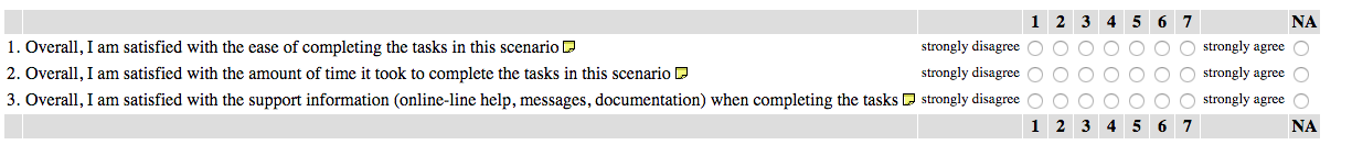
The ASQ is commonly used, and research has supported that it “ has acceptable psychometric properties of reliability, sensitivity, and concurrent validity, and may be used with confidence in other, similar usability studies.”
2. NASA-TLX
The NASA-TLX is “a widely-used, subjective, multidimensional assessment tool that rates perceived workload in order to assess a task, system, or team’s effectiveness or other aspects of performance.” It’s also been cited in over 9,000 studies.
The questionnaire is broken into two parts. The first part is divided into six subscales that are represented on a single page:
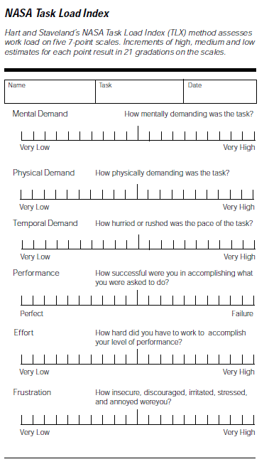
The next part lets the user weight the measurements based on what they thought was more important to the task.
3. Subjective Mental Effort Questionnaire (SMEQ)
SMEQ is made up of just one scale, and it measures the mental effort that people feel was involved in a certain task.
According to Jeff Sauro in Quantifying the User Experience, SMEQ correlates highly with SUS scores, as well as completion time, completion rates, and errors.
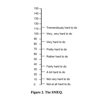
SMEQ is easy to administer and supported by a good amount of research.
4. Usability Magnitude Estimation (UME)
Magnitude estimation is a standard technique applied in psychophysics to measure judgments of sensory stimuli. According to The University of Edinburgh:
The magnitude estimation procedure requires subjects to estimate the magnitude of physical stimuli by assigning numerical values proportional to the stimulus magnitude they perceive. Highly reliable judgments can be achieved for a whole range of sensory modalities, such as brightness, loudness, or tactile stimulation.
Similarly, this process has been adopted for usability studies to measure perceived difficulty of tasks. In Quantifying the User Experience, Jeff Sauro writes,
the goal of UME is to get a measurement of usability that enables ratio measurement, so a task (or product) with a perceived difficulty of 100 is perceived as twice as difficult as a task (or product) with a perceived difficulty of 50.
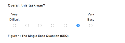
5. Single Ease Question (SEQ)
Finally, there’s the Single Ease Question, which is often recommended for task-level satisfaction for its ease and correlation with other usability metrics.
It consists of just one question after a task:
What do you do with these numbers?
The purpose of task-level questionnaires is to assign quantitative measures to the task experience (problems encountered or the number of steps to complete a task). As Sauro put it, “task level satisfaction metrics will immediately flag a difficult task, especially when compared to a database of other tasks.”
It also helps to compare actual task difficulty and completion rates to expected task difficulty. Here’s what Sauro said about that:

Jeff Sauro:
“It’s helpful to use a survey question that’s been vetted psychometrically like the Single Ease Question (SEQ). Even with the right question and response options you’ll want some comparable.
Tip: Consider comparing the actual task difficulty rating with the expected task-difficulty rating. You can ask the same users or different users how difficult they think the task will be. The gap in expectations and retrospective accounts can reveal interaction problems.”
Really, though, the goal of task-level questionnaires is to improve them. If you can improve the mean rating over time, you can quantify how designs have improved the UX. Fixing these usability bottlenecks, should, in turn, improve conversions (and revenue).
Test-level satisfaction
If task-level satisfaction is measured directly after each task is completed (successfully or not), then test-level satisfaction is a formalized questionnaire given at the end of the session. It measures users’ overall impression of the usability and experience.
There are, again, a variety of questionnaires, but I’m going to focus on two popular ones:
- System Usability Scale (SUS, 10 questions);
- Standardized User Experience Percentile Rank Questionnaire (SUPR-Q, 13 questions).
1. System Usability Scale (SUS)
The SUS includes 10 items:
- I think that I would like to use this system frequently.
- I found the system unnecessarily complex.
- I thought the system was easy to use.
- I think that I would need the support of a technical person to be able to use this system.
- I found the various functions in this system were well integrated.
- I thought there was too much inconsistency in this system.
- I would imagine that most people would learn to use this system very quickly.
- I found the system very cumbersome to use.
- I felt very confident using the system.
- I needed to learn a lot of things before I could get going with this system.
For each questions, users are given a scale of 1–5:
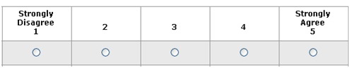
To score the SUS:
- For odd items, subtract one from the user response.
- For even-numbered items, subtract the user responses from five.
- This scales all values from 0 to 4 (with 4 the most positive response).
- Add up the converted responses for each user and multiply that total by 2.5. This converts the range of possible values from 0 to 100 instead of from 0 to 40.
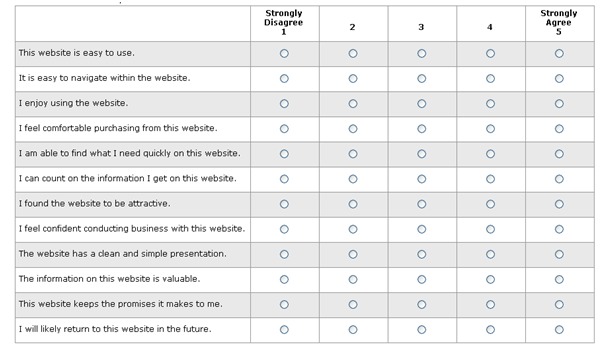
2. SUPR-Q
The SUPR-Q tries to judge whether a website is usable, credible, and visually appealing. It has 8 questions (including 1 NPS question). The trust questions vary based on whether the site is commerce-oriented. They are as follows:
- The website is easy to use. (usability)
- It is easy to navigate within the website. (usability)
- I feel comfortable purchasing from the website. (trust for commerce sites)
- I feel confident conducting business on the website. (trust for commerce sites)
- The information on the website is credible. (trust for non-commerce)
- The information on the website is trustworthy. (trust for non-commerce)
- How likely are you to recommend this website to a friend or colleague? (loyalty)
- I will likely return to the website in the future. (loyalty)
- I find the website to be attractive. (appearance)
- The website has a clean and simple presentation. (appearance)
Again, they are scored on a 1–5 scale:
As for scoring it, add up the responses for the first 12 questions. To that total, one half the score of the NPS question. The lowest possible score is a 12, and the maximum score is a 65. You can then compare your score to industry benchmarks.
Net Promoter Score (NPS)
NPS isn’t in the same category as other questionnaires here, but I wanted to add it because it’s a popular and effective method of measuring user experience and satisfaction (and it’s one of the questions on the SUPR-Q).
You’ve likely already heard all about Net Promoter Score (NPS). NPS is calculated by asking one question:
“How likely are you to recommend (product or service) to a friend?”

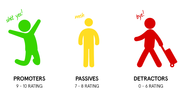
Then, you break up responses into three chunks:
- Promoters (9–10). These are your happiest and most loyal customers who are most likely to refer you to others. Use them for testimonials, affiliates, etc.
- Passives (7–8). These customers are happy but unlikely to refer you to friends. They may be swayed by a competitor fairly easily.
- Detractors (0–6). Detractors are customers that are unhappy and can be dangerous for your brand, spreading negative messages and reviews. Figure out their problems and fix them.
Simply subtract the percentage of detractors from the percentage of promoters to get your NPS. Your score isn’t to compare you with competitors. It’s a benchmark for keeping track of how well you’re doing.
In this way, NPS is much like your conversion rate—a good NPS is better than the one you had last month.
While NPS is quite popular, there are skeptics. Here’s how Craig Morrison of Usability Hour addresses that:

Craig Morrison:
“When talking about the Net Promoter Score, you’ll often hear people say it isn’t accurate, or it doesn’t work, or that it depends on how you phrase the question, etc.
But the thing is, what are you actually doing right now to keep track of how your users experience with your product?
Anything? Surveys? Interviews?
Many startups I work with are doing absolutely nothing. So while this system might have its flaws, it’s way better than doing nothing at all.
It’s the best way to keep track of how the changes you’re making to your product are effective your user experience.”
What do you do with these numbers?
Again, as with task-level numbers, the goal with test-level usability numbers is to improve the score.
However, there’s also value in comparing your numbers to competitors to get a realistic idea of where your customer satisfaction level is at. Here’s how Sauro put it:
Jeff Sauro:
“What do users think of the overall usability of the application? The System Usability Scale (SUS) is a popular usability questionnaire that’s free and short (at 10 items). It provides an overall estimate of usability.
Tip: Take your raw SUS score and convert it to a percentile rank relative to 500 other products or several industry benchmarks. If the product you are testing is consumer/productivity software you can compare your SUS score with 17 other products.”
You can compare your NPS to those in your industry, but, as noted before, the value is limited. NPS, used wisely, can have much greater benefits than benchmarking.
For example, check out this RJMetrics data. Your best customers spend far and away the most money with you:
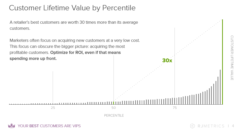
You can assume that your promoters are your best customers, or at least correlate highly with those who spend more. Therefore, knowing your “promoters,” those who love your brand, can be valuable for planning targeting promotions and campaigns. As Questback said, “help your promoters tell everyone they ♥ you.”
Similarly, you can dig up a lot of user experience problems from the detractors. Which issues keep appearing? Are there any trends?
Some say ignore the passives; some say don’t. Often, you can look at them as a growth segment and figure out how to turn them into promoters.
So for NPS:
- Measure your score over time. (Hopefully, you’re improving.)
- Measure individual trends over time. Investigate trends that are improving or worsening.
- Help promoters tell the world about you. (Also, help them buy more stuff.)
- Find insights via the detractors. Let them teach you things you can improve about your user experience.
A quick note, though, with these metrics: According to NN/g, “users generally prefer designs that are fast and easy to use, but satisfaction isn’t 100% correlated with objective usability metrics.” Actually, they’ve found that users prefer the design with the highest usability metrics only 70% of the time.
Though they found only weak paradoxes in the data, it’s important to consider performance and preference metrics (such as those above). Usability questionnaires are a tool in the pursuit of optimizing your UX for revenue and customer lifetime value. Don’t quit A/B testing any time soon :)
Conclusion
There is no single best way to measure your site’s UX. As Sauro summarizes, “There isn’t a usability thermometer to tell you how usable your software or website is.”
So instead, a few metrics measure aspects of usability and the user experience. This article outlined only satisfaction metrics; it left out other important metrics like completion rates, errors, task time, and the all-important conversion rate.
Still, the task-level and test-level satisfaction numbers can give you a good indicator of user satisfaction, at least as a benchmark for optimization.
You don’t have to use all the above questionnaires (obviously). Pick one from each category and start measuring.
Working on something related to this? Post a comment in the CXL community!
Related Posts
-

Animation for the sake of "cool" can often hurt conversions since it's distracting, but not…
-
Ever wonder why your site has a lot of visitors but not enough transactions, purchases,…
-
What's user experience (UX) got to do with conversions? Everything. Great user experience is a…
-
Today, there are more than 2.32 billion smartphone owners around the world. These devices aren’t…


Net Promoter is terrible. The rest of the measurements are dubios at best.
Thanks for crediting my image, and also the shout out!
Hello Birket!
Excellent metrics to measure user experience. UX plays a vital role for your website. Better UX more will be the traffic and more chances of generating leads and sales. Can you please suggest out of the three metrics which one is the best?