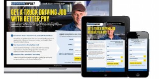
A landing page is the first page that visitors see after clicking on your banner ad, PPC ad, or promotional email. It can be a specific page on your website or a separate page created exclusively for search engines.
Landing pages direct visitors to take a specific action, such as making a purchase, completing a registration, or subscribing to your email list.
Your landing page often determines the success of your ad campaign. A good landing page equals good ROI. A crappy landing page (needlessly) wastes money.
Table of contents
3 Rules for building high-converting landing pages
Let’s start with the basics: the rules that every landing page should follow.
1. Never send traffic from an ad to your homepage.
You should never drive traffic from your promotional campaigns—whatever they are—to your site’s homepage. Homepages are usually cluttered with information, offering users many possible actions. The most important one might be missed.
Hence, you should drive traffic from promotional campaigns to a page that is aimed at only one thing—getting a user to take the one action that’s the goal of your campaign.
It’s the only way to convert browsers into buyers.
2. Clarity and relevance make or break your landing page.
Visitors spend just seconds looking at a landing page before determining its usefulness and relevance. If they can’t find what they’re looking for, or if your site has functional or usability problems, they will abandon the page.
Rather than let that happen, make the few seconds of their attention that you do have count. Answer the questions on their mind:
- Does this place have what I am looking for?
- Is there enough information?
- Can I trust this site?
- How long will this take?
Your landing page must entice visitors to stay and complete the desired action for conversion, whether it’s filling out a subscription form or buying a product.
3. Good landing pages follow a proven structure.
Although there is room for experimentation and variation when it comes to the anatomy of a landing page, this structure is proven to work in many good landing pages:
- Open with a benefit-oriented headline.
The headline is the most important part. If the visitors came from an ad, the headline must correspond to the ad text. If your banner or PPC ad promised a “Breakthrough meditation system,” then this phrase should also be in the headline of your landing page. - Write clear, relevant, and concise copy.
Don’t put too much text on the page; the visitor has to be able to read it quickly. Use bullet points to drive home the main points. Make sure the language in the ad is also present in the copy of the landing page. - Focus on getting visitors to take one specific action.
There should be only one possible action for the visitor to take—be it subscribing, making a purchase, whatever. Don’t offer options, or the conversions will suffer. - Remove distracting navigational links.
Remove all extra clutter—links, menus, buttons—that have nothing to do with the particular ad or campaign. Make it impossible for the visitor to ignore your message or get distracted. - Make the form or checkout option prominent.
The one action you want the visitor to take has to be big and obvious. Put a large sign-up form on the right side of the landing page; use a high-contrast color to make it stand out. If the landing page is long enough for scrolling, duplicate the form or button at the bottom of the page. - Maintain your brand.
Don’t make your landing page look different from your overall website and brand. Keep the same colors, font, and overall look and feel of your main site. This reinforces brand awareness.
A 5-step process to design the perfect landing page
Before you talk to your designer about creating a landing page, draw one on paper. The five steps below will help you get it right and keep you from wasting your designer’s time.
(Also, make sure the designer works with the actual copy, not lorem ipsum. That means you need to write the copy first.)
Here’s how to design the structure for a high-converting landing page:
- Identify your audience (their problem, their needs and what they want)
- Define the most-wanted action that people should perform in your page
- Craft your solution into an easy-to-understand message
- Design your landing page with the core elements (explained below)
- Put it all together and upload it
Now that I’ve summarized all steps, let’s go into detail with each one of them:
1. Identify your audience.
Make sure the landing page talks to a specific audience. Know the problem, the need, and want of your target audience. Write the copy with a specific person in mind.
If you drive traffic to the landing page via advertising and run many different ads, create many versions of your landing page. They can be mostly the same, but tweak the headline and copy.
2. Define your most-wanted action (MWA).
Your MWA is the one action people should take on the landing page.
What that action is depends on your product and strategy. Generally, if your product is somewhat expensive and complicated, it’s better to just get their email address and grow the relationship via email.
If you’re selling cheaper and/or more straightforward products (e.g. wine, socks), go directly for the sell. If your product is software, offer a free-trial.
3. Define your message.
You know the audience, their problem, and the solution you offer. Now craft that into an easy-to-understand message. There’s no way to know in advance what will work, so create a few hypotheses and split test them.
“Clarity trumps persuasion” is a good maxim.
4. Design your landing page.
Your MWA is in place, you understand your target audience, and you have a hypothesis about which offer will appeal to them. How do you design a landing page to motivate them to take action?
First, list all the elements you need on your landing page.
What your landing page needs to have:
- Headline that speaks to the target audience;
- Company logo;
- Quick explanation of your offer above the fold (i.e. visible without the average user having to scroll down);
- Longer explanation of the offer below the fold if the offer or product is complex;
- Image of the product being offered;
- Simple form, ideally with just 1–3 fields (usually just name and email, but do you really need the name?);
- Buy or sign-up button depending on your MWA;
- Link to your privacy policy (load it in a pop-up window to keep people on the page).
Remember, the more fields you ask the visitor to fill in, the more friction you create; therefore, fewer people will fill out the form.
What you should leave out:
- Navigation menu—focus only on your offer;
- Links to other parts of your sites. such as “About Us”;
- Pictures or images that don’t relate to the offer; these are distractions;
- Hard-to-read text (i.e. anything less than 12px);
- Scary forms with unnecessary fields, such as “title” or “fax”;
- “Clear fields” button;
- Links like “Click here to subscribe” or “Click here to read more.” If you can’t cram all your content above the fold, let the user scroll down. Scrolling is almost always better than clicking to another page.
There are always exceptions, and you (usually) can’t copy best practices directly to your site, but this advice should be your starting point. Get the essentials in place first and tweak from there.
5. Put it all together.
Once you’ve created your page layout and the copy, put it together and upload it to your site. Use simple URLs that users can easily recognize.
If your landing page is about job offers to work on an oil rig, your URL should be something like somesite.com/oil-rig-job-offers/.
Such URLs often generate better click-through rates on Google Ads. A searcher who types “oil rig job offers” is more likely to click on an ad with a keyword-rich URL.
How long should a landing page be?
Long or short? There is no definitive answer. In most cases, if the offer is free, short copy works better. If you’re asking for money, longer copy performs better. The more money, the longer the copy.
As per Bob Kemper of Marketing Experiments, three factors affect the efficacy of copy length on a landing page:
- Nature of visitor motivation;
- Initial level of anxiety about product/company;
- Level of cost/commitment associated with conversion.
Short copy performs better when the offer is free, cheap, or otherwise not intimidating. It also works well for impulse buys or purchases that deliver emotional satisfaction (e.g. concert tickets, candy, something beautiful).
When rational thinking and analysis are factors for purchasing, longer copy helps you make a more compelling case by adding explanations, proof, testimonials, etc. Use longer copy with products for which more information helps people decide.
Many people associate long-form copy with hype, spam and cheesy get-rich-quick landing pages. Don’t hate the length; hate the content.
In a case study from Conversion Rate Experts, they showed how they massively improved conversions for a Moz landing page. One of the key changes they made was increasing copy length:
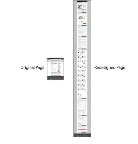
They’re not the only ones, of course. Take a look at product pages on Amazon. (Amazon is known to test everything.)
Some long-form landing pages for free offers convert well, but the linked example is a rather complex product, which may be why longer copy works better there.
When using long copy, make sure it’s obvious that people can and should scroll down—encourage them to do so. You can use CrazyEgg or Clicktale to see a scrollmap of how far down the page people scroll.
Test, test, test
Once everything is up and running, test the effectiveness of the landing page based on your predetermined MWA. You should always create at least two alternate versions of a landing page. Test them, measure, and improve.
Read our guide on conversion optimization to learn how to do it all.
Examples of good (and bad) landing page design
I just googled a bunch of keywords and clicked on some ads to find different landing pages. I couldn’t find a “perfect” landing page during my limited search, but that’s life. I skipped the totally awful landing pages.
Here they are, along with what they’ve done well and the changes I would recommend they test.
University of Phoenix

What they’ve done well:
- An emotional image;
- Obvious call to action;
- Clear branding.
What I would change or test:
- Remove the navigation or reduce the number of other links;
- Increase headline and form font size;
- Make the form and text boxes solid, not semi-transparent, so that the text is easier to read.
Zoho
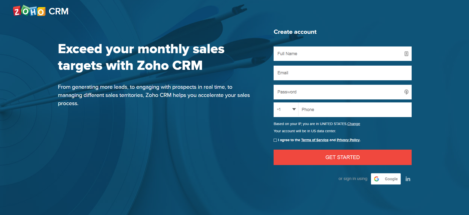
What they’ve done well:
- Benefit oriented headline;
- Succinct copy;
- Call to action stands out;
- Clear branding.
What I would change or test:
- Add a product image.
- Fix the false bottom—there’s plenty below the fold, but how would I know?
- What does “Get started” mean? A sales call? Free trial? Whitepaper?
- Add a bulleted list of product benefits rather than a comma-separated list in a paragraph.
Outskirts Press
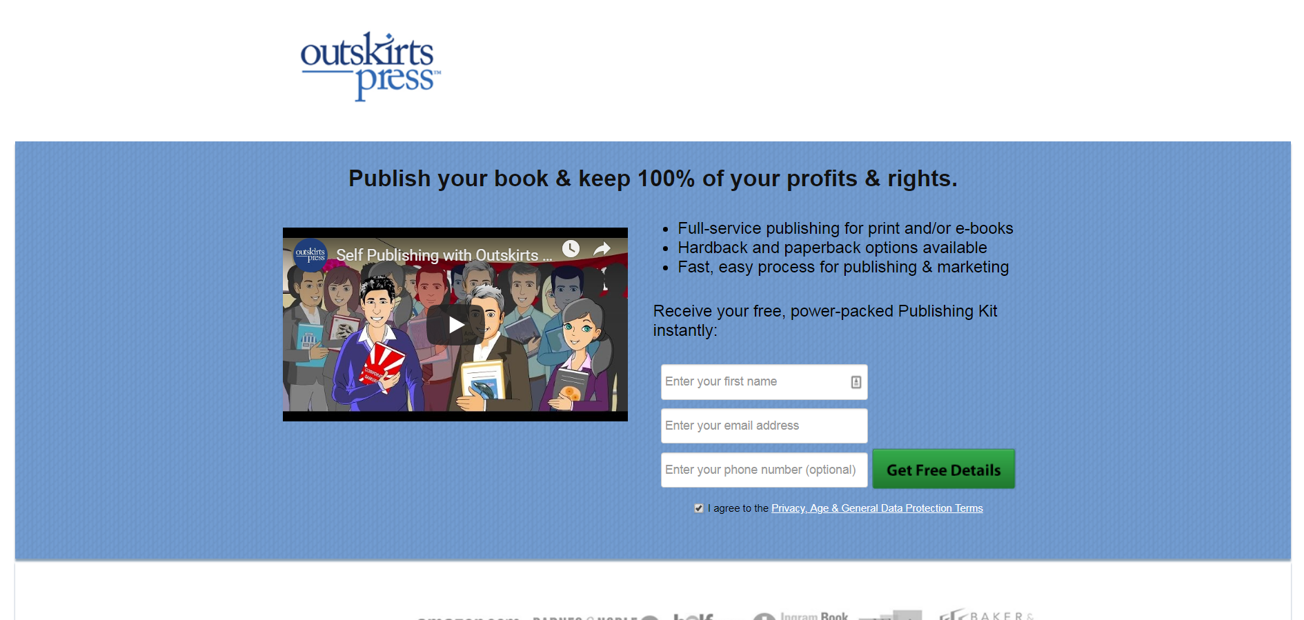
What they have done well:
- Concise, key benefits listed in headline;
- Bulleted list of additional benefits;
- Social proof (testimonials below the fold).
What I would change or test:
- Design. This looks dated and amateurish.
- Remove jargon-y language like “power-packed Publishing Kit.”
- Increase the contrast between button and background (as well as text and background).
- Remove the second offer (a free ebook) that shows up below the fold.
Tools for building landing pages
There are many great tools for building landing pages. Check out these options:
- Unbounce. The most powerful.
- KickoffLabs. Viral landing pages.
- LaunchRock For “launching soon” landing pages.
Conclusion
Getting a customer to subscribe to your offer or email list isn’t enough. After a customer subscribes, you must sell them on actually consuming your content. Many visitors that complete sign-up forms will not actively consume your offer.
But everything starts with that additional signup. And if you’re already spending money on paid ads, you might as well take the time to design a landing page that’s going to deliver a greater return on that spend.
Working on something related to this? Post a comment in the CXL community!
Related Posts
-

It took us six rounds of tests until we landed on a variation that was…
-
Navigation gives a user control, which is generally a good thing—but what about on a…
-
We talk a lot about creating high converting landing pages, getting traffic that converts, and…
-
In an iconic scene from Glengarry Glen Ross (1992), Alec Baldwin lectures a group of…


Great article, thank you for sharing!
I found my way here while searching for Landing Page Conversion. The information you are providing is really helpful in the IM business.
Good article, thanks for the info.
Thanks for the great article. I especially liked the examples and the critique.
Lots of good tips. I would add lead pages to the list of landing page creation tools
Peep, damn! That was brainstorming. I have sent this link to my designer as we are designing some important landing pages to get some clients in the field of internet marketing. Hope she grasps what you wrote! :)
Thanks a lot for the article. It really helped me a lot.