
Understanding what consumers want, what consumers need and why is a crucial part of conversion rate optimization.
Earlier this year, BrandShop released the results of the 2015 Digital Consumer Preferences Survey, which revealed in no uncertain terms that consumers want (and need) buying online directly from brands to be easier.
Why do consumers, despite the rise of eCommerce, find buying online difficult? Is it really as difficult as they perceive it to be? What’s contributing to the expectation-reality gap?
Table of contents
Has the eCommerce Industry Just Hit a Plateau?
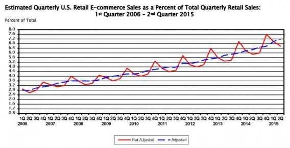
Well, according to the U.S. Department of Commerce, online sales were up 15.4% from 2013 to 2014. From Q2 2014 to Q2 2015, that number increased 14.1%.
Last year, eCommerce officially became a $300 billion industry in the U.S. alone. At the current rate, 2015 will mark the sixth consecutive year of growth close to or above 15%.
Estimates from the U.S. Department of Commerce show no signs of slowing growth…
So, What Does “Make Buying Easier” Mean?
According to BrandShop, over 71% of respondents shop online at least several times per month. There’s no doubt that eCommerce is a rapidly growing industry, but there is a large expectation-reality gap.
A significant amount of online transactions occur through third party retailers. 78% of respondents make frequent purchases from Amazon, 47% from online retailers, 24% from eBay. Only 37% of respondents make frequent purchases directly from brands.
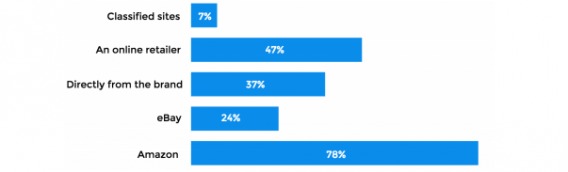
Here’s where things get interesting. 82% of respondents expect to be able to purchase directly from brand sites. In fact, 88% prefer to purchase directly from a brand if given the choice.
While some brands are happy with engagement (i.e. consumers buying their products via a third party), consumers want and need to be able to transact with brands directly.
In 2014, Optimizely shared a case study from Dewalt, one of Black and Decker’s brands, which serves as a good example.
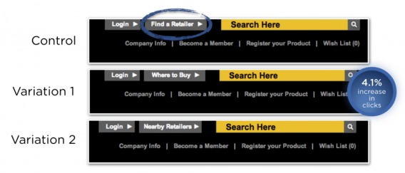
Note that visitors are 4.1% more interested in “Where to Buy” than either variation mentioning a third party retailer.
Given the results of BrandShop’s study, it seems many brands (not just Dewalt) are under delivering – in a big way.
Examples: MAC Cosmetics, Serta & Nintendo
The first major brand I think of is MAC Cosmetics. Let’s look at their site…
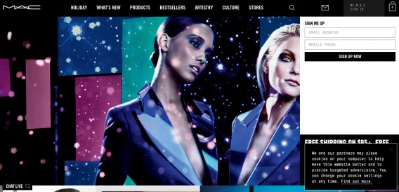
Three clicks are necessary before I can even see a product (or a shop / buy call to action).
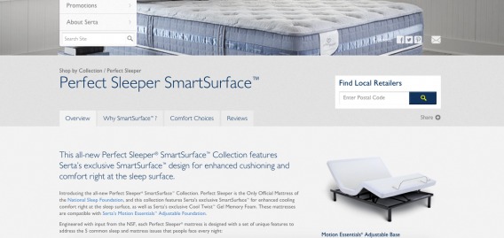
When I think of mattresses, I think of Serta…
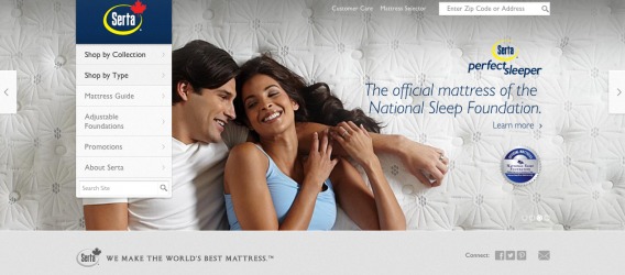
The site looks promising and there’s plenty of reading material on the various types of mattresses, but…
Nintendo doesn’t make it easy to buy the latest Zelda game, either…
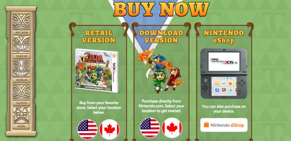
The list of brands that don’t allow consumers to easily make a purchase directly on their site is endless.
What Makes Buying Easy?
So, what goes into making buying easy for your consumers? Three core factors contribute to ease:
- Clarity and simplicity.
- Intuitive design.
- Informative content.
The table is already set for you. Consumers want to shop online and they want to buy directly from your brand. All you have to do is provide them with the resources they need, make the process as simple and intuitive as possible, and get out of their way. [Tweet It!]
Step 1: Perfect Brand Experience
Only 18% of respondents are highly satisfied with their branded shopping experiences online. 10% were completely dissatisfied and the remaining 72% were merely somewhat satisfied. So, in a $300 billion industry, less than 20% are completely satisfied…? Yikes.

Joanna Lord, Growth Marketing Expert:
“To me, conversion rate optimization is a way in which I can rework experiences to best serve the customer. In the end, that is what marketing is: reworking a story and brand experience to best serve the customer’s needs.” (via Unbounce)
There’s likely room for improvement in your brand experience, as well.
Think you’re not being held responsible for bad experiences if you rely on third party retailers? Think again. According to BrandShop, “Regardless of where a transaction occurs, more than half of respondents hold the brand responsible for the end-product experience.”
Brand Experience Example: Maytag
Take a look at Maytag’s site, for example. Let’s say you’re looking to buy a dishwasher. The site follows most eCommerce navigation prototypes and the “Cart (0)” link in the top, right-hand corner of the screen tells you you will be able to make a purchase on-site…
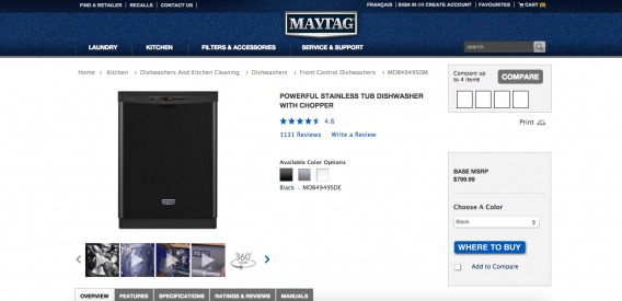
As it turns out, you can’t and will be directed to a third party retailer…
Your Next Steps
- If you already have a branded online buying experience, conduct conversion research to discover issues.
- UserTesting.com will tell you how long each step of the buying experience takes, where consumers are falling off and bouncing, how your experience compares to the competition, etc.
- You aren’t objective about your own site. Your opinion of what’s easy and simple is very different from what’s easy and simple to your visitors.
- Start optimizing near the end of your buying experience and work backwards, if you don’t have much testing traffic.
- If you don’t have a branded online buying experience, conduct conversion research to discover opportunities.
- Qualaroo will help you hone in on what visitors are looking to accomplish on your site, what they think is missing, where you’re failing to meet expectations.
- Your site’s search queries will show you what, specifically, your visitors are interested in buying.
- Inspectlet will show you eye-tracking, click and scroll heatmaps to ensure you make smart positioning / call to action decisions.
Step 2: Create Awareness & Make It Obvious
Only 22% of respondents start their search for information / a product on the brand’s site. Not surprisingly, the majority (58%) begin on Google. What’s interesting is that only 14% start on third party sites like Amazon.
Think about that for a moment. Respondents are more likely to start their search on a brand site than a third party site, but they are more likely to buy from a third party site.
Your visitors are gathering information from your site, but are leaving your site (despite their desire to buy right then and there) because (a) your site doesn’t allow transactions or (b) your site makes buying difficult.
The key to creating awareness is working with these buying habits, not against them. Don’t view search engines as competition. Make the fact that you can transact on-site (or not) as obvious as possible by following eCommerce prototypes.

Des Traynor, Intercom.io:
“Favour clarity over beauty; your job is to get clicks, not become a master of subtlety.” (via Intercom.io)
Remember when I mentioned Maytag’s misleading “Cart 0” link?
Awareness Example: RCA
Now consider RCA, which sells laptops, phones, small appliances, etc. Here’s the RCA site…
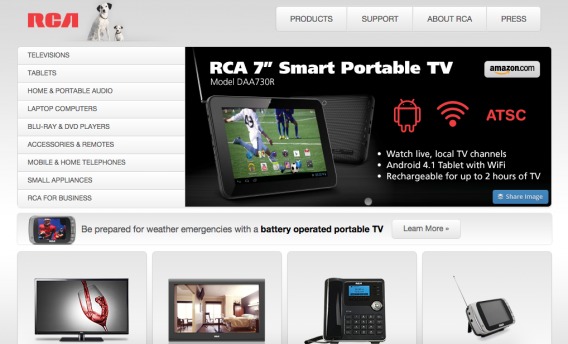
I assumed, based on a first look (note the Amazon logo), that RCA didn’t sell products on their own site. They don’t mention words like “buy” or “shop” anywhere, there’s no search option, there’s no mention of a cart, calls to action like “Learn More” are passive, etc.
However, when I clicked through to Products -> Mobile & Home Telephones -> Home Phones -> Cordless, I reached this page…
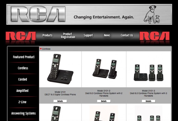
Again, the “Details” call to action is passive, reinforcing the idea that the site is for research purposes. Yet, the products are displayed the way they would be on a standard eCommerce site. When you click through, you get…
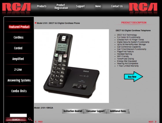
This looks more familiar! A product description to the right of a product picture, a contrasting “Buy Now” button, more detailed product information below, etc. At this point, you’re pretty confident you can purchase the phone without visiting a third party.
And then…
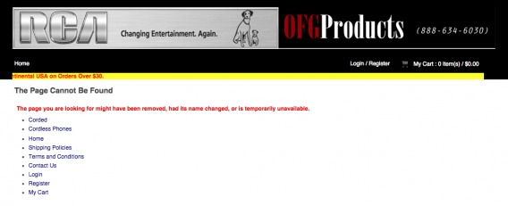
All of that work and “The Page Cannot Be Found”, really? If I were actually looking for a home phone, this would have been an extremely dissatisfying buying experience.
Your Next Steps
- Make sure your site is optimized for search engines. That’s where the majority of your visitors are beginning their search. They want to purchase from your brand site, but it’s your responsibility to make it as easy as possible to find it.
- Expectation setting is key. If you’re going to provide product information, but move the visitor to Amazon or a local retailer, let them know upfront. If you allow transactions on-site, bring it to the visitor’s attention right away.
- Whatever the case may be, make it obvious to avoid disappointed consumers. According to a 2013 research study sponsored by Zendesk, 95% of consumers will share a negative buying experience and 54% share a negative experience with more than five people.
Step 3: Build Authenticity
You’ve conducted the conversion research, you’ve got the visitors to your site and they know they can make a purchase. Now, it’s time to convince them to convert to customers.
96% of respondents believe research is a crucial part of the buying experience and 63% of those surveyed would buy from an authentic brand over a brand that isn’t perceived as honest. So, what can you provide to ensure your site is viewed as an authentic product provider?
Social Proof
Social proof in the form of testimonials, customer reviews, social media praise, activity data (e.g. “43 other people are viewing this product”), storytelling (e.g. “With this product, your life will be like this”), etc.

Brian Solis, The Altimeter Group:
“During the new customer journey (aka the decision making cycle), a consumer may find themselves at a point of indecision. When consumers are uncertain of what to do next, social proof kicks in to see what others are doing or have done.
To influence decisions, wish lists, popularity lists, social sharing, reviews, and social recommendations become paramount.” (via BrianSolis.com)
Trust Signals
Trust signals in the form of security seals (e.g. Better Business Bureau), a privacy policy, a return policy, warranty information, etc.
Contact information in the form of a physical address, a phone number, a contact form, a live chat, social media profiles, etc.
Content & Context
High quality content in the form of product manuals, product specs, product features and benefits, editorial content (e.g. at CXL, we have the Conversion Optimization Guide), etc.
Context in the form of prices on third party retailer sites, prices of competing products, prices and specs of similar products, a “compare” button, etc.
The goal is twofold: (1) give visitors that confidence that your site is credible and nothing will go wrong, and (2) reinforce the idea that if something does go wrong, your brand is available and ready fix problems – quickly.
Your Next Steps
- Complete an authenticity audit. Using the information above, determine how authentic your brand is. Does it seem trustworthy? Does it seem authoritative?
- After you’ve identified your weak points, fill the gaps. If you’re lacking social proof, ask some of your biggest advocates for a few kind words to display near calls to action. If you’re missing quality content, have someone outside of your product department (they have the curse of knowledge) write a few product manuals.
- Use these authenticity indicators around your calls to action to inspire action. An impressive 91% of consumers value honesty about product and services, making it the most important factor (above product utility and brand appeal).
- The more authenticity reminders there are near your calls to action, the easier it is for consumers to buy.
Step 4: Make It Intuitive
Finally, your buying experience and site design must be intuitive. Here’s how Peep Laja describes intuitive design / UX…

Peep Laja, CXL:
“The main thing about intuitive design is that it’s invisible. Design is intuitive when users can focus on a task at hand without stopping even for a second. Intuitive designs direct people’s attention to tasks that are important. In the end, an intuitive design focuses on experience.”
He wrote an in-depth article on intuitive design, Intuitive Web Design: How to Make Your Website Intuitive to Use, which I highly recommend you read thoroughly.
Essentially, intuitive buying experiences and site designs reduce the consumer’s need to stop and think about what they’re doing. The next step is always obvious, questions are answered before they’re asked, etc.
Remember the MAC Cosmetics example from above? Their buying experience wasn’t intuitive. When you land on the site, you don’t immediately know where to go to make a purchase.
If you’ve ever shopped for a car without knowing much about cars, you know how daunting it can be. There are so many brands to choose from and then so many models to choose from and then so many features to choose from.
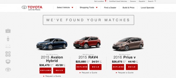
Intuitive Example #1: Toyota
Look at how Toyota made car shopping more intuitive with their “Find Your Match” campaign…
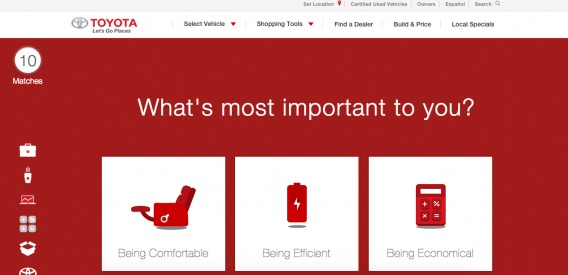
After answering a series of questions about my needs and lifestyle, I’m shown my matches…
Intuitive Example #2: BustedTees.com
Another example of an intuitive buying experience is BustedTees, a pop culture apparel site…
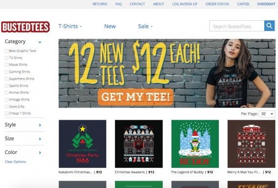
Let’s say you like the “Christmas Awakens” t-shirt for $12…
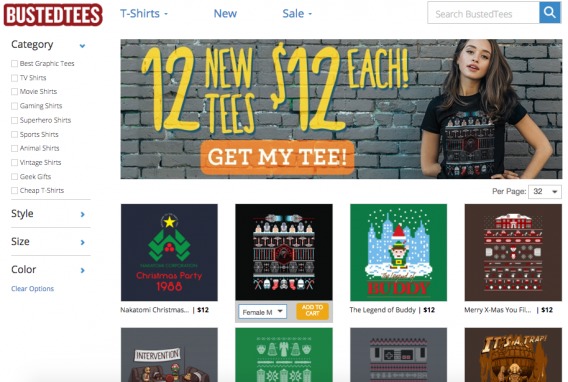
When you move your cursor over the design, you can add the t-shirt, in your size, to your cart with one click and then continue shopping. All without ever leaving the page.
The next step, quite obviously, is to checkout. The second the t-shirt was added to the cart, these calls to action appeared…
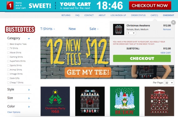
You don’t need to think about when or how to check out, you’re immediately prompted. (The blue call to action at the top stays on the page as you scroll and continue shopping.)
Internal Questioning
When designing (or improving) your buying experience, ask yourself…
- What sites do I enjoy buying from?
- What is it about those sites that makes the experience enjoyable?
- What’s the most annoying thing about buying online?
The factors that make buying unintuitive and just plain difficult are common. The roadblocks and annoyances you experience when shopping online are likely similar to the roadblocks and annoyances your visitors are experiencing.
Your Next Steps
- Simplify every step. If a step (e.g. “review order”) is unnecessary, remove it. If you can keep consumers focused and avoid breaking their train of thought, do it. Consider everything you believe to be required. Is it really important or is it “standard”?
- As mentioned, user testing is invaluable. The best way to understand how consumers move through your buying experience is to watch them.
- If you already have a buying experience, watch for stumbling blocks and hesitation points to identify friction.
- If you’re just starting out, test multiple experiences and throughout each development / design phase to get the best end result.
Test Ideas for Optimizers
No buying experience is perfect. There is always room for improvement, which means you should always be optimizing. Whether you’re an established eCommerce site looking to make buying easier or a brand looking to allow transactions for the first time, optimization is clutch.
Michael Aagaard explains the importance of a testing culture among brand-side marketers…

Michael Aagaard, Unbounce:
“I recently spent three months with a major Scandinavian firm implementing CRO training. I was onboard to do hands-on optimization work and to help key employees become competent CRO professionals who can handle their own in-house projects. We achieved some impressive lifts on key areas of their e-commerce platform that directly impact revenue.
Nevertheless, the best part for me was witnessing the transformation that took place within the team as they went from gut feeling and guesswork to a structured, data-driven methodology that resulted in more revenue and deeper customer insight. Brand-side marketers can learn that it’s never too late to invest in CRO and that such an investment can lift an entire business.” (via Unbounce)
But where can you start…? (We’ve written The Ultimate Guide to Increasing Ecommerce Conversion Rates, which I highly recommend reading.)
1. Customized Recommendations
It’s common practice to recommend similar products to browsing consumers…
What if you recommended complementary products instead? Or products based on the consumer’s previous behavior instead of on the product they’re currently viewing? Or relevant promotions / coupons based on their activity?
2. Free Shipping
Free shipping matters. Compete’s 2012 Online Shopper Intelligence Survey found that 62% of consumers said they would not have made their most recent purchase if they had not received free shipping. Experiment with how and where your free shipping offer is highlighted.
If you really can’t afford free shipping, at least use a flat rate (e.g. $10 shipping charge for all orders).
Whatever the case may be, it’s important to make the shipping fee obvious. Be honest about it upfront instead of moving them through the entire buying experience to discover a $40 shipping fee on a $35 product.
For example, Gnarly, a clothing company, tells me I need to spend another $72 until I qualify for free shipping…
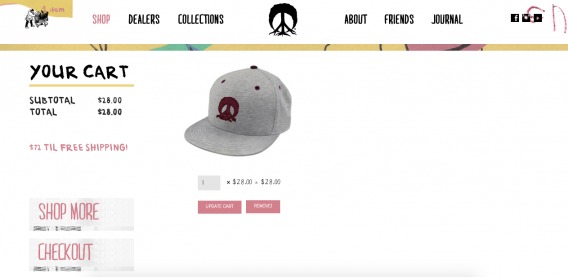
But when I checkout…
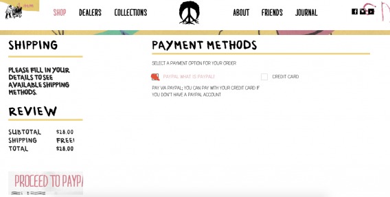
Honesty and clarity are important factors here.
3. Mobile Capability
According to a Criteo study earlier this year, mobile shopping accounts for 34% of all global e-commerce sales. By the end of the year, that number is expected to reach 40%.
A mobile buying experience is a necessity and it can’t be a carbon copy of your desktop buying experience.
As Charlie Graham of Shop It To Me, Inc. explains, “Most e-commerce companies today (especially fashion-related e-commerce companies) are pretty good at showing items. But most still have a mobile copy of their desktop checkout experience.”
“Companies should build checkout from the ground up for mobile, taking advantage of mobile-specific features (like using specific keyboards for different fields), dividing up forms into many more pages and getting rid of unnecessary fields (i.e. not asking for a city/state if you have a zipcode),” he adds.
Other Tips
- Prominently display a phone number for call-in orders and/or support. They are on a phone, after all.
- Optimize your mobile buying experience for every device. Just because everyone in your world has an iPhone 6s, doesn’t mean it’s the only device your consumers have.
- Offer social logins to avoid data entry requirements. Data entry on a small mobile keyboard can be time-consuming and difficult. Don’t ask for information you already have or information you don’t really need (e.g. “Repeat Password”).
Conclusion
It’s time to close the expectation-reality gap that exists in the eCommerce industry right now.
Consumers want to purchase directly from brands, not third party retailers. Unfortunately, brands are making it too difficult to buy, so consumers are turning to the buying experience experts (like Amazon).
Whether you have an eCommerce site or you’re a brand allowing transactions for the first time, here are the first few steps you can take towards an easier buying experience…
- Conduct conversion research with tools like UserTesting.com, Qualaroo and Inspectlet to discover issues and opportunities.
- Make sure your site is optimized for search engines. That’s where the majority of your visitors are beginning their search.
- Expectation setting is key. If you’re going to provide product information, but move the visitor to Amazon or a local retailer, let them know upfront. If you allow transactions on-site, bring it to the visitor’s attention right away.
- Complete an authenticity audit. Does your brand seem trustworthy? Does it seem authoritative?
- Use these authenticity indicators around your calls to action to inspire action.
- Simplify every step. If a step is unnecessary, remove it.
- Test, test, test. Your buying experience is a never-ending experiment, so always be optimizing. [Tweet It!]
Related Posts
-

A couple weeks ago, we dug into internal site search & found that in some…
-

I wrote this short rant. Isn't it fun? It's totally cool! Yes, it's that easy!…
-
Starting and running a business can be really hard. What's the secret? There are many…
-
Normally, I dig into massive amounts of data, but today, I think we should talk…


Hi Shanelle,
Its true that “Consumers want to purchase directly from brands, not third party retailers”. Hence, marketers must leverage on this knowledge to make their brand worth buying.
Understand why,where, how, and when consumers buy should be a continuous experience. If this is cleared then it becomes easier to buy from a site.
The seven steps to make buying easier for the customer as shared here comes handy for the marketer who doesn’t have an inkling of where to start!
I left the above comment in kingged.com as well
It’s less about making the products “worth” buying and more about making it easier to buy them. The consumers already want the products. But they are being forced to purchase from third parties (like Amazon) because brands (a) don’t allow transactions on their sites or (b) don’t make it simple / intuitive to buy.
Thanks for reading, Sunday! Hope this helps.
Shanelle, this is an awesome post. Thanks for putting this together.
About brands not allowing visitors to purchase on their own site… I feel like it’s rarely discussed, but it extremely frustrating and an oddly common experience. Glad that you’ve been able to clearly explain what is the problem with this, and how it can be solved.
I recently talked with a few owners of companies that did just that: have a website for their brand, but if you want to buy their products you have to order on someone else’s website.
When I asked them why they were doing this, many answered it was due to reseller agreements they’ve made with other retailers…
Unfortunately, these brands have to realize that not selling on their site will benefit their retail partners much more that it will benefit them (in most cases). Sure, they’ll get orders and don’t have to worry about their own e-commerce stuff, but think of all the lost orders due to the friction imposed on the consumer…
In this digital age, these brands have to re-think their retail agreements. Offline, sure, not having their own stores and selling through third-parties can be advantageous in many ways. But in today’s world, it doesn’t make a lot of sense.
Thanks for reading and for bringing up a great point.
Hopefully the study will show brands that consumers want to buy directly from brand sites.
Imagine the sales lost when consumers are forced to switch from a brand’s site to a third party retailer! Talk about a site leaking money.
I’d be really interested to hear from someone who has a reseller agreement with retailers, though.
In the ecommerce business, Website ought to be user-friendly, open, clean, honest, clean returns policy, offer different payment methods, and so on for it to convert sales. But among these, making the user’s life easier should be most considered.
Reading your posts, one could learn the some ideas useful to leverage the power of the ecommerce website. I must say that all the tips should be mulled over, because a well-designed website should aim to prevent nobody from buying – to allow 100% of the people who want to buy to do so.
Thanks for reading, metz!
Most of us have the curse of knowledge, meaning we can’t put ourselves in the shoes of someone visiting our site for the first time. That’s why conversion research is so important.