
At the heart of every landing page is the lead gen form.
When your visitors land on your page, you want to ensure they can find and complete the form as quickly and painlessly as possible, right? After all, it’s the gate to your conversion funnel, your first interaction with leads.
More than a few questions are likely circling around in your head. Does my form have too many fields? Should I change the button color? Will in-field labels help reduce friction?
The only way to truly answer these questions is to run the tests yourself, but you can learn the process of lead gen form optimization and the best practices for form design.
Table of contents
What is lead gen form optimization?
Lead gen form optimization is the process of improving the messaging and design elements of your sign-up forms, in order to increase the number of visitors that successfully fill them out and sign up for a newsletter, a lead magnet, or another kind of offer.
Unoptimized vs. Optimized Lead Gen Forms
An unoptimized lead gen form is a roadblock. It slows people down, it raises questions, it causes uncertainty. Essentially, it breaks up the conversion flow. If you don’t spend the time to identify points of friction and correct them, your form is leaking money.
On the other hand, an optimized lead gen form is a welcome mat. It feels like a logical next step, it doesn’t raise any red flags, it’s intuitive. It doesn’t interrupt your visitor’s flow.
There are two core characteristics of an optimized lead gen form:
- Perfected value proposition.
- Reduced friction.
A lead gen form is a transaction and it’s a mistake to think of it any other way. You’re asking for information from your visitors. If you’re unable to offer something in return, you won’t be getting much of anything. What’s your value proposition? What is being used to compel your visitors to complete the form?
Lead gen forms must also be as frictionless as possible. If your visitor feels like she’s doing data entry, you’ve done something wrong. Optimized lead gen forms feel so painless that visitors don’t have to think about it. They’re simply going through the motions, not jumping over a roadblock.
Understanding Your Problem Areas
Before you begin optimizing based on best practices and hoping for the best, conduct proper conversion research. What worked for a competitor won’t necessarily work for you. What worked on your last site might not necessarily work for this one.
You might assume fewer form fields is the solution, when really it is more descriptive field labels. You might think using “Your” for your button copy will outperform the competition, when “My” results in more clicks. The list is literally endless.
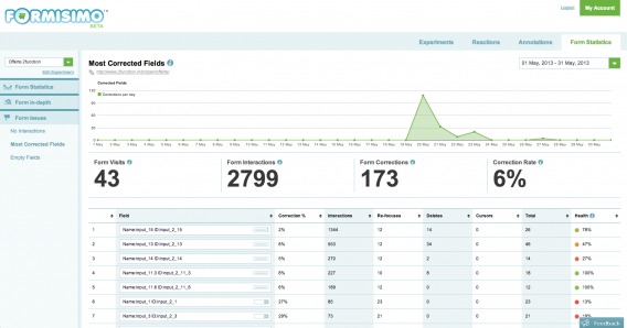
Use tools like Formisimo and Hotjar to see how your visitors engage with your site. Ask yourself…
- What fields are resulting in bounces?
- What fields are producing the most errors?
- What fields take the longest to complete?
A best practice will tell you to try a different button color, your data will tell you the truth. Don’t waste traffic on tests suggested without conversion research.
What’s a Good Form Conversion Rate?
As Peep famously wrote, “Stop worrying about what’s ‘a good conversion rate’. Work to improve whatever you have. Every month.” [Tweet It!]
Of course, it’s hard not to compare your lead gen form conversion rate to others, as a point of reference. If you’re far below the average, you know you have a lot of room for optimization. It might even been time for a radical redesign. If you’re way above the average, you know your conversion rate increases will be incremental.
Earlier this year, Formstack found that 11% is the average conversion rate for lead gen forms…
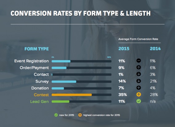
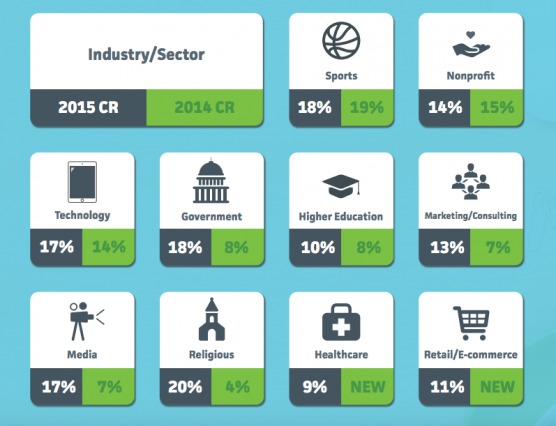
They also broke down the average conversion rate for all form types by industry…
They even looked at peak form submission times, based on form type…
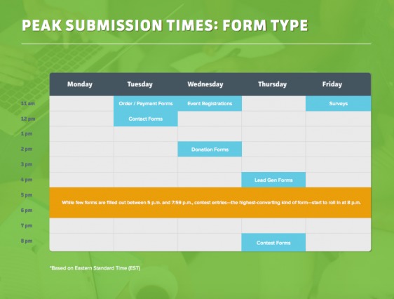
Just remember that these are simply guidelines. You likely won’t notice a sudden, unexplainable spike in form completions at 4 p.m. EST every day and aiming for an 11% conversion rate purely because it’s the average is short-sighted.
There are a lot of factors that influence your form’s conversion rate. It’s fun to compare, but all that really matters is that your conversion rate is higher than it was last month.
Optimized Lead Gen Forms (Before and After Conversion Rates)
So, how much of an impact can optimizing your lead gen forms really have? Of course, the answer varies, but the potential for a dramatic increase is definitely present.
That increase, Exit Intel CEO Matt Cimino notes, has compounding returns for a business:
The biggest mistake is just thinking, “We’ve got a pop-up [or a form], so we’re good to go.” If you can double or triple CTR, that can be a massive benefit because of the compounding effect of growing a list.
Michael Aagaard Simplifies
Michael Aagaard of Unbounce worked with a Danish shipping service that provides custom quotes from different carriers. After completing the form, leads receive the quotes via email just a couple of hours later.
Here’s what the site looked like originally…
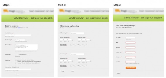
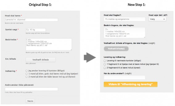
The original form converted at 43%, but Michael knew they could do better if the form was simplified. So, he made changes to each of the three steps, making them less daunting.
Step one…
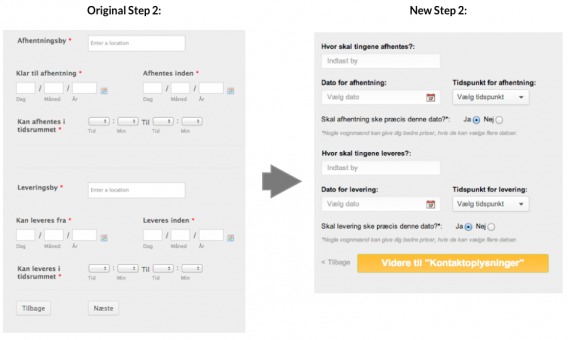
Step two…
Step three…
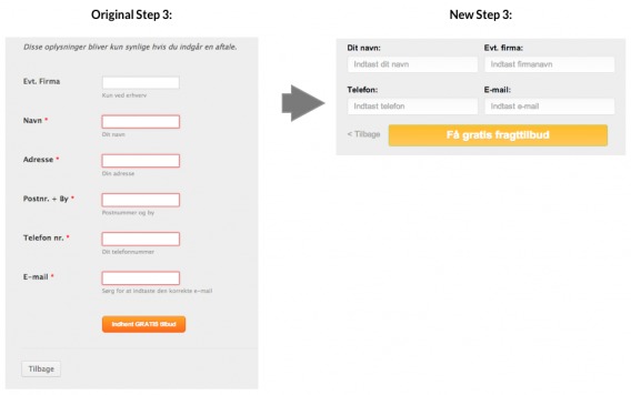
The final result, which also included a form header update, looked something like this…
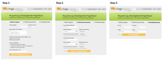
The result? The new form converted at 56%, a 30% increase in conversions.
A few tweaks to field labels, alignment, button design and number of fields was all Michael needed to get 30% lift. Not too bad.
His original hypothesis was: “By making the form easier to understand and interact with, we can simplify the experience, remove friction, and get more leads to complete the 3-step form.”
The key here, as Michael would tell you himself, is not to jump to conclusions about what’s easy to understand and interact with.
The parts of the form you felt were intuitive and simple could be confusing to the majority of your visitors. You could assume an open comment field is bringing down your conversion rate when really visitors hate your dropdown menu.
Do the research, create your treatments, run the tests and find out for yourself.
Common Lead Gen Form Mistakes
According to Oli Gardner of Unbounce, establishing purpose and intent (with the title and description) is vital…

Oli Gardner, Unbounce:
“You need to introduce the purpose of your form before you ask people to fill it out. Your form should be able to stand alone on the page.” (via Page Fights)
Of course, that’s only the beginning and the list of lead gen form optimization points is quite long. Instead of worrying about all of them right away, focus on the points that are most commonly associated with friction.
1. Believing Form Field Myths
There are quite a few form field myths floating around the Internet right now…
- Always reduce form fields to increase conversions.
- Always move the form above the fold to increase conversions.
- Always remove the phone number field because it will always decrease conversions by 5%.
Of course, sometimes these best practices work. But “always” is not a word in an optimizer’s vocabulary. If you follow best practices blindly, you might increase conversions, but you’ll be leaving money on the table.
- Try removing form columns or adding a progress bar instead.
- If your value proposition is complicated and your visitors are uncertain, a lead gen form above the fold won’t be very successful.
- Add a label description to explain why you’re asking for their phone number. Only in the event of an emergency? Let visitors know.
Believe your data, not what you read once on WhichTestWon.
2. Delayed Error Messages
The traditional error message model is outdated and ineffective. Take a look at the Chapters checkout process…
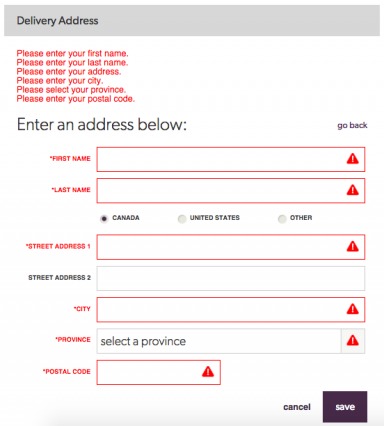
Those errors only display after you’ve completed the form and hit “save”. Seems a little inconvenient, right? You finally get through an eight field form only to learn that you need to redo something because of an error.
Your visitor’s expectation when clicking “save” is that she’s done with the form. If you then bring her back to the form, you’re creating friction.
Instead, eCommerce expert Linda Bustos recommends as-it-happens error messages.

Linda Bustos, Ecommerce Illustrated:
“Forms that contain input errors are culprits to cart abandonment because customers need to understand what to correct. You must make the error message very easy to spot, very easy to understand and very clear why the error happened. Many checkouts fall flat in this area.” (via GetElastic)
As each field is completed, note whether it was done successfully or with error. A simple green check or red x will do. Visualize the in-line error messages Chapters uses, but before the “save” button is clicked.
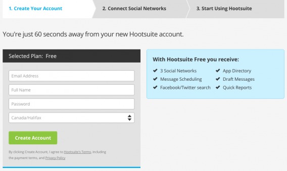
UJAM, a German music company, is a perfect example…
3. Poor Labeling
In another client case study from Michael, we see how powerful simply tweaking the field labels can be. Eliminating confusing questions and providing reasons why you need that information (i.e. how it will be used) can go a long way.
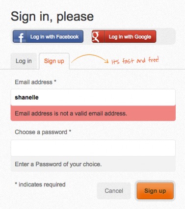
Another point of friction is labels within the fields. Take a look…
While HootSuite has as-it-happens error messages, they create friction by placing the labels within the fields. This format is often used in an attempt to shorten the form length, making it seem less daunting.
Unfortunately, it causes problems. As soon as you click on the field, the label disappears. With such busy, distracted minds, your visitors will soon forget what information they’re supposed to be entering.
Now, Hootsuite’s form is only four fields, so it might not be a major problem for them. However, this type of label would likely be an issue for longer forms.

Brian Massey, Conversion Sciences:
“Best form is label above, single column, and nothing on the inside. Just don’t mess with it. People know how to do that.” (via Business of Software)
4. “We Won’t Spam” Notices
You’ve likely seen plenty of calls to action with little notices like this. “We hate spam”, “We won’t spam you”, “Just the good stuff”, etc.
Take a look at James Clear’s call to action…
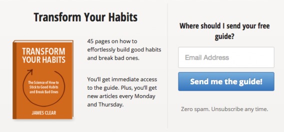
It’s important to know that “spam” is a stop word. It has a negative sentiment and sends a signal to the brain to stop and think. Instant friction. Obviously, you don’t want any stop words near your call to action.
So, while that “no spam, we promise” line might be designed to build trust, it’s actually more likely to do the opposite. If your landing page was well-crafted, your visitors weren’t even considering the idea that you might spam them… until now.
5. Weak Button Copy

Jason Fried, Basecamp:
“Most copywriting on the web sucks because it’s written for the writer, not for the reader. Write for the reader. That is all.” (via Signal v. Noise)
We all know your button copy shouldn’t simply read, “Submit”. Unbounce has even coined the phrase “never submit” in honor of this.
According to Formstack, adding something after “Submit” will help…

Other than that, it’s difficult to find any near absolutes, but here are some button testing ideas…
- Using the word “My” vs. “Your”.
- Using the word “Now”.
- Using the word “Free”.
- Using the word “Click”.
- Making the button larger.
- Moving the button above the fold.
Also, remember to tell visitors what will happen next. Vague calls to action create uncertainty and kill conversions. When your submission button is clicked, where will your visitors be taken? What will they receive?
The most important advice when it comes to web form button optimization is this: don’t be lazy. A red button probably won’t dramatically increase revenue, using “Free” isn’t always a silver bullet, etc. You have to test these best practices for yourself.
6. Annoying CAPTCHA
In 2013, Gian Wild wrote about how inaccesible CAPTCHA can be. “Not only are CAPTCHAs difficult for anyone to use, they are notoriously inaccessible to people with some types of disabilities,” she wrote.
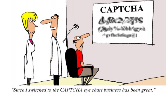
They are the very definition of friction. Even gamified CAPTCHAs, like Ow.ly’s, interrupt your visitors and add an unnecessary (and unwarranted) additional step.

If you absolutely must use CAPTCHA, at least look into alternatives like honeypots, verified / social sign-ins, timestamps, etc. For a more in-depth look at the alternatives, read UserTesting.com’s Think Your Site Needs CAPTCHA? Try These User-Friendly Alternatives.
7. Too Picky
Sites tend to design forms with their best interest in mind. How can you get the most data? How can we ensure the data is easily stored in the database? It’s easy to forget that a lead gen form is a transaction, which means it should be designed with both sides in mind.
Why require that a zip code, phone number or date be submitted a specific way?

Why ask for your visitor’s name and email if they’ve submitted it before?
Whenever possible, remove the burden from your visitors and place it on yourself. The easier it is for them to do something, the more likely it is that they will do it. Would you rather have a phone number that’s incorrectly formatted or no phone number at all?
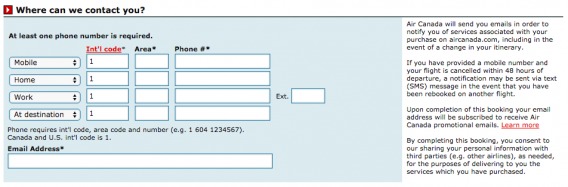
Use scripts to convert all entries into a specific format for you or build it into your design like Air Canada…
8. Choosing the Wrong List Format
If you ask visitors to choose between a list of options, be sure you’re using the right list format.
For example, this country selection is daunting…

It’s worth noting that Canada and America, the two most popular countries for Battle.net, were at the top of the list for easy access. Where you can, fill dropdown menu fields with the most frequent or likely response. Can you guess based on their IP? Can you guess based on where your usual leads are from?
So, what are the different list formats and when should you use each? Here are some guidelines:
- If you have 2-6 options, use radio buttons.
- If you have 7-15 options, use a dropdown list.
- If you have 16+ options, use an auto-fill field.
An auto-fill field allows visitors to begin typing the country, timezone, state, event type, car model, etc. that they’re looking for and then auto-fills relevant options. It’s much easier for a visitor to do this than to search through a huge list of options, even if that list is alphabetical.
Conclusion
The process for lead gen form optimization is just like any other type of optimization…
- Conduct conversion research to identify points of friction.
- Come up with hypotheses.
- Prioritize your hypotheses based on which you believe will have the biggest impact.
- Run the test, being careful to avoid sample pollution.
- Analyze and report the results.
To ensure your form is as quick and painless as possible, focus on optimizing points of friction. For example…
- Use as-it-happens error messages.
- Avoid placing labels inside the fields.
- Protect your call to action from words like “spam”.
- Don’t use “Submit” as your button copy and be sure your button clearly indicates what will happen next.
- Don’t use CAPTCHA unless you absolutely need to. Even then, look into more accessible alternatives.
- Don’t be picky about data format and avoid asking for the same data twice (i.e. remember and store whatever you can).
- If you have 2-6 list options, use radio buttons. 7-15, use a dropdown list. 16+, use an auto-fill field.
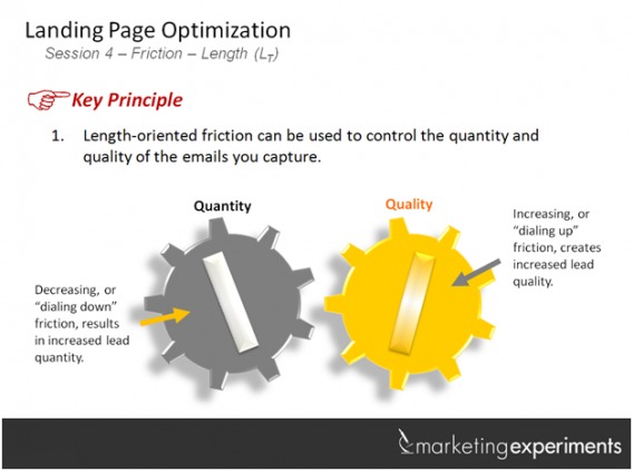
Of course, reducing friction isn’t always the solution, especially if your goal is to increase lead quality…
Whatever you do, avoid jumping to conclusions based on best practices. Do the research, run the tests. Look for additional points of friction that weren’t discussed here. Just because it isn’t a common issue, doesn’t mean it’s not a major issue for your particular form.
There are no shortcuts in conversion rate optimization. [Tweet It!]
Related Posts
-

Testing in an enterprise is truly a team sport. If a testing program was a…
-
Conversion optimization is hard; it’s constantly changing and you need to know a lot about…
-
The lead capture form has become one of the most ubiquitous tools in a marketer’s…
-

Learn how to run conversion optimization experiments the right way. In this video, I sit…


Another killer article on forms! Have to admit, I’m guilty of slapping on the old ‘no spam, I promise!’ disclaimer on many a form, without ever really thinking about it.. not to mention falling for some of those form field myths.. clearly I need to mend my ways. ;)
Thanks for reading, Rob! Glad I could help.
Great article, learned a few new tricks that I’m about to take for a test ride. Thanks Shanelle.
That’s awesome! Let me know how it goes. (I’m @shanelle_mullin on Twitter.)
Thanks for reading!
Great article! I had no idea that something like “next” good work that good as a CTA.
It’s definitely possible, but of course, you should always test button copy yourself. The potential is there, but the results won’t be the same for everyone.
Thanks for the kind words, Klim!
Hi Shanelle,
great post again. Thanks for mentioning Formisimo. The tool has moved on a lot (that screenshot is from the beta). We offer free trials so anyone working on their forms right now should take a look at the data we can provide.
http://www.formisimo.com/
Thanks Hazel. I totally agree re: the free trials.
I don’t have to make forms too often, and I’ve never really given it too much thought… so thanks for doing all the thinking for me! Haha. I’ll definitely keep all this in mind the next time I need to make a form (and I’ll probably be back here to look at this again).
Haha! No problem, Fred. Happy to help.
Let me know if you have any questions along the way.