Pop quiz time! When you think about optimizing your website to increase conversions, what are some of the first things that come to mind?
Do you think about copy? Headlines? The need for a strong call to action?
If you thought about any of those things, you aren’t alone. Recently Ott mentioned in the Mastering The Call To Action article, a study of Visual Website Optimizer’s customers shows most people are testing:
What if the answer to better conversions is to start small?
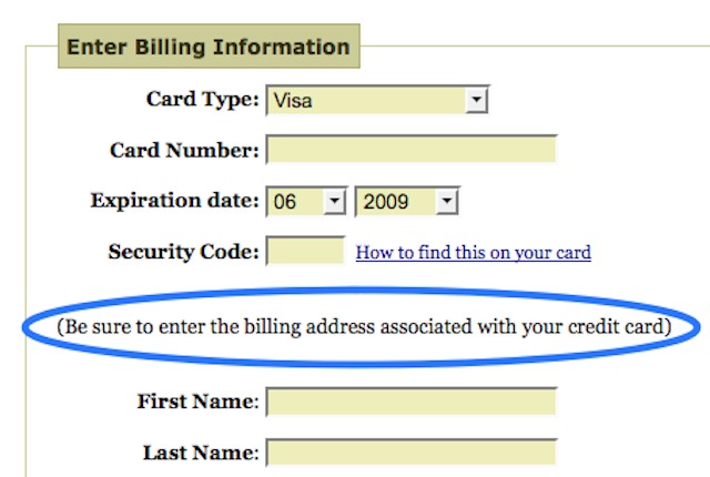
What if tweaking the small stuff, like the tiny bit of copy next to the credit card field or the wording of a specific link could transform your hesitant visitors into confident leads & buyers?
An ecommerce site that I analyzed recently had a payment page where 84.71% of the traffic proceeded to buy. I calculated that if we can increase that to 90%, that would result in 461 more orders and additional $87,175/month. That would be 23.94% growth in revenue. So yes— “small” gains here can be very big.
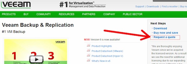
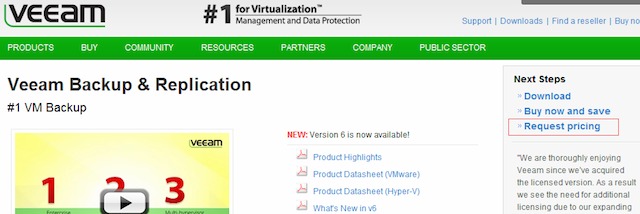
Or when Veeam noticed through their on page survey, that many visitors were asking for a price—which they couldn’t display due to partner agreements—so they tested changing the phrase from “request a quote” to “request pricing” and saw a massive 161.66% increase in clicks to their lead gen form.
Control:
Variant:
What is microcopy?
Microcopy refers to the short-form copy used to advertise your product and brand, in order to enhance the experience, add personality, and most importantly have the ability to reduce friction and get people to take action.
Though not often talked about, microcopy is everywhere, and in many cases, might influence a user’s decisions more than the big headline or body copy.
Why? Because it’s closer to the point of conversion.
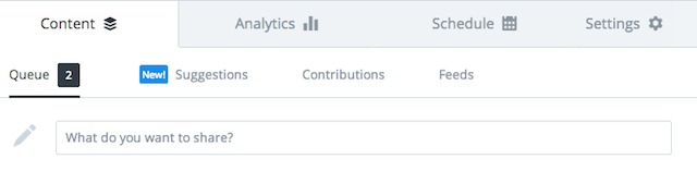
Look at the difference removing Buffer’s “What do you want to share? “ makes, in how you might feel about interacting with the app.
For a software company whose success hinges on whether customers actually use the product, not having those six words severs the personal connection with the experience, and makes it feel like you’re using just another piece of software.
Yelp’s microcopy on the other hand, gives the user a very subtle call to action, but one that helps them unlock the full benefit benefit of the site.
Now before I continue, I’d like to stress that if you have little to no traffic, microcopy certainly isn’t a quick fix.
Bad microcopy might not break your user experience, but well crafted microcopy can make the UX noticeably better.
Good microcopy comes from knowing your user
In my work, I’ve noticed a great number of user experiences are littered with their companies internal language.
This is mostly because a great number of user experiences are designed without ever involving the users. If I visited your site right now what would I see?
Looking at the two examples we’ve already mentioned, Joshua Porter’s form field was added as a response to receiving the same error message over and over again.
The microcopy wasn’t added arbitrarily, but as a direct response to user feedback.
In this fantastic article about preventing bad microcopy on Smashing Magazine, author Bill Beard talks about running usability tests, and how the test moderator should be paying attention to more than just the interaction between user & site:
[…]make a point to really listen to — and take notes on — the actual words the user says during testing[…]
Listen to the inflection in their voice as they read microcopy: Did they say that label or term with a question in their voice? Don’t hesitate to have your moderator follow up on copy. Have them go back and ask the user whether they’ve understood that label.
Listening to user feedback and hearing trepidation in their users voices is likely the reason why Shopify included this tiny bit of text into their signup form—You can change your store name afterwards.
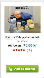
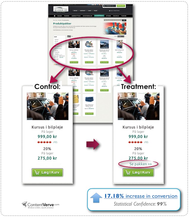
Case Study—17.18% increase in conversions by adding “View Bundle” above CTA
Our friend Michael Aagaard published a case study about a Danish ecommerce site who sold car care product kits.
The problem was, with nothing but a image thumbnail & prominent “Add To Basket” button, it wasn’t clear that you could click through see what was included in the bundle. Potential customers thought they were being asked to buy the entire kit sight unseen—which obviously hurt conversions.
By adding a simple “View Package” link above the main call to action, Michael was able to increase the amount of people viewing the full bundle, and as a result, increased conversion to sales by 17.18%
While the microcopy alone can’t take the credit for the 11.30% increase in conversions in this case study, it certainly plays a significant role.
Before:
After:
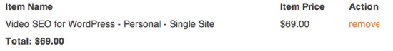
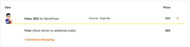
Adding small bits of text such as (there will be no additional costs) next to the Total, changing “remove” next to the product price to simply “x” and adding a “<<Continue shopping” link” helps keep the cart experience more streamlined.
According to Thijs, Yoast’s behavioural scientist, the “no additional costs” text was added because hidden costs are the #1 reason why people abandon shopping carts.
Other minor tweaks—like the progress bar and button design—were to take advantage of a person’s inherent desire for forward progress…
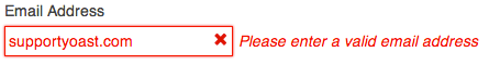
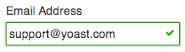
…and the inline form validation giving positive feedback—by being green & displaying a little green checkmark when completed—would give the visitor instant feedback and instant validation, making them more likely to keep filling out the form.
Overall, these & a few other small changes helped Yoast see an increase of 30% in successful transactions.
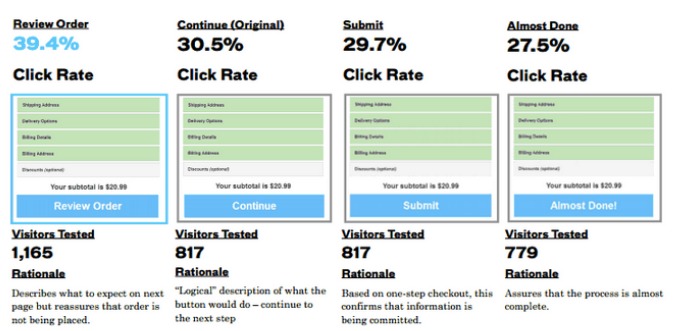
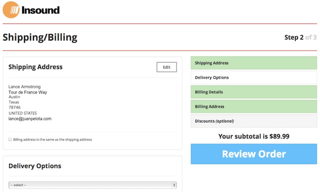
Case Study 3—Insound gets more visitors completing checkout flow with 2 words
A while back, Insound created a new checkout process designed to be stunning on tablets & mobile phones. It was absolutely beautiful, and unlike anything the site’s users had ever seen.
Unfortunately, the team at Insound noticed that it was underperforming compared to it’s predecessor, and with a big holiday marketing campaign coming up, they couldn’t afford even the slightest dip in performance.
Both Insound & Digital Optimization firm Clearhead suspected that having users pressing “continue” through each step of the funnel was causing confusion & ultimately abandoning before reaching the Bill/Ship details page.
So, they tested 3 button copy variations against the control (the button labeled “Continue.”)
Even though Clearhead suspected “Almost Done” would be the winner, the simpler “Review Order” provided a 39.4% CTR to the next page, and now more than half of the visitors move on to the next page before checking out.
For Insound, this is a particularly great win, as the additional revenue lift didn’t come from any additional sales & marketing spend, making their margins far better than before.
Case Study 4—11% increase for mortgage lead generation
Conversion Voodoo conducted an optimization project for a mortgage company that ultimately drove a 37% increase in completed refinancing applications from their site.
What stood out was an implementation of a simple checkbox on the front page of their website. Users were asked to check that box, and enter their first name and email address to begin the refinancing process.
If you’ve never tried to get a better mortgage rate, you should know the application process just plain sucks.
It usually involves a 20 minute process of filling out a form with a million questions to get many details about where you’ve lived, how much you make, how much you pay in taxes etc.
So, by adding this checkbox at the head of the form, users reaffirm their commitment to getting a better rate. For ConversionVoodoo’s client, it sure paid off, by adding 11% more completed forms—an increase of hundreds of more applications per month.
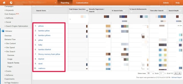
If this is the case with your site (If your Google Analytics is configured properly, you can check by looking here) then why present visitors with a generic “Enter Your Keywords, Sku or Product #” phrase?
Why not take your most popular search terms (found here) or categories and pre-populate the search bar with those terms?
I created a quick mock-up of what this might look like if we applied the above data to the Ikea.com website:
Using real data doesn’t just add a subtle layer of context to the overall user experience, it helps to expedite the shopping process for visitors who were coming to the the site with the intent to purchase items in those exact product categories.
In my research, I’ve also found that internal site search isn’t the only place you can find inspiration for what words you can use to enhance site search.
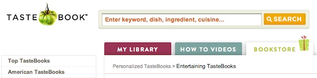
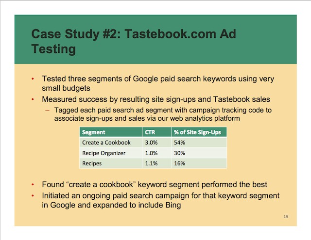
Tastebook, a site for sharing recipes and compiling your own custom cookbooks, for example, has had several iterations of their prefilled search box over the years.
Their highest performer, “Create A Cookbook”, has also become a primary navigation item, which leads me to believe that these seemingly small tweaks have had significant performance improvements.
Using microcopy to answer “UGH, Why Do You Need That?!”
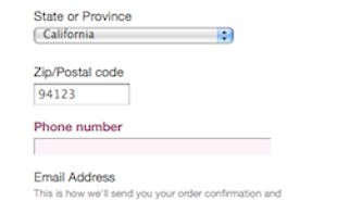
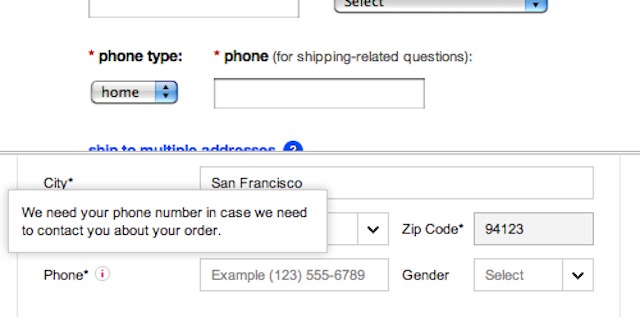
In a usability study by Baymard Institute, they learned that customers felt as though their privacy was being invaded when they were required to enter seemingly unnecessary personal information, like a required phone number field, without any further explanation or help.
Every single person in the study complained at some point that some part of the process asked for too much personal information.
During user testing at Apple.com one test subject refused to give up her phone number, anxiously clamoring: “Look, why do they need my phone number? What do they need that for? They don’t need it!
What was interesting however, was that users were far more forgiving when the reason why the information was necessary was clearly visible around the form input.
In fact, the anxious test subject quoted in the beginning of this section provided her phone number to another website without any complaints[…]
The checkout is the “moment of truth” for your customer so it’s especially important to remove as much friction as possible.
For new buyers especially, something as simple as (for shipping related questions) can go a long way in establishing trust at the most critical point during the buying process.
Conclusion
Truthfully, we could talk about microcopy all day, because it can be found everywhere, from pricing pages, to the security messages under your optin forms, to the tiny little reminders in your checkout form.
But here’s what I’d like to know: where do you think these tiny phrases will provide the most impact on your website?
Special thanks to Mario Krivokapic for the significant contributions to this article.
A/B testing is great and very easy to do these days. Tools are getting better…
Tommy Walker
Tommy is the former Editor-in-Chief at CXL. You can follow him on Twitter here.
Join the conversation Add your comment
Mary Green
This is an amazing post. I’ve never thought to call CTAs microcopy or relate to them as such. Great job on sharing all of the examples. Must read for all inbound marketers.
Tommy Walker
Thanks Mary! I’m glad you enjoyed it.
It was amazing to me doing the research just how much influence these things could have, especially when I took certain microcopy phrases away. It really does make a huge difference, especially when you’re zeroing in on certain areas.
Ryan Biddulph
Power read Tommy! Note those action verbs make all the difference ;)
Tommy Walker
Thanks Ryan, it was really cool to start looking at all of these things under the microscope.
Jon
It was interesting to see Yoast given as an example, if you checkout with Paypal then it adds VAT on, which is a slap in the face when it says there will be no additional costs…
Not sure if it does that when paying direct via card, I did intend to go back and do that at some point.
Tommy Walker
Interesting…
I wonder if they even know about that. Perhaps they should have a different cart that’s targeted towards international buyers?
Good thing to point out!
S Emerson
Some great ideas shared.
Implimented a couple as we read this post. We have had some customers confused trying to use their credit card. Maybe the note about entering their information as it is on their statement will help.
Tommy Walker
Oh good!
I hope that helps. To be sure, you should of course be testing it with a service like Optimizely, but please, be sure to let me know if it helps!
S Emerson
Thanks for the suggestion. Just tried it. Doesn’t work when you break out of frames. (wink)
Eme
That is unbelievable that little tweaks can results thousands extra into your pocket..there is so much to learn…which wordpress plugin do you recommend for A/B testing?
Kamil
thanks for this post. I read and I am going to use it on my new website.
Comments are closed.
Current article:
Microcopy: Tiny Words That Make A Huge Impact On Conversions


This is an amazing post. I’ve never thought to call CTAs microcopy or relate to them as such. Great job on sharing all of the examples. Must read for all inbound marketers.
Thanks Mary! I’m glad you enjoyed it.
It was amazing to me doing the research just how much influence these things could have, especially when I took certain microcopy phrases away. It really does make a huge difference, especially when you’re zeroing in on certain areas.
Power read Tommy! Note those action verbs make all the difference ;)
Thanks Ryan, it was really cool to start looking at all of these things under the microscope.
It was interesting to see Yoast given as an example, if you checkout with Paypal then it adds VAT on, which is a slap in the face when it says there will be no additional costs…
Not sure if it does that when paying direct via card, I did intend to go back and do that at some point.
Interesting…
I wonder if they even know about that. Perhaps they should have a different cart that’s targeted towards international buyers?
Good thing to point out!
Some great ideas shared.
Implimented a couple as we read this post. We have had some customers confused trying to use their credit card. Maybe the note about entering their information as it is on their statement will help.
Oh good!
I hope that helps. To be sure, you should of course be testing it with a service like Optimizely, but please, be sure to let me know if it helps!
Thanks for the suggestion. Just tried it. Doesn’t work when you break out of frames. (wink)
That is unbelievable that little tweaks can results thousands extra into your pocket..there is so much to learn…which wordpress plugin do you recommend for A/B testing?
thanks for this post. I read and I am going to use it on my new website.