If you run a SaaS business or sell only one product (with some options), you probably have a dedicated pricing page for the whole thing. Here are 10 principles to get it right:
Table of contents
1. Simple is best.
Some fundamental truths about your potential customers:
- They don’t read; they skim.
- Nobody likes complicated stuff. Nobody enjoys figuring stuff out.
- People prefer things that are easy to understand.
Conclusion: Make your product pricing simple, and the pricing page easy to understand.
When you build your pricing page, the first question to ask should be, “How can we make this as easy as possible?”
LessMeeting improved conversions by simplifying its pricing. Ash Maurya found that simplest pricing sold the best.
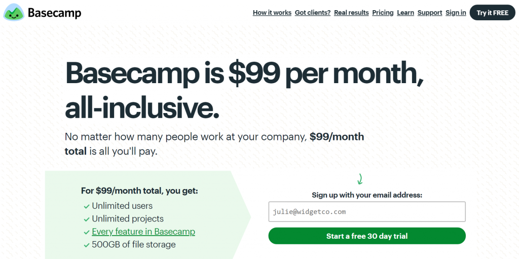
Can you figure out how much Basecamp costs? Simple = #winning.
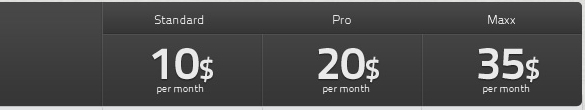
Subway found success with its $5 footlong sandwich campaign. Fiverr probably wouldn’t have become known if it hadn’t had the $5 pricing policy. Apple gets it. The iPad Pro costs $799. The iPad Air costs $499. The standard iPad is $329. Simple pricing works.
Tiered pricing is the standard for SaaS companies, and many follow suit blindly. But maybe you should get rid of it? Assistly (now part of Salesforce) did just that.
Today’s businesses want to buy SaaS services like they buy apps in the Apps Store. We saw an opportunity to simplify our pricing and drive customer satisfaction through the roof.”
Matt Trifiro, senior vice president of marketing
My point is not that you should get rid of tiered pricing, but that you should strive for simplicity—even if it means disrupting the norm.
2. Make it easy to compare.
People do research and compare your offer to alternatives. You want to win these comparisons.
Let’s say I’m looking for a social media monitoring service. I’m an educated buyer. I know my needs. I’m not going to read through the websites. I’m just going to look quickly at the pricing options.
This is how most users compare options. They pay extended attention only when the initial conditions have been met.
Pricing plans have a role besides getting people to sign up. They’re also there to help people understand what they want. As Dan Ariely put it, “Most people don’t know what they want unless they see it in context.” Different plans communicate what’s possible.
The example below does many things well—but some things, not so much. The prices are huge, so they get more focus than the features/benefits. If you’re not competing on price, this might not be a good idea.
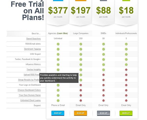
What I like is the how the features are presented—well built for comparison shoppers (and +1 for the tooltips).
On the negative side, the feature list is kind of long and doesn’t even fit on the same screen with prices. It’s a challenge for designers, I know. They’ve still done much better than some.
Some companies make it hard to compare on purpose.
Of course, you could try a radically different approach and make it very difficult to compare. Supermarkets and airlines do just that—on purpose. The cost of flying from Point A to Point B isn’t straightforward.
“For most travelers, the air fare is now the starting point rather than the end point in calculating what your trip cost will be,” said Henry Harteveldt, an analyst at Forrester Research. “You can’t rely on average air fare data anymore.”
There’s the price of the seat, then fees for checked luggage (often different for 1st and 2nd), sometimes even for carry-on bags, food, and so on.
Why do they do this? Nickel-and-diming you is one reason, but also so that you can’t (easily) compare their offer to the competition and decide based on price.
A common way to confuse people is bulk pricing. We know more or less how much a carton of eggs should cost. What about a bulk offer of 48 eggs? People assume that buying in bulk is cheaper, but often it’s more expensive.
While confusing pricing may work for some companies or industries, I advise against it. As-simple-as-possible pricing works best for 9 out of 10 companies.
3. Help people choose a plan.
When you offer multiple plans, people need to make a choice. The easier it is to understand the differences between plans, the easier it is to choose.
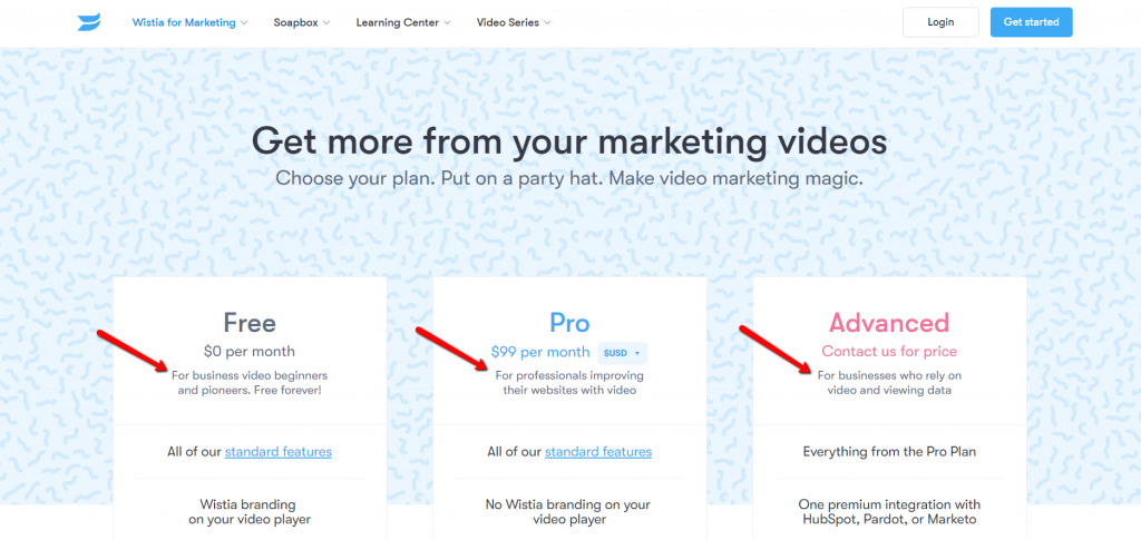
I like how Wistia explains who each plan is for:
DaCast is using meaningless names for their plans, which is unfortunately pretty common. If “Enterprise” users don’t need the “high-volume,” “Custom” plans, who does?
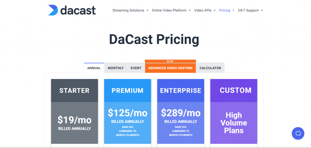
All that is to say nothing of the additional variables—annual, monthly, event, advanced(?!). If you need a calculator…
Which pricing plan should you emphasize?
There is no single best way to go about it. I would test these options:
- The middle option. It makes sense to suggest the middle plan. Most people usually prefer something in the middle.
- What fits most users best. From a user experience perspective, you should suggest the plan that (honestly) fits most visitors. Hopefully, you’ve planned your plans well.
- The most expensive one. Price anchoring! Let’s say your most expensive option is $990/mo. If you emphasize this plan, that’s the first price they will see. When they see that the middle plan is just $59/mo, it suddenly looks cheap.
- Free trial/freemium. Suggest the plan with the least amount of friction. Get them to sign up and see how great your product is (and that it’s worth the upgrade).
4. Address FUDs.
FUDs are fears, uncertainties, and doubts. Whenever you ask for money, there is friction. You cannot remove friction, but you can minimize it.
The best way to overcome objections is to prevent them. First, make a list of all the possible reasons why somebody might not want to buy your thing. (Better yet, survey your leads and customers.) Identify which FUDs are most common. Second, write answers to all those fears and doubts.
The result might be something like this:
- What if it’s not what I’m looking for? We offer a full, 30-day, no-questions-asked, money-back guarantee. If you don’t like it, you get all your money back.
- I don’t think it will work in my case. Show or link to testimonials or case studies in which “People like X” have used it successfully.
Work with your designer to find a place on your pricing page to include that information.
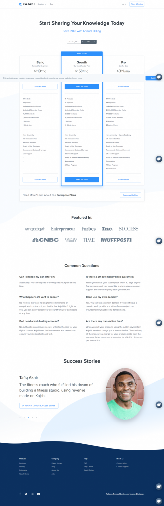
See how Kajabi is doing it. Notice the guarantee, testimonials, and FAQ section right below the pricing plans:
Trust and security
Will my credit card data be safe? Am I the only idiot buying this stupid thing? These questions might be subconscious, but they exist for a lot of people. Address them.
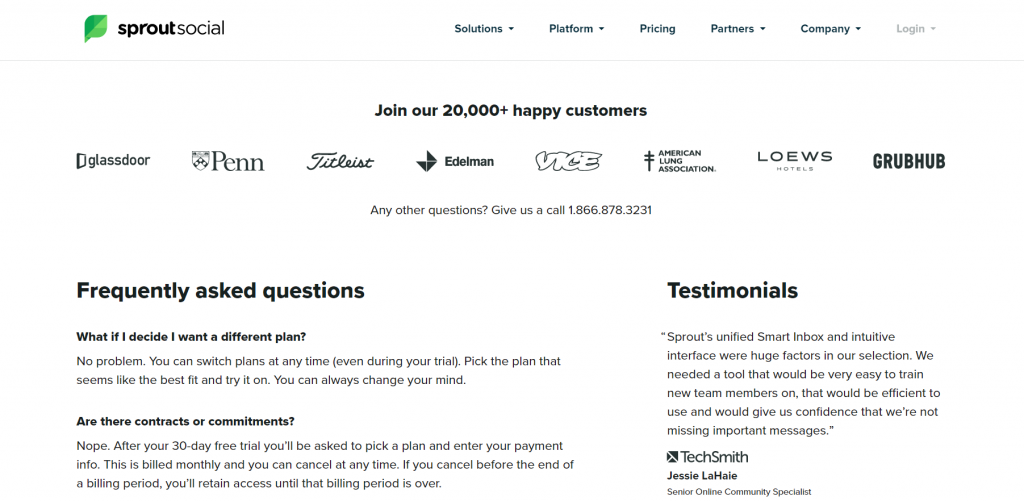
Sprout Social shows customer logos (and some testimonials) for social proof just below their pricing plans:
5. Offer currency options.
It’s a global world. If you offer your product to an Argentine buyer in euros, pounds, or Canadian dollars, you’ll cause friction. Even for some Europeans, U.S. dollars are difficult.
I don’t have exact data on how many people are negatively affected by seeing prices in foreign currencies, but this thread on HackerNews (predominantly a U.S. audience) gives some idea:
Would you buy a service that bills only in €?
- € is OK – 73 votes
- € is OK but I would really prefer $ if possible – 65 votes
- € is not OK at all – 19 votes
- I would not buy in $, but only in € – 6 votes
So out of a total of 163 respondents, 84 (~51.5%) want to pay in dollars instead of euros. Foreign currency is causing friction. What’s today’s rate? Do I need a calculator? Does my bank take a cut? Since exchange rates change, and how much will I get billed each month?
People want to know how much they’re really paying! Let users see prices in different currencies, either by toggling a currency button or via IP lookup.
6. Limit choice.
Too much choice paralyzes.
The most popular number of pricing plans offered among SaaS companies seems to be 4. Still, I bet most companies just decided on a whim and never tested it.
RingCentral had four plans on their pricing page. Then they tested it. The page that showed three plans increased conversions by more than 37%. (The page that showed two plans decreased conversions.)
However, when you go to RingCentral’s pricing page today, they have four plans again (couldn’t find a case study to explain why). They must have conducted new tests and found a new winning page. Do your own testing.
You might have heard that choices should always be limited to 7 +/-2. It’s a myth. Three options is definitely safe and not too much:
7. Incentivize up-front payments.
Cash is king, and having users pay up front for a longer period (year, two years) is good for cash flow.
The main goal of the pricing page is to get users to sign up, so don’t be too aggressive with the upsell.
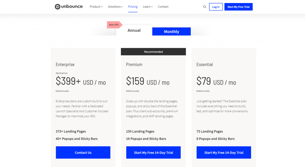
Unbounce offers two options right above the plans and defaults to “Annual” (20% off). I like how subtle yet insistent it is.
SurveyGizmo inserts up-front payment pricing right into the plans. Users will focus on the annual price first (translated into a monthly rate):
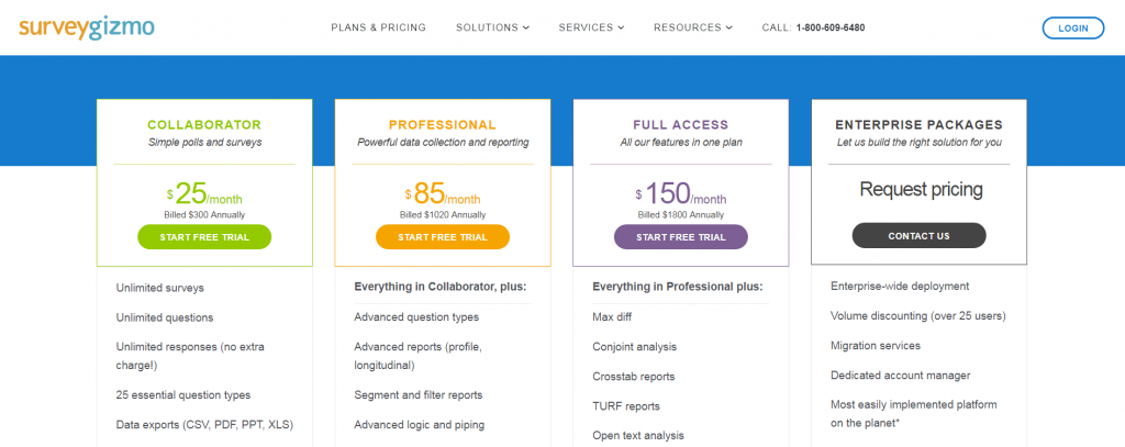
I wonder how many potential buyers leave when they find out they have to pay more for true month-to-month pricing. Only one way to find out!
8. Add playfulness.
People like to play. They like to press buttons, drag stuff, and watch cause-and-effect take place.
A great way to increase engagement on the pricing page is to add some playfulness.
Heroku used to do this on their pricing page where you can drag the dynos sliders, and the price changes before your eyes.
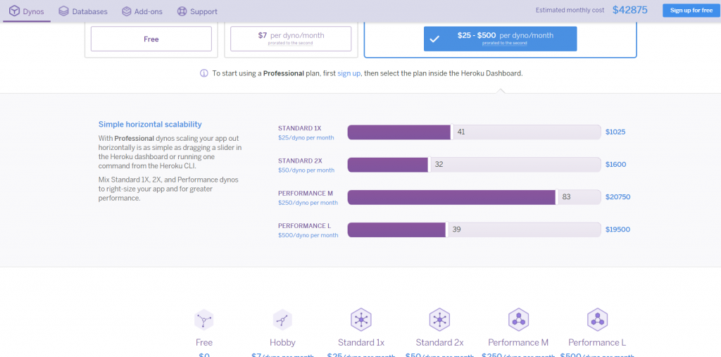
A great way to implement sliders like on the Heroku Pricing page is to use a calculator builder.
Interactions create excitement. Years ago, one guy on a HackerNews thread wrote about Heroku’s pricing page:
… I literally spent ~15 minutes just playing with it!
Talk about engagement! How many other pricing pages do you know where people hang out for 15 minutes? (The fact that they’ve kept the interactive component around for so many years suggests that it works.)
We did something similar for (a former venture) Traindom. People could drag the slider to see their hypothetical monthly payment:
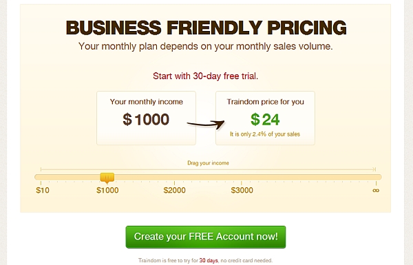
People absolutely loved it, and almost every visitor spent some time toying with it. There was a problem, however: The numbers confused some users, and our live chat was bombarded with clarifying questions. Simplify!
(Live chat is great for instant feedback.)
9. Use a clear call to action.
The call to action (CTA) button, size, and wording matter.
The best starting point is to make the CTA buttons big and avoid saying “Buy now.” I yet have to see a test where “Buy now” performed better than the alternatives (“Add to cart,” “Get started,” “Choose plan,” etc.).
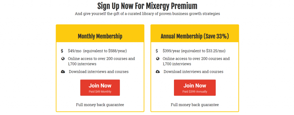
Mixergy uses “Join Now”:
Once you have the fundamentals in place, you can test colors and other minor things.
10. Tell them what happens next.
People like to feel in control. That’s why the elevators include a “Close doors” button (that often doesn’t do anything).
On a pricing page, users want to know what happens next. Make next steps clear. What happens after they pay? Put them in control of of the process. You’re dealing with their hard-earned money; nobody likes surprises at that stage.
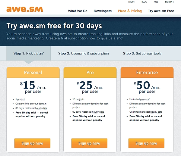
This example from Awe.sm gets it right by showing a liner flow of steps above the plans:
What about having the sign-up form on the pricing page?
It’s something you have to test, but, from the user experience point of view, you usually shouldn’t include anything that the user doesn’t expect. Remember, people spend most of their time on other websites. Most pricing pages don’t have a form, so people aren’t expecting one.
Seeing a sign-up might seem like sales pressure or a distraction. It removes the focus from choosing the right plan and will cause some people to flee.
Do your own testing
Don’t just copy and assume stuff. Interview your customers. Try to understand how they shop for the things you sell. Simplify.
Related Posts
-

Why is it that some books become bestsellers and others can hardly sell a 100…
-
Most businesses struggle with their product pricing strategies. Are you charging too much or too…
-
People judge books by the cover and other people by their looks. Take a look…
-
Your website design is more important for conversions than you think. You can implement every…


Thanks, Peep Laja!
I like your writing. This post helped me to optimize my pricing table!
There is a huge mistake that most pricing structures make… not enough of a choice.
I’m going to use Dropbox as the example here. If you look at their pricing structure, they have Free 2GB, then shoots all the way up to 100GB starting at $10 a month.
Well, I need more than 2GB, but don’t need anywhere near 100GB. Let me have the option to choose exactly how much space I need on a per GB price basis. 15GB at $2.50 per month would do fine for me, but I can’t get it. Therefore, I’m sticking with the free option and then signing up for Box.com’s free option and Sugarsync’s free option as well. Dropbox lost a sale.
@Tim: I think Dropbox know’s what they are doing… but you make a good point.
@Peep, I think a few of these pages have changed :) Love that you have the old ones ;) Maybe it’s time to compare the old to the new?
Great post , very helpful!
One thing I haven’t seen anywhere talking about is RESPONSIVE tables.
Nowadays almost more than 50% is mobile traffic. When you view these tables on your mobile devices, it will be viewed one below the other and will not make any sense anymore most of the time. What is your opinion about this? What would be the best comparison layout for mobile devices?
Thanks Peep for sharing these insights on pricing. Very practical! I liked the part about playing on the pricing page. Good inspiration.
I bundled all kinds of pricing strategies and tactics for startups in a new book.
Check it out here: http://leanpricing.co