
![How Does Product Copy Format Affect User Engagement? [Original Research]](https://cxl.com/wp-content/uploads/2016/03/study3_aoi_figure-1024x244.jpg)
Product page copy is something that, generally, gets ignored.
Not just the content, but how it is formatted.
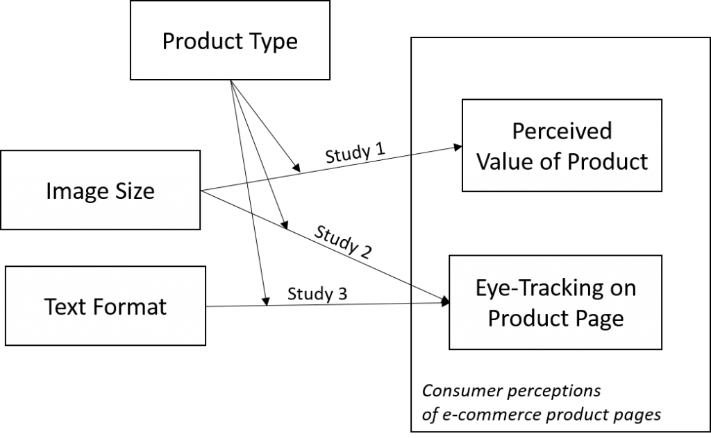
In this 3 part study from CXL Institute on eCommerce product pages (part 1 here, and part 2 here), we wanted to explore how elements of a product page affect users’ visual and value perceptions.
This experiment looks at how users view a page and read product text descriptions when the text format changes.
Results summary
- Text format changes how people read text descriptions.
- 'Techy' product classes (i.e. spec-driven things like hard drives) are influenced the most by text format.
- Generally, people read bulleted text for a longer amount of time than paragraph text. Though this pattern depends on the product class.
How do I apply this research?
- If you sell 'tech' type products (e.g. electronics like printers, hard drives, routers, etc.), then text formatting matters a lot. Test it.
- If you sell ‘design’ type products, test a smaller image size. Longer copy does get more attention, but format matters less.
Full study setup description
This experiment was part of a 3-part series exploring the layout of e-commerce product web pages, specifically:- how do pricing perceptions change with image sizes
- how people visually perceive the page with differing image sizes
- how the presentation format of the specification/description text affects how people visually perceive the page
Leads / Guides / Research Cheat Sheet
Get a Roundup of Our Most Insightful Original Behavioral Science Research
Full Study – Visual Perceptions & Text Formatting
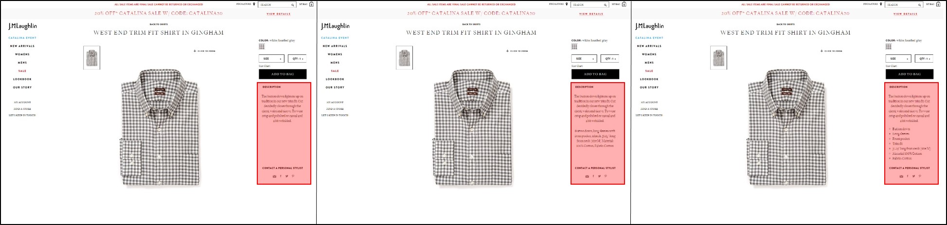
The formats we tested included:
- Paragraph format.
- Bulleted format.
- No specifications at all.
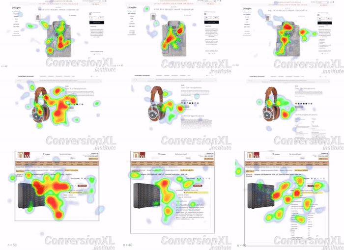
Note, we retained a small amount of descriptive text that was consistently formatted across treatments and within product types. These variations are illustrated, with the shirt product, in the figure below.
This study was conducted using eye-tracking.
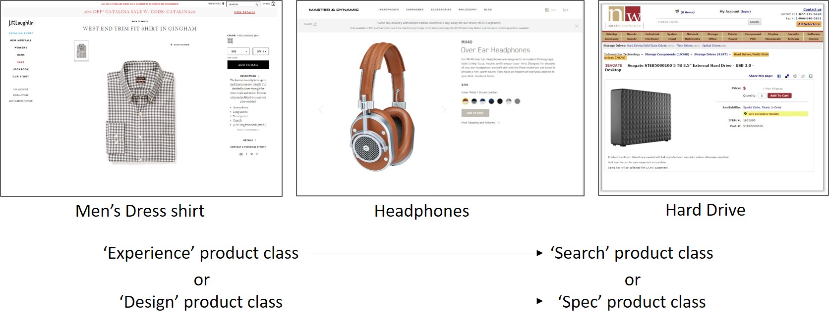
For each combination of product type (n = 3; dress shirt, headphones, hard drive) and specification text format (n = 3; paragraph format, bulleted format, and no specifications at all), we had at least 42 people view the page with the task of assessing the product with the intention to purchase or assess value.

Here are aggregated heatmaps for our treatments, which are interesting to look at, but mainly provide us with a visualization of all the variations tested. What we really are interested in are the stats behind how much time people spent reading the text area, but we settle for how much attention was paid to the text area.
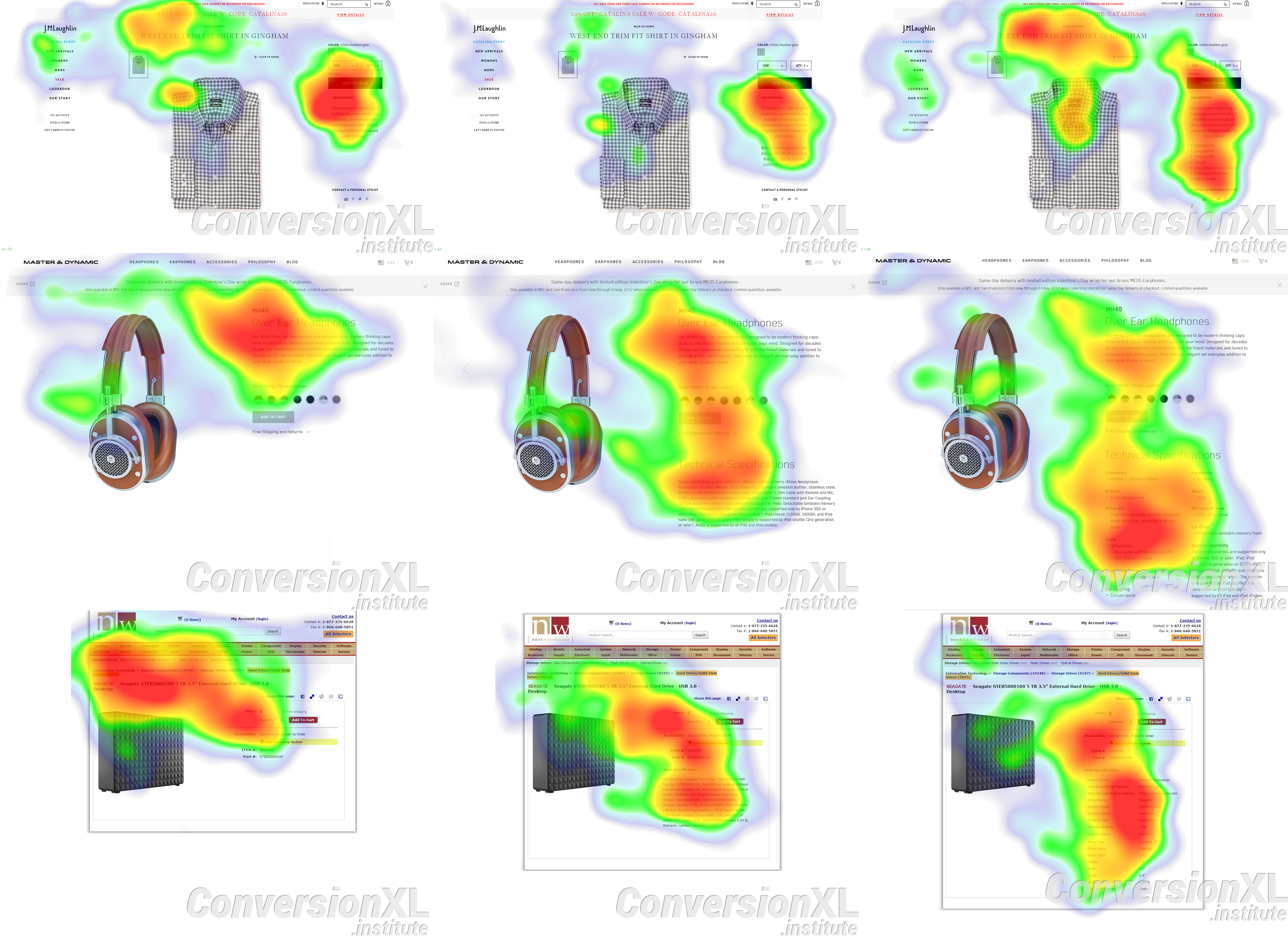
Here’s a gif of the same thing.
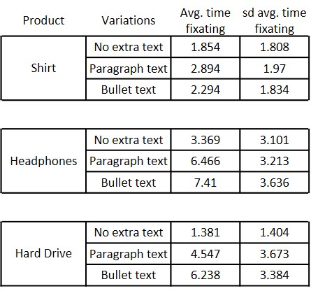
Our primary statistic of interest here is the average fixation time on our primary area of interest, which, in this case, is the text in the right column.
So sticking to product categories, let’s see if format means anything. Here are the raw summary stats:
And here is a better way to visualize it with comparative ANOVA within product classes.
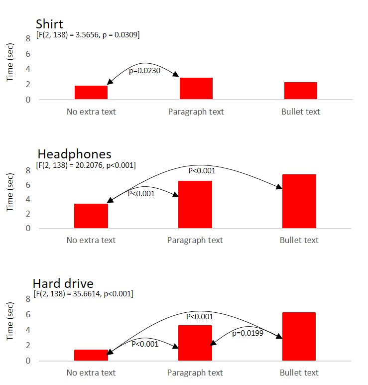
These results suggest that text formatting is important for ‘search’ products or products that are heavily ‘spec’-driven.
The most telling result is, for the hard drive, the mean time for fixation on the paragraph vs. the bullet format is significantly different (p = 0.0199).
The differences between no extra text and paragraph and/or bullet text are not too surprising. Even though we normalized the fixation time to the amount of text, just the fact that there is less to read surely created less of a visual anchor for viewers in general.
Now let’s separately consider the amount of time paid to the text area among the product types. Here are the analogous ANOVA results for testing differences in mean fixation time among product classes:
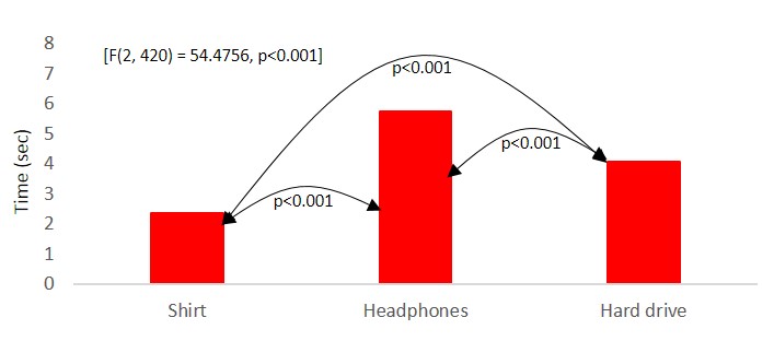
Our thinking before the experiment was that viewers would pay less attention to text descriptions on ‘experience’ products compared with ‘search’ products. We get mixed support for this.
The shirt experienced the least amount of text-reading, but the headphones, our ‘experience-search’ hybrid product, saw more than the hard drive.
Considering the image size results from Study 2, the shirt is turning out to be a bit of an odd-ball. Viewers aren’t looking at the shirt very long, and they’re not reading about it much either.
Considering the price valuation results from Study 1, suggesting that the page’s general look and feel might provide a value basis, the results from Study 2 and 3 start to make some sense.
The possible implication is, at the extreme end of “experience” products, people don’t care as much about the look of the product itself. Rather, they use the look and feel of the page (as a whole) as a basis for judgement and attention.
Everyone has a good idea of how a shirt will fit (you likely know your size, generally). So without prior knowledge of a brand, and how it differs in feel and fit to other brands, the only thing a person needs to process with regard to the product image is the shirt pattern.
The look of the ‘shop’ serves as a surrogate for quality and value. Just a hunch to test another time.
Conclusion
This wraps up our 3-part series on eCommerce product page layout (part 1 here and part 2 here).
In this study (part 3), we learned that product specification copy does matter in how people view the page. Particularly, it matters a lot for “technical” products (spec-driven things like hard drives, computers, and head phones). Bullet-point format tended to garner more attention, so it’s worth testing different text formats and layouts.
Be sure to read the whole series to get a better idea of holistically optimizing the layout of your product pages.
Click here to suggest our next original research study.
![]()