The correct answer is of course that you should start testing where you have the most traffic and/or the biggest leak.
But let’s assume for a minute that you have no data. Maybe it’s a brand new site. Changing the color of your button might result in a 1.2% improvement, but a better offer can bring upon a 320% improvement. In that case you should start your testing with variables that can really boost your results.
Everything that follows is based on the assumption that you have no data on the current performance.
Table of contents
What to test first
The number one thing to test is the offer. The offer is not what you give, but what they understand they will get from you – if they take a certain action (join your newsletter, buy your product or service, start a free trial of some sorts etc).
You see, there’s usually a huge difference between what they will actually get and what they think they will get. The offer and how you communicate it make all the difference in the world.
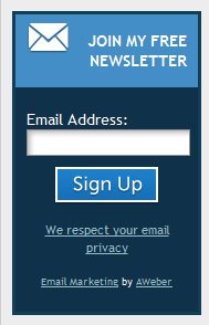
Here’s an offer somebody makes to get people to join their list:
Compelling, isn’t it? Unfortunately I see this way too often. The web is flooded with “Join our FREE newsletter” offers for getting people to subscribe to their newsletter.
You can test it with a green or orange call to action button, but it’s only going to have a minimal impact. The 500-pound gorilla in the room is that “join my free newsletter” is a crappy offer!
In order to boost your email subscription rates, craft (and deliver) a better offer.
It’s extremely unlikely that you will come up with the best possible offer right off the bat. Always start with 2 offers, and split test them. Your main goal is to find out what your audience wants. If your offer matches their wants and needs, you’ve got yourself a winner.
Found the winner? Try to do even better now. Come up with a challenger and test those against each other.
The same applies to any kind of call to action
If you want them to buy something, make sure you clearly communicate what they will get for their money. Or package the offer differently. Here’s an 11-point checklist that can help you improve your offer.
Start testing offers. It will make the biggest impact.
What to test second
Test your headline and value proposition.
The headline is the first main thing they will read on your site. Value proposition answers the question “why buy from you and not from the competition”.
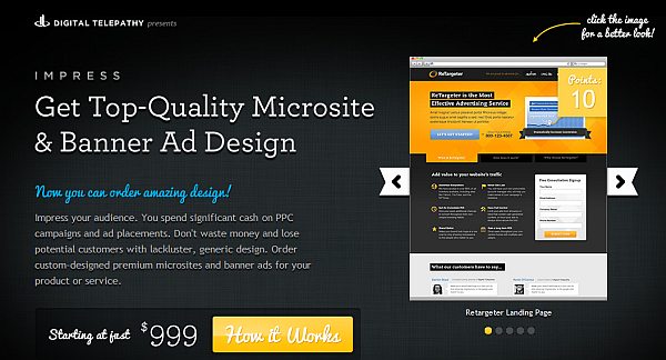
Here’s an example:
The headline here is the big-font statement, and along with the text paragraph that follows and the images on the right it forms the value proposition.
People are impatient and they will only read the first bits of your page. If your headline or value proposition doesn’t capture their attention and built interest to learn more, you’ve lost it.
In the example above, I’m convinced they could use a better headline. It’s descriptive, but doesn’t pack enough punch. My hypothesis is that they would do better if they’d focus more on promises of improved conversions and results – since that’s probably why someone would commission their service to begin with.
Beware if your headline or value proposition is vague (“Get more pizzazz”), irrelevant (“Welcome to our site!”) or doesn’t exist.
Bear in mind that (depending on your product category) most people do research before buying something and check out many different sites. You need to differentiate not only your offer, but also your headline and value proposition.
We make websites would be a horrible value proposition for a web design company because every single competitor of theirs does the very same thing. Yet, so many companies just announce what they do. It’s not enough.
You need to state how you’re better or different. Your headline can be somewhat vague, but it needs to be followed by a very clear and specific paragraph of text.
What to test third
Test bigger, more prominent buttons and button copy.
Obvious? Yes. Does it work? Unbelievably well.
In an interview with Anne Holland she shared this story:
We run the testing awards every year, and this year we gave an award to a test where the people had taken a button that was already like 300 pixels across, which is a pretty big, fat button, and they tripled its size. It’s the biggest submit button you’ve seen in your life. I mean it’s like half the screen. But by golly their response rates went up.
Don’t sweat about the color of the button, focus on the size. Make sure your call to action buttons are above the fold, big and have clear wording. The button copy matters. The more clear it is what happens after they click, the more they click.
SAP BusinessObjects turned their regular blue link into a big button, and improved conversions by 32.5%. Follow their example and turn all of your main calls to action into prominent, easy to spot buttons, and test different ideas.
Don’t forget these conversion-boosting principles
In all of the points above, always bear in mind these principles:
- Clarity trumps persuasion. Don’t be vague, be specific. Avoid needless hype.
- Users don’t care about you, they care about themselves and solutions to their problems. Write copy accordingly.
- Less is more. Remove all extra clutter that might serve as distraction. Keep the elements that help the user toward conversion. Guide the user down the right path.
- The best copy is the one that provides all the information the user needs. Half of the sales don’t take place due to lack of information. Don’t ask for the sale before providing enough information so that the users can convince themselves.
If you don’t get much traffic
The lower your traffic, the better your aim needs to be. You cannot waste precious time on testing things that will not matter much – like whether the sign-up button should be yellow or orange.
If you’re Amazon, 1% boost will mean lots of dollars in absolute numbers. For a small business 1% means hardly anything. You know what’s better than 1% improvement? A 100% improvement.
You need to achieve statistical significance before you can conclude whether the test results are valid or not, and with low traffic it takes a long time to test. You cannot speed up testing either, since if you make business decisions based on unreliable data, you’re really shooting yourself in the foot.
If your traffic is low, avoid multivariate tests and stick with split testing – you’ll get conclusive answers much faster.
MarketingExperiments has a good example of this: if you get 3,000 visits a month, have a 7% historical conversion rate, and six treatment pairs (2 payment designs x 3 cart designs), it could take as much as three years to validate the results.
Last words of wisdom
- Always optimize one page at a time. Pick a page that is as close to conversions as it gets (like the product page or shopping cart screen). Improve the conversions there because that’s going to give you your biggest boost.
- If your website sucks – don’t waste your time testing. Just get a new one. No single tweak can fix an ugly site.


Another piece of gold. I’ve learned more from your articles (and I’ve read only over a handful so far) than from anywhere else on the internet (including the best SEO sites) put together in one big pile.
And, when it comes to SEO, I read A LOT.
Patri
google.com/+PatriHernandez