
While there are no universal rules in conversion optimization, there are some things that tend to work more often than not. This article will give you some of these tactics to test for yourself.
Let’s be realistic: websites are highly contextual, and what works for website A, doesn’t work for website B. In addition, the concept of a tactic is one thing, its impact is all about the specific implementation. So nothing in this post is guaranteed to work.
That being said, there are a few tactics that we’ve seen win time and time again. These are principles that, while they don’t work 100% of the time, work more often than not.
We also asked some notable CRO experts about any tactics that work more often than not. Muchas gracias to the following for the input:
- Tim Ash,
- Brian Massey,
- Alex Harris,
- Andrew Anderson,
- and our own Peep Laja.
Sure enough, a lot of the answers were similar. We’ll outline them here.
Whether you’re just starting your first tests, looking for an a/b testing guide or just hoping for continuous and never ending improvements, these tactics are worth a look. At the very least, question your assumptions and give ‘em a test.
Table of contents
- 1. Static Image w/ Single Value Proposition Is Better Than Auto-rotating Slider
- 2. Hamburger+”Menu” Beats Just Hamburger
- 3. Proper Value Proposition Beats No Value Proposition
- 4. “Sticky” Content
- 5. Product Videos Are Better Than No Videos
- 6. Removing form fields
- 7. Prominent Contact Information
- 8. Live Chat
- 9. Trustworthy Testimonials Beat No Testimonials
- 10. Offer a guest checkout option
- 11. Free shipping
- Conclusion
1. Static Image w/ Single Value Proposition Is Better Than Auto-rotating Slider
Sooner or later you’ll find yourself asking the question, “should I use an auto-rotating slider”?
The answer is: no, you shouldn’t

We’ve written about this topic extensively in other articles.
In general, don’t use auto-rotating sliders (aka carousels). Though there are undoubtedly examples of them working better than static images (rare as they are), for the vast majority of sites, they are a usability nightmare. Here’s what Peep has to say about the subject:
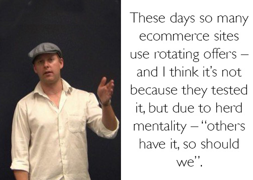
“These days so many e-commerce sites use rotating offers – and I think it’s not because they tested it, but due to herd mentality – “others have it, so should we”.
What’s wrong with using carousels?
There are multiple reasons for this, but in our article, we outlined three:
- The human eye reacts to movement (thus missing the important stuff)
- Too many messages equals no message (clutter effect)
- They look like banners, which people ignore because they hate them (banner blindness)
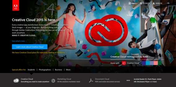
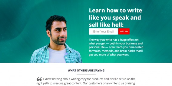
Ultimately, users crave control, and auto-rotating carousels offer the opposite of that. The solution? Implement a simple, static hero image like this one:
But – if you’re set on the carousel, for whatever reason, there are ways to improve upon it.
Improving the carousel
Nielsen Norman Group offers the following tips for proper carousel design:
- Include five or fewer frames within the carousel
- Use crisp-looking text and images that coincide with the organization’s charter.
- Indicate how many frames are present, and where the user is within the “progression.” This helps people feel in control.
- Use icons and links that are understandable and recognizable
- Ensure that navigation controls appear inside the carousel, not below it or separated by a fold.
- If offering a navigation button for each frame (rather than arrows to scroll through), ensure that each button looks different, and represents the frame.
- Make links and buttons large enough to decipher and click.
So to reiterate, this:
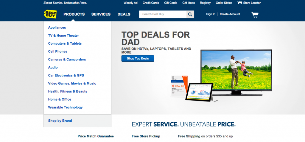
is better than this:
But if you’re going to do a carousel, do it right. You should probably just scrap the carousel, though.
If you’re looking for a redesign, Mightybytes offers a pretty fantastic resource on that.
2. Hamburger+”Menu” Beats Just Hamburger
The hamburger icon is like a bad piece of folklore.
Like any good myth, it’s passed down generation to generation until its origin is entirely obfuscated. The problem with the hamburger icon is that we just assume it works. However, the vast majority of our tests say something else:
In most cases, using hamburger + a “menu” label beats just a hamburger icon.
As an example, here’s a test we did a while back. We tested these three icons, plus the addition of a hamburger icon+menu label in a bright pink color:

Outcome: All 4 treatments brought in more revenue than the control.
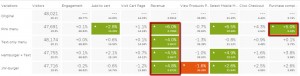
(Click to enlarge)
If you want to read more about this, check out our article on testing the hamburger icon.
Note: not everyone hates the hamburger icon (goes back to the point of no universal rules). But if you were a betting person, you would have good odds betting against the hamburger icon. Why?
- It’s not intuitive.
- It’s not noticeable.
- It’s ambiguous.
To the last point, try to label these four icons:

They are:
- Motorola Hardware Menu Button
- MS Word Bullet Butcon
- Android Holo Composition Icon
- Android Context Action Bar Overflow (top right on Android devices)
In our tests, hamburger+menu+a bold color usually perform best. It removes the ambiguity and makes the icon noticeable and intuitive. Problem solved.
3. Proper Value Proposition Beats No Value Proposition
You’d be surprised how many businesses don’t have a value proposition. It’s not just that they lack a good, proper value prop – they lack one altogether.
So it’s pretty easy for us to say that most tests confirm: value prop is better than no value prop.
What is a value proposition? Simply put, it’s the primary reason a prospect should buy from you. Even more bluntly, it’s the #1 reason someone will continue to read or hit the back button.
What does a proper value proposition consist of? A few things:
- Headline. This is the attention grabber. What’s your offer? Short, sweet, concise, and relevant.
- Sub-headline or a 2-3 sentence paragraph. This gets more into the nitty gritty of what you’re offering, for whom, and why it’s beneficial.
- 3 bullet points. Here you can list the key benefits or features.
- Visual. Images communicate much faster than words. Show the product, the hero shot or an image reinforcing your main message.
What should your value proposition convey? Relevancy, quantifiable value, and unique differentiation. Honestly, it would take a lot of words to fully expound upon proper value propositions, and I don’t want to do that here (we already wrote a post about that). Instead, here’s the good:
The bad:
And the entirely missing value prop:
4. “Sticky” Content

Brian Massey, Conversion Scientist™
“Our Conversion Scientists have consistently found upside with “sticky” content. On small-screen mobile websites, having a sticky header or footer containing a call to action has consistently increased conversion rates. This call to action may be “Subscribe”, “Search” or “Click to Call”.
One of our clients saw a 400% increase in mobile leads from a sticky header. Note that the target audience here is high-school students, and this data may be skewed.
So effective has this been that we are now testing these on desktop “big-screen” websites. So far we’ve seen one successful test of this.
There appears to be some blindness with footers as opposed to headers. This may be thanks to mobile ads. Who hasn’t learned to hate “Art of War”? We’ll probably see a decrease in the effectiveness on these over time. Visitors will form lexical memories that will make stickies less tempting to click. But right now, they are hot. They are hot because they funnel engaged visitors like crazy.”
Here’s a good example of sticky content:
5. Product Videos Are Better Than No Videos
So first off, having video usually converts users better than having no video. No, it’s not just for branding and awareness. Video can actually help move customers down the funnel and convert them (even if they don’t watch the video).
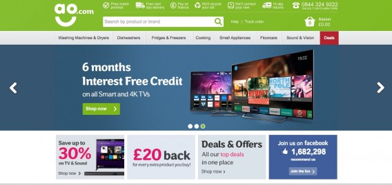
We found one result that was pretty extraordinary. Matt Lawson, Head of Conversion at ao.com was quoted in this article as saying, “We have tested and proven that when someone watches our video reviews they’re 120.5% more likely to buy, spend 157.2% longer on the site and spend 9.1% more per order.”
Now, results like that aren’t typical. But using video to improve conversions works more often than not.
But here’s something that might be controversial:
Any casual user of Facebook will know that autoplay video are annoying (Twitter too now). But, oddly enough, most of the time they convert better.
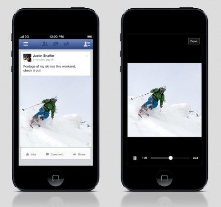
Of course, this makes sense when you think about. As a data-driven company, Facebook is clearly seeing better results from autoplaying video. In fact, they tested it and noted that they found a “10% increase in people watching, liking, sharing and commenting on videos.”
Not bad.
Twitter tested autoplay as well and found the following results:
- People were 2.5X more likely to prefer autoplay videos over other viewing methods (including click-to-play and video preview thumbnails).
- They have better video recall with autoplay. In fact, we saw a significant 14% lift in video recall over other video formats.
- For brands, during our autoplay tests we saw a 7x increase in completions of Promoted Videos.
For more info, check out our post on how to use video to increase conversions.
6. Removing form fields

Tim Ash, CEO of Site Tuners, Chairperson of Conversion Conference
“Often we online marketers suffer from “greedy marketer syndrome” and try to collect as much information as possible. One sure conversion-killer is asking for unnecessary information on forms. A longer form often looks more imposing and some people will be less likely to complete it simply for that reason. If the actual information is sensitive in nature they will also have a strong adverse emotional reaction to it.
In my Landing Page Optimization book, I proposed the following Form Field Test: “Is this information absolutely necessary to complete the current transaction?” If you can’t answer “yes” to that question, the form field should be removed.”
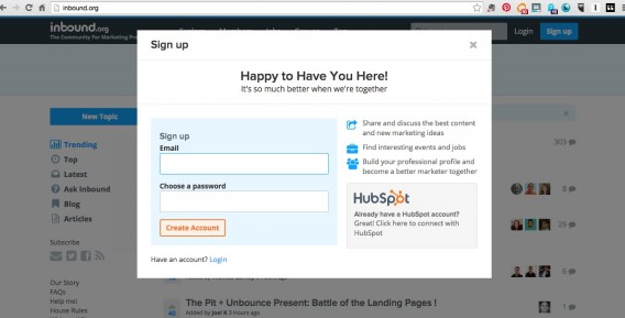
Nice, simple sign up form from Inbound.org:
Note that you can also add form fields when you want to qualify leads. For example, we added a budget field on our customer experience optimization services page. This way, we don’t waste our time on unqualified leads and they don’t waste their time on something not in their budget:

7. Prominent Contact Information
Even though it seems like a small thing, putting your phone number and email address on the top of your site usually boosts conversions.
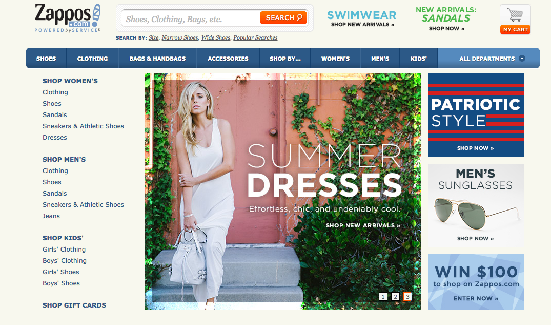
It’s a trust thing. People want to know that they can reach you. It’s a simple fix that adds a lot of value in most cases. The famous example, of course, is Zappos. Along with their fanatical customer support, they’ve always featured their number prominently on their site:

An example of this is when LessAccounting.com ran a simple a/b test where they boosted conversions 1.8% by adding a 1-800 phone number to the top of their site.
As Sean Work from KissMetrics said, “The bottom line is that having a phone number does bring peace of mind to consumers and people you do business with. If, at the very least, it instills trust in your visitors and removes any “fly-by-night-operation” fear they may have.”
Furthermore, click-to-call helps mobile convert better, especially for local businesses. Google actually did a study in 2013 that showed 70% of people use the click-to-call feature. In addition, they found 61% of mobile searchers said click to call is most important in the purchase phase of the shopping process.
Calls are king, and putting a phone number up is a pretty painless way to increase conversion rates (more often than not).
8. Live Chat
Live Chat has almost become ubiquitous with good service, and with good reason: live chat usually helps convert. Here’s an example of a live chat:
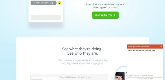
I do my banking with Charles Schwab, and they have a pretty excellent Live Chat feature for all of my silly questions:
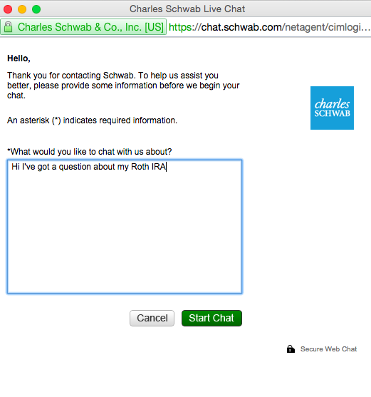
What’s the point? Well, according to a Forrester report, “Many online consumers want help from a live person while they are shopping online; in fact, 44% of online consumers say that having questions answered by a live person while in the middle of an online purchase is one of the most important features a Web site can offer.”
Awesome article about increasing conversions with Live Chat from the Conversion Scientist here.
9. Trustworthy Testimonials Beat No Testimonials
Not surprisingly, leveraging social proof with legitimate testimonials can often increase conversions. Since word of mouth is a huge factor in purchase behavior, displaying testimonials can help drive trust in your site.
But your testimonials should be authentic and trustworthy. If not, consumers are skeptical. In fact, an econsultancy study found that negative reviews can help boost your conversion rate (only to a certain extent, though. Too many negative reviews is not a good thing.)
How you display testimonials matters, too.
Simple text testimonials can help. But adding a photo of the reviewer can help even more. Quality photos in general can help boost conversions, but specifically in the domain of reviews, they help add authenticity to the text. Finally, adding video testimonials can help boost credibility even further. Sidekick is a good example of testimonials done well:
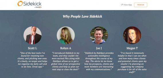
You can also leverage the credibility of other sites by pulling your testimonials from Yelp and other review sites. As Sean Ellis wrote in an Unbounce article, “When you use the testimonials from trusted sites, you hit a trifecta of credibility: authenticity of real customer feedback, published on a credible website, with a more objective bent because it appeared elsewhere on the web.”
10. Offer a guest checkout option
A few weeks ago, I wanted to buy this tank top:
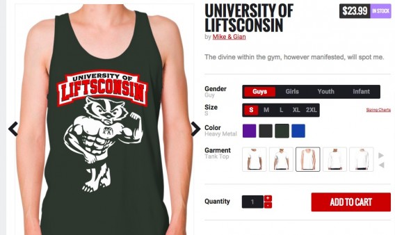
I went through the checkout process, and I was happy to note that they had a ‘guest’ option:
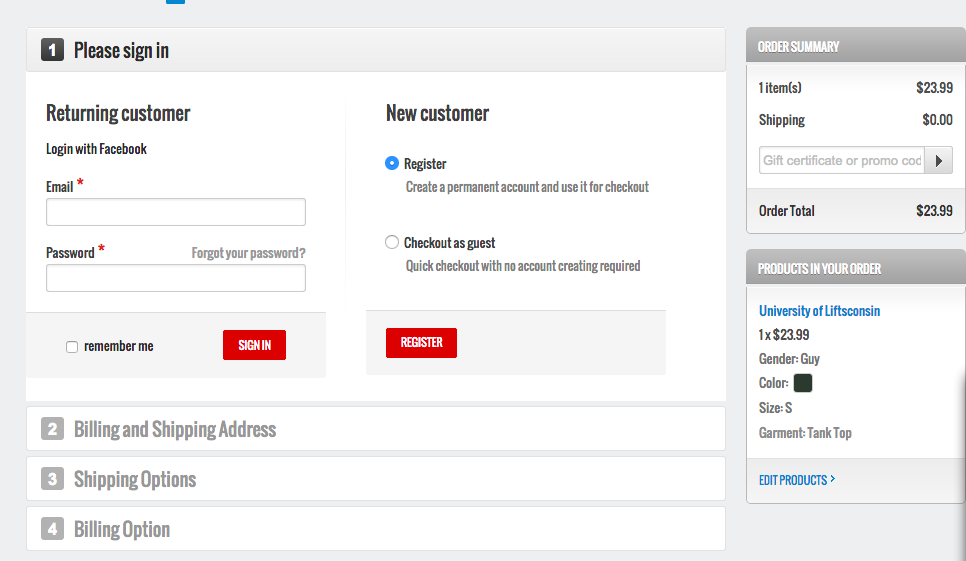
I chose ‘guest’ and paid for the item. Later on, they asked if I wanted to register, and I did anyway.
This is a common experience. The converse is much less smooth. When e-commerce sites force registration, they put up one extra barrier for the customer. In fact, 1 in 4 customers leave because of forced registration. It’s just another facet of ‘greedy marketer syndrome,’ and it can be solved with a guest checkout option.
11. Free shipping
Charging for shipping is a conversion killer. At this point, the majority of companies offer some form of free shipping. If you’re not one of them, start trying to figure out a way you can offer it.
You’ve surely heard of the research on this:
- 2BigFeet had already implemented free shipping on orders over $100 with coupons and had noticed a spike in conversion. After they made free shipping automatic on $100+ orders, their conversion rate increased by 50%.
- ComScore found that Free Shipping Day increased sales by 16%.
- A study by Compete found that 93% of respondents said free shipping on orders would encourage them to purchase more products online.
As David Bell said, “The phrase “free shipping” is like a siren song to many who shop on the Internet.”
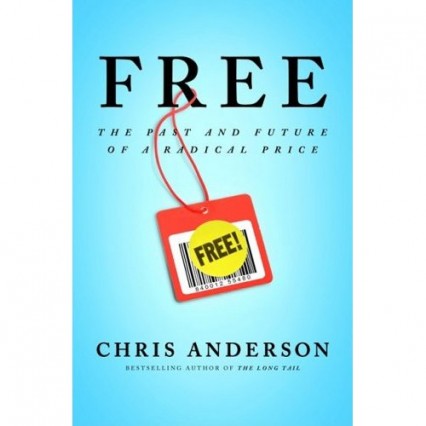
For more info on the power of free, check out “Free” by Chris Anderson.
Note: this is not just a test object. This is a fundamental business decision. Shipping is a large expense for small businesses, and this is a tactic you will have to learn to bake into your business strategy. Sometimes, it might be damn near impossible to make free shipping profitable. However, there are strategies you can experiment with:
In an article for Kissmetrics, Andy Hunt outlines 4 ways to make free shipping profitable for your business:
- Establish a Baseline: Compare conversion with and without a free shipping offer.
- Create Thresholds: Increase the minimum order value required for free shipping, and test the improvement in margin.
- Set Restrictions: See what kind of improvement you’ll get by offering free shipping only on select products where it is profitable.
- Enact Price Increases: Increase all your product prices to compensate for the loss you take on free shipping, and see how your profit compares.
Conclusion
Nothing is universal. Your website has specific problems, not generic problems. You’re better off doing proper conversion research using a data-driven framework (like ResearchXL) to make sure you’re testing the right things. CRO is a process, not a list of tactics.
But the 11 things above boost conversions more often than not. They’re a good starting place for test ideas as well.
Related Posts
-

A/B testing is highly useful, no question here. But a lot of businesses should not be…
-
As a marketer and optimizer it's only natural to want to speed up your testing…
-
A/B testing is great and very easy to do these days. Tools are getting better…
-
Sometimes A/B testing is made to seem like some magical tool that will fix all…


Thank you so much for the great tutorial. This is a fantastic outline of some important “do’s and don’ts” of building an optimized web page.
Great article and super informative. I love that you use so many examples, but a lot of your images are not appearing or appearing as broken. I’ve tried reading this in a few browsers now and am getting the same results… Anyone else having issues?
Hi Eric. Are you able to see specific errors pop up in the browser console?
Thanks so much for including my article on Conversion Scientist here! Feeling flattered.
Thanks for finally writing about >Things That Work More Often Than Not inn A/B
Tests <Loved it!
Thanks, glad you liked it!