Best practices are starting points: If you have no data, start with these. They are not what you should end up with, but they’re often where optimization begins. That’s an important distinction.
This post applies Jakob Nielson’s 10 Usability Heuristics to B2B websites that focus on lead generation (as well as “high consideration” B2C sites that lack any transactional functionality).
Usability heuristics are “best practices” for user interface design. When applied to your site, these tenets help reduce friction and keep buyers focused on your message—rather than distracting or confusing them with a deficient or incomplete interface.
B2B websites often have to explain a lot to get buyers to convert. The higher the value of what you’re selling, the higher the inherent friction; therefore, the more questions you’ll need to answer throughout your site.
In these situations, information architecture is much more complex. Some B2B firms are notorious for ignoring this reality because, they argue, “we don’t actually sell anything in our website.” That argument rarely holds up.
When redesigning a website, especially if it’s a radical redesign, these heuristics are a north star—reliable criteria to decide between alternative page designs, functions, or ways to layer your information. For each of Nielsen’s 10 heuristics, we provide commentary and examples for B2B site designs.
Table of contents
- 1. Make your system status highly visible
- 2. Match your system to the real world
- 3. Allow user control and freedom
- 4. Use consistency and standards
- 5. Prevent errors
- 6. Base everything on recognition instead of recall
- 7. Encourage efficiency and flexibility of use
- 8. Keep your design aesthetically minimalist
- 9. Allow users to recognize, diagnose, and recover from errors
- 10. Offer help and documentation
- Conclusion
1. Make your system status highly visible
The system should always keep users informed about what is going on, through appropriate feedback within reasonable time.
Jakob Nielsen
Translation for B2B websites: Always tell your buyers where they are when navigating your site. You can achieve this through the use of:
- Breadcrumbs. Breadcrumb navigation works like a GPS, telling your buyers where they are on your website at all times. Plus, your buyers have a path laid out that tells them how they got there. Use breadcrumb navigation on your site, whether that’s location-, attribution-, or path-based.
- Page headers. The page header should resemble the copy of the navigation items or links. This is a good practice not only for SEO but also user experience. If the page header matches what the user clicked, the buyer will be reassured.
- Highlighting selected menu options. When you click on a navigation item, keep it highlighted, bolded, or underlined, so that your buyer gets instant feedback about menu options.
- Show progress bars. Include page-load indicators during page load. If buyers are trying to load a calculator widget or process a request, then a progress bar or notification of some sort let’s them know what’s happening.
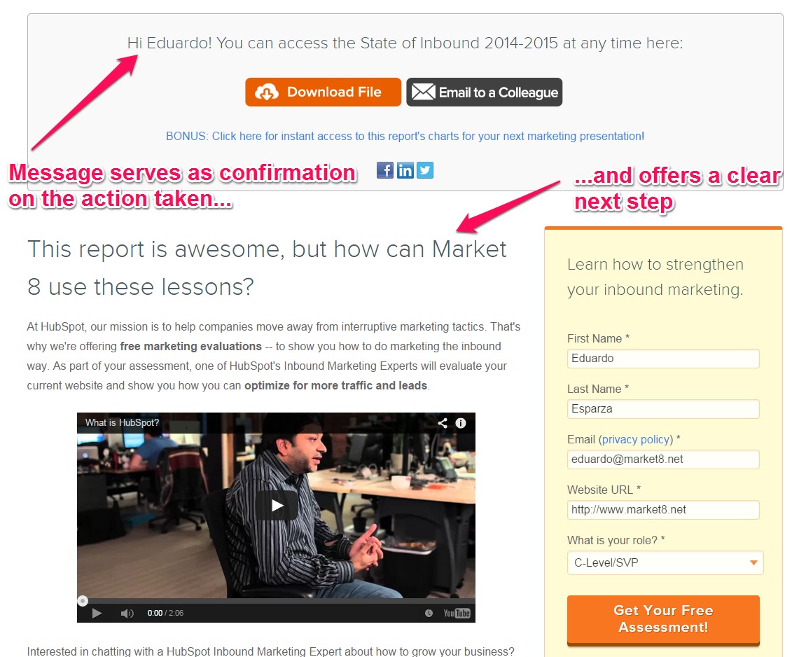
- Thank you pages. Thank you pages are great indicators of current status. If your buyer downloads an ebook or signs up for a webinar, the Thank You page confirms the action that was just taken.
If you skip these elements, your site will confuse buyers, who will wonder where they are—a completely unnecessary friction point. Make your navigation clear.
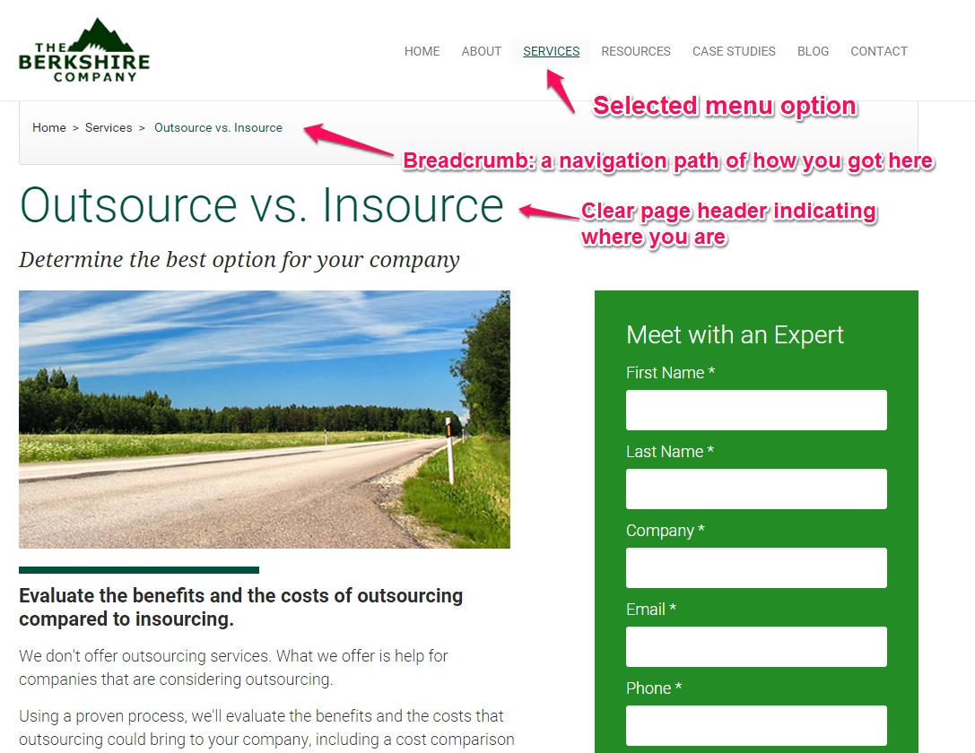
The Berkshire company does it right, providing their buyers feedback about exactly where they are while navigating their site, and the breadcrumbs tell them how they got there:
In the case of MSC Industrial Supply Company, buyers who want to view their specialty brochures see a rotating progress wheel that indicates what percentage of the brochure is loaded:

Above all, remember that good websites must answer buyers’ questions before they think to ask them. If buyers get distracted trying to navigate your website or are left wondering if something is happening after a click, they’ll get frustrated.
Take this homepage as an example:
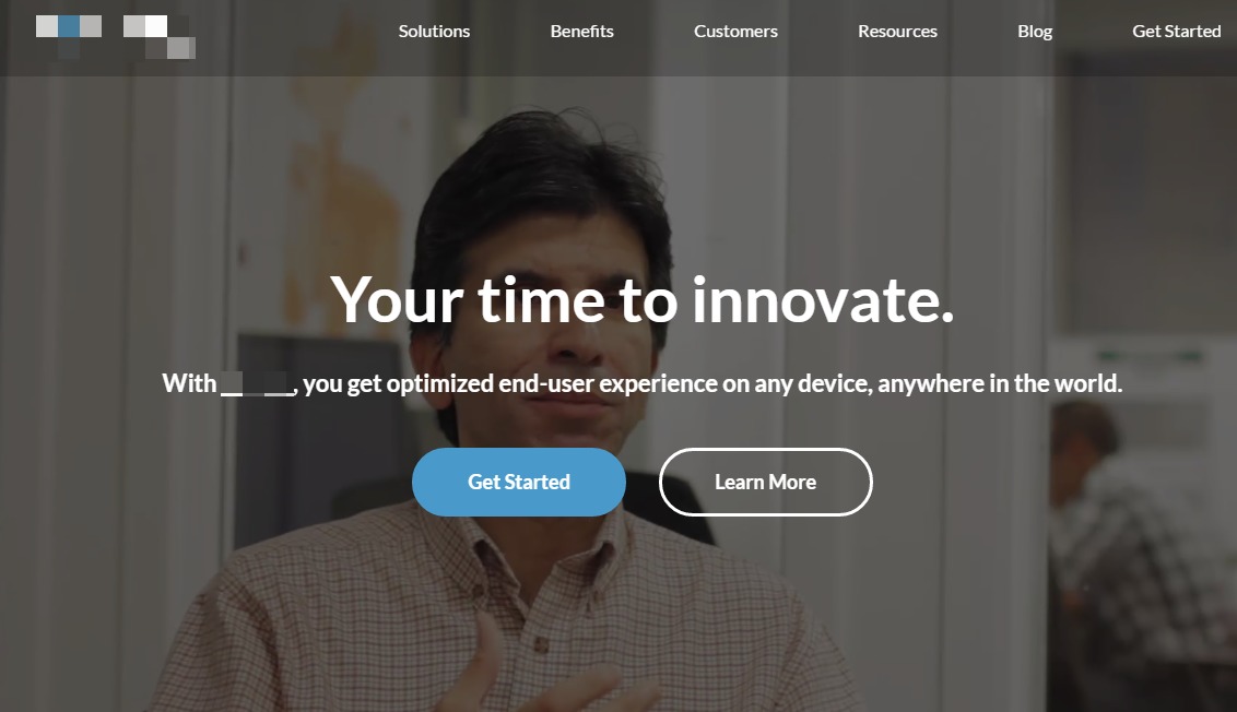
All good there, right?
Well, now look at this interior page and try to guess which section of the site was clicked, or if you can tell where in the site you are:
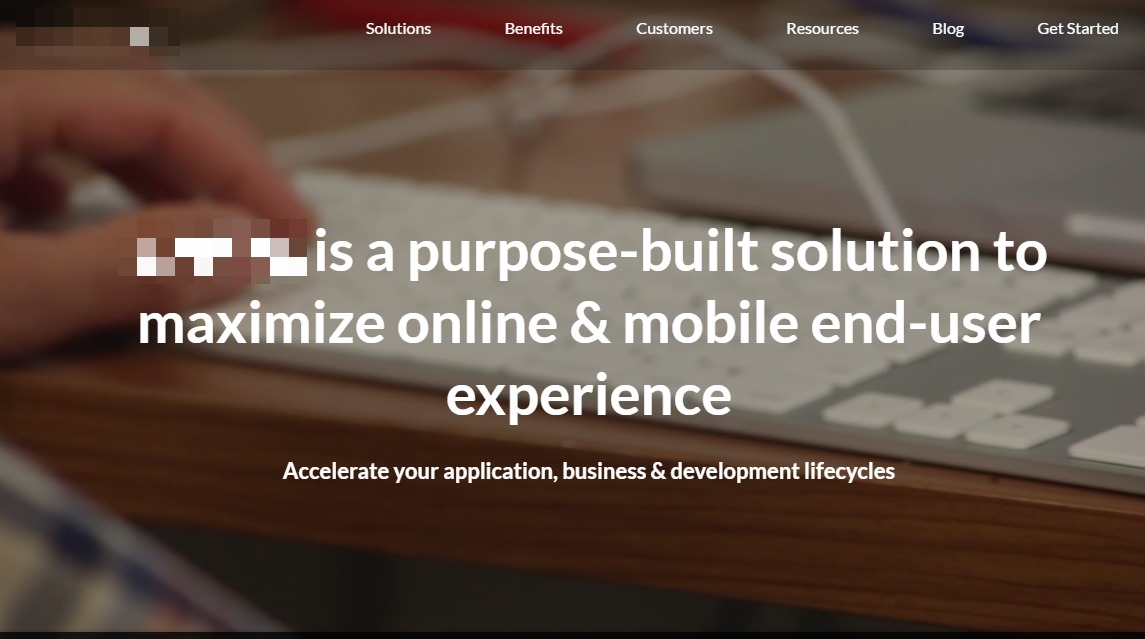
Nope. You have no idea where you are.
Here’s an example of how a thank you page can act as a system status confirmation:
2. Match your system to the real world
The system should speak the users’ language, with words, phrases and concepts familiar to the user, rather than system-oriented terms. Follow real-world conventions, making information appear in a natural and logical order.
Jakob Nielsen
Translation for B2B websites: Use phrases and words that your buyers are already thinking about. Eliminate jargon. Your buyers must come across words, phrases, and concepts that are familiar to them.
The best language and tone of voice should come directly from your buyers mouths. Spend time talking to your customers:
- Ask them to tell you what your product means to them;
- What problem it solves;
- How their life was before using it.
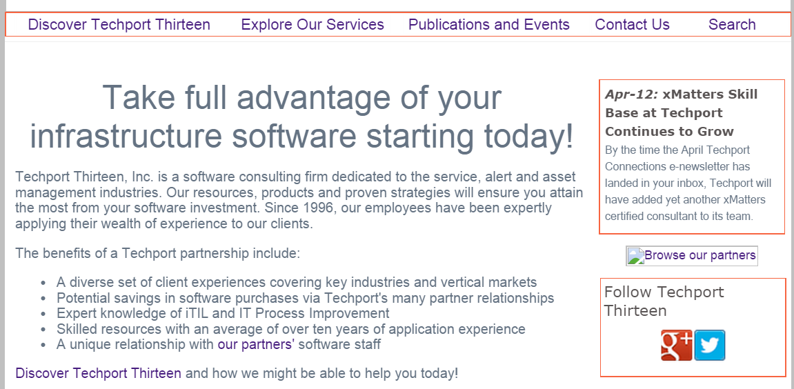
Techport 13 does it right. Their value proposition explains what they do in very simple language:

Their buyers literally use terms like:
- “roll out new software”;
- “train the team”;
- “do customizations and enhancements”;
- “make IT run smoothly.”
This was intentional and based on research. In sharp contrast, look at the language from their homepage before their website redesign:
Their clients didn’t use terms such as:
- “Our resources, products and proven strategies”;
- “attain the most of”;
- “…our employees have been expertly applying their wealth of experience to our clients”;
- “a diverse set of client experiences…”
You get my point.
3. Allow user control and freedom
Users often choose system functions by mistake and will need a clearly marked “emergency exit” to leave the unwanted state without having to go through an extended dialogue. Support undo and redo.
Jakob Nielsen
Translation for B2B websites: Eliminate anything that takes control out of the user’s hands. Here are three examples in which this heuristic is commonly violated in web design:
Pop-up offers
We’ve all visited websites where a pop-up window suddenly appeared and asked us to join an email list or take a survey. While intrusive pop-up windows like these are annoying (pop-ups do work when done right), they’re worse if your buyer can’t reject them.
If you want to collect feedback, give users 100% control. Let them reject your offer. This will actually increase the quality of your surveys: Those who opt in are more likely to be honest and genuine.
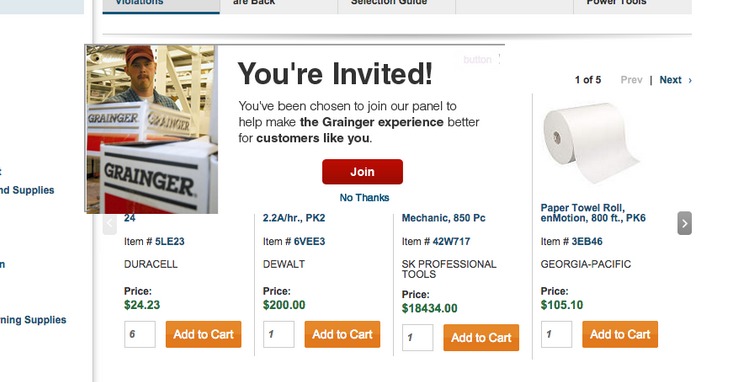
Grainger is an industrial supply company. On their website, buyers clearly see the helpful “No Thanks” microcopy, right underneath the big, red “Join” call-to-action button. Your buyers will appreciate this thoughtful feature because it adds to their user experience.
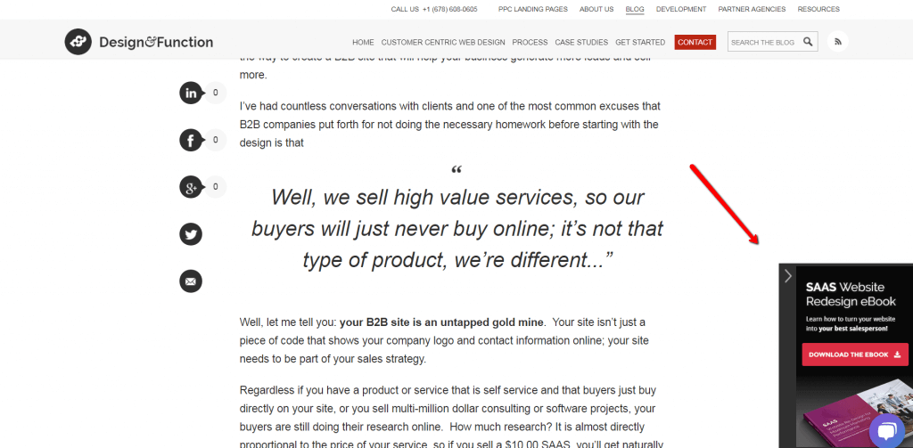
On the Design&Function blog, a slide-in call to action shows up only after users begin scrolling. The ebook offer is also collapsible, so the buyer can reduce its visibility or come back to it later:
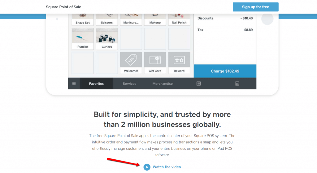
Autoplay videos
Another pet peeve for buyers is a website that autoplays a video. This can be a nuisance, especially if it defaults to sound On. Don’t assume what you’re site users will want to do—let them decide when (if ever) to play your video. Video content should still be supplemental to text information.
Here’s how Square does it:
Automatic Carousels
Another example of loss of control that causes anxiety and frustration are automatic sliding banners. In addition to causing frustration, CXL research has demonstrated that automatic carousels don’t work.
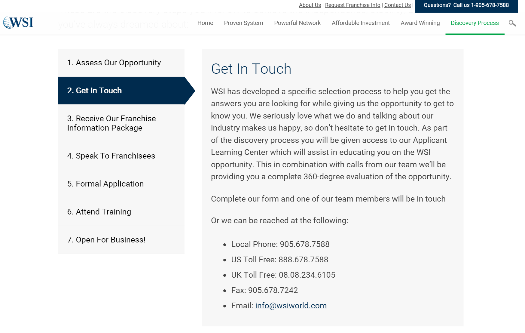
Instead of using this distracting element, layer information in a way that makes it easy for buyers to discover and explore with full control over their experience.
Here’s an example of a better way. WSI franchise uses tabs to walk the user through related content:
4. Use consistency and standards
Users should not have to wonder whether different words, situations, or actions mean the same thing. Follow platform conventions.
Jakob Nielsen
Translation for B2B websites: The last thing you should subject your buyers to is a sense of confusion. They shouldn’t wonder if words, situations, or actions really mean the same thing. Websites are not puzzles. Create fluid experiences that eliminate guesswork.
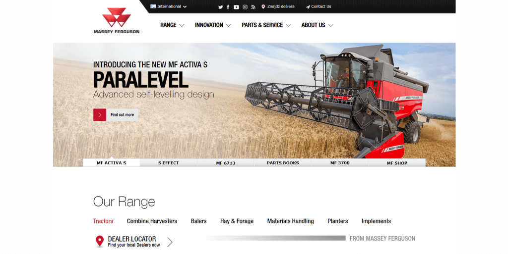
Massey Ferguson’s website, a leader in tractors and global harvesting, exemplifies consistency. On every page, whether the homepage or a product page, buyers see the same use of white space, a clean layout, and a well-organized information hierarchy.
This keeps buyers calm and makes it easy to scan the site quickly for important information. Consistency and conventions make your website “learnable,” and that’s a good thing—it will appear easier to use.
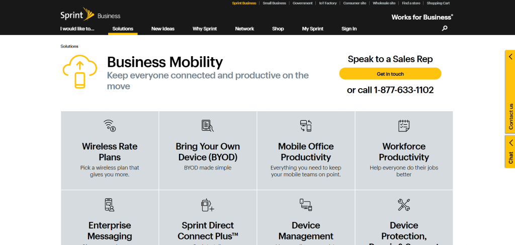
Another example: Throughout the Sprint Business site, you see the same elements in the navigation bar that make it easy for buyers to know where they are. In addition, the same drop-down menu appears in the layered navigation from every page accessed via navigation bar.
Compare that to Georgia-Pacific. They’re a huge corporation, yet the experience on related brands is different—navigation styles and standards change. This isn’t a unified experience and may cause confusion for some B2B buyers.
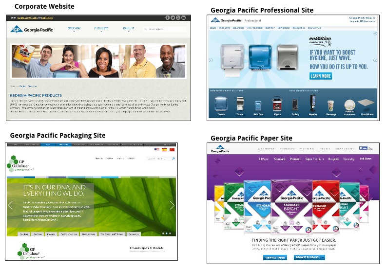
Now, one could argue that because the company is so large and the markets so varied, this is a lesser issue than if it occurred on the same site (or with the same pool of buyers). In the worst-case scenario, these designs would:
- Force buyers to adapt to different interfaces on a different section or microsite;
- Cause some buyers to think that they had actually left your main site.
5. Prevent errors
Even better than good error messages is a careful design which prevents a problem from occurring in the first place. Either eliminate error-prone conditions or check for them and present users with a confirmation option before they commit to the action.
Jakob Nielsen
Translation for B2B websites: The best defense against errors is to avoid them in the first place. When you design carefully and mindfully for the user experience, errors don’t pop up much. This may require several iterations of usability testing and improvements to your site.
Here are five errors that are easily preventable:
Typing the wrong info in a web form
This is accentuated when, in an effort to make forms clean and sleek, field names are placed inside the fields themselves. Once the buyer clicks on the field, they need to remember what’s supposed to be there.
Make it easy on your buyers. Don’t stretch their short-term memory; put field names outside of the form.
Causing users to mistakenly perceive a “wrong” click
When a call-to-action button doesn’t resemble landing page language (has no “scent“), it causes doubt or frustration. Take this example:

The landing page has nothing to do with the expectation the call to action created; hence, it’s easy for the user to think they made an error.
Let’s look at Simply Business’ flow to invite users to request insurance quotes. First, this is the call-to-action in their homepage:
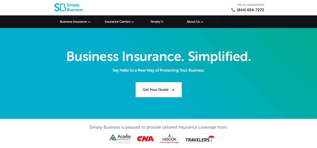
And this is the landing page where you land:
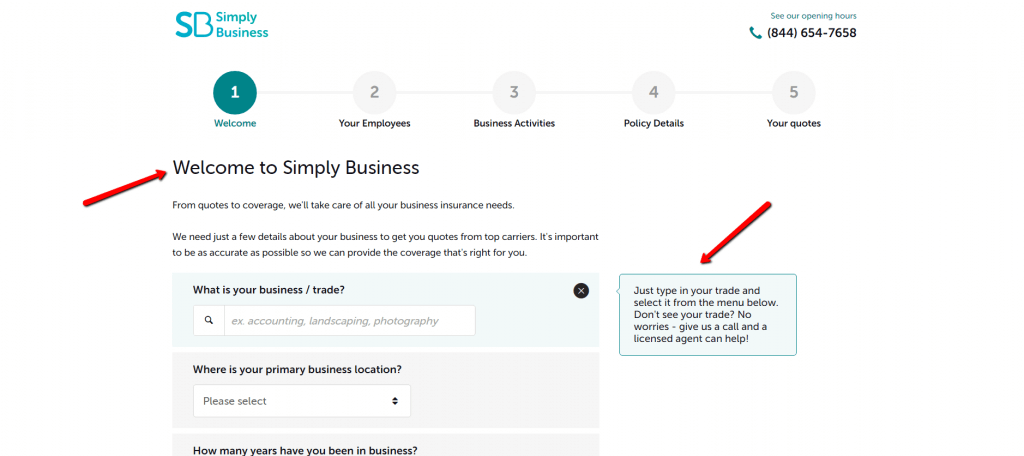
There are good things and bad things here. Two stand out:
- Good: There’s helpful explainer text for users if they have a question about the form.
- Bad: The headline doesn’t provide a message match to the call to action on the homepage. (It doesn’t provide any useful information at all.)
Failing to include autocomplete for site search
Search boxes are other places where users make common mistakes. The “auto recommendation” feature can work wonders for users. Take Google, for example. Every time you enter a short- or long-tail keyword, Autocomplete shows matches to expedite the search and avoid typos:
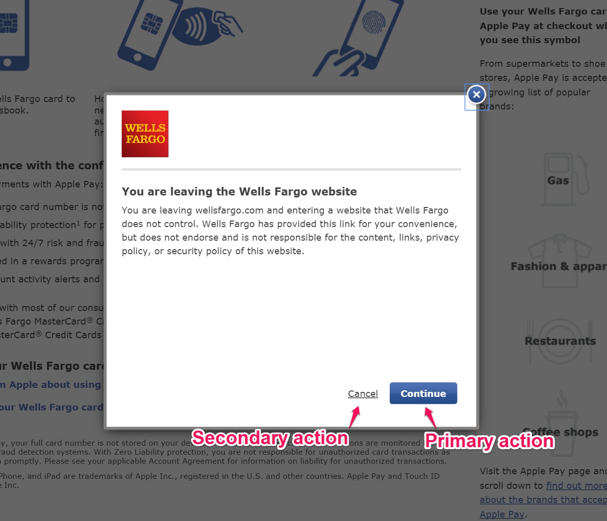
Encouraging users to leave your site at critical moments
As users learn about your products and services—or are on a critical page in your conversion funnel—keep your buyer on task and on your website by eliminating external links.
If you must place an external link on these page, show a “you’re leaving our site” notice. This will prevent unintended leaks from your site. This isn’t a rule for blog posts or other top-level pages, but consider it for sales or other bottom-of-funnel pages.
Failing to distinguish between the primary and secondary calls to action
In any conversion-oriented page, there should always be a “most wanted” next step. You shouldn’t lock your buyer into only one possible action, but you need to establish a clear hierarchy and make the primary call to action bigger and bolder.
Here’s an example of the last two points:
Shoot for clarity everywhere. If something isn’t clear, buyers will make mistakes, and it’s not because they’re stupid. It’s because your site design let them down.
6. Base everything on recognition instead of recall
Minimize the user’s memory load by making objects, actions, and options visible. The user should not have to remember information from one part of the dialogue to another.
Jakob Nielsen
Translation for B2B websites: Your buyers need to recognize where to go or what to do next quickly. A few UX features can help you achieve this, but use them properly.
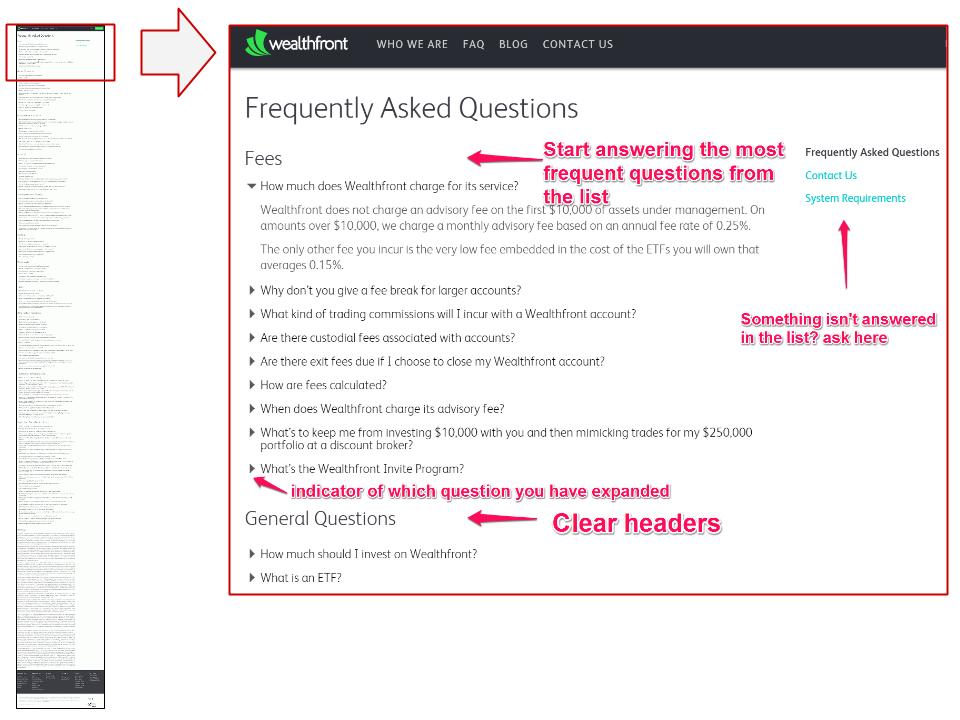
Accordions. Accordions stretch short-term memory. They work best if the wording in the accordion items matches consumers’ top-of-mind concerns. This is a common structure for FAQ pages.
Wealthfront does it right. It presents an enormous amount of information through accordions. Questions are categorized in sections with clear headers, written using easy-to-understand language, and placed in a logical order:
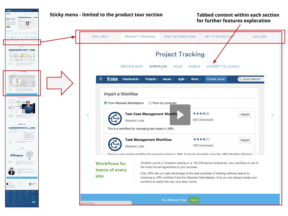
Sticky menus. For long pages, a common challenge is letting your buyers know how deep in the page they are. Sticky menus are a sleek solution. No matter how far down the page a user is, they always have access to menu navigation.
Atlassian does a pretty amazing job at letting their buyers recognize which section they’re in and what information has been explored. They’re able to explain their entire software solution Jira for development ops (which is a pretty complex software solution) in a single page, with a combination of sticky menus and tabbed content.
Change the colors of visited links. This is an often overlooked principle by modern designers and developers but a simple way to improve the recognition heuristic.
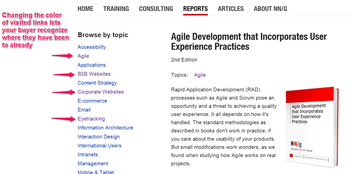
Don’t stretch your buyers’ memory when they’re navigating your site. Don’t force them to remember anything. Indicate where they are, where they’re going, and where they’ve been clearly.
7. Encourage efficiency and flexibility of use
Accelerators — unseen by the novice user — may often speed up the interaction for the expert user such that the system can cater to both inexperienced and experienced users. Allow users to tailor frequent actions.
Jakob Nielsen
Translation for B2B websites: make the most frequent tasks on your site the easiest ones to find.
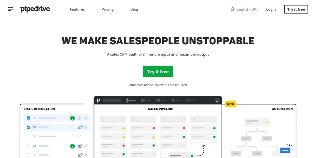
Offer limited (but relevant) user flow options. Pipedrive’s possible actions above the fold are limited to five options: Try it free, Login, Features, Pricing, or Blog.
Courtesy call to action for returning visitors. For lead-generation websites, place an always-accessible call to action shortcut at the top of the site.
This becomes important because B2B users may come repeatedly to your site during the evaluation stage of their buying process. The ever-present call to action makes it easy for them to act when they finally make the call.

8. Keep your design aesthetically minimalist
Dialogues should not contain information which is irrelevant or rarely needed. Every extra unit of information in a dialogue competes with the relevant units of information and diminishes their relative visibility.
Jakob Nielsen
Translation for B2B websites: There’s an instant appeal to minimalism. In fact, simple designs are scientifically proven to be more appealing to buyers.
Here are a couple examples of designs that keep it simple while still providing sufficient information:
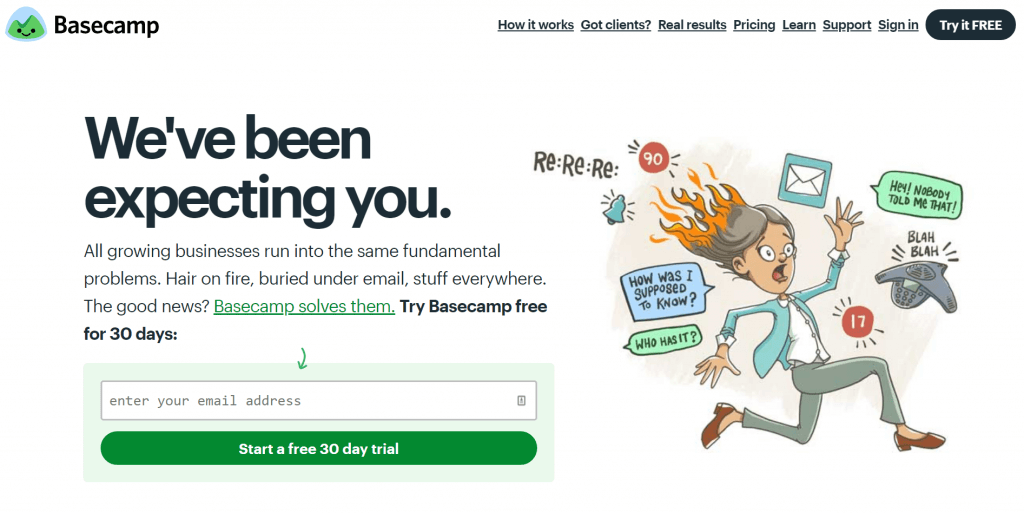
Basecamp is another good example. It’s very clear what they want you to do, and they leave plenty of white space to limit distractions:
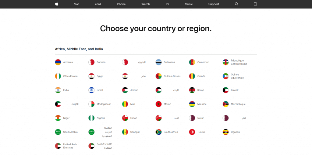
Now take Apple’s interface to “Choose your country or region.” (This is probably the one time that Apple’s design or UX is being used as a bad example).
They obviously sell their products to businesses and users from countries all over the world. With that in mind, you’d think they would ease the cognitive load on buyers when prompting them to choose their country.
Unfortunately, Apple makes buyers individually locate their respective countries from a giant list. This forces buyers to think and identify the name or flag of their country instead of relying on a smart recognition feature to offer suggestions after they type a few characters.
9. Allow users to recognize, diagnose, and recover from errors
Error messages should be expressed in plain language (no codes), precisely indicate the problem, and constructively suggest a solution.
Jakob Nielsen
Translation for B2B websites: No web design, no matter how sound, is immune to errors. When errors happen, they’re frustrating enough, so your user needs a way to recover fast.
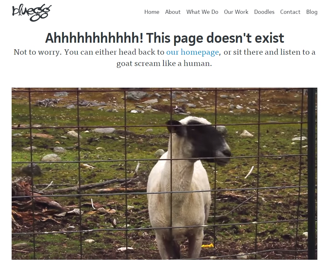
Digital agency Bluegg epitomizes how to mitigate the frustration of not finding a page with a humorous and highly effective error page. Sure, the page is funny, but it also provides a functional benefit (a link back to the homepage).
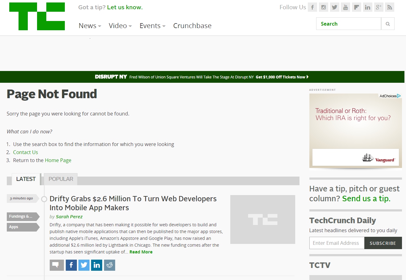
Here’s another take on the classic 404 page, this one from TechCrunch. Not only does the error page suggest a search feature, but it also offers users the latest content.
Any error messages on your website need to be displayed in plain, everyday language so that buyers know exactly what happened. Error messages should state the problem and also offer a helpful solution.
10. Offer help and documentation
Even though it is better if the system can be used without documentation, it may be necessary to provide help and documentation. Any such information should be easy to search, focused on the user’s task, list concrete steps to be carried out, and not be too large.
Jakob Nielsen
Translation for B2B websites: It’s imperative that your website doesn’t require instructions. Keep it simple, but do offer help.
Here are a couple of ways you can do it:
Live chat pop-ups. The best time to get your buyer to ask a question is exactly when they have it.
FAQs are useful, especially when used to respond to common questions or hesitations in areas of the site where users take action. The bigger the commitment you’re asking for, the more questions you’ll have to answer. FAQs are important to have in pricing tables or high-commitment landing page (e.g. “Sign up”).
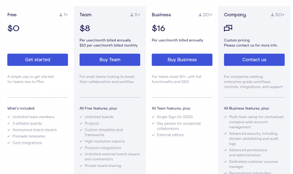
Pricing tables can be rife with confusion. It’s good practice to split the overview of pricing plans from the complete features table. This will make it easy for your buyers to understand, at a high-level, the different price points (while still allowing them to dive deeper).
Here’s an example: first the summary, then the feature-comparison table.
Microcopy alleviates that one hesitation that the buyer has before converting or prevents the most common mistake. (You have to find out what those are through research and analytics.) Microcopy can act as small but essential documentation.
Conclusion
Whether you’re redesigning your website or going through an optimization journey, following these heuristics is simply an act of sanity.
Even though these heuristics aren’t ironclad laws of web design, they’re the perfect place to start.
Related Posts
-

Tommy evaluates Cheap Recipe Blog, and The Murray Group, an independent insurance agency out of Rochester…
-
What's user experience (UX) got to do with conversions? Everything. Great user experience is a…
-

Do you want to make your website better? There are many ways to optimize a…
-
Do you need business experience? Where should you work to get the best experience? Work…

Awesome post Eduardo. Some great points here to be implemented.
Finally..!! Some B2B talk from the conversionXL blog …!! I think I’m about to have tears of joy :D And what’s even better is that its coming from an impressive and accomplished b2b pro :) !
Hey thanks Eduardo, this is an excellent piece of writing on the topic and I’m bookmarking this to work with in the future.. Please keep up with sharing your views and good work in this area, I will certainly be following you on-line! Cheers!
Awesome post Eduardo . I found this very helpful . Thank you so much , great work . Keep it up !
This is a great thorough guide for anyone who is looking at updating their website, or for those about to create one. If you can get the combination right, you’re on to a winner. The design must be based around your customers and potential buyers. User experience is everything, as if they can’t easily navigate to where they want to be they’ll go elsewhere.
The tip on error pages is useful too. Again this encourages people to continue navigating rather than becoming frustrated and leaving your site.
Quite an informative article, Eduardo. Without implementing proper site structure I guess attracting more n more customers is quite a difficult task for the businesses.