Nothing is more frustrating than filling out a badly designed form.
It’s a common experience, though. How many times have you entered a password only to be taken back with red ink proclaiming “Error! Password needs a capital letter, two numbers, a special character, and a quote from a Fetty Wap song.”
Form optimization is a key component of conversion optimization, and form field validation is a big part of that. It’s easy to measure, and optimizing bottlenecks in your forms is a way to produce solid ROI upfront.
Table of contents
What is form validation?
Form validation is a “technical process where a web-form checks if the information provided by a user is correct.”
The form will either alert the user that they messed up and need to fix something to proceed, or the form will be validated and the user will be able to continue with their registration process. For example, Twitter won’t let me use an email address that is incorrectly formatted, and gives me an error message when I try to do so:
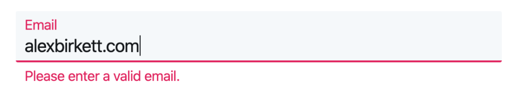
But when I correctly enter my email address, it works, and the error message disappears:

Basically, validation makes sure that the provided text is in the right format (e.g., for email, [email protected]), and if the text fits the qualifications for a suitable entry (e.g., the email isn’t already registered, or the password fits the criteria).
In general, there are two main types of form validation:
- After submit validation
- Inline validation
After submit validation
After submit validation is probably what you’re most used to. It’s also usually a worse experience than inline validation.
According to Designmodo, “when the user provides all the data and submits the form, usually by hitting the button, the information is sent to the server and validated. The response of the “validator” is sent back to the user’s computer and it’s visualized as either a confirmation message (“everything went fine!”) or a set of error messages.”
In other words, you fill out the whole form and then press submit. After that, if you made any mistakes, the page will tell you what you did wrong. Sometimes, when errors stack up (especially when they’re all shown at the top), it can get quite frustrating, leading people to abandon forms:
Even worse, sometimes a form will spit back error messages that are unclear. Here’s an example:
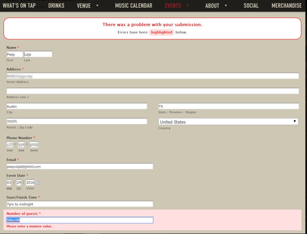
Peep was trying to fill out a form on a venue’s website in order to get a quote for an event.
However, he was returned this page with a big red message saying, “there was a problem with your submission” at the top.
The error was that he entered a range of guests (rational choice, seeing as it’s hard to state an exact number of guests for events), but they wanted an exact number. Of course, they didn’t mention this before he hit ‘submit.’ Even after hitting submit, the error message didn’t clearly say to enter an exact number.
As we’ll see below, there are ways, even with after submit validation, to make things clear upfront and avoid the frustration of the above examples.
One way to improve form UX, though, is simple to move to inline validation…
Inline validation
Inline validation is a wonderful way to reduce friction in forms. It’s becoming more and more common, probably because we’ve seen compelling case studies supporting its effectiveness.
According to Designmodo, inline validation is when “validation messages are shown immediately after the user types in data to form fields. Usually, information is shown next to the fields and encourages the user to take immediate action.”
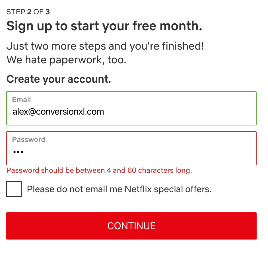
A good example of inline validation is the one I gave of Twitter above. Another great one comes from Netflix. Fields that are correctly filled out become green, and red ones show you what you did wrong and how to fix it:
Most experts agree that inline validation is better for user experience. As Luke Wroblewski put it:
Web forms aren’t great conversationalists. They ask a bunch of questions, then wait until you answer them all before they respond. So when you register for that cool social network or use an ecommerce site, it’s pretty much a monologue.
Inline validation solves that problem, making the experience of filling out a form a bit more conversational. Wroblewski also tested inline validation against a control (after submit validation). Here’s a video example of the inline validation:
Though the sample was small, they found the following results with the inline version:
- A 22% increase in success rates;
- A 22% decrease in errors made;
- A 31% increase in satisfaction rating;
- A 42% decrease in completion times;
- A 47% decrease in the number of eye fixations.
That’s 22% more people making it through your forms, so it’s well worth the effort—and so is creating a more satisfying experience for anyone filling out the form.
Why inline validation works so well
A Designmodo article explained the delight of filling out a form with inline validation here:
The discrete charm of well-designed form validation in Twitter’s forms was absolutely seductive. Informative error messages popped out right when I’d made an error, immediately eliminating irritation. “Inline validation” helped me understand what was going on right away. I could feel that this simple form was trying to have an actual conversation with me. That was a revelation! At the end, I didn’t have to wait for a reload of the whole page to check if the form was filled in with the right data.
But even if you don’t use inline validation, there are a few ways to make your forms more pleasant anyway. Here are some best practices.
1. Use microcopy to increase clarity
Microcopy includes the small pieces of copy throughout your web page that help make a better user experience. Things like error messages, instructions, terms and conditions, and examples of inputs are all considered microcopy. Most importantly for this article, you can use microcopy to bring clarity to your form fields.
Your form field labels should be as clear as possible. The Baymard Institute found that “92% of top ecommerce sites have inadequate form field descriptions in their checkout process.”
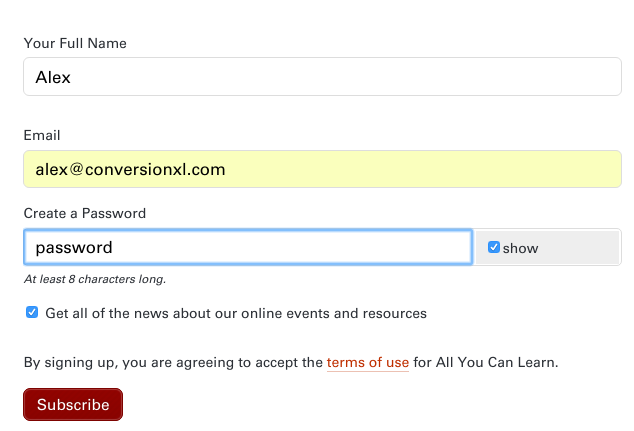
To make form fields clearer, try being more specific in your microcopy, like the following example:
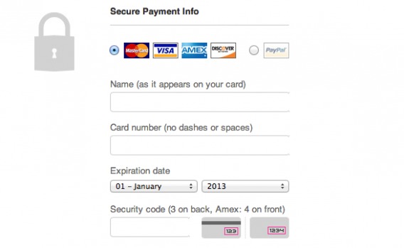
In the above example, the microcopy clarifies some common points of confusion (and therefore friction): how you should write your name (“Alex” or “Alexander”), card number (should I put dashes or spaces in?) and the security code (just to make sure you’re entering the correct number). This avoid helps users avoid hesitation and complete the form faster with fewer errors.
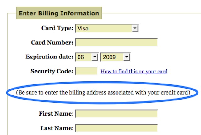
Joshua Porter also wrote about this. He noticed he was getting form errors on the “enter billing information” page, so he added microcopy to remind users to enter the billing address associated with their credit card, and noticed the errors went away, “thus saving support time and increasing revenue on the improved conversion.”
Microcopy is good not only for increasing clarity, but also for reducing friction in form fields.
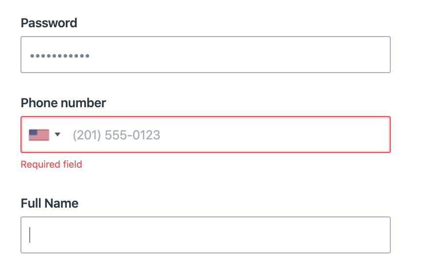
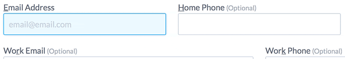
For example, a usability study by Baymard Institute found that customers felt as though their privacy was being invaded when they were required to enter seemingly unnecessary personal information, like a required phone number field, without any further explanation or help. Use microcopy to answer, “ugh, why do you need that?!”
Especially if you’re going to use their phone number or email to provide some sort of act of exceptional service, let them know. Turn a negative into a positive; or at least assuage their doubts and fears:
2. Be clear when communicating errors
Whether or not you’re using inline validation, it’s important that the user knows what they’re doing wrong. If they can’t tell, it’s going to be a frustrating experience. If your user experience is frustrating, you’re going to be leaking a lot of potential registrations.
A good example of this is a former version of the signup form on Meetup.com. In this case, the zip code wasn’t entered:
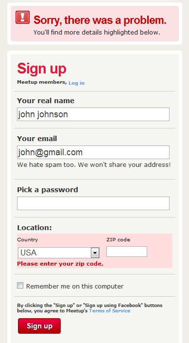
If they did fill the form incorrectly and you need to show an error message, make sure the fields are populated with the data they entered.
If they have to start from scratch, it causes frustration and they might not do it.
3. Be nice when communicating errors
This much is obvious: users don’t like seeing error messages.
You see, according to Smashing Magazine, “when getting the exact same page but with an error message, the user will feel they have made little or no progress, despite having typed 90% of the form fields correctly.”
To start, don’t use words with a negative tone. Things like, “oops,” “failed,” and “wrong.”
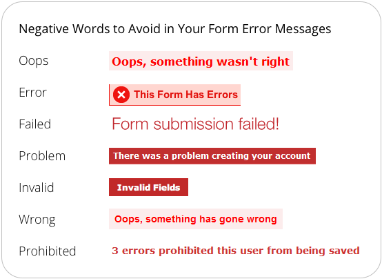
The last thing you want to do is make your visitors feel stupid after not completing your (probably woefully confusing) form. Instead of focusing on the user’s mistakes, focus on what they need to do to fix the error.
Users, of course, will make mistakes. And while clear labelling and loose form validation will help prevent these mistakes, you need to allow errors and make the messaging helpful and friendly. This article goes into great depth on friendlier error messages.
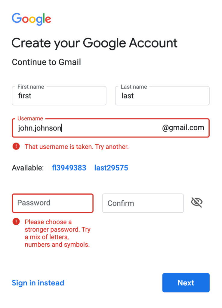
As an example of doing things right, Google provides clear and friendly error messages:
In addition, if you’re using inline validation, you should also provide positive reinforcement when a user gets something right. Here’s how Manuel de Costa put it in a Formisimo blog post:
Use inline form validation with tick marks to show users their input is valid. This is a form of positive reinforcement rather than just using red Xs. This also prevents the situation where a form has been submitted with incorrect details only to be reloaded again for the user to correct their mistakes. Help them get it right the first time.
4. Don’t be picky
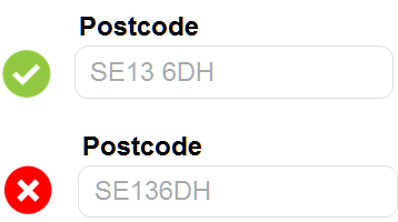
When asking for information, there’s nothing more annoying than a form that requires information to be entered in a very specific format.
For example, if you’re asking for a date, accept the year as in 16 and 2016 both. Let them use either slash (/) or dot (.) in between the numbers. When you ask for a phone number, don’t require spaces, brackets or anything else—let the user enter their phone number as they please.
If you need the data in a specific format, make it clear (with microcopy) – or better yet, have it converted by a script. Here’s an example from an article Craig Sullivan wrote:
As he explained:
In the first example on this form where the postcode failed validation because it expected a space, this is just a really stupid moment. We simply fix and test the postcode validation before making it live. […] We might measure the impact of fixing this kind of validation issue but mostly, we’ll just accept we’re doing something dumb and fix this as a bug or BAU (business as usual) change. The solution is completely straightforward and implementable with little or no discussion required.
This is loose field validation, and it makes the experience more inclusive. No matter how the user understood the prompt, as long as the variation is reasonable it should be accepted.
James Robinson put it well in a Formisimo blog post…
Start with loose field validation—rather than restrict what the user can enter too heavily on any new form, start with relaxed rules until you identify a problem with certain entries and tighten from there. That way you learn the rules from the customer, rather than forcing them to meet your requirements and losing conversions.
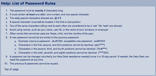
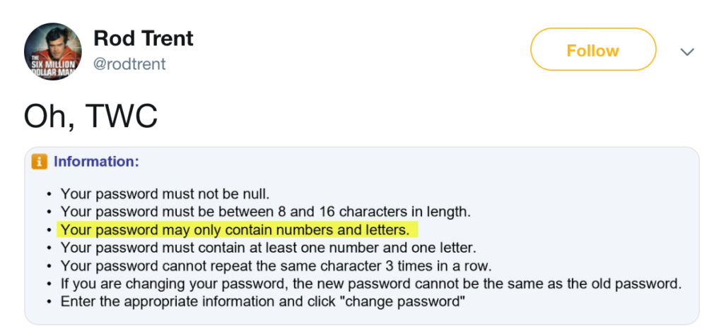
Oh, and don’t do this with your password requirements:
Preventing error messages
The best way to convert users isn’t necessarily to design better error messages, but rather to prevent those error messages from occurring in the first place.
We’ve written articles about designing high converting forms in the past, so I won’t go too into detail here. But here are a few ways to prevent error messages when validating forms.
Don’t fall for password ‘common practices’
Many forms make you fill out your password and then confirm it, and they usually mask the password as well. These may be common practices, but it doesn’t mean they’re best practices.
You can experiment with showing the latest character typed in a password (great for big fingers and small screens on mobile):

You can also just give the user the option to see their password as they type it, as New Look does:
In fact, Jakob Nielsen wrote an article called “Stop Password Masking,” where the premise was, well, just what it sounds like. He stated that password masking causes big usability problems. According to the article:
- Users make more errors when they can’t see what they’re typing while filling in a form. Therefore, they feel less confident and give up more easily (leading to lost conversions).
- The more uncertain users feel about typing passwords, the more likely they are to use simple password or copy and paste passwords from a file on their computer. Both behaviors actually lower security.
Here’s an example from UIE:
Finally, you don’t need to require the user confirm their password. Just because everyone else does it, doesn’t make it effective. Could do something like this instead:
Don’t use infield labels
Infield labels look like the following:
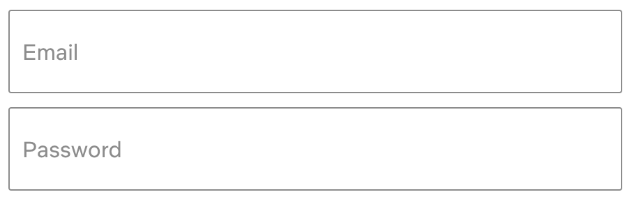
They are no bueno for several reasons:
- Labels inside the field can look like pre-filled answers.
- Using labels as placeholder text inside the field (where users know the answer normally goes) interrupts the conversational flow.
- If the labels disappears as soon as the field receives focus, then screen readers can’t read the label.
Make suggestions or force responses
Whenever possible, restrict responses so users can’t possibly mess up. For example, with dates, you can make it a drop down menu:
Remember the example I gave above about the venue with a bad form? This one:
Where they require the exact number, they could provide a drop down of different ranges (0-50, 50-100, 100-200, etc.).
If possible, input suggestions can also be helpful. Here’s an example from NGP Van:
How to track form errors
It’s nice to implement best practices, but it’s even nicer to figure out where people are falling off on your specific form. How do we do that? Well, we have to set up some way to measure form analytics, error messages, abandonments, and completions.
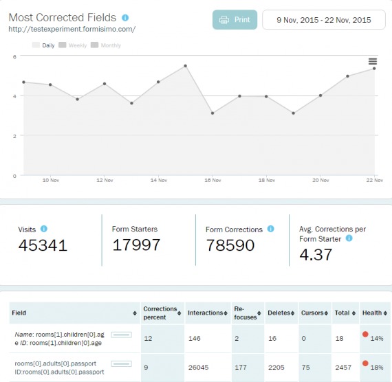
If you’re using a tool like Formisimo, it’s relatively straightforward. Just check out the Most Corrected Fields report:

You can see the average corrections per form starter and use that as a baseline. The goal, of course, is to reduce the number of corrections on a form field (and thereby reduce friction on the form):
You can also set up scripts to track JavaScript errors on your page, which you can send to custom events in Google Analytics. Search Engine Watch explained how to set up custom events in order to track form errors:
Employ a series of custom events on your form with each event representing a field on that form. Your category should define which form is flagging errors; your action should define each form field; and your label can be dynamic, pulling in both a description of the validation rule that triggered the error and the value entered that broke the rule, separated by a pipe (i.e. “|”). This one may require developer assistance.
Once set up, you can then dive into a custom report that quantifies and stratifies the most critical errors on your forms. At that point, you can assess the root causes of the errors by inspecting the values users are entering. Finally, you should then either relax your validation logic or include better help text to minimize the number of errors impeding your most important conversion activities.
Finally, if you’d like to track your form engagement through Google Tag Manager, here are two great articles explaining how to set it up:
- Form Engagement Tracking with Google Tag Manager (LunaMetrics)
- Track Form Engagement With Google Tag Manager (Simo Ahava)
Whichever way you choose to track error messages, you’ll be able to segment your audience and see which error messages correlate most with abandoned forms. These are the areas of highest impact for your form conversion rates, so focus on fixing those form fields first.
Conclusion
Form validation is one of the most frustrating parts about using the internet (at least for me). When filling out a form, if it’s unclear what I’m doing wrong and there’s no easy way to fix it, then I’m much more likely to give up and wander away to another site.
While the best way to decrease friction in form fields is preemptive (clear labels, only necessary information, inline validation, etc.), there are some measures you can take to make them less frustrating. Things like:
- Use microcopy to increase clarity.
- Be clear when communicating errors.
- Be nice when communicating errors.
- Don’t be picky.
Everything I mentioned above may be a best practice, but your site is unique so you’ll need to test it for yourself. In addition to your regular analytics setup, there are great tools like Formisimo that allow you to get granular on your form analytics. Start testing at the biggest drop off points and see if you can convert a few more of those prospects by making the experience a little more delightful.
Working on something related to this? Post a comment in the CXL community!
Related Posts
-

As marketers, we spend countless hours acquiring traffic and crafting persuasive content, but too often…
-
Growing your mailing list and generating leads should be a focus of your marketing. If…
-
What's user experience (UX) got to do with conversions? Everything. Great user experience is a…
-
Guest post by Pratik Dholakiya. If you practice CRO, you already know that the debate…


Hi Alex,
thanks for showing how Formisimo can be used. Error prevention is hard and you must allow that users will make errors. However, when you see certain parts of your form causing a high level of errors and forcing users to make corrections you know the form itself needs improving, that’s why we report on most-corrected-fields.
If any readers would like a full demo of the tool, you can do so at http://info.formisimo.com/formisimo-demo
Hi Alex,
Great post – we all know how annoying form filling can be. I particularly liked your point about providing the user with suggestions. Online Retailer ThinkGeek have this nailed in their checkout process using typeahead address verification technology to complete the customer’s full address. This is particularly useful for mobile users constricted by small screens and large fingers.
Regarding after submit/inline validation, there exists research in support of after submit validation: http://www.sciencedirect.com/science/article/pii/S0953543807000100
In their later publications, authors still recommend after submit validation: http://www.intechopen.com/books/user-interfaces/simple-but-crucial-user-interfaces-in-the-world-wide-web-introducing-20-guidelines-for-usable-web-fo
Ivan, thanks for linking to those studies. I searched the paper 20 Guidelines For Usable Web Form Design. very interesting results with inline validation:
“If the error messages appeared at the moment the erroneous field was left (inline validation), the participants made significantly more errors completing the form. They simply ignored or, in the case of pop-up windows, even clicked away the appearing error messages without reading them.”
Considering there are case studies that show positive results with inline validation and that you should always test anyway, this is just another reason to never assume anything or copy because it worked for someone else.
Hazel, I would be grateful for pointing me to the scientific research in support of inline validation.
Hi Ivan,
The case study I was thinking of is Luke Wroblewski’s, that is mentioned in this blog post:
“Wroblewski also tested inline validation against a control (after submit validation).”
with inline validation producing the following results:
a 22% increase in success rates,
a 22% decrease in errors made,
a 31% increase in satisfaction rating,
a 42% decrease in completion times, and
a 47% decrease in the number of eye fixations.
That’s not an academic study and Alex notes that the sample size was small but I think these results versus the studies you’ve linked to throw doubt on accepting either as a rule.
Would be great to continue gathering examples of studies but I think the best thing to do is test with your own site and users.