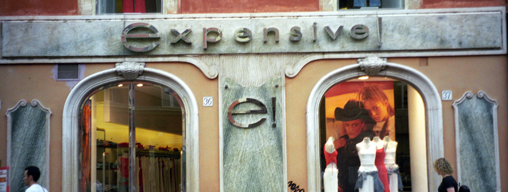
If you’re a budget brand, there’s nothing wrong with a website that looks kinda cheap.
But if you’re selling expensive watches or clothes? Well, that’s not the message you want to be sending.
Of course, it’s all about context. Aligning design elements to your brand and business goals is important, and there are certain elements that make a site look more expensive/luxurious or cheap.
Table of contents
What Makes a Website Look Expensive?
A beautiful website tends to look more expensive. Just like with attractive people, an attractive website seems to create a Halo Effect, where people will judge the product quality, customer service, and other things higher.
But what does it really mean to have an attractive website? That’s pretty subjective, isn’t it?
Well, yes and no. There are certain qualities that luxurious brands tend to use, and there are certain design elements that people perceive as more luxurious.
The resounding design element that leads people to believe a site is more prestigious is simplicity.
Simplicity and a Luxurious Experience
We recently published an academic insight that explored which design elements lead people to believe a website is more luxurious.
This study analyzed user reactions to 78 watch websites and 81 car websites, and it looked purely at design elements as differentiators. Things like:
- Mean RGB (Red, Green, Blue)
- Mean HSL (Hue, Saturation, Lightness)
- Number of colors
- Dominant color
- Amount of white space
- Number of products
While the study only looked at two product types (watches and cars), it found that a few traits were consistent in creating the perception of prestige.
If you’re looking to create the perception of luxury on your site, use lots of white space, keep a low number of products on display, and use fewer colors…
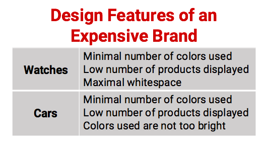
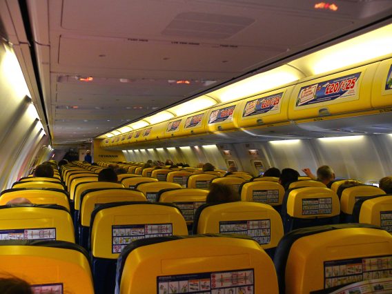
And using colors that weren’t too bright correlated with a higher perceived price. There’s something about clutter and bright colors that screams “I’m cheap” (as RyanAir knows):
Don’t Forget Mobile
Intuitively, mobile seems like a casual browsing medium, so you wouldn’t think that those browsing on mobile would purchase, say, a luxury watch or car.
True or not, it’s silly to ignore the mobile experience if you’re a luxury brand. Check out these data points:
- According to Think With Google, Luxury car price searches grew nearly 90% on mobile.
- They also found that 79% of luxury auto buyers indicated they used a smartphone during their research process.
So no matter where customers eventually buy a Rolex or a Porsche, they probably did some preliminary research on their phone. Since our academic insight (above) didn’t explicitly research mobile, we can’t fully extrapolate the findings, but we can assume some of the basic design principles still apply (minimal color, etc.)
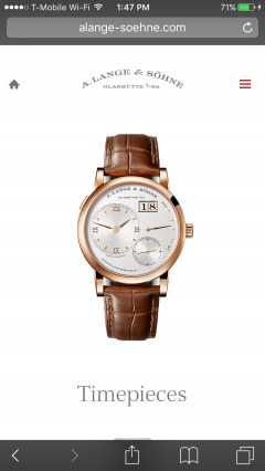
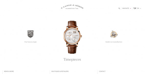
For example, A. Lange & Söhne’s mobile site keeps the simple elegance that its desktop site has. Only one product displayed, few colors, lots of white space…
Other than that, it’s most important to make sure your mobile site is usable and that you invest in a great mobile experience. Many think they’re doing this, but research shows otherwise (about a third of luxury brands are said not to be optimized for mobile).
You can read more on mobile optimization here.
While these design elements are good heuristics if you want to look expensive, it’s also helpful to avoid elements that explicitly make your site look cheap.
What Makes a Website Look Cheap?
While creating a perception of luxury seems largely to be a brand decision, avoiding the perception that you’re cheap has much more to do with usability and, in general, the user experience. Anyone can optimize their site to avoid looking cheap and benefit from it.
Note also that most of what constitutes “cheap” design is pretty similar to what constitutes untrustworthiness (the most important factor in affecting distrust, after all, is visual design). We’ve written a lot on conversion credibility killers, so think about “cheap” design elements with the same heuristics.
Typography
If someone says that typography is a top 5 most impactful A/B test to run, you probably shouldn’t listen. However, typography clearly (and empirically) has an effect on brand perception as well as recall.
Studies have also shown different fonts have strong effects on trustworthiness (comic sans caused users to disregard a NYT article, and in some users, it even caused contempt). One expert even said, “Web design is ninety-five percent typography.”
The difficulty in discussing typography, however, is that there isn’t a single right answer. Of course, it first needs to be readable, but then it also needs to accurately reflect your brand. Here’s how Tommy Walker put it in a previous CXL article:

Tommy Walker:
“The reality of the situation is, asking about ‘the best typeface’ is going to be about as fruitful as asking ‘what color converts the best?‘
It’s all subjective, depends on your target market, the story you’re telling & the emotions you’re trying to evoke. Looking at the the big 50 research from Smashing shows us ‘other’ fonts are being used more and more, because they’re a better reflection of the brand’s characteristics and personality.
The question you have to ask is if the typeface you’re using accurately reflects you?
It’s a difficult question to answer, but could make all the difference in the world to your customers.”
Stock Photos and Other Inauthenticity
Stock photos tend to be a credibility killer, and when done really poorly, they make your site look cheap.
Stock photos, in general, aren’t a problem. You can certainly find good quality stock photos and fit them to your purpose. But the problem is, if you’re trying to look like a luxury brand, you can’t use photos that are common, prevalent, or overused. It makes your brand look like those three adjectives – the opposite of your goal.
Remember the Everywhere Girl? In 1996, Jennifer Anderson posed for a stock photo shoot shortly after graduating college. At the time, companies would subscribe to a service & receive their stock photos on a CD-ROM.
Trouble was, the companies receiving the CD’s didn’t have an easy way to verify who else was using the photo, and the license for the images was not exclusive – meaning anyone could use them.
Within a few years, Jennifer became the face of college girls in what seemed to be every marketing campaign. The most notorious faux pas was in 2004, when PC competitors Dell & Gateway used photos from the same photo shoot in their “Back to School” promotional material.

As MassImpressions put it, “Try to avoid stock photos wherever possible…There are countless professional photographers out there, many of whom are absolutely crying out for somewhere to showcase their work in exchange for a credit on the website or a link back to their portfolio. And they deserve your support – the way things are going online, we need to use ’em or we’ll lose ’em.”
Usability
Many luxury sites make the mistake of throwing usability best practices out the window because they are “stifling their creativity.” That’s not a good idea.
According to Information-foraging theory, people “behave on the web like animals in the wild: they assess the perceived value of a new foraging patch against the perceived cost (effort) of obtaining that food.”
In other words, it’s motivation vs. friction. Any additional friction lowers the chance that users will take the action; beyond that, friction actually produces a negative reaction to the brand (a reverse-Halo-effect).
Here’s how Aurora Bedford from NN/g explained it…

Aurora Bedford:
“By improving a site’s usability, we reduce the interaction cost, and thus increase the expected utility.
But remember that the perception of the interaction cost (that is, users’ assessment of how hard it will be to use the site) is almost as important as the actual interaction cost (i.e., the real effort required to use the site): the perceived cost drives the initial assessment of the site’s expected utility.
Thus, to convince people to stick around and explore deeper into the website, it is important to accurately reflect the quality of the organization and convey ease of use. If, at a glance, users do not believe that the site is worth their time and effort, then they have little reason to stay.”
Tons of Popups and Distractions
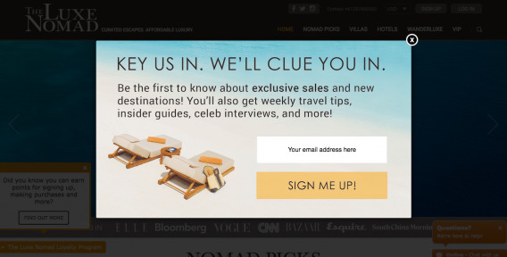
While data may, in aggregate, tell you that popups work well, if you run a luxury brand, nothing says cheap like 13 popups in your face before you can even read the value proposition.
I landed on The Luxe Nomad, a site supposedly for luxury travel accommodations, and within seconds was bombarded with like 5 popups (one large overlay and a few more in the background). They were also bright orange, not doing any favors to the attempted ‘luxury brand’:
But when I went on A. Lange & Söhne’s site to buy a watch (I wish), all I got was a nice, minimalist design with no distractions.
It’s not enough to say that “pop-ups are bad.” I’m sure there are ways to make them fit with a luxury brand (seems Bounce X does this well). It’s more about avoiding a cluttered and sleazy looking user experience.
When a website is too cluttered, it conveys a certain cheapness. Here’s how Aurora Bedford from NN/g put it:
Aurora Bedford:
“In the physical world, we often assess the value of a shop based on the storefront: displaying many items in the front window may signal cheaper prices and lower quality, while a few products in a large window may convey exclusivity and higher value. (This assessment is related to people’s scarcity bias: many items crammed into a display appear easy to obtain, while a single object seems more elusive.)…
…Just as with the physical storefront, a cluttered webpage lowers the perceived value of the organization. Clutter and disorganized content suggest a lack of attention to detail, or an inability to distill information into a meaningful summary that, due to the halo effect, people assume reflects the overall character of the business.”
Abundance
Scarcity works (and not just for narcissists). Part of prestige is the idea that you’re one of the few invited to the club. If everyone has a Rolex, then it becomes mundane.
I mentioned a study above that said smaller product offerings correlated with higher perceived price, but when something is limited, either in quantity or simply because of its “prestige pricing,” it becomes perceived as more valuable.
I think Sid Bharath put it really well in a Crazy Egg article from 2014:

Sid Bharath:
”In 1962, Ferrari manufactured a series of sports cars called the Ferrari 250 GTO and sold them for $18,000 each. Only 39 were manufactured in total.
In 2004, a young man put the finishing touches on a website he was working on from his dorm room at Harvard. It was a site where people could connect with each other online, but only Harvard students could access it.
Today, one of those cars is worth over $50 million, making it the most expensive car in the world. And that website is worth more than $150 billion, making it one of the most valuable companies in the world.
When access to something is restricted, by being scarce or exclusive, the perceived value and demand for it increases. We always crave what we can’t have. We want to be the only one to own that rare item, or get admitted to that private club. And we’re willing to pay big.”
By capping their production output, Ferrari makes it more valuable to own one of the limited vehicles it makes. And you know that luxury fashion retailers have mastered this “limited edition” scarcity tactic.
Let Design Match Your Objectives
So to get people to buy, do you need to raise prices, offer fewer products, limit your colors, etc.? No. Let your objectives lead your design.
There was a good discussion in the comments section of a previous article, Beauty Pays: Beautiful Websites (and People) Get Better Results, about whether or not beautiful design actually works better.
The answer? It depends.
As a commenter put it, “Imho design should support your objectives and help converting your audience. However this does NOT mean that your design has to be beautiful (whatever that may be).”
He went on to mention RyanAir, eBay, and Amazon as examples of non-beautiful design.
Peep agreed with this:

Peep Laja:
“…’Design should support your objectives and help converting your audience’ – I agree 100%! And great design enables you to do it.
I see that in my line of work day in and day out. You change nothing but design, and conversions go up. Of course, the design has to be conversion optimized.
Ryanair’s brand is ‘cheap’ and they do an excellent job of communicating with their website. It’s a brand thing.”
Aurora Bedford from NN/g also emphasized the focus on brand and objectives to guide your design…
Aurora Bedford:
“The most important thing to remember is that the initial perception of the site must actually match the business — not every website needs to strive to create a perception of luxury and sophistication, as what is valuable to one user may be at complete odds with another.
The ‘budget’ impression communicated by Tigerair’s bright colors and dense presentation of deals works well because the company’s value proposition is low price, not exceptional service.
If a flight with Tigerair was more expensive than a seemingly higher-end Singapore Airlines’ flight, for example, the user would likely not purchase because such a disparity does not match the expectation set up by the website design.
On the other hand, users who care about hospitality and service will prefer the sophisticated design of Singapore Airlines to the cute graphics of Tigerair.”
Conclusion
If you want to look like an expensive luxury brand, here are some best practices that correlate (not cause, by the way) with a higher perceived price point/value:
- Use fewer colors
- Use fewer bright colors
- Use more white space
- Display a smaller product offering
- Clean up the clutter and cheap tactics
If you don’t want to look like an expensive luxury brand, well, then don’t feel like you need to march in lock-step behind these heuristics. Instead, align your objectives and strategy with your design, and find what works best for your own business case.
Related Posts
-

User flow is the path a user follows through your website interface to complete a…
-
What's user experience (UX) got to do with conversions? Everything. Great user experience is a…
-
Typography is the detail and the presentation of a story. It represents the voice of…
-
Animation for the sake of "cool" can often hurt conversions since it's distracting, but not…


Good article, the only thing I would take issue with is encouraging people to compensate photographers with a “link” or “credit”. Photography is a professional service and should be compensated as such. I think it’s problematic to encourage the culture of expecting creative services for free. Plus, you get what you pay for!
Really like this. I think the big take away is that you should design for your target audience. Just because a site isn’t beautiful doesn’t mean it doesn’t convert like heck for their target audience. Not all websites have to look luxury.
TL;DR.. If you are targeting the high/luxury end of the market, goto the conclusion and follow the pointers.