Guidelines 1-12

Visual hierarchy is a key principle behind effective ecommerce homepage design (and, for that matter, all web design).
A strong visual hierarchy helps deliver your message quickly and clearly to potential shoppers. Your call to action, in turn, offers a clear next step to move visitors beyond the homepage and toward your product pages.
Together, they’re two of the most important components when it comes to designing an effective commerce homepage. These are 12 guidelines will help you succeed with both.
12 guidelines for ecommerce homepage design:
- Avoid meaningless, extra design elements that needlessly burden cognitive load.
- The visual hierarchy should follow information hierarchy.
- The transactional menu should be higher up in the visual hierarchy than the content menu.
The value proposition should be located above the fold.- Call attention to the navigation menu by making it visible and color contrasted against the rest of the page.
- If you have the space, display pictures or thumbnails next to product categories.
- Make separate content blocks look visually distinct, add enough white-space in between.
- Avoid placing site promotions directly above product lists.
- CTA should be visually prominent.
- CTA buttons are usually better than links.
- If you have a secondary CTA, it should be less noticeable.
- Highlight the CTA with visual cues.
Where to start with ecommerce homepage design

Start with your business objective. Rank the importance of elements on your homepage based on your business objective.
A good ecommerce homepage design requires taking into account the user journey:
- Where do you want people to click?
- Which information do you absolutely need them to read?
- Which pricing plan do you want them to choose?
Once you know your priorities, you can set the visual hierarchy right—make sure that important stuff stands out, and less important elements are lower in the visual hierarchy.
Keep in mind that certain elements of a website are more important than others (forms, calls to action, value proposition, etc.) and you want those to get more attention than the less important parts.
Make important links more prominent.
- If your website menu has 10 items, are all of them equally important?
- Where do you want the user to click?
- How likely are users to take action on a CTA?
When it comes to testing different colors, know that it’s all a waste of time and effort. There is no one best color. What matters is that you use colors that stand out from the rest of the layout for the important stuff. It’s always about visual hierarchy, not color.
Calls to action minimize hesitation (the “now what?”) and guide visitors to the next obvious step. Our goal as optimizers is to make it clear what the next step should be.
Getting users to click on a CTA depends on three factors:
- They notice the CTA.
- The next step is obvious and makes sense.
- They see value in the next step.
We consider these three main factors when evaluating calls to action. Want to learn more? Take our Persuasive Design Course.
Below is each of the 12 guidelines, complete with examples of what to do (and not do) to help your ecommerce homepage succeed.
Guideline #1. Avoid meaningless, extra design elements that needlessly burden cognitive load.
In a study by Google, researchers found that not only will users judge websites as beautiful or not within 1/50th – 1/20th of a second, but also that “visually complex” websites are consistently rated as less beautiful than their simpler counterparts.
Moreover, “highly prototypical” sites – those with layouts commonly associated with sites of it’s category – with simple visual design were rated as the most beautiful across the board. In other words, the simpler the design, the better. Your ecommerce homepage design process should leverage this information.
The reason less “visually complex” websites are considered more beautiful is partly because low complexity websites don’t require the eyes and brain to physically work as hard to decode, store, and process the information.
The more color and light variations on the page (visual complexity), the more effort required for the eye to send information to the brain. This is why it’s important to remember that every element –typography, logo, color selection, etc.– communicates subtle information about a brand.
When these elements don’t do their job, the webmaster often compensates by adding unnecessary copy and/or images, increasing visual complexity and detracting from the overall aesthetic.
Optimizing a page for visual information processing –minimizing the amount of information traveling from eye to brain – is about communicating as much as you can with as few elements as possible.
Learn 8 web design principles you can apply to your homepage.
How NOT to do it
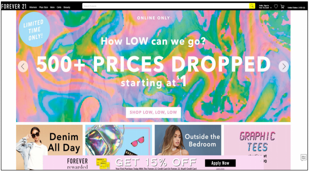
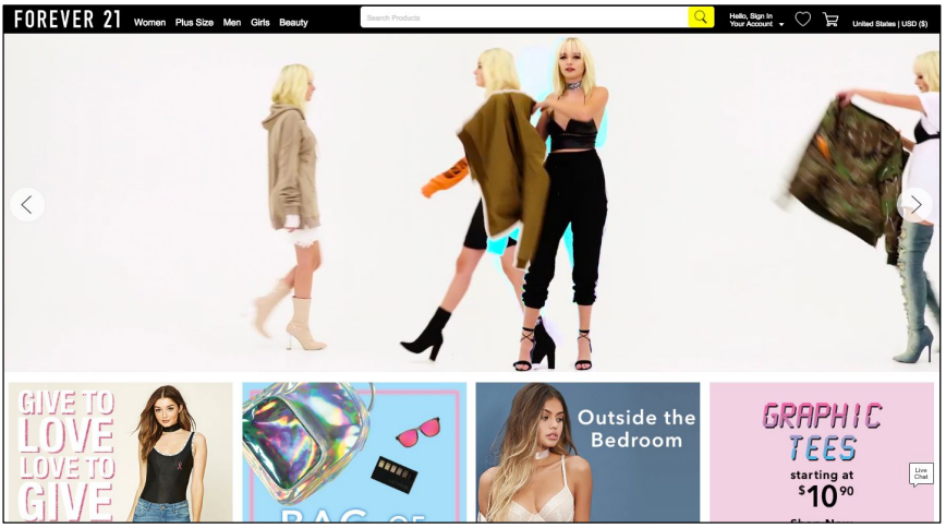
Forever 21
This homepage incorporates several moving graphics, bright colors, and an auto-rotating carousel.
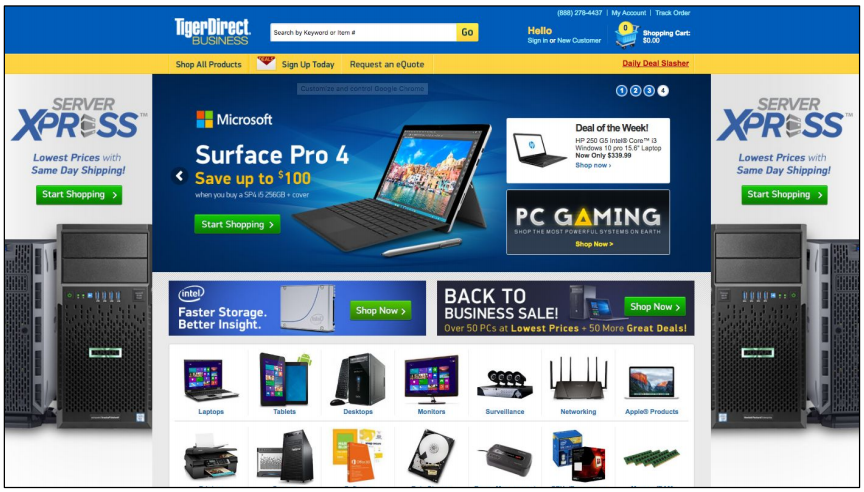
TigerDirect
This incredibly busy homepage could stand to lose quite a few design elements (logos, graphics repeated across the page, text elements, etc.).
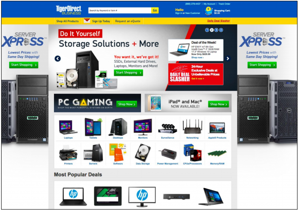
The main page was slightly busy. It seemed to put more emphasis on, “Hey! Look at all the stuff we have!” rather than helping the user navigate to what type of items they may want to purchase.
User quote on TigerDirect
How to do it RIGHT
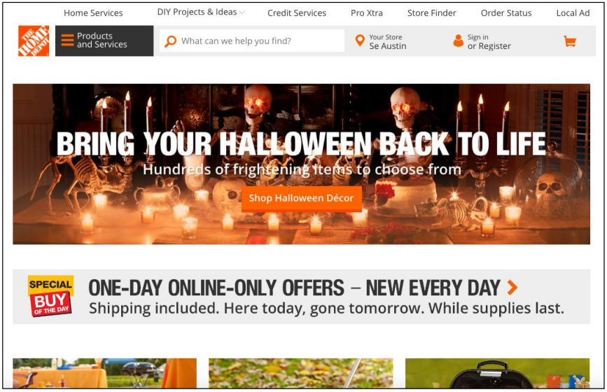
Home Depot
This homepage follows prototypicality, uses lots of
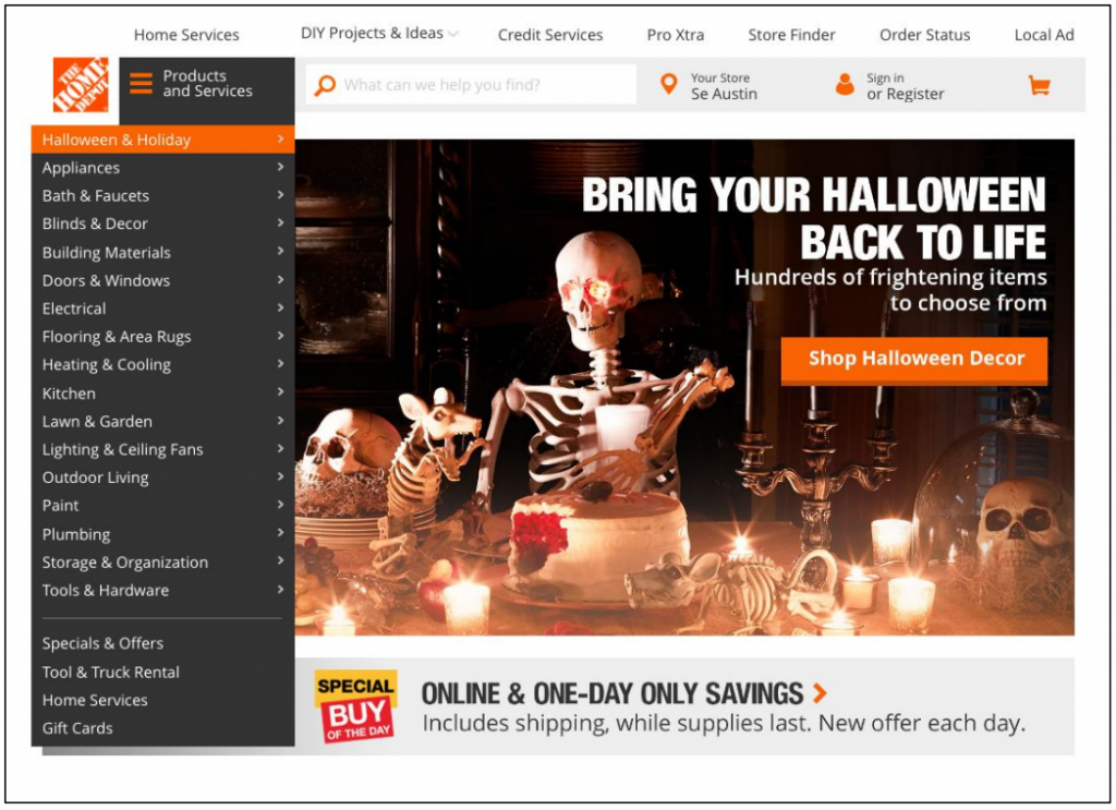
I like that the pictures of the products were big, and it looks very clean.
User quote on Home Depot
Petsmart
This simple homepage has a clear visual hierarchy and follows conventional design.
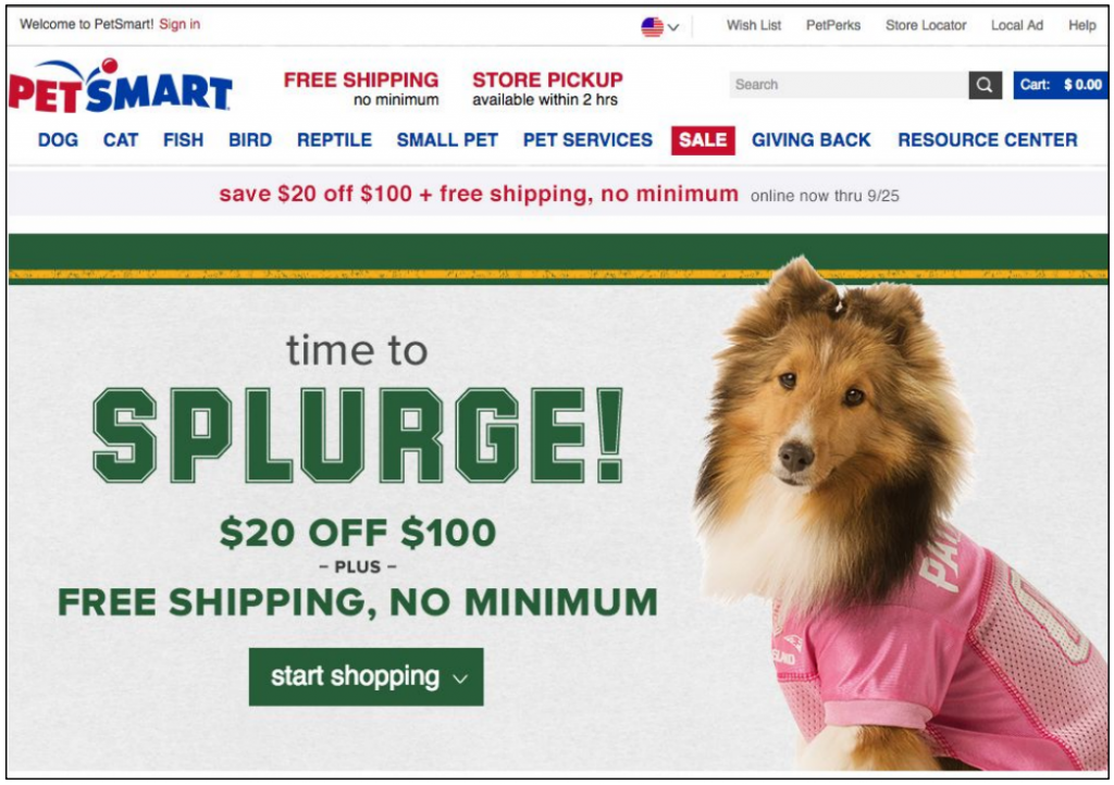
I like how everything was laid out and you didn’t have to go around guessing where things were.
User quote on PetSmart
Guideline #2. Visual hierarchy should follow information hierarchy.
Match the size and location of content with its relative importance.
When it comes to size, the biggest elements on a page get the most attention. When it comes to location, elements on the top of a page get the most attention. Apply these common sense visual hierarchy principles to homepage elements.
Also, remember that when it comes to ecommerce homepage design, the real estate closer to the top of the page is the most valuable.
Place the most important elements (logo, CTA, value proposition, navigation menus, etc.) above the fold, and make them big. Show less important content further down the page; thumbnails should decrease in size as you move down page.
How NOT to do it
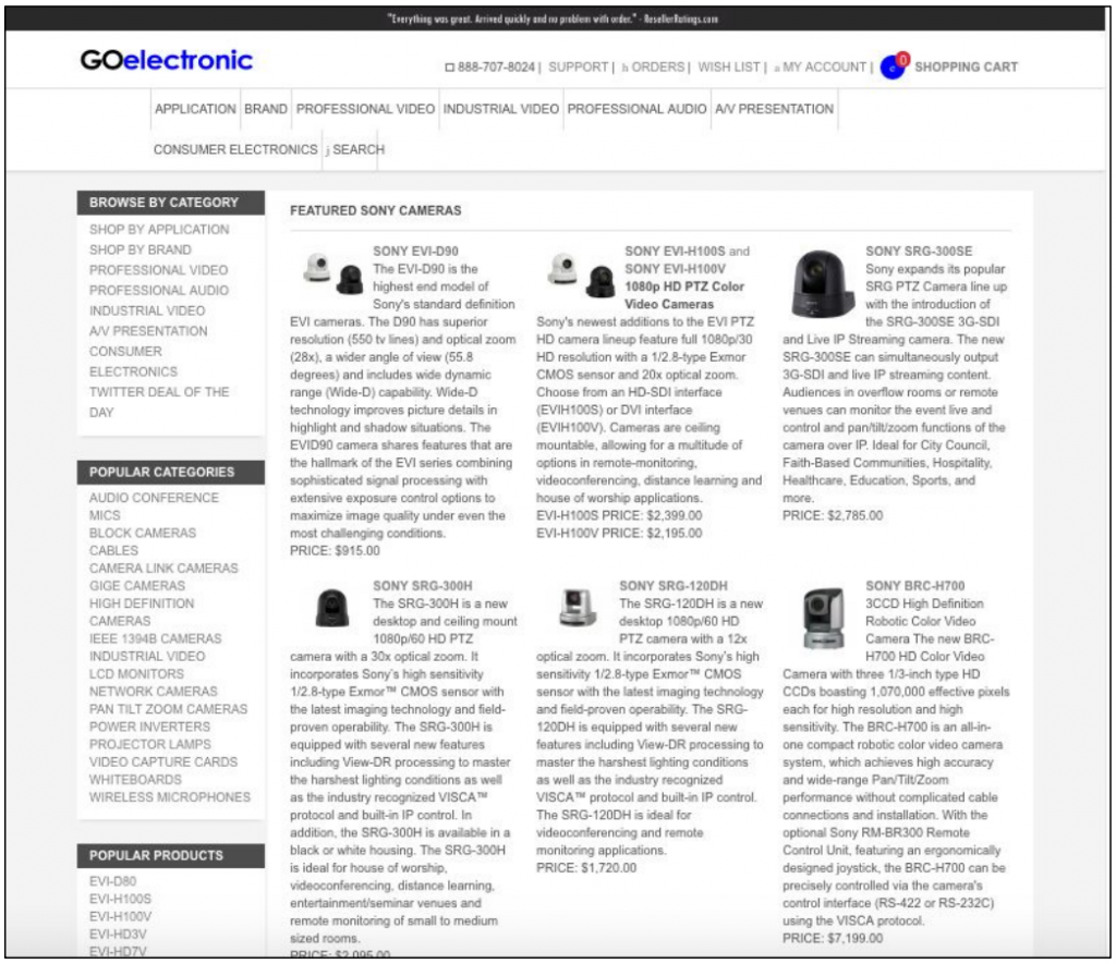
GO Electronic
It is impossible to tell what the most important element on this page is.
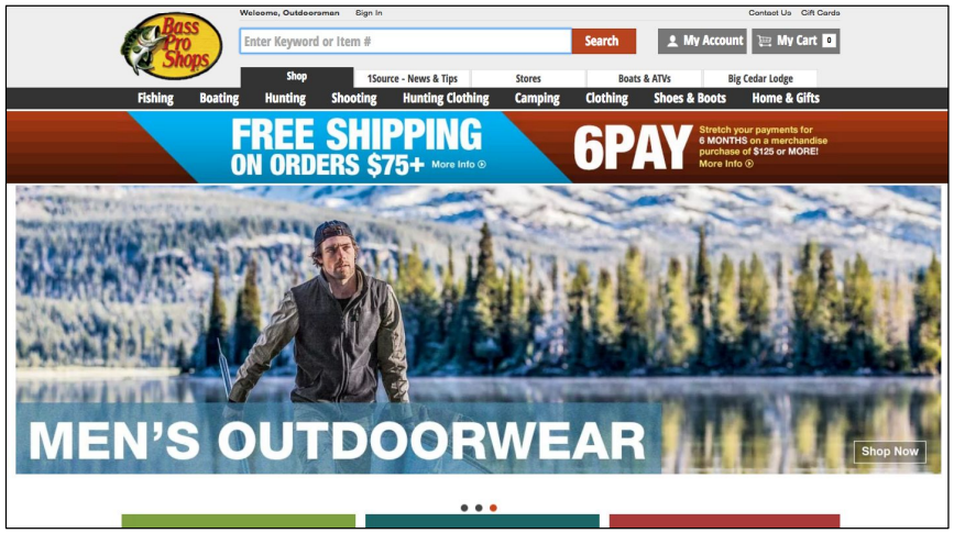
Bass Pro Shops
There are so many bright colors and words fighting for attention on this page that it’s hard to look at just one, much less tell which is most important.
Two sales graphics may cause confusion, as users won’t know where to click. Aside from visual hierarchy, the multiple “free shipping” graphics are a waste of space
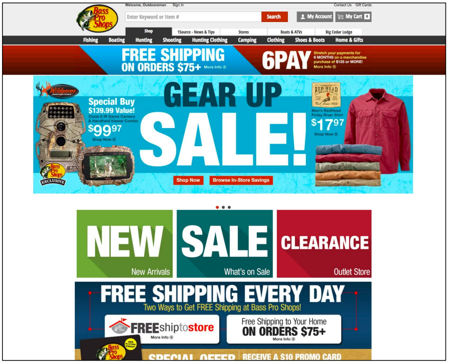
The landing site is not at all welcoming or giving any sense of the site’s
User quote on Bass Pro Shops
“personality.” Instead, it’s just a swarm of ads for a site the user is already on. The banners and boxes are all jam-packed together, and each one is packed to the gills with colors and pictures and text of all different fonts and sizes, some of it blinking or moving, and most of it YELLING AT THE USER IN ALL CAPS.
How to do it RIGHT
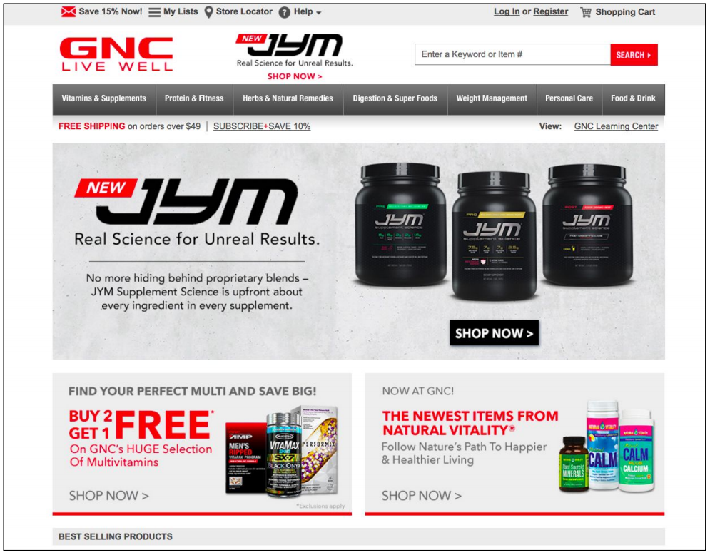
GNC
The visual hierarchy on this homepage creates a natural path, directing users from the most important elements at the top of the page downward.
There is no repetition of sales promotions or shipping information.
Vitacost
The exemplary correspondence between element size and page location communicates an intuitive visual hierarchy.
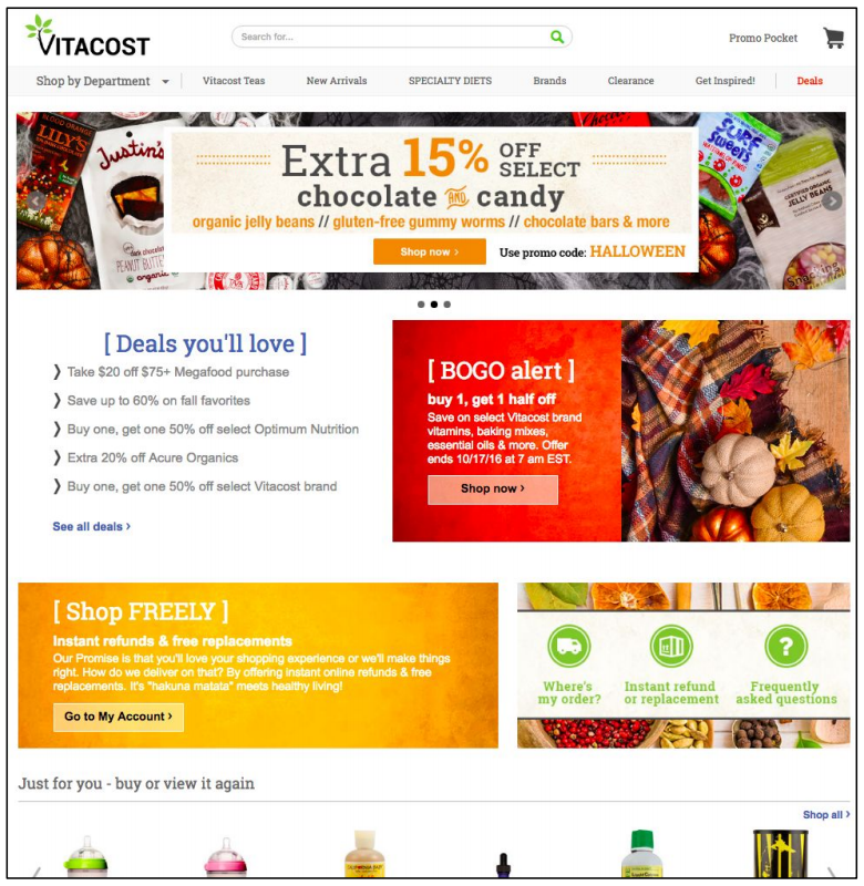
I liked the Colors and neatness/simplicity. Good layout and design.
User quote on Vitacost
Guideline #3. The transactional menu should be placed higher in the visual hierarchy than the content menu.
Consider which is typically more desired on a homepage: the FAQs page (content menu) or the site’s product list (transactional menu)? Remember: we’re talking about ecommerce homepages, so the focus is on selling and not on browsing.
Because transactional menus are accessed more often than content menus, they should be higher in the visual hierarchy. Follow convention to determine the best placement for a transactional menu:
- Typically it’s located front and center on the homepage, but can also be found as a vertical menu down the left side of the page.
- The transactional menu should be larger in size than the content menu.
- To draw attention to the transactional menu, place it in a colored banner contrasting the background.
- Alternatively, design a border around the menu for a similar effect.
- Leaving ample white-space around the transactional menu is another viable technique.
How NOT to do it
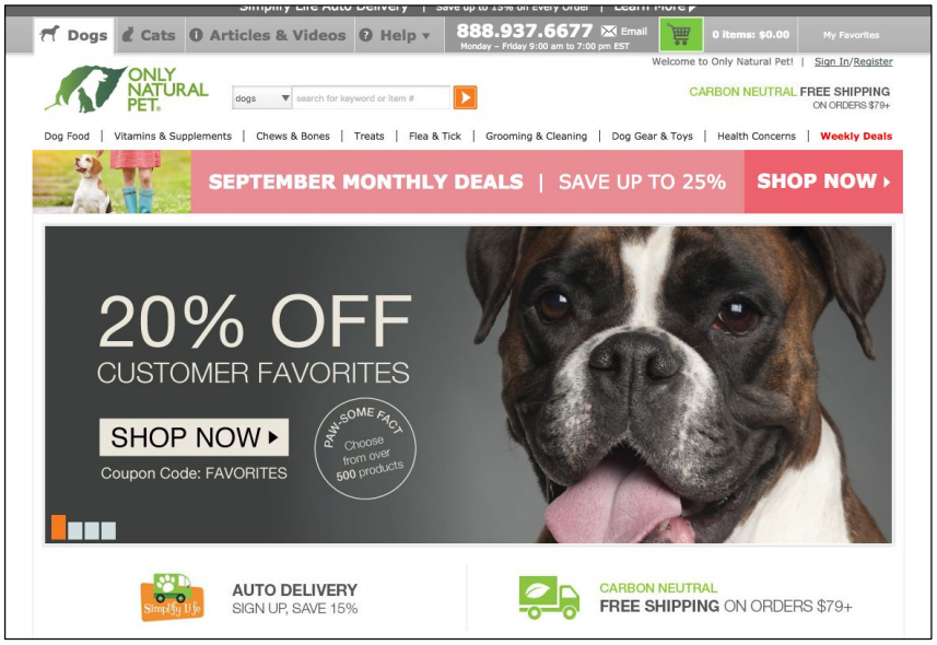
Only Natural Pet
The content menu (“Help” link and contact phone number) at the top of the page is prominently highlighted in a grey banner. Meanwhile, the small transactional menu below it isn’t accentuated in any way. This site’s menus violate visual hierarchy and conventional rules.
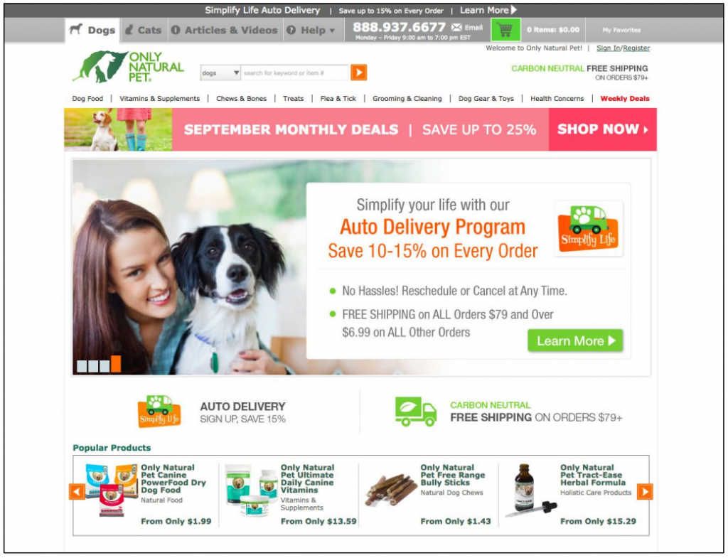
It was very cluttered on the homepage and on the Dog main page.
User quote on Only Natural Pet
Backcountry
The content menu in the top right is more highly contrasted (black text against a white background) compared to the transactional menu (grey text against a white background).
It is important to note, however, that the conventional placement of these menus does help with overall homepage usability.
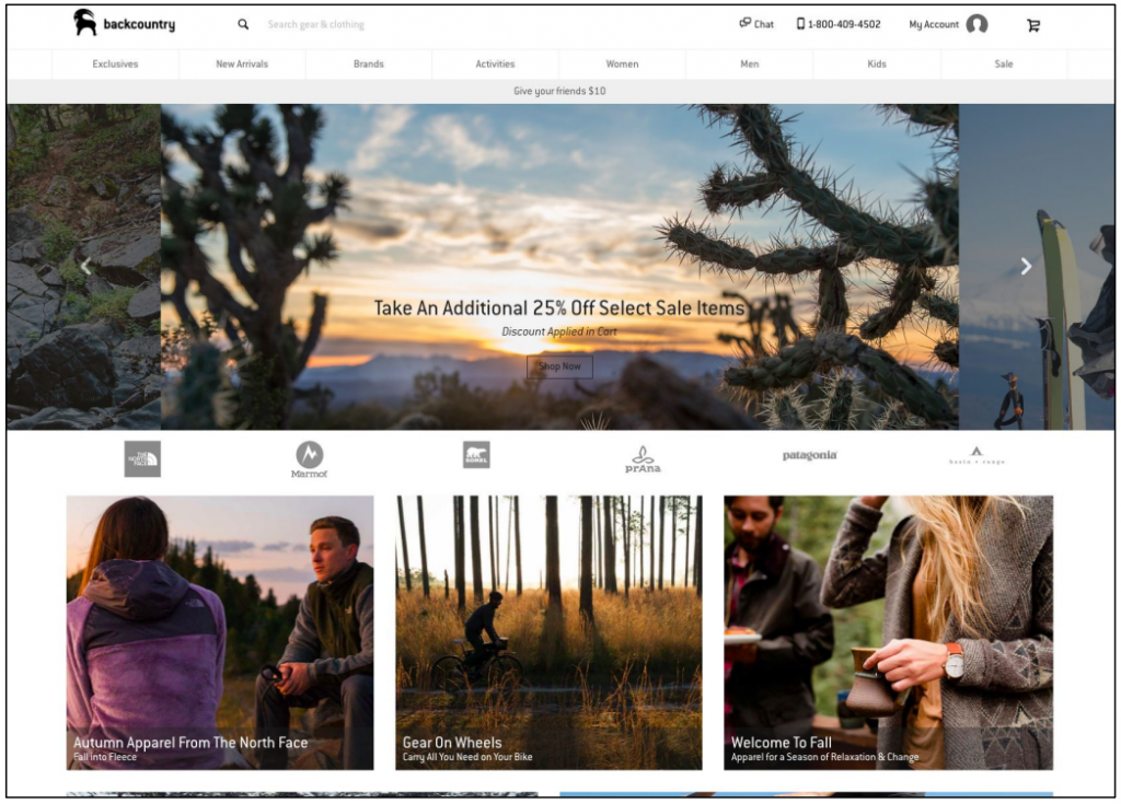
Instead of putting all the categories, like Men’s, Women’s, Children’s at the very bottom of the page it would be easier to see them as tabs at the very top of the page. I don’t like to have to scroll all the way to the bottom of the webpage for that info, it should be right at the top—the first thing you see.
User quote on Backcountry
How to do it RIGHT
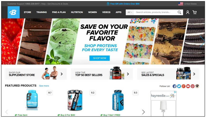
BodyBuilding.com
The content menu (in the dark grey banner at the very top of the page) is smaller and less noticeable than the larger transactional menu right under it.
Both the content and transactional menu are placed in conventional locations.
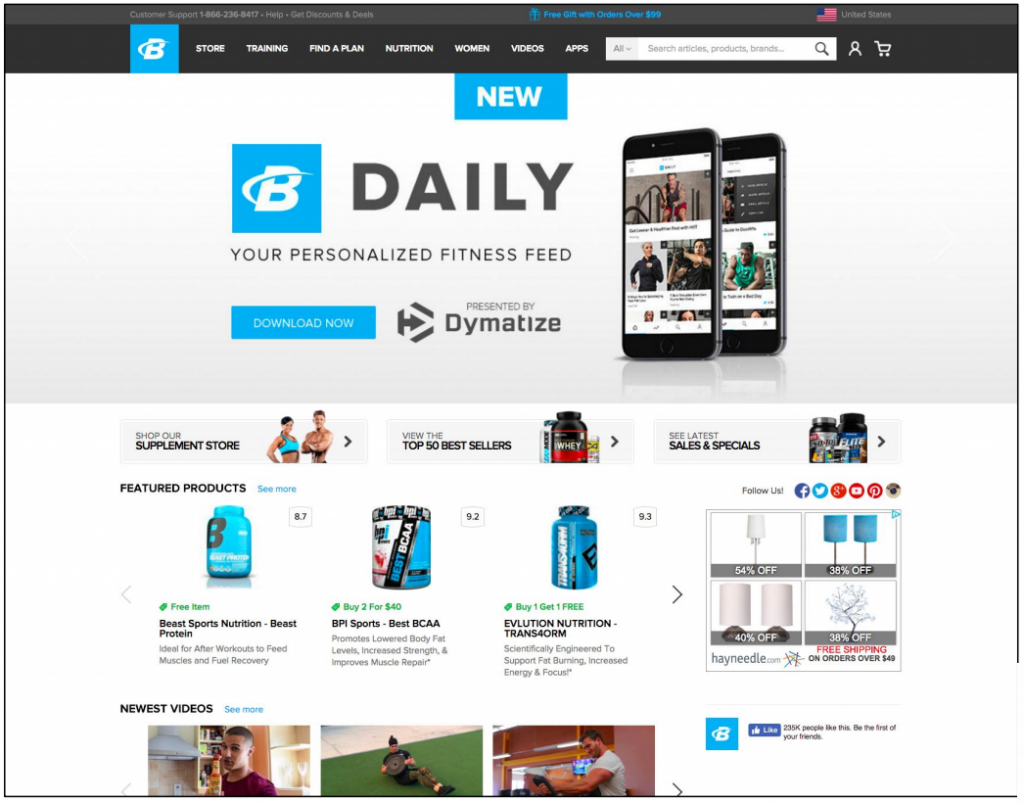
Clean interface, super easy to use” & “its very well organised everything is easy to find.
User quote on BodyBuilding.com
West Elm
The transactional menu is prominently highlighted in the black banner contrasting against the white background. The content menu is appropriately tucked into the upper right corner where one would expect to find it.
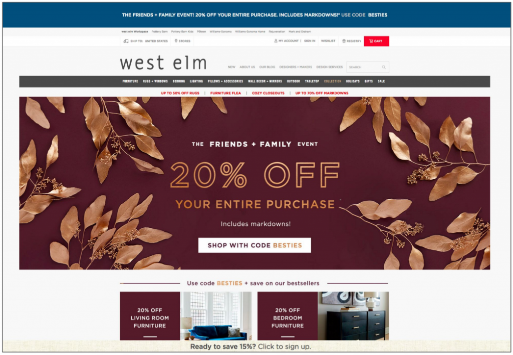
I liked how easy it was to navigate to the types of items I wanted to see. I liked how the filters were set up. Really made it easy to search for the item I wanted and it really wasn’t overwhelming when I was doing that so I really liked that part of my experience.
User quote on West Elm
Guideline #4. The value proposition should be located above the fold.
“Above the fold” is the part of the website that people see without scrolling down. The name comes from newspapers that were (many still are) folded in half, so newspapers put all the top news and pictures in the top half, above the fold.
When you are designing a long page, it’s critical that you prioritize content: serve the most important information first, least important last.
The value proposition is a central component of any homepage. It communicates the purpose of a site and how a company is different than — and superior to — its competitors. As a homepage cornerstone, value propositions should be placed above the fold where they have the highest chance of garnering attention.
How NOT to do it
Entirely Pets
The value proposition is found near the bottom of the homepage where few people will read it.
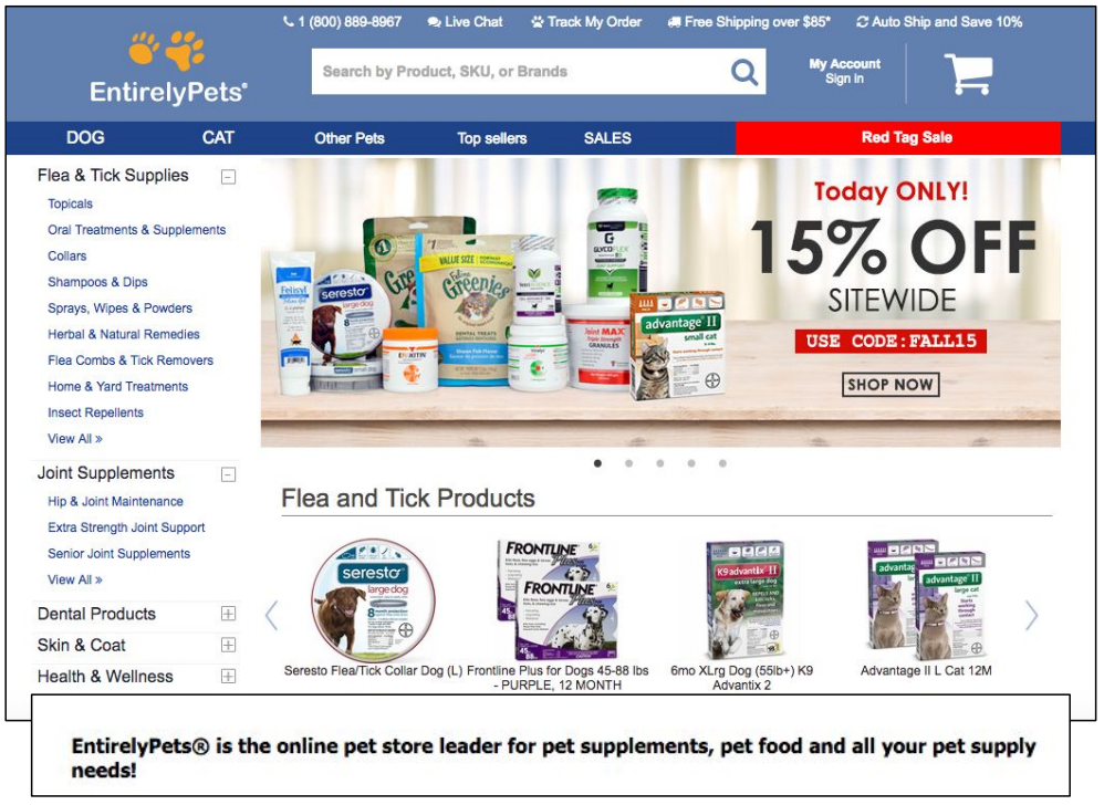
I don’t really see any benefits such as low prices, good quality, etc. While that might be true, they should focus more on what makes them stand out from their competitors!
User quote on Entirely Pets
Vitamin Shoppe
The value proposition (“quality matters: We vow to consistently deliver pure, high-quality dietary supplements you can count on.”) was found roughly three folds down the homepage.
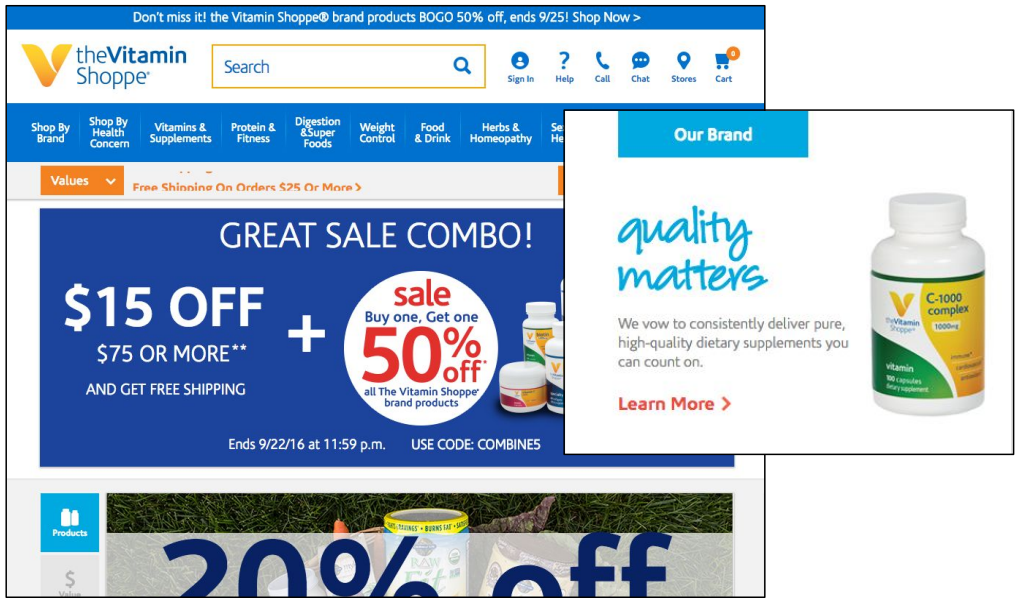
I didn’t see an indication of why I should buy from this website. I don’t at all. There didn’t seem to be a differentiating factor.
User quote on Vitamin Shoppe
How to do it RIGHT
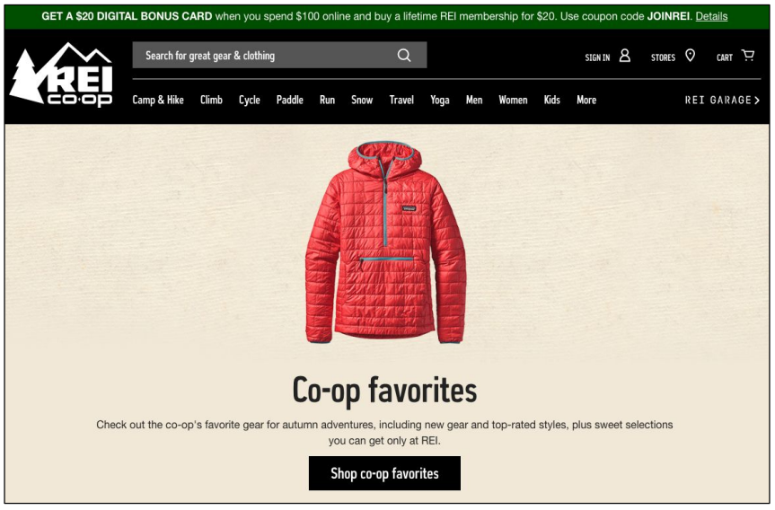
REI
This value proposition boasts new, top-rated, and appealing products exclusive to the company. It naturally attracts attention as one of the few bits of copy above the fold on the
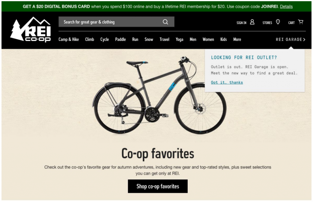
I understood that I should buy from this website because of the selection and prices.
User quote on REI
Vitacost
One cannot miss this value proposition. This banner says everything a potential buyer should know and it is designed with a good visual hierarchy.
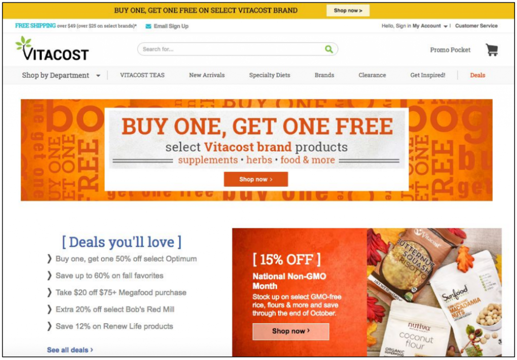
I saw a lot of sales on this site and so that made it pretty clear to me as to why I buy from this website instead of other ones.
User quote on Vitacost
Guideline #5. Call attention to the navigation menu by making it visible and color contrasted against the rest of the page.
The navigation menu is another critical homepage element on ecommerce sites. Many users ignore the contents of an entire homepage and go directly to the navigation menu.
Recently, web designers have been experimenting with hidden and partially visible navigation menus. However, research shows that hiding the navigation menu hinders user experience and content discoverability.
Unless you want to lead the visitor to take a specific action (landing pages), the navigation menu needs to be one of the most noticeable elements on the page.
Use a banner, box, or contrasting colors to execute this guideline.
How NOT to do it
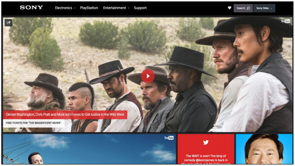
Sony
The navigation menu is not highlighted in any way. Noticing the navigation bar isn’t too difficult considering there’s barely any other copy on this atypically designed homepage. On conventionally designed homepages with more copy, however, the menu would be hard to spot.
Only Natural Pet
The top navigation menu, clearly highlighted in a grey banner, presents two main product categories (Dogs and Cats) along with some general information. Regardless of the effective banner, users may become distracted and confused by the secondary navigation menu below it.
This secondary navigation menu lists the subcategories for the Dogs product category. The navigational organization would be much more clear if the subcategories were presented as a drop-down menu instead.
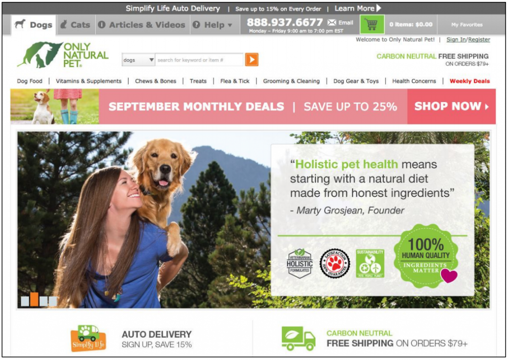
The sub-headers within the menu really blended in and did not stand out. The sub-headers would have been helpful if I would have realized they were there from the beginning, but since they blended in I didn’t notice them at first.”
User quote on Only Natural Pet
How to do it RIGHT
GNC
The black banner contrasted against the white background highlights the navigation menu. This homepage provides a great example of white-space use.
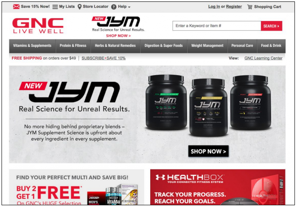
I like how everything was laid out and easy to understand. I didn’t have a ton of places to go to look for whey protein. It was clearly labeled.
User quote on GNC.
Guideline #6. If you have the space, display pictures or thumbnails next to product categories.
The job of the eyes is not only to get the information into the
– Mary Potter, MIT professor of brain and cognitive sciencesbrain, but to allow the brain to think about it rapidly enough to know what you should look at next.
Humans are intrinsically visual creatures. This is not news. UX researchers discovered that users can find items in a list approximately 37% faster when the items are paired with icons.
What’s more, Potter’s research found that it only takes 13 milliseconds for your brain to see and comprehend an image. Not convinced yet?
Images on a web page receive 94% more views than pieces of text.
Images are a fundamental component of ecommerce homepage design. In fact, we have an entire set of guidelines focusing on ecommerce images.
In a CXL Research study, we used to eye tracking to find out how long and what elements of a webpage people look at. The only element of the page that 100% of people looked at was the image.
Images are quicker and more innate than text. Displaying thumbnails next to product categories creates intuitive search flow and lowers cognitive load. (Avoid this guideline if your homepage doesn’t have space for complementary thumbnails.)
How NOT to do it
Sony
With such ambiguous categories, this homepage would greatly benefit
from complementary thumbnail pictures.
EntirelyPets
Gets straight to displaying the Flea & Tick category. Displaying parent categories with thumbnails on the homepage would be more clear and effective than the products from just one category.
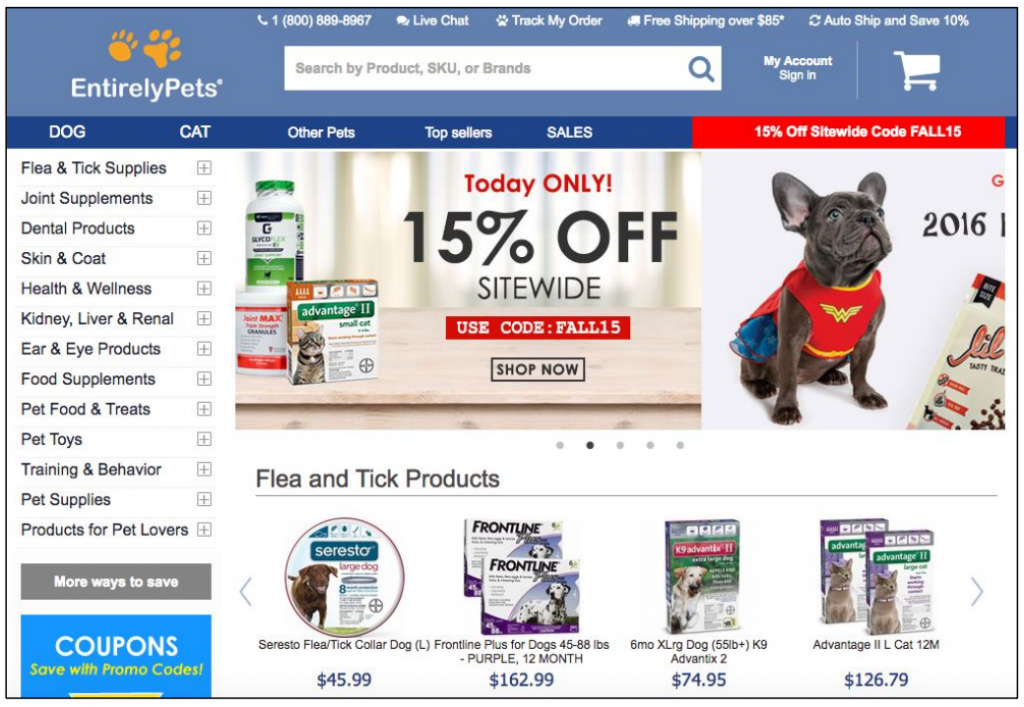
The site had a cluttered feel to me. I would clean it up a bit.
User quote on EntirelyPets
How to do it RIGHT
West Elm
These high-quality thumbnails clearly communicate what users will expect to find in each category.
I was easily able to find and add the specific items that I wanted,
User quote on West Elmbased on the pictures.
PetSmart
These simple thumbnails not only effectively communicate product categories, but advertise the seasonal Halloween collection. The dog food thumbnails are helpful for customers who can quickly recognize the bag that they’re used to purchasing.
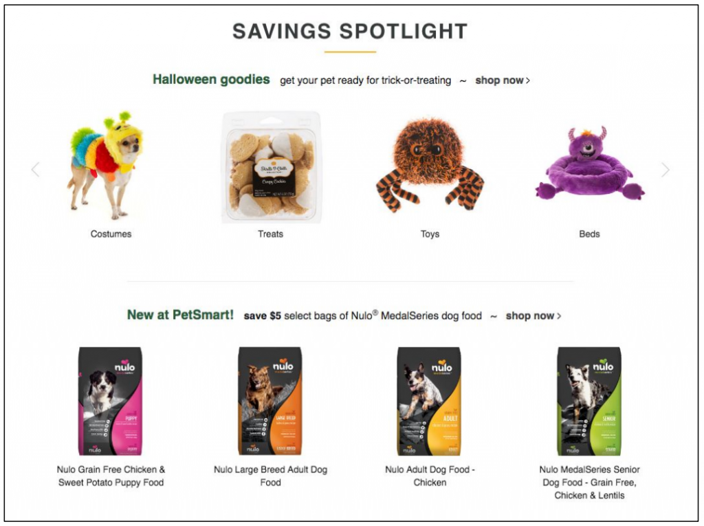
I liked the overall content, the good number of options and it is very well organized.
User quote on Petsmart
Guideline #7. Make separate content blocks look visually distinct, use white-space.
Content should be visually separate so that users understand what’s related and important and what’s not. (See also guideline #8.)
When designing an ecommerce homepage, this is particularly important: if you want users to take action, you should not overwhelm/overload them with cluttery information.
There are a couple of ways to visually separate content and make it look more “tidy”:
- White-space is sometimes referred to as negative space. Essentially, it’s the unmarked part of your site (e.g. margins, gutters and space between text/images). If you want to be sure something comes across clearly, be sure there is enough white-space surrounding it, eliminating the threat of distraction and miscommunication.
- Minimalistic lines, borders, and grids between can also create fenced boundaries between content blocks without looking too obtrusive.
How NOT to do it
Hatland
How to do it RIGHT
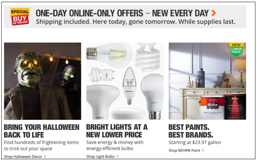
Home Depot
The grey box around the One-day only offers makes it clear that the promotions below it are not one-day offers.
Guideline #8. Avoid placing site promotions directly above product lists.
Similar to the previous guideline, this guideline aims to avoid confusion when discriminating between page elements. If a site promotion is displayed directly above a product list (typical on ecommerce homepages), there’s a chance that users will confuse the promotion as part of the product list.
For example, if a promotion “Select sweaters 20% off” is placed above the product list for all sweaters, site visitors might mistake this product list as being the “select” sweaters that are on sale.
It all depends on how the elements are designed. Displaying a promotion above a product list is acceptable so long as the two are clearly distinguishable.
Use borders or other visual cues that say: “these two things are not related”.
How to do it RIGHT
H&M
The 50% off promotion is visually contained in a box and explains that the discount applies to select items only so as to not be confused with the surrounding inspirational product categories.
The $17.99 leggings promotion clearly only applies to the Leggings product category.
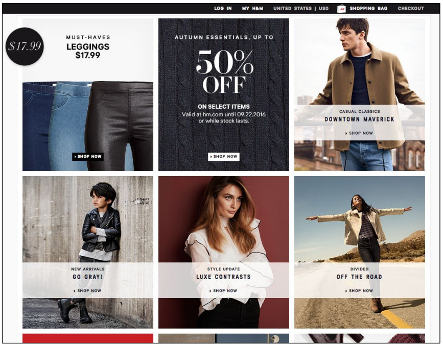
Clean, thoughtfully laid out. Easy to hone in on what
User quote on H&Mi’m looking for without being overwhelmed.
BodyBuilding.com
The buy-one-get-one 50% off promotion is visually distinct from the featured products.
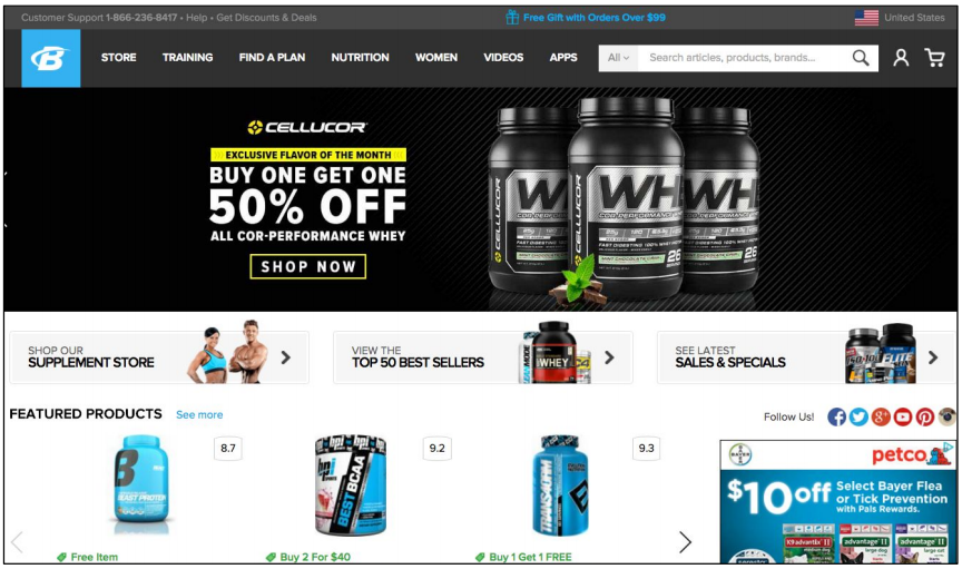
It is very well
User quote on BodyBuilding.comorganised everything is easy to find.
Guideline #9. CTA should be visually prominent.
A CTA should be color contrasted, surrounded by lots of white-space, and high in the homepage’s visual hierarchy. The CTA is often the most important element on a homepage (or landing page, or any page actually… it doesn’t have to be ecommerce).
For a CTA that users actually click on, design a button simply cannot be missed. Some ways to ensure your CTA is seen:
- Make it BIG—place it above the fold.
- Color contrast the CTA button against the background.
- Surround the CTA with white space.
- Make it the most—and first—noticed element on the page.
Avoid competing graphics:
- Large navigations that take up lots of space;
- Distracting fonts and colors;
- Moving images;
- Additional CTAs with high-contrast colors.
In 2000, the average human attention span in Canada was 12 seconds. By 2013, that number had fallen to 8 seconds, which also happens to be a second shorter than a goldfish. (You know, the fish notorious for being unfocused.)
Design the main CTA with distractions in mind.
How NOT to do it
Forever21
The large rotating slider featuring various GIFs takes up the majority of the space above the fold, offering no room for a CTA.
Bass Pro Shops
The “Shop Now” CTA is hidden in the right corner of the auto-rotating slider. It is small and not visually prominent in any way.
How to do it RIGHT
BodyBuilding.com
The “SHOP NOW” CTA is located above the fold, in the top middle of the page. It is brightly colored, and is surrounded by white space.
Loved the promotions: makes me want to buy from them since I feel like I am saving money!
User quote on BodyBuilding.com
Vitacost
Once again, the “Shop now” CTA is located in the top middle of the page, is brightly colored, and is surrounded by white-space.
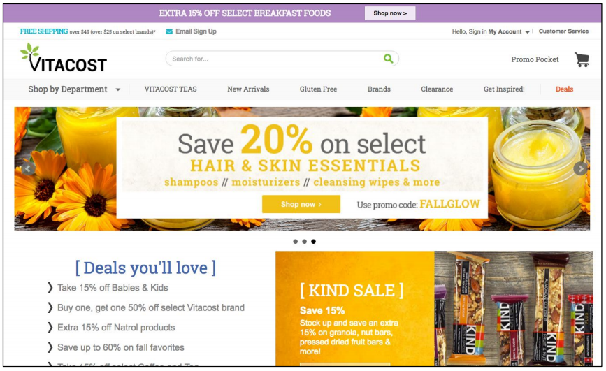
I saw a lot of sales on this site and so that made it pretty clear to me as to why I buy from this website instead of other ones.
User quote on Vitacost
Guideline #10. CTA buttons are usually better than links.
Buttons get more attention than links.
Affordances are clues about how an object should be used, typically provided by the object itself or its context. For example, even if you’ve never seen a coffee mug before, its use is fairly natural. The handle is shaped for easy grasping and the vessel has a large opening at the top with an empty well inside. The object ‘affords’ being picked up, meaning that it is able to be picked up. It also affords drinking out of. These are the things it’s designed to do, and that’s also what it looks like it’s designed to do.
Nick Pettit, Treehouse
Buttons are designed to be clicked. Their affordance communicates so.
Since the CTA is the most wanted action on a homepage, designing it as a button should be your chief approach. Especially if there are no other visible buttons on the page, the CTA will clearly be the next course of action for site visitors.
Wondering how to create an eye-catching CTA? Use embellishments and borders and check out this article for more button design inspiration.
How NOT to do it
L.L.Bean
The CTAs for Men’s Kids’ and Women’s categories within the image might be more noticeable—and would get more clicks—as buttons, not links.
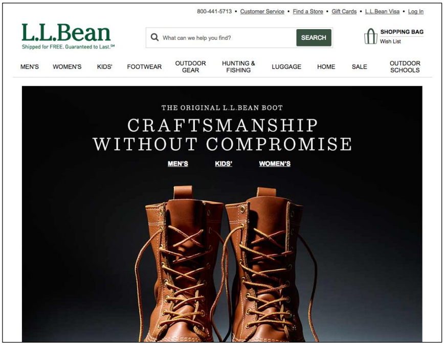
The home page was very long and i know they were showcasing their new boots as a seasonal item i would guess, but there was nothing that was showing me any collection or line of items that may just catch my eye in addition to what i came to the site to purchase.
User quote on L.L. Bean
How to do it RIGHT
REI
The noticeable “Shop co-op favorites” CTA is obviously a button and it does its job at getting noticed.
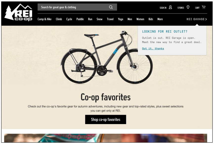
I liked that the site had a good appearance and it was easy to navigate through and find the items I needed to.
User qtuoe on REI
Lowe’s
The prominent white “Shop Now” CTA button tempts visitors to explore the kitchen appliances sale.
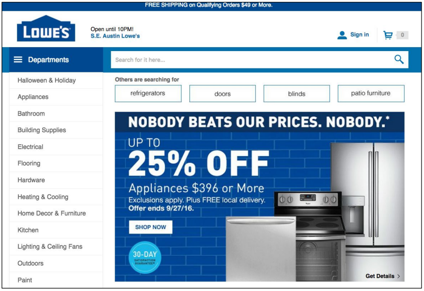
Not distracting at all. The site was well laid out, the items were prominent, not crowded and navigation was user friendly.
User qtuoe on Lowe’s
Guideline #11. If you have a secondary CTA, it should be less noticeable.
The purpose of a CTA is to draw attention to the most desired action on a page. When there are two or more CTAs, users are no longer being directed to the single most important action. Instead, it becomes their duty to mentally process each CTA and try to sift out differences between them.
The most important action should always be the most noticeable. This is especially important for ecommerce homepage design. Avoid the temptation to guide users to multiple offers or products (guideline #3).
A secondary CTA doesn’t need to be avoided at all costs. Instead, a secondary CTA should also be second in the visual hierarchy. The goal is to naturally direct users to actions and areas of importance without imposing cognitive load on them.
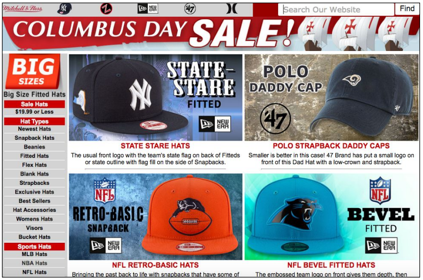
How NOT to do it
TigerDirect
This homepage displays five of the same CTAs above the fold. The power of the green CTA button is lost. Users won’t perceive it as a visual cue to take an action, but an annoying obstacle they need to get around.
Only Natural Pet
There are two Shop Now CTAs above the fold on this homepage. Although the CTAs are not identically designed, they are similar in other ways. They are both attention grabbing and advertise the same message (click this button to begin shopping with a discount).
Because the CTAs are so similar in appearance and message, users have to decipher the difference between the two before taking an actions. The buttons have lost their efficacy.
How to do it RIGHT
Home Depot
The foremost CTA, bright orange and in the middle of the page, invites users to Shop Halloween Decor. The secondary CTA, tucked in the top left corner, highlights the drop-down menu, where users can start browsing products and services.
REI
The first CTA (Shop co-op favorites) is unmistakably the most important on the page. The top green banner promoting REI memberships is less noticeable but delivers an enticing proposition to the users who take notice.
Guideline #12. Highlight the CTA with visual cues.
Add visual cues to draw attention and importance to the CTA. Through our own research with CXL Institute, we found that people spend significantly more time looking at a CTA when there’s a visual cue highlighting it.
Out of the cues tested in our research, we found the a hand drawn arrow directed the most attention to the CTA. The second most effective visual cue was a simple line pointing towards the CTA.
Not sold on the hand-drawn arrow? Here are some other visual cues to test out:
- a person looking at the CTA;
- a graphic pointing towards the CTA (can be a variety of shapes: a line, a triangle, etc.);
- a CTA that’s visually highlighted from the background (e.g. abright blue border that contrasting a white background);
- borders or boxes around the CTA.
How NOT to do it
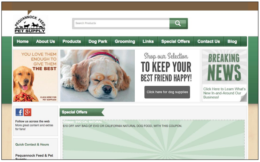
Pequannock Feed
The black CTA button “Click here for dog supplies” would greatly benefit from a few visual cues.
EntirelyPets
Once again, there are no cues or graphics drawing attention to the SHOP NOW button.
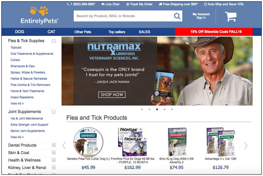
The site felt really cluttered. I would clean it up a bit.
User quote on EntirelyPets
How to do it RIGHT
Vitacost
Both “Shop now” CTAs are highlighted in a lightly colored box that contrasts against the background color.
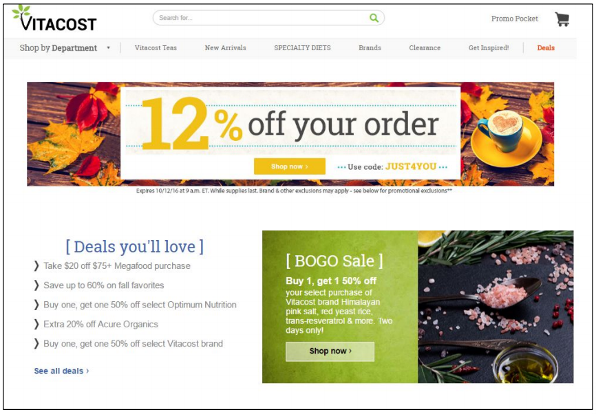
I like how the promotions were all displayed at the front page.
Usere quote on Vitacost