
What if there were a method—even a process—that you could apply to increase website sales? Wouldn’t that be swell? Well, there is.
I’ve turned it into a checklist.
This method works across all categories; it doesn’t matter what business you’re in. Take your website, assess it for any item on the list, make improvements, and your online sales will increase.
Table of contents
Start with measurable goals
Before we get started on the checklist, make sure you have actual, measurable goals in place (e.g. sell boots, get subscribers).
- If you don’t have a single focus for your site, it’s very difficult to achieve results.
- You cannot systematically improve what you cannot measure (or won’t notice it when it happens).
Start with specific goals and make sure your web analytics software is tracking those goals.
Personal opinions do not matter (much)
There’s no shortage of opinions in the world. People see the world from where they are and think everybody else is like them—”But I never click on ads!”; “Nobody shares their email!”; “I think it should be blue!”; and so on.
You are not the world. You are not your customer. Hence, you can’t draw conclusions about user behavior based on your personal preferences. Instead, focus on evidence-based marketing.
There are entire frameworks for testing programs, reams of academic research, and mountains of data.
The following checklist is a summary of key elements that will help you get more online sales (or whatever conversion you’re after).
11 strategies for increasing your online sales
Here’s the checklist for you to follow:
How to increase your online sales: 11 strategies
- Create buyer personas
- Drive relevant traffic
- Design a great site
- Create compelling value propositions
- Understand buying phases
- Reduce friction
- Focus on clarity
- Eliminate noise and distraction
- Engage visitors
- Add urgency
- Follow usability standards
Now let’s look at each item individually:
1. Create buyer personas
The more people feel that an offer is right for them, the more likely they are to take it.
Let me prove it to you. Let’s say you want to buy new running shoes. First, list:
- Your gender;
- Age;
- Weight;
- Where you normally run.
Now, would you rather buy running shoes that are suitable for all runners, or ones specifically designed for your gender, age group, weight, and type of use? That’s a no-brainer.
Your goal is to identify customer groups—their needs, wants, requirements and use cases. Buyer personas are essentially a specific group of potential customers, an archetypal person whom you want your marketing to reach.
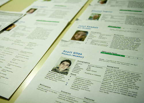
Optimizing your site for buyer personas diminishes the egotistical point of view and gets you to talk to users about their wants and needs. People care about themselves and answers to their problems, which is why buyer personas are so critical for marketing success.
Essentially, it’s about knowing whom you’re selling to, their situation, what they’re thinking, their needs, and their hesitations. If you know the exact person you’re selling to and the problems they have, you’re in a much better position to sell to them.
How to build a buyer persona
The truth is that most companies have only the faintest idea what lies behind the buying decision. We presume an awful lot. The buyer persona is a tool to help you see deeper into the buyer’s thinking.
Use customer interviews to map out different personas. Your personas will dictate every word and every image on your site. Your website layout, navigation, and general user flow should all come from personas.
Additional reading:
- The Buyer Persona Manifesto (PDF);
- How Buyer Personas will Rock the Conversion Rates of your Landing Pages (webinar).
2. Drive relevant traffic
This is about two things:
- Targeting the right people;
- Communicating the right message.
It’s almost impossible to sell people things they don’t need or want. If you sell laptops and somehow get me to your site, I won’t buy one. I already have one. What you offer is not relevant to me at that moment.
A key ingredient of high conversions is relevant traffic. If you stop wasting resources that drive irrelevant traffic to your site, you will increase sales. As a marketer, one of your constant jobs is finding the right marketing mix:
- The right media. Where to advertise/promote, free or paid;
- The right message. What to say;
- The right offer. How much money for what.
If you get the media right and the traffic is relevant (i.e. people are genuinely interested in what you have to offer), you’re instantly doing better.
Next, you have to figure out which value proposition works best for this audience. This is when you go back to Item 1 and customer personas.
Learn why people need your product, which problems it solves, and reflect it back to them. When your target group feels understood, magic happens.
Additional reading:
- What to Call Your Call to Action (blog post);
- How to Use Voice of Customer Research to Boost Conversions (blog post);
- How to Design User flow (blog post).
- Building Data-Driven Personas (online course).
3. Design a great site
In a nutshell: Beautiful design sells better than ugly design. Beautiful does not mean laden with bells and whistles—often, it’s quite simple. Beautiful design looks great and works well.
BMW, Apple, and Nike don’t throw millions at design for fun. They know it sells better. In fact, design (how it looks and how it works) is a key reason people buy from them.
How do you know if your site is ugly?
If you built your site yourself—and you’re not a designer—it sucks. Get a new one.
If you use cheesy stock photography—like customer service people with headsets or suits shaking hands—the rest of your site probably sucks, too. Don’t use the “women laughing alone with salad” style:

If you had a freelancer build it who charged you $2 per hour, it sucks. Quality craftsmanship always comes at a fair price—no matter what country they’re from.
The more you know about something, the better you’re able to tell the difference. Have you seen The Devil Wears Prada? There’s this scene where Anne Hathaway’s character mocks the fashion people who think two identical belts look “so different.”
Be it dogs, fashion, or web design, you have to spend years analyzing them to separate the good from the bad, and know exactly why. (If you want to commit to a feature-length explanation of this concept, watch Who the #$&% Is Jackson Pollock?)
I’ve seen too many butt-ugly websites that their respective owners thought looked great. Yes, beauty is in the eye of the beholder—to an extent. But, mostly, it’s not. Your site either is ugly or it isn’t.
There are exceptions, like Craigslist, but those are outliers. Craigslist started when butt-ugly was the standard, and later made bare-bones design its “thing.” If they started that way today, nobody would use it.
Visual hierarchy and user guidance
Your website design has another important role—it communicates what’s important and what the user should do next.
Every page on your site should have a most-wanted action, the number-one thing you want people to do on that page. This is where visual hierarchy comes in.
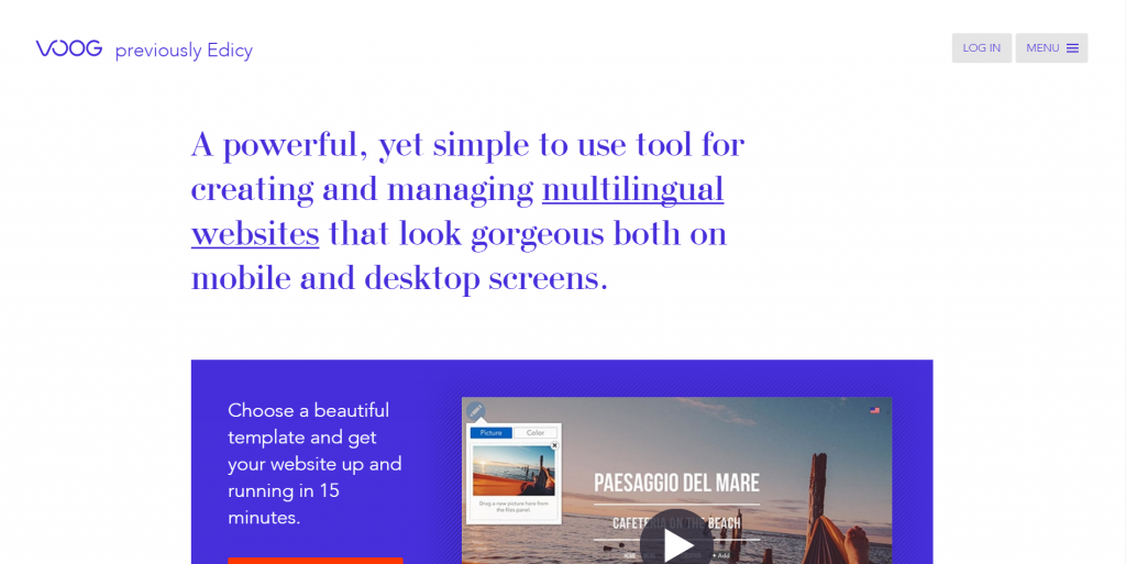
Look at this screenshot:
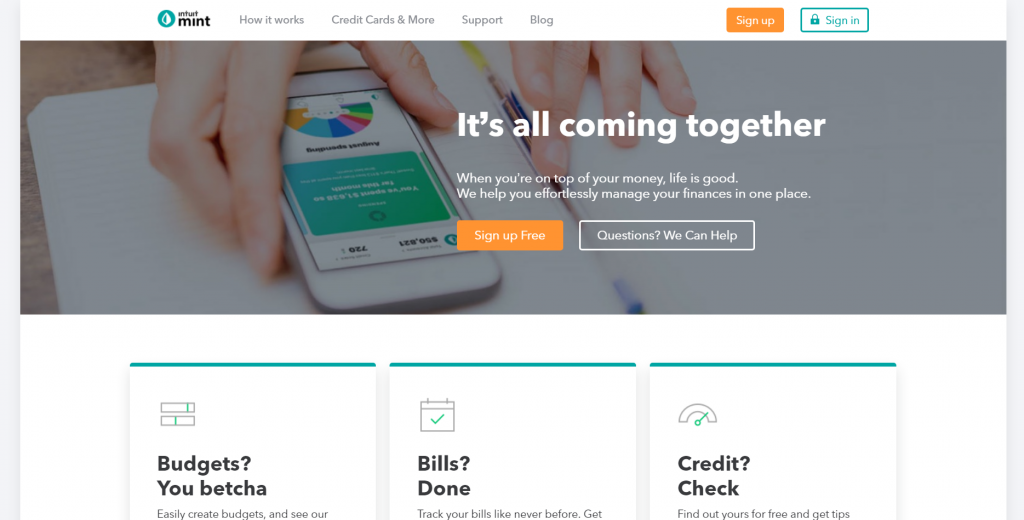
Now, what was the order of your eye movements? What did you notice first, second, last? The first two were probably the headline (“It’s all coming together”) and the image, followed by the explanatory paragraph and call to action (“Sign up Free”).
It’s not a coincidence. They wanted you to see those thing in that order. And what’s equally important is what you didn’t notice—the navigation and other secondary information that’s less important.
Additional reading:
- 8 Web Design Principles to Know in 2019 (blog post);
- Design like Jagger or why you shouldn’t design your own website (unless you’re a designer (blog post);
- 10 Useful Findings About How People View Websites (blog post);
- 8 Things That Grab and Hold Website Visitor’s Attention (blog post);
- UX for Marketers (online course);
- Fundamentals of Persuasive Websites (online course).
4. Create compelling value propositions
A value proposition is a promise of value to be delivered. It’s the main reason a prospect should buy from you (and not from the competition).
In a nutshell, a value proposition is a clear statement that:
- Explains how your product solves customers’ problems or improves their situation (relevance);
- Delivers specific benefits (value);
- Tells the ideal customer why they should buy from you and not the competition (differentiation).
Your value proposition should be the first thing that visitors see on your homepage, but it should also be visible at all major entry points to the site.
If your main landing pages (homepage, product pages, etc.) don’t have a value proposition or users don’t understand it (see Item 7), you’re losing sales.
I’ve written an extensive post on creating value propositions along with a bunch of examples. You should read it.
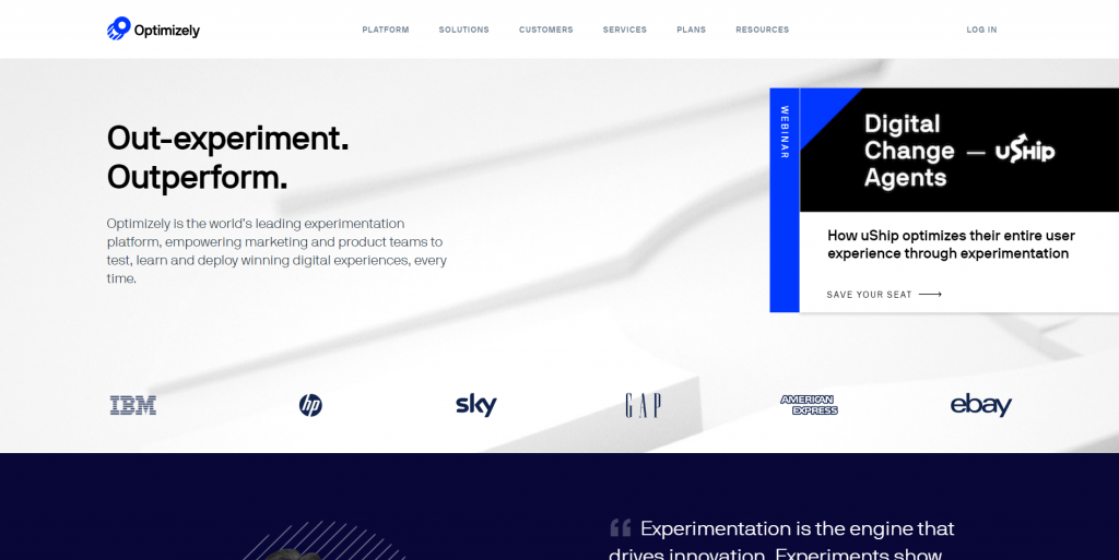
Optimizely does it well:
- What is it? A website experimentation platform.
- What’s the benefit? Outperform competitors.
- Who’s it for? Marketing and product teams.
5. Understand buying phases
Let’s say you surf the web and come across this site:
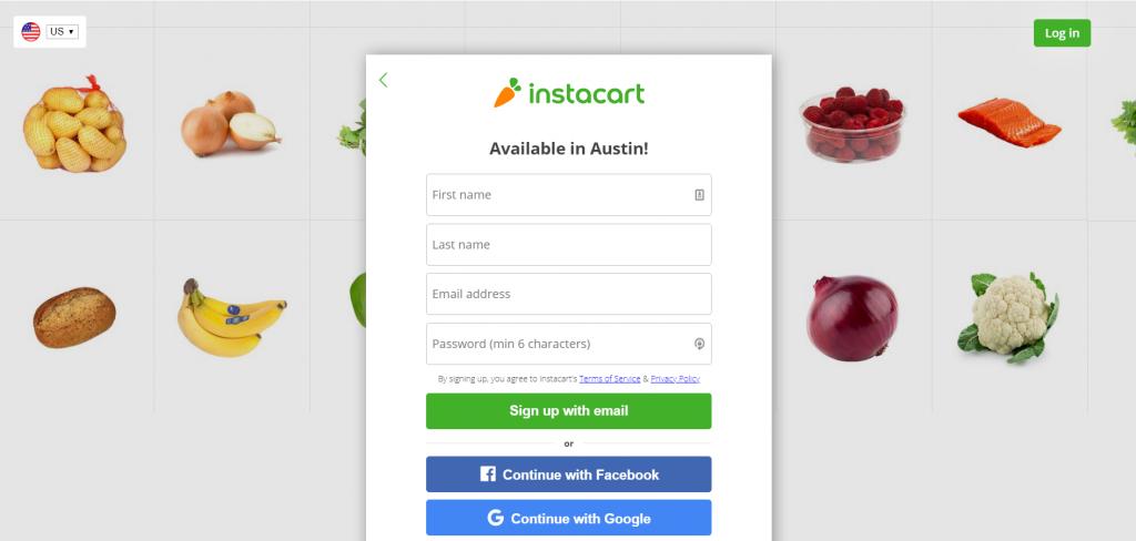
What stands out is that they go straight for the sale—asking you to register right away. But they’ve give you zero information about who they are or why you should register.
Understanding buying phases is all about understanding how people work. Largely, customers fall into three groups:
- People who have a problem or need but don’t know it;
- People who are researching different options, comparison shopping;
- People who have made a decision to buy.
Depending on your industry, there may be a few additional groups. Use customer interviews to learn about the different phases your buyers are in.
You have to sell differently to each group. The first group is pretty much hopeless. It’s difficult to sell them anything since you need to sell the problem first.
The other two groups—those researching and those who have made a decision—warrant added attention.
People who are researching
In most niches, these people form the majority. The main question you need to answer is “Why should I buy from you?”
If you don’t have a compelling value proposition, you’re going to lose. If you don’t make it clear how you’re better or different from the competition, you’re going to lose—especially if you’re not the cheapest.
Humans don’t like to think. They like to compare products by looking at a couple of simple parameters, like price and maybe something else (e.g. for web hosting, server space).
If people can’t understand the differences between your product and that of your competitor, they’re going to choose based on price: “If it’s all the same, why pay more?!”
Do this:
- State your advantages and differences on your homepage and product pages.
- If you sell mass-market products (e.g. Sony TVs, Dell laptops, Gucci perfumes) and you’re not the cheapest, clearly communicate the added value of your higher price.
Researchers are looking for information to help them decide. Your job is to give them what they need to feel good about buying. If you rush the sale—ask for a sign-up before they have enough information, you will scare them away.
Here’s a good case study for burying your sign-up or buy button. One company removed the sign-up call to action from the top of their homepage, and signups increased 350%.
People who have decided
After conducting their research, some people will come back for the transaction. They’re looking for clearly visible call-to-action buttons (e.g. “Add to cart”) or links with trigger words (“Sign up”).
Your job is to make sure those are easy to find. Conduct “think out loud” usability testing to test it.
6. Reduce friction
Whenever you ask people to commit to something, there’s friction. It’s impossible to remove all friction from a business transaction. You can only minimize it.
Friction includes all the doubts, hesitations, and second thoughts people have about giving you money for a product.
Is it really worth the money? Will it break? Can I trust this site? Will it work? What if it doesn’t fit? Is this a scam? Is it the right choice for me? Will she like it?
The way to convert an infidel to a believer is to address all doubts and give them full information—so they can convince themselves.
Elements that add friction:
- Long and/or complicated process. These are “get a quote” forms with 10 fields, 3-page applications, etc.
- Websites with horrible usability. People don’t understand how to buy or can’t find any contact info.
- Anonymous site. No names, photos, phone numbers, or physical address is visible. If you’re trying to hide, you must have something to hide.
- Ugly, amateur website. See Item 3!
- Insufficient evidence. You make a bunch of claims but don’t back them up.
- Insufficient information. A chair: 2 feet tall, black, $5,000. There are thousands of sites provide hardly any information about the products they sell. Research says 50% of purchases are not completed due to lack of information.
- FUDs. Fears, uncertainties, doubts. The way to overcome these is to address those FUDs in your sales copy. Interview your customers to find out what they are.
One classic way to boost credibility is to use testimonials:
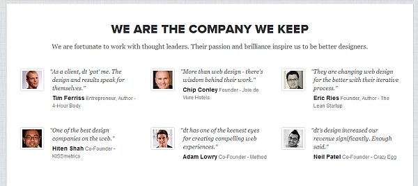
Credible testimonials are with full name and photo, from celebrities and people like your buyers. Anonymous testimonials are not believable.
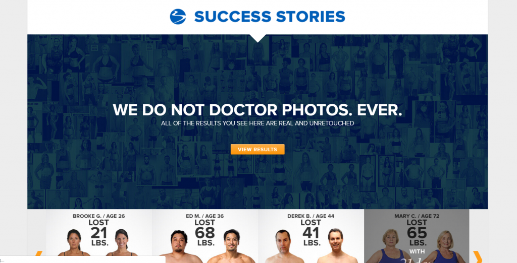
Fitness sites are easy examples. People are skeptical that any fitness program actually works. “No one can achieve those results in three months,” you can imagine everyone saying.
So, programs like Beachbody (which includes P90X) add tons of testimonials with real people and plenty of visual evidence. They make a point on their homepage to highlight that customers’ results are legitimate:
Make a list of all the FUDs that your target group have, then address them with evidence.
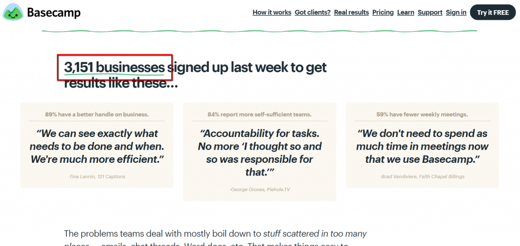
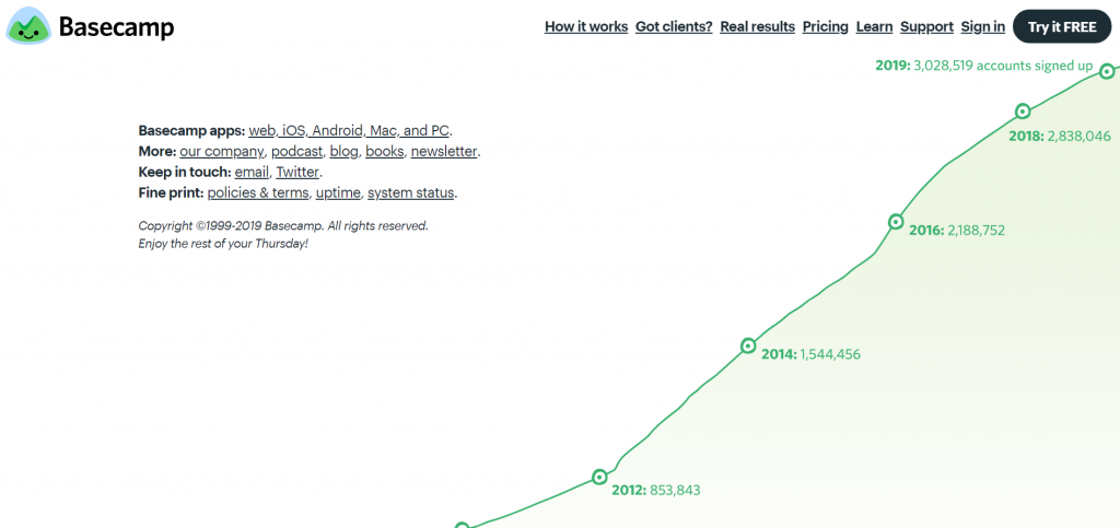
Social proof is powerful. Show impressive numbers, like how many happy customers you’ve got. Nobody wants to be the only idiot buying your stupid product.
Basecamp doubles down on this concept, offering a weekly counter with testimonials and a multi-year growth chart on their homepage:
7. Focus on clarity
People won’t buy what they don’t understand. In fact, people fear what they don’t understand. Racism and xenophobia come from the fear of the unknown.
Whatever you’re selling, the buyer is a human. It doesn’t matter if it’s your granny or a top executive from IBM. They’re all humans. If the text (or video) on your site is easy to understand and written compellingly, your conversions will go up.
Years ago, a friend of mine blogged about an email he received. I think it’s a good example of what NOT to do.
Hi Deniss,
My name is […], Senior Director of Feedback Management at [..]. I wanted to let you know about some information that could impact on your role at […]. A recent […] study, “Customer Feedback Management: Leveraging the Voice of the Customer to Amplify Business Results,” revealed that companies successfully leveraging Voice of the Customer (VOC) programs accomplish quantifiable year-over-year performance gains including increased annual revenue and higher customer satisfaction ratings.
[…] I will be hosting a webinar, based on the study’s findings […]
I hope you’ll be able to join us for what is sure to be an informative webinar that will yield valuable take-aways for your organization!
You can avoid jargon by using the “friend test.” Read the text on your website out loud and imagine it’s a conversation with your friend. If there’s a word or a sentence you wouldn’t use, re-write it.
What does this company do?
Pretty clear, isn’t it. No fancy-schmancy stuff. You don’t need big words. You need to be clear. If the text on your website isn’t fun to read and takes effort to understand, you’re doing it wrong.
Same goes for video. Here’s a good example of a clear presentation by Nest:
It’s a thermostat! This could be the most boring technical video of all time. But it’s not. And it worked. Nest became so popular that Google bought it in 2014 for $3.2 billion.
8. Eliminate noise and distraction
There’s an adage for outdoor billboard design—it’s ready when there’s nothing left to remove. In a way, this also applies to websites.
The more choice you give people, the harder it is to choose anything. When there are too many options, it’s easiest to choose nothing at all. There’s tons of research to confirm this. In addition, more choices make us unhappy.
If you have a ton of products, you have to provide great filters to help people narrow down their options.
Noise and distraction aren’t just about how many products you have. It’s about how busy your layout is, how many competing design elements there are, how many things—in total—ask for user attention.
The “rule of noise”
The closer you get to closing the sale, the fewer things you should have on your screen. Once users get to the checkout, you shouldn’t have anything on the page that doesn’t directly contribute to the conversion.
Look at the Amazon checkout screen. No sidebar, no menu, no related products. They just really want you to click the “Place your order” button:
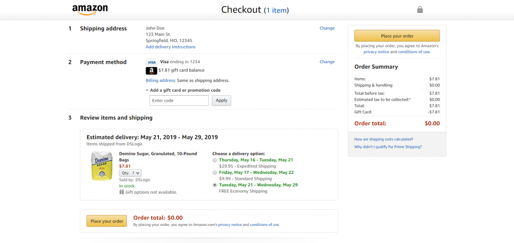
Identify a single-most wanted action for each screen, then make sure the important stuff stands out. Don’t have anything in the layout that isn’t absolutely necessary. Simple works.
9. Engage visitors
What’s your conversion rate? 1%? 3%? Even if it’s as high as 5%, that means that 95% of visitors don’t buy anything. They came to your site—maybe even through paid advertising—bought nothing, and left.
Now what? Have you lost them for good? Not necessarily. In many cases, the best way to increase online sales is to avoid one at first. Remember buying phases? Instead of asking for money right away, engage users and, ideally, collect their email address so that you can keep talking to them.
As a general rule, the more expensive and/or complicated the product, the more time people need to make a decision. If you’re selling cars or computers, it’s unlikely that someone will buy one online on their first visit. This is why you should get their email first, add value, prove your expertise, get them to like you, etc.—all before you ask for the sale.
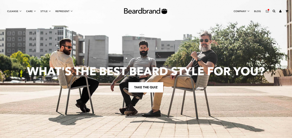
Beardbrand wants to sell you products to manage your facial hair. Even with an inexpensive product, they still go for an email first, asking users to go through a quiz funnel on their homepage:
While email is the best way to go, you might also go for
- Social media follow (Twitter, Facebook etc.);
- Immediate product trial;
- Sweepstakes (“Enter to win!”).
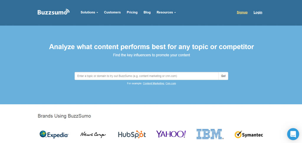
Buzzsumo lets you just enter any topic or domain to see their product in action:
Additional reading:
- 14 Steps to Building Sign-up Forms That Convert (blog post);
- Optimizing Mobile Forms for More Conversions (blog post);
- Lead Magnets: Email List Building on Steroids (blog post);
- How to Get Subscribers to Actually Consume Your Content (blog post).
10. Add urgency
Urgency is a powerful motivator—if done well. All of us have seen something like this:
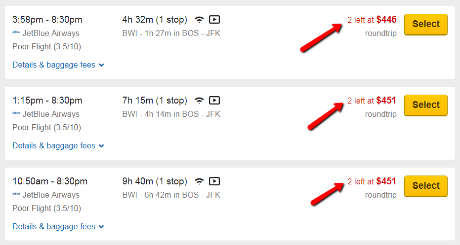
There are three ways to create urgency:
- Quantity limitations. “Only 2 tickets left at this price!”
- Time limitations. “Early-bird pricing ends July 1!”
- Contextual limitations. “Get a gift now for Father’s Day!”
As long as the reason for the urgency is believable, it will work. Too many marketers abuse it and add urgency to everything. OpinMonster, for example, suggests that there’s a time-limited offer any time you visit their pricing page:

When it makes sense to use it, it will produce a ton of results.
11. Follow usability standards
If your site is difficult to use, people won’t use it. Nobody will bother to figure out stuff. The best websites provide a seamless experience—everything is intuitive; people don’t have to think.
Luckily, it’s not the 1990s or early 2000s anymore, when usability was awful. Check out these fantastic usability checklists for different sections of your website.
Compare your site against all of them and make necessary corrections.
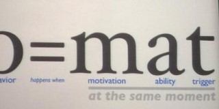
Conclusion
More than a decade ago, Jakob Nielsen proposed a formula based on four variables:
- Business results;
- Visitors/traffic;
- Conversion;
- Loyalty.
Business results, the formula suggested, were the product of the other three variables: B = V × C × L.
If you want to double your results, you can either double the number of unique visitors (very expensive), double the conversion rate (possible, but increasingly harder), or double repeat purchases.
As Nielsen foresaw:
Whereas we might aptly call the period 2000–10 the conversion decade for website usability professionals, 2010–20 will be the loyalty decade.
That prediction has held up. If you want to increase website sales right now, focus on conversions or driving traffic. If you want to increase sales online in the long run—well past 2020—focus on loyalty.
Related Posts
-

.... That concludes the list. Instead of looking for a quick fix, you have to…
-
In today's review I'm assessing whether websites in question could do anything to better get…
-
In today's review, Tommy is assessing the visual complexity of a cabinet hardware eCommerce site…
-

Do you want to make your website better? There are many ways to optimize a…

Thx for your Checklist! Great Stuff =) And no… this isn’t a spam bot!
Great checklist. Thanks.
Thank you for taking the time to break this all out for us just starting in business and with online sales. I have found this little article to be very useful.
This post deserves a billion of positive comments…
This is my absolute reference when I’m starting something.
Thank you ever so much for this one…
I have been browsing online more than 4 hours today, yet I never found
any interesting article like yours. It’s pretty worth enough for me. Personally, if all webmasters and bloggers made good content as you did, the internet will be a lot more useful than ever before.
Thanks a lot for such a wonderful info…. I was able to get most of the answers for my sales…
Great article man. Thanks fro such a good post. You are awesome….. Like your post :)
Awesome selection of best practises, ideas, checklists. I printed this article on paper as it’s really that useful!
Interesting Article with wonderful ideas. Good work !
Terrific Web page, Continue the fantastic job. Appreciate it!