
Many modern psychology researchers have suggested that the human brain has three (figurative) parts:
- The new brain – thinks (rational data)
- The middle brain – feels (emotions and gut feeling)
- The old brain – decides (takes input from both and pulls the trigger)
Until fairly recently, many fields of study (notably economics) believed that our decisions were largely rational. However, neuromarketing as a field has suggested that the old brain, the old primitive “fight or flight” part, makes most of our decisions.
So how do we influence the old brain for greater growth?
Patrick Renvoise and Christophe Morin wrote a book called Neuromarketing about this in 2005.
The book is a gold mine of information, consisting of both academic research and case studies. Many are classic advertising examples, but you can easily apply these to your website.
In the beginning of the book, they offer a sort of framework for marketing to the old brain. It consists of “the only 6 stimuli that speak to the old brain.” We’ll outline those here and show of examples of the triggers in action.
You’ll find that these stimuli are used in many of the most effective ads and websites. (Note: quotes on each point come from the Neuromarketing book)
Table of contents
1. Self-Centered
“The old brain is responsive to anything pertaining to self. Why? Because it’s completely self-centered. Think of the old brain as the center of “ME,” with no patience or empathy for anything that does not immediately concern its own well-being and survival. “
So what the authors really mean here is ‘customer-centric’. What kills conversions is being too self-centered about your company and features. People care more about what you can do for them.
As the authors write, “this stimulus explains why 100 percent of your message as a seller should focus on your audience, not on you. If you take a critical look at your typical presentation, website, or even your brochures, you will find that a lot of content relates to your business, your people, your history, your values, and your mission statement – none of which is of any particular interest to the survival brain of your audience.”
There’s a good reason so many copywriters tell you to sell benefits, not features. Features are fairly objective, where benefits fully relate to your audience, and they help solve a problem that they have. They invoke their self-centered desire to solve their problems (not your conversion rate problems).
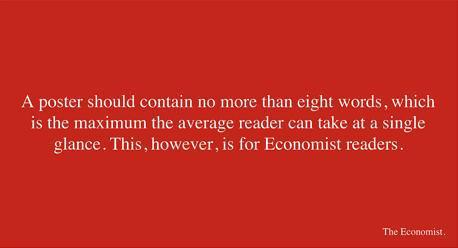
And also, the greatest ads throughout history have all appealed to our most personal and emotional desires. This ad from the Economist is designed to make the reader smile and revel in their intelligence…
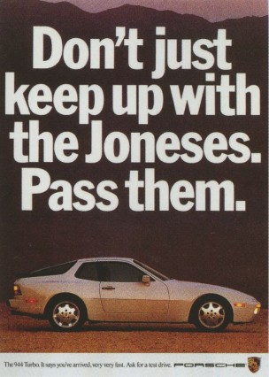
This old Porsche ad is all about the benefits:
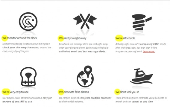
Online, it’s often a lot more subtle. Customer-centric copy most often says in plain language what the offering can do for the customer. Sometimes it’s as simple as changing a pronoun. Joanna Wiebe from Copyhackers gave the following example. Here’s the first version:
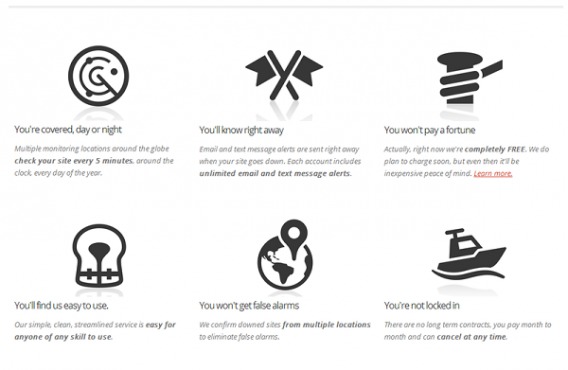
And here’s the customer-centric version…
2. Contrast
“The old brain is sensitive to clear contrast, such as before/after, risky/safe, with/without, or fast/slow. Contrast allows the old brain to make quick, risk-free decisions. Without it, the old brain enters into a state of confusions leading to delayed decision or no decision at all.”
The contrast principle states that, “We notice difference between things, not absolute measures.”
In conversion optimization, contrast is generally used in the context of design, notably that of call to action buttons. The heuristic is that you should make your CTAs contrast with the dominant design of your page in order for them to stand out. As Unbounce put it, contrast is “Using color to draw attention to an element on your page. A quick rule of thumb is to look for the dominant hue of your page and pick its contrasting color for your call to action.”
But more often, contrast is used in sales to show a stark difference between product offerings or results. This could be implemented in a few ways, such as…
- Showing you a poor quality product alongside the one that they want you to buy.
- Showing you a wonderful product that is way beyond your reach (anchoring).
- Selling add-ons and cross-sells. When you buy an expensive car, the optional extras look so cheap in comparison.
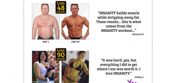
This concept is not at all novel. Direct marketers have been using this for years, especially those in the fitness industry. Insanity does this well:
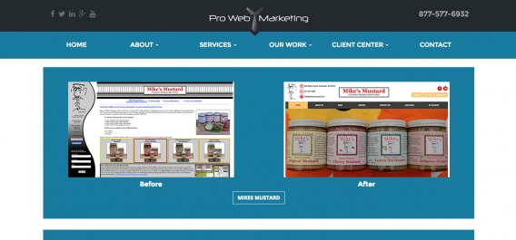
It doesn’t always have to be before/after fitness photos though. This marketing/design firm shows websites before and after they worked on them:
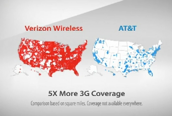
Marketers will often invoke a comparison with a competitor, usually to show a contrast between a competitor’s weakness and their own strength. Here’s an example from Verizon:
3. Tangible Input
“Since the old brain is not qualified to process written language, the use of words – especially complicated ones – will slow down the decoding of your message and automatically place the burden of information processing onto the new brain…(The brain) is constantly scanning for what is familiar and friendly, concrete and immutable, and recognizable. The old brain cannot process concepts like “a flexible solution,” “an integrated approach,” or “scalable architecture” without a great deal of effort and skepticism.”
Good user experience can often be summed up in a sentence: Don’t Make Me Think. Too often, groupthink or a HiPPO leads to convoluted, jargon-filled copy that makes no sense to real humans. And yes, real humans are behind B2B purchasing decisions, too.
As Peep wrote, “Even if you sell B2B products, there’s always a person with a name and an identity reading your copy and making decisions.”
So don’t write vague stuff like this…
Write clear, value-based headlines like this…
But of course test it on your own site. Perhaps enterprise software needs some vague language that sounds important to convince a committee…who knows? Point is, the brain likes the simple, the familiar, the tangible.
4. The Beginning and the End
“The old brain enjoys openings and finales and often overlooks what is in between. Such a short attention span has huge implications on how you as a seller should construct and deliver your messages. Placing the most important content at the beginning is a must, as is repeating it at the end. Anything in the middle of your message will be overlooked”
Serial position effect is “the tendency of a person to recall the first and last items in a series best, and the middle items worst.” It’s made of two parts:
- Primacy effect
- Recency effect
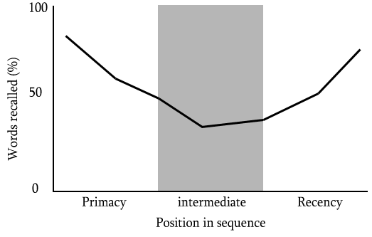
The primacy effect tells us that our brain views items at the beginning of a sequence as more important or significant than the rest. We’re more likely to remember them, as well.
So if you want something to stand out in your copy, use it at the beginning. Don’t bury the lede in the middle of the page. Repeat the message several times, as well.
The recency effect tells us that our brains also remember things better if they occur at the end of a sequence. Therefore, in sales copy, you should also repeat your most important message towards the end to reiterate what you want to stand out.
Here are some other ways that the serial position effect can be used in marketing:
- Show/demonstrate the products sequentially.
- Placing the product first on a multi-product display.
- Draw visual attention to that product so that it is viewed first.
In addition, the links at the top and bottom of a menu get the most clicks, so use that space wisely to send people where you want them to go.
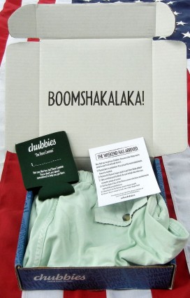
Recency also suggests the importance of the last customer touch point. I was so thrilled when Chubbies sent me a well-designed and funny packaging with some free gifts and a letter…
5. Visual Stimuli
“The old brain is visual…Since humans cannot rely on the speed at which the new brain processes information, we are hardwired to make decisions that are mostly based on visual input. By using visual stimuli, you ensure that you tap into the processing bias that the brain has developed over thousands of years.”
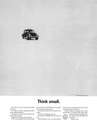
Of course visuals matter in advertising. In a noisy world filled with marketing messages, you need to disrupt people’s attention, and good visuals do that. Here’s a famous ad from Volkswagen:
And online, too, good visual design matters. It’s what creates first impressions, and first impressions are incredibly important. In fact, it’s been shown that it only takes people 50 milliseconds to judge whether or not they like a website. Google research actually showed many decision judgements only took users 17 milliseconds to form.
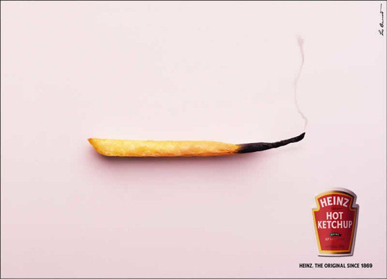
Even in print, some of the best examples of visual design embody simplicity and clarity, like this Hot Ketchup ad from Heinz…
So how do you optimize for visual clarity and persuasion online?
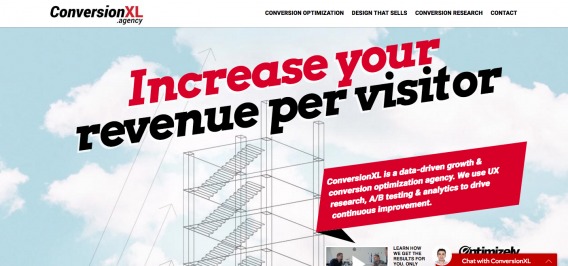
Do a Five Second Test. Can people correctly describe your site in 5 seconds? If not, do a heuristic analysis and specifically address clarity issues. Make sure everything is clear, visual, and contextual – starting with your hero shot. Here’s a good example of a contextual hero shot from Juliana Bicycles…

6. Emotion
“The old brain is only triggered by emotion. Thankfully, the field of neurobiology has brought more clarity to how our emotions work. Scientific studies show that emotions create electrochemical responses in our brain. These reactions directly impact the way we process and memorize information.”
Ahhh emotional persuasion! You’ve probably read so much about it, but it’s still a tough art to master.
Even though we like to believe our analytical minds are on top of things, many time we’re driven by emotions. This has been studied a lot in the last few decades, much of it by a neuroscientist named Antonio Damasio. He studied people with brain damage that prevented them from feeling emotions.
They all behaved in a normal way, except for one thing: they were unable to make decisions. The subjects could describe what they should be doing, logically speaking, but none of them could make even basic decisions like deciding what to eat and where.
As far as emotional persuasion goes, much of it is contextual to your own audience. Inspiring sadness might work for ASPCA but it probably wouldn’t for McDonald’s. One of the greatest companies at emotional advertising throughout the last century has been Coca Cola, with famous ads like this…
Usually, you can apply an emotional persuasion framework to four emotions:
- Anxiety
- Anger
- Awe
- Sadness
Though there are many other emotions you can invoke, such as belonging, fear, happiness, etc. Here’s a great example of a fear appeal here…

Read more about emotional persuasion here.
Conclusion
Our old brain drives decisions. So market to the old brain.
Again, the 6 triggers are:
- Self-centered
- Contrast
- Tangible input
- The beginning and the end
- Visual stimuli
- Emotion
Of course, there are many ways to execute on these triggers – so hopefully the above examples give you some inspiration for things to try on your own site.
Related Posts
-

You'd like to think that you’re a completely rational person making completely rational decisions, right?…
-
Do you make rational decisions or are you a slave to primitive thinking? Does free…
-
You've read about color psychology, system one and two, emotional persuasion, etc. I know you…
-
Neuromarketing assesses how our brain reacts to stimuli, not simply what we self-report in qualitative…


Good article. I liked the examples, highly relevant and inspiring.
Thanks Alex
This is what I like about Conversion XL artilces. They write content based on studies and science.
Great article Alex. I’m ordering “Neuromarketing” right now! Again great article (see what I did there?).
Nice! It’s a great book :) Thanks for the comment
Nice and clear article. Great examples. And inspiring links te read more about the topic. Great work.
Thanks!