Do you remember when Slack launched? At the time, I was a diehard HipChat fan. Needless to say, I wasn’t interested in trying Slack.
I considered it nothing more than a passing trend. Now? I use it for an average of 10 hours a day for personal and professional reasons. (Sorry, HipChat.)
What’s going on here? How’d I go from loathing something to using it daily in the span of just 3-4 weeks? It’s called the mere-exposure effect, which means we tend to develop a preference for things just because we’re familiar with them.
During those 3-4 weeks, I can’t even begin to guess how many times I heard or read about Slack. TechCrunch, The Next Web, Fast Company, Gigaom, WSJ, Inc. – everyone was talking about this new app. I began to like Slack because it became more familiar to me than HipChat.
Familiarity has a major impact on our decision-making process, whether we realize it or not. That means it has a major impact on conversions as well. Understanding the different psychological theories behind familiarity will lead to better UX / design, copy and calls to action.
Table of contents
The Science Behind Familiarity
Unconsciously, we give preference to things and people we’re familiar with. Psychologists have even found that the more often you see someone, the more likely you are to develop a romantic attraction to them. Even if the stimuli you’re being repeatedly exposed to is negative (e.g. an abusive relationship), you will subconsciously find comfort in the familiarity of it.
From an evolutionary perspective, it makes sense that familiarity leads to comfort. Something you’re familiar with is less likely to hurt you. Or, at least, hurt you in an unexpected way. We don’t want to risk the unfamiliar.
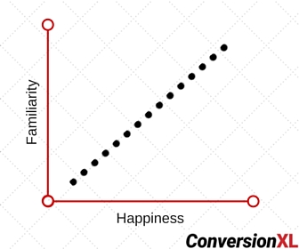
Psychologists have found that happiness is directly correlated to how many things (e.g. types of music, types of food, activities, countries) we’re familiar with.
There are three theories that get to the heart of familiarity: cognitive fluency, prototypicality, and habit.
1. Cognitive Fluency
Cognitive fluency is a measure of how easy it is to think about something. It shapes what we believe, how we invest, and who and what we think is beautiful.
Our brains are lazy. The easier something is to understand, the more likely we are to believe it. According to psychologists, any situation where we are required to weigh information (e.g. voting, buying, marriage) is influenced by cognitive fluency.
If the name of your company is easy to pronounce, shares are likely to perform better.
If you write in a clean, clear font, people are more likely to believe you’re stating a fact.
In North America, if your name is John, people will be more trusting of you than if your name were Zesiro.
Takeaway: Simplicity really is the key to conversion. It’s even backed by science.
2. Prototypicality
Prototypicality is the degree to which an item is an exemplar of the category of which it is a member.
Our brains love prototypes. Once we have an idea of what something should be, we want other similar things to share the same qualities.
For example, we all know the prototype of a car. Now imagine Ford comes out with a car that has two wheels in the back and only one in the front. I’m willing to bet it wouldn’t sell well. Why? Because it has low prototypicality and that makes our brains uncomfortable.
What about an oval fridge? Or a five foot tall microwave? Or a website with no pictures?
Takeaway: If we aren’t familiar with something first-hand, we want it to be similar to something we are familiar with.
3. Habit
A habit, from the standpoint of psychology, is a more or less fixed way of thinking, willing, or feeling acquired through previous repetition of a mental experience.
Our brains are creatures of habit. If you’ve ever tried to quit smoking or lose weight, you know this is true. The more often you do something, the more likely it is that you’ll continue doing it.
Habits are not as easily created and dropped as you’ve been led to believe.
You’re familiar with the concept that it takes 21 days to form a new habit. Let’s bust that myth right now. That concept is based solely on the loose interpretation of what Maxwell Maltz, a plastic surgeon, found in 1960. More recent studies, by trained psychologists, have found that it actually takes over two months to form a habit.
All of your habits, good or bad, provide a subconscious benefit to you. That’s why they’re so difficult to break. You know you shouldn’t check your email first thing in the morning because it’s bad for productivity, but you do anyway. No matter how hard you try, it’s difficult to stop the habitual behavior.
Takeaway: Persuading someone to break a habit is very, very difficult. Instead, use their current habits to persuade them.
Websites Using Familiarity to Convert You
Now that you know about familiarity, you can look around at some of your favorite sites and see how they’ve been using it to convert you.
1. Ecommerce
Let’s look at Amazon vs. those ranked in the Internet Retailer Top 500 Guide.
The average conversion rate for the Top 500 is 3.32% compared to Amazon’s average of 13% (nearly quadruple).
Amazon Prime members (that’s Amazon’s loyalty program), convert at 74%. When those same Amazon Prime members shop at other online retailers, they convert only 6% of the time on average.
Those numbers are impressive. So, what gives? Amazon’s copy and design aren’t 1,133% better than everyone else’s.
Amazon converts so much better than the competition because it’s familiar. The brand, not just the service or products, has become familiar… to the point of habit.
When you’re a habitual Amazon user, it’s unlikely that you’ll purchase elsewhere. Even if the product you’re looking for is available, you’ll check (and prefer to convert via) Amazon because it’s familiar, it’s safe.
“I got it on Amazon.” is almost as popular as “Google it.” It’s become the prototype. As a result, it’s become so easy to think about using Amazon that we, well, don’t. That’s cognitive fluency.
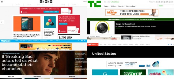
2. Tech Startups
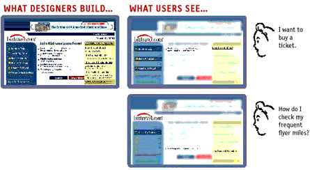
If you’re familiar with tech startups, you’re familiar with this website design…
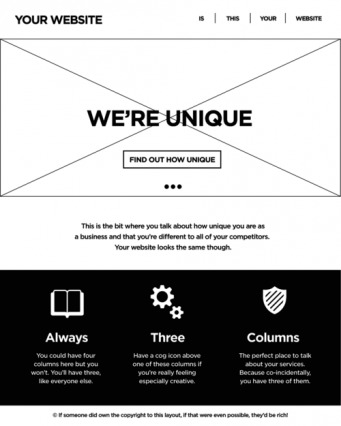
As the copy indicates, this is probably one of the most common site designs, especially in the tech startup space. Still, people continue to use it instead of coming up with something more original.
Why? Well, for the most part, laziness. It’s easy to steal ideas from the competition and follow a trend.
The design can definitely be improved upon and optimized. And a small element of surprise could go a long way in terms of standing out from the competition. After all, if you’re the same in the sea of sameness, you have no competitive advantage. If you blend in completely, you won’t be noticed at all.
But the fact remains that if an early tech adopter visits a startup site and its design / UX is dramatically different from the prototype above, it will be harder to understand (lower cognitive fluency).
“Oh, Startup XYZ just launched. Let’s check out their site.” That visitor knows exactly what to expect. Top right navigation, a hero shot and headline, and three services or benefits. That’s how early tech adopters have become accustomed to learning about new startups.
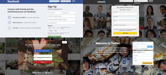
Consider the social networks…
And news sites…
How to Use Familiarity to Increase Conversions
The question remains: how can you apply all of this psychology to your landing pages to increase conversions?
1. Design & UX
Cognitive Fluency
Your brain operates at a speed of about 120 bits per second (that’s quite slow). Just listening to someone speak takes up 60 bits per second. When the brain tries to multitask or process too many things at once, it ends up not processing any of them very well.
Consider what this means for a site with too many calls to action, too many columns, too much text, etc. The more stimuli competing for your visitors’ attention, the less attention you’ll receive.
The more simple your site is, and the fewer stimulants it has, the higher the cognitive fluency.
Unfortunately, your design only has about 50 milliseconds to convey to a visitor that it’s simple and will be easy to process.
Prototypicality
Simplicity isn’t the only factor, of course. A Google study revealed that sites with low visual complexity and high prototypicality are the most appealing.
Let’s say you’re the CMO of a major gym chain. First, let’s look at the landscape…
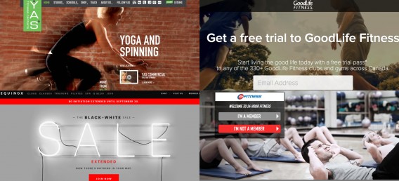
It all looks rather… prototypical, right? If Danielle is looking for a gym, she’s probably been to all four of these websites. If she goes to yours, a fifth site, she is unconsciously expecting to see a similar design.
If she doesn’t, it’ll take her brain 50 milliseconds to deem your site too complex, too unfamiliar.
Habit
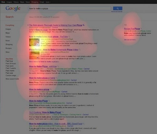
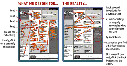
Out of habit, we process information online in a certain way. For example, the top left part of your site will likely get the most attention and people tend to read in an F pattern.
Trying to change these types of habits would be a waste of time. Instead, design to accommodate the habits. Look at how CollegeHumor is using existing habits to their advantage.
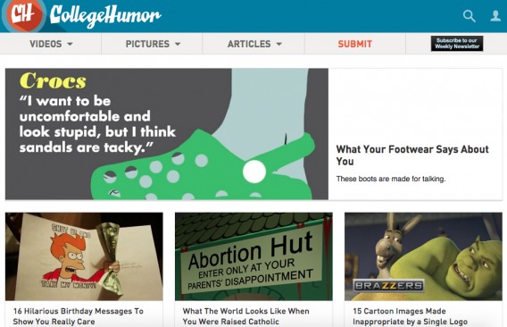
If you overlay the F pattern, you’ll see that CollegeHumor draws attention to their top articles. While I don’t have access to CollegeHumor’s data, I’m willing to bet that once they convince a reader to view one article from the homepage, their engagement and retention metrics increase.
Note that the F pattern was discovered in 2006 and is not without its flaws.
While it’s still widely accepted and reported on, just a year later, Shrestha investigated the differences between searching and browsing. Shrestha found that while visitors were browsing, they followed the F pattern. However, if they were more deliberately searching, their eyes would jump around the screen in a less systematic way.
So, while the F pattern is a habit for most Internet users, it’s not a universal truth. Use tracking tools like SessionCam to analyze the viewing habits of your particular audience and design for their truth.
Next steps for you:
- Eliminate as much clutter (e.g. rotating images, flashing anything, too many calls to action, etc.) and as many complex design elements (e.g. small images, less readable font, multiple columns, etc.) as you can.
- Research your audience thoroughly to discover the types of sites they’re visiting so that you understand the design prototype. You must meet the basic expectations of that prototype.
- Use a tool like SessionCam to identify the habits of your audience. Use that data to design for those viewing habits.
2. Copywriting
Cognitive Fluency
Think about this: The average American reads at a 7th or 8th grade level. Only 15% of the population has full literacy (a university undergraduate reading level). So, if you’re writing copy that a 12-year-old would find difficult to read, your writing is too complex for the average American.
In fact, the more complex your copy is, the less intelligent you are perceived. As it turns out, most people seem to believe the old saying: “If you can’t explain it simply, you don’t understand it well enough.”
Do you remember going over your times tables in elementary school? Studies have also shown that your brain forgets information at an alarming speed if there is no repetition – whether you’re in elementary school or not. (Quick, what’s 7×6?)
Prototypicality
What are the words you often hear in your industry? How are competing products often described? You’ll want to match these types of words and phrases in your copy, to some extent.
Let’s look at the pickup truck market as an example…
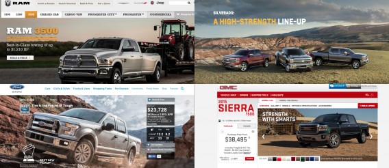
Strength, power, toughness are all key concepts on these sites. That’s the feeling pickup truck drivers are after, that’s the image they want to portray when they’re driving around. If those concepts were missing from your copy, you would be breaking the prototype.
Remember, according to the mere-exposure effect, we like words we hear often.
Now, this doesn’t mean you should steal copy directly from your competitors. Instead, steal it from your audience. Conduct some qualitative research and actually talk to your visitors. What types of words are they using to describe you and your industry? What types of words are they using day-to-day?
Look for trends in your data. Once you identify how your audience speaks and writes, you can begin crafting your copy.
Habit
As Steve Krug wrote in Don’t Make Me Think, scanning and skimming copy has become a habit.
In 2013, Chartbeat analyzed Slate.com and found that most people scroll through about only 50-60% of an article. Visitors simply don’t read your copy the way you intend them to.
Earlier this year, Copyblogger urged writers to begin crafting more scannable content to improve readability and boost engagement. Instead of trying to push visitors to form new habits, it’s much easier to accommodate their current habits.
Next steps for you:
- Use words and sentence structures that are simple and easy to read. Write all of your copy as if you’re writing for a 12-year-old kid. Repeat key words, phrases and concepts multiple times… not for the search engines, but for information retention.
- Conduct qualitative research to discover the words and phrases that your visitors are already using. Incorporate them into your copy to capitalize on familiarity.
- Ensure all of your copy is 100% scannable. Use short sentences and paragraphs, make liberal use of subheadings, use informative images whenever possible, etc.
3. Social Proof & Calls to Action
Cognitive Fluency
Above, we mentioned that we find comfort in the familiar because there’s limited risk. Our natural aversion to risk is what has kept us alive for the last 200,000 years. This aversion is often at work without your knowledge, which means it impacts most decisions.
Daniel Kahneman, a Nobel Prize-winning psychologist, wrote, “For most people, the fear of losing $100 is more intense than the hope of gaining $150. [Amos Tversky and I] concluded from many such observations that ‘losses loom larger than gains’ and that people are loss averse.”
This means that if visitors perceive any type of risk after seeing your call to action, they’re more likely to surrender the potential benefit (your offer) than risk the potential loss (getting spam emails, being scammed out of money, ending up in a lengthy signup funnel, etc.)
We perceive anything we’re unfamiliar with (i.e. anything unknown) as risky. It’s why you’re afraid of the dark or the ocean or space… you don’t know what could be out there. It’s also why clarity beats clever.
As quickly as possible, help visitors get their footing and provide a no-risk call to action. If there’s uncertainty, there’s risk. If Tom doesn’t know what will happen when he clicks the button, he probably won’t click the button at all.
Answer the following questions for your visitors:
- Where am I?
- What can I do here?
- Why should I do it?
- What happens next?
Clever leaves room for interpretation, which means uncertainty. Clarity tells you what to do, why to do it and what will happen when you do. Clever doesn’t convert, but clarity does.
Prototypicality
Again, look at the prototype for your industry. Visit your competitors and websites your audience frequently visits. What do their calls to action look like? Are they in popups or in right rails? How are they incentivized? How frequent are they?
For example, I’m personally seeing opt out popup calls to action taking over the sites I frequent…
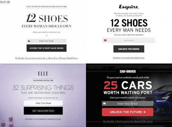
All of these calls to action have some similar features:
- A logo to lend credibility and reduce risk.
- A large heading featuring a number.
- A simple request for an email address.
- A large button with benefit-focused copy.
- A small (and cruel) opt out link.
Once again, you’re not looking to copy your direct and indirect competitors. Instead, you want to understand the expectations of your audience and meet those expectations on a basic level.
If the call to action feels familiar, there’s less perceived risk.
Habit
Before making a decision, we have a habit of seeking social validation. Try to recall the number of decisions you’ve made in your lifetime based on the fact that “everyone was doing it”. I’m willing to bet it’s a lot.
We know that conversion rate optimization experts still swear by the power of social proof. (If the product or service itself isn’t familiar, at least the names / faces associated with it might be.) Thanks to Robert Cialdini, we also know that social influence is a major factor in our decision-making process.
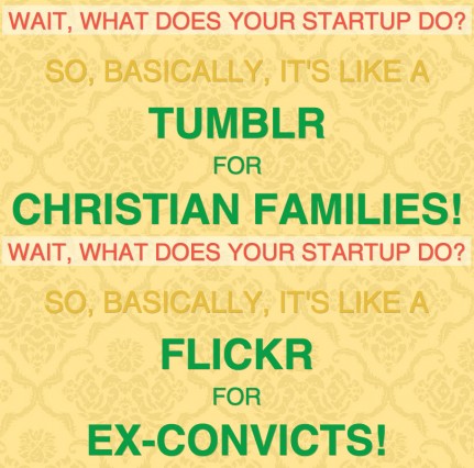
If your product or service doesn’t have a prototype, lacks social proof and is completely unfamiliar, you can always borrow familiarity…
Next steps for you:
- Reduce any perceived risk surrounding your call to action. You’re naturally bias toward your own site, so perform some qualitative research to identify risk. Ask visitors what they think your site does, what they think the next step is and what they think will happen after they take that step. Does perception line up with reality?
- Identify the types of calls to action your direct and indirect competitors are promoting. What kind of expectations does this create in your audience’s mind? How can you meet those expectations with your call to action?
- Capitalize on the human need for social validation by providing social proof near your call to action. If you don’t have social proof yet, borrow familiarity by taking two well-known concepts and using them to describe your product or service (e.g. it’s like blank for blank).
Balancing Familiarity and Innovation
Does all of this mean that original ideas are dead? No, not at all.
While unoriginal thinking can be advantageous and boost conversions, it’s not an absolute rule. Innovation is still alive, well and converting. Remember back in 2012 when Optimizely totally redesigned their site, removing the majority of their homepage copy, and saw an increase in conversions?
Innovation calls on the psychology of surprise. Essentially, when something unexpected happens, our brains are surprised and focus more attention on the new, novel stimuli.
According to Tania Luna, an entrepreneur and self-proclaimed surprisologist, “Surprise is the neuropsychological equivalent of a pause button. It makes us stop what we’re doing, hijacks our attention, and forces us to pay attention. It also intensifies our emotions by about 400 percent.”
Instead of reducing the need to think like familiarity, surprise increases the need to think.
So, now we have two contrasting psychological theories. Which one is correct?
Unfortunately, many marketers will choose one or the other, familiarity or innovation. The key is to combine both. Use prototypes, habits, and cognitive fluency to meet basic expectations and use surprise to delight.
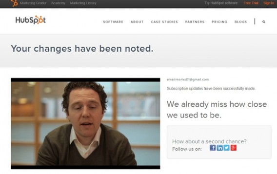
You’ve seen this before, time and time again. For example, HubSpot’s email unsubscribe page…
And GitHub’s 404 page…
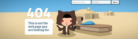
Both pages meet the basic expectations of unsubscribe and 404 pages, respectively. Yet, they both have surprising elements designed to delight visitors.
Conclusion
It’s a simple concept: We like things that are familiar to us. But unless you truly understand why that is, you can’t use familiarity to increase conversions in a meaningful way.
Now you can convert visitors the same way Slack was able to convert me.
Here’s the step-by-step process to follow:
- Eliminate clutter and complex design elements.
- Understand the design prototype in your industry.
- Research the habits of your audience.
- Use (and repeat) words and sentence structures that are simple and easy to read.
- Discover the words and phrases that your visitors are already using.
- Ensure all of your copy is 100% scannable.
- Reduce any perceived risk surrounding your call to action.
- Identify the expectations your competitors’ calls to action are setting.
- Provide social proof near your call to action or borrow familiarity by taking two well-known concepts and using them to describe your product or service.
Working on something related to this? Post a comment in the CXL community!
Related Posts
-

Do you want to make your website better? There are many ways to optimize a…
-

Online video keeps getting more and more popular. This year's Black Friday and Cyber Monday…
-

When trying to boost conversions, whether it’s on a signup screen or a landing page,…
-
Conversion optimizers are in the business of attention management, just like magicians. It's your job,…


I am mindblown. This is a fantastic article Shanelle, one of the best I’ve read in a while.
I want to highlight that you made a really good point saying marketers will often choose one or the other, familiarity or innovation. It’s so true – especially when the big traditional agencies are hired to do the work…
Balance is key. Stand out, but don’t destabilize visitors.
Thanks for sharing.
– Raphael
Thanks Raphael. I’m glad you liked it.
Exactly. It’s about meeting basic expectations to trigger familiarity while using the element of surprise to stand out from the crowd.
Hey Shanelle! Very interesting topic.
I have gone through reading whole of it and I must applaud you for writing this blog. The concept of familiarity you have given here is completely true, we all know familiarity breeds enjoyment. But the question is why are familiar things more likeable?
Because familiar things – food, music, activities, surroundings etc – make us feel comfortable. From an evolutionary perspective, it makes sense that familiarity breeds liking.
Well, generally speaking, things that are familiar are likely to be safer than the things that are not.
Your theory of cognitive fluency striked me. Liked it.
Thanks for reading, Angel.
It’s a pretty simple concept, you’re right. But hopefully breaking it down to cognitive fluency, prototypicality and habit will help people understand how to use it (and why it really works).
This is very detailed post also interesting to know various factors that affect the psychology of our blog readers, thanks for interesting post
Thanks for reading, Harsha.
When we really understand why people do what they do, we’re able to use psychology to increase conversions. It’s not enough to know “we like things that are familiar”, we need to understand why that is and what psychological factors are at play.
I do like this article. The way you explained how to understand the familiarity in a very basic set of feelings/behaviors: lazyness, comfort, aversion.
I found very interesting how to use the surprise is like using opposite tools. I think there is a potential to explore there. And I thank you for giving me all of this insights.
Absolutely! We know that both familiarity and surprise convert. To maximize conversions, we’ll need to find the perfect balance between the two.
Thanks for reading, Adrian. Glad you liked it!
This is a great article, it feels like fresh new information, unique. Nice work
Thanks Ron! Happy to help. Be sure to check out the links throughout the article. You might find them useful, too.
Thorough. Thoughtful. Useful.
Thank you!
Thanks Kay! Appreciated.
Well done. Bravo!
Thanks for reading, Danny! Glad you liked the article.