Let’s get one thing out of the way that is already on the minds of some of you…
…it’s true, I’m not a big fan of conversion optimization.
Some of you may have seen my article where I tried running nothing but A/A tests for 8 months, and found all sorts of misleading “results“.
The moral of the story is if you have a low baseline rate, not a lot of traffic and don’t know your statistics, you can lead yourself astray.
I assume all of you have learned that by now, but I wanted to get it out of the way.
BUT, there’s another thing I hate about conversion optimization. That’s some of the design myths I see thrown about. I’m here to dispel some of them.
There Is No “Best” Button Color
The more experienced among you already know that “button color” talk is the lowest-common-denominator of CRO talk. But, I still get asked about it all the time.
To put it simply: There is no best button color.
Some people say, “The most popular ‘favorite color’ is blue, so buttons should be blue.” Well, look at this example.
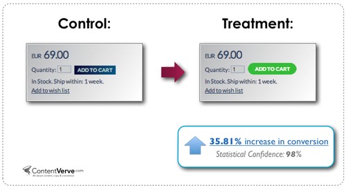
Green beat blue in this case, increasing sales (not just CTR) by nearly 36%.
“Well,” some might say, “they would have increased conversions EVEN MORE if they had used red. Warm colors, like red, are exciting. So, CTA buttons should be warm colors.”
I’ve even heard some take it as far as to say, “Red is the best button color.”
Okay, let’s see if that’s right. Here’s a test that Verizon ran. One has lots of red buttons and one has lots of buttons that are kind of a dark, boring, muddy gray. It’s like the button was walking down a country road and got sprayed by a jalopy driving through a puddle.
This is a no-brainer, right? Clearly the red buttons will win.
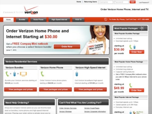

Nope. The dark gray buttons boosted clicks by 10% over the red buttons.
How is this possible? Well, I posit that since Verizon’s branding is red, the red buttons get lost within the page. The buttons don’t contrast the rest of the page enough.
One thing that tends to work in conversion-centered design is creating contrast wherever you’d like the user to take action.
Note how the blue color in the first example didn’t contrast well and how the red buttons blend in with the rest of the Verizon page. The winning options were both colors that created more contrast.
There Is No “Best” Font
Another question I get asked very often is, “What’s the best font for conversions?”
Again, the unsatisfying but true answer is: There is no best font.
What I can tell you is that the font you use should be clear to read, and should convey a mood or personality that is appropriate for your brand.
If you have a good designer, that person should be able to help you narrow down the right font choice.
But, if you’re driving your own design, the best advice I can give you is to keep it very simple. If you think the font looks “cool”, then it’s probably the wrong font.
In my own email course, I provide a list of recommendations and details that are outside the scope of this lesson.
I can tell you this simple thing, though: If you’re doing your own design, just pick ONE good font. It will free you up to concentrate on the stuff that matters (more on that in a bit).
There Is No Design “Silver Bullet” (But Here’s What DOES Work)
If you’ve noticed a theme so far in this lesson, it’s that there is no one simple thing that you can do to your design that will always increase your conversions.
However, all of the winning landing pages I’ve seen have one thing in common: It is very visually clear what they want the user to do next.
For the sake of reducing variables, let’s look at this simple test. Which one do you think won?
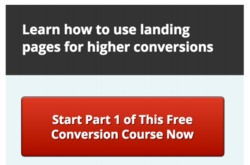
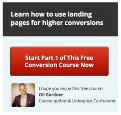
You may think that Oli’s sexy v-neck would build trust, thus increasing conversions like a kajillion percent.
But, in fact, Oli decreased conversions by 14% (at a 99% confidence level, by the way).
Forget everything you think you know about psychology, or whatever reasons you might have for thinking Oli’s smiling mug would increase conversions. Just take in the whole section as if it were a work of art. Squint your eyes a little bit and concentrate on the “Start…” button.
Do you notice anything?
Oli’s face COMPETES for visual attention with the “Start…” button. Not only are Oli’s stunning good looks a distraction, but his presence takes away valuable white space that could be used to draw attention to the “Start…” button.
Let’s see these concepts in action at a slightly higher level in this test.
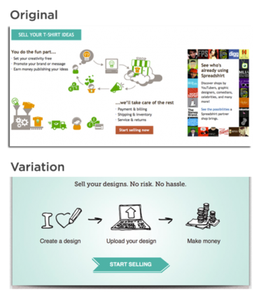
The variation outperformed the original at an incredible 606%! Take some time to think about why.
Look at all they’re trying to do to convince you to sell your t-shirt designs in the original: “you do the fun part,” “we do billing and shipping, etc.,” and “oh, look at who ELSE is using our service” (social proof). Finally, amongst all of this, there’s the (warm-colored) call to action button.
In the variation, everything is much more clear. They’ve reduced the excess language about “fun” and them “[taking] care of the rest”, and boiled it down to what people pay attention to: “make money”.
Also (and, I posit, just as importantly), the design is much more clear. The CTA is centered in the composition, on its own row, with plenty of space around it. It stands out and it’s clear what they want the user to do.
So, here’s what DOES WORK when designing for conversions: Make your business objectives visually clear.
By that, I mean that, generally, whatever action you want your user to take, the place where they can take that action should be the most visually compelling part of the page. Use contrasting colors, clear typography, well-considered white space, and compositional forces to make it clear to your user what they should be doing.
Takeaways
- There’s no such thing as a “best button color”. Contrast is what really matters. Does your call to action pop?
- There’s no such thing as a “best font”. Different fonts create different moods, so it depends on your audience. Legibility is what matters most.
- Visual clarity is the key to conversions. Your design can be clear or complex, just like your copy. Remove distractions from your call to action, add space around your call to action and simplify all of your design elements.
For more from David, check out Design for Hackers.
Read Next Lesson or Download guide as PDF
-
Introduction to Conversion Optimization by Brian Massey
Copywriting, A/B testing, analytics, psychology... we'll cover it all. But first, Brian Massey, the Conversion Scientist, reminds you of the basics. -
How to Write Copy That Sells Like a Mofo by Joanna Wiebe
Joanna Wiebe of Copy Hackers and Airstory on how to write copy that converts like crazy. -
Introduction to Designing for Conversions by David Kadavy
David Kadavy, author of Design for Hackers, on designing for conversions. He debunks today's biggest design myths and tells you what actually matters. -
How to Use Psychology in Conversion Optimization by Bart Schutz
Bart Schutz of Online Dialogue and The Wheel of Persuasion on using psychology to increase conversions. -
Emotional Targeting 101 by Talia Wolf
Talia Wolf of Conversioner talking emotional persuasion. Building on what we learned from Bart, she explains how to appeal to your visitors' emotions. -
How to Build a List and Send Emails That Convert by Justine Jordan
Justine Jordan from Litmus walks you through collecting emails, improving your open rate, designing for all browsers / devices / email clients, A/B testing emails and more. -
How to Setup Analytics and Measure the Right Stuff by Chris Mercer
Chris Mercer from SeriouslySimpleMarketing.com on how to setup your analytics in a meaningful way that ensures you're gathering useful data. -
How to Use Analytics to Find Insights by Yehoshua Coren
Yehoshua Coren, the Analytics Ninja, walks you through extracting insights from your analytics using segmentation. -
How to Gather Qualitative Data for Insights by Jen Havice
Jen Havice of Make Mention on how to use qualitative research to answer one of the most important questions in conversion optimization: Why? -
What to Test (Conversion Research) by Michael Aagaard
Michael Aagaard, senior conversion optimizer at Unbounce, on how to strategically decide what to test using conversion research. -
How to Run A/B Tests by Peep Laja
Peep Laja teaches you everything you need to know to run valuable, statistically valid tests that will actually lead to applicable insights. -
How to Create a CRO Process by Peep Laja
Peep on how to combine everything you've learned into a systematic, repeatable CRO process.