
If you run an ecommerce shop, you’re always trying to boost your sales. Here’s how to increase the conversion rate of your ecommerce site.
Table of contents
- What’s a good ecommerce conversion rate?
- 23 Ways to increase your ecommerce conversion rate
- 1. Quality product images
- 2. Great product copy
- 3. Product videos
- 4. Customizable products
- 5. Free shipping
- 6. Sales and specials sections
- 7. Reduce shopping cart abandonment
- 8. Persistent shopping cart
- 9. Show contact info, offer live chat
- 10. Clear progress indicators
- 11. Address uncertainty
- 12. Multiple payment options
- 13. Strong value proposition
- 14. Better search
- 15. Good filters
- 16. Short forms
- 17. Simplify credit card input
- 18. Promote shopping cart contents
- 19. Deferred account registration
- 20. Product reviews
- 21. Thoughtful upselling
- 22. Clear, big calls to action
- 23. Back-ordering
What’s a good ecommerce conversion rate?
Don’t worry about “average” ecommerce conversion rates. A good conversion rate is one that’s better than what you have right now.
Because there are so many variables that affect conversions, it’s very difficult to have apples-to-apples comparisons between sites. The quality of traffic is a major contributor. Rates around 1% and 2% are fairly common
So, if you want to improve where you are right now, take stock of these 23 ways to improve your ecommerce conversion rate.
23 Ways to increase your ecommerce conversion rate
1. Quality product images
If I had to pick one thing that would sell a product online, it’s images.
Technically, you could have an ecommerce site with only product images and no product descriptions, but I don’t recommend it. (It wouldn’t work vice versa, either.)
People want to see what they’re getting. One of the original tactics to boost ecommerce conversion rates is to use high-quality photos of your product. The more the better. Show the products from different angles and in context; make them zoomable.
Ties.com gets it right:
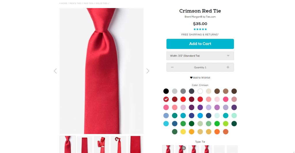
In addition to multiple images, you can click to open up a high-definition image that makes the texture of the product clear.
Read all about using images to boost your conversion rate. Also, see how Nike made more persuasive product pages with compelling images.
2. Great product copy
Product descriptions matter. The role of product copy is to give buyers enough information so that they can convince themselves that the product is right. Clarity beats persuasion. The best sales copy is full, complete information. No hype needed.
How long should it be? Offer a concise version and a long version. The shorter version should capture the essence of the offer:
- Who the product is for;
- What it will do;
- Why it’s good.
The longer version should answer any and every potential user question. If someone reads the whole thing and still has a question or doubt, you have a problem. If they’re convinced halfway through the copy, they’ll skip the rest and continue to checkout.
Let’s look at the same product on Home Depot and Amazon. The Home Depot version sucks:
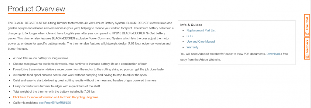
They provide only a few sentences of information and a bunch of technical info in bullet points.
The Amazon version has a highly visual mix of description and product-in-action explanations as well as all the technical specs and answers to almost 800(!) questions from potential buyers.
If you sell stuff you don’t make, add a personal touch and recommendations—tell the customer why you personally recommend this product and how it will help them.
Recommended reading: How Does Product Copy Format Affect User Engagement? [Original Research]
3. Product videos
Images are good, but video’s better—the next step before actual touching and feeling. If you’re not doing product videos yet, do them for part of your inventory and see if it makes a difference.
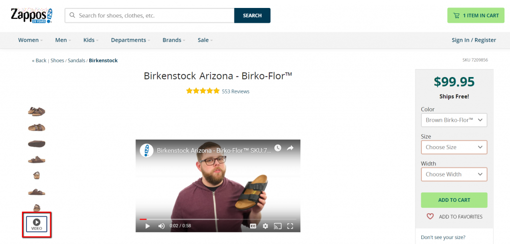
Zappos has videos for almost all of their products, such as this:
Read my post on how to use video to increase conversions.
4. Customizable products
People like to customize stuff. It’s fun, has a game-like element to it, and creates a feeling of ownership. Once you’ve spent minutes configuring a product, it’s no longer a product, it’s your product.
A few years ago, I needed a new laptop and went to Dell.com. I played around for like 30 minutes customizing my laptop. At the end, of course I bought it. It ended up being much more expensive than any of their standard sets.
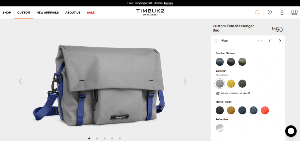
If your business is up for it, you can do mass customization, like Dell or Timbuk2 – using efficient manufacturing.
Here what Timbuk2 bag customization looks like:
Does customization make money? Gemvara lets women customize jewelry (“I designed it myself!”) and raised $51 million before getting bought out by Berkshire Hathaway. So yeah.
5. Free shipping
Some 75% of consumers expect free shipping, even on orders under $50. Many ecommerce companies offer always free; some have conditions. Amazon bet it’s entire Prime membership on consumers’ obsession with free shipping (even when it’s baked into the cost elsewhere).
The lack of free two-day shipping, according to the same report, caused nearly one in three shoppers to back out of a purchase. People want free shipping. But how attractive is it? When 2BigFeet introduced free shipping for orders over $100, their conversions went up by 50%.
For whatever reason, a free shipping offer that saves a customer $6.99 is more appealing to many than a discount that cuts the purchase price by $10.
David Bell, Wharton
If you’re afraid that offering free shipping will erode most of the profit in the order, watch this video for a useful strategy .
What about charging very little instead of free?
In the book Free, Chris Anderson shares the case of Amazon. Once Amazon implemented free shipping, sales went up in each country except one—France. Why? France charged $0.20 instead of free. While $0.20 is almost free, it sure didn’t seem that way to French customers. (Once they changed it to free, sales went up in France, too.)
The moral of the story is that free is in a league of its own. The difference between cheap and free is huge.
If you charge for shipping…
If you still decide to charge for shipping, mention shipping costs up front. If you can, charge a flat fee (simple pricing is best) instead of per item.
Nothing kills conversions like a surprise shipping fee at the end. According to this study, 47% of people indicated they would abandon a purchase if they got to the checkout only to find out hat free shipping wasn’t included.
6. Sales and specials sections
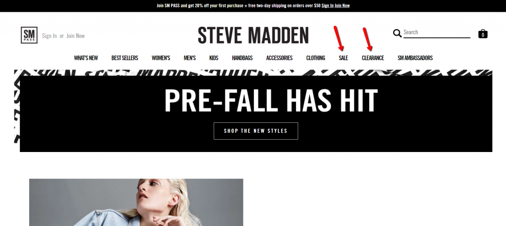
Endless sales, Groupon, and its clones have trained people to shop cheap. Discount-seeking behavior is set to continue, so think about having a dedicated “sales” section on your site. Naturally, do what’s right for your brand, but it might be a worthwhile experiment.
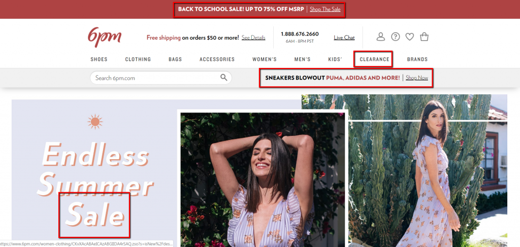
Make it easy for people to find the stuff that’s on sale. Steve Madden has two top-level menu items for discounted products:
6pm has four different promotions for discounted sections of the site:
7. Reduce shopping cart abandonment
Shopping cart abandonment means the loss of a customer who is going through the check-out process of an online store. It’s widespread.
Nearly two in every three ecommerce shoppers abandons their cart prior to purchase. Researchers attribute the high rate to user sophistication: As shoppers become more experienced online, they’re more likely to comparison shop even as they move toward checkout.
The top 5 reasons why people abandon shopping carts (and what to do about it)
- High price. If your product is the same or similar to what competitors offer, people will choose based on the price. If your price is the best, say it. (And if you say it, it’d better be true.) If you won’t win on price, you have to communicate your added value.
- Shipping costs. You charge for shipping? Stop. Figure out how to offer free shipping.
- Hassle. you ask for too much data / forced registration.
- Doubt. Will it fit me? Can I return it? Use live chat to address buyers’ concerns and answer their questions.
- Slow site. Speed up your site.
Follow up with cart abandoners
An effective way to reduce shopping cart abandonment is to follow up by email. Movies Unlimited got a 500% ROI with a shopping cart abandonment campaign. SmileyCookie recaptured 29% of abandoned carts.
How many companies do this? Listrak shopped the top 1,000 retail sites, added items to a shopping cart, began the checkout process by adding first and last name, email, and phone number, then abandoned the carts before completing a purchase. They then tracked whether retailers responded with emails and analyzed the contents of follow-up emails.
Only 14.6% of top web retailers used email campaigns to retarget shoppers.
Here’s how to do it:
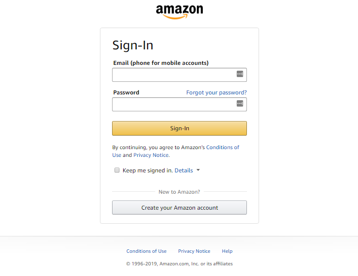
- Collect email address first so you can send follow-up emails if they don’t complete their order. This is the screen people are taken to on Amazon when they’re ready to check out:
- Make sure the first follow-up email goes out ASAP. If they complete the purchase somewhere else, it’s over. After the initial email, send one or two follow-up emails. (You may want to include a coupon.)
- Track the effectiveness of those emails: opens, click-through rates, and conversion rates.
Many ecommerce platforms such as Magento, 3DCart, and Volusion offer integrated cart abandonment solutions. There are also several add-on software providers out there that can do this, like Rejoiner.
8. Persistent shopping cart
People comparison shop. A common behavior is to add products to a cart so they can return later. If, upon their return, they discover that the contents of the shopping cart have expired, they’re unlikely to start from scratch (too much hassle).
The solution? Persistent shopping carts. By using a persistent cookie, the shopping cart will wait for users to return for a day or even a week later.
An alternative to this is to give user the option to save their shopping cart content. Offering to email the cart contents to a user (retrievable through a link) is a smart way to stay on the shopper’s mind (and build your email list).
9. Show contact info, offer live chat
Making your phone number clearly visible is a small thing but known to boost conversions—especially for small, lesser known stores. It’s a trust thing. A clearly visible phone number or email shows that you’re a real business.
Icon Direct shows a real person and a prominent phone number:
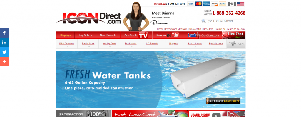
Offer a live chat option to answer quick questions.
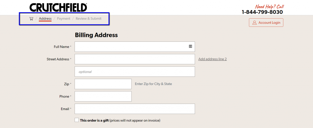
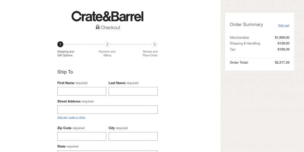
10. Clear progress indicators
People like to be in control and in the know. Are we there yet? How much longer will this take? This is why numbered lists are better than unordered lists and why you should have clear progress indicators on your site.
Crutchfield has an implied progress bar below their logo, but it’s small and not explicit—it may go unnoticed by users.
The way Crate&Barrel is doing it is better; the steps are more prominent and clearly labeled:
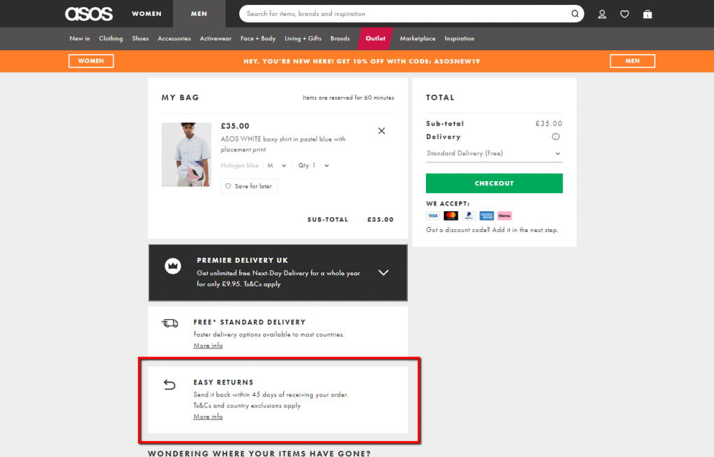
11. Address uncertainty
Is this safe? Can I do returns? When will I get my stuff?
If a visitor has never ordered from you, they’ll have uncertainties. Make a list of the most common objections and doubts, and address them on product pages and in the shopping cart.
ASOS confirms “Easy returns” right below the items in the cart (as well as confirming free standard delivery and answering other FAQs further below):
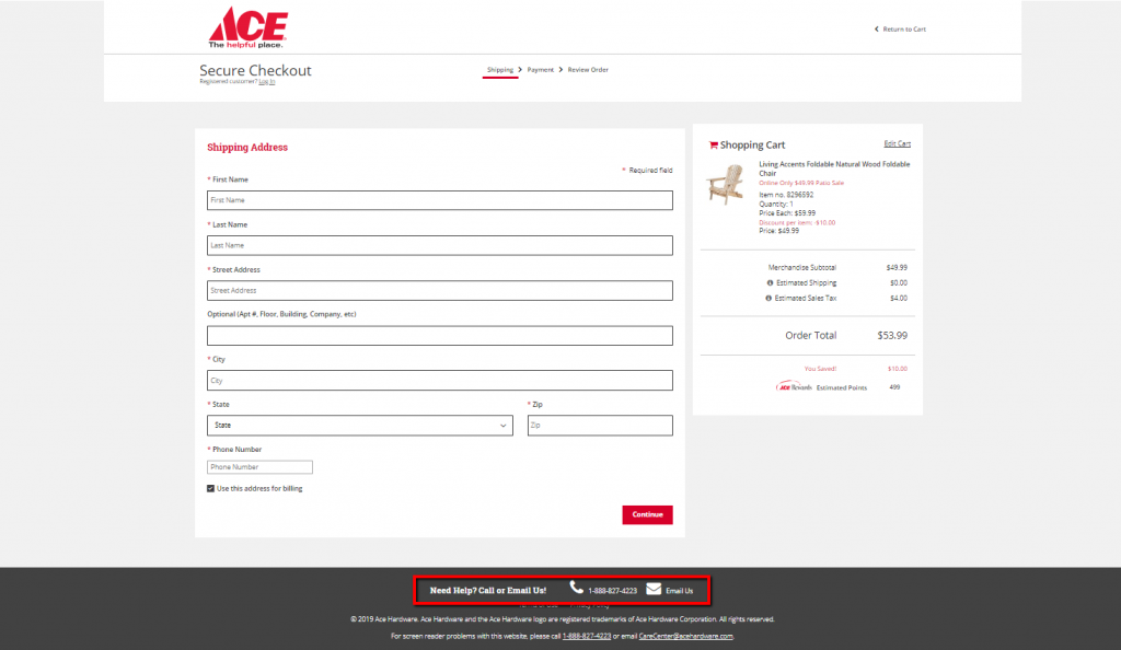
Ace Hardware puts their phone number, email, and privacy policy at the bottom of the checkout page:
12. Multiple payment options
Options are good for two reasons:
- Given the proliferation of data breaches, some people are wary of using certain payment methods (especially on a site they’ve never bought from before).
- A survey of 2,000 British adults found that 50% of those who regularly shopped online said they would cancel a purchase if their preferred payment method wasn’t available.
These people are not the majority, but adding payment options like PayPal will help you win over customers you would lose otherwise.
The House offers three options:
13. Strong value proposition
Too many ecommerce sites forget about value propositions. When new people arrive on your site, they have to figure out what your site is about in a matter of seconds. Yes, they see that you sell stuff, but how are you better or different?
For instance, I’ve never heard of this store:
They don’t say anything interesting about themselves. This is costing them sales.
Here’s a different example. While it’s far from perfect, they state what they do under the logo and list key reasons for buying from them:
If you don’t communicate your value proposition, you will lose a lot of potential buyers. People won’t invest time to figure it out.
14. Better search
Search is crucial to ecommerce. People need to find products—fast. Around half of visitors navigate ecommerce sites using search. For search-centric sites like Amazon, the number is probably way higher.
Use autosuggest to show product matches as users type. After online retailer BrickHouse Security added an automated drop-down menu of text results in its site search window, conversion rates went up.
Here’s an example from Wild Gems:
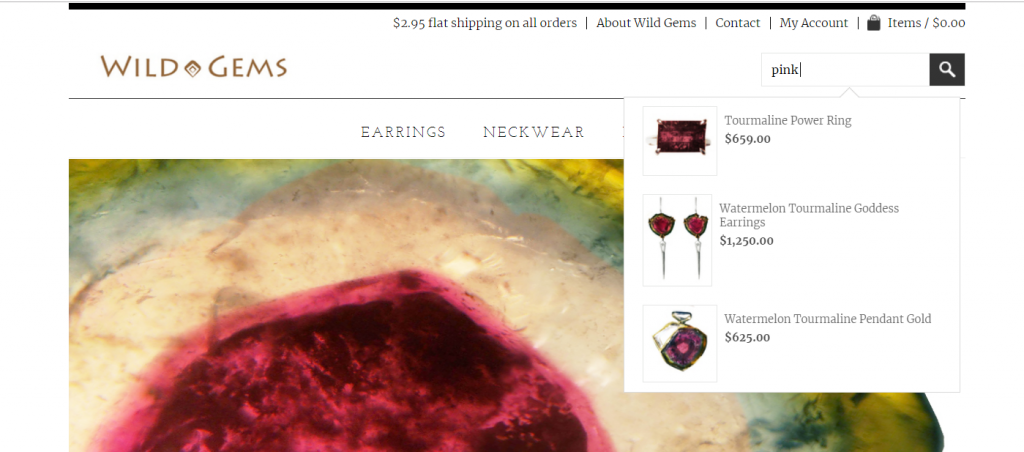
Smashing Magazine wrote a great article on ecommerce search. Read it.
15. Good filters
The more choice you give people, the harder it is to choose something. Combat the paradox of choice with filters. The more choice you offer, the better filters you need to provide.
Ever been to a wine store? It’s one of those places where the selection knocks you unconscious and you feel like grabbing beer instead. Retail stores don’t have good filters. (Usually, the “filters” are salespeople.)
Online, you can have great filters. The role of the filter is to make finding the most suitable products easy. Winelibrary‘s filters do a good job:
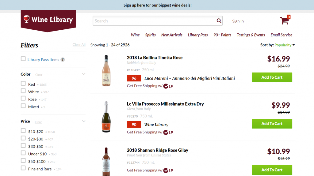
All of the filters don’t fit on this screenshot, but there are plenty more—grape, region, vintage, etc. The order of the filters is by popularity: The more common options like color and price are first, with less-used features like region or bottle size listed farther down.
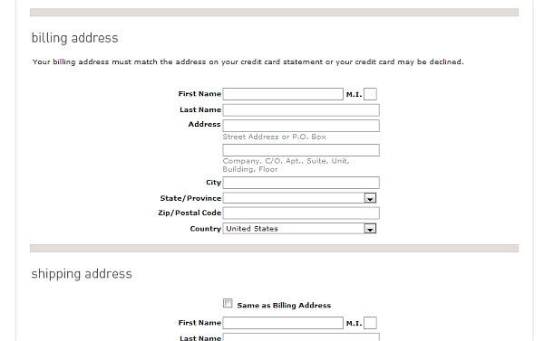
16. Short forms
Eventually, people will put stuff into the cart and head to the checkout. Your success in leading them through this depends a lot on forms. The more fields they have to fill in, the more friction there (usually) is.
This is why people prefer to buy from Amazon. The shipping and credit card information is already there, so they save themselves the hassle of filling in forms. They’re even ready to pay a higher price just to save a couple of minutes. (I know I am!)
I’ve seen stores ask for a shipping address for digital downloads. Ugh! No fax number, no salutation. Stick with the essentials. Do not ask for information you don’t absolutely need.
One must-have feature: People need to be able to check the box “shipping address same as the billing address”:
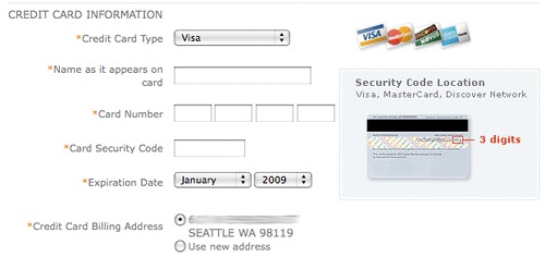
17. Simplify credit card input
People from all walks of life shop online, and some aren’t very savvy. They don’t know what the CVV code is or even have a hard time figuring out their credit card number.
Your job is to make it as clear as possible what data you’re asking for. A previous version of the Target checkout made it difficult:
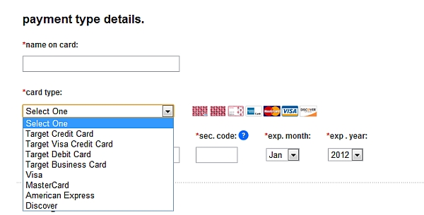
Why on earth would you ask the type of a credit card?! I bet tons of people spend minutes figuring out what card they have, and another group constantly chooses the wrong card type. This is very bad design. Your job is to make the customer’s life easy, not yours.
Another thing: sec. code. That’s not clear or easy to understand. Yes, there’s a question mark there (to get an explanation), but it could be so much better.
This also ask for card type (#fail), but it at least explains where to find the three digits:
18. Promote shopping cart contents
Many marketers assume that once a customer clicks “add to cart,” they’ll make it through the entire checkout process. Nope. You’ve still got work to do.
Even when they add a product to the shopping cart, it doesn’t mean they’re going to buy it. You have to keep selling it to them.
The best solution is a perpetual shopping cart that displays the contents of the cart while users browse. That’s exactly what Amazon does:
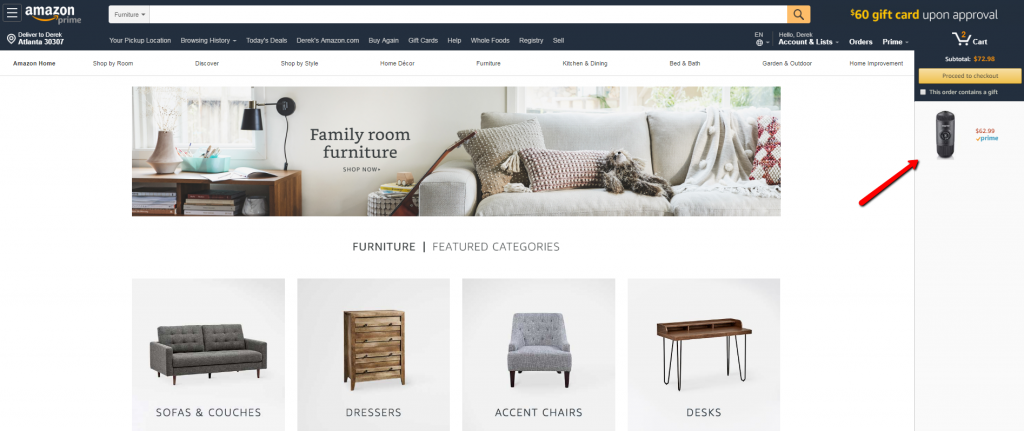
The key is to show the subtotal, the items in the cart, and photos: a constant reminder of what they’re about to buy.
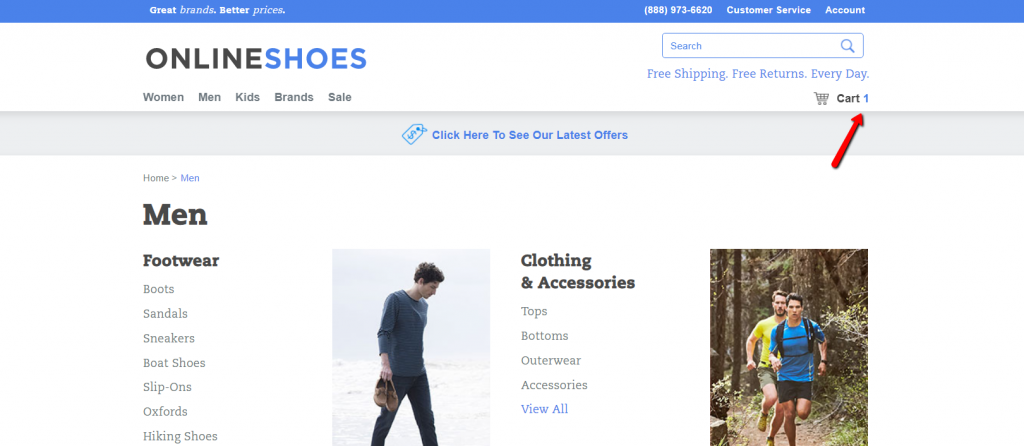
Onlineshoes.com shows only the number of items in the cart. (The full cart contents appear upon hover.) People will forget in a minute what they put in there:
Marketing Sherpa reported that 64% of retailers believe perpetual shopping carts are “very effective” at improving conversions.
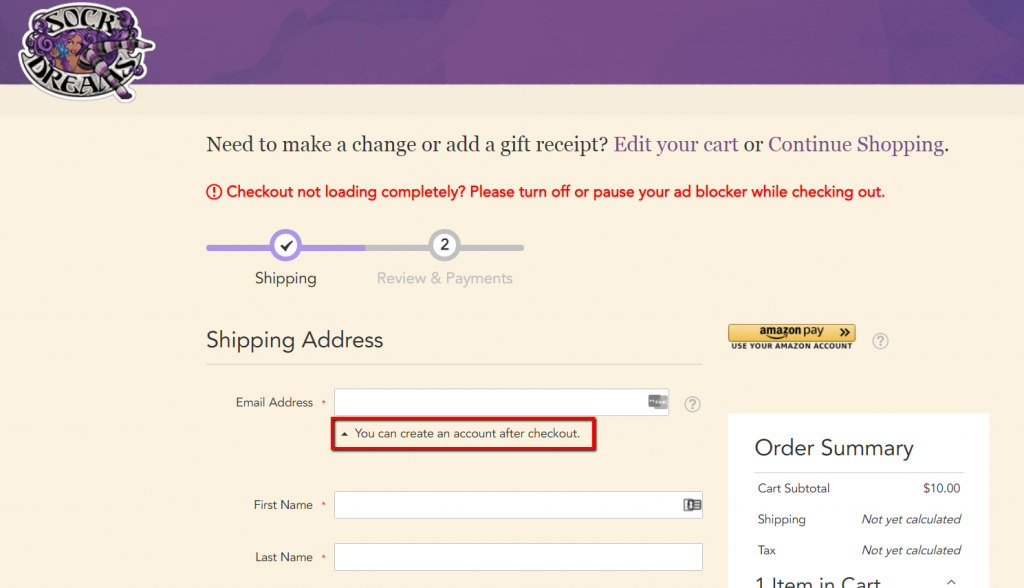
19. Deferred account registration
Surely you know the $300 million dollar button story. Don’t force people to register.
Instead, offer the option to register but create an account (behind the scenes) even for those who opt for the guest checkout. They’ll enter their email and name anyway. All you need to do is generate a password and email it to them once they complete their order.
Sock Dreams even defers the option for account creation until after the checkout:
20. Product reviews
People use reviews. A lot. Even when they’re shopping in brick-and-mortar stores. You’re probably doing it, too. I know I am.
Start gathering and showcasing reviews on your site. If you sell commodity products and can’t get users to write many reviews, look into pulling reviews from an external site.
Don’t delete negative reviews—they actually help sales if there are only a few of them.
21. Thoughtful upselling
Upselling and cross-selling will boost your average order size. Apple knows this. Immediately after adding an iPad to your cart, they try to upsell you:
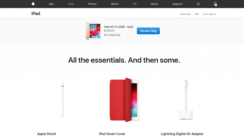
The rule of upselling is this: You offer only related products (Apple offers a pencil, cover, and adapter—not a laptop), and the offer must be at least 60% cheaper than the product someone just added to their shopping cart.
So if they’re buying pants, upsell a belt.
Brick-and-mortar supermarkets will try to upsell you while you’re checking out (e.g. grab a candy bar while you wait). Online, don’t do it. Focus on getting them to check out.
22. Clear, big calls to action
The user experience in your store needs to be smooth. Smooth in the sense that users should never have to look for something. It should be obvious how things work.
If people need to look for “Add to cart” or “Check out” buttons, you’re failing miserably. Those two are the most important buttons in your store. You want them big, bold, and prominent. Avoid text links.
Patagonia’s “Add to cart” button stands out:
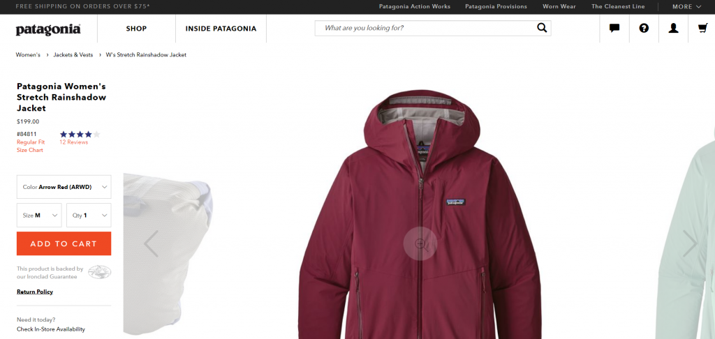
The wording and color of the button also matter, but you need to test it. Bigger buttons are better.
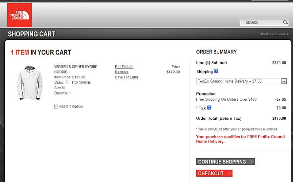
A few years ago, The North Face lacked a hierarchy with their buttons. The “Checkout” button is more important, but the “Continue shopping” button is nearly as prominent:
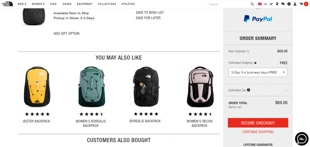
They’ve since fixed that by making the desired action clearer:
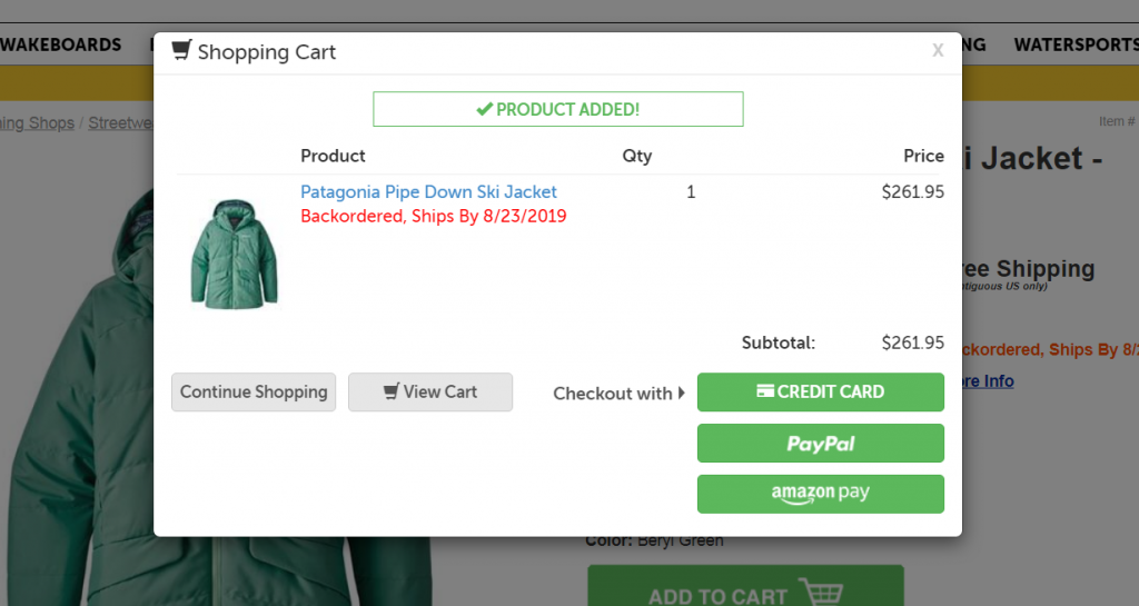
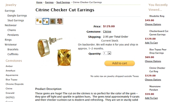
23. Back-ordering
Is an item out of stock? Too bad, no sale. Or still? If you plan to re-stock the item within a predictable time or can have it custom made/ordered, offer a back-order option.
Tips for research and implementation
Don’t copy Amazon (or other big brands)
What’s permitted to Jupiter is not permitted to an ox.
The big guys have a huge advantage over you. They’re known. They don’t have to wrestle with trust and security issues. People are super confident that Amazon or Target will deliver goods on time, have stuff in stock, accept returns, etc.
You still need to win customers’ trust. Don’t copy the big guys blindly. (Here are 10 more reasons why you shouldn’t).
Do user testing
Usability is your best friend. I strongly recommend you conduct user testing on your ecommerce site to find problems with your interface you might not be aware of. Give people some tasks (e.g. find X and buy it), and have them comment out loud while they’re browsing your site. You either watch over their shoulder or watch a screen recording.
About 15 people will discover 99% of problems. Even testing one target user is better than testing none at all. Usertesting.com and TryMyUI are some of the tools you can use for it.
Test this stuff
Take my advice. Then do your own testing.
Related Posts
-

Almost all business owners hate Yelp, but they understand its power. In general, user-generated reviews…
-
Get data-backed ecommerce guidelines you can implement right away to increase revenue. If you're wondering what…
-
Last time I kicked off my Christmas present series - a series of posts where…
-
In today's review I'm reviewing 2 different ecommerce product pages. Watch this 5-minute review: Pages…


Great article! We just launched our ecommerce store and there are definitely some ideas here that we’ll incorporate.
Amazing piece of information and classic examples to support them. Great work and I’d love to follow your writing henceforth.
Super! Great yet simple matters covered, a must read for every online store manager. Love the visual examples too!
GREAT article! you touched all the great points. One thing that really adds to the conversion is also the post sales experience, this can only be measured long term and with repeat shoppers – yes, they exist online! :)
Awesome article! We launched our eCommerce site (www.peckish.co) two weeks ago. There are definitely things we can improve on to boost our conversion rate! Thanks again.
Great article thank. I have always wondered about free shipping and I like the the backorder idea. :)
EXCELLENT article!! Every link was leading to something good, interesting and educational also! In all the months gone that i have spent reading articles of the same subject i don’t think i have yet come across content where i took so many interesting notes or couldn’t leave without finishing!
Worth a read… Thanks… looking forward to more insights :)
A very neat article giving insights very accurately and aptly.. Thanks and keep them coming :)
Great tips on increasing online CR: your suggestions are clear, actionable, practicle and right on target. We are start up with still some work to do on our site. Your tips will definitely be incorporated!
Great article, simple and easy to understand, but some hardcore comments that collectively could make all the difference!
This collection just makes me faint .. exactly what every ecommece business will be looking forward to
Some great points. I used to think that offering PayPal looked Mickey Mouse. But we recently added it to a number of stores and we have seen a higher than expected % of orders come in that way. Why not add Google Checkout, Amazon etc. Also..not too much about testimonials in this article but they can be very powerful if you are not selling in a format where reviews make sense.
Thanks for a great article with excellent examples! Just one note about the account creation. I agree it should be as easy as possible, but I would never trust a site that sends out passwords by email. Please do not encourage this practice. Email is an insecure medium. Instead send an invitation link where the user can enter a password to create an account or just provide a form on the order confirmation page.
This is so helpful. Kudos to the author for helping small businesses. This is amazing info!
great post. looking forward on your next article!
Excellent article which will really help more the first time e-commerce entrants like me. Thank you.
Really interesting and really information, it was surely a long list, must have taken you loads of time to compile, but it was worth the time it took to analyze each and every point.
Point Well Taken!
Great article, we have incorporated almost all the points described above like free shipping, good product images etc etc but sales are still on a lower side, why is that so?
Great article and specifically your point around search. However, it’s crucial to also understand what kind of conversion rates are you driving from search as those typically tend to be much higher due to strong intent from the user. Look at how many searches return no results, and that’s your loss of opportunity and low hanging fruit to increasing revenue.
Great Stuff. We will be using a lot of this for our clients.
Great post, indeed! I work for a new conversion optimization software . We used some of these ideas to create a conversion optimization quiz for ecommerce websites. The focus is on product page and cart page optimization. What do you think of it? http://quiz.marketizator.com/
Incredible article on conversion and sales. So much info to take from this. Thanks a lot
Hi,
First i want to say thank you so much for this treasure of infos. I have 2 very important questions, and i hope if you can answer me, cause it will resolve my biggest obstacles.
1) which is better, offering the lowest price possible, or offering slightly high price and give coupons for registering an account ?
2) How to implement free shipping if the shipping fees are more than 50€ (i can only offer secured shipping as i sell dresses for more than 200€) ? Also, if i try to add the shipping fees to the product price, it turns out to be very high comparing to my competitors, then i lose all possible buyers.
Thank you so much again
As far as free shipping goes I did this a while back in one of my ecommerce stores and had a substantial conversion increase. It’s really is one of the largest conversion boosters that I’ve found on our sites.
The one issue I ran into was that I knew the price of each product had to increase but it was difficult to determine by how much. I started with of a basic method of pretty much guessing, making a sale, retroactively figuring out the true cost then increasing each item by this price. For this site we have thousands of products ranging from less than 1lb to greater than 250 lbs so this method was clearly this was killing our margins and took a long time for us to ‘dial in’ the correct markup to use for each item (we have 2000+ products on this site alone!)
To solve this we did the following…. First take each SKU’s weight, the location of it’s origin and figure out the furthest destination code that this item could be shipped to. For us this part was easy, we only ship to the continental US and most of our warehouse locations are a zone 2 so the max we ship to is a zone 8. Just get a single zone 8 zipcode and since all zipcodes in a zone have the same shipping cost that’s all the data we needed. From here we went through each item, calculated the HIGHEST shipping cost of this item, then could add this cost to each time that we wanted to offer free shipping on.
Using this method, we know that in the very WORST case we’ll breakeven on a free shipping item that has to be shipped to a zone 8 (in our case). For every other destination in the US we’re in the black. This has allowed us to offer free shipping, know our margins ahead of time and be extremely competitive on price.
I’d like to start by saying that this is totally not a sales pitch but…. because a free friends first asked us for it we started to offer this as a product to others (currently Magento only) for a small fee. We allow users to upload their products and all at once calculate a breakeven worst case shipping price for every product in their database. Honestly you can totally do it by hand in Excel if you would rather. We offer this as a service because once you get to 100+ products using the UPS website to calculate the shipping price of every product a gets a tad repetitious.
If you want to check it out we would love to hear your feedback – http://sparkshipping.com
Great stuff, wish I had an article like this for converting paid subscription based sites. There are many similarities, but a lot of differences at the same time.
I recommend you to look this site about What is the Best Shopping Cart
for Joomla and extremely helpful with well explanation.
http://www.gowallaby.com/what-is-the-best-shopping-cart-for-joomla
Regarding live chat, I would highly recommend Inside. I accidentally came across inside, and after looking through their site http://www.inside.tm/, it morphs a business website into a virtual storefront so business personnel can see and help their site visitors in real-time using chat.
Amazing list, Peep! Product details in the form of video gives a 360 degree view of the product that help visitors take decisions quickly. I’d like to add that landing pages and a consistent navigation help in conversions greatly.
Landing pages are a highly focused way to promote products, trends etc. that urge a visitor to take action.
A clear and consistent navigation enables easy browsing and quick product discovery.
I wrote a similar post on ways to increase conversions for ecommerce sites, take a look. http://unbxd.com/blog/11-ways-generate-conversions-ecommerce-site/
Always remember to be creative and unique. Brand yourself different from other brands, even you are in the same industry or business with other competitors. One should think from the customer side, instead of seller side.
Great stuff. I really appreciate your post!
Amazing stuff!
This article kind a small bible to kept close.
Thanks a lot for the great tips!
I was working on my website and was wondering..is it user friendly or not. But now I’m implementing some change as you suggested in your post. Thanks a lot Peep Laja.
Most of these tips are nice but also a little useless because a majority of the small online stores use ecommerce websites such as Shopify or Big Cartel and many of them don’t give a lot of room for that kind of customization and are very limited. I myself use Shopify and I have to use about 35 apps or more in order for my store to run properly.
But you don’t have to be trapped by those guys. It’s a choice. You always have a choice.
Yes, this are good tips and they surface two big issues:
1. We can blindly trust a system and don’t think too much about optimization (Shopify, WooCommerce, Magento), so we just let it do its thing (even though I consider myself a tester I find myself making this mistake sometimes in one way or another, especially when trying new things.)
2. When you are trusting it and realize that you need to change some things, that’s when you see you need a developer to “fix it”, so you realize you can’t afford to be cheap about this. It’s all cost of opportunity.