
Sites that don’t work, don’t convert.
That’s why optimizers conduct quality assurance on sites, landing pages, test treatments, email campaigns, you name it—to make sure they work the way they’re supposed to.
While it’s common knowledge that quality assurance is something you should do, not enough optimizers complete it properly. If they did, there wouldn’t be so many sites that just plain don’t work.
Table of contents
What is website quality assurance (QA)?
Website quality assurance, frequently referred to as website QA, is the process where optimizers and developers test a website to ensure everything looks and works correctly on all relevant devices and browsers.
For optimizers, quality assurance ensures the quality of a site (or landing page, test treatment, email campaign, etc.) before visitors endure friction and other “conversion killers.”
Here’s how Lucian Adrian Stroie of R/GA defines it:
As it is the case with testing in any field (not just in software), it’s aim and scope is to provide information to stakeholders and decision makers about the tested item.
This information gathering happens by subjecting the item to be tested to various experiments.
Ideally, you conduct quality assurance before launching a tested item, but it’s never to late to start. If you’ve never conducted quality assurance on your site, you’ll find a lot of low-hanging fruit.
When conducting quality assurance for a test treatment, however, it must always be done prior to launch (or you’ll distort your data). After all, if you don’t conduct proper quality assurance, you might declare a vastly better treatment a loser due to a technical problem.
User testing vs. quality assurance
There’s some uncertainty about whether quality assurance is just user testing. Often, you’ll see them lumped together, with the terms used interchangeably.
There is a difference, however. Namely, user testing focuses on how the user actually experiences the site; quality assurance focuses on the site itself and how it stacks up against developer intentions.
User testing:
- Examines how real people perceive and use your site/software.
- Explores points of visitor/user misunderstanding, unexpected visitor reactions, points of friction, etc.
- Understands how the visitor experiences the site and how that differs from developer intentions.
Quality assurance:
- Examines the site itself.
- Looks for bugs, glitches, errors, broken links, points of friction, etc.
- Creates a faster, cleaner, better site that works the way the developer intended.
They complement one another well but are two very different things.
You might also consider combining qualitative user testing data with quantitative survey data to create a UX baseline. A UX baseline serves two purposes:
- Better understand the effect of your design changes.
- Better understand how your site’s UX compares with your competitors.
According to Ben Labay, Research Director for Speero agency, you should create a UX baseline during the conversion research phase, “ideally in conjunction with user testing so that qualitative insights can be coupled with the quantitative data behind the individual UX dimensions.”
To get quantitative survey data:
- Develop task/study objectives and success criteria.
- Collect data via an unmoderated remote user testing survey.
- Turn the survey results into a score for each dimension of site quality.
With a baseline, you can measure how UX improves (or declines) over time, meaning you can measure the effects of your treatments.
UX vs. QA
Given that user testing and quality assurance are complementary, it shouldn’t be surprising that the same can be said of user experience and quality assurance.
Jakob Nielsen of the Nielsen Norman Group explains:
Quality assurance (QA) and user experience (UX) have a two-way relationship:
- Most obvious, usability is a quality measure for design. To ensure usability, a good UX thus requires QA thinking.
- Beyond the user interface itself, many other quality issues also impact the total UX.” (via NN/g)
The more interaction between UX and QA, the better. Anna Schmunk of Dave Ramsey suggests that they should be “BFFs”:
QA and UX have a direct impact on what our customers experience, from flow to function. But more than that, they’re BFFs because both teams can have a symbiotic relationship. They have a huge opportunity to make each other better.
For example, UX learns who the audience is for the business and designs experiences specifically for those people. If the user experience team knows that 75% of their audience are visually impaired, they’ll make sure things are designed in such a way that the site is easier for visually impaired users to use. With that context, QA could step into functional testing looking for issues that could affect users with disabilities.
UX (and the entire development team) and QA teams should work together from the beginning. This allows QA to better understand the UX team’s intentions, making it easier for them to assess quality and spot bugs.
While most people think of QA helping UX, it really can be a two-way street.
Why is quality assurance important?
Maybe before you push something live, you check it on your desktop, on your phone, in Safari, and in Chrome to make sure everything looks and works right.
At a past CXL Live, Marie Polli, explained how extensive proper quality assurance is—and how risky it can be to ignore:
Sometime yesterday afternoon, your technical team got in touch with you and told you that the test is ready to go live.
You’re at this conference, enjoying yourself, watching the presentations, so you’re happy you can present something to your client. You’re happy you can set it live. You’re actually bringing value to the client.
So you check it maybe from your phone, your laptop, a couple of different browsers, but you don’t really do proper quality assurance. And it’s a very high-risk test. It’s on the checkout page, it directly influences revenue, and it’s an innovative test, so you have multiple elements on the page that were changed that can break.
Marie was talking about innovative testing, which is riskier by nature, but launching something that doesn’t work properly is always risky. And what works on one browser might not work on another, as Ian Newman of Box UK explains:
There is a huge amount of competition in the browser market (and has been since the days of cover disks with either IE, Netscape, or AOL on them) and therefore each browser tries to differentiate themselves.
Due to this, extra features are added or refined on top of the HTML standard meaning that each browser potentially deals with the same HTML in a different way.
If you don’t check all browsers (and all versions) as well as all devices (and all their operating system versions), you won’t know if something is broken.
And while you might consider Browser XYZ and Device ABC irrelevant and outdated, I assure you that someone has tried to visit your site using it.
If you fail someone, your poor QA causes two issues:
- Hurt trust and credibility;
- Cause frustration.
As Nielson explains, your site will be tested, no matter what:
Your design will be tested by users—your only choice is whether to run the test yourself before launch so that you can fix the inevitable problems while it’s cheap instead of playing expensive catch-up later.
For best results, quality assurance should be conducted on:
- Landing pages;
- Entire site.
- A/B test treatments;
- Email campaigns (including transactional emails).
The 11-step checklist for website QA
Here are the main categories that you might find in website QA guidelines (plus, where applicable, links to CXL articles where you can learn more):
- Speed;
- Error messages;
- Copy and content;
- Image quality/performance;
- Accessibility;
- Links;
- Font style and size;
- Site security;
- Online forms;
- Emails sent as expected;
- Bugs and crashes. (Visitors might blame themselves or develop superstitions about what will and will not result in a bug/crash.)
According to Usability First, the first step is to create your own set of guidelines:
Your company should come up with its own set of guidelines to follow while conducting quality assurance testing. The guidelines should address editorial, graphics, and coding conventions. After the site has been built, it should be put through a rigorous post-production process. Finally, there should be a provision for user feedback, which can influence the ongoing maintenance of the site.
For best results, have the QA team work with the UX team to develop these guidelines.
Going through your funnels
If you haven’t conducted quality assurance before, this is the perfect place to start. It just makes sense to start by conducting quality assurance on the user experiences that are the most profitable, right?
If you don’t go through your funnels step-by-step to ensure quality, you are neglecting to plug the biggest, most expensive leaks.
Or, you could waste thousands of dollars sending paid traffic to a landing page only to find out that people aren’t converting because of a problem on the checkout page.
To make sure the elements of your funnel are technically sound and issue-free, you could try writing scenario-based use cases, tasks for yourself. For example, “Submit lead gen form for ebook 1,” or, “Make a purchase by searching Google for keyword X.” Think of it as user testing, but you’re the user.
As Catriona Shedd of SalesforceIQ notes, you should also create scenarios where you fail to perform the task:
Create several scenarios in which a user fails, whether it be because of system constraints, incorrect actions, or unexpected system failure.
Try to ensure that errors are prevented whenever possible and that errors that do occur are clearly explained and help move the user forward.
Finally, don’t forget to conduct quality assurance on your analytics. As you’re going through your funnel and looking for issues, check to ensure your activity is being tracked properly in Google Analytics.
We’ve written an entire article on conducting a Google Analytics health check, which you can use to help you with this step.
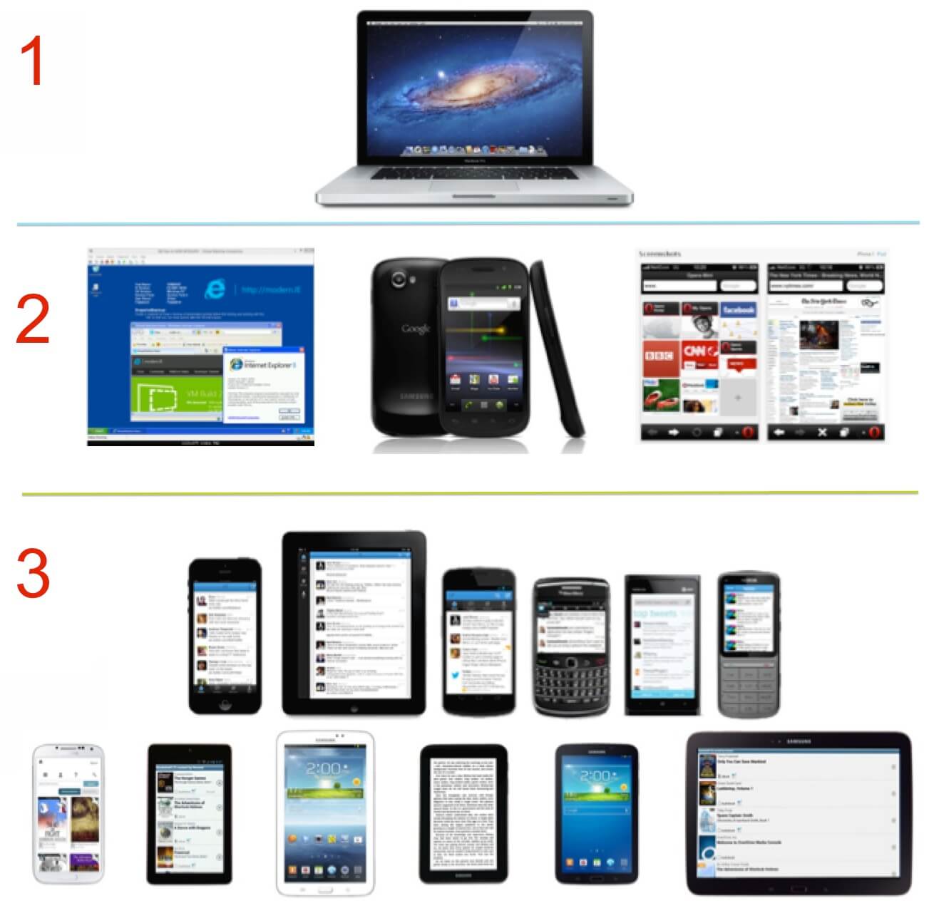
Cross-browser and cross-device quality assurance testing
Next, let’s focus on making sure your site (or treatment, email, etc.) displays properly on all browsers and devices. Note that you conduct cross-testing for two reasons:
- To discover bugs and errors. (You’re trying to break something.)
- To verify the user experience. (You’re making sure the experience is as developers intended.)
Google Analytics can help you find problem areas by looking at how your current visitors browse your site.
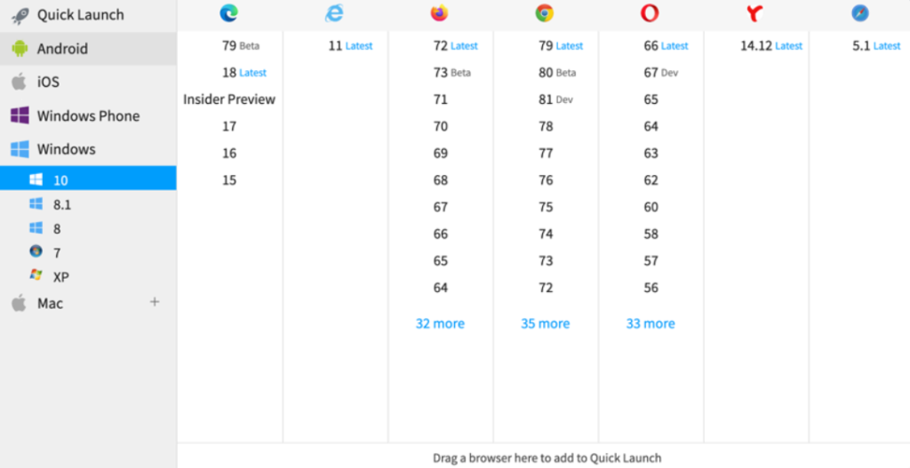
First, navigate to Audience > Technology > Browser & OS. Then, switch from the default “Data” view to the “Comparison” view. You can compare based on any metric (e.g., conversion rate, revenue), but you’ll see below that I’ve chosen bounce rate:
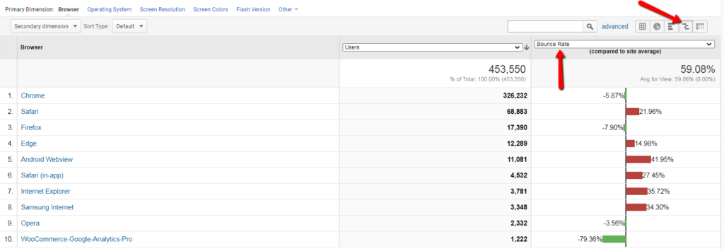
Note that you shouldn’t compare browsers to one another. Instead, compare browser versions within the same browser family. Click on the browser to see browser versions:
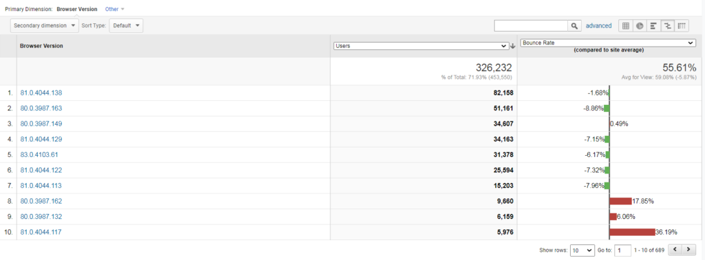
Now you’re looking at a prioritized list of browser versions to focus your energy on for the biggest ROI.
Then, you can go to Audience > Mobile > Devices and use the same “Comparison” view:
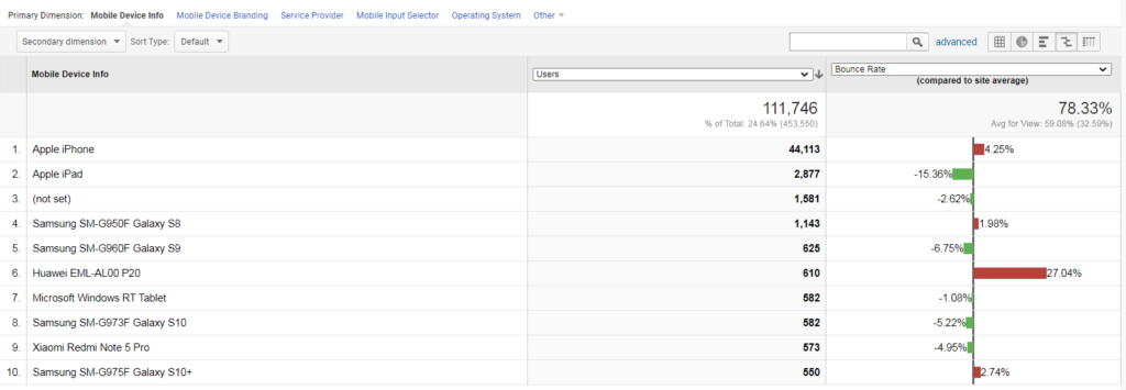
Again, compare within the same device family.
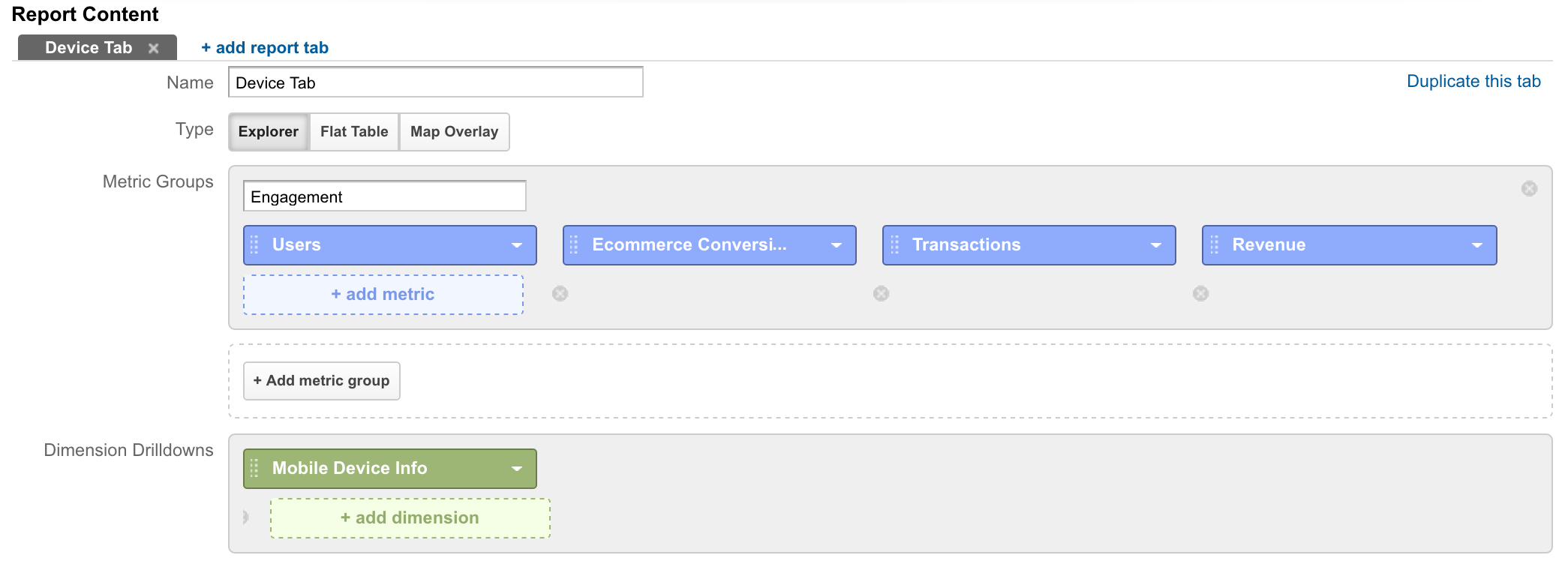
You can also use custom reports to keep an eye on your data. You can customize the report however you like, depending on your core metrics.
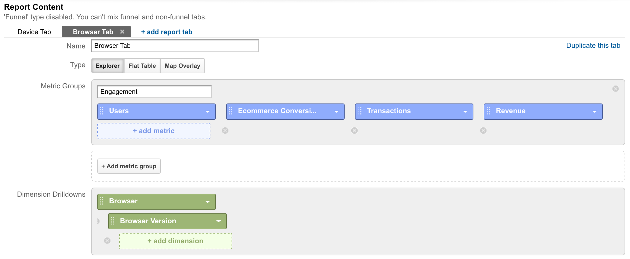
Here’s a quick example of what the device tab report might look like:
And here’s what the browser report might look like:
Now, if you’re conducting quality assurance pre-launch, the typical advice is to start with the most popular browsers and devices, then work your way down to less-popular ones. However, this isn’t your only option.
Chris Ashton of BBC explains how he and his team do cross-testing to save their sanity…
1. Reconnaissance
Conduct exploratory tests in a popular browser on a development machine. Get a feel for where the bugs might be hiding. Fix any bugs encountered.
2. Raid
Manually testing on a small handful of problematic browsers likely to demonstrate the most bugs. Fix any bugs encountered.3. Clearance
Sanity checking that the most popular browsers amongst your audience are cleared to get the expected experience.
Here’s how that looks visually:
In step one, you focus on the browser-agnostic issues. In step two, you find many, many more issues by checking your most problematic browsers, which also makes your site more resilient in less-problematic browsers.
Once you’re confident in the first two steps, you can move on to other browsers, knowing you’ve likely already fixed most issues.
You can also use tools, like BrowserStack, which allow you to test your site instantly on different browsers and devices.
There are a few testing methods to choose from:
- Live testing. An interactive lab where you can run live tests in hundreds of browser and OS combinations.
- Automated screenshots. Check your site’s design across multiple browsers using screenshots.
- Local testing. Test your site while it’s still in development, behind a firewall or on your desktop.
- Actual device testing. Test your site on actual browsers, not using emulators for even more accurate results.
- Selenium cloud testing. Automate browser tests across thousands of browsers for faster debugging and a pre-supplied infrastructure and Selenium grid.
So, for example, cross-testing tools allow you to browse your site through the lens of an iPhone 7:
…and then easily switch over to an iPad:
Given there are so many different browsers, browser versions, devices and operating systems, tools are a definite asset.
A special note on mobile quality assurance
As we’ve written before, just because you have a responsive design doesn’t mean your site displays and works properly on all browsers and devices. You still need to conduct quality assurance.
Due to the nature of mobile, you also need to consider some mobile-specific factors. Remember, a quality desktop experience looks quite different from a quality mobile experience.
Talia Wolf of GetUplift.co offers some advice and identifies common problem areas:
With mobile, it’s more than just identifying bugs and critical errors (which goes without saying). It’s about ensuring you have designed and set up a mobile experience that is seamless and easy to use.
- Keyboards: Make sure the right keyboard appears when people are ready to take that step. Whether it is to fill in their email address, phone number or add their credit card details, make sure that when people tap the field the right keyboard opens. Numeric for credit card details, text + @ to help complete their email address quicker, etc.
- Error Messages: On desktop, there are many ways to show errors. For example, within the field itself or beside it in a different colour. On mobile, highlight the field with the error in red and add short text below to describe the error.
- Load Time: On mobile, images may take longer to load, causing a lag in load time and causing a higher bounce rate. Make sure to reduce heavyweight images, consider the amount of images you use and optimize for best fit. You don’t necessarily have to use the same images as on desktop.
- Think Cross-Device: As many as 65% of all online shopping starts on mobile and continues to other devices (tablets/desktop). Make sure your mobile experience allows for people to save items for later or receive an email for future reference. At Banana Splash, we’ve added a ‘save for later’ pop up to many of our eCommerce customers’ mobile sites and increased their revenues by over 54%.
- Un-Playable Videos: There is nothing more frustrating and annoying than tapping on a video on mobile and getting this notice: ‘Video not available on mobile.’ Make sure your videos work on mobile or remove them before going live.”
Of course, the list goes on and on. When you switch to mobile quality assurance, switch your mindset and adjust your definition of quality, too.
Conclusion
“Check your site, landing pages, test treatments, and email campaigns for bugs and errors.” Seems like pretty straightforward advice, right?
Yet there are still many sites that just don’t work.
Here’s how to start plugging leaks and improve the quality of your site:
- Your UX and QA teams should work together closely so that both can perform their jobs better, resulting in a better-performing site.
- Conduct quality assurance on your analytics. Is activity being properly reported in Google Analytics?
- Create a set of guidelines with the help of the development team before you begin quality assurance.
- If you haven’t conducted quality assurance before, start by going through your funnels. Use scenario-based use cases to complete tasks and fail to complete tasks, both of which will shed light on issues.
- Use Google Analytics to help you find browsers and devices that aren’t performing as well as others.
- Quality assurance is time-consuming, so use cross-testing tools or modified strategies to get a bigger ROI faster, like BBC’s three phases.
Working on something related to this? Post a comment in the CXL community!
Related Posts
-

Do you want to make your website better? There are many ways to optimize a…
-

In today's review I'm assessing whether websites in question could do anything to better get…
-
List building is a top priority for a blog. In this review we look at…
-
In today's review, Tommy is assessing the visual complexity of a cabinet hardware eCommerce site…


That’s Great Article website quality is first thing thanks for the great review and help.
Thanks Jadi. I really appreciate it. Glad I could help.