Heat maps are a popular conversion optimization tool, and for good reason. We leveraged correctly they are a powerful way to better understand your audience and deliver more value.
So what can heat maps answer?
Table of contents
- What are heat maps?
- What is a website heat map?
- The 4 types of heat maps
- Bonus: User session replays
- 6 best tools to create heatmaps in 2022
- 19 things we’ve learned from heat-map tests
- 1. The content that’s most important to your visitors’ goals should be at the top of the page.
- 2. When in a hurry, what sticks out gets chosen.
- 3. People spend more time looking at the left side of your page.
- 4. People read your content in an F-shaped pattern.
- 5. Don’t lose money through banner blindness.
- 6. When using an image of a person, it matters where they look.
- 7. Men are visual; women seek information.
- 8. Abandon automatic image carousels and banners for better click-through rates.
- 9. Use contrast wisely to guide your visitors.
- 10. 60-year-olds make twice as many mistakes as 20-year-olds.
- 11. Use photos to get your visitors to pay attention.
- 12. Summaries are better than full articles on blog homepages.
- 13. People spend less than a minute on your email.
- 14. Combine A/B testing with clickmaps for increased effectiveness.
- 15. Displaying the discounted price next to the original one will increase satisfaction.
- 16–19. Eyetrack III research on news portals
- What’s wrong with heat maps?
- Conclusion
What are heat maps?
Heat maps are visual representations of data. They were developed by Cormac Kinney in the mid-1990s to try to allow traders to beat financial markets.
In our context, they let us record and quantify what people do with their mouse or trackpad, then they display it in a visually appealing way.
“Heat maps” are actually a broad category that may include:
- Hover maps (mouse-movement tracking);
- Click maps;
- Attention maps;
- Scroll maps.
To make accurate inferences for any of the above heat-map types, you should have enough of a sample size per page/screen before you act on results. A good rule of thumb is 2,000–3,000 pageviews per design screen, and also per device (i.e. look at mobile and desktop separately). If the heat map is based on, say, 50 users, don’t trust the data.
What is a website heat map?
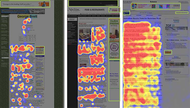
A website heat map is a visual illustration of how your users interact with your website by depicting the categories on your website in a range of colors from the “most popular” in red to the “least popular” in blue.
The 4 types of heat maps
Since there are a few different types of heat maps, let’s go over each one of them and the value they offer.
1. Hover maps (Mouse-movement tracking)
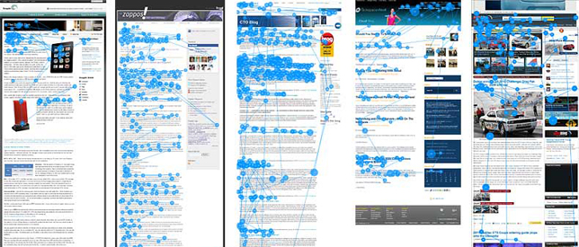
When people say “heat map,” they often mean hover map. Hover maps show you areas where people have hovered over a page with their mouse cursor. The idea is that people look where they hover, and thus it shows how users read a web page.
Hover maps are modeled off a classic usability testing technique: eye tracking. While eye tracking is useful to understand how a user navigates a site, mouse tracking tends to fall short because of some stretched inferences.
The accuracy of mouse-cursor tracking is questionable. People might be looking at stuff that they don’t hover over. They may also hover over things that get very little attention—therefore, the heat map would be inaccurate. Maybe it’s accurate, maybe it’s not. How do you know? You don’t.
In 2010, Dr. Anne Aula, a Senior User Experience Researcher at Google, presented some disappointing findings about mouse tracking:
- Only 6% of people showed some vertical correlation between mouse movement and eye tracking.
- 19% of people showed some horizontal correlation between mouse movement and eye tracking.
- 10% hovered over a link and then continued to read around the page looking at other things.
We typically ignore these types of heat maps. Even if you do look at it to see if it supports your suspicions, don’t put too much stock in it. Guy Redwood at Simple Usability is similarly skeptical about mouse tracking:
We’ve been running eye tracking studies for over 5 years now and can honestly say, from a user experience research perspective, there is no useful correlation between eye movements and mouse movements – apart from the obvious looking at where you are about to click.
If there was a correlation, we could immediately stop spending money on eye tracking equipment and just use our mouse tracking data from websites and usability sessions.
Hence why Peep calls these maps “a poor man’s eye-tracking tool.”
Without much overlap between what these maps show and what users do, it’s tough to infer any actual insights. You end up telling more stories to explain the images than actual truths. This blog post criticizing heat maps for soccer players’ movements puts it well:
“What do heat maps do? They give a vague impression of where a player went during the match. Well, I can get a vague impression of where a player went during a match by watching the game over the top of a newspaper.”
While some studies indicate higher correlations between gaze and cursor position, ask yourself if the possible insights are worth the risk of misleading data or encouraging confirmation bias in the analysis.
What about algorithm-generated heat maps?
Similarly, there are heat map tools that use an algorithm to analyze your user interface and generate a resulting visual. They take into account a variety of attributes: colors, contrast, visual hierarchy, size, etc. Are they trustworthy? Maybe. Here’s how Aura.org put it:
Visual Attention algorithms, where computer software “calculates” the visibility of the different elements within the image, are often sold as a cheaper alternative. But the same study by PRS, showed that the algorithms are not sensitive enough to detect differences between designs, and are particularly poor at predicting the visibility levels of on-pack claims and messaging.
(Note: PRS, the other study cited above, sells eye-tracking research services.)
While you shouldn’t fully place your trust in algorithmically generated maps, they’re not any less trustworthy than hover maps.
And, if you have lower traffic, algorithmic tools can give you some visual data for usability research, including instant results, which is cool. Some tools to check out:
Just because it’s “instant” doesn’t mean it’s magic. It’s a picture based on an algorithm—not actual user behavior.
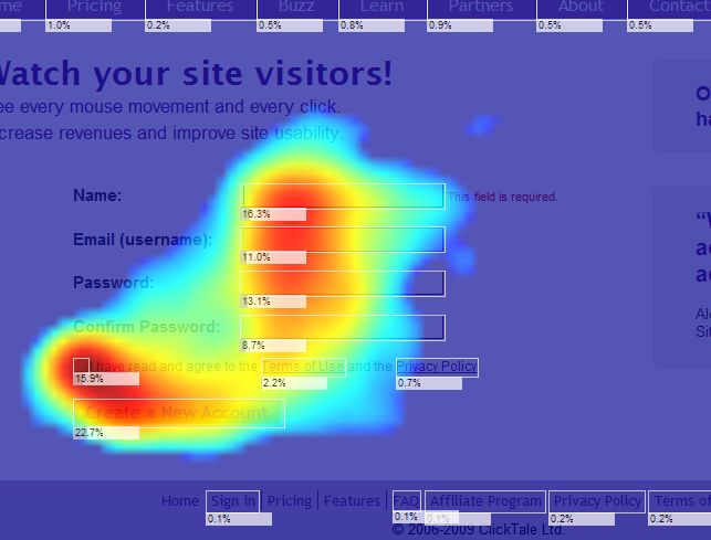
2. Click Maps
Click maps show you a heat map comprised of aggregated click data. Blue means fewer clicks; warmer reds indicate more clicks; and the most clicks are bright white and yellow spots.
There’s a lot of communicative value in these maps. They help demonstrate the importance of optimization (especially to non-optimizers) and what is and isn’t working.
Does a big photo get lots of clicks but isn’t a link? You have two options:
- Make it into a link.
- Don’t make it look like a link.
It’s also easy to take in aggregate click data quickly and see broad trends. Just be careful to avoid convenient storytelling.
However, you can also see where people click in Google Analytics, which is generally preferable. If you’ve set up enhanced link attribution, the Google Analytics overlay is great. (Some people still prefer to see a visual click map).
And, if you go to Behavior > Site Content > All pages, and click on a URL, you can open up the Navigation Summary for any URL—where people came from and where they went afterward. Highly useful stuff.
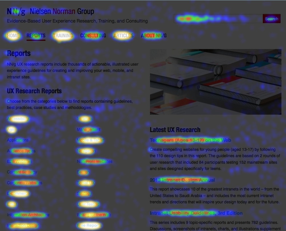
3. Attention maps
An attention map is a heat map that shows you which areas of the page are viewed the most by the user’s browser, with full consideration of the horizontal and vertical scrolling activity.
They show which areas of the page have been viewed the most, taking into account how far users scroll and how long they spend on the page.
Peep considers attention maps more useful than other mouse-movement or click-based heat maps. Why? Because you can see if key pieces of information—text and visuals—are visible to almost all users. That makes it easier to design pages with the user in mind.
Here’s how Peep put it:

Peep Laja:
“What makes this useful is that it takes account different screen sizes and resolutions, and shows which part of the page has been viewed the most within the user’s browser. Understanding attention can help you assess the effectiveness of the page design, especially above the fold area.”
4. Scroll Maps
Scroll maps are heat maps that show how far people scroll down on a page. They can show you where users tend to drop off.
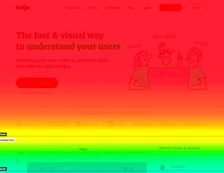
While scroll maps work for any length of page, they’re especially pertinent when designing long-form sales pages or longer landing pages.
Generally, the longer the page, the fewer people will make it all the way to the bottom. This is normal and helps you prioritize content: What’s must have? What’s just nice to have? Prioritize what you want people to pay attention to and put it higher.
Scroll maps can also help you tweak your design. If the scroll map shows abrupt color changes, people may not perceive a connection between two elements of your page (“logical ends”). These sharp drop-off points are hard to see in Google Analytics.
On longer landing pages, you might need to add navigation cues (e.g. a downward arrow) where the scrolling stops.
Bonus: User session replays
Session replays aren’t a type of heat map per se, but they are one of the most valuable bits that heat mapping tools offer.
User session replays allow you to record video sessions of people going through your site. It’s like user testing but without a script or audio. Also unlike user testing—in a positive way—is that people are risking actual money, so it can be more insightful.
Unlike heat maps, this is qualitative data. You’re trying to detect bottlenecks and usability issues. Where are people not able to complete actions? Where do they give up?
One of the best use cases for session replays is watching how people fill out forms. Though you could configure Event tracking for Google Analytics, it wouldn’t provide the level of insight as in user session replays.
Also, if you have a page that’s performing badly and you don’t know why, user session replays may identify problems. You can also see how fast users read, scroll, etc.
Analyzing them is, of course, timely. We spend half a day watching videos for a new client site. And after looking at hundreds (thousands?) of heat maps and reviewing other studies, we’ve identified some recurring takeaways from heat maps of all kinds.
If you want to get started with heat mapping, here are some tools to consider.
6 best tools to create heatmaps in 2022
Quite a few companies offer excellent heat mapping tools, with a range of free trial, freemium, paid, and fully free options.
Paid heat-mapping tools
Crazyegg is a great tool for mouse-tracking tests. It features a click heat map, scrollmap, overlay for number of clicks on specific elements, and confetti, which you can use to distinguish clicks based on referral sources. They claim to have up to 88% tracking accuracy when compared to eye-tracking tests. All plans are free for 30 days; paid plans start at $24/month.
Mouseflow is another good tool for mouse tracking. They put a lot of emphasis on playback and record all mouse movements—clicks, scroll events, key strokes, and form interactions. You can even record visitors’ keystrokes when filIing forms. They have separate options for ecommerce tracking. Pricing starts from $30/month, and they also have a small freemium plan.
Clicktale is enterprise-level mouse-tracking software. The software includes heat mapping, session replays, conversion analytics, and other advanced analytics. You need to contact them for pricing.
Luckyorange offers mouse-movement recording and tools like real-time visitor maps, visitor polls, and live chat software. It has a free trial, with paid plans starting at $10/month.
Free heat-mapping tools
Clickheat is an open-source alternative that allows you to create a heat map from mouse clicks on your site.
Corunet requires development support. Similar to Clickheat, Corunet allows you to generate a heat map from click data on your pages.
19 things we’ve learned from heat-map tests
We’ve looked at a lot of heat maps over the years. So have other researchers. And while every site is different (our perpetual caveat), there are some general takeaways.
You should test the validity of these learnings on your site, but, at the very least, these generalized “truths” should give you an idea of what you can expect to learn from a heat map.
1. The content that’s most important to your visitors’ goals should be at the top of the page.
People do scroll, but their attention span is short. This study found that a visitor’s viewing time of the page decreases sharply when they go below the fold. User viewing time was distributed as follows:
Above the fold: 80.3%
Below the fold: 19.7%
The material that’s most important to your business goals should be above the fold.
In the same study, viewing time increased significantly at the very bottom of the webpage, which means that a visitor’s attention goes up again at the bottom of the page. Inserting a good call to action there can drive up conversions.
You should also remember the recency effect, which states that the last thing a person sees will stay on their minds longer. Craft the end of your pages carefully.
2. When in a hurry, what sticks out gets chosen.
A Caltech neuroscience study showed that at “rapid decision speeds” (when in a rush or when distracted), visual impact influences choices more than consumer preferences do.
When visitors are in a hurry, they’ll think less about their preferences and make choices based on what they notice most. This bias gets stronger the more distracted a person is and is particularly strong when a person doesn’t have a strong preference to begin with.
If the visual impact of a product can override consumer preferences—especially in a time-sensitive and distracting environment like online shopping—then strategic changes to a website’s design can seriously shift visitor attention.
3. People spend more time looking at the left side of your page.
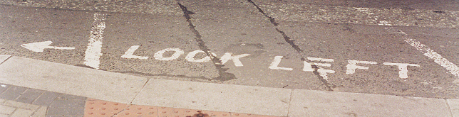
Several studies have found that the left side of the website gets a bigger part of your visitors’ attention. The left side is also looked at first. There are always exceptions, but keeping the left side in mind first is a good starting point. Display your most important information there, like your value proposition.
This study found that the left side of the website received 69% of the viewing time—People spent more than twice as much time looking at the left side of the page compared to the right.
4. People read your content in an F-shaped pattern.
This study found that people tend to read text content in an F-shaped pattern. What does that mean? It means that people skim, and that their main attention goes to the start of the text. They read the most important headlines and subheadlines, but read the rest of the text selectively.
Your first two paragraphs need to state the most important information. Use subheadings, bullet points, and paragraphs to make the rest of your content more readable.
Note that the F-pattern style does not hold true when browsing a picture-based web page, as is evident in this study. People tend to browse image-based web pages horizontally.
5. Don’t lose money through banner blindness.
Banner blindness happens when your visitor subconsciously or consciously ignores a part of your webpage because it looks like advertising. Visitors almost never pay attention to anything that looks like an advertisement.
This study found no fixations within advertisements. If people need to get information fast, they’ll ignore advertising—and vice versa. If they’re completely focused on a story, they won’t look away from the content.
There are several ways to avoid creating banner blindness on your website. Most problems can be prevented by using a web design company that’s experienced in online marketing.
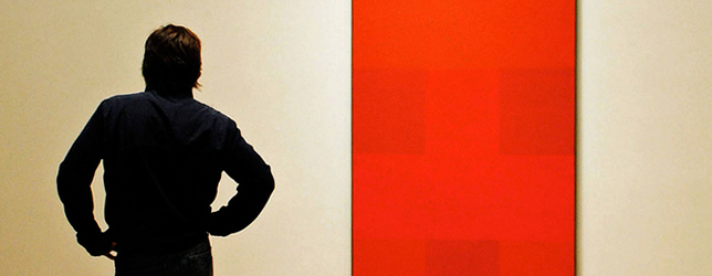
6. When using an image of a person, it matters where they look.

It makes sense to use people in your design—it’s a design element that attracts attention. But it also matters where their eyes are looking.
Several heat map studies have shown that people follow the direction of a model’s eyes. If you need to get people to focus not only on the beautiful woman but the content next to her, make sure she’s looking at that content.
It’s also important to convey emotion. Having a person convey emotion can have a big impact on conversion rates. This study found that a person conveying emotion can have a larger impact on conversions than a calm person looking at the call to action.
Your best option may be to combine these two approaches—use an emotion-conveying person who’s also looking at the desired spot on the page.
7. Men are visual; women seek information.
When asked to view profiles of people on a dating site, this study found a clear difference between men and women. Men were more visual when looking at a profile of a person, focusing on the images; women tended to read more of the info provided.
In another study, men spent 37% more time looking at the woman’s chest than women did, whereas women spent 27% more time looking at the ring finger. The study concluded, that “men are pervs, women are gold-diggers.”
8. Abandon automatic image carousels and banners for better click-through rates.
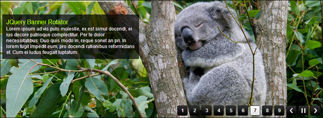
This study concluded that, on two sites where users had a specific task on their mind, the main banners were completely ignored, including the animated version. Automatic image carousels and banners are generally not a good idea. They generate banner blindness and waste a lot of space.
The same study found an exception to this rule in of the sites—a banner on ASOS’s homepage that captured the attention of participants better than the other sites. How was it different? It looked less like a banner and was better integrated into the page.
9. Use contrast wisely to guide your visitors.
After testing a landing page with heat maps, TechWyse found out just how important color contrast is. A non-clickable, informational element about pricing on the homepage won the most attention because of its color contrast with the surrounding area.
After a slight redesign, the scanning patterns of visitors aligned with what the company needed.
10. 60-year-olds make twice as many mistakes as 20-year-olds.
When your target audience is elderly, make your website as easy to use and clutter-free as possible. When testing 257 correspondents in a remote user test, the failure rate for tasks was 1.9 times greater for those over-55 compared to those under-25. Almost twice as many older people failed or abandoned the given task.
Older people are also slower online.Compared to the youngest participants, the oldest took 40% more time to complete a task.
Even if a random task on your website feels easy to you, it may be difficult for older users. If your target audience skews older than average, make sure to test you layout on them.
11. Use photos to get your visitors to pay attention.

People are visual. Sites have been using well-selected images to boost conversion rates since the dawn of internet, and with good reason. Including a well-selected image is almost always a good idea.
Use photos of real people. People respond well to images of real people. In this study, the test subject spent 10% more time viewing photos of employees compared to reading the text content that made up the majority of the page.
In contrast, visitors completely ignore stock photos of “real” people. Somehow, we’ve learned to recognize “photobank people” from photos of actual people. This blog post is a perfect example of what may happen when using stock photography. This also holds true for actual photos that may look like stock photos, so don’t over-edit your photos.
This study proved that your photo is the most important element on your LinkedIn profile, and this study found the same correlation on Facebook.
When used well, big product photos are also a guaranteed way of getting attention.
12. Summaries are better than full articles on blog homepages.
This study found that using article summaries instead of full articles on your blog homepage will make visitors read more content.
If you have a blog with full articles on its homepage, you risk losing visitors if they don’t find your first article interesting. They will “use up” all their interest reading the first article.
Summaries let you show visitors a wide selection of topics, which increases the likelihood that your visitor fill find something of interest.
13. People spend less than a minute on your email.
This study revealed that 67% of the users had no fixations within newsletter introductions. People tended to skip the introductory paragraphs and scan the rest of the content.
The average time allocated to a newsletter was 51 seconds; people fully read only 19% of newsletters. They mostly scanned, so keep your newsletters short and to the point, with a clear call to action.
14. Combine A/B testing with clickmaps for increased effectiveness.
The people at VWO found out that nearly 25% of their homepage traffic went to a tiny “pricing” link in the top menu, while the main call-to-action button gathered only 5% of the total clicks.
They combined the click map knowledge with A/B testing to find out which version of a changed homepage would work better.
When you combine the knowledge from click maps with A/B testing, you can increase the effectiveness of your click maps many times. CareLogger achieved a 34% increase in conversions by changing the color of their call-to-action button.
15. Displaying the discounted price next to the original one will increase satisfaction.
Inspired by Dan Ariely’s book Predictably Irrational, Robert Stevens did a test with 60 random people to see how relativity affects everyday decision-making.
People were tested with two different shelf layouts for smoothies. The first version had only the discounted “Innocent” smoothies visible, with none of the smoothies from the same brand at full price. The second version also included a selection of smoothies at regular prices.
While the price for discounted smoothies was unchanged, people were more satisfied with their purchase when they also knew about the original price.
16–19. Eyetrack III research on news portals
In the Eyetrack III research, several dozen people were observed for one hour as they were given mock news websites and real multimedia content to visit.
16. People’s eyes fixated first on the upper left of the page, then hovered in an area to the right. Only after some time did people start exploring further down the page.
17. People see dominant headlines first, Especially when they’re in the upper-left corner.
18. Use smaller type for focused reading. Larger type resulted in more scanning of the page because people looked around for words or phrases that captured their attention.
19. The first words of your headline are important. If the first words engage your visitors, they’re likely to read on. You have less than a second to get their attention.
With so much they can do, it’s worth remembering: Heat maps aren’t good for everything.
What’s wrong with heat maps?
Heat maps’ problems recall the old adage about the drunk and the light post—people use it for support instead of illumination.
Ignoring some of the data inaccuracies discussed above opens you up to a world of potential bias, especially if heat maps are your primary piece of conversion research.
Andrew Anderson, head of optimization at Malwarebytes, puts it very well:

Andrew Anderson:
Nothing shows a lack of understanding of rate and value more than people getting overly caught up with where people click.
Is more or less people clicking on something good or bad? Is the most clicked thing the most important? The most influential? What will happen if twice as many people click on this one thing? Does something have to be clicked on a lot to have influence? Does it have to be clicked on at all?
Heat maps, in the end, provide a thousand more questions without the ability to answer a single one in a meaningful way.
What we know is that most people will use their bias to determine the value of items and use that to filter all the incoming information. They will confuse the most active for the most valuable. They will default to a linear rate model, which is the least representative type of model. They will try to get more people to a step or an item on the page without any real insight into the relative value or efficiency of that change.
Even worse, they will use a heat map or any click-based metric as a way to continue their storytelling and to continue to confuse what they hope will happen with what is the best for the site or page.
Heat maps can be helpful at a high level and as a way to communicate problem areas to less analytically savvy people in an organization. They can also be a good starting point for conversion research and analysis.
But almost all the insight they bring can be gleaned from different analytics tools, and Google Analytics tends to offer less wiggle room for interpretation, storytelling, and bias.
In other words, heat maps are great tools in the optimizer’s arsenal but should not be the end-all-be-all for project and test planning.
Conclusion
Heat maps look pretty cool. And they can offer substantial value—if used right):
Here are some of the may ways heat maps can be used to improve your marketing.
- Algorithmic heat maps can give low-traffic sites an idea of how people use their site.
- Click maps can give high-level visuals on where people click and where they don’t.
- Attention maps help you see which parts of a website are most visible to all users, across all browsers and devices. They help you decide where to put your value prop and other important elements.
- Scroll maps can help you design longer landing pages and keep people moving down the page (prioritizing content location as well).
- User session replays are irreplaceable tools in your arsenal.
But you should never rely solely on heat maps for conversion research. The results are limited at best and misleading at worst, compounding bias and delivering illusory insights.
Related Posts
-

Most of the personal development advice there assumes you have no kids. I don't want…
-
Hiring is tough. Interviews and not even their history are not perfect to assess somebody's…
-

"How do we get our customers to do what we want them to do?" Digital…
-
Today I'm reviewing lead magnets. Lead magnets are the key contributors to high email opt-in…
Great article. Glad that someone has finally come out and said it.
Perfect example: we were using heat maps (and scroll maps) to see how far people scrolled on our webpage and where they paid attention. We focused on prioritizing content to where people scrolled and hovered over, and also increasing our scroll depth. Then we realized that the people that convert only read the first section. So we actually should have been preventing scroll (or deleting extraneous content).
To Ryan’s comment: many enterprise users of customer experience solutions compare segmented heatmaps that show how converters vs. non-converters behaved differently on the site.
Sometimes it jumps out from that comparison that those who scrolled deep and immersed themselves in the technical details of a product page end up not converting. There are many possible explanations. For example, as retailers know some “nice to have” products are more likely to be purchased when buyers remain in an emotional decision making mode as opposed to engaging in a rational buying process. Too much info switches buyers from emotional to rational buying.
But as you point out that is just one possible explanation. Since there is no way to know for sure, the best way to leverage the insight is to run a test. For example, formulate a hypothesis: What if the product pages don’t show technical details upon scroll down but put them behind tabs so the details are less in your face and keep buyers in an emotional buying mode.
Let the test data decide.
For companies selling discretionary products this and similar adjustments have led to 3x increases in Sales as we’ve seen in our work with customers at ClickTale.
In general, I want to disagree with some of the tone in this article. Just because you cannot deduct causation from correlation and cannot be 100% sure that the eye is where the mouse is doesn’t mean that the data aren’t useful. You just have to know how to use the data.
This reminds me about the debate ten years ago about whether web analytics data is accurate. As you know, the conclusion for web analytics has been: It’s not and get over it!
But that doesn’t mean that the analytics aren’t tremendously useful for increasing revenues and customer experiences.
yawn
Another catchy headline with Peeps hubristic style.
Truth is any data is “crap” if not analyzed from every perspective. And sample size does matter. 3k, really? If you really want to critique bad assumptions based statistical inference, 3k is hardly reliable. Perfect world, 100k samples at least.
Correct, the perfect world is rarely possible with the constraints of most small and medium sized businesses (traffic)… but if you’re going to make a statement about “crap”, how about some solid math behind it. For those unfamiliar with statistical mathematics, the rate of error (standard deviation) is near zero with large data samples. 3k is on that scale is far too small to determine any hypothesis/ conclusion with any certainty.
Thanks John.
While the article is not written by me, I appreciate your feedback. I don’t see anything being called “crap” in the article, but I do agree that in addition to offering a ballpark number (as this is what people remember far better than sample size calculations), it should also state a proper statistical way of determining it. Magic numbers for sample sizes don’t exist.
Interesting piece, thanks for sharing.
Full disclosure: I work for Decibel Insight, an analytics tool that includes a suite of heatmaps.
In the past I’ve seen some research touted around by other heatmap providers that suggests a correlation between cursor position and eye gaze. This seems tenuous to me personally, from my own anecdotal experience, and we tend to say in our own demos that focus heatmaps provide a proxy of eye gaze at best.
I think it’s fair to say, though, that there is value in seeing where cursor position commonly falls among your users, because, unlike pure click tracking, it shows content that is “tempting” too. Again, though, this is an inexact science. You need to combine this kind of evidence with the session replays, metric-focused analytics, and VOC too.
We’ve developed heatmaps that do not track clicks on the page with dots (which is fraught with inexactitude and confirmation bias) but instead attribute values to clickable elements precisely, tracking them across responsive views and removing the need to approximate, based on colour and ‘size of blob’ alone, how many clicks occurred in a given area.
These heatmaps are called Attribution heatmaps, and as well as tracking clicks they also track the elements that contribute to eventual goal achievement, which is extremely useful for CRO. I’d urge you to check them out. https://www.decibelinsight.com/heatmaps/attribution-heatmaps/
As Arin says, heatmaps are as useful as the tests they give rise to. They’re one part of the arsenal of tools available to web analysts and optimizers, and I think that when they’re used in a wider mix they can be extremely helpful.
Great article, as always.
Advice – don’t bother contacting Eye Quant, there is no response after 10 days. The expectations were as high as the prices on their page.
Great content!
Our company uses a lot of cartoons/sketched images. What is your takeaway about conversions rate Vs real people images?
Great post, also should be mentioned Hotjar and Plerdy Heatmap