There’s a popular user experience quote: “A user interface is like a joke. If you have to explain it, it’s not that good.” While clever, that statement is far from true.
User interfaces shouldn’t be complicated, but you can’t expect a new user to understand a new interface without any direction. Similarly, you can’t expect an existing user to understand an updated interface or a new feature without any help.
That’s where user onboarding flows come into play. Proper user onboarding leads to more money in the bank. It’s a familiar concept for most, yet user onboarding flows are often created during development—then ignored.
Onboarding flows deserve innovation, experimentation, and optimization, too. You might be surprised by the ROI.
Table of contents
- What is user onboarding?
- User onboarding flows: types and subtypes
- Two popular user onboarding myths
- Questions to ask before designing a user onboarding flow
- 6 user onboarding flow examples
- Top 10 user onboarding tools
- Why are user onboarding flows important?
- How can you set user onboarding goals?
- Conclusion
What is user onboarding?
User onboarding is the process where a product, service, or app is introduced to a new user and they become familiar with it.
This phase often starts with the user’s very first experience with the product, where they are expected to be assisted and taught what to do. It’s a crucial moment where the product makes its first impact, and it may also begin before the user interacts with the product.
User onboarding flows: types and subtypes
There are two main types of user onboarding flows:
- Mobile user onboarding flows introduce you to a game, a productivity app, a banking app, etc.
- Desktop user onboarding flows introduce you to a task-management tool, a conversion research SaaS, etc.
5 subtypes for onboarding new users
There are also different subtypes depending on how you’re onboarded:
- Benefit-focused: Explains the 2–3 core benefits and how to achieve that benefit via the site/product/app.
- Function-focused: Explains the 2–3 core functions of the site/product/ app and how to use them.
- Doing-focused: Walks the user through the first or most common actions.
- Account-focused: Walks the user through account/profile creation, including finding and adding friends or interests.
- All: For complex sites/products/apps, it may be necessary to combine the four above.
The onboarding type depends on the medium, but the five subtypes are all viable options. It comes down to how much information your new users need to get to the core value, how easy it is to discover the core value organically, and how “new” the core value is.
Two popular user onboarding myths
Despite popular belief, user onboarding does not begin and end with the first experience. There are three stages of user onboarding:
- Before: The sign-up/registration phase. How friendly is your form?
- During: The initial user onboarding flow that most people consider “user onboarding.”
- After: All other stages of the customer lifecycle. How can you help existing users understand new features?
Another common misconception is that onboarding email flows and on-site/in-app onboarding flows are separate. The two complement one another, working together to bring the user to the core value as quickly as possible. On their own, they’re rarely successful.
Questions to ask before designing a user onboarding flow
Before you design your user onboarding flow, answer a few questions:
- What’s the core value you’re trying to deliver to your users?
- What steps do new users need to take to receive that core value?
- What friction might exist within those steps?
- What actions do long-lasting users take? How can you encourage new users to take them?
- How familiar are your new users with similar products?
- How easy is it to understand your core benefits/functions?
Nate Munger explains why the answers to these questions are important:

“Some new users expect you to welcome them and show them around the place, while others prefer you to get out of their way as soon as possible and let them figure things out for themselves.
The problem is that in order to be a top site with tens or even hundreds of millions of active users, you’re going to have to successfully onboard customers from across this spectrum. On top of that, users don’t necessarily want to do the things you need them to do in order to be successful.
You need to balance the user experience of onboarding with the friction of necessary steps such as account creation, user education, and data gathering. No small challenge.” (via Intercom)
There is no “right” or “perfect” user onboarding flow. What works for one site/product/app might not work for another. In fact, what works for one user might not work for another. Designing a user onboarding flow that works is complicated. It involves a lot of research, testing, and optimization.
For example, you might need to onboard a developer vs. an average user. In that case, the flow will look very different. As Sascha Konietzke said:
Onboarding for API-centric products is very different. Developers don’t want a forced click-through tutorial, they want to use your API right away. Support them with quick-start documentation, as well as example code, and get out of their way as soon as you can.
While there are no absolutes, Samuel Hulick of UserOnboard relies on some core principles:

Samuel Hulick, UserOnboard.com:
- “User-centric, not product-centric: Onboarding tends to fall down when it’s just about the software pointing itself out.
- Action-oriented, not instructive: Rather than throwing up a bunch of tooltips that I have to remember later, have me learn by doing.
- Informed, not reactionary: Are the things you’re having me do highly correlated with me getting value out of the product, or are you just offloading busywork because your design is broken?
- Evolving, not fixed: Onboarding isn’t a “feature” but it’s often treated that way. Are you treating it like a quality of your overall experience that evolves along with your product and market, or is it something you ship every couple years?
- Holistic, not one-off: Onboarding can take the form of knowledge center docs, blog posts, invitations from a friend, lifecycle emails, a well-timed phone call, etc. Are you focusing on the interface and leaving the rest on the table?” (via Inbound.org)
6 user onboarding flow examples
Let’s look at 6 good examples of user onboarding:
1. ROBIN
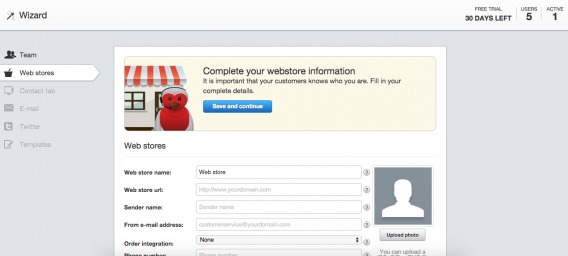
ROBIN is an all-in-one ecommerce customer service tool. All-in-one tools are an easy target for user onboarding flow analysis. Since they are typically complex products with many different functionalities, poor onboarding can be detrimental.
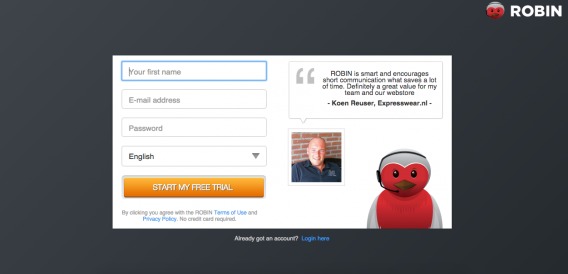
You start at the registration page…
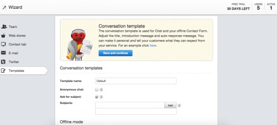
From there, you’re taken to a mandatory wizard, which guides you through the process of setting up your live chat, integrating your email/social, creating customer service templates, etc.
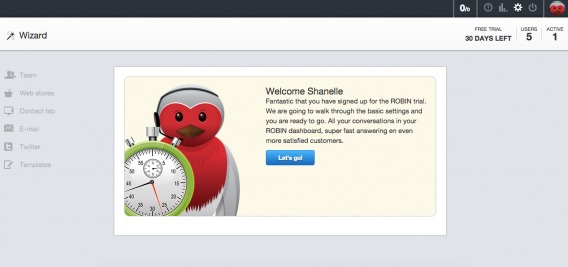
Note that, in the welcome copy, they remind you why you want to use ROBIN. This is key for the users who would rather just get started right away. The stopwatch also subtly indicates that it will be a short process.
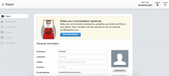
As you move through the process, the navigation to the left becomes active. At this point, you can see that you are in the “Team” section and have five more sections to complete.
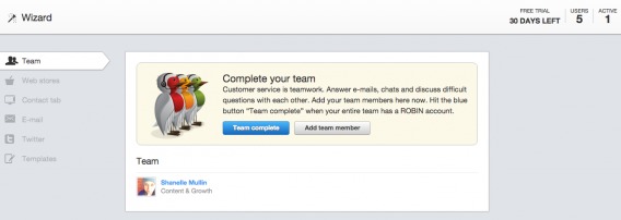
In some cases, there are multiple steps within each section. For example, after completing the “Personal Information” step, you might assume that you finished the “Team” section.
Yet you’re not. It’s like a teacher assigning you questions 1–3, but each number also has an A–Z. Frustrating, right? Indicate progress as clearly as possible.
Until this point, every step has been mandatory. Below, you’ll notice that an “I’ll do this later” option appears:
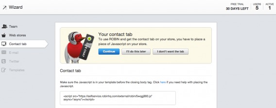
I would assume that adding JavaScript is a high-value action. Without it, the customer service “Contact” tab won’t appear on the user’s site. Yet, this is not a required action.
The “I’ll do this later” options continue…
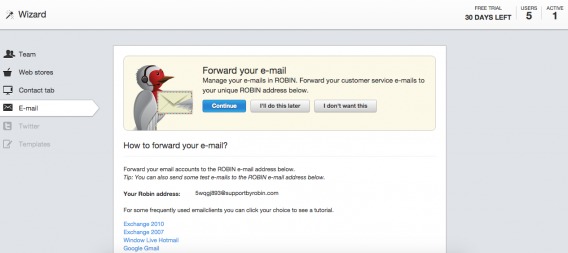
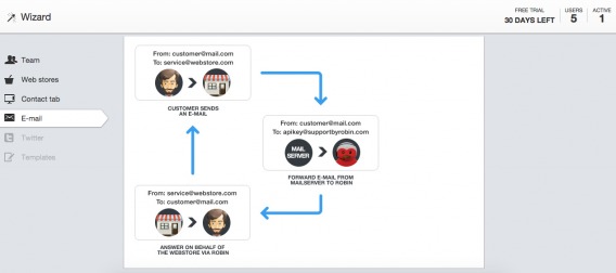
Here, you’ll see that ROBIN illustrates the email forwarding cycle so that users who are new to customer-service tools get a complete understanding:
Again, more “I’ll do this later” options:
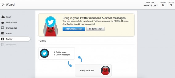
These optional steps appear at times of friction. For example, connecting your email and Twitter accounts to a tool you’re unfamiliar with could feel like a security risk: “Will it tweet on my behalf?” “Will it send emails to my customers?”
In the final section, “Templates,” we’re back to mandatory steps:
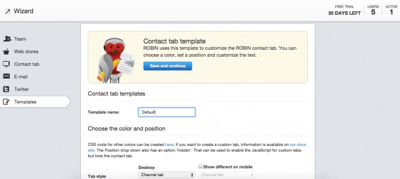
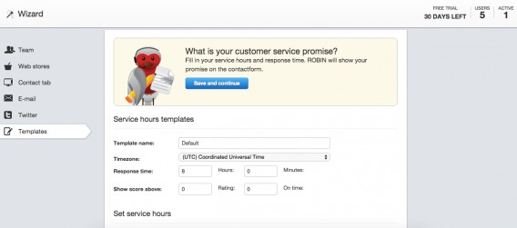
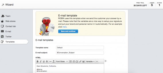
If something isn’t mandatory, don’t include it in a mandatory set up wizard. Instead, suggest it on-screen as the user progresses. There’s nothing wrong with asking for a lot of information if it’s necessary to move the user closer to your core value.
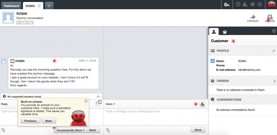
After the wizard is complete, you get a simple walk-through of ROBIN’s core functions:
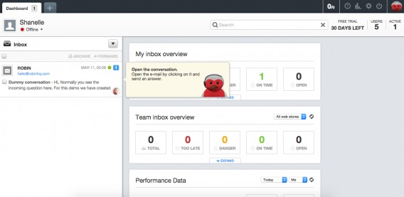
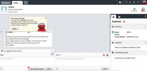
A demo message is in your inbox, and you must open it to send a response:
Note the red dots scattered across the screen. These indicate key functionalities that will be explained, which also serves as a subtle progress bar:
It would be helpful if the red dot within the message (the step we just walked through) turned green to indicate completion.
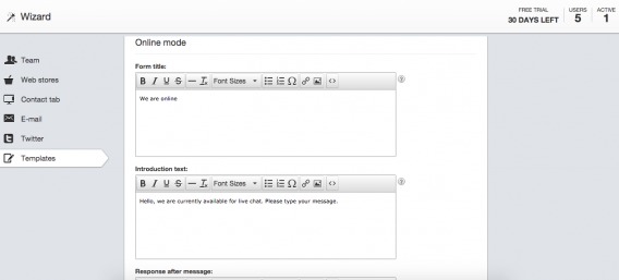
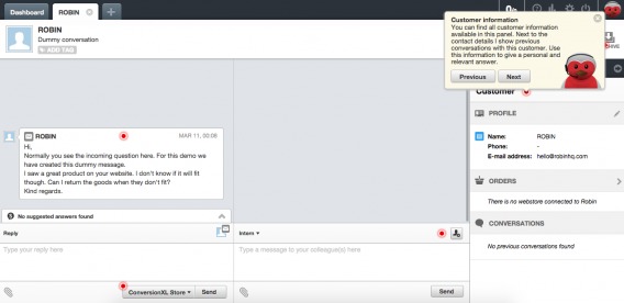
Here’s what the rest of the process looks like…
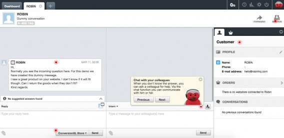
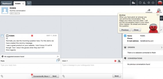
It appears that this is the core function of ROBIN. Ensuring new users understand how to work this interface is paramount. Interestingly enough, you’re not asked to take any of the actions described here, which seems like a logical next step for their onboarding flow.
This user onboarding flow is extensive. A full, mandatory wizard with multiple steps within multiple sections and a mandatory walk-through. This raises an interesting question: How much is “too much” when it comes to onboarding?
Hulick has a good rule of thumb…
Samuel Hulick, UserOnboard.com:
“When in doubt, I recommend asking for only the information that’s useful/relevant to the user at that particular time. If you can’t come up with a good reason to look them in the eye and tell them why it’s in their best interest to provide it, it’s probably a very good candidate for leaving on the cutting room floor.” (via Inbound.org)
2. Inbound.org
Note: Inbound.org was replaced by Growth Hub (growth.org) in 2018; the lessons below, however, are still relevant.
Inbound.org was self-described as “the internet’s smartest marketing community.” All things inbound marketing were discussed there. Needless to say, encouraging a new user to become an active, engaged member of a community wasn’t an easy task.
Here’s where you started:
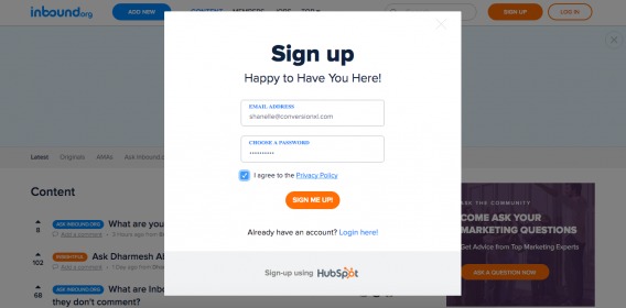
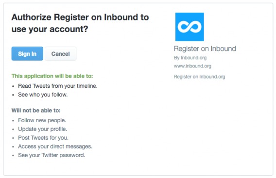
Email address, password, agreement with a Privacy Policy (that no one read)—seemed pretty straightforward. Immediately after completing the registration form, you were taken here:
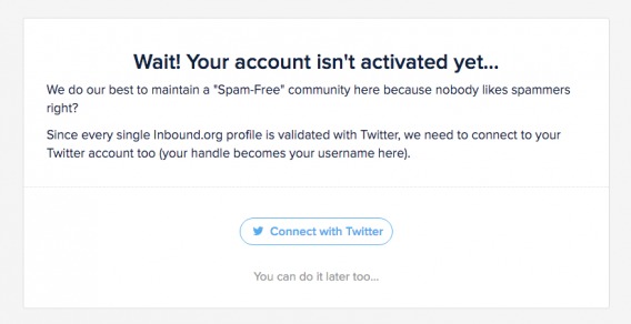
Requiring a Twitter account certainly prevented spam and made it easier to grow the community. Inbound.org knew that many marketers, their target audience, used Twitter to network with peers. So, the channel selection (vs. Facebook, for example) was strategic. Second, syncing with Twitter made it easier to recognize friends, follow friends, invite friends, etc.
Munger explains the power of social login in detail…
Nate Munger, Intercom:
“Their 2013 survey on The Value of Social Login says 92% of people have left a website instead of resetting or recovering login information, while 1/3 do so frequently. If your goal is any form of virality, social login is a must, as it increases your Monthly Unique Users (MUU) to Monthly Active Users (MAU), meaning a returning visitor is already in a position to take sharable actions.
Social Login also offers the ability to access and connect to the user’s contacts. A majority of those surveyed (52%) believe that Social Login leads to a better, more personalized online experience. The network effect from creating user accounts with social profiles also has potential upsides for user and revenue growth. According to the same study, 78% of people say they have navigated to a website after seeing it mentioned on their social network, and 72% said they would consider buying a product based on positive recommendations from their friends online.” (via Intercom)
Of course, you had to complete the basic (and familiar) social authorization…
From there, you were taken to a simple profile creation page:
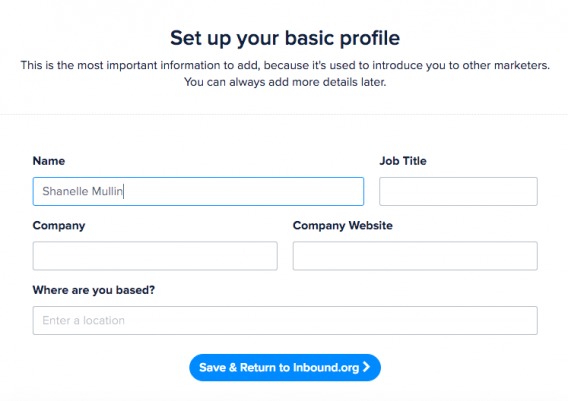
There were only a few fields. (“You can always add more details later.”) This exemplified the “ask for only what you need” principle that Hulick describes. However, ideally, Inbound.org would’ve pulled some information (e.g., location) from Twitter.
After completing the profile page, you went to the homepage to begin browsing. That was it. Three steps and Inbound.org got out of your way…except for a clever “Getting Started” box:
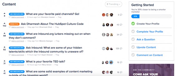
You’re likely familiar with this type of onboarding tactic. If you use LinkedIn, you’ve experienced something similar. It’s a gradual onboarding process, which is a much different approach than ROBIN took.
Each step within “Getting Started” was a link, which took you to the page that allowed you to complete the step. As you completed each, you received a green check and your progress bar filled up.
When asked about how he feels about these “Getting Started” tactics, Hulick had this to say:
Samuel Hulick, UserOnboard.com:
“I LOVE ’em!
I think they’re so much better than tooltips/walkthroughs, for 3 primary reasons:
1) They’re non-interruptive. I’m not at all a fan of throwing up a barrier to the user’s immediate progress in the form of a tooltip or splash screen, but progress trackers just sit there, helpfully abiding.
2) They’re persistent. Unlike other onboarding design patterns that only show up upon signup and are never seen again, these dudes hang around until the job is actually done. Onboarding doesn’t happen in a single visit, after all.
3) They’re progress-y. The whole point of onboarding is to get people to take meaningful actions that lead to value, not to click “next, next, next, next” on a tour of how confusing your interface is. Progress trackers, by definition, are naturally predisposed to the former.” (via Inbound.org)
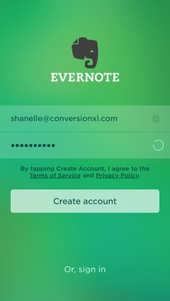
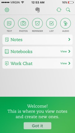
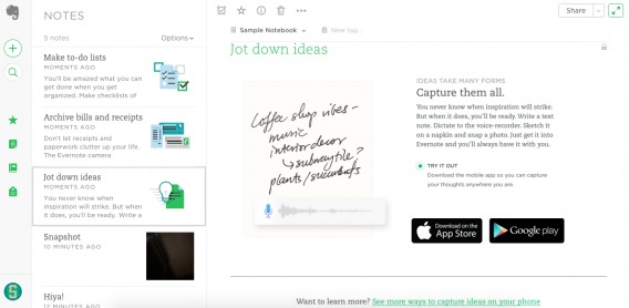
3. Evernote
Evernote allows you to write, collect information, and present ideas. It’s on your desktop and has a mobile app, but your files are available across all devices. Think Dropbox, for example.
On the mobile app, you’re taken through three simple feature/benefit slides before you even make it to the registration form:

It pays to remind (or inform, in some cases) new users of your core value before the user onboarding flow truly begins. Why use this tool/site/app? What makes it different from the competition? How will it make your life better?
Keep these reminders simple and brief. If you go too far, you’ll end up with frustrated users who just want to “get to it.” Creating a great user onboarding flow is a balancing act. Equip new users to get the most from your product while getting them to that core value as quickly as possible.
Conduct research upfront. How well-informed are new users (on average)? How familiar are they with similar products? How motivated are they to get started? The answers help you decide whether to use these types of reminders, like Evernote and ROBIN, or skip them, like Inbound.org.
Also, consider the environment. You can flip through these three pages on mobile in two swipes. That’s not exactly a barrier to entry. Moving on…
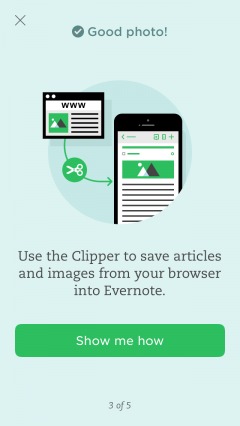
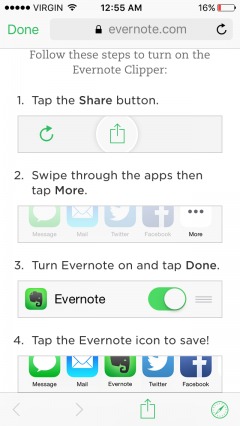
After you’ve created an account, you’re taken through a simple tour. The tour combines written instructions and required actions:
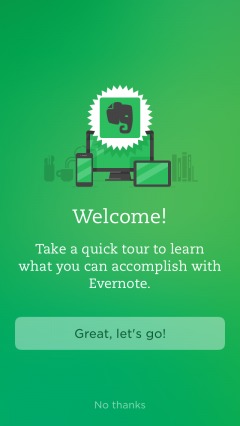
Note that you can opt out of the tour. It’s a muted option to prevent new users from skipping it, but those who are familiar with Evernote (e.g., people who already have the desktop version) shouldn’t have a problem locating it.
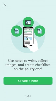
The progress indicator shows that you’re on step “1 of 5.” To move to the next step, you must create a note.
Once you’re on the right track, more instructions are given in case the interface is unclear. This continues throughout the guided tour:

After completing the first step, you see a congratulatory message as well as the next required action:
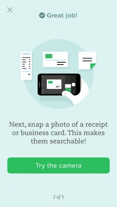
Asking users to try the app helps them get a feel for the real app vs. a theoretical one. Is it easy to use? Do you swipe or tap?
According to research by William C. Bradford, approximately 65% of the population needs to see what they’re learning about to comprehend it. Another 5% needs to actually experience it. (Learning styles are important and, perhaps, illusory.)
Plus, an action is a commitment. It’s the basic foot-in-the-door technique, right? Asking the user to take a small step, like creating a note or trying the camera, is a foot-in-the-door. Asking the user to let you in is now easier.
If a core functionality is complex, it can help to create a simple tutorial…
On mobile especially, keep tutorials brief. New users don’t want to read through a manual or short ebook before using a core function.
If it’s complicated enough to require a long, complex tutorial, it’s likely too complicated in general (and definitely too complicated to include in a guided tour). Evernote gets it just right with its four-step tutorial (with images).
Note the difference between the first three steps and these last two:
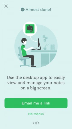
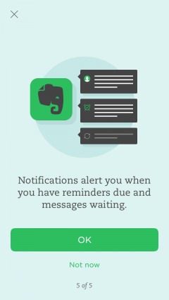
They have “Not now” options. They are high-value for Evernote, but not absolutely required to move the user closer to the core value. Of course, it’d benefit Evernote if you allowed mobile push notifications and downloaded the desktop version, but it’s a nice-to-have action, not a requirement.
Note the differences between ROBIN and Evernote. With ROBIN, you can input 2–9 fields of data or select “I’ll do this later.” After a lengthy wizard, that “I’ll do this later” option becomes very appealing. With Evernote, you can either click a button or a text-based link. Either way, the commitment and “physical work” is no more or less.
Also, ROBIN has many optional steps mixed in with mandatory steps, but Evernote saves two optional steps for the end. This prevents confusion and questions like “Why are there so many steps?”, “Why are so few mandatory?”, “Why do I need to do this now?”, etc.
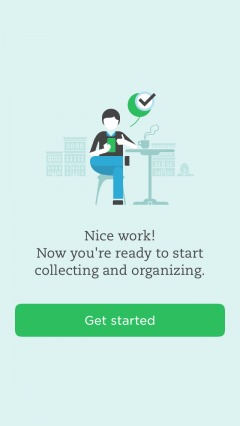
The final page is simple and to the point, but the call to action could be a bit more specific. What action should the user take next? What’s the best way to “Get started”?
Of course, the user onboarding flow doesn’t end there. Or, rather, it shouldn’t. Hulick explains:
Samuel Hulick, UserOnboard.com:
“To my mind, onboarding is so much more than just introducing signups to your interface — it’s about ensuring they get what they hoped to when they decided to bother signing up in the first place. When you view it from that perspective, there’s suddenly a lot more to work with and to manage.” (via Inbound.org)
With a product like Evernote, users will likely move between mobile and desktop versions. The user experience (UX) will be slightly different depending on the device, requiring an additional desktop onboarding flow.
What will your users do with your product or service? How will they use it? What benefits will they receive? Likely, there are a handful of different answers, depending on the user. Asking users to narrow it down can improve the onboarding flow:
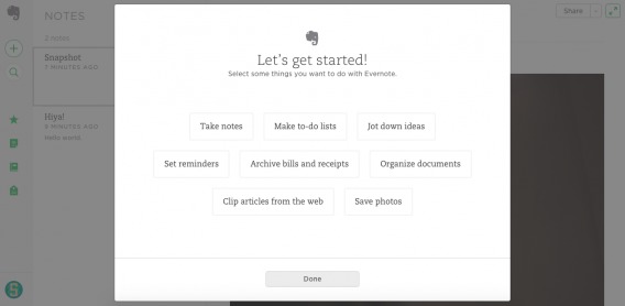
Once you select your desired tasks, you’re taken to instructions and quick tips for each:
See how each of the three functions I selected now appear as notes? Evernote uses its own product to explain the product. That’s terrific user onboarding.
Again, it doesn’t end there. Jackson Noel from Appcues explains why not just new users require onboarding flows…

Jackson Noel, Appcues:
“How you introduce your change to existing users is critical to the success of your feature launch. Just because a user has been active for a few days (or months/years for that matter), doesn’t mean that they too don’t require the gradual engagement, careful copywriting, and personalization that gets new users to stick around. In fact, some of your most engaged users will be the most resistant to change.” (via Appcues)
4. Clash Royale
Similar in nature to “Clash of Clans,” Clash Royale involves collecting and trading battle cards, battling online, joining battle clans, etc.
When you first open the game, you’re asked to connect with Game Center…
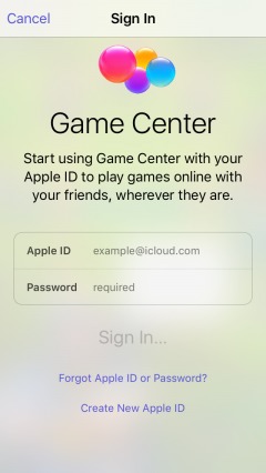
Asking new users to connect with Game Center is similar to asking them to connect with Facebook or Twitter. It makes it easier for them to find their friends, invite their friends, share their achievements with friends, etc.
Immediately after signing into Game Center, you’re brought to a mock battle…
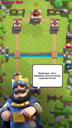
Instead of one simulated training battle, Clash Royale prompts you to complete a full series of training battles. Nearly the entire game is focused on the battle function, so it’s important that new users become familiar with the interface. They might not notice and comprehend all of the options the first time around.
For example, I didn’t realize until battle three that you have to place your battle cards on your side of the bridge until you destroy a tower.
With strategy games like this, especially where you graduate to playing against other people, a strong understanding of core functionalities is clutch. If someone doesn’t understand the concept, they can’t begin to develop strategy. Thus, they will lose. Who wants to play a game they lose 90% of the time? Few people.
Moving on, you’re told that you must destroy the enemy towers…

To do so, you’ll need to deploy your troops…

Note how the hand icon shows you where you can place your troops. For my first couple of battles, I thought I had to place my cards all the way back at my tower. Instead, it would’ve been helpful if they had highlighted the eligible drop area, similar to how they highlighted the enemy’s side of the bridge.
The battle was, of course, easy. It’s important that a new user wins and experiences that feeling of achievement. It’s also important they receive the “Wooden Chest” reward:
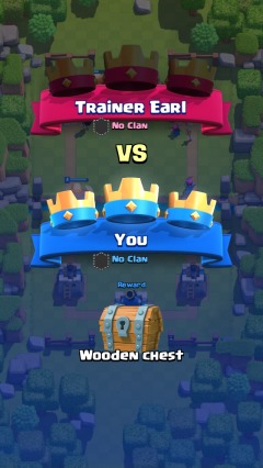
Chests are another core function of the game. You collect chests, which take upwards of three hours to unlock. You can pay with in-app currency (which is limited but available for purchase with actual currency) to open the chests earlier. Inside the chests are new cards, gold, gems, etc.
Before taking you to the main interface, Clash Royale prompts you to accept push notifications…
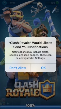
According to Localytics, 52% of people opt in to receive push notifications when they download an app. Android users are more willing (59%) than iPhone users (46%), but that likely has something to do with Android enabling push notifications by default.
The direct open rate for segmented push notifications is 7%. The number of people who open the app after seeing a notification is likely higher, but that’s the percent who open it via the notification.
For example, I rarely open an app through a push notification. Usually, I read it, unlock my phone, and navigate to the app myself.
But how often do users take the action the push notification prompts them to take? Some 54% of users who click on a segmented push notification convert.
It’s definitely worth prompting your users to enable push notifications. Re-engagement messaging is stronger via their personal mobile devices than email.
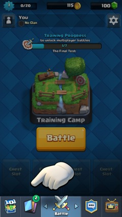
After opting in, you’re taken to the main interface…
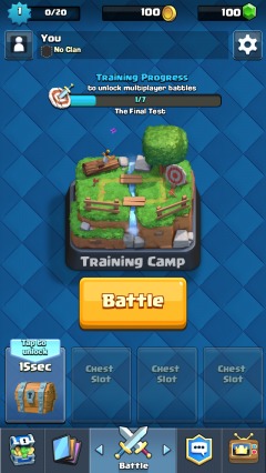
You can see here that there’s a training progress bar. To move out of the Training Camp, you need to complete another six battles against the computer. But first, you’re asked to tap the chest to unlock it.
While it takes hours to unlock chests, it takes 15 seconds in the Training Camp arena. Why? To get new users hooked on the game, increasing the likelihood that they’ll pay to unlock chests down the line. (You can read more about building habit-forming products from Nir Eyal here.)
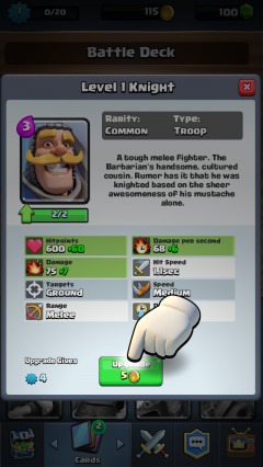
Next, you’re prompted to explore some of the secondary functionalities:
When you click on the cards icon, you’re brought to your Battle Deck, where you can upgrade your cards as you collect them:

See how you can see “Cards to Find” below? That’s an important element of the interface. You can even read about the cards you have yet to discover. It creates a “I’ve got to get them all” mentality, which encourages engagement and habit formation.
Next, you learn that upgrading costs gold, which gives value to that method of in-game currency:
On to the next battle. Before you begin, you’re given a tip about how frequently cards can be played, in case it wasn’t clear:
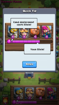
After the second game, you’re asked to create a username. This is the name other users will know you by when you make it out of the Training Camp:
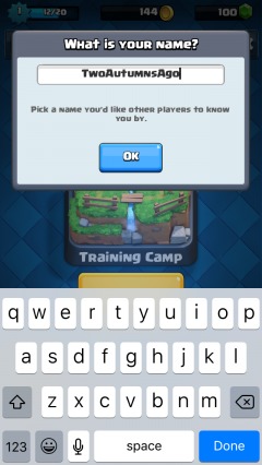
Asking new users to select a username this early is a great idea. It’s a type of commitment and makes the game experience feel more personal. More importantly, it’s another sign of progress. Since Clash Royale forces you to go through seven training battles (which seems excessive after you’ve gotten the hang of the interface), signs of progress are important.
The question becomes: How much training does a user need before graduating out of the initial onboarding flow? While it’s easy to simply say “seven battles,” it’s more effective to decide case-by-case.
For example, if a new user wins two consecutive training battles by capturing all three castles and preventing the enemy from capturing any in the first 90 seconds, it’s a sign that they’re ready to graduate. Instead of pushing them through another five battles, allow them to move on.
Every user has different onboarding needs, so constructing a one-size-fits-all flow isn’t advantageous.
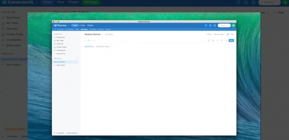
5. Flow
Flow is a task management tool for teams, which includes a built-in custom chat feature.
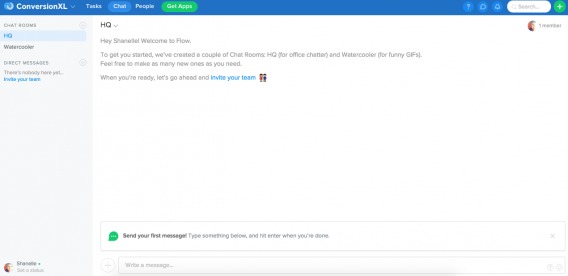
When you sign up for a free trial, you’re taken here:

Note how the user’s expectations are set by “will take around a minute.” Let’s see if they deliver on that promise.
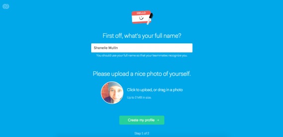
Again, we have a simple “Step 1 of 2” progress indicator at the bottom. Also, note the elaborations and tips below the fields as you continue (e.g., “You should use your full name so that your teammates recognize you.”)
On to the next page:
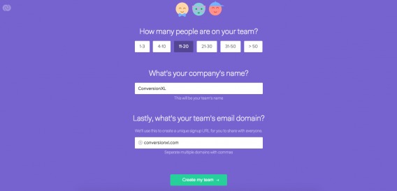
This is key for Flow. For Flow, it’s ideal if an entire team creates an account and begins using the software. A single user, I suspect, is much less valuable and less likely to stick around. Asking about the user’s company and team size upfront allows Flow to understand the growth potential for this account.
On the next page, you get a confirmation page. Success! (And it definitely took less than a minute.)
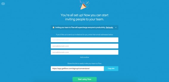
You now have three options: Invite your co-workers via email right away, send them a link, or start using Flow without inviting anyone.
It’s unclear whether Flow personalizes the user onboarding flow. For example, if I had selected a team size of 1–3, would my flow be different? I choose to start using Flow without inviting anyone:
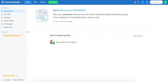
Now, there is a welcome message and three call-outs on the screen. One, of course, is to invite my team.
Would this be here if I had invited 10–19 people in the previous step? I hope not. Whenever possible, personalize the user onboarding flow. If a step has been completed, don’t divide focus even more by prompting them to complete it again.
I selected the call-out in the top, right-hand corner of the screen:
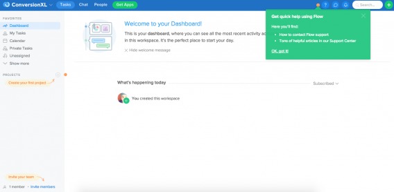
It’s a simple reminder that a customer support team is available to assist you and has instructions for how to contact them. Task management systems can be complicated, especially when you have to onboard an entire team. This gentle reminder is likely very necessary.
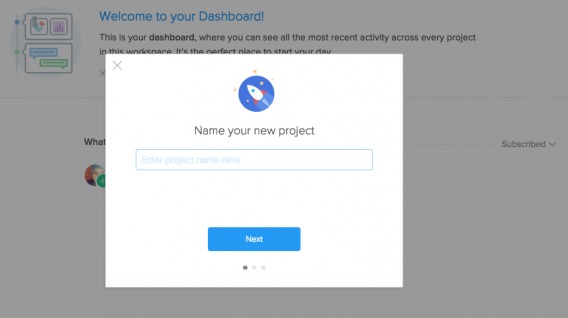
Another key action for Flow is creating a project. The sooner a new user creates a project, the sooner they can understand the benefits of Flow:
“For a new user to become an active one, they must experience value from the application – and the sooner, the better. Churn rate is proportional to the distance between sign-up and value. That is why top sites focus on steps they know are Key Performance Indicators (KPIs) for user retention. By focusing on these KPIs, onboarding experiences are designed to set the user up to experience value from the product quickly. This increases their probability of remaining engaged.” (via Intercom)
I’m willing to bet “adds a teammate” and “creates a new project” are two KPIs for Flow.
When you click the new project call-out, you see this:
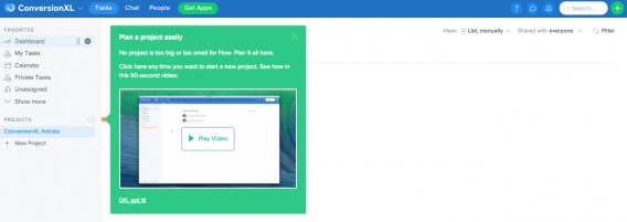
You can choose to play a demonstration video, which expands to this:
Since this is a core functionality, it’s important that new users understand it fully. If the user is the type to follow instructions, they might want to watch the demo. If they’re the type to dive in and try it, they can skip the video and do just that.
This self-guided tour allows users to choose the onboarding flow that they want, but not necessarily the one that they need. That’s the balancing act. If they don’t watch the video, they may not understand how the process works. Worse, they might miss features.
Here’s the project creation flow:
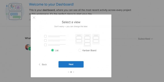
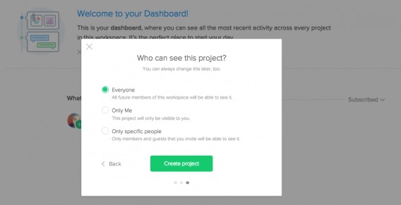
Three simple steps and you’re done. One thing Flow has nailed is efficiency. They don’t ask for more information than they need, and they simplify steps to minimize the amount of work for the user.
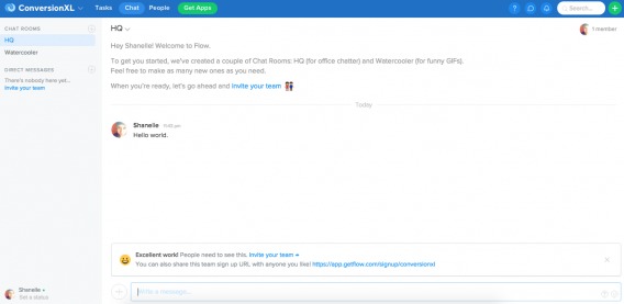
After creating a project, you flip over to the “Chat” function:
While it’s not part of the initial three-step user onboarding flow, there are more onboarding tactics at play here. Remember, user onboarding does not end after the initial “Welcome!” It’s an on-going effort to keep new users engaged and coming back for more.
You’re welcomed and prompted to send your first message to the group.
After doing so, you’re shown a congratulatory message and, again, prompted to invite your team to the software. After all, if you’re exploring the chat function, you likely have a team you’d like to communicate with.
Finally, you receive a welcome email from Flow as well:

Notice how, yet again, you’re pushed to think about inviting your team: “It’s gonna feel great to have your whole team nice and organized in one central place.” This is an example of how email and on-site onboarding flows work together.
6. Typeform
Typeform is a modern form-creation tool used to ask for insight and payment. It’s often used to manage incoming job applications, suggestions, surveys, polls, registrations, orders, donations, quizzes, etc.
Before you even begin, you’ll notice that Typeform advertises a “No sign-up required” user onboarding flow:
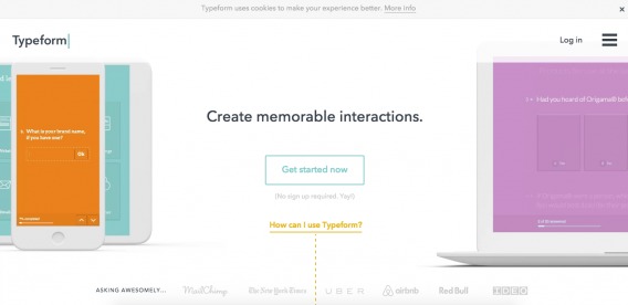
When you click the “Get started now” button, you’re taken to this page:
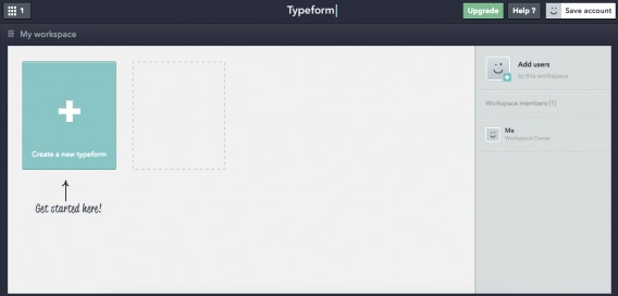
If you’re familiar with Typeform, you’ll recognize this as the “My workspace” interface, which is where all forms are stored after you create an account. It looks and feels just like an account of your own, despite the fact that you haven’t actually created an account.
You’re clearly prompted to “Create a new typeform,” which brings you to here:
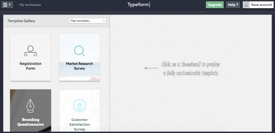
Depending on the form you want to create, you’re asked to choose a template. You randomly select the market research survey template, which delivers you here:
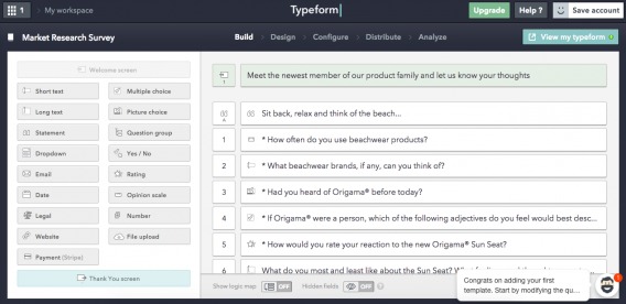
In the bottom, right-hand corner of the screen, you’ll notice a call-out. If you click to expand it, this rolls out from the right side of your screen:
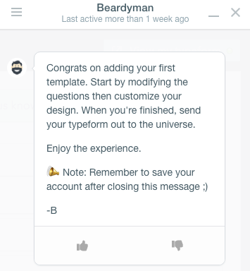
Beardyman explains the next steps and also reminds you to save you account before leaving. Remember, you haven’t actually created one yet. If you look back at the images above, you’ll notice that there’s a “Save account” button in the top, right-hand corner of the screen.
Clicking that button brings you here:
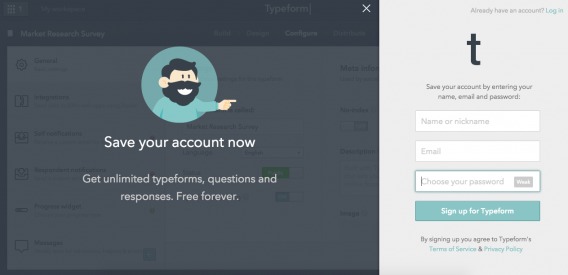
There’s Beardyman again, explaining why you want to save your account. The use of the word “save” is interesting. You’re not “creating” something new, you’re “saving” what you already have. If you enjoyed the form-creation process, there’s very little reason not to “save” your account.
Typeform focuses on getting new users to the core value as quickly as possible by allowing them to use the product right away—without creating an account. This isn’t a user onboarding flow that you see every day, but perhaps it should be.
Top 10 user onboarding tools
Given the number of ways to onboard a new user, it shouldn’t surprise you to learn that there are a wide variety of user onboarding tools.
Here are the 10 ones that I suggest using:
- whatfix
- Tour My App
- The Joyride Kit
- Helppier
- Appcues
- Inline Manual
- Intercom
- Evergage
- Nickelled
- WalkMe
Why are user onboarding flows important?
When I say “user onboarding,” you likely think of SaaS companies first, right?
According to a State of SaaS report, 51% of SaaS startups surveyed were not profitable, and only 33% expected profitability within the next six months.
The same report found that less than 7% of SaaS companies achieve 10K users…ever. And only a little over 25% of SaaS companies with less than 10K users spend money on user acquisition.
So, what does that mean? It means that user retention becomes even more important. If users aren’t onboarded properly, the chances of retention are minimal.
And if you weren’t originally thinking of a SaaS, you were probably thinking of a mobile app. According to Go-Globe, mobile apps now account for a majority of all time spent on digital media.
For the leading 500 merchants, 42% of all mobile sales come from mobile apps. So, mobile apps can be quite profitable—if they’re used more than once. Unfortunately, 20% of mobile apps aren’t reopened after the initial visit.
What makes an initial visit memorable? What makes a user come back again for more? A great user onboarding flow.
How can you set user onboarding goals?
Here’s a common misconception debunked by Hulick:
Samuel Hulick, UserOnboard.com:
“[…] onboarding isn’t about setting users up, it’s about getting them back. Retention is the trailing indicator and true measure of quality onboarding, so that’s what I’d hold experiments up against.” (via Inbound.org)
A trial-to-paid conversion rate or mobile user-to-customer conversion rate metric is a good start. It’s close to the revenue. It’s measurable. It’s directly linked to onboarding. However, the true test of a user onboarding flow is not conversion. It’s retention.
Hulick suggests asking if more people are continuing to log in for longer. If so, your user onboarding flow is successful (but you should continue optimizing). If not, you have some work to do.
A successful user onboarding flow gets new users to perform tasks that have signaled long-term use in the past. For example, Facebook has a “seven friends in 10 days” metric. The theory is that users who do so stick around. (If you’re interested in setting up a goal like this, read this article from Andrew Chen.)
Conclusion
Expecting a new user to know how to navigate and get the most from your interface is like expecting a toddler to cook you a five-course meal. It’s just not going to happen.
The least you can do is create an initial user onboarding flow to help them get acquainted with the interface. However, your job doesn’t end there. User onboarding isn’t about simply familiarizing new users with your interface. It’s about getting them into a habit loop and ensuring they come back again and again.
Onboarding is about retention, not acquisition. Here are some tips to remember:
- Focus on all stages of onboarding. Existing users need onboarding flows for new features; inactive users need an onboarding flow; new users need an onboarding flow that extends beyond the first five minutes of registration.
- Combine email and on-site user onboarding flows for the best results. The two should work together and complement one another, always pushing users toward experiencing the core value.
- Choose an onboarding flow that’s right for your audience. It depends on their familiarity with your product/industry, their motivation level, the complexity of your product, etc.
- Experiment and optimize based on your findings. Choose a metric like trial-to-paid conversion or “seven friends in 10 days.” What can you do to encourage that behavior? It’s like any other element of CRO—start with conversion research. What behaviors did your long-lasting users display early on? What trends can you identify?
Working on something related to this? Post a comment in the CXL community!
Related Posts
-

You got people to sign up for your free SaaS trial—great! Trouble is, a significant percentage…
-
User flow is the path a user follows through your website interface to complete a…
-
Tommy evaluates Cheap Recipe Blog, and The Murray Group, an independent insurance agency out of Rochester…
-
What's user experience (UX) got to do with conversions? Everything. Great user experience is a…


![]()
Shanelle Mullin
Shanelle Mullin previously did content and growth at CXL. She's a jill-of-all-trades marketer with a 12-year background in growth and content marketing.
Join the conversation Add your comment
Comments are closed.
@Shanelle Mullin.
Great long post. I just scroll down and down to see the bottom of the content at first, but got really scared when it takes times. (Just joking)
User interface is quite a complicated issue for me. But anyway, you just done a complete research. Btw, how can you do it so often? Do you ever sleep?
Thanks so much, Abrar.
I’m glad you liked the article. Which onboarding flow did you think was the most effective?
Onboarding users correctly is not an easy task. I work for a SaaS and we are still trying to figure out the best way to do that. Articles like this are extremely helpful!
:)
Anyways, lately I’ve been thinking that sometimes onboarding can “fail” (meaning: doesn’t seem to be working) because the company is not attracting the right leads in the first place! And I don’t know the best way to handle this yet.
If I’m attracting the wrong leads, I’ll never know how effective my onboarding is. Because I’m testing it against people that might not be the ones that will see the value of our product.
This issue is driving me crazy right now…. :/
What are the “wrong leads” who signup looking for? They must see some sort of value, unless your proposition is unclear.
What percent of your total new users fall into this “wrong leads” category? Is it possible that they’re the right leads?
Try looking back at the tasks / actions your most valuable users took within the first 24-48 hours. Then the first week. That’s the best way, in my opinion, to craft an effective onboarding flow.
Great read! Something I really resonate with, and there’s a bunch of solid points written here.
Thanks John! Glad you liked the article.
Great article. I am just launching my first startup and I totally missed the boat on onboarding and retention. Spent all my time (and money :)) focusing on the platform itself that I am only now realizing how much this process is lacking. Your article was a real eye opener and I will be implementing many of your suggestions.
Hey Jacob! Thanks for reading and for the kind words. Glad the article helped.
You might also like this article on retention optimization…
https://cxl.com/retention-optimization-introduction/