Readability is crucial. Even the best blog post or sales copy won’t save you if the readability is poor. The easier it is to read your texts, the more gets read. or instance the content of this article might be good, but I’ll never bother to read it.
The good news it’s easy to improve your websites readability. Here are 9 key steps that will make a major difference:
Table of contents
1. Large font
Larger font is easier to read than small font. The font size should be at least 14px, or even 16px.
2. Line height
Line height is the distance between two adjacent lines of text. If there’s more space between the lines, it’s easier to read. The optimal line height is 24px.
3. Contrast between the text and background color
It’s easiest to read black text on white background as the contrast is very stark.
I’ve seen a lot of blog posts white light grey text on white background. Not good – low contrast. Here’s an example of especially low contrast:

4. Narrow lines
It’s way easier to read narrow lines than reeaaallly long lines. Newspapers and magazines get it. The columns in an average publication are very narrow!
Tynan does it well. The post part of his blog is narrower than the sidebar. Very easy to read.
5. Use sub-headlines
Add a sub-headline after every 2 paragraphs or so. It helps you break down the general pattern, thus makes it easier to read. Make the sub-headline bold and you might even want to use a slightly larger font for it.
Remember, 79% of the people don’t read online, they just skim. The goal of sub-headlines is also to pass on the key points of your content. Ideally one would get your main points just by reading the main headling and sub-headlines.
6. Use bullet points
Bullets points make it easier to read, break text apart and they’re especially good for lists.
Which is easier to read and understand:
A:
IBM Lenovo T61, Intel Core2Duo 2Ghz, 1.5 GB DDR2, 80GB 5400rpm, cd-rw/dvd combo, 14″ WXGA+ (1440×900), 2 kg, $299.00
B:
- IBM Lenovo T61
- Intel Core2Duo 2Ghz
- 1.5 GB DDR2
- 80GB 5400rpm
- cd-rw/dvd combo
- 14″ WXGA+ (1440×900)
- 2 kg
- $299.00
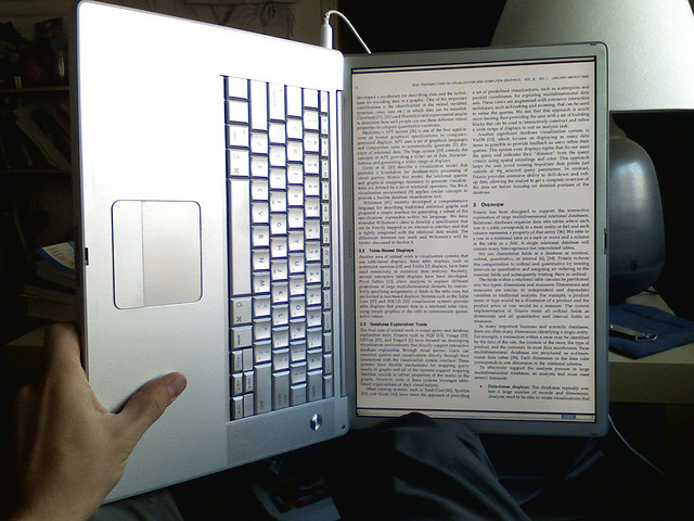
7. Use images
The more you can down break the text pattern, the easier it is to read. Images are perfect for this. People also “get” visuals much faster than text, our brains are just wired that way.
8. Short sentences
Short sentences are easy to read. (Right?)
Now read this:
Career that is spent primarily in the back office for troubleshooting for the benefit of the department can be detrimental to your advancement.
Much harder, isn’t it?
9. New paragraph every 3-4 lines
It’s very hard to digest large chucks on text at once. Break it down by adding a new paragraph every 3-4 lines (make sure there’s an empty line between paragraphs).
Image credit: Ken-ichi
Related Posts
-

Do you want to make your website better? There are many ways to optimize a…
-

List building is a top priority for a blog. In this review we look at…
-
In today's review I'm assessing whether websites in question could do anything to better get…
-
If you want to double your results, you can either double the number of visitors (very…


Always sharing great content peep, great job !
Make your days great,
Yassin