
In an iconic scene from Glengarry Glen Ross (1992), Alec Baldwin lectures a group of salesmen about the correct way of doing business.
In his motivational (read: foul-mouthed) speech, he highlights a very important strategy that still rings true today—especially in the world of conversion rate optimization:

“Always be testing.”
That’s how it went, right?
Okay, this may not have been what was actually said in the movie, but if you’re a marketer, chances are you’ve heard this mantra in the real world.
“Always be testing” echoes across marketing blogs like a broken record.
And for good reason.
The “best practices” of CRO, UX and design are exactly what they’re labelled as: “best practices.” But when it comes to conversions, there are no hard and fast rules. What worked for someone else will not necessarily work for you. And the only way to validate your assumptions is to test.
This of course applies to every aspect of your landing page, but you’ve got to start somewhere.
So let’s start with one of the often overlooked part of landing pages—your opt-in forms.
Here are five A/B tests you should be running on your landing page opt-in forms to be sure that they’re optimized for conversions.
Table of contents
A/B test #1: The placement of your form on your page
If you’ve read an article about CRO in the past several years, you’ve likely heard about the importance of placing a CTA “above the fold.”
And though many take that piece of advice as gospel, it doesn’t always work. Michael Aagaard of ContentVerve debunked this “best practice” in this case study.
The PPC landing page below offers a delivery service for recipes and ingredients for busy families:
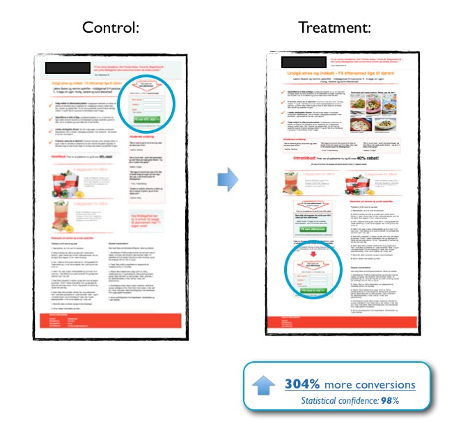
Placing your opt-in form “above the fold” isn’t always the answer; in this example, placing the opt-in below the fold resulted in a 304% conversion lift
Michael tested an above the fold form versus a variation that made the case for the service before asking for the sale.
The result? The variation with the CTA below the fold beat the control by 304%.
By placing the call to action at the bottom of the page, they allowed the reader to understand the complete value of the service and its benefits before asking for a conversion.
As Michael explains:
You should place your CTA where it best complements the decision-making process of your prospects.
The complexity of an offer should impact your decision to place a CTA above or below the fold.
If your offer is complex and requires a lot of explanation, then give prospects the time and information they need to make an educated decision before you try pushing a sale.
If your offer is relatively straightforward such as a value-packed whitepaper—then testing for a CTA above the fold is a great place to start.
If you’re worried that your opt-in form will get buried below the fold, use attention-driven design techniques such as contrast and directional cues to draw attention to it.
A/B testing takeaways
- If your offer is complex and requires explanation, test placing your opt-in form below the fold so you can convince people of your solution before you ask for a commitment.
- Use contrast and directional cues to draw attention to your form if it appears below the fold.
A/B test #2: Form label alignment
If you’ve ever stopped to think about form label placement, then you’ve probably wondered which is best for conversions—top, right, left, inline?
How’s a marketer to know?
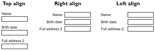
And though there aren’t many case studies that have focused on this explicitly, UX expert and author Luke Wroblewski makes the case that top-aligned labels are a good option to test.
An eye-tracking study from the same article illustrates the reasoning:
The study counted each of the “eye fixations” for each form alignment setup, counting the number of times the eye had to adjust its course. They found that certain setups forced users to “take more time to interact visually with the form.” Specifically:
- Top-aligned labels generally work well because users don’t have to look separately at the input field and label.
- Left-aligned labels can result in more eye fixations and a “heavy cognitive load”.
- If labels must be placed to the side of the field, right-aligned fields can be easier to read.
But what about in-line field labels?
They might save visual space, but there are a plethora of usability problems that come with inline form fields.
At first glance, they can make the field look like it’s already filled out. Additionally, prospects might click and forget what they were filling out. That causes confusion and frustration.
With so many options to choose from, you might feel overwhelmed.
But don’t.
Just test.
A/B testing takeaways
When you’re testing your field labels, think of the experience your prospects will have with your form. Are you making them work harder than they should have to?
- Test your label placement and positioning
- In-field labels can create usability problems, so be careful testing these on forms with more than two fields.
A/B test #3: Test for more personal CTA copy
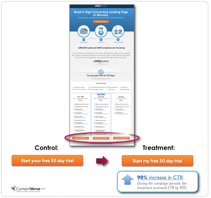
In this case study, Oli Gardner ran a split test on a PPC landing page that pitched a free 30-day trial of Unbounce’s landing page software.
The two CRO experts hypothesized that changing the CTA copy to better match what prospects were thinking could increase conversions. Accordingly, they changed the button text from “Start your free 30 day trial” to “Start my free 30 day trial.”
And getting personal really paid off.
After they ran the test for three weeks, the treatment button copy, “Start my free 30 day trial” had increased the click-through rate to the payment page by 90%.
But using more personable CTA copy isn’t the only thing you should test for. Consider this test, in which Empire Flippers changed the CTA button copy on their blog sidebar form.
They swapped out their original button, which read “Join us!”:

for CTA button copy that instead focused on the benefit of signing up. It read, “Make Money Flipping Websites.”

This simple A/B test on button copy led to a 33.10% lift in conversions.
Testing showed them that making their button copy more benefits-focused resonated more closely with prospects.
A/B testing takeaways
- Test CTA copy that matches the conversation in your prospects’ head. As copywriter Joanna Wiebe shares in this article, your button copy should complete the sentence: “I want to _______.”
- Make sure your form copy speaks to the user, their pain points and the benefits of signing up.
Get personal. Your CTA button copy should match the conversion in your prospect’s head.
A/B test #4: Test your data privacy copy
Many believe that adding a privacy message to your opt-in form builds trust with users—so much so that it has become common practice.
In theory, it seems logical that users want to be reassured that their data is safe and won’t be shared—but what about in practice?
But in a study by Content Verve, an A/B test revealed that an opt-in form with the message “100% privacy—we will never spam you!” caused conversions to fall by 18.70% with a statistical significance of 96%!
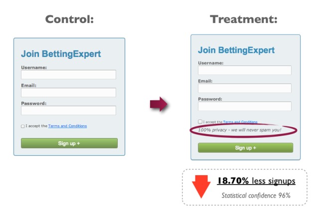
They hypothesized that the word “spam” could have caused negative connotations in the users minds and prevented them from converting.
This phenomenon is sometimes referred to as halt words:
But steering clear of “halt words” won’t automatically “fix” your conversions. Consider this second test from Content Verve:
The new treatment message read “We guarantee 100% privacy. Your information will not be shared.” The control had no privacy message.
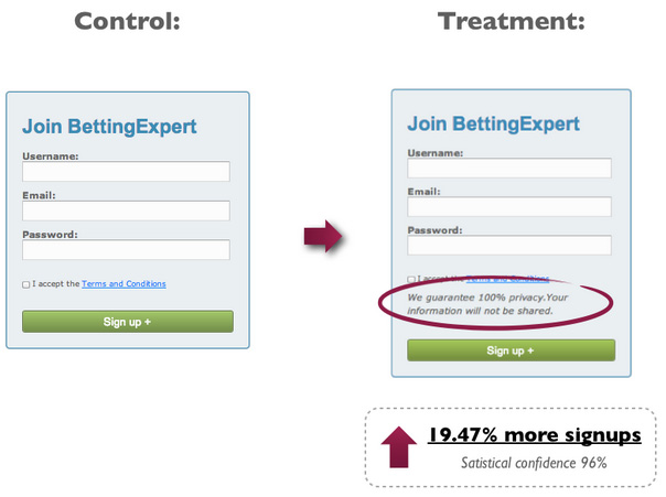
This second message treatment increased their signups by 19.47%.
This suggested that the phrasing of your privacy statement can have a serious impact on converts.
A/B testing takeaways
- Test for “halt words” near your CTA button—especially when reassuring customers about data privacy.
- If you’re including privacy statements near your CTA, test putting a positive spin on things. Positive phrasing may just give prospects the reinforcement they need to seal the deal.
A/B test #5: Test the number of form fields
Have you ever seen this scary-looking graph before?
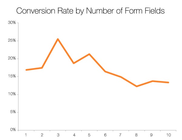
It’s easy to look at a chart like this and take it as evidence that fewer form fields = higher conversions, but conversions aren’t the be-all, end-all.
We’ve all heard that fewer form fields generally means a higher conversion rate, but it can also result in a pipeline filled with unqualified prospects.
It’s your job as a marketer to weigh the number of form fields with the information needed to qualify a prospects—so you get more of the right type of conversions.
The only way to find out the happy medium?
You guessed it. You gotta test.
Find your happy medium through AB testing
In this case study, Marketing Experiments ran an A/B test for an unnamed hosting company. Amongst other things, in the variation, they cut down form fields from 20 (!) to four.
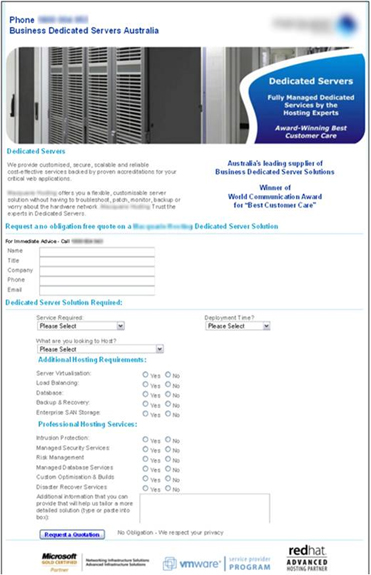

Predictably, they saw an increase in leads—an 188.46% increase, to be exact.
In this example, only collecting the bare minimum—the information they needed to begin the sales process—reduced friction and pushed more leads to convert.
But reducing the number of fields on your opt-in forms just for the heck of it can cause the lead quality to go down.
Though longer forms are notorious for lower conversion rates, they do have advantages; the more information you can collect about your prospects, the better you can qualify them.
A short form “just for the heck of it” can result in spending marketing dollars targeting the wrong people: poor quality leads.
Adding form fields to qualify prospects may reduce conversions—but it can increase the *right type* of conversions.
A/B testing takeaways
Should you reduce or increase the number of form fields on your landing page? Here are some A/B testing ideas:
- If your conversion rate is suffering, make sure you are only asking for the details you really need to move the user to the next phase of the buying process.
- If you follow up with leads via phone, ask yourself which questions can be left to that phase of the buying process.
- If you’re getting a lot of unqualified leads, test adding a lead qualification checkbox to your opt-in form. A great way to improve lead quality is to ask people their intended budget for a service business.

A/B testing your opt-in form isn’t just important—it’s essential.
Implementing best practices is a great start, but every audience is unique. You have to get your hands dirty A/B testing your forms to find out what works best for yours.
Only then will you be able to inspire visitors to convert.
Conclusion
Your landing pages form conversion rates can be improved too, but you need to take the test ideas you have learned here today and put them into practice.
Remember there are no set rules in conversions, no one size fits all fixes.
Whether you test the location of your form, the number of form fields in relation to lead quality or the label placement. You should ‘Always be Testing!’ and incrementally improving your forms.
What tests are you running to improve your landing pages form conversions? Share your interesting results and test ideas in the comments below for discussion.
Special thanks to Michael Aagaard as many of his tests help illustrate ideas within this article.
Related Posts
-

It took us six rounds of tests until we landed on a variation that was…
-
Navigation gives a user control, which is generally a good thing—but what about on a…
-
We talk a lot about creating high converting landing pages, getting traffic that converts, and…
-
A landing page is the first page that visitors see after clicking on your banner…


Thanks for the mention, Giles! :)
Hi Vincent
You’re welcome.
Giles
WOW – this is really impressive stuff. My only issue with testing is prioritizing what’s most important (and then NOT touching it until I have stat sig). It’s all about discipline – great stuff!
Whoah how’d you get Alec Baldwin to reverse age 20 years and pose for that picture? You guys rule!
90% increase in CTR swapping “your” to “my” on the button… riiiight.
Thanks for the good article
I too use
Thank you for interesting content. It was very helpful and informative.
Thanks Giles, for these wonderful tips about A/B testing on landing page. It is important to perform A/B testing on the various site elements of your landing page so as to improve your user experience and conversion rates. Apart from these elements, you can perform A/B testing on other elements like images, call- to- action buttons, contact information, links and other such components so as to improve the usability and performance of your landing page.
To perform A/B testing, you can take the help of various A/B testing tools like Unbounce, Mocking Fish, Optimizely, VWO and such others. However, Mocking Fish among them is considered to be most ideal due to its lower cost, simple dashboard design, easy implementation, free lifetime account facility and reliable test results.