In a nutshell: we can record what people do with their mouse / trackpad, and can quantify that information. Some of it might be insightful.
There are many tools that enable you to do this stuff, and some of them call the stuff differently. Some tools – like Crazyegg for instance – calls a click map “heat map”. So always check the tools documentation to see what they call what, how they define things.
Very important: like with A/B testing, you need enough sample size per page / screen before you can trust any results. A rough ballpark would be 2000-3000 pageviews per design screen. If the heat map is based off like 34 users, do not trust any of it.
Heat maps
What is a heat map? It’s a graphical representation of data where the individual values contained in a matrix are represented as colors. Red equals lots of action, and blue equals no action. And then there are colors in between.
When people say ‘heat map’, they typically mean hover map. It shows you areas that people have hovered over with their mouse cursor – and the idea is that people look where they hover, so it’s kind of like poor man’s eye tracking.
The accuracy of this thing is always questionable. People might be looking at stuff that they don’t hover over, and might hovering over stuff that gets very little attention – and hence the heat map is inaccurate. Maybe it’s accurate, maybe it’s not. How do you know? You don’t.
That’s why I typically ignore this types of heatmaps. I mean I do look at the info if it’s there – to see if it confirms my own observations / suspicions (or not), but I don’t put much weight on it.
There are also tools that algorithmically analyze your user interface, and generate heat maps off of that. They take into account stuff like colors, contrast, size of elements. While I don’t fully trust these either (not based on actual users), I don’t think they’re any less trustworthy than your hover maps.
Using algorithmic tools is especially a good idea if you lack traffic. It gives you instant results. Check out Attention Insight, Feng GUI, and EyeQuant. But again, this is not magic, it’s an algorithm and not based on your actual users’ behavior.
Click maps
A click map is a visual representation, aggregated data of where people click. Red equals lots of clicks.
You can see where people click also with Google Analytics – and I actually prefer that. Provided that you have enhanced link attribution turned on and set up, Google Analytics overlay is great (but some people prefer to see it on a click map type of visual).
And if you go to Behavior -> Site Content -> All pages, and click on an URL, you can open up Navigation Summary for any URL – where people came from, and where they went after. Highly useful stuff.
OK – back to click maps. So there is one useful bit here I like – you can see clicks on non-links. If there’s an image or text that people think is a link or want to be a link, they’ll click on it. And you can see that on a click map.
If you discover something (image, sentence etc) that people want to click on, but isn’t a link, then:
- A) make it into a link,
- B) don’t make it look like a link.
Attention maps
Some tools – like SessionCam for instance – provide attention maps.
It shows which areas of the page have been viewed the most by the user’s browser with full consideration of the horizontal and vertical scrolling activity.
What makes this useful is that it takes account different screen sizes and resolutions, and shows which part of the page has been viewed the most within the user’s browser. Understanding attention can help you assess the effectiveness of the page design, especially above the fold area.
You can see if key pieces of information – both in terms of text and visuals – are in the area that’s visible to almost all users.
I consider this far more useful than any mouse movement or click heatmap.
Scroll map
This shows you scroll depth – how far down people scroll. Can be very useful.
It’s absolutely normal that the longer the page, the less people make it all the way down. So once you acknowledge this, it makes it easier to prioritize content. What’s must-have and what’s nice-to-have. Must have content must be higher.
Also if your page is longer, you probably want to sprinkle multiple calls to action in there – look at your scroll map to see where are the biggest drop-off points.
Analyzing the scroll map will also help you decide where you need to tweak your design. If you have strong lines or color changes (e,g. white background becomes orange), those are called ‘logical ends’ – often people think that whatever follows is no longer connected to what came before.
So you can add better eye paths and visual cues to spots where scrolling activity seems to drop heavily.
User session replays
You can record video sessions of people going through your site. It’s kind of like user testing, but has no script and no audio. But people are risking with their actual money – so it can be more insightful.
You don’t need a million visitors to record user sessions – this is almost like qualitative data. Use tools like Hotjar (great), Inspectlet (great), SessionCam (terrible UI, but a workhorse), or Clicktale to record user sessions, and watch your actual visitors interact with your site. Some basic heatmap tools like Crazyegg don’t even have this feature.
Session replays are extremely useful for observing how people fill out forms on your site. You can configure event tracking for Google Analytics, but it won’t provide the level of insight that user session replay videos do.
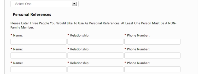
One of our customers has an online resume building service. The process consists of 4 steps, and there was a huge drop-off in the first step. We watched videos to understand how people were filling out the form. We noticed the first step had too many form fields, and we saw that out of all the people who started filling out the form, the majority of users stopped at this question:
Personal references! The form asked for 3. Most people had none. So they abandoned the process. Solution: get rid of the references part!
Very difficult to learn this without watching the videos.
I typically spend half a day watching videos for a new client site. Not any random videos, but where they visited key pages. Try to see what’s different between converters and non-converters etc.
Form analytics
Not exactly mouse tracking, but several mouse tracking tools like Hotjar, Inspectlet or Clicktale have this feature. Or use a standalone tool like Formisimo.
These tools will analyze form performance down to individual form fields.
- Which form fields cause the most error messages?
- Which form field people hesitate to fill? Hesitation measured in milliseconds
- Which form fields people leave empty, even though they’re required?
And so on.
If your goal is to make your forms better – and form optimization is a key part of CRO – it really adds a whole new layer of insight where you have data about each and every form field.
You can remove problematic fields, or re-word instructions, or add help text, or turn inline field labels into top aligned labels. Whatever. The main point is that you know WHERE the problem is, so you can try to address it.
No data on form fields = guessing. And your guesswork is no better that flipping a coin. And you don’t want to base the success of your work on a coin toss.
Read Next Lesson or Download guide as PDF
-
#1: Mindset of an Optimizer
You seek to understand your customers better - their needs, sources of hesitation, conversations going on inside their minds. -
#2: Conversion Research
Would you rather have a doctor operate on you based on an opinion, or careful examination and tests? Exactly. That's why we need to conduct proper conversion research. -
#3: Google Analytics for Conversion Optimization
Where are the problems? What are the problems? How big are those problems? We can find answers in Google Analytics. -
#4: Mouse Tracking and Heat Maps
We can record what people do with their mouse / trackpad, and can quantify that information. Some of that data is insightful. -
#5: Learning From Customers (Qualitative Surveys)
When quantitative stuff tells you what, where and how much, then qualitative tells you 'why'. It often offers much more insight than anything else for coming up with winning test hypotheses. -
#6: Using Qualitative On-Site Surveys
What's keeping people from taking action on your website? We can figure it out. -
#7: User Testing
Your website is complicated and the copy doesn't make any sense to your customers. That's what user testing can tell you - along with specifics. -
#8: From Data to Test Hypotheses
The success of your testing program depends on testing the right stuff. Here's how. -
#9: Getting A/B Testing Right
Most A/B test run are meaningless - since people don't know how to run tests. You need to understand some basic math and statistical concepts. And you DON'T stop a test once it reaches significance. -
#10: Learning from Test Results
So B was better than A. Now what? Or maybe the test ended in "no difference". But what about the insights hidden in segments? There's a ton of stuff to learn from test outcomes. -
Conclusion
Conversion optimization is not a list of tactics. Either you have a process, or you don't know what you're doing.