Could you imagine a situation where 72% of your customers think that the content on your site was completely disconnected from what they really wanted?
What if you discovered that only a measly 14% of your customers actually valued a relationship with you and your brand?
Sorry to be the bearer of bad news, but according to recent research done by CEB Marketing, this might just be the case. What’s even more frightening, is how highly marketers (that is you and me) think of themselves.
In the study, marketers believed that 44% of customers valued relationships with brands, and that the majority of their customers wanted to get content that showed how Their products fit into Customers lives.
Turns out, the marketers were wrong. Less than ⅓ of the consumers surveyed felt like this kind of content was important.
When You Display Irrelevant Content, Visitors Leave. Simple.
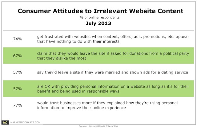
Back in 2013 study by Janrain and Harris Interactive revealed that 74% of users get frustrated when a website displays irrelevant ads, offers, or promotions that have nothing to do with their interests.
So the question is, how do we start making the user experience less frustrating, and well… better?
It All Starts With Good First Impression
Did you know that first impressions are formed within fractions of a second, and it only takes around 2.6 seconds for a user’s eyes to scan an entire webpage and land on the area where they’re supposed to be focusing?
This is the conclusion from researchers at Missouri University of Science and Technology who used eye tracking software and infrared cameras to monitor student’s eye movements as they scanned different elements of educational web pages such as menu, logo, images, social icons and the like.
This is what Dr. Hong Sheng one of the researchers of the study had to say about the results:
“The longer the participants stayed on the page, the more favorable their impressions were. First impressions are important for keeping people on pages.”
When participants were asked what sites made a favorable first impression, their top three responses were:
It’s also interesting to note that in the study, users were allowed to view the pages and consider them for as long as they like in order to form their opinion.
When scanning, their eyes would spend a cumulative time on the following areas:
The Logo – 6.5 seconds
Main Navigation Menu – 6.4 seconds
The Search Box – 6 seconds
Main Image – average time of 5.99 seconds.
Social Icons– 5.95 seconds
Written Copy – 5.59 seconds
Bottom Of The Website – 5.2 seconds
From the design standpoint, how many of these elements are you really putting effort into? Just going by the website reviews we do, I’d say maybe the logo, main image & written copy, and everything else is kind of taken for granted.
Seeing just how long the people in this study spent in these areas is a great reminder that elements like microcopy (for the search box in this case) typography, and menus can set the tone for the overall user experience.
Imagine how intimidated you’d be, if you encountered a menu like the one found on retailer Debenhams:
In Google Analytics, people who display this kind of behavior on the site as a whole look like this:
Looking at analytics alone, it’s easy to write the 0-10 second visitors off as people who bounce, but what if their experience looks something like what you see in the Debenhams video?
How would you even begin to know where to make improvements?
http://youtu.be/ZXQG5eTeJ9s
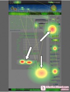
This is where services like SessionCam or ClickTale that let you see heatmaps & session videos come into play. By watching what happens within those first 0-15 seconds, you can get a pretty good indication of what a visitors “first impression” might be like.
So if for example, you’re noticing that a vast majority of people leave the site after experiencing an overwhelming menu, then leaving, you’ve got concrete evidence of a part of the user experience that you can bring to your boss.
User Experience Doesn’t Start On Your Site, It’s Part Of A Larger Journey
For the UX designer, understanding the user’s journey can help to bridge the “gaps” that may occur between the click from the traffic source, to landing on the website.
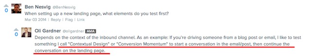
Oli Gardner, co-founder of Unbounce, calls this “Conversion Momentum,” which is starting the conversation on one channel (like a blog post/ email/ or organic search result) and continuing the conversation on the landing page.
If we understand that the “best UX” is invisible, then we also must understand who the visitor is, what they’re looking for, and where they are coming from is vital to influence how they flow from one page to another.
An Example Of Measuring The Customer Journey & Planning For Future Goals
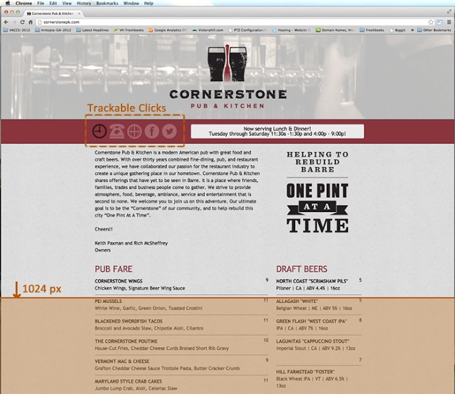
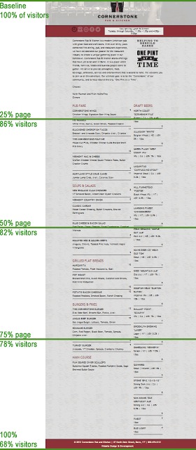
Cornerstone Pub & Grill, a restaurant in Vermont had launched a single page, responsive website, so people searching for pub information over Google could see the menu, call the restaurant, and so on.
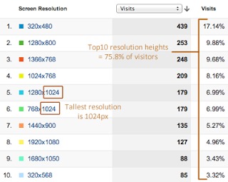
Design agency Vickery Hill decided that given the length of the page and that a significant amount of users used “tall” browsers between 1024 – 1080px , it would be important to track how far down the page visitors scrolled, to ensure they were actually being exposed to the menu.
With a little hack to google analytics, they were able to track scroll depth to see just how far down the page visitors were scrolling.
To their surprise, nearly 70% of visitors made it to the very bottom of the page.
From their perspective, this was a pretty big win, because it meant that the majority of the people who visited the website were exposed to the restaurant’s menu, a necessary action for a person to take if they wanted to “convert” to being a real life customer.
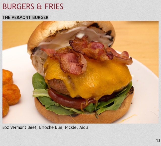
It’s too bad that Cornerstone Pub & Grill doesn’t use any kind of online ordering system, because with this 70% scroll depth as a baseline, they could conduct tests to see if adding elements to the page might simultaneously increase sales, without negatively impacting the amount of people scroll to the bottom.
For example: Let’s say they wanted to add images of the food to some of their menu items.
If the goal is to increase online orders w/o negatively effecting the UX, we might use the following scale as a way to measure the performance of the changes:
– Good: If the addition of menu items increases sales of specific items.
– Better: If sales increase & scroll depth remains the same.
– Even Better: Sales increase & higher percentage of users scroll down the page to see more menu items.
– Best: Sales increase, higher percentage scrolls down to bottom of page & more users scroll down the page & Add A Dessert
How far down the page a visitor goes, particularly for eCommerce or SaaS sites with products that require long descriptions, can be a valuable metric to understand where there might be clogs in the UX of the individual pages on a site.
If the visitor isn’t scrolling down the page, but they need to in order to meet the goal, there is learning to be had at the points in the page where people drop off.
So let’s say that you know a significant portion of visitors drop off between 50% – 75% of the way down the page.
But your heat-map & form data also shows you that the people who do make it that far down the page also convert more & therefore are more valuable.
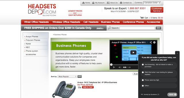
Firing off a Qualaroo Survey or Live Chat at the right before the spot the majority of visitors are prone to leave could provide you with insight that helps you understand why they are leaving & possibly issues that could be addressed with the copy.
When scroll depth is combined with other metrics that provide clues to the user experience (“time on page” for longer pages for example), heatmap data, along with quantitative feedback loops, you can create better hypothesis, that lead to better tests, that (hopefully) leads to a better User Experience.
Just Don’t Forget The Little Things Should Move Visitors Towards A Goal
In Conversion Optimization, we often talk about the big picture, macro conversions, like how many people click the “add to cart button” but when looking at measuring UX improvements, it’s important to also understand how micro-conversions play a role.
In this article on the NN/g blog, they break micro-conversions down into two categories:
Process Milestones are conversions that represent linear movement toward a primary macro conversion. Monitoring these will help you define the steps where UX improvements are most needed.
Secondary Actions are not the primary goals of the site, but they are desirable actions that are indicators of potential future macro conversions.
Process Milestones
These are the little things that can add up to the macro conversion.
Time on page
Scroll depth
# of pages visited
CTR to key pages
If you run a site with a complicated offer that requires visitors to visit X, Y & Z pages in order to fully grasp what you sell, improving the flow – by improving the above metrics -and creating a more linear path between pages would be a good example of improving process milestones.
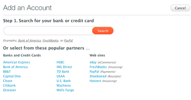
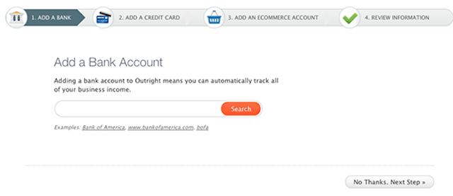
Accounting & Tax prep site, Outright did this by changing their new user flow from a single page form that asked multiple questions, to a multi-step form that made it very clear what was coming next (and an option to skip the step)
Before:
After:
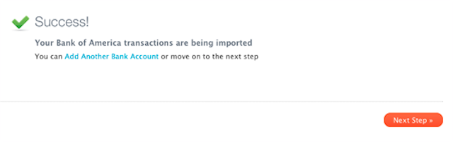
Once the user added all of their information, Outright was polite enough to let them know the data was being imported, and invite them to enter another account or (more importantly) move on to the next step – which is to start using the interface.
It also appears that since this case study was published, they’ve gone on to continue improving their process milestones by implementing an in-app onboarding process that will get the newly registered user familiar with the controls.
In the long run, making these kinds of improvements to the UX, but also reduce churns & increase retention and referrals.
Improving Secondary Actions
As stated earlier, secondary actions aren’t the primary goal, but are desirable actions your visitors should take that support them moving towards the primary goal.
Again, these are minor actions, but if you know that a significant portion of your visitors who watch the video convert to a lead, wouldn’t you want more visitors watching the video?
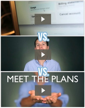
To make a point about the role custom thumbnails can play on improving play-rates & engagement, Wistia tested 3 versions of their video thumbnail on their pricing page to see if it made any difference in how many people watched the video.
The Results?
“The Photoshopped thumbnail (hands) and the thumbnail we selected (Jeff) had similar play rates and a 35% improvement in play rate compared to the system-generated one. These two versions also had higher engagement rates than the one with an automatic thumbnail. Total result was an increase in total time watched of 50%.”
Unfortunately, the article didn’t mention whether these higher play-rates resulted in more purchases, but we do know that the people who watched this video ultimately became more informed about the product and plans.
Follow up:Read this post to learn how to configure Google Analytics to track video plays or any other desired secondary, then this post to learn how to track the behavior of the people who perform that action.
Finally… Testing With Real People
All the talk of analytics & heatmaps is fantastic, but what about what real users have to say?
With video testing platforms like YouEye or UserTesting you’re able to see exactly how visitors respond to the changes you’re making.
There are, a number of applications for video user testing, that can help you gauge real responses & provide honest feedback on specific areas of the User Experience.
Ideally, you would use video user testing at both the beginning – to help find issues – and the end – to see if there was an actual improvement in user experience.
But if that’s not feasible, personally I’d recommend at least testing your challenger designs before implementation of a live test, so you can get real feedback and find the major flaws before going into a live A/B test.
Conclusion
User experience is a hard thing to define and an even harder thing to quantify without seeming overly opinionated & biased.
However, by understanding the metrics, the research, the real user behavior and the role all the little pieces of their experience plays on the macro-conversion level, hopefully you’ll be able to identify the trouble areas & design an experience they enjoy and ultimately makes you money.
User experience is a nebulous term. What defines a "good" UX from a "bad" UX,…
Ott Niggulis
Ott Niggulis is an chef-paramedic-marketer. He has been doing traditional and digital marketing for the past 4 years in Europe and in the Middle East in mainly not-for-profit sector.
Join the conversation Add your comment
Mat
Just been upgrading an online store, the first thing on the list is de-clutter, and simplify the header!
Great post.
Evan Everman
More good food for thought on appearance and user behavior. Thanks Peep.
We recently did some user testing with real people. We gave them specific objectives and watched how easy or hard it was to accomplish them. It was amazing to see how something such as link color can change how a user interprets the site.
I’d love to see more UX improvement examples like the one from OurRight if you do a follow up post. I thought helps really drive the point of UX.
Also, the link to feedback loops lead to a 404 page.
Great Post!
Irina Weber
Thanks, Ott! Great sharing! To provide a positive user experience is pretty vital for successful online marketing business. I can add that good website loading speed is one more important point to pay attention. I guess popup windows and different ads can distract users’ attention. It should be careful with flash sites to hold your target audience.


Just been upgrading an online store, the first thing on the list is de-clutter, and simplify the header!
Great post.
More good food for thought on appearance and user behavior. Thanks Peep.
Evan
http://www.evaneverman.com
We recently did some user testing with real people. We gave them specific objectives and watched how easy or hard it was to accomplish them. It was amazing to see how something such as link color can change how a user interprets the site.
I’d love to see more UX improvement examples like the one from OurRight if you do a follow up post. I thought helps really drive the point of UX.
Also, the link to feedback loops lead to a 404 page.
Great Post!
Thanks, Ott! Great sharing! To provide a positive user experience is pretty vital for successful online marketing business. I can add that good website loading speed is one more important point to pay attention. I guess popup windows and different ads can distract users’ attention. It should be careful with flash sites to hold your target audience.