Knowing where to segment your Google Analytics data can be daunting. Where do you start? And how the Hell are you supposed to know if what you’re looking at is going to make any difference what-so-ever?
Trust me, I hear you. I’ve been learning more about gaining real insights from analytics myself, and my head’s been reeling from staring down the infinite possibilities.
Fortunately for both of us, I’ve found a handful of segments & reports to help get you started. Don’t think of this as a definitive list, but rather as a source of inspiration to jump-start your own thinking around the different ways you can segment your data.
Also, it’s very important that when you use the segments in this article, that you customize the values entered to reflect your own data.
If you’re newer to segmenting in Google Analytics, I highly recommend you check out Justin Cutroni’s article on updated segmentation, there’s a lot of really great stuff in there that’ll help you wrap your head around slicing & dicing your traffic.
Table of contents
1. The Big Spender Segment
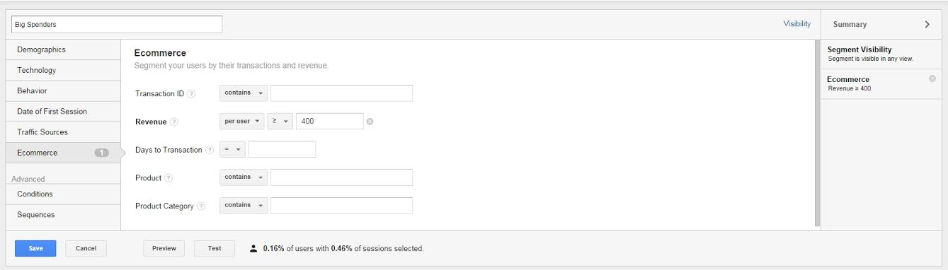
If your Average Order Value is $150, this is the group of people who’re spending 2-3x as much.
The idea with this segment is to understand how your high value customers use the site, so you can focus your acquisition efforts to find more customers just like them & motivate existing customers to move into this category as well.

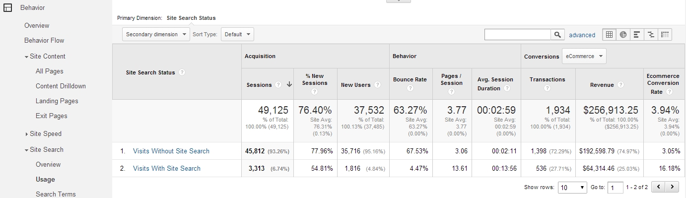
Notice how the Big Spenders have a 33.33% conversion rate and account for almost 1/6 of the overall revenue for the site in that time period?
Knowing that, dig in to your data to see what else you can uncover about this segment:
- Are they coming from a specific channel?
- Do they buy higher priced items or are they buying in higher quantities?
- How frequently are they visiting your site?
Once you’ve gained insight from questions like these, you’ll be able to develop smarter hypothesis for future tests.
I’d also recommend setting up a feedback loop that gets you in contact with the Big Spender shortly after they receive their order. Conducting qualitative research on this segment could provide massive insight to their customer personas and what motivates them to buy from you.
Another thing you could do with this segment is to search for patterns in the Big Spender’s Geography – do certain areas of the country spend more than others?
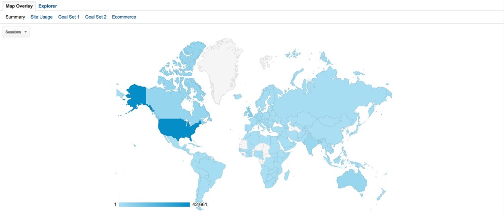
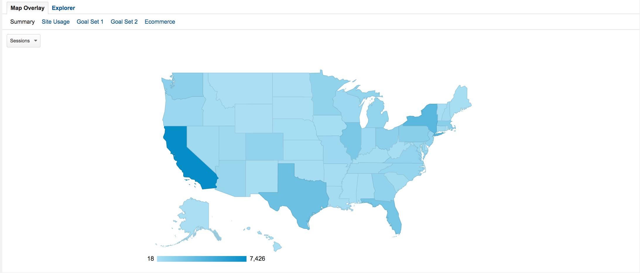
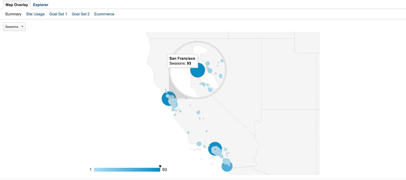
If there is a concentration of big spenders within a certain area, how are the people in that area using your site?
- Do they view certain pages more than others – like your shipping or return policy pages?
- Do they have a tendency to buy products from specific categories?
- Are there patterns in the search terms they use to get to your site?
Once you have this information, you can you use tools like VWO or Exact Target to customize content for visitors coming from that area.
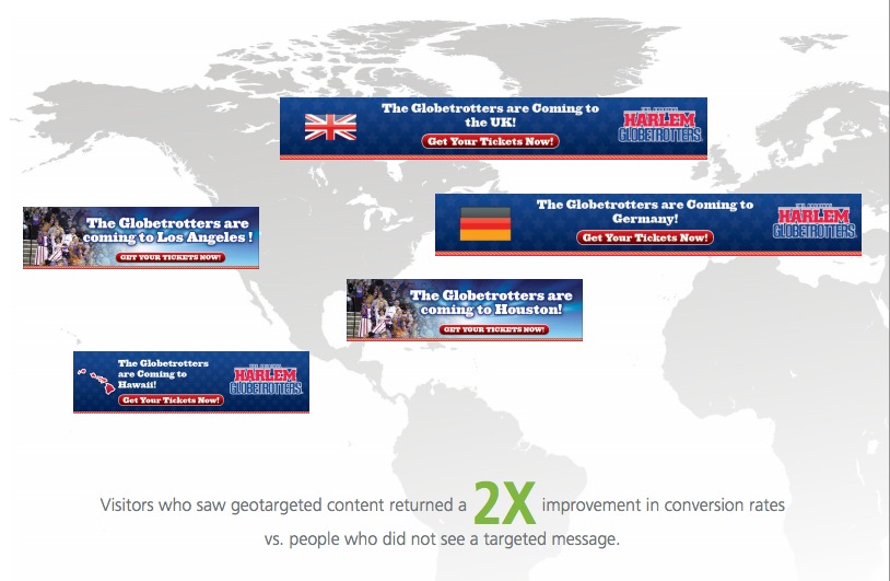
This kind of GeoTargeting is exactly how the Harlem Globetrotters were able to customize their hero shots & product banners to increase ticket referrals by 2x.
To get even more out of the Big Spender segment, import it as a remarketing list in Google Ads and create retargeting campaigns specifically designed to bring Big Spenders back to your site.
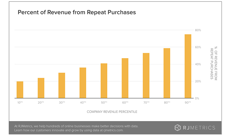
This could be very valuable – according to this post on the BigCommerce blog by Janessa Lantz from RJMetrics , top customers also have a tendency to make 4x more purchases than the average customer.
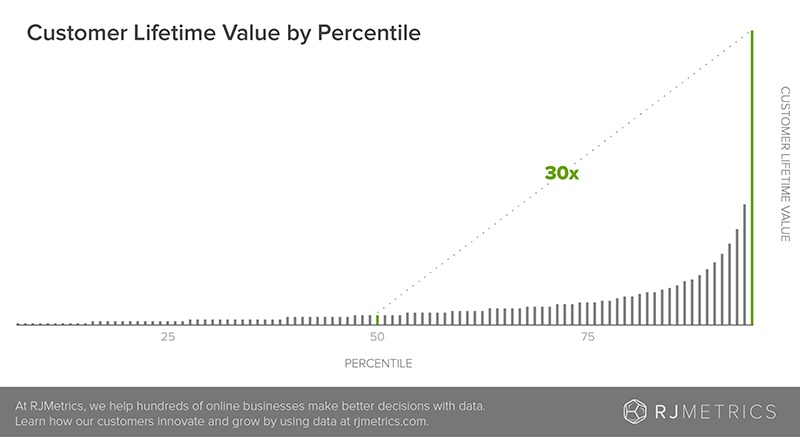
According to RJmetrics, the lifetime value of Big Spender’s also tends to be a lot higher, with them spending an average of 30x more than the median customer over a longer period of time.
Get The Big Spender’s Segment Here
2. Visitors Who Used Internal Site Search
It has often been observed that eCommerce customers who use internal site search convert at a much higher rate & typically spend more than the average visitor.
If this is true for you, the Site search usage reports will help you to make sense of how the people with high purchase intent are looking for products on your site.
One way to use this set of reports is to see which keywords are getting queried the most & result in the highest order value.
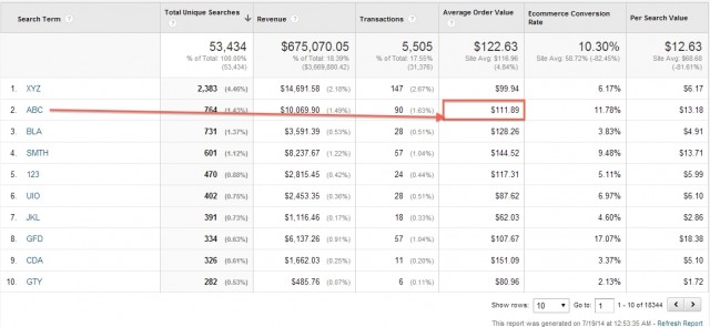
Knowing this can inform your paid acquisition efforts, but also if you notice spikes on specific search terms, this could provide hints to how you might optimize your home page.
For instance, let’s say you ran a hardware store eCommerce site, and you noticed there was an uptick in searches for “Heaters”, “Fireplaces” & “Stoves” as the season starts to change to Autumn.
Knowing that Autumn & Winter can become bitterly cold in some parts of the country, you might click the keyword (in this case “Heaters”) then change your secondary dimension to Regions, to see where these searches are coming from.
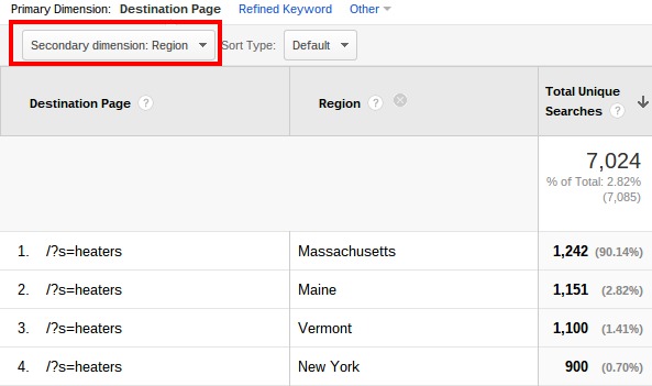
Once you have this, you might create a home page test, targeted towards visitors from these regions, that sells top rated heaters, fireplaces, stoves or whatever items are getting searched for the most from these areas.

Knowing what result pages that are getting the most action may also provide you with valuable real estate for cross selling & upselling opportunities that you may not have thought of before.
There are a number of other ways you can use this data too – like letting it inform email marketing promotions, or double down on certain Google Ads keywords – but the thing to keep in mind is that this report gives us a rare glimpse into the thing that the visitor actually wants, and knowing that can be incredibly valuable if you use it well.
Get The Internal Site Search Report Here
3. Finding The Twitter Users Who Refer The Most Traffic/Conversions
“Get influential people to share your stuff on Twitter…” How many times have you heard that before?
The problem is, without a system in place to measure how much new traffic you’re getting from an influencer, you’ll never know who’s really helping you spread your message.
Speaking from experience, I’ve had plenty of influencers share my stuff, without a significant change in… anything. But, what if there was a way to measure exactly how many people are visiting your site for the first time from an influencer link on Twitter?
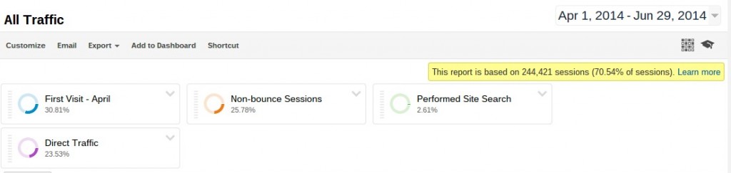
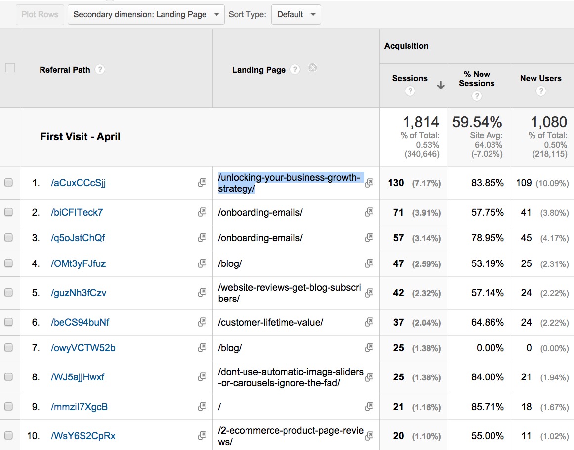
To do this, you must first set up the First Visit – [enter month] segment (which is useful for a great deal of other things) then navigate to the Referral Traffic > T.co report.

While the bottom part of this doesn’t look like much, what you might not know is that each t.co link is unique to the person who shared it on Twitter.
So by changing the “secondary dimension” of this report to show the “landing page” I can see exactly what url each t.co link was referring traffic to.

Once I have that, I can plug that URL into Topsy, sort the results by “influencers”, and hover over the links shared by each influential person until I find the exact t.co link:

Please note: normally you have to look in the bottom left hand side of your browser to find the t.co link.
For good measure, I’ll show you with the second highest trafficked link from Twitter – the onboarding emails article.
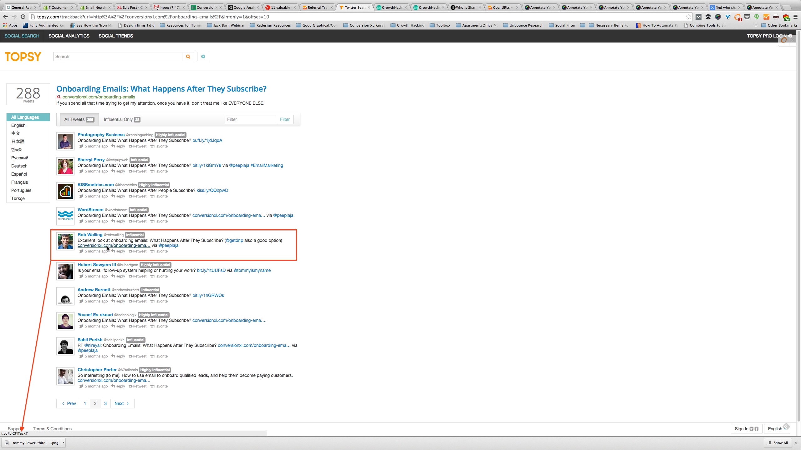
You do have to hover each Topsy link manually, which does add some time onto this process. However, in my opinion, it’s time well spent if it means you can know exactly who’s having the most positive impact on your online business.
Who knows, if they referred a decent amount of traffic through Twitter, maybe a guest post, or a newsletter mention, or some other way of getting in front of their readers might pay off nicely.
Get The First Visit – [Month] Segment Here
Get The Referral Traffic > T.co Report Here
Go To Topsy.com Here
Conclusion
When I was writing this article, Peep reminded me data segmentation is really about trying to answer a question or solve a problem.
In the segments I’ve created here, those questions are:
- Why do big spenders spend higher than average?
- What internal site search terms lead to the most revenue?
- Who on Twitter sends the most new traffic?
What I feel are the answers to these questions become the basis for interesting test hypothesis, and that is where the real fun begins.
Related Posts
-

"Statistics are like bikinis. What they reveal is suggestive, but what they conceal is vital,"…
-
Some of you out there may find this Google Analytics feature overview to be mostly…
-
When you hear "data segmentation", it's tempting to feel overwhelmed. Why? Segmentation can seem daunting…
-
This post is not a dry feature-by-feature comparison, nor does it include a winner-take-all verdict.…


Segmentation are really synchronized
This article gives the light in which we can observe the reality. This is very nice one and gives in-depth information. Thanks for this nice article.
Peep, once again you have some great insights here! There are so many great reports you can put together in analytics, thanks for highlighting these.
Nice article. I thought the list of segments was helpful, but really liked how you talked about doing qualitative research on big spenders immediately after the purchase to gain even better insights on what makes them tick and fill in any gaps that raw analytics can’t fill.