
How do people view search results? The answer to this questions brings great insight to those trying to make money on search marketing, whether SEO or PPC. We conducted a new eye tracking study to find out.
Table of contents
- The Ever-Evolving SERPs
- How Did Users View Google Search Results in the Past?
- How does this compare to our results?
- Does The F-pattern Still Hold True?
- How Do People View Ads
- Google Vs Bing: Significant Differences?
- There is a significant difference between how quickly users looked at rich text depending on whether Google or Bing was used.
- It took users significantly longer to begin exploring the search results “below the fold” on Bing than on Google.
- Users spent significantly more time viewing the search results page “above the fold” when using Bing compared to Google.
- Similarly, users spent significantly longer viewing the first 5 search results when using Bing compared to Google.
- It took Bing users significantly longer to view the first organic search result compared to Google users.
- Users spent significantly longer looking at the first organic search result and significantly less time looking at the first ad search result on Google compared to Bing.
- Conclusion
There have been a few eye-tracking and mouse-tracking studies done on search behavior in the past. Of course, you’re probably familiar with the F-Pattern uncovered by NN/g years ago.
However, SERPs (search engine results pages) are evolving quickly, and so is user behavior in relation to search.
So, as part of brand new research arm – CXL Institute – we conducted our own eye tracking study. We wanted to see if previous research still holds up.
For our study, we used a sample of 71 users for Bing and 61 users for Google. Industry standards (via NN/g and Tobii) suggest a sample of 30 people for valid heatmaps. However, since errors will occur with certain participants (looking away from the screen, etc), we wanted enough data with the errors thrown out, so we processed more than enough to get us at minimum 30 sets of eyes.
The Ever-Evolving SERPs
Google and Bing are constantly changing their interface. The goal, of course, is to provide the greatest possible user experience with the most relevant results. If users reach their goal faster, and are satisfied with the content the SERP delivers, they’re more likely to return and bring that sweet ad revenue to the company.
Let’s take, for example, the proliferation of rich snippets, the additional content other than the black text and link that call your attention to a results. These are things like reviews, photos, phone numbers, etc.
They’re thought to be highly effective at calling attention to a result and to provide a good user experience, but recently Google has mentioned that they don’t want to clutter results with too many rich snippets
As Zineb from Google posted on Twitter, “enfin, nous essayons de ne pas trop “encombrer” les SERPs avec trop de sites avec RS. Du coup, vos critères sont à évaluer.” (That translates to “Finally, we try to not “clutter” the SERPs with too many sites with RS. Suddenly, your criteria are to evaluate.”)
Point is, things change. So we looked at some past studies to compare to our results. Here are a few things we’ll touch on in the article:
- How Do Users View Google Search Results, Now vs Then?
- F-Patterns and Gutenberg Diagrams: Do They Hold Up?
- How Do People View Ads?
- Google vs Bing: Significant Differences?
How Did Users View Google Search Results in the Past?
In 2014, Mediative did an eye tracking study on 53 participants who did 43 common tasks. They compared the results with results they had gotten from a similar 2005 study:
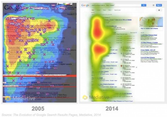
Writing about the study, MarketingProfs’ author Nanji said, “the top organic result still captures about the same amount of click activity (32.8%) as it did in 2005. However, with the addition of new SERP elements, the top result is not viewed for as long, or by as many people. Organic results that are positioned in the 2nd through 4th slots now receive a significantly higher share of clicks than in 2005.”
How does this compare to our results?
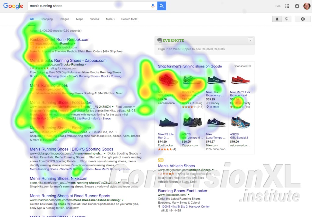
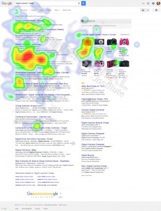
The top organic search result still receives, by far, the most clicks of any organic search result (20.69% of all clicks on Google). The closest to that is, oddly enough, organic result #3, with 6.897% of clicks. However, rich data now gets 39.655% of clicks, by far the largest share.
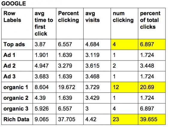
While there was a big difference in what users clicked on (1st vs 3rd vs 2nd), there wasn’t much of a difference, on Google or Bing, on how long users fixated on each organic result:
Does The F-pattern Still Hold True?
Web optimizers and researchers are usually at least somewhat acquainted with Nielsen Norman Group’s F-pattern theory based on their 2006 study and article. The idea that you can slap an uppercase letter onto a webpage to solve all your design problems sounds good, certainly looks good, and for a while it probably was good.
We’re here to say that the F-pattern is no more. The evolution of search engine results pages has caused a similar evolution in user behavior patterns. The strict F-pattern style we saw before is, quite frankly, outdated
Here’s what the old F-Pattern looks like:
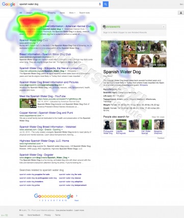
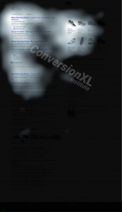
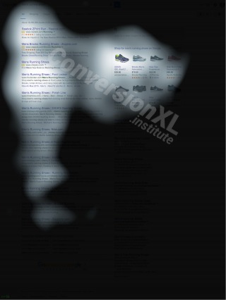
With the advent of rich text and ad placement, users find themselves exploring the entire results page to find what they’re looking for. As we observed through the Google platform, many users look at rich text on the right before even considering actual search results. Unfortunately, there is no longer a letter in the (English) alphabet to describe this new pattern:
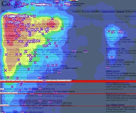
You can also see the F-Pattern from a 2009 Google study with 34 participants:
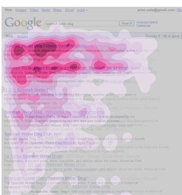
But we simply didn’t see that in our data, even though we did the same task (we had 71 users search for ‘spanish water dog’):
How Do People View Ads
It’s true – ads positioned on the right don’t get much love.
Their position on the search results page simply won’t allow for it, they’re in a bad part of town.
However, when it comes to ads cleverly designed to look like top search results, users can’t help but look even if for only a moment. When the hoax is up, though, users quickly leave the paid search results behind for organic ones. The fact does remain that they’re looking at those paid results, though, and right away.
When it comes to how long users spend looking at ads, there’s no significant difference between right sided ads and paid search result ads.
One thing that popped out in the data is how much more common it was for users to click top ads on Bing. 19.118% of clicks were to the top ads on Bing, compared to only 6.897% on Google.
This all being said, it will be interesting to see how Google’s decision to stop showing right sided ads will affect user behaviors.
Google Vs Bing: Significant Differences?
Some of our findings can influence how you approach PPC and SEO; some of it is simply interesting, especially regarding the differences between Bing and Google. Here are some things we found…
There is a significant difference between how quickly users looked at rich text depending on whether Google or Bing was used.
Users began to view and consider rich text significantly more quickly when using Google than Bing. (Users looked at rich text after approximately .75 seconds while using Google. On Bing, it took them about 1.3 seconds to view the rich text)
It took users significantly longer to begin exploring the search results “below the fold” on Bing than on Google.
Users on Google began to view search results below the fold after around 7.1 seconds. When on the Bing search engine, users didn’t get around to exploring results located below the fold until around 10.5 seconds.
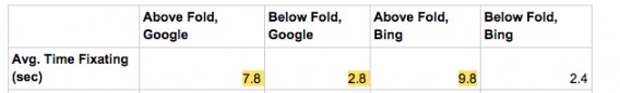
Users spent significantly more time viewing the search results page “above the fold” when using Bing compared to Google.
On Bing, users spent around 9.8 seconds looking at information above the fold, while Google users only spent an average of 7.8 seconds above the fold.
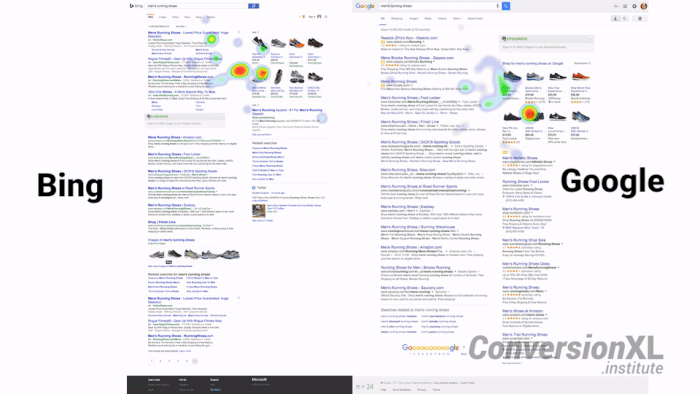
Here’s Bing:
And Google:
Similarly, users spent significantly longer viewing the first 5 search results when using Bing compared to Google.
Users on Bing spent an average of 4.5 seconds focusing on the first five search results. Google users only spent an average of 3.4 seconds considering the page’s first five results.
It took Bing users significantly longer to view the first organic search result compared to Google users.
Google users viewed the first organic search result around 3.3 seconds into their search experience. It took Bing users approximately 8.8 seconds to begin considering the first organic search result.
Why?
It seems unlikely that Bing users were simply exploring other elements of the page first due to the fact that most Bing users looked at the search results before any other element on the results page. Google users, who typically viewed rich text before the search results, still managed to beat Bing users to the first organic search result by five seconds. Perhaps computer users are less familiar with Bing and need time to figure out what’s an ad and what’s not.
Users spent significantly longer looking at the first organic search result and significantly less time looking at the first ad search result on Google compared to Bing.
Google users spent around .764 seconds considering the first paid search result. Bing users spent almost double that time (1.455 sec) considering the first paid search result. Bing users spent around .7 seconds considering the first organic search result while users spent 1.059 seconds on the first organic result on Google.
What does this mean?
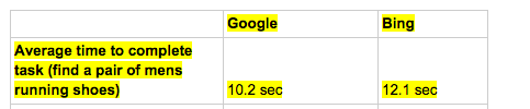
This could mean that people who use Bing are not as familiar with it (compared to Google users), so they need to spend a bit longer discriminating between paid and organic search results. This is supported by the fact that Google users completed tasks almost 2 seconds faster than Bing:
Also, and this is just a theory, but the gold ad icons Google uses make it really easy to breeze past and find organic results. Maybe people on Bing just don’t notice the difference between ads and organic. This is supported by the fact that Bing users spend much more time above the fold and don’t make it below the fold as often:
Conclusion
On Bing, users spend a major portion of their time considering search results (in comparison to rich text and ads off on the right side), especially the first five search results.
As a familiar and most popular search engine, Google users feel comfortable exploring the entirety of a search results page as opposed to strongly focusing in on the first elements they see. Users are comfortable viewing rich data and don’t hesitate to quickly scroll down and consider results located below the fold.
Perhaps, it is the novelty of Bing as a search engine that requires users to spend more time exploring and digesting search results.
The evolution of search engine result pages has certainly changed user behavior. The strict F pattern style we saw before is, quite frankly, no more. (At least in the contexts we researched). With the advent of rich text and ad placement, users find themselves exploring the entire results page to find what they’re looking for. As we saw through Google, many users look at rich text before even considering the actual search results.
Related Posts
-

Eyetracking and other user research have studied how people look at websites. Here are 10…
-

Most of the personal development advice there assumes you have no kids. I don't want…
-
Hiring is tough. Interviews and not even their history are not perfect to assess somebody's…
-
Today I'm reviewing lead magnets. Lead magnets are the key contributors to high email opt-in…
Remove the pictures. F-Pattern will remain intact. You’re comparing apples to oranges. Visuals are much more effective than text. The social network of visuals, Instagram and Pinterest. The latest boom in the modern era, I wonder why? Up next, instant facetime twitter like communications. Live visualization…
Ludo, can you clarify – hard to understand what you were trying to say here.
Hi Peep, the addition of the e-commerce shoe images influenced the experiment heavily. Images are more powerful than text. F-Pattern experiment before 2010 did not have much — or just about any visuals to influence experiment as it has done today. Once visuals are heavily involved, people would gravitate towards most images that can be seen. Why? A picture is worth a thousand words. Easier to read and grasp as much info as you can. Now when visuals are hardly even present, we tend to be pleased scanning horizontal more than vertically since we are used to reading left to right. Or right to left (considering other countries). Take 4 columns of text vs. 4 rows of text. It’s obvious, but if you want to test, see which one offers more of a pleasant experience. Let me know your thoughts.
I would redo the experiment considering:
text
images
combinations of text and images
based on google’s layout.
Sure, images definitely impact user behavior. But we have to look at Google search results as they are – not as they were in 2007. Google search results layout definitely impacts how people look at stuff, and that’s what the study looked at.
Hi Alex, this is highly interesting (and well-written). Can you give any additional info on the methodology used? What were you asking people to do exactly? And how the audience was selected?
I don’t wish to knock the good effort and interesting data produced by this, but I’ve just never quite believed that you are going to get the same kind of eyetracking results on “spanish water dog” as you are going to get on “super tuesday results” or “enchiladas 78701”
For example, this would be, potentially actionable if it was a small set of research-phase jewelry keywords vs jewelry keywords with purchase intent.
But, again, it sounds more like a criticism than I want it to. Thanks for providing this insight.
I agree that it would be great to see a follow-up experiment using queries derived from users with purchase intent. For example, using a group of people who are interested in shopping for shoes to search for something like “running shoes” or any more ecom-related searches.
Great info though.
Info-seeking vs purchase intent would be a fascinating study. great idea! I’m also interested in geo-specific searches. There are great things to come from our lab and research team.
Hi Joe, Ben from CXL here. Great comment and idea for a followup study, definitely not seen useless criticism. This variation on keyword phrase is certainly something we’re thinking about. Basically, you’re suggesting a hypothesis that people will consume results differentially based on task and intention, right?….which is correct, and why we tried to compare the camera and water dog results to past examples so they aren’t just stand-alone results. We didn’t try to get to the task question…but maybe we’ll do that next!
For the primary study we were just after a common product (shoe) SERP result, and then comparing Google vs Bing. For the shoe example, we asked people to “Imagine they were shopping for a pair of men’s running shoes”, then gave them the SERP result to assess and click-through. So we gave them a task to complete. Our population was selected with the help of a recruiting/paneling service, and aimed to achieve a ‘general population’ slice..so various ages, mix of gender, etc. Hope this helps to answer your questions!
Like the article!
I have noticed that sometimes search results don’t show ads on the right side. They just show 4 results on top and all the others in the bottom. Google has not given any official statements about that, but this is what I see as a marketer and also other colleagues have noticed that.
What do You think how this influences your experiment?
In Estonia there are not enough advertisers for most keywords, hence lack of ads.
Hey Nikita! Maddie from CXL.
Your observation of Google’s lack of right ads is absolutely correct, they just made the move to stop showing ads on the right side of search results pages.
You should check out this article: http://searchengineland.com/google-no-ads-right-side-of-desktop-search-results-242997
It should be interesting to see how the lack of right sided ads affects ad placement in other parts of the search results page. If Google decides to put ads in other locations, we’ll probably see yet another evolution in viewing behaviors. Maybe Google will start putting more than 4 ads on top and users will spend more time viewing those?
Fascinating. Can you share the raw data or sample sizes and threshholds? Difficult to evaluate conclusions without that. I would generally want metastudy level data here. Can you convince me otherwise? I am open.
L’s query about impact of images is valid. Current study may have different results than past studies because of the image intervention.
Does what was true in the past v. true now matter that much? Not to me, but perhaps it is of academic interest. Google will probably limit rich text soon, so we need to test as much as we can now. What do we know about behavior today?
Hi Kelly, good comments. Our sample sizes included at least 40 people per heat map generated. Sometimes there were more….our goal was 40, but we had to overshoot because sometimes the data wasn’t valid for a person (maybe they looked away too often for example). What specifically do you mean by thresholds?
The raw data is quite cumbersome so we haven’t thought about sharing (we do have it, of course), but we mostly don’t even mess with it directly, rather we let the software algorithms do the work (too much data for mere mortals to comprehend).
Did you want to find out something specific?
Regarding L’s comments, they are good for some follow-up tests for sure, but as you said, does the past matter? That the images possibly create or contribute to the different can be the finding as well.
Hi Ben,
Thanks for the response.
RE: threshold. Why 40 samples?
Thnx,
KKW
Hi Kelly, we came up with this number while working with Tobii eye-tracking equipment and software personnel. Only 30 people is the industry standard for valid heatmaps, per Tobii and nngroup. Our 40 number (or 10 extra) was to assure enough (30) truly valid (accurate) results within the aggregate data, even after ‘invalid’ data was tossed.
nngroup reference – https://www.nngroup.com/reports/how-to-conduct-eyetracking-studies/
Very impressive and insightful results. Nice work.
May I ask what tools you used for these? Were they all done in a lab using a Tobii eye tracker?
Hi Frank, we use a combination of our own lab’s biometric user testing equipment and service companies that allow remote testing and surveying capabilities. You’ll soon see studies that combine multiple types of toolsets including eye-tracking, emotional facial coding (tracking emotions such as frustration while completing a task…this one we’re excited about), remote and moderated user testing, large-scale panel surveys, large scale (across many websites) A/B testing experiments, etc.
it looks like an ‘r’ now (small letter R) :)
specifically in the list pic
https://cxl.com/wp-content/uploads/2016/03/Google-Shoe-Transparency-Map-1-320×426.jpg
You’re right. i think the images of the shoes on the right side affect where people look quite a bit
Defiantly some fruit for thought. Stat that stood out for me is the resulted clicks in Top organic search compared to a top ad.
To me, this show people trust organic searches more than a paid ad. In my opinion users feel like they will be made to buy something as soon as they click. Obviously these paid ads done right are profitable but to me people don’t trust them.
I know personally I will click a top ad last after going through a number of pages. How many of you a like this.
I believe we should do a case study on this and break down the why. I own a agency and I’m all about helping businesses generate result. Ads do get results but if we can somehow make them feel more trust worthy than then profitability will go to another level.
Especially when you do a Bing search and notice that everything above the fold is basically an ad, yeah it’s surprising they still get substantially fewer clicks.
I think personally, I click ads more on local searches (ie looking for a lawn care company in austin), than I do if I’m looking for shoes or something (then I’m looking for trusted brands, which tend to be towards the top of organic).
We’ll likely do another study to try to differentiate search intent (buy vs info-seeking etc).
Hi Alex,
Thank you for conducting this insightful study. :)
In addition to this, I’d like to see how users behave when they encounter SERPs that don’t have image ads or rich snippets.
I believe the “rich ads” on the right-side of SERPs are more relevant to eCommerce (or B2C) related search queries. For B2B-related queries (e.g., “Conversion Optimization Agency”), I get a plain-text SERP. Would the F-pattern still exist there?
Not quite sure. I think all of the tasks we measured had right-side rich data, but measuring the results of those that don’t could be a great future study. Thanks for the comment!
Hi Alex,
Really interesting read. Can I just clarify – what would you include within ‘rich data’?
Thanks,
Niamh
Hey Niamh,
Glad you liked the article. Rich data includes things like the images of shoes in the above example, as well as maps, “people also search for” results (like in the spanish water dog example), and knowledge graphs, etc.
-Alex
Great article, guys. It’s really interesting to see a modern perspective on this ‘classic’ heat map. Re: ‘The top organic search result still receives, by far, the most clicks of any organic search result’ would you consider doing a study where this is segmented by search query? I’d be really interested in hearing your guys input about whether the aggregate stats on click throughs via ranking are actually worth paying any attention to.
Could you explain the methodology and share the instructions of the experiment ?
What were the user instructions, what size of monitor did they use? resolution? was there someone else in the room? After searching for the dog breed what where their instructions?
Hi Julian, good questions. Note that this was our first study out as an information piece. Future studies will be more ‘experimental’ types, and include detailed methodologies.
But to answer your questions, the conditions and screen size varied a bit across users of course, though no mobile device was used, and the browser width was fixed at around 1200 pixels across the different studies (some were a bit smaller, but only marginally), to normalize across screens. We did not control for observers or ‘other people in the room’.
For all tasks, they were provided with a scenario and associated task, so for the shoes it was to find a pair of men’s running shoes, for the water dog, it was to seek out information considering they were interested in purchasing one….scenarios like that. After a baseline eye calibration, they were provided with the SERP.
Nice work, Alex, and I hope you have stimulated others to nail down the tracking matter. See http://www.businessinsider.com/heres-what-recruiters-look-at-during-the-6-seconds-they-spend-on-your-resume-2012-4, which shows the eye pattern of recruiters looking onscreen at resumes. The pattern shows splotches of concentration (eye stops) with arrows to indicate sequence. How about using layouts that let the reader go where they want to go and get what they want to get quickly. Complex, dense layouts keep the originator of the piece in control. Open layouts with clear focal points put the reader in control. Much better!
Interesting. Curious to know if you think you would get different results since Google eliminated the side bar ads?
Hi Michael,
User behavior evolves as search results pages do, so we’d expect at least minimal changes in results now that Google has gotten rid of those right side ads. What I’m particularly curious about is how Google will compensate for their lack of right side ads and how that’s going to affect user behavior.
Thanks for the updates and the link! (What got my attention with the sample size was that eye movement has less variation among individuals than I would have assumed. Have you seen any research that explores whether or not it’s possible to disrupt eye movement on a search results page by manipulating the page title field?Completely off-topic, I am thinking through what other aspects of digital engagement behavior might be similar.)
Cheers to you and Peep for taking on this kind of work. The dialogue here has reminded me of some things I love about our field of work.
Excellent piece of work and report.
My only problem is the sample size. I know it is bigger than the industry standard of 30 but surely even 40 cannot possibly provide a full cross section of any search audience. To my mind this would need hundreds to be meaningful …. Probably 700 minimum.
It is however a good indication of search behaviour from a small group.
Hey Stefan,
Sample size is one of those things that varies a lot depending on the type of research you’re conducting. For example, if you’re collecting census data, you absolutely want to maximize sample size in order to accurately represent the entire population.
With eye-tracking research, however, data and results converge at 30 participants. 40 participants is considered valid. Of course, the more the merrier, but in this scenario it wasn’t necessary in order to obtain sound results. This article provides a bit more information about sampling size in case you’re curious: https://www.nngroup.com/articles/how-many-test-users/
Truth is, F pattern never really existed outside the “truth” of Jacob Nielsen and his crew. Already back then eye-tracking showed that. The data from Nielsen F-pattern was flawed from the beginning. At least I have seen data to counter is 7 years ago.
This does not make the discussion above less interesting, just adding it to the storyline.
What Pattern Do You See?
I See a G pattern… and then something that looks like an Equal Sign…
But perhaps I am to visually oriented…
Could it be that Bing users are less savvy than Google users?
Really interesting article, thank you for sharing your findings. Following your response about how you used multiple methods including remote, could you please confirm how many people you actually used the Tobii eye tracker on? Thanks :)
Hi Lisa, thanks for the comment. For these heatmap studies even the remote methods used Tobii tech, so all 61-71 people, depending on the heatmap. For our in-house lab, we processed 15 people through for baselining, and used a Tobii x2-30 fyi. It’s an extremely reliable and handy version that we can use both on large monitors and labtops, for ‘in field’ testing, for example in a shoe shop to test people who have the intention of buying shoes, this was a suggested follow-up study in another comment.
And because Google is skipping the right ads -they are only going to provide ‘knowledge’ on the right side- you have a new challenge for your next research :-)
Indeed! Lots of future research ideas have sprung from this. It was interesting to see that no one really paid attention to the right sided ads anyway, maybe validating google’s decision to get rid of them.
Well written and highly interesting. It seems that marketers now have a new rule of thumb. The fact that 3rd search result got more traction than the 2nd search result is indeed interesting. Thanks for sharing.
Thanks Michael, I found that interesting too. I wonder if sometimes a ubiquitous name (like Wikipedia or Amazon) influences where people click more than ranking (1 vs 3). Could be an interesting future study anyway
Good article, thank you very much for sharing …..
One thing that is not considered here is the quality of the result set. From my own experience with Google/Bing results, the Bing results tend to be of a much lower quality than that of google, which would result in the user needing to spend longer considering the results presented by Bing, hence spending longer reacting to Bing results.
I think I like Google’s results better than Bing’s too, but it’s hard to prove that’s the reason WHY people spend more time on Bing – just a correlation. Makes sense intuitively though
‘unsubscribe’.