
Every once in a while a big debate comes along in the conversion optimization industry. There was the carousel debate, the hamburger menu debate, the above the fold debate, etc.
Optimizers have been debating another question: Which mobile design is best for optimizers?
Is it m(Dot) design, responsive design, or adaptive design? All three options have their unique pros and cons as far as UX and SEO go, but which is most suitable for someone running experiments and tests on the regular?
Table of contents
First, what is m(Dot) design?
m(Dot) design is the original solution for mobile visitors. Before m(Dot) design came along, mobile visitors had to wait while the entire site loaded and then struggle to navigate a design and UX made for desktop visitors.
Today, it’s hard to imagine a site that doesn’t have any sort of mobile solution.
With m(Dot) design, you must create a separate version of your site specifically optimized for mobile users. For example, this was Facebook’s m(Dot) design…

Typically, you’ll notice less content, a simplified navigation, fewer images, and so on
What is responsive design?
Responsive design is a newer solution to the mobile visitor issue. Instead of having to create an entirely separate site, you can simply create one version that is responsive to different screen sizes.
Here’s how Google defines it…
Responsive web design, originally defined by Ethan Marcotte in A List Apart, responds to the needs of the users and the devices they’re using. The layout changes based on the size and capabilities of the device. For example, on a phone, users would see content shown in a single column view; a tablet might show the same content in two columns.
So, for example, here’s how the HAUS site looks on desktop…

And here’s that same site on mobile…

See how the design of the site literally responds to the size of the visitor’s device? That’s responsive design in action.
What is adaptive design?
Adaptive design, also known as dynamic design, is another modern alternative to m(Dot) site design. Here, the server identifies the device type that the visitor is using and then loads the correct version of the site.
So, for example, if you’re browsing on your iPad, the server will load the tablet version of the site.
Essentially, you have three different versions of your site prepared…
- A desktop site;
- A tablet site;
- A mobile site.
Only the necessary resources will be downloaded. For example, if the visitor is arriving via a mobile device, the content and images for the desktop version won’t be downloaded.
What’s the current mobile landscape?
You don’t need yet another article to tell you that people are using multiple devices and mobile traffic is on the rise. For the purposes of this article, you’ll just need to remember one thing…
- People switch devices multiple times before making a purchase.
Joel Harvey of Conversion Sciences explained this to the CXL Live audience a few years ago…

Joel Harvey, Conversion Sciences:
“Almost 50% of mobile researchers start on search engines. The rest are starting on branded websites and branded apps. So, I would assume that a lot of these are brands that they already have an affinity for, and I would also assume that a heavy chunk is Amazon.
For new customer acquisition, let’s focus on the search engines. As these people are searching, they’re deciding what they want, they’re refining their consideration set. What happens when they convert?
Interestingly, the vast majority convert in-store and this shouldn’t be surprising. But let’s ignore that, let’s just focus on the digital conversion paths. For those that convert digitally, more than double have flipped over to the desktop and tablet… 45% compared to 17%.
So they do the research on mobile and they move to desktop in order to complete the purchase. And it’s happening on your sites too.”
So, you need to be prepared for visitors using a variety of devices. A few years ago, this was the breakdown of how the top 500 retailers are preparing, according to Pure Oxygen Labs…
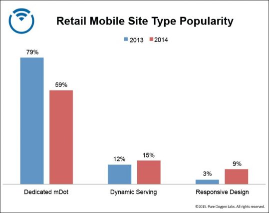
As you can see, m(Dot) rapidly declined.
Responsive design climbed quickly. It has definitely hit mainstream status and is occupying a lot of mindshare…
More retailers were found to be using adaptive design than responsive design. A few years ago, it was expected to grow to 20% (or more). Why?
Brian Klais of Pure Oxygen Labs explains…

Brian Klais, Pure Oxygen Labs:
“It presents retailers with the ‘Goldilocks’ solution: mdot pages are speedy, but use separate URLs and are harder to optimize. Responsive pages are integrated for easier maintenance and SEO, but slow and overweight for mobile users. Dynamically served pages are the ‘just right’ solution—combining the best of both for a single-URL, device-optimized layout and fast-loading pages that are easy to maintain and good for mobile SEO.” (via Pure Oxygen Labs)
So, at the end of the day, m(Dot) sites are on their way out, while responsive design and adaptive design battle it out for the top position.
The rise of responsive mobile design
m(Dot) sites were created because, well, they’re better than trying to load the full desktop version of a site on a mobile device. They were also pretty easy to create, which means they won’t take up too many resources.
Unfortunately, there’s a laundry list of problems that comes along with doing something the fast and cheap way…
- You need to manage and optimize two separate sites.
- The redirect causes a slower load time, which as we all know, is a conversion killer.
- Google doesn’t like redirects very much (because it requires additional resources on their end).
- Have you ever tried to share an m(Dot) link with someone on a desktop? It’s a terrible experience.
- Are you going to create a new subdomain for every device? Tablets? Gaming consoles? Smart TVs?
These problems have allowed responsive design to blossom. In fact, it addresses the three main problems that plague m(Dot) sites…
- You only need to manage and optimize one site.
- Having just one URL means no redirect issues.
- Social sharing looks good again.
In fact, Google has recommended responsive design quite publicly in the past. After sharing this chart…
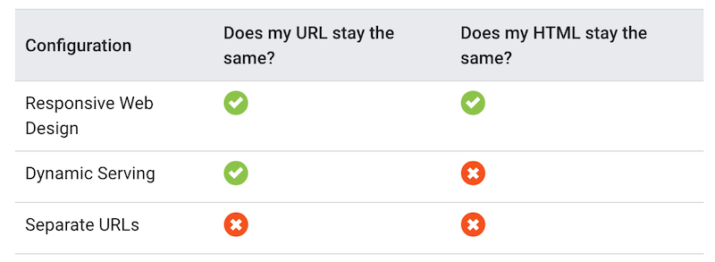
Google confirmed its preference for responsive design…
Responsive Web Design: Serves the same HTML code on the same URL regardless of the users’ device (for example, desktop, tablet, mobile, non-visual browser), but can render the display differently based on the screen size. Google recommends Responsive Web Design because it’s the easiest design pattern to implement and maintain.
But was careful to add that Google doesn’t favor any particular URL format as long as the pages and all page assets are accessible.
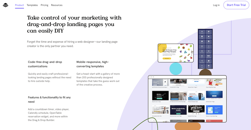
Responsive design is also standard practice for landing page tools…
The problems with responsive design
But nothing is perfect, right? Responsive design has its own issues, just like m(Dot).
First, responsive design means that everything from the desktop version is downloaded, even on mobile… Even if it’s not used in the mobile version. In addition, the responsive design needs to make a number of decisions. “Should this be shown on this device?”
Joel explains how responsive design can impact speed…
Joel Harvey, Conversion Sciences:
“Responsive designs, because they’re having to go through all of these decisions—and things are getting better, but—two years ago, Internet Retailer found that for large ecommerce companies with responsive design, it took 18.24 seconds on average for their homepages to load.
That’s more than a little too long.”
Sometimes, Joel goes on to say, responsive design makes the wrong decisions…
Joel Harvey, Conversion Sciences:
“So, we want to make the experience better for our mobile visitors, we’re going to use responsive.
But it’s going to make stupid decisions and, oh by the way, in order to do that, we’re going to put our desktop conversion rate at risk.
That doesn’t mean that responsive is not a direction to go in, it just means that you have to do it responsibly. You make the decisions and test every single thing.”
When Joel says “we’re going to put our desktop conversion rate at risk,” he means that a desktop redesign is required to deploy responsive design.
Too often, redesigns are done based on subjective opinions vs. actual conversion research. The result? Conversions tank.
Another major issue is that instead of optimizing the mobile experience and the desktop experience separately, you have to optimize for both. Since desktop visitors and mobile visitors are so different, that’s a problem.
That also limits your testing capabilities. Let’s say you run an A/B test on your responsive design and it results in a 15% decrease in conversions.
When you drill down, you notice that mobile visitors loved the variation, but desktop visitors did not. Since there are more desktop visitors, your test results in a decrease.
Imagine if you could deploy the variation to mobile visitors, but keep the control for desktop visitors.
The benefits of and problems with adaptive mobile design
While responsive design is certainly gaining attention, Brian claims that many companies are moving to adaptive design to combat the problems that arise from responsive design…
Brian Klais, Pure Oxygen Labs:
“Dedicated mobile sites were the industry’s first-generation mobile solution; responsive design represents the industry’s second generation. But like its predecessor, responsive has technical shortcomings of its own that quietly push retailers towards dynamically served solutions.” (via Pure Oxygen Labs)
So, how does adaptive stand out compared to responsive?
It’s lighter, meaning faster load times
As mentioned above, one of the biggest issues with responsive design is speed.
Since responsive design means downloading everything from the desktop version, even when you’re accessing the site from mobile, Brian says critics are right to be skeptical of responsive design…
Brian Klais, Pure Oxygen Labs:
“Retailers are right to be cautious about embracing responsive given the impact page speed has on online conversion and search rankings.” (via Pure Oxygen Labs)
With adaptive design, visitors only have to download the assets for that particular version of your site.
For example, if a visitor arrives via mobile, they only have to download the mobile assets. The desktop assets are not downloaded. As a result of having to download fewer assets, page load speed is increased.
Peter Nelson of UnDelay.io, an adaptive landing page builder, describes a speed test his team ran and how adaptive stacked up against responsive…

Peter Nelson, UnDelay.io:
“We actually performed our own performance testing about a year ago. We used Dotcom-Monitor, which gave us the waterfall, load time and page weight.
We uploaded the same content, forms, images, copy, etc. to our competitors’ platforms, which offer a responsive solution.
Our mobile page weight, on average, was about 75% lighter than theirs.”
So, while even Peter admits that a lot has changed for both UnDelay.io and their competitors in this rapidly growing industry, adaptive was found to be significantly faster than responsive.
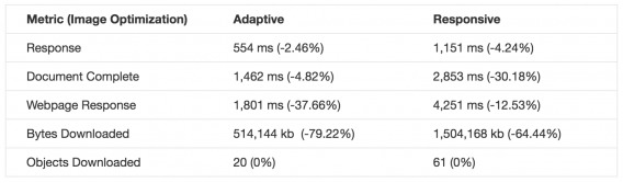
Catchpoint Systems tested the speed of adaptive design vs. responsive design as well. They built two identical sites in WordPress. Both had the same text and images, the same content. Not surprisingly, both sites performed exactly the same on desktop.
When you switch to mobile, however, things get more interesting…

As you can see, adaptive is significantly faster than responsive, just as Peter and his team found.
But, of course, smart optimizers are able to make content more mobile-friendly. So, they decided to optimize the images since the original site content was heavy on visuals…
Benefits across the board on that one, but you’ll still see that adaptive is faster.
Finally, they did the concatenation of CSS and JavaScript to reduce the number of objects being downloaded…

Again, benefits across the board, but adaptive is still faster. I don’t need to tell you how valuable that speed, that saved time is.
Optimize for each device, making testing easier
Above, we also addressed the optimization and testing limitations that come with a responsive design. Adaptive gives you more control and flexibility.
Peter helps explain why that’s important to optimizers…
Peter Nelson, UnDelay.io:
“With adaptive, you have the flexibility to completely change the customer journey on every device type. Since consumers use 2.6 devices on average to convert, it implies that every device is used for a different purpose.
That’s why you need to customize the customer journey by device type. It begins by analyzing the visitor’s intent as it relates to each device. What do they want to accomplish using their mobile device? What’s their main goal?”
So, consumers are using multiple devices before they convert. No surprise there. But consider the implications of that. They’re using different devices for different steps of the funnel, for different purposes.
In a very simple example, they might be using your mobile site for research purposes and then your desktop site to actually convert. What should you do? You should optimize mobile to make research easier and you should optimize desktop to make converting easier.
In this particular example, why waste time pushing the mobile traffic to convert when they’re there to conduct research?
With responsive design, you have to either find a common ground that satisfies both, but doesn’t seize all of the opportunities available or seize all of the opportunities on one end of the spectrum, leaving the other end neglected.
You could be, essentially, sacrificing desktop for mobile or mobile for desktop or tablet for mobile… whatever.
With adaptive, you don’t have to. You can create a separate journey optimized for a separate goal.
Peter adds that some versions of responsive design are taking steps towards making optimizing for each device easier…
Peter Nelson, UnDelay.io:
“Responsive does have the ability to hide content on mobile and desktop devices, which is helpful to test small changes, like headlines or an image. But keep in mind, every change adds page weight to a page that’s already heavy.
It’s not an elegant solution to make big changes that include major redesigns with unique functionality for each device type; desktop, tablet and phone. Responsive doesn’t accommodate that very well and can become a real pain the neck, if not impossible.”
Another important point to touch on is A/B testing. We talked about the issues that plague responsive design when it comes to actual testing. With adaptive design, it works a little something like this…
So, if you have the traffic, you can simultaneously run an A/B test on mobile, an A/B test on tablet, and an A/B test on desktop. Furthermore, you can be running an A/B test on mobile with the goal of capturing emails while you’re running an A/B test on desktop with the goal of getting money in the bank.
But… It’s resource-heavy
That all sounds great, so why the hell is anyone using responsive or m(Dot) sites? Well, because adaptive design has its downfalls, too. Namely, that it takes a lot of human and monetary resources to pull off…
Brian Klais, Pure Oxygen Labs:
“The biggest challenge with dynamic serving is the level of effort. By nature, it integrates mobile content serving into the core web server and page logic. This often requires a concerted effort among senior developers.
If you can accept the implementation hurdle, dynamic serving (including responsive design that incorporates server-side detection) will comply with Google’s mobile SEO rules more easily.
The dynamically served mobile pages can solve for responsive design’s load speed issues, while avoiding the mobile SEO requirements of mdot sites.” (via Retail Dive)
The application of adaptive design is not a standard offering among landing page builders, it’s not the most popular mobile solution, it’s not talked about as often as its competitors, etc.
Peter takes us back to when adaptive was first introduced…
Peter Nelson, UnDelay.io:
“Adaptive has been around for a while and the first implementations of adaptive were sites with 30-40 templates, one for each device model.
It solved the problem of delivering a customized version, but the cost to develop and update the site was enormous. Just imagine having to update that many templates for simple product updates. That’s a lot of work.
At that time, only larger companies with resources could take advantage of adaptive.”
Whoa… 30-40 different templates? I’m willing to bet no one is reading this and thinking, “That sounds fun.” Developer time is scarce, especially senior developer time. Small and even mid-size companies just don’t have the resources to take on this kind of design, even if they want to.
How adaptive design is evolving
In an article, UXPin wrote…
Responsive design will remain popular, but that might be because we have not yet found a decent solution to the heavy maintenance that adaptive demands. Adaptive design hasn’t died out though, despite the web’s apparent love of responsive, so it’s possible—in theory at least—that we’ll see some improvements emerge yet that will blow responsive web design out of the water.
I have to agree. Adaptive design is still becoming more accessible to smaller businesses. I expect that responsive will be the equivalent of m(Dot) in the not-so-distant future.
While still in beta, you can see that steps have already been taken by adaptive on drag-and-drop builders like UnDelay.io…
Peter Nelson, UnDelay.io:
“The latest technical advancements of adaptive design have addressed all the drawbacks. Now it’s just as convenient to build a page with adaptive as it is with a responsive template.
This is accomplished with drag and drop builders that can be linked, unlinked, and then relinked again. You can customize your template on the desktop and, just like responsive, the changes will carry through to the other devices and look great.
But to optimize for higher conversions, templates are only good to use as a starting point. The real test is to gauge how efficient it is to optimize for each device type.
For example, let’s say you want to create a variation on the mobile version with major changes. You want to test new images, text or add functionality such as a sticky header, a pop-up, or click-to-scroll. You can make all those changes, to just the mobile device, by unlinking your desktop, tablet and mobile builders.
Then if you want to change the button design on all three device types, you can simply relink and the changes will carry through to all three versions.”
Despite the fact that responsive is still in vogue, I wouldn’t be surprised if the entire industry is headed towards an adaptive future.
Mobile optimization isn’t exclusively a technology problem
Talia Wolf of GetUplift hits the nail on the head about the responsive vs. adaptive debate…

Talia Wolf, GetUplift.co:
“The problem with adaptive or responsive design is that they both focus on the device rather than the mobile visitor itself. Responsive and adaptive design focus on screen resolution, the device a customer is using and the layout it should present.
Mobile visitors are far more than just devices or screen resolutions, they have a different state of mind than desktop visitors and they require an experience that acknowledges that. This isn’t just a technological challenge, mobile optimization is a strategic challenge, too.
While the desktop visitor sits comfortably at his desk and has all the time in the world to read and convert, the mobile visitor is usually on-the-go, multi-tasking, using a couple of devices at the same time. Mobile visitors are even looking for different information, real-time information. Mobile visitors deserve a different experience—one that address both their emotional and behavioral needs.
Mobile visitors are not mini desktop visitors divided by the size of their device or screen. To truly convert more mobile visitors, you have to first get to know them better, understand their unique behavior (e.g., their search patterns within the site). Equally important, you must understand their emotional state, the context they are in, their motives and emotional triggers.
Without this, both adaptive and responsive design are destined to fail. Only once you conduct the research and begin treating mobile visitors as a different type of customer can you truly provide a better experience for them that converts.”
Both have pros, both have cons. Is your site going to fail because you chose responsive over adaptive? No.
What it really comes down to is this…
- Do you know who your audience is?
- Do you know what’s different about your mobile audience’s behavior (vs. desktop)? How about your tablet audience’s behavior?
- Do you know what they’re looking for on each device? What they’re trying to accomplish?
- Have you conducted the proper conversion research to identify problem areas and make it easier for them to find and accomplish what they set out to on that device?
If you answered yes, you’re in better shape than most people debating whether responsive or adaptive is better.
Conclusion
In summary…
- m(Dot) isn’t dead, but its vitals are weak.
- Responsive is gaining a lot of attention, but has undeniable speed and flexibility issues. It’s still the least popular of the three options.
- Adaptive solves responsive design’s core issues and is better for optimization in theory, but requires a lot of human and monetary resources. Technology is beginning to correct that; expect major growth in this space.
- More important than this debate is understanding your audience, their behavior on different devices, their wants / needs on different devices, and how to make it easier for them to get what they want / need on each device.
So, which mobile design is best for optimizers? Stick to responsive or adaptive for the best results, but remember that this debate is purely technological… there’s a lot more that goes into mobile optimization.
Related Posts
-

Google is a strong advocate for responsive design. Mashable named 2013 "The Year of Responsive Design,"…
-
Several years ago, Jeremy Smith wrote, "Traditional optimization is dead, and in its place is arising…
-
There are an almost limitless number of mobile usability gotchas that need to be identified…
-
Designers versus data more than ever deserves its place in the pantheon of great conflicts:…


Responsive design works on the principle of flexibility – a single fluid website that can look good on any device. Responsive websites use media queries, flexible grids, and responsive images to create a user experience that flexes and changes based on a multitude of factors.
Thanks for sharing..!! :)
Thanks for reading, Taylor! Appreciated.
For small businesses it is not affordable to get into the adaptive design track as it requires a lot of human and monetary resources. with progressive growth the company may switch from responsive to adaptive based on the requirements.
Definitely, Reza. But I think technology will quickly make adaptive a realistic choice, especially with tools like UnDelay.io already in beta.
Shanelle, you consistently put out some of the best articles on here. I’m a fan.
Thanks so much, Peter. I really appreciate you saying that.
Shanelle this article it’s really complete and objective.
Thanks Luca!
Shanelle;
Thanks for the great article, it is very helpful with my current mobilization project! You mention that “You should optimize mobile to make research easier and you should optimize desktop to make converting easier.” I find this fascinating advice, but I can’t find any examples of websites doing this. Do you know of any that are using this strategy?
J.R.
I wish I could think of some because I would have loved to include them in the article. None came to mind immediately and I couldn’t find any while browsing around, unfortunately.
I’m glad you found the article helpful, though. Best of luck with the project!
Thank you for a great overview. A while back ScientiaMobile conducted researched the top 10,000 sites globally to see if they were ready for “Mobilegeddon”. A summary of the findings can be found here: http://www.scientiamobile.com/page/are-you-ready-for-googles-mobile-friendliness-rankings-lessons-from-the-top-10000-sites.
It is important to point out that the three options you outline above are not mutually exclusive. It is very common to combine. A more recent research on the same topic ScientiaMobile found that only a fraction of the top 10k sites used only RWD. (See slide 12 here http://data.wurfl.io/MOVR/pdf/2016_q1/MOVR_2016_q1.pdf) Most sites used RWD as a basis and then Adaptive approaches with device detection etc. to address the short-comings of RWD.
Really appreciate you taking the time to share this with everyone, Jon. Awesome points.