User flow is the path a user follows through your website interface to complete a task—make a reservation, purchase a product, subscribe to something. It’s also called a user journey.
And it has a massive impact on conversions.
To maximize your conversions, you have to get the user flow right on your site. Do it by building a user flow that matches user’s needs.
Table of contents
The wrong way to go about designing your site
You need to decide what your new website will be like. Two most common ways people approach it:
- Scenario A. You keep everything as it is on your current/old site but make it look “better.”
- Scenario B. You start with the building blocks: Okay, the logo goes in the top-left corner. Let’s put the menu to the right. A nice image in the header. Cool. And so on.
Both of these are the wrong way to design a site. Neither will result in a great user flow. Here are six steps to getting it right.
How to create a user flow for your website
First of all, I’ll name all the steps in building your user flow, then look at each one of them in-depth.
Here are 6 steps to create a user flow for your website:
- Elaborate on your objectives, and your user’s objectives;
- Make sure your traffic source matches your messaging;
- Choose the kind of user flow that should be created;
- Determine the details your visitors need to know;
- Deliver the appropriate information at the appropriate time;
- Implement state diagrams to map the flow steps.
1. Start with the objectives—yours and your users’.
Your primary aim is to fulfill the business objectives (either your own or the ones set by your client). Business objectives might be getting users to sign up for something, purchase products, or join an email list.
But people don’t just come to your site and—right away—do what you want them to do. In most cases, they need to go through a series of steps that lead up to the action.
Your goal is to map users’ paths—flows that take users from their entry pages through conversion funnels—toward the final action (signup, purchase, etc.).
The final action needs to provide value both to the user as well as the business; otherwise, the conversion won’t happen.
To do this, you need to know two things:
- Business objectives. The action(s) you want visitors to take on the site.
- User objectives. The desires or needs users want to satisfy.
If the user wants to clean their car, and your goal is to get the user to buy car-cleaning products, the goals intersect, and the conversion can take place. On the other hand, if they want their car cleaned right away, and you want them to wait two days for delivery, there isn’t a match.
2. Match your message to the traffic source.
Site visitors don’t arrive on a web page out of nowhere. The first step in a flow is mapping out how they get to your site.
Once they land on your site, they won’t immediately perform the action you want them to. Specific sequences of actions lead visitors through your website as they try to accomplish tasks.
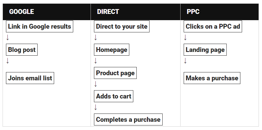
To diagram user flows for your site, you need to establish possible entry points and how users flow from there toward the final goal.
Typical entry points for users
- Organic search. A user comes via Google after searching on a particular keyword. They often land on a deep link.
- Paid advertising. Visitors come via Google Ads, banner ads, or other promotions. They arrive on your landing page.
- Social media. A user comes from a friend’s post on Facebook or Twitter, or via a social news site like Reddit.
- Email. A user comes from an email newsletter or a link they saw in an email sent to them.
- Press or news item. Visitors come after a mention in the news or a blog post.
- Direct link. A regular visitor who has been on your site many times and knows the URL by heart.
How they end up on your site largely determines their needs, expectations, and what they know about your product (or even the general category). You need to treat different people differently.
3. Decide on the type of user flow you need to create.
So what do user flows look like? And how should you design yours? Here are some sample flows.
User flows based on traffic source
Stacked user flows
Sometimes, you want visitors to join the email list on their first visit but ultimately want to sell them a product. In those cases, you should map stacked user flows.
In a stacked user flow, the first flow is completed by joining the email list; the second one starts after the first flow is complete:
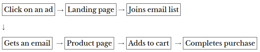
A user who has already been through the first flow is much more knowledgeable than a first-time visitor. They also have some kind of relationship with you, and you should treat them accordingly.
4. Identify the information that visitors need.
To design the best possible user flow, you need to understand the visitor and their motivations. Start by answering these questions:
- What needs or desires do your visitors have? What problem do they want to solve?
- Why do they need it?
- Which qualities (about your product or service) are most important to them?
- What questions do they have about the product?
- What are their doubts or hesitations?
- What information do they need to take action?
- What’s their emotional trigger to propel them to taking action?
To answer these questions, you need to talk to your customers (or your clients, if you’re a service provider). You can’t just pull the answers out of thin air. Yes, you should use buyer personas, but those should be based on actual customers and their needs.
Here’s an interesting case study detailing how customer journey maps were used at Boeing. Another article you might want to read is about designing a hotel booking experience.
The answers to the questions above determine how you present information on your website. You have to demote certain elements and emphasize others.
You cannot be all things to all people. Your website cannot be about 10 different actions. You need to build focus into your site.
5. Present the right information at the right time.
For users to convert, the information flow must give users the information they need in the moment they need it.
Many websites mistakenly ask for the sale (or signup) too soon. People don’t take action with inadequate information.
Your goal is to keep users moving down the funnel, toward the desired action. Optimize the content on each screen for conversions.
- In each step, present a clear, benefit-oriented value proposition.
- Explain how your offer is useful and how it works. Invite users to read more detailed information.
- Back up your claims with easy-to-digest proof points (references, testimonials, studies, etc.).
- Minimize friction. Ask for the minimum amount of information, reduce the number of fields, extra clicks, and page-loading time. Use trust elements.
- Create clear and attractive calls to action that guide users to the next step
Designing users flows does not mean that you forget about all the other conversion stuff, au contraire.
6. Map flow steps with state diagrams.
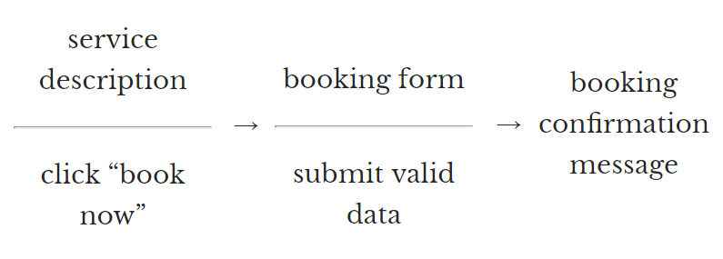
Flows are made out of individual screens where interactions take place. Every screen offers possibilities from which the user chooses one. Then, the screen changes, and the user has another choice. It’s an ongoing conversation.
In each moment of a user flow, the screen shows something, and the user reacts to it. A good and understandable way to map steps in the flow is to use state diagrams:
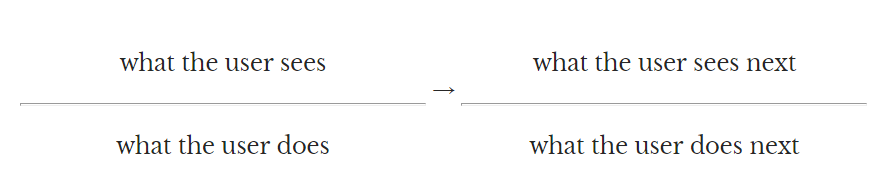
Above the bar is what the user sees. Below the bar is what they do. An arrow connects the user’s action to a new screen with yet another action. These are called state diagrams in computer science.
Use these diagrams to help you focus on the most-wanted action on every screen the user sees. It’s also useful when explaining the flow to your colleagues or clients.
A user flow example with a state diagram
Let’s say you run a website for a car-detailing service.
Create a similar flow diagram for every page on your site. Define the key content you want to present to the user and a most-wanted action.
The next action from a screen doesn’t have to be one thing: The flow can break into two or three alternative paths. The important thing is that you plan ahead for each path and design each screen accordingly.
Doing this requires ruthless focus, but the boost in conversions will make it all worthwhile. Indeed, “flow” isn’t just some UX buzzword—it’s a psychological reality.
User flow supports flow
Flow, as a mental state, was first proposed by psychology professor Mihaly Csikszentmihalyi. It’s a state of being that makes an experience genuinely satisfying. Everybody has experienced it. Most people refer to it as being “in the zone” or “in a groove.”
During flow, people typically experience deep enjoyment, creativity, and total involvement in the task at hand. There’s even a book about it.
Ideally, your user flow nurtures the flow experience for your users. Three key ingredients for “flow” are:
- Challenge at the right level;
- Immediate feedback;
- Skill that can be mastered.
In order to design your site for flow, according to Jim Ramsey, you must:
- Have clear goals for users. Help them understand where they’re going and each step they’ll take to get there.
- Provide immediate feedback. Whether they click a button, fill a form, or navigate from one page to another, tell them how they’re doing, and what’s going on. Messages and copy have a critical role.
- Maximize efficiency. Once a user becomes familiar with your site and starts experiencing flow, they’ll want to work more quickly and the site to feel more responsive. Use key features of your site (a lot) and see if there are any annoying, repetitive tasks. Pay close attention to feedback from user tests. Make the experience frictionless.
- Allow for discovery. Once a user has begun to work with maximum efficiency, there’s a chance that they’ll feel less engaged and grow bored with their experience. To avoid this, make content and features available for discovery.
When the smooth path is interrupted—or something doesn’t seem to fit—the flow is broken, which means that the experience is also momentarily broken. These small episodes of friction are cumulative.
Unfortunately, the breaks in flow weigh more heavily on the experience than the positive, frictionless moments. Experimentation and testing are key to getting it right.
Clutter, animation, and surprises may be disruptive. Online, people don’t like surprises (especially the “Now what?” or “How do I…” kind). Take out or improve elements that might cause friction. Less is more: Remove visual and navigational noise that might seem like clutter to users.
Here are a couple of sites that get it right.
Examples of sites with great user flow
Invest 5 to 10 minutes in each of those sites. You’ll learn something.
What does it take to develop a site with that type of flow? The process may look something like this.
Designing a user flow:
A (hypothetical) case study
Let’s pretend I have a client, a company that manufactures mini infrared saunas (such as this random one on Alibaba). The business objective is to get people to buy those saunas online, or at least get a solid lead.
The first thing I would do is talk to the client and learn all I can about their business and their customers. Next, I would compile a list of questions to ask their last 20 or so customers (whose buying experience is still fresh).
Questions for my client
- Tell me about your typical/ideal customer. Who are they? Why do they buy? Where are they going to use it?
- What matters to them when they’re looking for a sauna?
- How do they compare different products?
- What matters the most?
- What happens after they buy? Describe the process in detail from the moment they place an order to when the sauna is all set up for use.
- What do your customers say about your products?
- How is your product better or different from the competition?
- What kind of praise have you heard? Can you forward me the exact wording they used?
Questions for their customers
- Why did you want to buy an infrared sauna?
- What were the main questions you had when you were looking for one?
- What was most important to you? Which parameters did you compare?
- What kind of doubts or hesitations did you have?
- What alternatives did you consider?
- What made you decide to buy from us?
- Now that you’ve bought it, what do you like about it the most?
Based on the answers I get, I would develop follow-up questions and ask even more. The point is to really understand the customer and their approach to buying this product.
We need to know:
- Why they want it;
- How they’re going to use it;
- The qualities that are most important.
They won’t make a purchasing decision until our site addresses all of those concerns.
Traffic source analysis
My client tells me that they’re after organic search traffic and plan to run some campaigns on Google Ads. This means I must map user flows from landing pages (PPC traffic), the homepage (direct and SEO traffic), and directly from product pages (long-tail SEO traffic, direct links, and mentions).
In the sales process, we’d go for a direct purchase—rather than getting their email first and warming up the lead—due to the nature of the product.
Here’s the user flow I drew on my whiteboard:
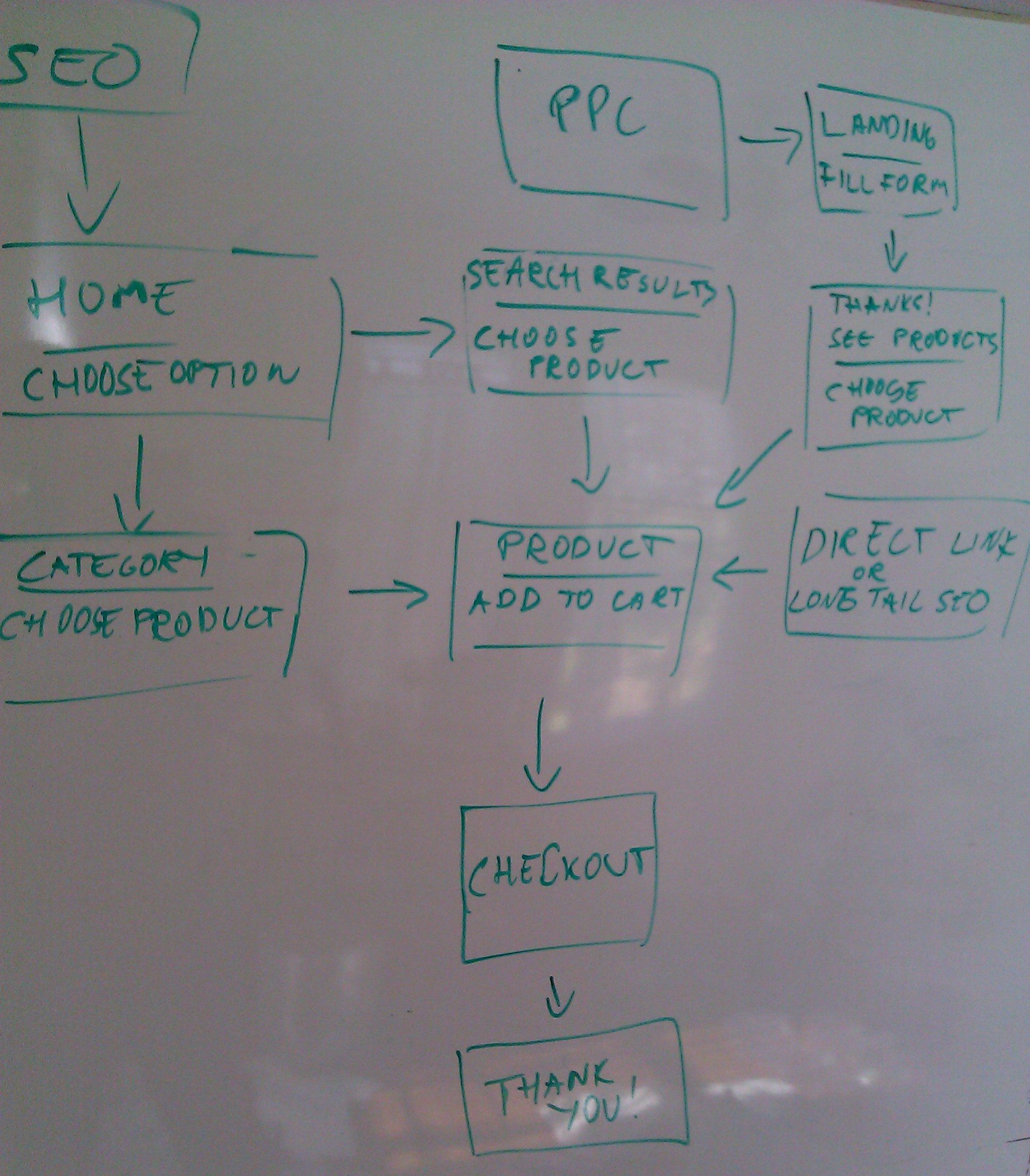
(Tools like WebSequenceDiagrams are great for this, too. You may also want to check out this list of tools for sketching website experiences.)
Now that I’ve established the most-wanted action for each page, I know what I want users to do next at each step and can prioritize or demote content accordingly.
The content for each screen is super important and has the biggest impact on conversions. The sales copy emphasizes details that are important to potential buyers in the purchasing process and addresses their questions and doubts.
When deciding which content should go on each screen, I also have to look at how they got there and what they already know. A user who arrives on a product page from the homepage is more knowledgeable than the one who comes via a direct link.
Hence, I must ensure that the direct-link visitors won’t leave due to insufficient information, and I have to re-emphasize the key points from the homepage again on the product page, especially if the brand isn’t known and the majority of the visitors are first-timers.
Test, test, test
Naturally, the flow itself, the layout, and the content—value proposition, product info, calls to action, etc.—need to be tested. I construct my first hypothesis as well as I can based on the best information available to me, but it’s still a hypothesis. I need to create alternative value propositions and copy to test immediately.
For every site, the initial flow design is just the starting point.
Measure, observe, and improve
Measure your flow in analytics
Which step in the flow does a good job at taking users to the next step? In which step do a large number of users drop out?
You can measure this by using goal funnels. In Google Analytics, as well as most web analytics tools, you can easily set up goal funnel tracking for steps in your user flow.
The Goal Flow report will tell you which step of the flow is performing well, and which is a flow stopper, so you can take action. Also, check out the Behavior Flow report to get another insightful overview.
Test your flow with users
For your user flow to boost conversions, you must base it on customer personas. Use actual customer behavior and research to determine the tasks that customers want to perform, what matters to them, and why.
Do what you can to experience a day in the life of a customer. Once you’ve finished your initial flow, conduct user testing. Watch people try to perform a task on the website and have them comment out loud.
Ideally, you’ll recruit test subjects who match your ideal customer profile and observe them in person (over their shoulder), but you can also use services like usertesting.com.
User testing will help you find bottlenecks and sources of friction. It will also help you understand how users want to use the site (so you can adjust it accordingly).
Even if you put a ton of effort into designing the flow, what you come up with is still a hypothesis. You need to test it. Pay close attention to whether you’re missing a step in your flow, or if you have one too many.
Once you get the flow right, focus on optimizing different screens.
Conclusion
Creating a seamless user flow aligns the needs of your business with those of your users. The key is to ditch gut feelings and base your decisions on research—which you can then test until you know you have it right.
Follow these six steps:
- Start with the objectives—yours and your users’.
- Match your message to the traffic source.
- Decide on the type of user flow you need to create.
- Identify the information that visitors need.
- Present the right information at the right time.
- Map flow steps with state diagrams.
If you do, you’ll increase your chances of generating “flow” for your visitors—and winning more conversions in the process.
Working on something related to this? Post a comment in the CXL community!
Related Posts
-

What's user experience (UX) got to do with conversions? Everything. Great user experience is a…
-
If you’re a budget brand, there’s nothing wrong with a website that looks kinda cheap.…
-
Typography is the detail and the presentation of a story. It represents the voice of…
-
Animation for the sake of "cool" can often hurt conversions since it's distracting, but not…


I must say – practice what you peach! You’re images link to themselves not the websites they are a screenshot of. How could you! Big no-no….
Intentionally, to show a larger size version. There’s a link to the website above the images. And I have not preached to do otherwise.
Thanks for the post. Did you go through this process in designing your blog? Or was it more common sense and testing? I’m curious about user flow on smaller sites with no ecommerce.
One “expert” designer suggests through video that the only real objective of your site is a marketing tool and to build your list, and sell there. Their niche is web design for coaches and consultants. I’m not so sure, what do you think?
Randy – It looks like you have the right instincts. There are so, so many ways to sell online, and I’m sure this web design coach’s strategy works, but it just depends on how the site it set up.
To use myself as an example, I work for a design company that sells visual assets via our website, so our website *is* our primary marketing tool, but it’s also our shopping area and checkout.
Thanks very much for sharing. You said “Minimize friction. Ask for the minimum amount of information, reduce the number of fields, extra clicks and page-loading time. Use trust elements.”………………..could you please expalin what do you mean by trust elements
Things that make the website seem more credible. See this list: https://cxl.com/website-credibility-checklist-factors/
Hi there, I found your website by the use of Google at
the same time as looking for a comparable topic,
your website came up, it seems good. I have bookmarked it in my google bookmarks.
Hello there, just was alert to your weblog thru Google, and located that it is really informative.
I am going to be careful for brussels. I will appreciate for those who continue this in future.
Many folks might be benefited from your writing. Cheers!
You should also try Lucid Chart’s software! You can create a flow diagram for your website https://www.lucidchart.com/pages/examples/sitemap_creator
Just started without my new company in the Netherlands , called userflow.
Message was deleted?! Sorry , can’t use mobile smiley’s I think. What I was saying.. Like the article about userflow, because I am skilled, always learning, in Interaction design and interface design. Will read some more of you articles.
slt, cela fait pas mal de temps que je lit ce article.
Excellent article. Thank you for sharing your knowledge.
Awesome article and resources are very useful! Thank you, Vlada
Thanks for sharing this , i was looking for a good article on creating good website design,it will help me to understand the whole criteria easily.