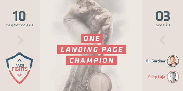
Last Friday, Oli from Unbounce & Peep teamed up for the second episode of Page Fights where they tore apart contestants landing pages & give them actionable advice & best practices on how to make their landing pages better.
The winner of Page Fights gets 1 free year of Unbounce’s Pro 99 account, a half hour private consultation with Peep & free early membership into the CXL Institute.
In this second episode, they reviewed 5 different landing pages with the page owners & went into more detail than Peep normally does in our regular website reviews, so hopefully you’ll find more value in it.
In case you don’t have time to watch the full 39:00 minute video, I’ve included the main takeaways as well as included links to helpful landing page best practice content from here & around the web.
Table of contents
Finalist 1 – Paul Jarvis, Write & Sell Your Damn Book
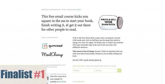
What’s interesting about this page is that it uses powerful copywriting to draw visitors into the page.
According to Paul, the page gets over 800 visitors/week & converts at about 24% (with no paid traffic)
Oli’s Feedback:

On your screen right now, on the bottom left, it’s all about buying the course on Amazon. I understand you’re probably looking to make a little money, but wouldn’t that call to action be better served in the email sequence?
If your main call to action here is to get people to sign up for your course via email, why would you also try and take them away from the page?
I also really like the cleanliness of the site, but I would put more emphasis on the form. It just kind of blends into the rest of the site. You want to make sure it’s really clear that it’s the most important part of the page.
Peep’s Feedback:

I agree with pretty much everything Oli said, the form is the weakest part of the page. The green you use is a very timid color. Also, those sponsor logos are dominating the form itself. Even if your sponsors require that you display their logos, what you do have control over is the boldness & design of your form.
Two column forms also don’t typically perform as well as a single column form, your call to action “Go” could really be more specific, and I wonder how a test using specific language on the headline would perform?
Takeaways
- Remove anything that distracts from the call to action
- Makes sure the call to action accurately named is emphasized on the page
- Test 2 column forms with single column forms
- Test clearer language in the headline
Finalist 2 – Ryan Walsh, Mind Over Pain
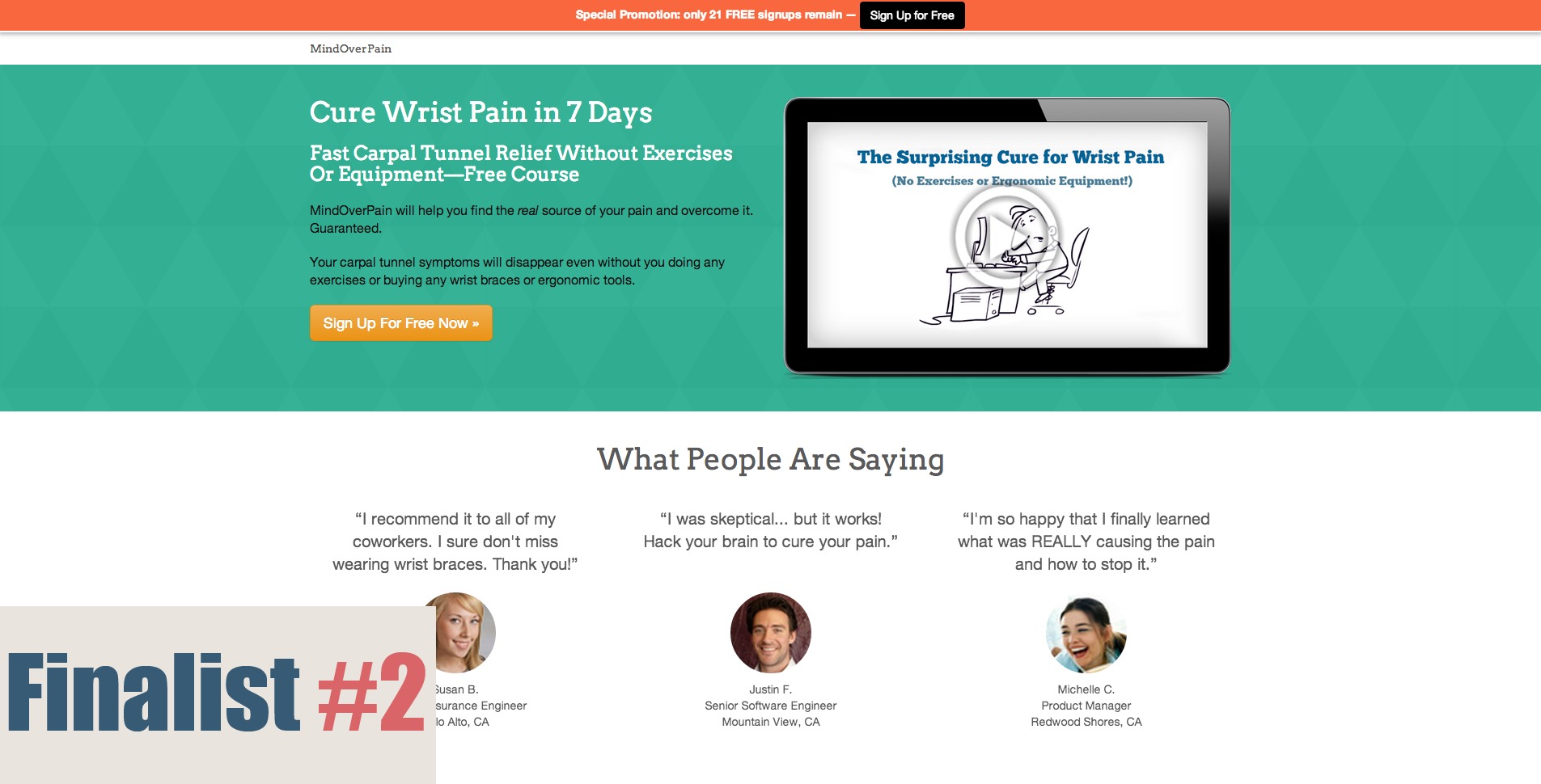
Ryan created Mind Over Pain as a way to teach others how to get relief from chronic wrist pain without doing funny exercises or using silly looking gear.
Peep’s Feedback:

The way Ryan described his story when telling me why the company exists was way more compelling copy than what he has on the page.
The headline is great, but then you go into buzzwords, you make guarantee something, but how can you do that – it’s a free course, it makes my bullshit detector go off.
And you don’t answer the “how are you doing it” question above the fold. Of course you do a little later, but we know that most people don’t read, and the page starts using cheesy stock photos once you start to scroll, because they really hurt your credibility.
You’re also confusing page length with page depth. There’s a lot of stuff on this page, but how much of it really adds value?
As one last tip, we’ve found that short pages generally convert better for free offers.
Oli’s Feedback:

Remove the “What People Are Saying” and the section right after that, just remove them entirely.
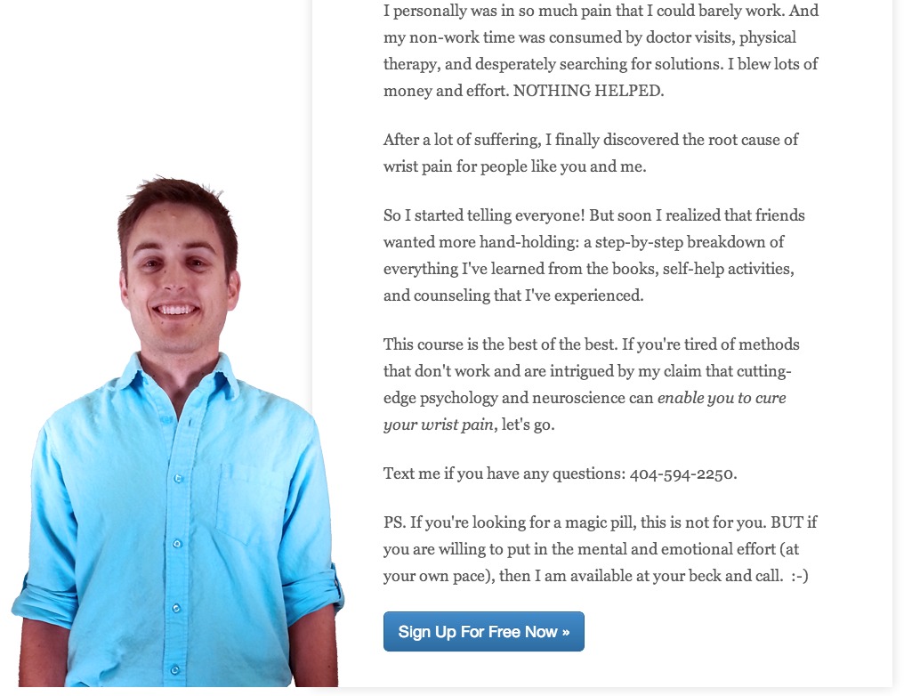
What you have at the bottom, there’s a photo of you, and you don’t look like a douchebag. You look a little uncomfortable there, which adds to the overall credibility, because you’re not polished & this is the kind of stuff people are going to believe in.
You might also want to change the ad headline headline to speak more to the pain other people are having, so maybe something like “I want to reduce my wrist pain now”…
Me: Yes, but you don’t want to guess, you want use qualitative research to understand how your existing customers are describing their problems & pain.
So if your customers are saying “I want to reduce my wrist pain now”, than yes, but if they’re saying something else, you want to go with the trigger words, the language that people are using in their heads to describe their problem.
The best way to get this information is to create a feedback loop that collects information right after they sign up, but before the course begins, so they’re fresh in the “I’m going to solve my problem” mindset.
Oli: Also don’t use scarcity, if you’re not going to actually be teaching the course live.

Takeaways
- Be relatable & human. Sometimes being “polished” isn’t the best approach and a personal story is what gets people to trust you.
- Don’t fake scarcity or make guarantees if the course is automated & free. There’s no way you can give me my time back and there’s no reason to limit the space if you’re not actually teaching live.
- Stay away from cheesy stock photos that do not add value to the page. Poor stock photos only hurt your credibility.
Finalist 3 – Josh Frank, Chalkfly.com
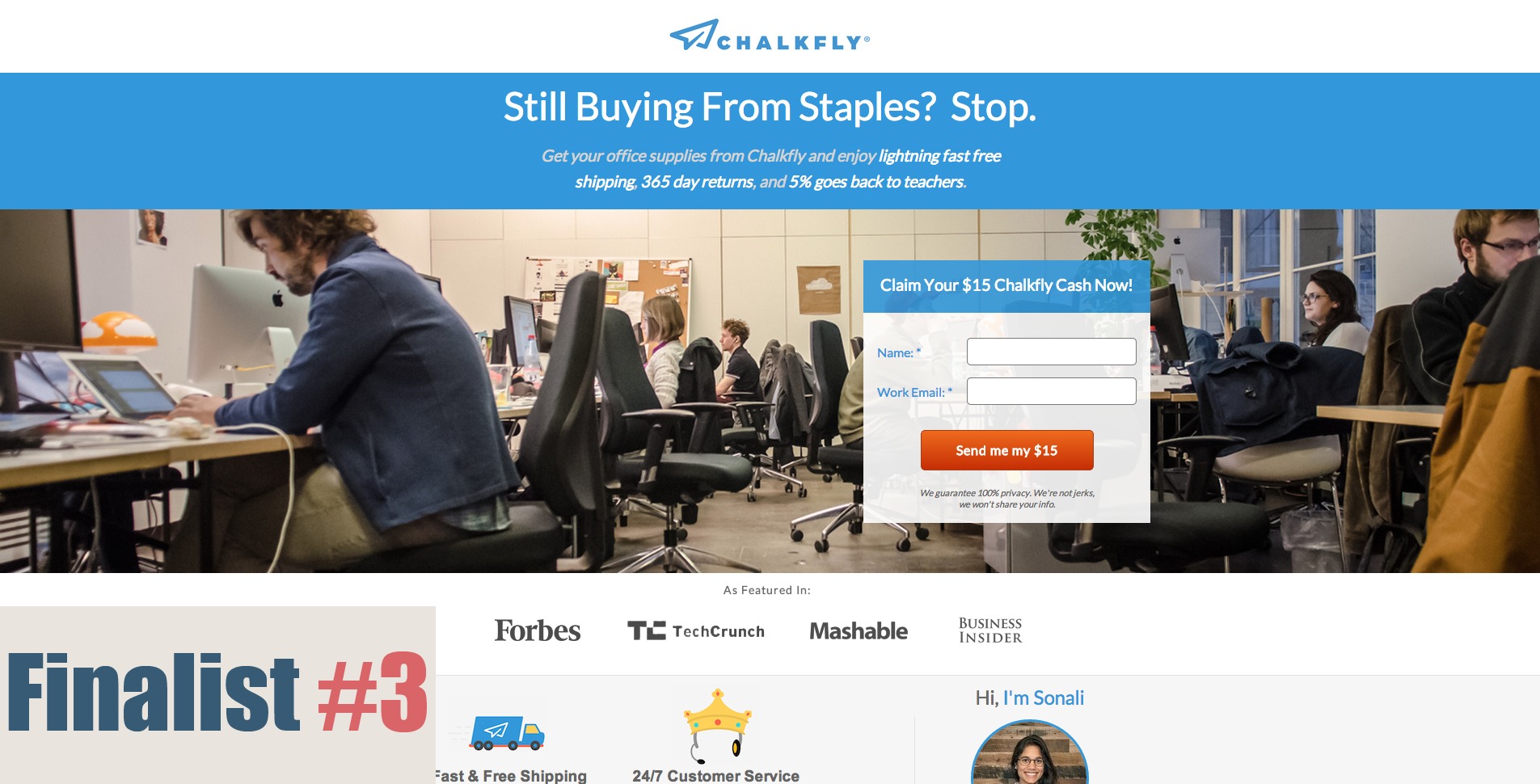
Josh was only with Chalkfly as the eCommerce lead for 4 weeks when he entered the contest and now he hopes to make his bosses happy by winning Page Fights.
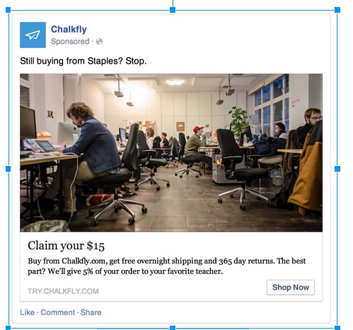
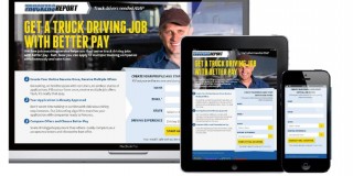
It’s also important to note that to drive traffic to this page, Josh has been running a Facebook ad, targeted towards startup founders, that has a 20% conversion to leads.
It looks like this:
Josh says that their cost per customer acquisition is about $90, but their customer lifetime value is about $1,000 and is profitable.
Oli’s Feedback:

The thing about Facebook ads, is that it’s a really shitty system. The headline at the bottom gets more attention than what’s at the top, and these big ads can often perform worse than the sidebar ads, because of it.
My suggestion with the ad is to put the typography right into the photo, so you have control over how powerful it is, and how easy it is to read.
After that, we all know that people scan & quickly look for things. If you were to write down all of the things you see and read it back to yourself, “Still buying from staples. Stop, Claim my $15, Forbes, Fast shipping, Hi, I’m Sonali…” none of it makes sense.
This is what I call congruent design; everything on your page should align to a single goal. Read it back to yourself and see which parts should be taken away or moved around so it tells a story and reinforces your main call to action.
Right now, there is no story to this page & no design flow that makes me feel, “ok, I should sign up for this.”
Peep’s Feedback:

You don’t mention explicitly that you’re for startups.
Sure, you tell me in your headline what category you’re in “Stop buying from Staples” but you don’t mention me, the startup founder, until the bottom of the page – and even then not really…

Also, you have this area where you’re telling me that you’ll donate 5% to a teacher’s charity of my choice.
But as a startup founder, is that something that’s going to make me want to buy from you more? In my experience, the answer more often than not, it’s no. (though it may be a good thing to include in your email onboarding sequence)
Another thing, you mention getting $15 in Chalkfly cash.
But if I’m unfamiliar with your brand (as I am coming from Facebook) what does this mean to me? Isn’t this just $15? Why not just tell me I get 15$ towards your service?
That clarity makes for a much more compelling lead magnet.
Takeaways
- Mention your target market in your headline to make your value proposition instantly useful
- Make sure your copy tells a story from top to bottom so page scanners get a full perspective of what the page is about without having to do a ton of reading
- Remove items that are unnecessary to conversion
- Use language real people use, not catchy terms you invent – like Chalkfly cash, or [your company here] bucks
Finalist 4 – Mike Svystun, Vertalab
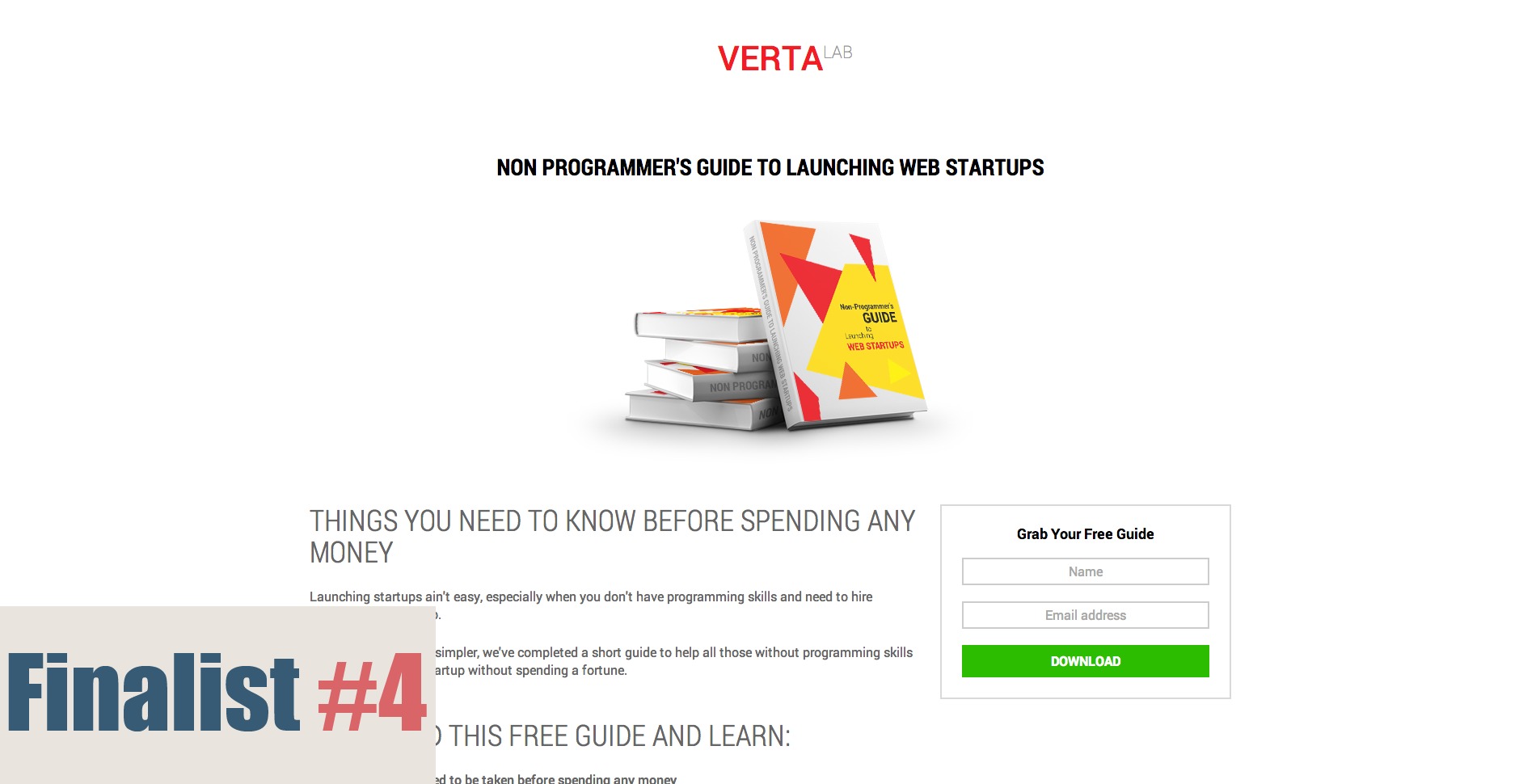
Vertalab is a company that helps startups build their web app from prototype to complete solution, and the purpose of this page is to help raise brand awareness within the startup community.
Peep’s Feedback:

You show a picture of a book, but is it a book, or an ebook?
Another thing, who are you to give this advice? Every dude out there is a startup guru these days, so what makes you qualified to give me this information?
Inject some authority in here, let me know how many startups you’ve worked with, or show examples of your most famous clients.
Also, I’d work on your copy. “Things you need to know” and “Download this free guide” don’t add any value on their own. You can’t expect me to read what follows here.
Instead of “Download this free guide and learn” it might say “Learn X,Y,Z” by repositioning those subheadings as benefit statements, you give me a real reason to want to download this free guide.
Remove negative social proof buttons. Showing no tweet button is better than showing a tweet button with 3 tweets. That just proves nobody else gives a shit.
As far as your form is concerned, test putting your label names above the form field and left aligned, as that typically performs better.
Oli’s Feedback:
Everything Peep said, plus I would look at redesigning this page starting with the form and working my way out. If the form is the most important piece, we should design the form as though it’s the only thing on the page.
If the form can’t stand alone, you’re doing something wrong.
I would take the second subheader, “Download this free guide and learn” and the three bullet points, & turn that into the headline & copy area for your form.
Also, put the social proof buttons on the confirmation page, after someone’s downloaded it.
Looking at your ad, it also appears there is a mismatch between the ad-copy & landing page copy.
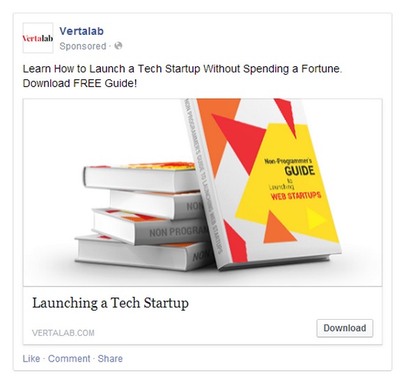
Peep: Here you say “Learn How to Launch a Tech Startup Without Spending a Fortune” so it’s money centric, but when you get to the page, the copy is more focused on programming. It’s a different focus.
Without a correct message match, the visitor who was interested enough to click, loses the page’s scent before they even have the chance to get hooked into the experience.
Takeaways
- If you’re giving away an ebook, mention that it’s an ebook/.pdf/download
- Use authoritative proof to make it clear why I should chose you in a crowded market
- Lead with benefits. Don’t tell me to download this guide, tell me what I get if I do.
- Design your form as though it’s the only thing that exists
Finalist 5 – Stu Harrison, Hampson Hughes Solicitors
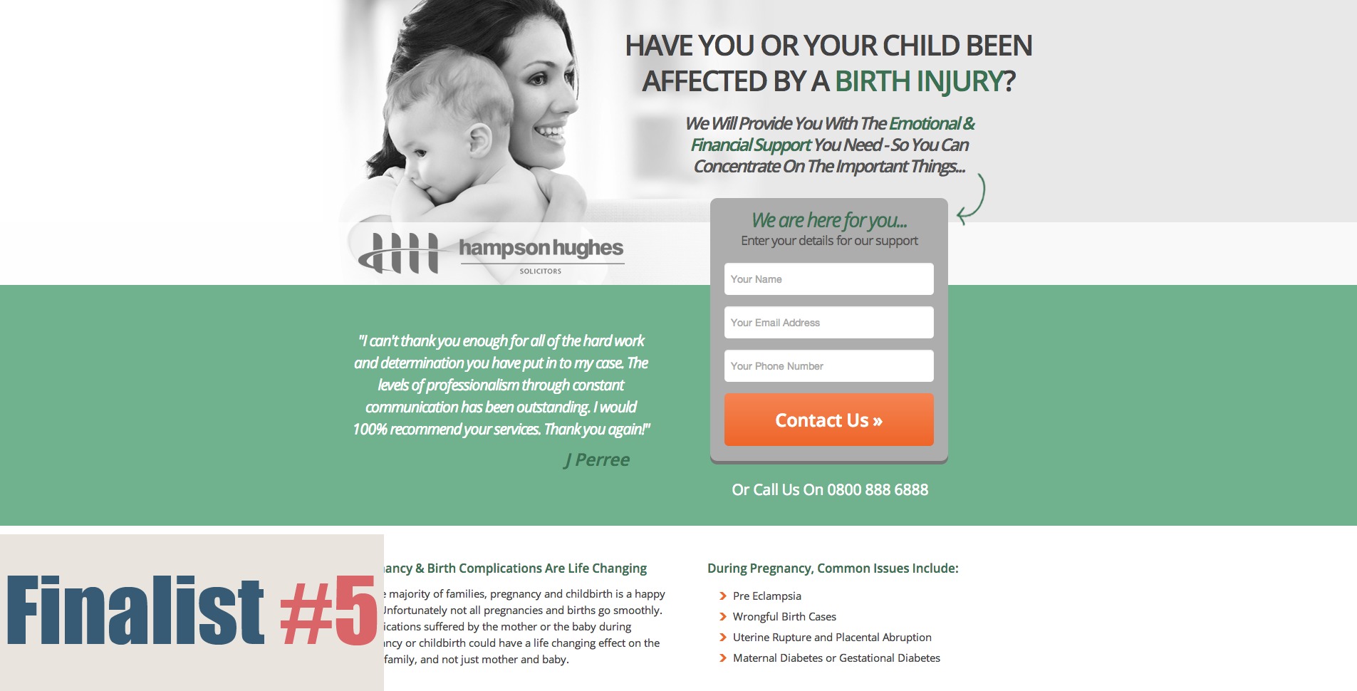
You have to congratulate Stu for making it to the semi-finals – this was the first landing page he’s ever created. But with a 1% conversion rate, there’s probably a few things he could work on.
Oli’s Feedback:
I like that you start immediately with a question, because automatically it segments your traffic letting visitors decide right away “is this right for me or not?”
However, now that I’ve seen the ads, I wonder how necessary this headline really is?
If you’ve already asked me the question in the ad, when I click to your landing page, I don’t want you to ask me the same question again.
It’s what I like to call “conversation momentum”, where if you start a conversation in one place, you have to maintain that conversation in another.
So where you’re asking “Have you suffered an injury during pregnancy in the last 3 years?” in the ad, the headline on the landing page might say something like, “You’re not alone. 3,000 other people in [target zone] experience this.” gives a more conversational flow to the entire funnel.
Also, your testimonial, I don’t trust that at all. There’s no face, no full name, it looks like bullshit.
Then at the bottom, there’s a lot of copy, try and simplify or remove what isn’t necessary.
Peep’s Feedback:

Since the form is pretty powerful on the page (which is a good thing) it kind of suffocates the most important thing on the page, the sub-headline “We will provide you with the emotional & financial support you need.”
I would kill the “we are here for you” at the top of the form, and the “enter your details” as both of those are unnecessary.
And the “emotional & financial” support is so vague, that it doesn’t really tell me anything. Are you going to sue for me? I understand there are legal limits, but this is too vague & vagueness doesn’t resonate.
I’d also test “Contact Us” against “Contact Me”, because the goal is for you to reach out to me, not the other way around.
Also the typography is so small, that it’s very difficult to read. Try 14 or 16px type to make it easier to see.
Takeaways
- Remember what your visitor clicked before coming to your landing page, so you can keep up the conversation momentum and really make everything make sense.
- Non trust-worthy testimonials can hurt your credibility more than help.
- Small text is difficult to read & may add friction to the sign-up process. On the same note, remove unnecessary text like “enter your details” we already know what to do on a form.
- If the goal is for you to give you my information so you can contact me, use language that reflects that you will be contacting me, not me contacting you.
Conclusions
Landing page best practices are really about thinking like your customers & reflecting back that you understand their fears/needs/wants and that you can help them solve the problem.
If you look at the entire experience from first click, to final conversion like a big interactive story, instead of just some way to collect leads or make sales, you can start to design landing page experiences that get people excited to see what happens next.
Related Posts
-

It took us six rounds of tests until we landed on a variation that was…
-
Navigation gives a user control, which is generally a good thing—but what about on a…
-
We talk a lot about creating high converting landing pages, getting traffic that converts, and…
-
A landing page is the first page that visitors see after clicking on your banner…

Definitely some quality takeaways once again guys. Thanks for taking the time to analyze these pages for us to learn from.
Have a good one.