What follows is a list of resources that can be applied specifically to landing page optimization.
We’ve organized everything to best simulate a visitor’s experience on a landing page from first click to final conversion.
To get the most out of this guide, please use each resource to focus on one area of your landing page experience at a time. Trust me, this will help you later on when you’re wondering what to test next.
I recommend you bookmark this page so you can come back to it when it’s time to create that next landing page.
Table of contents
- Step 0: Really understand your target market
- Step 1: Set up actionable analytics
- Step 2: Make sure your ad’s message matches the landing page
- Step 3: Evaluate your landing page’s first impression
- Step 4: Does your page have emotional resonance?
- Step 5: Craft a clear and compelling value proposition
- Step 6: How will images reinforce the message?
- Step 7: Should we create an explainer video?
- Step 8: The importance of social proof, authority, and testimonials
- Step 9: Does the copywriting make you want to read more?
- Step 10: Does your call to action communicate clearly?
- Step 11: Start A/B testing
- Conclusion
Step 0: Really understand your target market
Do this: Really get to know your market. Conduct surveys and interviews to understand your customer’s pain points. If you have any existing copy, use Wynter for messaging testing. For extra credit, make a list of websites they’re exposed to, and build a picture of what their “typical” online experience is.
Ask questions such as:
- Who are you? Tell me about your age, job, position in your company, etc.
- What are you using our product for?
- How is your life better thanks to it?
- Do you consider any alternatives? Why?
(Note: If you’re a startup, you’ll want to use customer development questions for your page to resonate with future traffic.)
These questions help you uncover trends within your market and tell you things analytics alone can’t. All of this is to inform a landing page design that’s in line with your target market expectations which plays a huge role in reducing the amount of friction it takes for them to convert.
The biggest problem I see in landing page optimization and design is that the page has no understanding of who the visitor is or their level of online exposure.
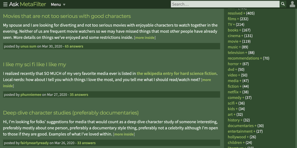
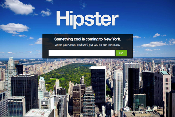
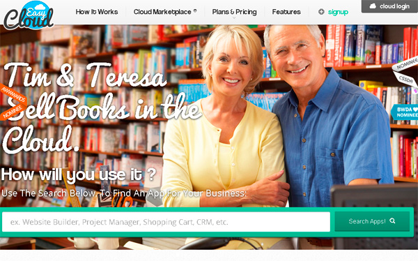
Surely, what “appeals” to a 54 year old mother of five who goes online to check Facebook and MetaFilter will be vastly different from a 27 year old power-user of social networks you haven’t even heard of yet. (Screenshot below is of the now defunct UseHipster.com.)
Landing page design isn’t a game where you flex your own aesthetic prowess.
It’s about connecting with the viewer and communicating value as quickly as possible. The more you accept that connection is on their terms, not yours, the better your pages will be.
Recommended reading:
- How to Identify Your Online Target Audience and Sell More
- Why You Should Focus On Clicks Before Conversions
- 20 Questions to Ask When Creating Buyer Personas
Step 1: Set up actionable analytics
Do this: Set up your conversion goals in Google Analytics.
Ask Peep about analytics, and he’ll tell you:
Metrics are there to provide actionable insight. You need to look at a metric, ask ‘so what?,’ and have an answer.
“Conversion rates for our top ads are way up. So what? We should increase our ads budget.”
Seems simple enough. Yet conversion analytics look so intimidating that many of us skip this step so we can get straight to making money.
Stop it.
If you don’t have actionable analytics, you’ll never get the full story on your landing page activity. You’ll end up throwing away money and guessing at what to do next.
Take the time. Learn to interpret your analytics data and make the most of it. Your marketing budget will thank you, I promise.
Recommended reading:
- 12 Google Analytics Custom Reports to Help You Grow Faster
- 10 Optimization Experts Share Their Favorite Analytics Reports
- Building Your Marketing Funnel With Google Analytics
- 6 Ways to Set Up Funnels in Google Analytics
Step 2: Make sure your ad’s message matches the landing page
Do this: Check the bounce rates on the landing pages you’d like to generate more business. If they’re too high and conversions are too low, you may have a message match problem.
To know for sure, look at the ads pointing to that page that receive the highest click through rates.
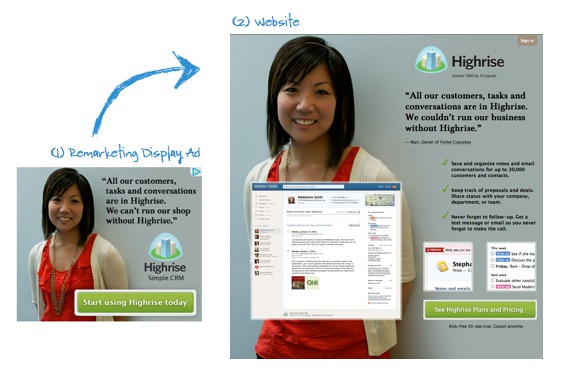
Does your page use similar language to what’s in the ad? Do the images in display ads reappear on the landing page?
If you miss the mark on this, your landing pages are destined to fail.
Why? Most times, messages in the ad don’t correspond directly to what’s on the page.
Ad images differ from primary landing page images. Ad headlines don’t correspond to landing page headlines and the page, generally speaking, is not what the user expected when they clicked the ad.
They land on the page and feel ungrounded. Where’s the headline that grabbed their attention? At the very least, have you inserted the keyword they were searching for in some prominent place on the page?
No? This is the result of lazy conversion optimization.
Instead of creating one page and throwing multiple, loosely targeted ads at it, create a handful of highly targeted landing pages that focus on tight-knit group of keywords. If your budget allows, experiment with a dynamic keyword insertion platform to automatically insert the keyword into the landing page.
Recommended reading:
- Give Your Advertising ROI a Serious Boost by Maintaining Scent (11 examples)
- The Science Of Landing Pages & How To Build One Backwards (webinar)
- Gmail Ad Fail – How Poor Message Match Can Kill Your Conversion Rate
- [Message Match] Project Management Software (video)
Step 3: Evaluate your landing page’s first impression
Do this: Search for your landing page’s primary keyword and click on the pages your primary competitors are creating.
The idea isn’t to copy what competitors are doing (they don’t really know either), but to get an idea of the first impression they’re trying to make.
See, it only takes 0.013 seconds for your brain to identify an image, and 0.05 seconds for visitors to form an opinion about your landing page.
The opinion they’ve subconsciously formed in between 1/13th to 1/50th of a second will influence every decision they make for the rest of their time on the page.
First impressions are why it’s vital that your message match is strong. It’s also why you should be designing your pages with some degree of familiarity.
Is your page laid out in a way that’s intuitive to your user? Do your product shots meet the standards your target market has from their web browsing experience?
Because the brain registers information faster than your user can even perceive, if these elements are even slightly “off,” it becomes an uphill battle all the way to conversion.
This is also why we make a list of websites in step zero, so you’re not answering these questions blind.
Recommended reading:
- First Impressions Matter: Why Great Visual Design Is Essential
- New Record for Human Brain: Fastest Time to See an Image
- Why Simple Website Designs Are Scientifically Better
- How Does Page Load Time Affect Your Site Revenue?
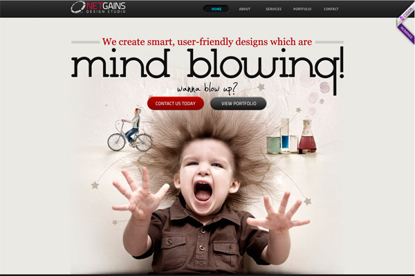
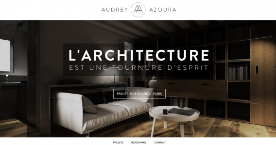
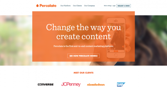
Check out these examples of great first impressions:
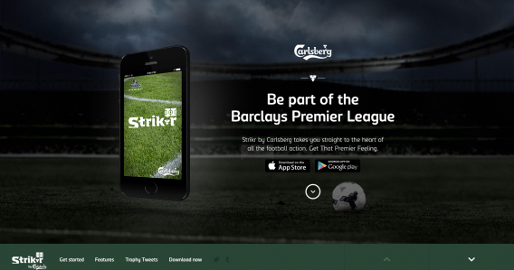
Step 4: Does your page have emotional resonance?
Do this: Use customer development techniques found in this post to build a profile of your ideal buyer personas.
Specifically, we’re looking for clues to let us know which emotional triggers will resonate the most for visitors to the page.
This goes hand in hand with first impressions, but it’s important we make a clear distinction between the two.
If first impressions start by ensuring everything is in a familiar location, emotional resonance is about enhancing these elements to create a mood, hook the visitor, and draw them deeper into the page.
Emotions like joy, pleasure, shock, horror, expectation, exclusivity, and surprise are just a small part of what you could be designing for.
Only after you’ve picked the mood of the page do you look at things like colors, fonts, photography, and video.
Determine how you will balance these elements to support the mood of the landing page. Don’t just arbitrarily pick colors and fonts for the sake of eliciting a certain emotion. Blue doesn’t automatically equal trust, and red isn’t always angry.
How each element plays with and supports each other is what really determines the overall mood of the page.
Recommended reading:
- Not Just Pretty: Building Emotion Into Your Websites
- Is Emotion Necessary To Make More Sales?
- Emotional Design: Why We Love (or Hate) Everyday Things
- The Psychology Of Color In Marketing & Branding
- The Effect of Typography on User Experience and Conversions
Some notable examples:
Step 5: Craft a clear and compelling value proposition
Do this: Ask if your value proposition…
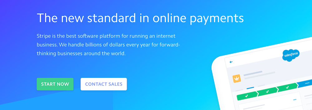
1. Directly addresses who your customer is (e.g., Stripe = online payment processing for internet businesses)
2. States what your product does (e.g., Markitekt, the version of CXL from a long time ago = we make websites sell)
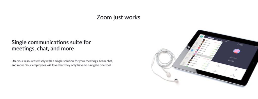
3. Tells why you’re unique (e.g., Zoom = communications suite for meetings and chat that ‘just works’)
4. Shows the end benefit of using it (e.g., Airbnb = book unique places to stay and things to do)
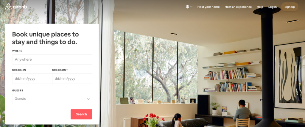
Now that your page is loaded and a first impression has been made, your visitor subconsciously decides if the page is worth reading.
If they haven’t clicked the back button, eye-tracking research shows the first thing they’ll be looking for, by default. is a dominate headline (your value proposition).
At this point, your visitor’s only decision is “Does this site have what I need?” or “Should I look somewhere else?” Because judgement was already passed a fraction of a second ago, all you’re doing now is reinforcing whether that initial judgement was right.
When your value proposition answers all of the questions above to help your visitor quickly decide if this page is really what they’re looking for, you stand a much better chance at keeping their interest throughout the rest of the page.
If your value proposition doesn’t answer those questions, you make the path to conversion far more difficult than it needs to be.
Recommended reading:
- How to Create a Unique Value Proposition (with Examples)
- In a Commodity Market? Here’s How to Craft Your Value Prop.
- Writing Value Propositions that Work
- Use these 3 points to create an awesome value proposition
Step 6: How will images reinforce the message?
Do this: Select, design, or capture images that reinforce the mood of the page and speak directly to your target market.
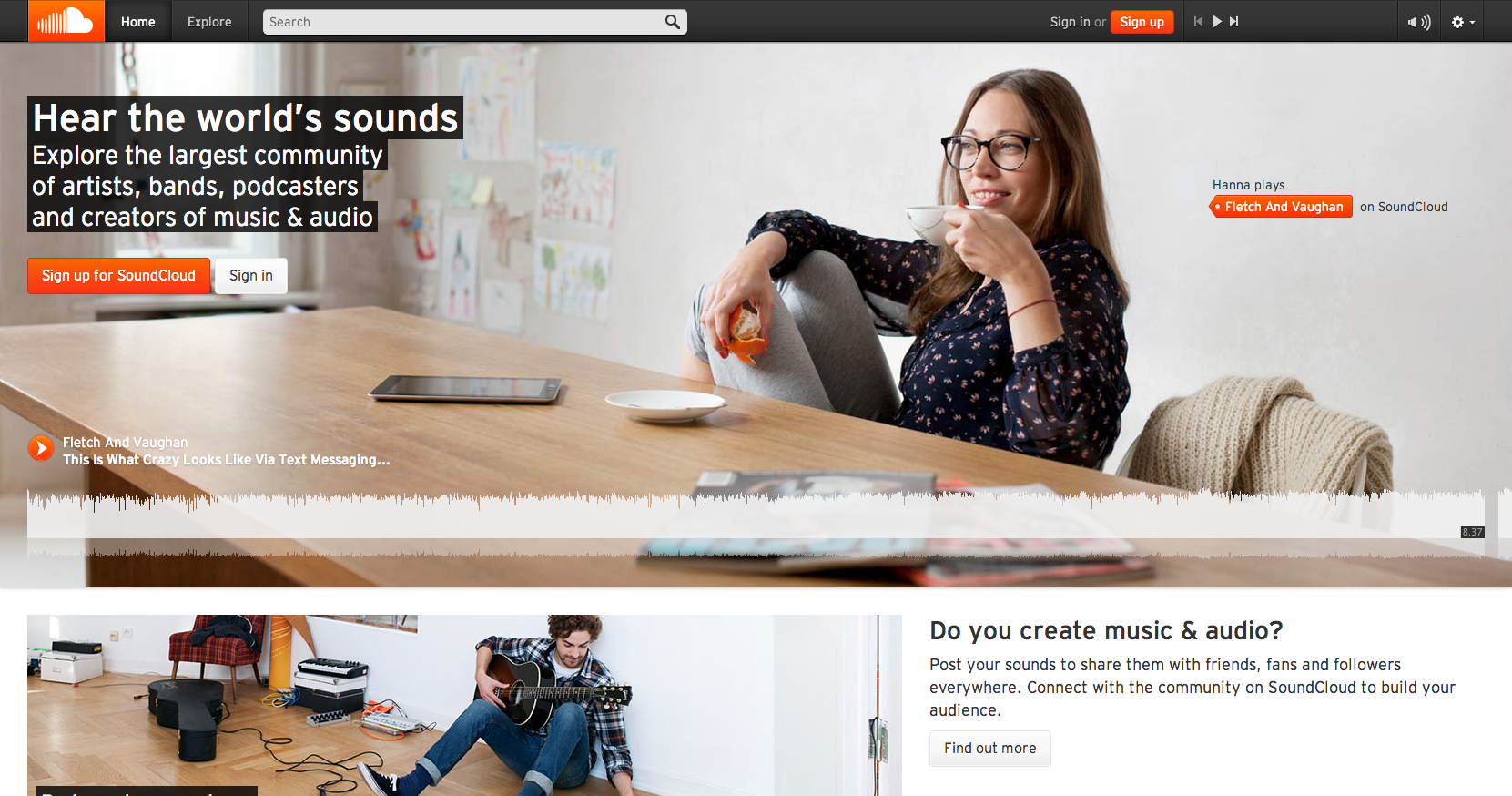
Looking at the SoundCloud page above, you get a very distinct sense that the site is for late teen/early 20s, hipsterish, music/soundphiles.
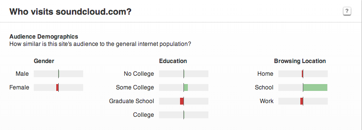
The Alexa data we looked at a while ago supports this. SoundCloud’s primary audience is:
- Male;
- Some college education;
- Accessing the site mostly from school.
The top referring sites and linking sites also provide further evidence that SoundClouds core audience is hip and trendy.
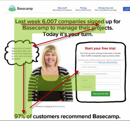
Ideally, the images on your landing page should have a representative of your target market. But beyond that, sell the emotional value of the product or service your visitor will get after “conversion.”
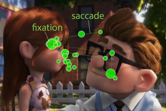
Images can also be used to “hack” our natural viewing patterns, and direct our eyes where to look next by following some simple compositional rules.
Remember in the last section I said a viewer’s natural instinct is to look for a dominate headline when a page loads? That instinct is superseded the moment you introduce real people or “humanoids” into the mix.
I always strongly recommend working with a professional to create any visual elements, and stay away from stock photos if you’ve got the budget.
But, if you must create your own photographs or use stock images, follow this tutorial by Practical Ecommerce and use this list of stock photographs.
Recommended reading:
- How Images Can Boost Your Conversion Rate
- Image Carousels and Sliders? Don’t Use Them. (Here’s why.)
- 3 Ways to Increase Your Conversion Rate With Images [Case Studies]
Here’s a notable example of the effect of images on web viewing:
Step 7: Should we create an explainer video?
Do this: Ask if there is something unique about your service (or brand) that can’t easily be communicated with static text and images.
For Spotify, a streaming music service, it certainly makes sense to incorporate audio/visual elements to flesh out their value proposition.
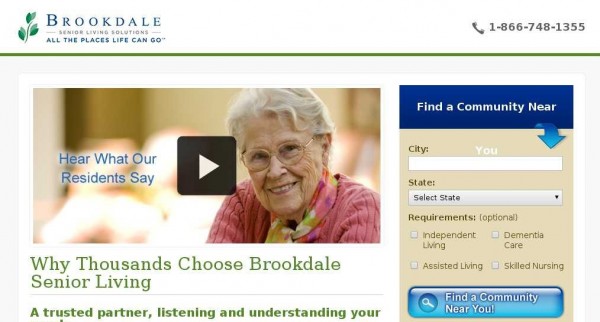
For Brookdale, a community for senior citizens, sticking with video would have cost them $106,000 in monthly revenue.
While the statistics suggest visitors will be anywhere between 64-85% more likely to buy because of video, you have a few things to consider:
Can my target market watch video?
Your prospect’s immediate circumstances may dictate that video isn’t the optimal communication method.
For instance, if they work in a quiet office or are around noisy children videos may be forbidden or difficult to watch.
Age, poor internet connection, or outdated computer hardware may also impede on your prospect’s ability to click play.
Explainer videos are not pitch festivals
Repeat after me. Online videos are not television commercials.
TV commercials were designed to stop you and grab your attention in between you switching from station to station.
With explainer videos, visitors chose to be on your channel. They click play because they want to see more. Be cool. You don’t pitch them to death.
How will video enhance the experience?
This goes back to my question from earlier: what can video do that text and images can’t?
If you can’t answer this, wait to make your video.
For a company like Dollar Shave Club, the video showcases the brand’s humor to endear the visitor to what might be an otherwise dull premise—razors shipped to your door starting at a dollar a month.
Unbounce, on the other hand, features Nemo Chu, a growth advisor and a former director of customer acquisition at Kissmetrics, in a hybrid of explainer and video testimonial.
Nemo’s enthusiasm for Unbounce radiates as he walks you through the product’s core features. He also implies that Unbounce is partially responsible for 2-3x growth his team to achieve—perfect for prospects who share Nemo’s acquisition title and have to justify the monthly expense for their company.
If what you sell is difficult to understand, requires demonstration, or needs a little extra push so your target market “gets it,” video is an avenue worth exploring.
Also, always work with a professional when it comes to video.
Recommended reading:
- How To Use Video To Increase Conversions
- Everything You Need To Know About Creating Killer Explainer Videos
- 5 Dimensions of Rockstar B2B explainer videos
Step 8: The importance of social proof, authority, and testimonials
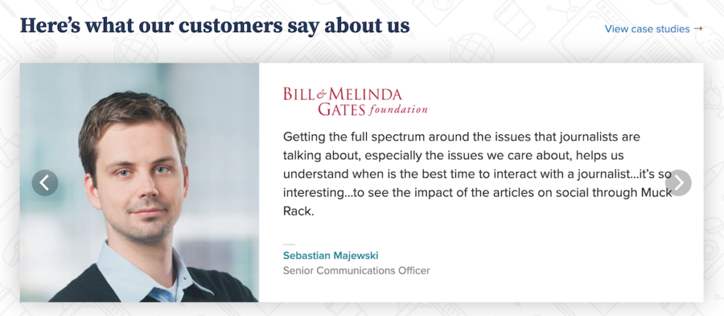
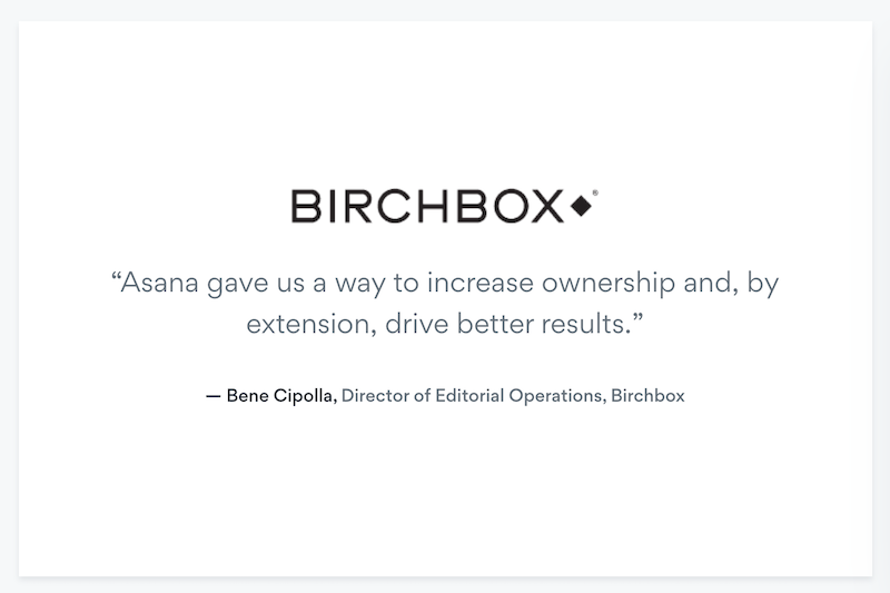
Do this: Create a social media listening dashboard to track mentions of your brand across the social web.
Next use Open Site Explorer to find any of the high authority websites linking to your site.
From here, reach out to the customers who most closely resemble your target market and the websites people within your market view as high authority.
This part is critical. There’s a psychological phenomenon known as implicit egoism that basically says people gravitate to people, places, and things that reflect a favorable self-association.
The more your visitor sees “themselves” in the reviews and authority sites, the more receptive they will be to your page.
Send emails asking permission to feature any images or logos along with their testimonial on your landing page.
Why go through all the trouble?
Research shows that businesses who increase their brand advocacy by 12% see an average of double revenue growth.
It’s also been documented that 63% of consumers indicate being more likely to purchase from a site if it has product ratings and reviews.
Seems like a pretty big payout in exchange for setting up a few filters and sending a few emails, no?
Recommended reading:
- How to Use Cialdini’s 6 Principles of Persuasion to Boost Conversions
- Social Proof: What It Is, Why It Works, and How to Use It
- How to Get Testimonials (and Why to Get Them) + Tons of Examples
Notable examples of social proof:
Step 9: Does the copywriting make you want to read more?
Do this: Get four to six peers together to conduct a peer review for the headlines and ledes on the landing page.
Ask the question, “Does this make me want to read more?” and rate gut level responses on a scale of 1 (low) to 4 (high). If the average score is below 3.2, get specific suggestions on what to change. Click here for more on this process.
Now that your visitor has been on your landing page for half a second, they’ve had all the time they need to process the visuals and decide if you’re trustworthy.
At this point, the conscious mind kicks in and they really start consuming the copy on the landing page.
Of course, you want the copy to communicate benefits, but if you want your visitor to sink their teeth in, reinforce the tone established by the visual elements on the landing page. It will resonate with your visitor in a way they can taste.
Why? Because science shows using language that teases the senses will fire up the sense centers in the brain.
Want to sell a running shoe?
Make the sweat sting their eyes. Get their heart thumping so loud it’s all they hear besides their feet hitting the ground and the quiet voice whispering “you’re almost there.”
Recommended reading:
- Website Headlines: 3 Formulas that Work for Homepages
- 5 Landing Page Headline Formulas You Can Test Today
- The Science of Storytelling & Memory and Their Impact on CRO
- 14 Copywriting Examples From Businesses With Incredible Copywriters
- The 7-Point Checklist for Powerful Landing Page Copy
- How Do You Know If Your Copy Is Any Good? (My 4 Step Process For Copy Testing)
Step 10: Does your call to action communicate clearly?
Do this: Ask if your CTA (and surrounding area) clearly says what it does, triggers a response, and is designed in a way that contrasts with the rest of the site.
The way I see it, the entire landing page experience is just one big interactive story. Your visitor has a problem, searches, clicks, reads, and decides.
If you’ve been focusing on all the details of the story, your call to action is just a gate to the next chapter where whatever pain they were having doesn’t exist any more.
Recommended reading:
- Mastering the Call to Action: Words, Color, Size, & Location
- Sell More Stuff Online By Eliminating Click Fear
- Which Button Color Converts the Best?
Here are some notable CTA examples:
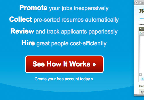
Step 11: Start A/B testing
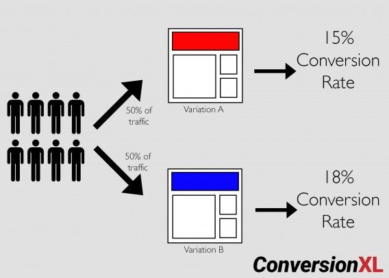
Do this: Create a document all of the alternative ideas you’ve had for copy, design, images etc. and form hypothesis as to why these may also work.
If this is your first time creating a landing page, you have two options:
- Build one page to test challenge the existing, low converting page. Run it, collect data, and form a hypothesis on how to improve the desired metric after the test is complete.
- Build two equally strong pages targeting the same keyword, run them both, see which performs better, and optimize the winning landing page accordingly.
In either scenario, all you’re really trying to do is collect enough data to validate your assumptions about your target market and formulate objectives, goals, and performance indicators for future tests.
For example:
Objective: “Get more people to buy software.”
Goal: Do X (insert more descriptive copy) to increase Y (Buy Now clicks) and reduce Z (cart abandonment).
They reason you document your ideas is to have a record of what you’ve done that works and what it’s increased. Even though many of your ideas will wind up being wrong and thrown out, it’s much better than forgetting good ideas that could have earned you more.
Recommended reading:
- A/B Testing Mastery: From Beginner to Pro in a Blog Post
- 12 A/B Testing Mistakes I See All the Time
- Case Study: How We Improved Landing Page Conversions by 79.3%
You could also test the media type of your email opt-in offer—this study says that PDF and web content convert better than video. Do your own testing.
Conclusion
So much of a visitor’s landing page experience happens in less than a second, and most landing page optimization focuses on the entirely wrong side of that experience.
If you think of your landing page as a way to tell the story of how your prospect’s life gets better, and use what you know about how the brain processes text and images, you can create a “hook” that gets them wanting more.
In that case, landing page optimization is just a way to make the story better every time it’s told.










In a word – Brilliant!
Man…this is STRONG! Love the use of visuals to really hammer home your bullet points. GREAT job with this guide.
Thanks Justin, glad you enjoyed it :-)
PERFECT!!!!!! Nothing more to say!
This took awhile to read but it was definitely worth it. Now I want to read through some of the articles you recommended.
Resourceful article!!
In a month this article should have 100+ comments, this is not an article, this beats all those crappy eBooks on Amazon. Fucking great job. Am I allowed to use the F word?
I’ll allow it ;-)
OMG, Tommy… it’s a freakishly long guide!! how am I going to read/check/view all that? :)))
From skimming I can see that there are quite a few topics that I’d like to dig into, so I’m definitely saving this to my bookmarks and once I design another landing page – I’ll make sure to give this guide a few hours of my time first!
Huge thanks, Tommy! I love when people take time to create such resources! You’re the man! ;)
Thanks Tim!
Yes, Bookmarks are a wonderful thing for taking something in like this. I used them a lot to put it together!
I wonder, do you think it would be benefical to you if we set up a short autoresponder to email the resource articles in sequence?
Just brainstorming ideas to make sure it’s not all too overwhelming.
Whoa… Tommy. This is a read-it-twice, second time slowly kinda post.
Thanks for this info. Been reading about the “E” & “F” line of site reading
that website viewers use. – Thanks Again.
Hey no problem Ed, I’m glad you liked it!
I’ve bookmarked your article and I’ll be coming back to it regularly because there’s too much information to take in all at once (especially considering all the other articles you link to).
If you don’t mind a recommendation for a future article, I’d be interested in finding more about solutions for landing page optimization one a shoe string budget and without the backing of a team (designer, programmer etc).
Cheers!
Hello,
By profession I am web designer. I know the value of Landing Page. Our clients have 3-3 landing pages for their single website. So its clear that how important LP’s are.
Great post Tommy. Understanding your market and what you can offer that’s different is the most difficult in my opinion. The rest can be done if step 0 is completed correctly.
Fan-tastic on every level, Tommy. You just gave me my next month’s worth of work. This page alone should be required reading at the university level!
Amazing Post here, Never seen this type of post about Landing Page Optimization…!!!
Wow! I need to re-read this a few times, incredible information…I appreciate the value you share. I might have missed it, but is there a “landing page” development software that you suggest for an intermediate marketer? Many thanks and keep up the great work!
Brilliant guide Tommy–you just made my to-do list super long, but I’m totally pumped to optimize what we’re doing with these insights.
That makes me very happy to hear :-) You’ll have to let me know your results!
Oh wow, I was just waiting for detailed instructions, suggestions and ideas like this about setting up a landing page. I guess we’ve got some home work now to accomplish.
Thanks a lot.
Etienne
So many tools to use and filter visitors with. I have no idea on where to start..lol
Although I have only skimmed this so far, there are some great points being raised making it look pretty bloomin good! Consider it bookmarked and I shall be reading this more thoroughly later on.
Tommy, ridiculously well written article!
This is a fantastic resource, well researched and full of really useful information.
This was a great article. Very informative, well-written, and great images.
Just shared this :-) Awesome compilation Buddy!
Super-enriched value! Thank you for sharing these deep tips, it is rare to get meaningful direction that is not puffed with SEO fluff – John
P.S. Found this while establishing value of using better images on ecommerce sites
Great post Tommy – really strong
I was just laughing at that Dollar Shave Club video the other day, thinking it did a GREAT job of setting the company apart in an otherwise pretty boring space.
Thanks for sharing :-)
Cheers
Loz
Did you see the one they did for their wipes?!
I almost died laughing.
It’s not often I leave a comment, but this is one of the best and most comprehensive articles I’ve read. Thank you for providing such valuable content. Amazing!!
Hey, thanks for this!
It’s really helpful
What can I say. A great example of how to write a useful, informative and valuable post. The next job is to share it internally with my team, then out on our social feed. This deserves a wider audience.
Thank you!
It is scientifically brilliant
Thank you. Very useful article with tons of information.
I rarely comment. But when I do, all I say is ‘Thank you’.
Haha. I’ll make an ebook in my mothertongue out of this, and put on amazon kindle. :p
Awsome, thanks for sharing this, will explore it in detail. Best!
This is the holy grail for startups! Its masterfully explained and I can’t wait to test what you wrote. Read some similar articles but yours definitely blew me away. Thanks! I hope to learn other stuff from you.
Should a non-profit website have negative images to make people act or positive images to make people think of results and therefore take action? I have been told to use positive images but if you look at the media in general, they all use pretty negative images to attract attention?
That’s a great question.
The only right answer is to test. That said:
I can’t remember the study off the top of my head, there have been studies that found positive images worked better for *a* non-profit. I imagine it’s due to playing to the feelings of hope rather than hopelessness.
The media isn’t really a good indicator, because they’re in a different economy and environment all together.
If my job is to stop you while you’re flipping through channels, and image filled with anxiety and hopelessness might grab your attention long enough to get you to listen to my message.
If you bait me with a Ppc ad though, and make me feel like garbage because of your cause, I’m probably less likely to give you what you’re looking for.
See what I mean?
Bookmarked. WOW! Thanks so much for this thoroughly changes my marketing strategies
Great ideas. You gave me several ideas and new sources of information. We’ve got good traffic, just not good conversions. Working on revamping CTAs. Thanks so much.
Fantastic post. I’m not even trying to sell anything through my website but was still compelled to read every word you posted. Thank you.
Great stuff. I’ve already read a lot on landing page optimization, but this surely is one of the most thorough and easy to read articles I have ever read on the subject. Thanks a lot for sharing!
Nina
Thanks for the insights!
Very very long but worth the time spend on this. This gave me so many ideas it’s hard to figure out where to start.
I spent a lot of time looking for a way to create a landing page with minimal effort and found this universal template http://justpx.com/just-lp-free-wordpress . I hope you’ll find my comment helpful.
Wonderful Informative Post…
This is huge and definitely one of the best article across internet on landing page optimization. In this aged of digital marketing these landing pages have very high value for online sales leads and conversion generation. This article is an one stop resource for those who are looking for this topic to learn or write. Bookmarked, tweeted and shared. Thanks for the knowledge you shared with us.
This is an amazing article. This was my first time to your site and you’ve successfully blown my mind. There is tons of great information in this post. I’m going to have to go through it a few times. Seriously, you’re the man.
Thanks Sean! I genuinely hope that you are able to get a ton out of it!