
If there’s a consensus about anything in the mobile market, it’s that mobile ecommerce conversions are lower than on desktop.
Smartphones have the lowest conversion potential, but tablets also win fewer conversions compared to desktop.
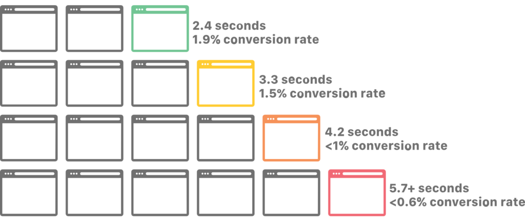
For example, Monetate reported that, globally, desktop conversion rates are more than twice that of mobile devices:
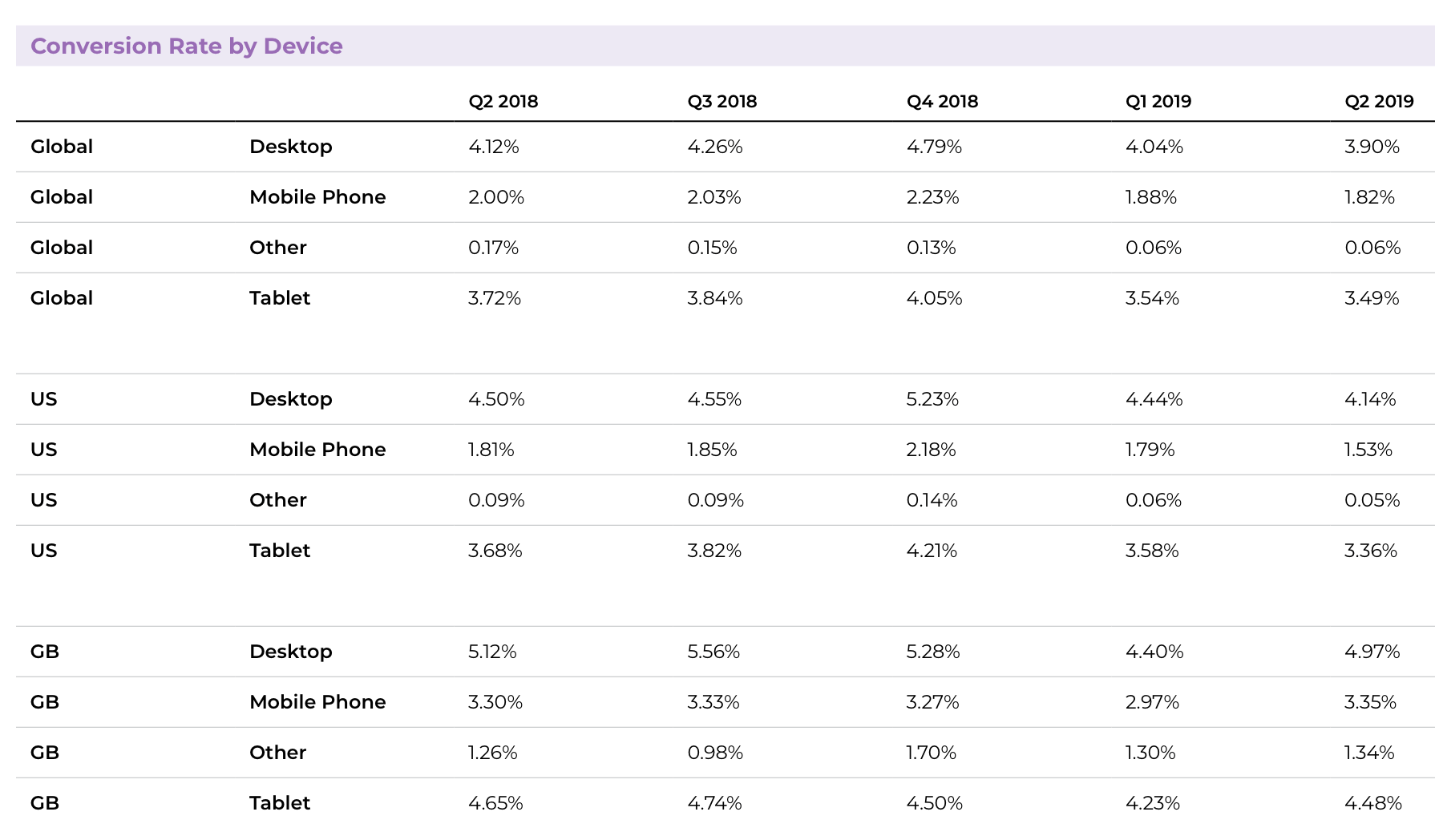
Table of contents
- Why doesn’t mobile convert?
- Issue 1: Some smartphone features hurt conversions.
- Issue 2: Mobile ecommerce sites have poor usability.
- 1. Confusing terminology in navigation elements leads to frustration.
- 2. The number pad isn’t used when it’s most convenient.
- 3. Untapable items confuse and frustrate mobile users.
- 4. Image sliders kill conversions, especially on mobile devices.
- 5. Forcing the use of a desktop version is an unwelcome surprise.
- 6. Menus make no sense and are confusing to navigate.
- 7. Search and filter options are overwhelming, redundant, inaccurate, and confusing.
- Conclusion
Why doesn’t mobile convert?
Although we all agree that conversions are usually lower on mobile, there’s no consensus as to why it happens.
A common explanation is that “Smartphones are more of a browse or research platform rather than a buy platform.” But that’s like saying an egg is round because it has no sharp corners: It describes the situation but doesn’t explain why it’s happening.
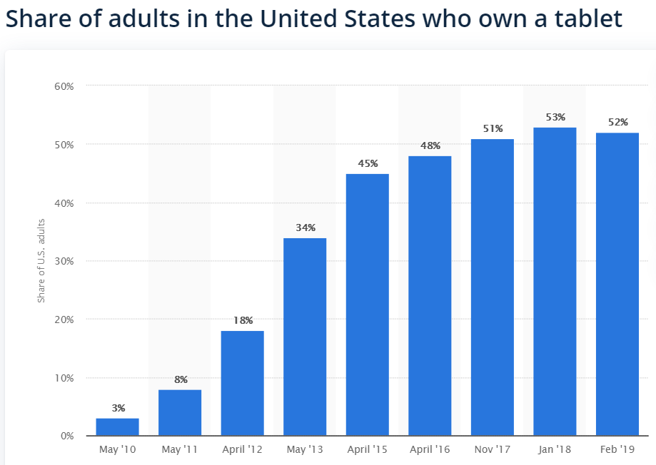
Another common explanation is that “only rich people use tablets.” In this idea, tablets convert at a higher rate because the rarefied group of tablet users spends more money on everything.
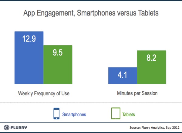
That may have been true at one time, but, today, tablets, smartphones, and personal computers are all mainstream devices in the developed world. Most U.S. adults have one:
A third explanation is that smartphones are used “on the go,” when people don’t have time to shop. But if people weren’t shopping on mobile at all, there would be no web traffic from smartphones to ecommerce sites.
And yet, according to Statista, 52.2% of all traffic to major websites comes from mobile phones. Also, people’s usage patterns indicate that “on the go” isn’t the only time when people use their devices.
So what is it about mobile that discourages people from converting?
At UserTesting, we’ve been analyzing this problem for years. In thousands of user tests by e-tailers big and small, we see two recurring conversion problems:
- Some of the problem is inherent to mobile. Some features of mobile devices, especially smartphones, discourage purchasing. But that’s not the dominant factor.
- The purchasing experience on mobile devices is poor. As an industry, we haven’t adapted our sites to the needs of mobile.
Let’s talk about why these things happen and what can be done to fix them.
Issue 1: Some smartphone features hurt conversions.
Two limitations of mobile device hardware interfere with purchase conversions. One is obvious, but the other isn’t.
Screen size isn’t optimal for shopping
This is the obvious difference. Desktop displays generally have much more screen real estate for displaying information, and that extra space benefits ecommerce. It’s much easier for desktop users to view side-by-side comparisons of products.
They can more easily see information that supports a purchase decision, such as background information, reviews, and multiple images of products. Tools that help users navigate choices, such as filter buttons, are usually easy to find.
In contrast, the smaller screens of mobile devices make it impossible to display the same supporting information all at once. It’s harder for users to make product comparisons, supplemental information is often missing or hidden, and filtering tools are limited.
As a result, users sometimes feel that they’re not getting enough information to complete a purchase. In user tests, it’s common for people to get partway through the purchasing process on a smartphone, then stop and say they’ll make the final purchase on desktop, where more information is available.
“I feel like there would be more product photos if I viewed the store on my PC, so I’ll wait and complete the purchase there.”
–Smartphone user in a test session by UserTesting
Network speed makes for (uncomfortably) slow shopping experiences
This is the other characteristic of mobile devices that limits conversion. Most desktop computers are connected through cables or WiFi to high-speed network connections. In contrast, most smartphones connect through the cellular data network.
Although cellular network speeds have increased substantially in recent years, they’re still not as fast as most wired connections. And, as we’ve noted before, speed matters a great deal to conversion rate optimization.
It doesn’t help that mobile devices also have higher latency than wired connections, meaning that they can be slower to respond initially to network requests, like loading a web page.
This is made worse, as Guy Podjarny discovered, by the fact that many responsive mobile websites still download most or all of the desktop payload, even if much of it isn’t displayed on screen.
The combination of latency, lower network speeds, and unnecessarily big downloads can slow the browsing experience. In our tests, these small delays accumulate and produce user frustration quickly. That frustration, inevitably, results in fewer conversions.
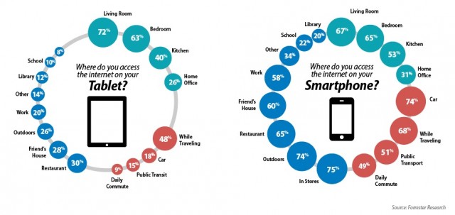
Mobile vs. tablet users
The screen size and latency issues explain why tablet conversion rates hover between those of smartphones and computers.
Tablets have more screen real estate than smartphones, letting users view more information at one time (although not as much as they can on a desktop). And tablets frequently connect to the network through WiFi, giving them a faster and more responsive shopping experience.
A more desktop-like shopping experience on tablets leads to a more desktop-like conversion rate.
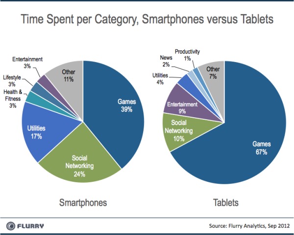
But as the (admittedly dated) research by Flurry indicates, how people use these devices is also different.
Faced with these built-in limits, it’s tempting to accept lower mobile conversion rates. Companies sometimes tell us they’ve made mobile a lower priority, shunting it off to a side team or starving it of resources.
That’s a big mistake. It’s reminiscent of companies refusing to get online 20 years ago or ignoring that social media is a reality for many verticals.
Instead of making mobile some overworked team’s side project, investigate how your visitors use mobile and how you might be able to create an experience that fits their existing use patterns.
Workarounds to overcome the shortcomings of mobile
For example, give a mobile user the option to view an item on the full version of a website. Although we don’t recommend forcing people to use the desktop version, giving them the option feels like a service rather than an imposition.
If nothing else, it reassures users that they’re not missing important sales support information, making them more likely to go ahead with the mobile purchase.
If you’re creating a mobile commerce app, there are things you can do to reduce perceived latency:
- Pre-load information that users might ask for;
- Animation of buttons and other screen elements can sometimes be used to mask short delays while the network is accessed.
But more important than any particular fix, understand that most mobile ecommerce problems aren’t caused by screen size or latency. Instead, they’re tied to subtle usability mistakes that companies often make.
Issue 2: Mobile ecommerce sites have poor usability.
The first—and biggest—mistake that we see companies make when designing for mobile ecommerce is trying to shift customers from shopping to buying.
Shopping on desktop, when implemented well, is seductive for many people. There are usually an enormous number of products to choose from, it’s easy to browse around, and years of design work have gone into creating a smooth, seamless experience.
On mobile, that process doesn’t just break down—it’s (mistakenly) sabotaged by the vendor. To respond to smaller screens and slower connections, companies often strip down their mobile shopping experience to the basics. A particular focus is on enabling a purchase with a minimum number of taps.
Here’s some typical industry advice from a few years ago from Adobe:
“Research has shown that (mobile) conversion rates are directly impacted by streamlined paths to purchase—conversion should occur within three touch events. Two will be table stakes in the near future.”
There’s no question that minimizing taps is a good idea—after the customer has decided what to buy. But many companies try to compress the whole shopping process into fewer taps.
The result is a mobile app or website that forces the user to make a quick purchase decision, rather than giving a great shopping experience. To the user, it feels like the site switches from giving enticement to issuing demands.
Our research shows that the best results happen when a site or app adapts to where the user is in the decision process. Once someone decides what to buy, they should be able to do it with a minimal number of taps. But if someone is undecided, they should feel free to explore and compare.
It’s a challenge. Many companies want to create a single master site design for personal computers and then use responsive design to adapt it to mobile.
Our research suggests that conversions are higher when the shopping process on mobile is rethought and tested from the bottom up—before a site design is locked in. That’s expensive and inconvenient for many companies, but as desktop traffic shifts to mobile, it will be more and more necessary.
Designer Virgil Pana shows off these animations for an iPhone app that demonstrates both the fun and functionality of an engaging mobile experience.
Beyond the core order-of-operations design issue, we also see a wide array of small usability problems on many ecommerce sites and apps.
Individually, none makes a big difference, but each one eats away at conversions. Taken together, they often make mobile ecommerce deeply irritating to users.
Here are the seven most common mobile ecommerce flaws we see.
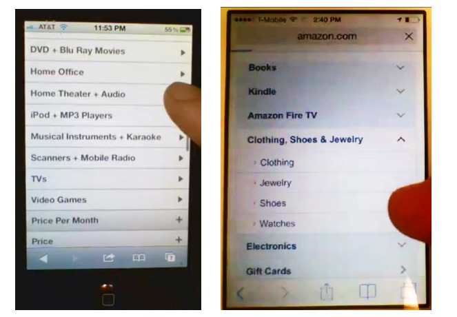
1. Confusing terminology in navigation elements leads to frustration.
Because a smartphone screen is so small, every word needs to be carefully considered.
Companies sometimes use terms to describe store departments and product types that are not necessarily understood by all users.
In the example below, a clothing company has chosen product categories that aren’t familiar to most people. In a test, a user asked to find boots was stopped dead by these menus.
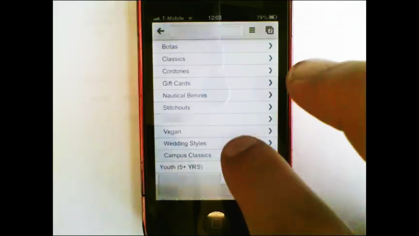
The menu titles aren’t necessarily wrong, but the company should be certain that all its customers—including first-time buyers—understand them.
The lesson? Know your target customers extremely well, and use their language, not your own.
2. The number pad isn’t used when it’s most convenient.
Entering any sort of data on a mobile device is painful. As a general rule, the more information you make people enter, the more will drop out of the buying process.
This has led to well-publicized techniques to save taps, like asking the user to enter their zip code first, then auto-filling the city and state for them.
Another frequent mistake is the failure to use the number pad when asking a user to fill in numeric information.
The example below has a couple of problems. In the screen at left, the user is being asked to fill in the zip code after manually entering the city and state—already a missed opportunity to make life easier for the user.

This sort of inconsistency shows that the company hasn’t thought systematically about mobile users. In user tests, a mistake like this often produces extreme user irritation.
3. Untapable items confuse and frustrate mobile users.
Smartphone and tablet interfaces are built around the idea of “direct manipulation.” Any on-screen information that the user might want to modify can generally be tapped or swiped and edited in place. Mobile users come to expect this sort of interface.
Mobile ecommerce companies sometimes violate this principle by presenting static screens of information that can’t be tapped. Instead, if users want to make a change, they’re expected to use a back button or some other navigation tool (the way they would on a desktop).
Mobile users often overlook navigation buttons and become frustrated when tapping does nothing.
In the example below, taken from the ecommerce checkout process of a mobile site, the user is trying to edit her billing address. She repeatedly tapped the address and swiped up, down, left, and right, with no effect.

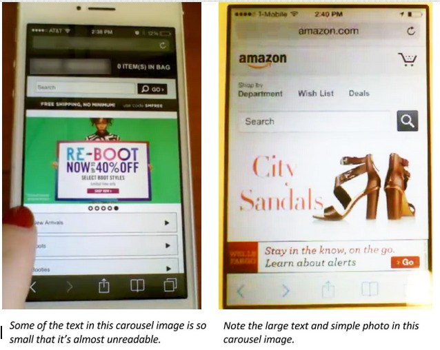
4. Image sliders kill conversions, especially on mobile devices.
Image carousels kill conversions. But on mobile they present a bigger problem. In tests, we frequently see carousels whose images have been adapted from a desktop version. The text is too small, and the images are too crowded for easy viewing on a mobile device.
We also see many cases in which the developer uses a mobile carousel as a supplement to the site navigation. Some features of a desktop version don’t fit into the navigation scheme on a smaller screen, so they’re bumped into the carousel.
This inevitably confuses customers who expect site navigation to be in the site’s main menu.
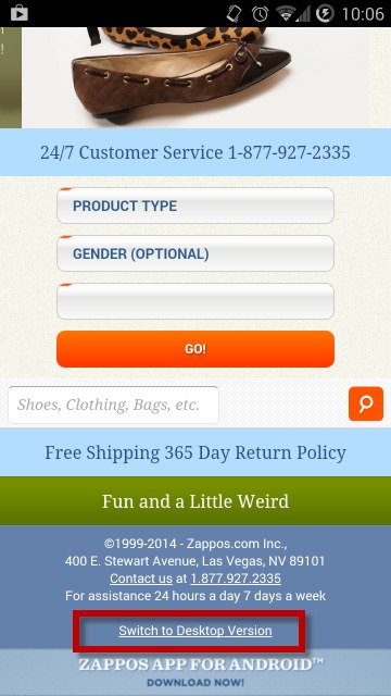
5. Forcing the use of a desktop version is an unwelcome surprise.
Although our research shows that it can be helpful to give mobile users the option of viewing an item on the desktop version of a site, it’s not helpful to force people into that view with no alternative and no warning.
The result is usually alarm and frustration as the user struggles to read tiny text and pinch and zoom the page. It’s like a highway that suddenly switches from pavement to gravel.
This is a common problem when a company relies on responsive design to reformat a desktop site for mobile. Although responsive design is better than nothing, it shouldn’t be used blindly. Ask whether a page should be completely redesigned rather than just rearranged.
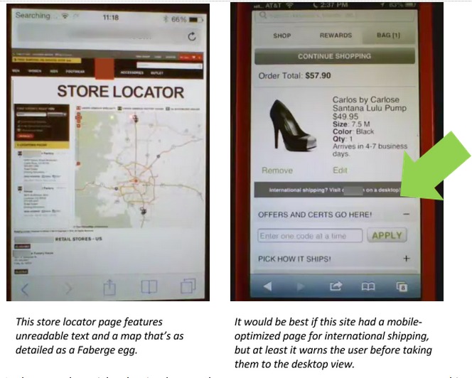
In the example at right, the site doesn’t have a mobile-formatted page for international shipping. But instead of dropping the user into that page unexpectedly, the feature is presented as a benefit while, at the same time, the user is warned that it will display as a desktop-formatted page.
Make sure all of your screens are rethought for mobile. If that’s not possible, at least warn people before you throw them onto the gravel.
6. Menus make no sense and are confusing to navigate.
It seems so logical: Most online stores are really a list of products, sorted by category. So why not have the user navigate through a set of hierarchical menus that list the categories?
Unfortunately, our tests show that people are rapidly confused by most menu systems that run more than two levels deep. Even relatively short menu lists can be intimidating if they contain unfamiliar terms.
In the example above, the consumer electronics site at left has attempted to arrange its offerings into a series of logical categories. The result is a labyrinth of related product terms that most users can’t navigate.
Contrast that menu structure to the one at right. Arrows pointing up and down show whether a category is expanded (rather than the right-pointing arrow, which leads some users to expect the screen to shift to the side).
In the left-hand example, the menus are a maze. In the right-hand example, the menus are like the elevators between floors in a department store. They don’t try to explain everything; they just move you between broad categories of goods.
7. Search and filter options are overwhelming, redundant, inaccurate, and confusing.
One of the most difficult design tasks in mobile ecommerce is site navigation.
The relatively large screen size on a desktop enables a site to display several navigation tools at the time time (e.g., a menu of departments and a set of filters). On mobile, those features are usually on different screens, and, in our tests, users often struggle to find them.
We also frequently see problems with wording. Often, a developer thinks the name it chose for a button or function is intuitive, but users don’t understand it the same way. Or users use the site’s search function to look for a particular term, but they don’t find what they’re expecting because inventory hasn’t been tagged that way.
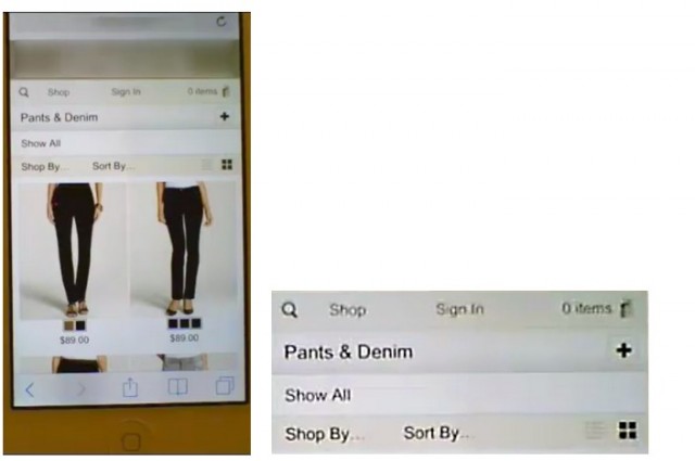
For example, the site above has too many overlapping ways to navigate. There’s a search button at upper left (the magnifying glass), a “Shop” button, a “+” button next to Pants & Denim, a “Shop by…” button, and a “Sort By…” button.
In tests, users were flummoxed by these five choices. They might try one or two of them, but if they weren’t able to find what they wanted quickly, they just gave up.
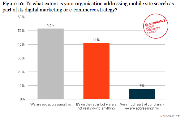
It’s too bad, really. There’s a huge competitive advantage in mobile site search. According to a study by Econsultancy, only 7% of companies say that mobile site search is a top priority.
One way to help with this problem is to test your site carefully to find the terms that people are most familiar with (e.g., “filter” may be a better choice than “sort by”).
There’s also a good argument for combining related functions into a single button to reduce the risk of a user pushing the wrong one. For example, we’ve seen mobile stores combine filtering and sorting controls on a single screen, accessed through a button labeled “Filter.”
Chances are very good that a user who wants to sort will push the Filter button anyway because it’s the only choice.
Conclusion
Every site, and every market, is different. There are an almost limitless number of small usability “gotchas” that need to be identified and gradually refined.
That process took years on desktop, and there’s no reason to assume it won’t take years on mobile, either. You need to be patient and test heavily to ensure you understand exactly where users are getting stuck—and why.
Testing is especially important if you’re making a mobile ecommerce app. App store reviews punish apps that aren’t excellent on day one. Rather than launching something adequate and then iterating, you need to launch something that’s great.
The only way to do that is to test heavily before you launch. In web development, the mantra is “release early and iterate.” In mobile, it’s “test and iterate before you release.”
Examples given in this article were reproduced with permission of the companies that funded the tests. Thanks to Bloomreach for sharing its results. Additional images were provided by other UserTesting clients who wish to remain anonymous.
Related Posts
-

There are an almost limitless number of mobile usability gotchas that need to be identified…
-
Several years ago, Jeremy Smith wrote, "Traditional optimization is dead, and in its place is arising…
-
You know that a good user experience leads to more conversions. You also know there’s…
-
While running A/B tests on all your traffic at once is often tempting, it's best to…


Really good post Michael, but I’m a bit disappointed you didn’t go into the point you made about there being more mobile conversions than we can track. Why would that be? That’s as interesting to me as any of this (and it was all interesting).
Certainly useful information. I was trying to access the post from my mobile, but the fonts in some of the images were barely legible. So there’s another ‘don’t’ to add to your list of making mobile convert: Don’t use images with too much detail!
Thanks for your question, Tom. We know from our studies that it’s pretty common for someone using a commerce site on a smartphone to say something like, “I think I’ll finish this transaction later on a personal computer.” Sometimes they do it because they feel the computer is more secure than the smartphone, sometimes it’s because they figure there will be more purchase support information on the computer site, and sometimes it’s because they feel checkout is easier on a computer. So we know this is a common problem, but many analytics systems are not capable of tracking how often it happens. It’ll look like an abandoned shopping cart on the smartphone and a later independent conversion on the computer (or tablet).
A number of companies are working to fix that gap in the analytics, but it’s hard to do if the user is not logged in on both devices.
Great article, thanks! We hear so much about how the future of ecommerce is mobile, so it’s refreshing to look into the drawbacks…
Thanks, good info to be aware of…
Hi Michael,
If a user switches from mobile to desktop to complete their purchase, is there a view in Google Analytics that can help track it? Or provide an estimate for how many people might be doing this?
I was also wondering if you had any thoughts about mobile traffic that comes in from newsletters. What would you optimize for that type of user?
Thanks a lot!