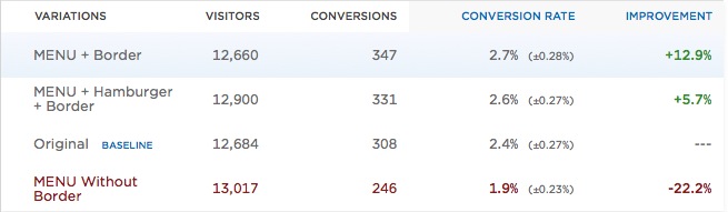
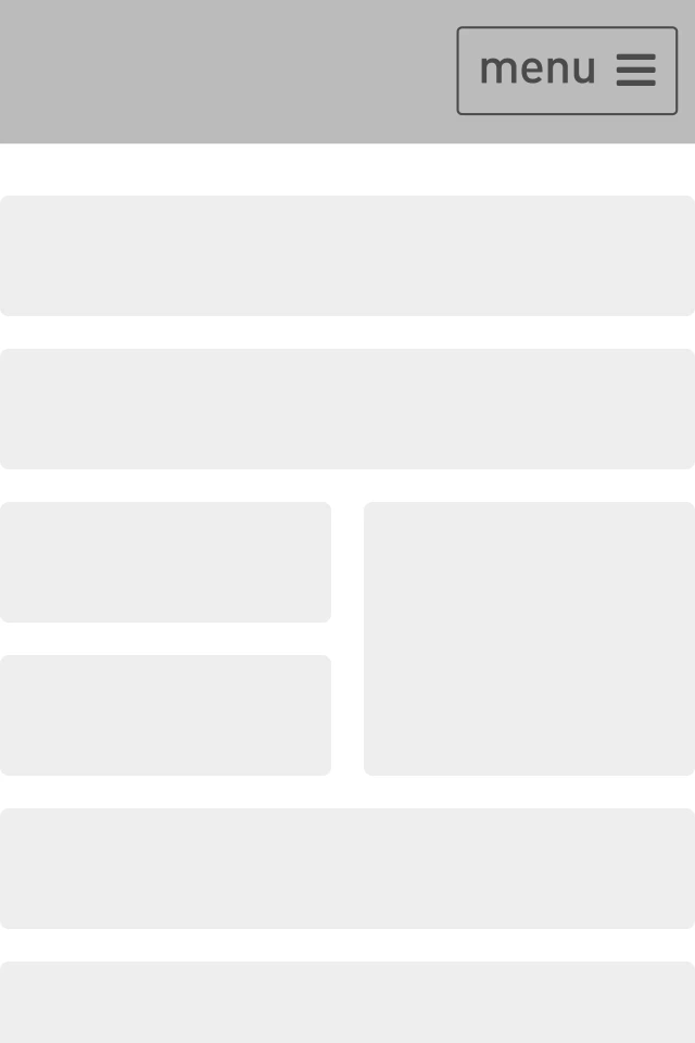
Exis Web tested the hamburger against the word “MENU,” creating three iterations. These were the results:
While the test ran for only five days, their (preliminary) results showed that the word MENU + border/hamburger worked better than just a plain hamburger menu.
The folks over at Booking.com tested the button as well—no difference in their case.
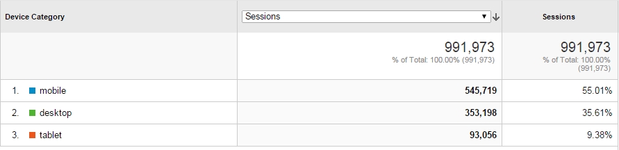
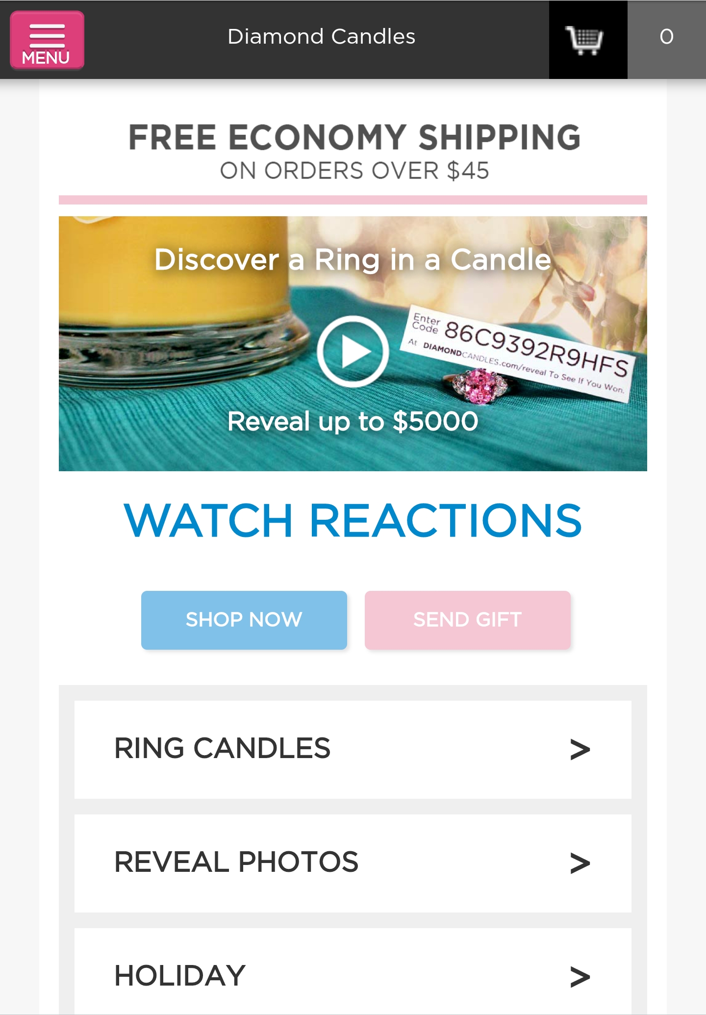
One of our clients is an ecommerce site selling scented candles. Mobile traffic is much more important than desktop in their case. This is their last 30 days:
We decided to test the hamburger icon and came up with three challengers based on what other people had tested:
We tried to innovate as well, but we couldn’t come up with a totally new, better icon. So we tested the usual suspects: the word “menu,” with and without the hamburger.
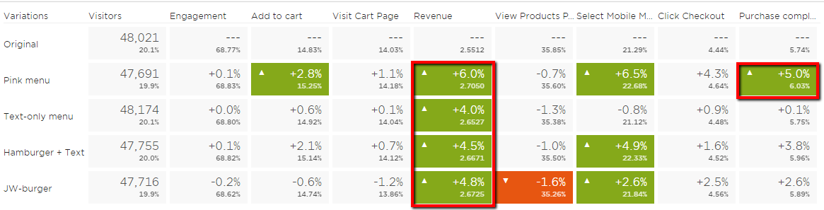
In addition to these, we added a variation. We made the “hamburger + menu” icon pink, which was one of the site colors, not chosen randomly. The idea was to draw more attention to the icon via color.
We ran the test for six weeks, with a total sample size of about 240,000 users; each variation had about 2,800 purchases.
These were the results:
(Click to enlarge)
The key outcome? All 4 treatments brought in more revenue than the control. Not clicks, engagement, or other soft metrics—dollars.
This outcome is worth an extra couple of hundred thousand dollars per year. Not too shabby for just switching out the icon.
This was the winner:
We ran a three-week follow-up test as well (to test alternatives), but we failed to move the needle. The winner of the first test remained the best.
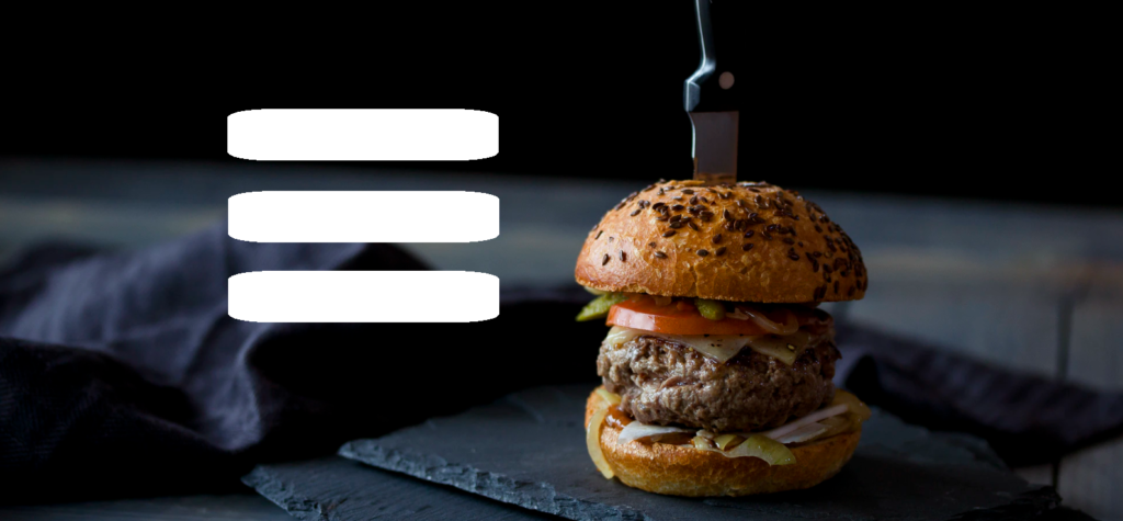
Why is the hamburger icon confusing (to some?)
Well, do you think it’s clear and obvious? Probably not. The icon was designed in 1990 for a whole different world. Just carrying it over to today doesn’t make a lot of sense.
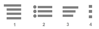
While it’s ubiquitous, not everyone is savvy enough to get it. So imagine that you’ve never seen the icon. Or you’ve seen similar icons, like these:
No wonder it’s confusing. When you read Norman Nielsen’s guidelines for designing icons, they recommend you use the five-second rule: If it takes you more than 5 seconds to think of an appropriate icon for something, it’s unlikely that an icon can effectively communicate that meaning.
Their own research into icon usability concluded that “Users are still unfamiliar with newer icons, including the three-line menu icon and the map-marker icon.”
Okay, so what’s better?
Our own test showed that the word “MENU” helps, and using a color to make it stand out from the noise can help, too.
Luis Abreu recommends displaying the full menu as a list all the time: “As long as it’s evident as website navigation, people will still scroll past it and will definitely be immediately exposed to the available options.”
Example:
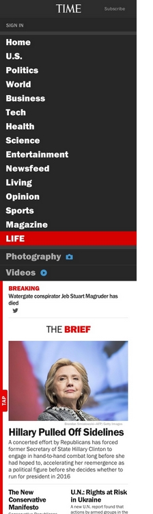
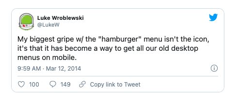
UX guru Luke Wroblewski has critiqued hamburgers on multiple occasions, like here:
“We know from the theory of gestalt principles, more specifically the proximity principle, that objects which are positioned near each other, are perceived as a group. So why not provide initial context by using this principle, and then fade out the “Menu” label as the user starts scrolling?”
By showing/hiding the labels during scroll, we can make sure that the user gets a chance to learn the icon’s associated action. We could even fade in the label once the user scrolls up again.
Conclusion
Don’t rely on the default option when it comes to navigation on mobile sites. Hamburgers icons have gotten their butts kicked in some tests, and, in others, replacement options made no difference.
Test your menu icon—run user tests as well as A/B split tests. Learn how your particular audience responds to it, and figure out what works best.
I too have thought the “hamburger” thing was a pretty crappy excuse for good UX forever. Here’s to not thinking about the user first. :)
Boris Yankov
Has anyone tested just the word ‘Menu’ without the hamburger?
What are the three lines adding?
Peep Laja
That was one of our variants in the test. Beat hamburger.
Ville Laurikari
Interesting test results and a good read as always, Peep :)
The consensus in UX design circles is that the hamburger menu is a good place to hide stuff. If you want people to click on a link, or even just be aware that it exists, don’t put it in the hamburger menu.
The scented candle site might want to test copying some of the best revenue generating items from the menu to main page content to make sure people find them.
Kelley Howell
Yes, Luke was being sarcastic. That’s why he put the comment in quotation marks, so you didn’t think he was advocating for the use icon + menu + “drawing attention to it”. (standard practice on twitter, otherwise why waste two characters when you only have 140?)
Andy Kuiper
This is very helpful info Peep – we’ve been implementing ones with MENU in between the lines, and quite like it. Your test results speak for themselves – nice work :-)
Stacelynn Caughlan
Thanks for this Peep, a great resource to send clients to when I’m trying to steer them toward testing this very feature.
Momoko Price
That 5-second rule of thumb for devising icons is spot-on!
As a copy geek, I personally think there’s something to be said for using the actual word instead of always defaulting to an icon if the word is perfectly short/clear enough on its own (like the word ‘Share’, for example!)
‘Share’ button vs. the ‘Share’ icon – it’s testable!
Herzco
Hey. So is there a visual sample of the company’s original site navigation? That would be helpful, thanks!
Peep
Original was plain hamburger, 3 lines
Zalman
It’s possible that the color of the icon is what’s drawing the activity. Did you test hamburger alone on color, and/or Menu alone on color, against hamburger+Menu on color?
Deb
Great insight. Which tool did you use for testing ?
Peep Laja
Optimizely
Paul Quin
Having used Xerox Star, I’d say that the context, on the screen and at that time, made the use of the icon perfectly clear. Things have changed, though, and I do wonder how much clearer the striped icon is than the simple word. Have to test that out. (Luke? Snarky?) Thanks, Peep.
Ian Hamilton
Luke W was being sarcastic. He was NOT recommending Time’s tiny text and overlay to draw attention to it as best practice. Quite the opposite.
Jakub Linowski
Hey Peep,
Thanks for sharing. Awesome stuff. Here are some of my red flags that fired up after looking at your results and tables:
1. One pattern where we get a bit skeptical is when there is a column (metric) which shares a common lift, above the control. So all variations having a 4-6% lift in revenue above the control raises the first questions. A more varied distribution would feel “more probable”, otherwise it could be a false positive for whatever reason (just a gut feel, hard to prove).
2. The other and more serious thing we look out for is if the pattern holds across a funnel or series of measured steps. So, I’d expect the claimed 6% lift to be somehow reflected in multiple goals (ex: revenue boost should be seen in “adds to cart”, “clicks checkout” and “completed purchases”). However for the text-only menu variation as an example, you only have a +0.6% adds to cart, then only +0.1% completed purchases, but a big +4% revenue squeeze. Or JW burger variation has -0.6% in adds to cart, but +4.8% in revenue. Or text-only menu with +0.9% clicks checkout and a +4% revenue boost. Some gaps? :)
I like when my data patterns line up across steps (ex: +12% adds to cart, +6% checkouts starts, +3% completed purchases, and +2-3% revenue, and not the other way around).
Any thoughts on those signals?
Cheers,
Jakub
Peep Laja
I hear ya, but all the data shows it’s legit. When analyzing it in GA, we see that the lift comes for increased avg cart value – and as per GA data the conversion rate was also higher for each variation. I just used Optimizely screenshot for at-a-glance view.
Vlad Malik
Optimizely’s dashboard is pretty sketchy. They don’t show you the actual conversion counts, so you have to do some math just to figure that out. Once you do and see the confidence intervals, you’ll probably see none of those green results are statistically significant.
The margin of error on that 2.8% green lift, for example, is huge. That’s we don’t even try to measure anything <10%. Typical conversion rates just aren't enough for studies powerful enough to detect small effects. And as Jakub noted, we'd expect Adds To Cart to correlate with your revenue and we don't see that.
Optimizely, as I recall, doesn't let you download visitor revenue data, so you can't verify the numbers and assess the variability. But eyeing those small lifts, I'd say those revenue numbers are as good as chance.
However, check out http://goodui.org/betterdata/#32. Again, Optimizely's dash is awful for this and they don't let you download the full data. But by applying the date filters, you should be able to see if those relationships hold over time or switch all over the place. I'd be curious to see performance day to day, week to week.
Peep Laja
We only use Optimizely for testing, not for analysis. All analysis is done with Google Analytics. We integrate each test with GA using built-in integration (using custom variables) as well as record an event each time a variation is loaded.
So all data analysis is inside GA + excel to calculate significance, statistical power etc.
Vlad Malik
Can you share what your analysis showed exactly? Were the results significant? Whas was the p-value and margin of error? Was the test powerful enough to detect a change of that size? Were the effects consistent over days and weeks?
Lucky for English they can squeeze the meaning of the word into 4 letters, “MENU”.
“Navigatiebalk” or “Inhaltsverzeichnis” can only hope English invades in this area (it has for other webby things).
Peep Laja
Haha, indeed! Local innovation needed.
K
Wat is precies mis met Menu?
Ankit Prakash
Yes, for some users who are new to mobile web find “hamburger” icon confusing, also, all the test results are dependent on the area in which the web business is operating.
Overall, I feel “Menu+Border” make a great sense. Maybe that’s why it has higher conversion.
David Mannheim
This is interesting but I do find it is contextually different for each site. So for example, 50% of your users land on your homepage. What do they want from this homepage? Inspiration? Browsing? Navigation? Take a look at eBays homepage – yes the search is at the top to encourage use of this but the menu is at the bottom because, unassumingly, they want to encourage browsing. A more standard approach. Amazon is similar. Whereas JohnLewis.com dives straight into navigation – categorising their users journeys immediately.
What are your thoughts on this – surely there’s not a 1 size that fits all?
PS: Loved the comparison against MS Word Bullet Butcon – never really thought of this before!
Colin Eyre
Great article; and backed up with testing too. Agree we need better use of context and what is in focus/front-of-mind for the end-user. I have felt the same way about the floppy disk ‘save’ icon. For people who have never seen a floppy, it just doesn’t make sense.
Michael
Call me crazy, but how about just using:
[ Menu ]
Peep Laja
That was one of the test variations. In our specific case it was better than control, but not the biggest winner.
tworzenie stron internetowych Wroclaw
If you love to travel, then I want to tell you about a revolutionary way to vacation. The important thing to know is just
where to go to find the help that you need. Finding a niche that has about
50,000 searches a month is ideal to be able to get good ranking and still have
a market large enough to be profitable.
Lockedown Design
Many UX designers are now saying the hamburger menu is “bad”. I am in the camp that believes the hamburger plus the word “Menu” , and/or a border is a vast improvement.
The big problem I see is that it takes a long time to train the populace to use a convention. The hamburger menu (formerly the navicon) has been around for about six years now. Many people understand it, but some do not. Some mobile apps now use a gear icon for the menu. Some sites are using four bars (as you showed). I believe this confuses the issue.
The second problem is that there is no other icon that is a good alternative to the hamburger. This does not stop us from trying to replace this convention with new icons.
Adding additional information to the three bar menu icon is a good way to train people that this is how to find the navigation.
(On a side note: People understand that a floppy disk icon means “Save” in the same way they understand a telephone receiver means “Phone”, even though the same subset of people have never seen a rotary dial telephone.
These are old conventions that younger people have grown up associating with certain actions. Just because these actions aren’t represented in their modern forms doesn’t mean people do not understand them. What would UX’ers replace the Save icon or Phone icon with, if they had a choice of existing icons? And how long would it take to retrain the population on their meaning?)


I hate the hamburger icon. It looks like a trigram from the iching to me.
An inverted pyramid would be a much better symbol for me. That may not be the case for all cultures, however.
That’s why we test shit :)
I always assumed Luke Wroblewski was being snarky about the Time menu, but perhaps I read him wrong.
He has talked about the shittyness of the hamburger icon any times and advocated a word label, e.g. https://twitter.com/lukew/status/431543820002398208
I too have thought the “hamburger” thing was a pretty crappy excuse for good UX forever. Here’s to not thinking about the user first. :)
Has anyone tested just the word ‘Menu’ without the hamburger?
What are the three lines adding?
That was one of our variants in the test. Beat hamburger.
Interesting test results and a good read as always, Peep :)
The consensus in UX design circles is that the hamburger menu is a good place to hide stuff. If you want people to click on a link, or even just be aware that it exists, don’t put it in the hamburger menu.
The scented candle site might want to test copying some of the best revenue generating items from the menu to main page content to make sure people find them.
Yes, Luke was being sarcastic. That’s why he put the comment in quotation marks, so you didn’t think he was advocating for the use icon + menu + “drawing attention to it”. (standard practice on twitter, otherwise why waste two characters when you only have 140?)
This is very helpful info Peep – we’ve been implementing ones with MENU in between the lines, and quite like it. Your test results speak for themselves – nice work :-)
Thanks for this Peep, a great resource to send clients to when I’m trying to steer them toward testing this very feature.
That 5-second rule of thumb for devising icons is spot-on!
Would love to see what kind of test you could run on the ever-contentious, generic “Share” icon: http://cf-wp-prod.sharethis.com/wp-content/uploads/2013/08/ST_LOGO.jpg
As a copy geek, I personally think there’s something to be said for using the actual word instead of always defaulting to an icon if the word is perfectly short/clear enough on its own (like the word ‘Share’, for example!)
‘Share’ button vs. the ‘Share’ icon – it’s testable!
Hey. So is there a visual sample of the company’s original site navigation? That would be helpful, thanks!
Original was plain hamburger, 3 lines
It’s possible that the color of the icon is what’s drawing the activity. Did you test hamburger alone on color, and/or Menu alone on color, against hamburger+Menu on color?
Great insight. Which tool did you use for testing ?
Optimizely
Having used Xerox Star, I’d say that the context, on the screen and at that time, made the use of the icon perfectly clear. Things have changed, though, and I do wonder how much clearer the striped icon is than the simple word. Have to test that out. (Luke? Snarky?) Thanks, Peep.
Luke W was being sarcastic. He was NOT recommending Time’s tiny text and overlay to draw attention to it as best practice. Quite the opposite.
Hey Peep,
Thanks for sharing. Awesome stuff. Here are some of my red flags that fired up after looking at your results and tables:
1. One pattern where we get a bit skeptical is when there is a column (metric) which shares a common lift, above the control. So all variations having a 4-6% lift in revenue above the control raises the first questions. A more varied distribution would feel “more probable”, otherwise it could be a false positive for whatever reason (just a gut feel, hard to prove).
2. The other and more serious thing we look out for is if the pattern holds across a funnel or series of measured steps. So, I’d expect the claimed 6% lift to be somehow reflected in multiple goals (ex: revenue boost should be seen in “adds to cart”, “clicks checkout” and “completed purchases”). However for the text-only menu variation as an example, you only have a +0.6% adds to cart, then only +0.1% completed purchases, but a big +4% revenue squeeze. Or JW burger variation has -0.6% in adds to cart, but +4.8% in revenue. Or text-only menu with +0.9% clicks checkout and a +4% revenue boost. Some gaps? :)
I like when my data patterns line up across steps (ex: +12% adds to cart, +6% checkouts starts, +3% completed purchases, and +2-3% revenue, and not the other way around).
Any thoughts on those signals?
Cheers,
Jakub
I hear ya, but all the data shows it’s legit. When analyzing it in GA, we see that the lift comes for increased avg cart value – and as per GA data the conversion rate was also higher for each variation. I just used Optimizely screenshot for at-a-glance view.
Optimizely’s dashboard is pretty sketchy. They don’t show you the actual conversion counts, so you have to do some math just to figure that out. Once you do and see the confidence intervals, you’ll probably see none of those green results are statistically significant.
The margin of error on that 2.8% green lift, for example, is huge. That’s we don’t even try to measure anything <10%. Typical conversion rates just aren't enough for studies powerful enough to detect small effects. And as Jakub noted, we'd expect Adds To Cart to correlate with your revenue and we don't see that.
Optimizely, as I recall, doesn't let you download visitor revenue data, so you can't verify the numbers and assess the variability. But eyeing those small lifts, I'd say those revenue numbers are as good as chance.
However, check out http://goodui.org/betterdata/#32. Again, Optimizely's dash is awful for this and they don't let you download the full data. But by applying the date filters, you should be able to see if those relationships hold over time or switch all over the place. I'd be curious to see performance day to day, week to week.
We only use Optimizely for testing, not for analysis. All analysis is done with Google Analytics. We integrate each test with GA using built-in integration (using custom variables) as well as record an event each time a variation is loaded.
So all data analysis is inside GA + excel to calculate significance, statistical power etc.
Can you share what your analysis showed exactly? Were the results significant? Whas was the p-value and margin of error? Was the test powerful enough to detect a change of that size? Were the effects consistent over days and weeks?
Hi Peep
Very interesting post.
It would be awesome if you could include the menu- & burger-icons used in the results table: https://cxl.com/wp-content/uploads/2014/12/2014-12-11_1644.png
So it would be very clear what the variations looked like. e.g. what is a JW-burger?
Lucky for English they can squeeze the meaning of the word into 4 letters, “MENU”.
“Navigatiebalk” or “Inhaltsverzeichnis” can only hope English invades in this area (it has for other webby things).
Haha, indeed! Local innovation needed.
Wat is precies mis met Menu?
Yes, for some users who are new to mobile web find “hamburger” icon confusing, also, all the test results are dependent on the area in which the web business is operating.
Overall, I feel “Menu+Border” make a great sense. Maybe that’s why it has higher conversion.
This is interesting but I do find it is contextually different for each site. So for example, 50% of your users land on your homepage. What do they want from this homepage? Inspiration? Browsing? Navigation? Take a look at eBays homepage – yes the search is at the top to encourage use of this but the menu is at the bottom because, unassumingly, they want to encourage browsing. A more standard approach. Amazon is similar. Whereas JohnLewis.com dives straight into navigation – categorising their users journeys immediately.
What are your thoughts on this – surely there’s not a 1 size that fits all?
PS: Loved the comparison against MS Word Bullet Butcon – never really thought of this before!
Great article; and backed up with testing too. Agree we need better use of context and what is in focus/front-of-mind for the end-user. I have felt the same way about the floppy disk ‘save’ icon. For people who have never seen a floppy, it just doesn’t make sense.
Call me crazy, but how about just using:
[ Menu ]
That was one of the test variations. In our specific case it was better than control, but not the biggest winner.
If you love to travel, then I want to tell you about a revolutionary way to vacation. The important thing to know is just
where to go to find the help that you need. Finding a niche that has about
50,000 searches a month is ideal to be able to get good ranking and still have
a market large enough to be profitable.
Many UX designers are now saying the hamburger menu is “bad”. I am in the camp that believes the hamburger plus the word “Menu” , and/or a border is a vast improvement.
The big problem I see is that it takes a long time to train the populace to use a convention. The hamburger menu (formerly the navicon) has been around for about six years now. Many people understand it, but some do not. Some mobile apps now use a gear icon for the menu. Some sites are using four bars (as you showed). I believe this confuses the issue.
The second problem is that there is no other icon that is a good alternative to the hamburger. This does not stop us from trying to replace this convention with new icons.
Adding additional information to the three bar menu icon is a good way to train people that this is how to find the navigation.
(On a side note: People understand that a floppy disk icon means “Save” in the same way they understand a telephone receiver means “Phone”, even though the same subset of people have never seen a rotary dial telephone.
These are old conventions that younger people have grown up associating with certain actions. Just because these actions aren’t represented in their modern forms doesn’t mean people do not understand them. What would UX’ers replace the Save icon or Phone icon with, if they had a choice of existing icons? And how long would it take to retrain the population on their meaning?)