
What kind of content should you have on your site? How should you structure the menu? What should be the first-level menu items? One or two menus? What should the menu links be called? This post gives you answers.
Website information architecture is no joke, yet the overwhelming majority of businesses structure their site using the IMO method (“In my opinion…”). While common sense is a useful tool, and a lot of sites are simple (e.g. 5 pages), there’s a better way to go about it.
If you already have tens of pages on your site, you should do a proper information architecture analysis. Guiding people through the vast amount of information on offer is something that requires thought and research. Intuitive navigation doesn’t happen by chance.
Peep Laja and Brian Massey discuss optimizing your website’s main navigation.
Table of contents
- What is website information architecture?
- How to create a website information architecture in 5 steps
- 1. Gather data about your site users before working on your site architecture.
- 2. Create customer personas and write user stories to design your site for real people.
- 3. Start building your information architecture with metadata, scenarios, pages
- 4. Create user flows to map users’ progression through your site.
- 5. Create sitemaps, wireframes—and gather feedback on your website architecture
- How to create an optimal menu structure for your website
- Guiding principles for website navigation design
- Tools to use to create your site’s information architecture
- Conclusion
What is website information architecture?
Information architecture is the process of designing, labeling and organizing a structure for information that supports usability.
It can be applied to websites, but also intranets, software, books, or any other medium of information. We could simplify it to “the art and science of organizing websites.” In this article, we’re talking about it only in the context of websites.
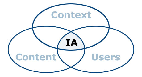
Information architecture gurus Louis Rosenfeld and Peter Morville (you should read their book) defined the “three circles of information architecture” as content, users, and context of use:
It’s about organizing the content and flow of a website based on research and planning. The goal of information architects is to come up with a structure and design that balances users’ desires with business needs.
Users have four fundamental questions when they arrive at a website:
- Am I in the right place?
- Do they have what I am looking for?
- Do they have anything better (if this isn’t what I want)?
- What do I do now?
One of your key tasks is to answer these questions effectively—on every page of your site. To do so, you have to:
- Assure visitors that they’re in the right place (always make it clear where they are).
- Make it easy for visitors to find what they’re looking for (clear navigation, search, etc.).
- Make sure visitors know what their options are (links like “See also” or “Related products”).
- Let them take various kinds of action (clear calls to action).
What’s the deliverable for an information architecture analysis?
The goal is to come up with the architecture of the site. The deliverable might include sitemaps, site-flow diagrams, and wireframes to convey how the site will work from a practical perspective.
It should determine the big picture, organizing the content on the site to support the tasks that users want to perform. Information architecture should also include little things, like deciding that products on a search page should be ordered by price not name.
All of it should be based on actual research and data—not much room for opinions here. There are multiple ways to get website information architecture right. Here’s the method that’s worked for me over the years.
How to create a website information architecture in 5 steps
You achieve your business goals when you help people achieve their goals. You can only do that when you fully understand your users’ goals, problems, and aspirations.
Here’s how to create the information architecture for a website:
- Gather user data and answer the basic questions
- Create customer personas and write user stories
- Add pages, scenarios and metadata to your website architecture
- Map user progression with a user flow
- Add a sitemap and wireframes, and gather feedback
Let’s go through these steps, one by one:
1. Gather data about your site users before working on your site architecture.
It’s critical to get inside the user’s head. Before you work on the information architecture, you need to know answers to these questions:
- What problem are we solving?
- Who needs it?
- What’s this site for?
The earlier the purpose and goals are defined clearly (and written down!), the more easily problems are identified and solved; the easier it is to stay focused; and the better the end result.
Talk to your users. In-person interviews and phone calls are best, but online surveys are also great.
The goal is to understand what your users want and why they want it. There will be different intents and use cases among your users. That’s to be expected.
2. Create customer personas and write user stories to design your site for real people.
Your website should be designed for somebody, not everybody. This is where customer personas come in.
Personas are fact-based (derived from user research) but fictional representations of your users. They represent the goals, motivations, characteristics, and behaviors of the most important groups of people who come to your site.
Here’s a sample persona. Attaching a photo to a persona helps us imagine a real person we’re building the site for:

The next step is to connect use cases with personas. Use cases are a simple way to decide and describe the purpose of a project. Use cases have two components: actors and goals.
Actors are people using the website. You want to focus only on the most prominent groups—the user personas. Goals are what one, some, or all of the personas want to achieve. Every use case must have:
- A specific goal;
- Actors who will perform tasks to achieve that goal.
Goals might be things like read a blog post, check an account balance, book an appointment, download software, take a test, and so on. Use cases define goal and the purpose: the problem we are trying to solve. (This is the first step to improving customer lifetime value, too.)
When you approach website architecture by thinking about personas and what they wish to achieve, you will work with greater confidence and clarity.
3. Start building your information architecture with metadata, scenarios, pages
Once you understand your users—their intent, the why behind it, and how they’d like to achieve their goal—you can begin to figure out how to present your content in a way that makes sense to your users.
There are several good methods to do this, but here’s the process I like to use:
Figure out the metadata.
Metadata is information about information. It’s what helps users find the content they’re looking for.
Let’s say you want to buy a coffee grinder, so you go to a website that sells them. If you browse around and can’t find one, it’s a sign of bad metadata. If you get your metadata right, you’ve already cleared the first hurdle of effective site design.
To develop useful metadata, you have to determine what people care about. For coffee grinders, do people search by blade size? Color? Brand? Knowing the parameters and variables to store in your system is crucial for excellent search results.
The metadata for a book could be its title, description, author, release date, ISBN, comments, cover image, etc. Plan for it!
Create user scenarios.
To design a pleasing experience, think about scenarios featuring user personas. A scenario is a story about someone (your user persona) using your website to carry out a specific task or goal, like booking a flight or buying yoga pants.
Scenarios work with personas. They’re the story behind why a particular persona would come to your website.
- What does the persona hope to accomplish on your website?
- What can help them complete the task at hand?
- What might cause friction?
Focus on users and their tasks rather than your site’s organization and internal structure. If you do, you’ll get insights into what content the site must have and how it should be organized.
You can read more about scenario mapping here.
Map user tasks to individual web pages.
Before you start thinking about actual design, you need to have the content in place.
Content precedes design. Design in the absence of content is not design, it’s decoration.
Jeffrey Zeldman
Next, decide what happens on your web pages and how many pages should exist. Each page must do two things:
- Help the user accomplish one specific task;
- Make the next step easy to access.
When you’re designing the site, making sure the user accomplishes each task is vital. However, achieving that objective usually consists of a series of smaller tasks. The relationship between tasks defines experience. Each page on your site needs to help build this chain of tasks.
Overall, your site will have three types of pages:
- Navigation pages. These help users determine where to find what they want, and give them access to it. Their goal is to send users “somewhere else.” Typically it’s a homepage or search results page.
- Consumption pages. These are the “somewhere else” you usually go to (articles, videos, pricing information, and so on).
- Interaction pages. These pages let users enter and manipulate data. Think search page or a sign-up form.
Each type of page is optimized for a different kind of user task. Understanding the type of page you need helps you tailor the interface design.
When you draw a sitemap or map user flows, note whether a page is a navigation page, consumption page or interaction page. Design accordingly.
Offer the right help at the right moment in the most unobtrusive way possible.
Some web pages are easy to use. Some might require some learning. Plan for help texts and microcopy to make sure users can complete tasks without confusion.
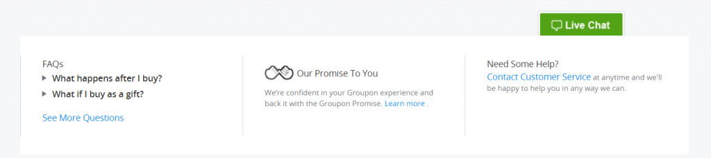
Information should be offered in context. Provide answers to booking-related questions on the page where users book stuff. Keeping testimonials and FAQs on separate pages isn’t optimal—information isn’t offered when it’s needed.
On-page FAQs do have a place—when they’re used to answer actual questions, not as a sales tool (e.g. Q: “Should I buy it?” A: “Of course you should!”).
I really like how R. Stephen Gracey put it: “A good FAQ is like insurance for your users: There when they need it, but hopefully they never will.”
Here’s Groupon answering questions in context: the on-page FAQ on their checkout page:
4. Create user flows to map users’ progression through your site.
Now that you’ve figured out the kinds of pages you need on your site, map out the optimal user flows. (I’ve written about creating user flows here.)
When designing flows, you need to know the four modes of searching information. There’s an excellent article by Donna Spencer on this very topic. According to her, the four types are:
- Known-item search. Often, when people know exactly what they’re looking for and what it’s called, they’ll mostly use search. But some prefer navigation, so it has to work with a search to get people where they know they want to go.
- Exploratory seeking. This happens when users may have a need but aren’t certain what will fulfill it. They might be looking for a remarketing solution or a new laptop. People will recognize an answer to their question but don’t know if they’ve actually found the right answer (i.e. note sure if there’s a better option out there).
- Don’t know what I need to know. Sometimes people don’t know what they need to know. Somebody looking to buy gemstone jewelry has to figure out precious metals, treatments, gemstone clarity, hardness, and many other things. They’re looking for one thing but discover that they really need to know about something else.
- Re-finding. People may want to go back to things they’ve discovered in the past. If they saw something they liked on your site during a previous visit, make it easy to find it again. (Change the color of visited links, use permanent shopping carts, etc.).
Each information-seeking behavior relies on specific navigational tools to succeed.
5. Create sitemaps, wireframes—and gather feedback on your website architecture
You’re only one person. You need fresh sets of eyes and brains to challenge your thinking. Maybe you missed something. Maybe you misunderstood the importance of something. This is why you need to go through it all with your teammates (or other peers).
You can use sketches, diagrams, sitemaps, or wireframes to communicate your findings and proposals to move forward.
Gather feedback, iterate, and move on to planning your site structure.
How to create an optimal menu structure for your website
Intuitive navigation doesn’t happen by chance. Here are research and testing techniques that UX professionals use to determine the best information architecture, workflows, menu structure, or website navigation paths.
1. Card sorting
You have a bunch of pages on your website that need to be categorized. What should go where? Card sorting lets you figure out where people would want to find something. It’s an awesome (and reliable!) method for finding patterns in how users expect to find content or functionality.
It works best if the subject matter is something people understand (e.g. audio-video equipment, apparel, etc.).
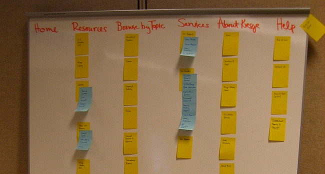
Here’s how the basic method works:
- Take a set of index cards or Post-It Notes) and write a term (e.g. name of the page, content) on each. Each card represents a (category) page on your website. If you’re an audio-video ecommerce site, you might write down things like “digital SLRs,” “Canon lenses,” or “DVD players.”
- Test subjects (representatives of your ideal customer whom you’ve recruited for this purpose) get a set of index cards with terms already written on them.
- You ask the first test subject to put the terms into logical groupings and create a category name for each grouping.
- This process is repeated with each test subject.
- After going through the exercise with all test participants, you analyze their output and look for patterns.
Here’s a great video explaining the concept in 3 minutes:
There are three main types of card sorting:
- Open-card sorting. This is where the test participants create their own names for the categories. It gives you insight into how your customers think and mentally classify items.
- Closed-card sorting. Participants are provided with a predetermined set of category names. Their goal is to assign the index cards to these fixed categories.
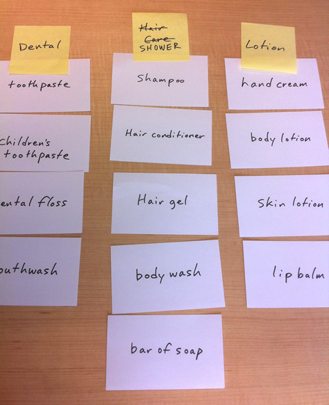
- Modified-Delphi method. This is different from the rest. Participants work one after another, refining a single model. The first test subject does a traditional open-card sort. Subsequent testers start with whatever the previous tester created. They can modify that organization (rename or restructure) or start over. You repeat the process until participants no longer make significant changes. The risk is that since anyone can start over, an outlier participant could compromise the whole study.
Here’s an example of the Modified-Delphi method in action (see the changed category name):
2. Tree testing (reverse card sorting)
Tree testing is where you create a menu structure (either yourself or based on other card-sorting outcomes), then let people find items from the menu. The goal of tree testing is to prove that your site structure will work – before you get into actual user interface design.
It is done on a simplified text version of your site structure—without the influence of navigation aids and visual design.
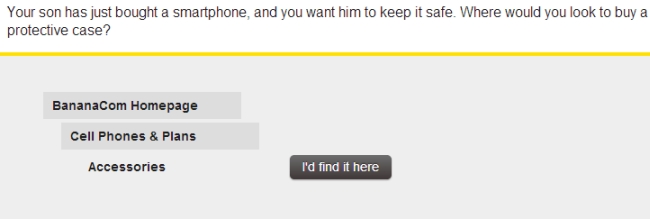
Example:
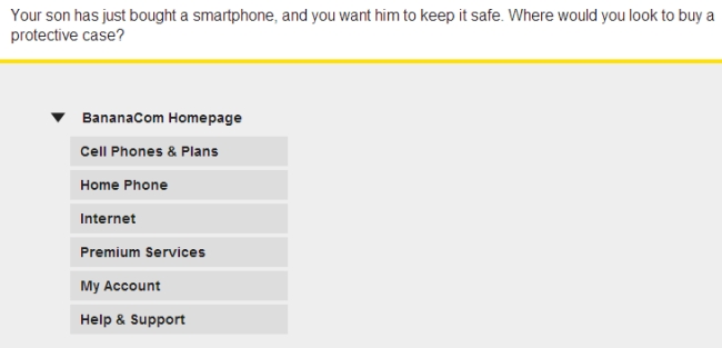
In this example, the user would navigate through the menu structure until they reach the place where they expect to find protective cases:
Reverse card sorting validates your menu structure assumptions (or offers feedback for re-arranging).
3. Online (remote) card sorting
You don’t have to conduct card sorting in person. Doing it online is cheaper, doesn’t require logistics planning, and can be done without geographical limitations.
You can’t be “there” to moderate it, although you could be having a Skype chat at the same time. A proper pre-education of test participants is a must. Some pros and cons of online card sorting are pointed out in this article.
The limitation of these online card-sorting tools is that they can’t be used with the Modified-Delphi method.
Online tools you can check out for this process include:
These tools will also help you analyze the results (as opposed to doing it 100% manually).
4. Analyzing card-sort results
Two questions often come up about results.
- What if half the people want to find Page X in Category Y, but the other half prefer Category Z? It’s okay to have the same link under two categories! If that helps people find the content they want, that’s the way to go.
- Do I just use the results as my site architecture? Not quite. You should use card-sorting results as a guide to organization and labeling. Don’t blindly use the results as your actual site structure. Your card-sort results can (and should be) supplemented with additional user research and task analysis.
As you design your navigation system, ask yourself, “What do the bulk of the visitors coming to my site want?” Ask a follow-up question, too: “What do I want my visitors to find easily?”
How many users should you test?
Tullis and Wood (authors of a prominent 2004 study) recommend testing 20–30 users for card sorting. However, based on his research, Jakob Nielsen recommends testing only 15 users (and 30 in big projects with lavish funding).
Testing with more people gives more insight, but there are diminishing returns. When testing past 15 users, the costs are often unjustified.
Further reading: Here’s a great guide to card sorting.
Guiding principles for website navigation design
Card sorting will help you figure out how to structure your menus. What about navigation menu design?
In good navigation design, links look clickable. They have clear labels that set expectations of what lies beneath. Unclear menu links cause click fear.
Take a look at the navigation menu I have up there. I’ve done a good amount of testing to find the perfect good-enough wording for those. (If some of those aren’t clear, let me know).
Here’s another one:

The menu items look like buttons, but I would argue that “learn more” and “order now” are pretty poor choices. What will I learn more about? What am I ordering?
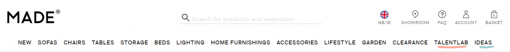
Provide consistent, reliable global navigation.Whichever links you have in your navigation menu and footer, keep them the same on every page of your site. Wherever you go on MADE, the top menu remains unchanged:
Where should you put the menu? Should the main menu be horizontal or vertical? While there’s a strong case against left-vertical menus, two studies (2003 and 2004) claim it’s better.
I say you should opt for a horizontal menu whenever possible, but go for the left vertical menu if you’ve got a ton of menu items (e.g. Amazon). This eye-tracking study says a top menu is easier to use, but there’s only so much space there.
If you do use vertical menus, make sure they’re aligned left. Right-aligned menus impede scannability.
Establish a clear hierarchy for global and local navigation. Almost all websites with more than one page have some sort of global navigation:

Then, there’s also local navigation (a sub-menu). Local navigation should appear below the global navigation. This is logical: The global menu is the main category, and local navigation is like a sub-category beneath it.
Local navigation links should be closest to where the user needs them. Content is first, but once the user is done reading the content, they’re going to reach for the local navigation before looking at the global navigation.
Similarly, if the page doesn’t have the content they’re looking for, the local navigation is the navigation they’ll look to first.
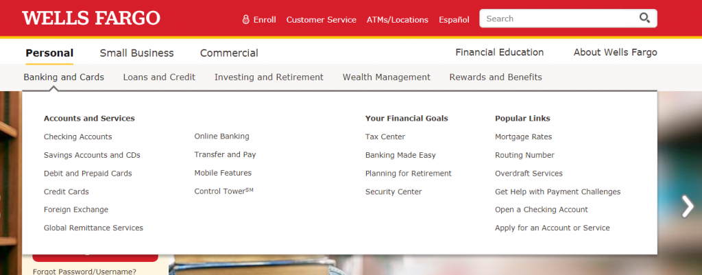
How many levels of navigation should you create? As many as you need—without driving users crazy. Some websites with a lot of content, like Wells Fargo, have four levels of content (sub-sub-sub-menus):
They feel that each level of navigation helps users zero in on their goals. Most websites have enough content for only two levels of navigation—the global navigation and one level of local navigation.
Tools to use to create your site’s information architecture
- Balsamiq Mockups. A great, fast wireframing tool. There’s almost zero learning to get going, and I love that it focuses on the big picture, not little design elements.
- Omnigraffle. The tool of choice for a lot of UX professionals. Diagrams, process charts, quick page layouts, website mock-ups, and more (Mac only).
- Microsoft Visio. Many people prefer it for diagramming and website architecture planning.
- MindJet MindManager. Mindmapping tool that’s also great for diagramming and sitemaps.
- LovelyCharts. A diagramming application that allows you to create diagrams of all kinds, such as flowcharts, sitemaps, wireframes and more.
Conclusion
People buy only what they can find. Studies show that websites are losing money because their navigation systems fail, and users can’t find the product they’re interested in.
I’ve seen the claim that “up to 50% of sales” are lost due to bad navigation, but I haven’t found the study confirming it. Nevertheless, good navigation is critical.
Information architecture works hand-in-hand with usability and conversions. If your website’s information architecture is good but your usability sucks, visitors will find what they’re looking for but struggle to complete the purchase flow.
If your information architecture is bad (even if your usability is good), most visitors won’t find what they’re looking for, leaving your site before entering the sales funnel.
Gettting the information architecture of your site right ensures a great user experience, which in turn leads to higher retention and more conversions.
Related Posts
-

Tommy evaluates Cheap Recipe Blog, and The Murray Group, an independent insurance agency out of Rochester…
-

Do you want to make your website better? There are many ways to optimize a…
-
In today's review I'm assessing whether websites in question could do anything to better get…
-
The easier your website is to use, the more people use it. An essential part…


Peep, as always, great article!
You should check your Re-Tweet Message as it is over 140 characters long for this article!
Yeah the title is kind of long… oh well :)
Awesome article Peep.
A quick question: if you’d need to use only one of those menu sorting techniques, which one would it be if the client is a SME with not a huge website?
If it’s at least 2-level menu with a bunch of links in sub-category, I’d use open card sorting.
Hi Peep
interesting article. I suspect the level of detail is beyond some of us but I recognise you’ve got a wide range of readers. I think the card sorting method is particularly helpful, something I’ve seen used in other non-website contexts (I’ve used it for classifying company values).
Regards
Angus
Yeah, I expected that too. The audience is a mix between agency people, freelancers and “client side” folk. Hopefully skipping stuff that’s less relevant is easy enough.
Not sure if you can delete this comment. Just wanted to point out that the name should be usabiliTEST and not UsabilitiTEST. Very thorough article! Thanks.
Fixed. I bet it happens all the time, uh?
No, not really. Have not seen that before, but there’s always a first time for anything, right? Thanks for fixing it.
This is a massive and very helpful article! I’m in the middle of changing the IA of my site, so this comes at just the right now. I’m going to visit and reread this article again along with the links you spread throughout. Awesome work – don’t stop!!
Thanks Mark!
Try and organize your website like a table of contents in a book. The most important thing to remember when writing web pages is to stay on topic. If page is about elephant toe nails, don’t talk about elephants, don’t talk about where they graze! The page should tell the visitor everything they ever wanted know about elephant toe nails, and answer any questions they have about the topic. Original content written from your personal view is the key. So research, research, research, then write! -whnme
Great post. I used to be checking constantly this blog and I’m inspired! Extremely useful info specifically the remaining phase :) I maintain such info a lot. I used to be looking for this particular information for a very lengthy time. Thanks and best of luck.
Hi, I am not an IT professional but am interested in website design as we are re-doing our website. I found your article to be very, very helpful and it is written in simple, layman’s language where any non-technical person, such as myself, can understand.
Appreciate it!
w.r.t validation of IA’s which of the sort methods metioned above would be best ? btw tree test and reverse card sort might be very close but they are bit different too ! When it comes to tree test, asking participant to find element X/Y/Z is stated but in reverse do we give such tasks ?
Quite possibly one of the best articles I’ve seen on this topic. I love that card sorting method – awesome!
GREAT info! Appreciate the knowledge. I’m sorta a newbie to the design side so this was very helpful.
Can you please help with my website structure. I think the way it is now certainly hurting my SEO efforts.
Some of the information here is hard for me to take in. I know its true that content precedes design, but for some reason every fiber of my being cares more about putting more effort into my design. Very informative article!
Peep, this article is exactly what I was looking for. Thank you! You’ve put a lot of work into it, and I’ll be returning to re-read and absorb and follow all the links.
Really appreciate this help. (Also, it was at the top of my Google search – “website architecture”. Congratulations!)
Glad it was useful!