Recently I critiqued a number of websites (links at the bottom of the post) and made suggestions for improving their conversion rates. I noticed that the key problems were pretty much the same for most of them. It’s highly likely your website suffers from the exact same problems.
Fix these issues and watch your conversion rate improve. Use the following as kind of a conversion improvement checklist.
Here are the 7 main mistakes I observed.
Table of contents
1. Missing or poor value proposition
This was by far the most common problem.
Listen – people don’t care about you and their attention span is shorter than a goldfish’s memory, so if they can’t get some crucial answers from your site right away, they will leave.
When a visitors comes to your site, they need answers and they need them quick. The first thing they read needs to provide answers to questions like ‘what is this site?’, ‘what can I do here?’ and ‘how is it useful to me?’.
Your value proposition needs to answer this question: Why should I buy from you and not the competition?
Compare yourself with the competition before they do
Do you have competition? Of course you do! And your customers know how to use Google. Before buying anything, most people will check out 4-5 different options. Hence compare yourself openly to your main competitors’ offers and state how you are better or different.
People are lazy. When comparing options, they usually only look at the most obvious things like price and key features. For example when choosing a web host they look at the server space and monthly fee and that’s it. You – as an expert in your field – know that many other things should be considered and perhaps your advantages are less noticeable at first.
When it’s you doing the comparison, you can point out the things you feel are your biggest advantages over the alternatives. If your product is more expensive than others, then this is your chance to explain why. If some of the specs are lower than the competition’s, point out that maybe your support is way better or you provide personal consulting or its more green or whatever.
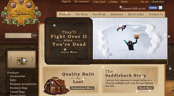
Example of a great value proposition
They’ll Fight Over It when You’re Dead
What a way to communicate that your product is desirable and lasts for a long time.
Do this:
- Go back to your site and see if you’re doing a good job explaining what you do and what’s in it for them (without having them to scroll, click or read something for more than 5 seconds).
- Check your Analytics data and identify the top 20 entry pages to your site. Make sure all of those pages contain a value proposition.
- State why they should buy from you and not the competition (how you’re better of different).
2. Vague bullshit
Way too many sites were overly vague about what they do and what they offer. Sometimes only an image was given the job of communicating what they do.
Always be as clear as possible. People don’t have the patience to play mind games with you, and vagueness doesn’t make you sound smarter.
Some actual examples
Our Point of Sale Systems Integrate Hardware, Software and Internet Social Media Marketing Into One Giant Revenue Super System.
Huh? Sounds like a bunch of over-hyped gibberish to me. Will I bother to invest another 5 minutes to figure it out? Nope.
Improve your dating skills
What’s a ‘dating skill’? If I improve this skill, what will I be able to do? Get more dates? Convert more dates into phase 2? Be a charming date? All of those things might be desirable, but I don’t think anyone tells their friend “man, I need to improve my dating skills!”. No – they’re specific! And you should be too.
A new way to share knowledge
Yelling at the top of your lungs at the city square? Gossiping in the sauna via Twitter? What is it? There are too many possibilities, and to figure it out, you need to think about it. Thinking is hard work, and most people don’t want to do it.
You CAN use a vague headline sometimes, provided there’s a detailed explanation in the following paragraph. But I recommend you phrase that vague thing to match the conversation in your prospects’ head (“I’m a loser. I need to get a date” -> “Get Tons of Dates Even If You Feel Like a Loser”)
Remember this: specific is attractive, specific is clear, specific is convincing. Don’t be vague, be specific.
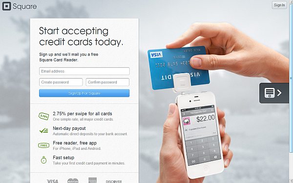
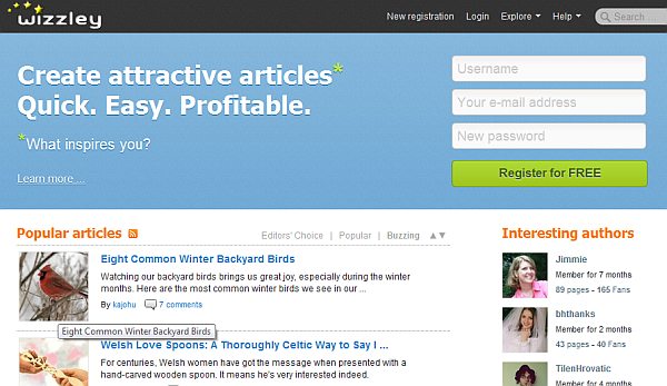
Here’s an example. Can you understand what they offer?
Specific headline. Specific call to action with a specific explanation of what they get when they sign up. Specific benefits listed. Specific image to show the product in action.
Do this:
- Read the texts on your site (especially the home page, product pages), and make the texts more specific. Find something vague, and make it more clear.
- Find a few strangers, have them look at your site for a short period of time and ask them to explain what you do.
- Your prospects are more interested in your headlines if they match the conversation in their head. Talk to your prospects and find out how they explain their #1 problem or challenge.
3. Lack of focus
Now that I am on your site, what is the one action you want me to take?
No, I will not invest my energy in going through everything on your site and making a calculated decision. If no option seems more important than the others, the easiest thing is to choose nothing. Too much choice leads to making no choice at all. If it’s not evident what one needs to do next, people won’t bother to figure it out.
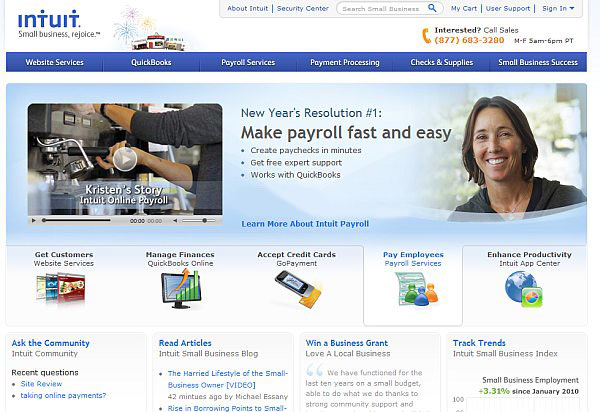
For instance, where would you click on this site?
It’s kind of hard, isnt it? Your eye starts to wonder around, you noticed all kinds of choices, many of them irrelevant to you.
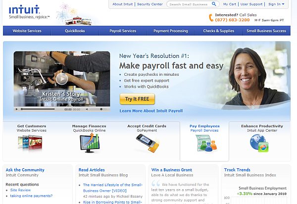
But what about this site, what’s the obvious choice here?
See how one single call to action can make a whole lot of difference?
Eliminate the paradox of choice and guide the user to the next logical step in their path.
If your site has a massive menu – and all of the options are of equal size – I will assume all of the items there are equally (un)important. Make the more important options stand out.
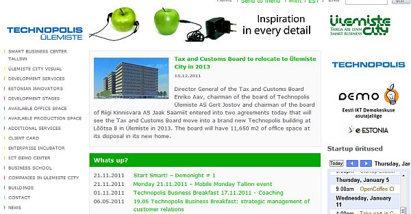
This is an example of an overcrowded menu:
If you have 16(!) items in your menu, in uniform style, you can be sure that no one clicks on those links.
Do this:
- Define a most wanted action for all of your main pages.
- Make sure that this one action stands out from the rest. If you want to provide a choice of actions, limit them to 3.
- Discriminate your menu options. Make the links that help the customer make a positive purchasing decision more prominent.
- Avoid huge menus.
4. Uninteresting lead magnet
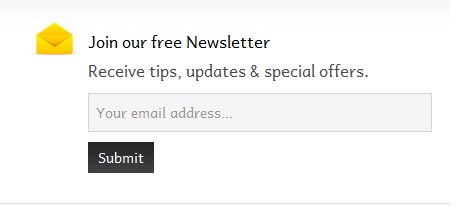
Join our FREE newsletter!
Email capture forms like this seem to be everywhere now (and haven’t come across a paid one yet). A call to action like this is fine, but you shouldn’t start out like that nor should that be the only text there is on your email capture form.
People don’t join your newsletter because it’s free. They won’t join it because you have one. They join it if they believe they gain something valuable from it and that giving you their email is a fair price to pay for it.
It’s a very important job to communicate the value that your prospects get by joining the email list. Start with the benefits, focus on communicating the value. The free part can just help you close the deal.
Don’t do (just) this:
The #1 conversion inhibitor of email capture forms is an unattractive lead magnet (the offer you make to get their email). If what you’re offering does not give them a virtual erection, you won’t get their email. Simple as that.
The truth is that you won’t know in advance which lead magnet will work the best. You will need to come up with 2-3 good magnets, and test them against each other.
The process I like to follow to come up with attractive lead magnets is this. I brainstorm on my own (taking into account what I know about the customers and their end goals), and I write down a bunch of ideas. I format them as headlines or value propositions (e.g. “21 ways to lose 10 pounds in 2 weeks”).
Scrap the crappy ones, select the best 6 to 10 ideas. I write them down and ask some of my current customers (who I know are my ideal customers) which article they’d most like to read from the list. Now you get some winners, and you can actually create those lead magnets (the actual content or whatever it is). Put them up on your site, and test them.
Do this:
- Craft a benefit-oriented headline for your email capture form and be specific about the value they will get.
- Analyze your lead magnet. Be critical. Is it really as good as it can be? Can you offer something that will rock the socks off your prospects? Sure you can.
- Read this post.
5. Inadequate evidence
You’re the best? Fastest? Millions of people love you? Top ranked company? Prove it to me!
Don’t use superlatives or make any claims without backing it up. Get a neutral 3rd party comment, analysis or study to back up your statements, or show me something I can believe.
Blendtec claims to have powerful blenders, and proves via Will It Blend? video series. You can be creative with how you present proof.
Customer satisfaction easiest to prove by using testimonials – BUT the testimonials need to be believable.
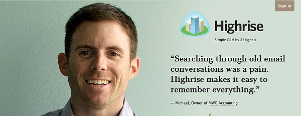
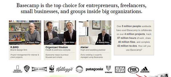
The worst kind is this: “I love it! J.K”. Nobody believes that or will take it seriously. First names or even full names are also not good enough. You have to at least use photos with your testimonials to make it work. Better yet – video testimonials (can’t fake those!).
Highrise uses huge customer photos:
Basecamp has videos, and logos people recognize:
Do this:
- Come up with a way to prove every claim you make.
- Add photos and videos to all the testimonials you have.
6. Asking for the sale too soon
I’m selling an office chair. It’s comfortable! Color: black. Buy now!
How many people would just hand me the money based on this information? Perhaps my mother, and only cause she feels sorry for me. People don’t buy anything without adequate information, yet so many businesses ask for a sale only after a couple of sentences.
Ready to sign up after reading these vague statements?
Didn’t think so!
The more complex or expensive the product, the more information I need to make a decision. The bigger the consequences of making a bad decision (have your spouse yell at you, become a laughing stock in your office, get fired, lose time and money etc), the more I want to be sure that this is the right thing for me.
If you ask for the purchase or sign-up too soon, you will lose them
In most cases it’s a good idea to direct them to reading more about your service or checking out a demo before asking for a commitment (signup, purchase etc).
Joshua Porter makes a good case for burying your signup or buy button. In one case a company removed the sign up call to action from the top of the homepage, and sign-ups increased 350%.
Do this:
- Think of the questions that are going through your customer’s mind while they’re on your site. Evaluate whether the content on the page does a great job of answering them. Guide them to the next logical step.
- Make sure enough information has been provided to the visitor before asking for the sale.
7. Not testing
Almost all of the websites in question did not have any testing set up. So pretty much they (or their designer) threw something together and … that was it.
Many keep their websites the same for years. Big mistake.
Let’s say you’re making $100,000 / yr off your website. 3 years = $300,000. But let’s imagine you had split tested a critical page and increased your sales by 20%. In 3 years, that would make $60,000 difference. That’s huge.
It’s not rare to improve your results way more than just 20%. You could be making double what you’re doing now if you only tested. You’re working so hard to boost your company’s income. Testing might be your shortest path to higher profits.
- It’s unlikely you will come up with the best headline or value proposition right off the bat. Test it.
- It’s improbable that your lead magnet cannot be any better. You need to test it.
- If you don’t test, you won’t know which changes make things better. Just eyeballing it is not enough.
Testing is not difficult nor time-consuming, and it can be the quickest way to increase your revenue or number of subscribers.
Do this:
- Start testing!
- Read this post on conversion optimization to learn how.
Related blog posts:
» 1st review post
» 2nd review post
» 3rd review post
» 4th review post



Another quality post. I agree with #6 a lot and think businesses would benefit much more if they split their sales funnel into multiple sections with each section being a value exchange with the customer. They need to slowly build the trust with the customer before they can go for the big close (obviously somewhat dependent on the product/service).