Back in 2013, Nielsen reported in its “Trust in Advertising” study that online banner ads are the least trusted form of advertising among consumers falling even behind traditional ads like in the newspapers or magazines. A few years later, Bannersnack reported that 54% of internet users don’t click on banner ads because they don’t trust them.
In fact, display ads have a click-through rate of just 0.05% (across all formats and placements). Certainly not encouraging.
This is due to many reasons, mainly:
- A lack of credibility;
- Ads that don’t meet expectations;
- Amateur ad design;
- Plain old ‘banner blindness.’
Table of contents
Banner blindness is largely due to the fact that most people read in a F-shaped pattern online:

And its implication:
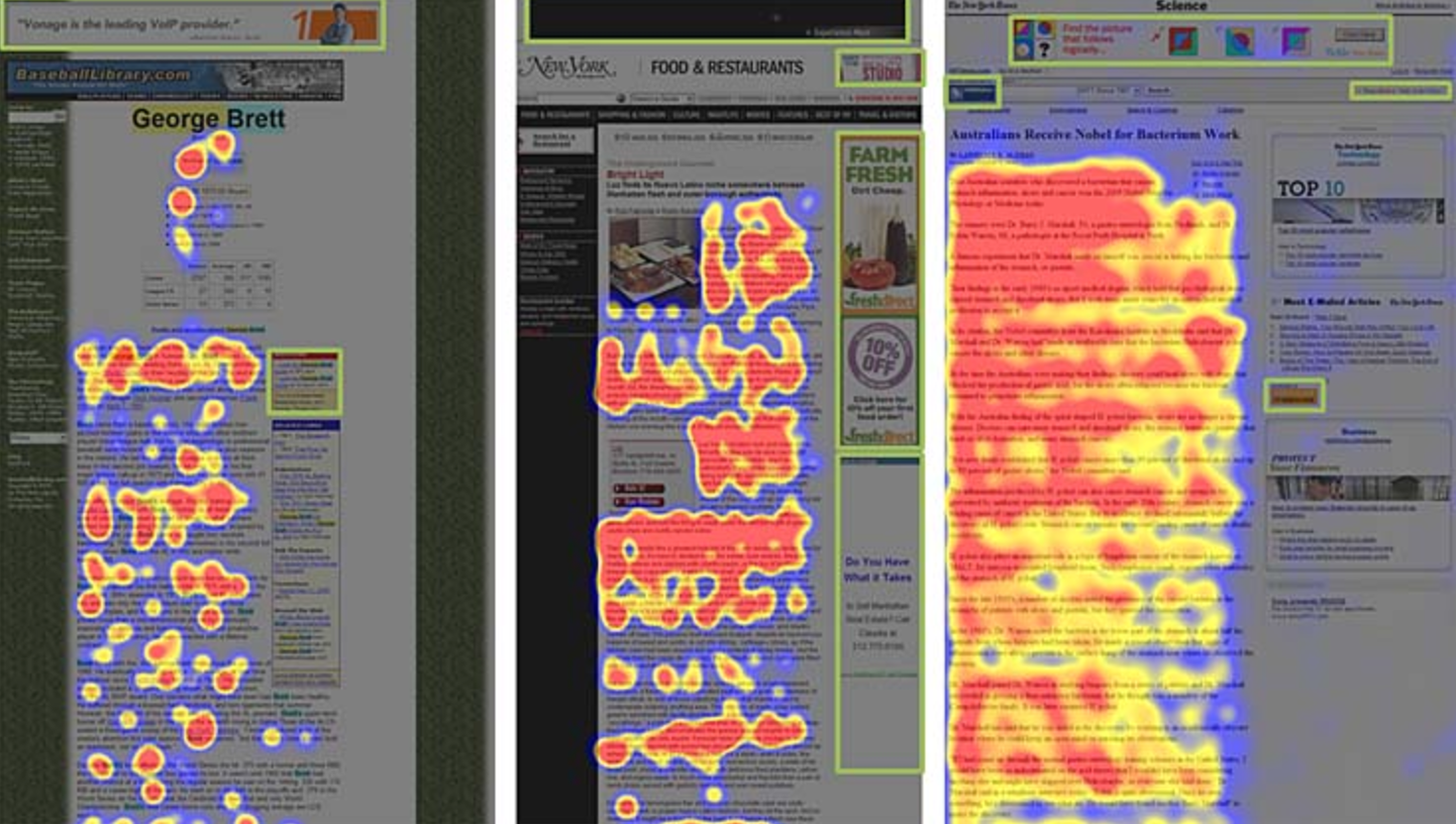
Yellow boxes mark the banner ad placements. The ads themselves vary from being either totally text ads, image ads or a combination of both.
Since users have learned to navigate the internet comfortably, they directly look for information in places on a web page where it is most likely to be. This is a result of our selective attention—an allocation of limited mental resources to the completion of a goal while avoiding distractions.
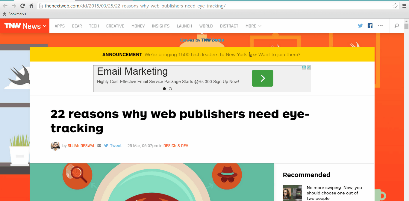
To counter this, marketers and web publishers are developing innovative ad formats. For example, TheNextWeb’s full page canvas ads:
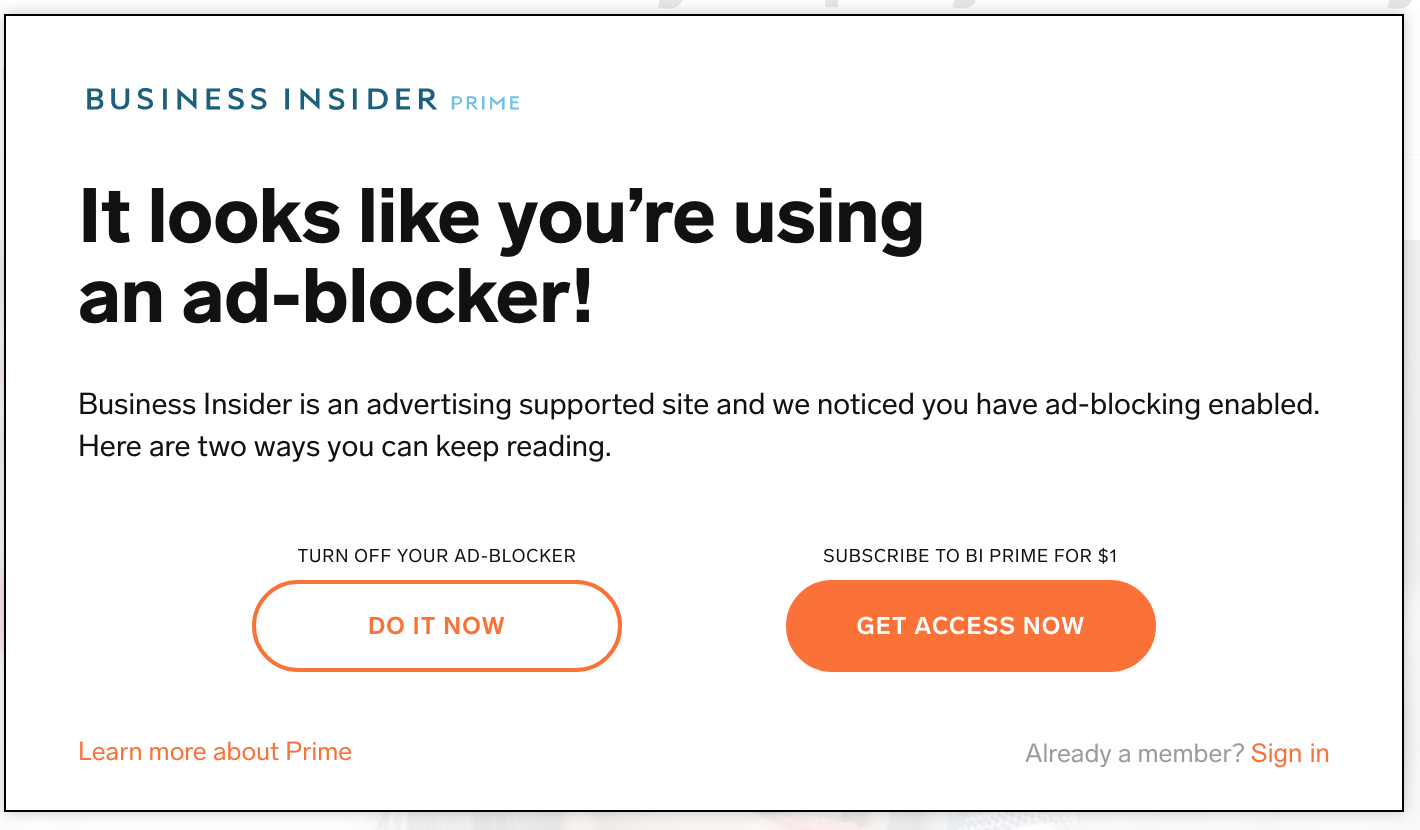
Or desperate measures like Business Insider asking you to turn off your ad-blocking software:
However, creating new ad formats might not be the optimal solution in the long run, at least according to Jakob Nielsen:
There is so much stimulus in the environment that for humans to survive they can only pay attention to the important things. If you get a new stimulus it takes a while before that system builds up again to automatically filter it out.
That is why when a new format comes out, you always see these initial press releases saying it has something like five times the click-through rate of normal banners. But you never see releases two years later saying the click-through rate has declined to the same level as other formats.
You could say that things are not going great for banner ads.
However, there are some time-tested techniques with which you can bump up the click-through rate. These techniques, listed below, are not a result of isolated incidents, but design principles based on psychology and usability.
Keeping this in mind, let’s get started.
1. Ad placement/positional changes
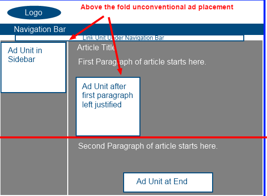
Since online users pay less attention to content on the far right side of a website —sometimes totally oblivious to it—a change in ad placement can help shock you into noticing them (and maybe clicking on them too).
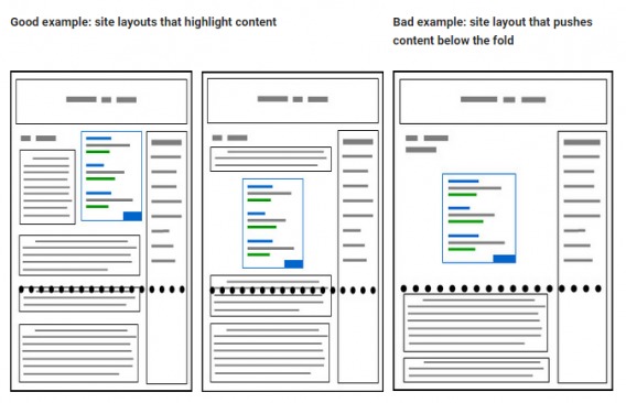
Google recommends that you place your banner ads above the fold and “show off your content.” Basically, that means that if the ad copy is relevant to the content, then there is a higher probability of the nearest ad being clicked.
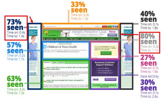
In addition, Infolinks found out that almost 86% of people didn’t recall the last display ad they saw. In such cases, try placing ads on the left hand side of the content. Like this:
When Infolinks ran a survey about which ad units were “seen” the most by users, using eye-tracking, they found that above the fold ads placed on the left hand side performed second best with a 73% visibility. First best were the ads near the top with 80% visibility.
NNGroup analyzed over 1.5 million eye-tracking fixations from hundreds of sites to understand how people read on the web. Here’s what they found:
- Users focus first on the information on top of the page.
- Second concentration area was left hand side of the page.
- Users tend to read the information instead of scanning it if the writing is of high quality. This also increases the likelihood of clicks on any relevant ads or call to action buttons in the page.
Dr. Flint McGlaughlin from MarketingExperiments ran some tests on designing better banner ads. One of the findings was that by simply moving an ad from the right side to the left side increased engagement by 74%. The experiment tested a “New Car Buying Guide” banner ad that led to the guide.
The control:
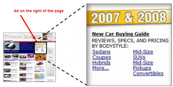
Treatment:
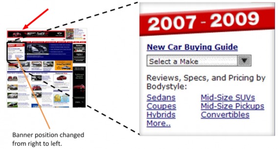
A side by side comparison:
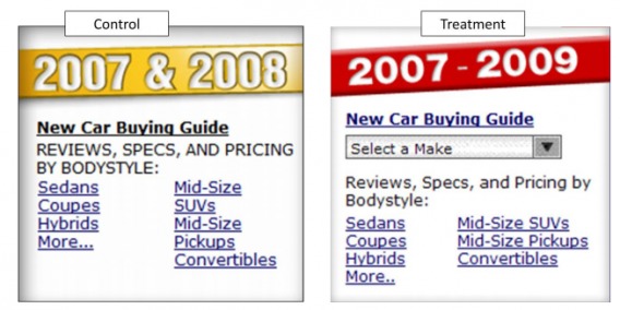
Dr. McGlaughlin had this to say about the experiment:
Let’s look at the two of them side by side with one critical difference, and that is, we move them right to the first step, so that it feels like the ad is doing more than scream for your attention. It is actually serving you by helping you self-identify and work through a process.
We have changed it from an ad to a utility, very important, and later, I would like to talk about how ads could become more useful, in fact, by changing many ads and so that they felt like, look like, and function like forms. We have seen dramatic increases in the response.
Mashable also found that banner ads on the top get the maximum attention, followed by left and then right.
Key takeaway #1:
Unconventional ad positions help generate clicks by standing out. They’ve got to complement the content too. The safest bet is to test various ad layouts. Start with the placing ads on the top and then the left hand side.
Note: If the ads that are being served on your website bear no relevance to its content, you’re just throwing impressions at the wall and hoping something sticks. An example:
2. Plain looking but bold design
A question on Quora asked, “Why do humans prefer simplicity over complexity?”
Adriana Heguy, Director of NYUMC Genome Technology Center and Professor of Pathology, answered:
There is also another positive aspect of simplicity: it is practical. You may achieve results faster if you reduce the problem to just a few variables instead of considering all the possible options.
Even with dealing with complex subjects, such as in the sciences, we still like to keep the variables to the minimum possible, and we add new variables only if strictly necessary.
Steve Jobs loved simplicity and his products reflected that. He attributed this characteristic to the architectural work of his childhood home by Joseph Eichler.
(Note: This claim was later disproven and it turns out Jobs’ childhood home was actually designed by another builder influenced by Eichler’s style.)
In a survey conducted by Ketchum, researchers found that three fourths of consumers around the world feel that the current technology is failing to make their lives simpler. They said it’s too complex and difficult to learn or use immediately.
Harvard Business Review found that the most reliable marketing tool to measure consumer engagement is a decision simplicity index:
A gauge of how easy it is for consumers to gather and understand (or navigate) information about a brand, how much they can trust the information they find, and how readily they can weigh their options. The easier a brand makes the purchase-decision journey, the higher its decision-simplicity score.
Why does simplicity work?
The underlying force behind the conclusions to the above two studies is a cognitive concept called processing fluency, which simply means how easy it if for someone to grasp information.
It’s either:
- High processing fluency (an individual has seamless interaction with their environment);
- Low processing fluency (too much information available and requires the use of analytical skills to solve it or take action on).
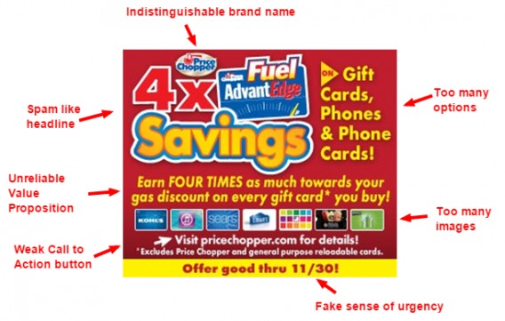
Web publishers generally make two mistakes in regards to simplicity with their ads:
- They populate their website with ads that are either too visually creative (difficult to consume instantly).
- They give too many options (information overload).
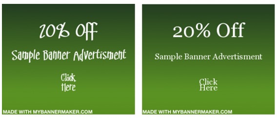
Below you’ll find two examples, one featuring traditional ad design and the other featuring a more modern robust design:
1.
2.
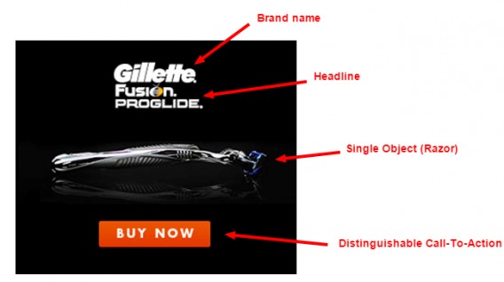
Here’s what Gillette did well:
- A single distinguishable call to action;
- A single headline;
- The company’s brand name;
- A single focal point or an eye-catching object.
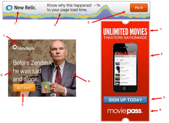
Here are more examples of some high CTR ads (you can find a few hundred more examples over at SmileyCat):
Key takeaway #2:
Add less information to your ad (visual and textual). Use a single object (image, CTA) and a concentration point (headline, copy) to drive the message home.
3. Typography can build trust
In 2012, writer and Film Maker Errol Morris conducted an interesting experiment in The New York Times disguised as a quiz titled “Are you a Pessimist or an Optimist?”
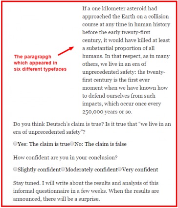
The purpose of this quiz was not to collect the participants’ opinion, but to find out if their decision and perception of the truth in a statement could be influenced by a change in font typeface. And sure enough it did.
Morris showed the quiz passage in six different typefaces: Baskerville, Computer Modern, Comic Sans, Georgia, Trebuchet, and Helvetica. Over 45,000 people took the test. If you’re curious, Baskerville won and had most people agree with the statement (Comic Sans was the most disliked and disagreed with).
Note: Although Morris is the first to admit that this technically was not an experiment because it wasn’t run in a controlled environment, the results are nevertheless fascinating.
Modern banner ads predominantly carry limited copy—powerful headline and a single call to action. So you’ve got an opportunity to build trust among your visitors with typography.
Terry L. Childers and Jeffrey Jass authored a study suggesting that the right typography (coupled with a brand’s established image) reinforces the brand values in the consumer’s mind.
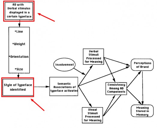
Based on two primary experiments, their study concluded:
Taken together, the results of the two experiments provide evidence that typefaces convey meanings that have the potential to significantly influence important marketing constructs. These associations influence how consumers perceive brands, as well as, what they remember about brands.
The first experiment demonstrated that typeface semantic associations significantly influenced the perceptions of advertised brands under both high and low involvement processing.
The second experiment demonstrated how typefaces interact with additional ad components, the ad picture and copy, to affect consumer brand memory. Memory for brand benefit information was superior when all three ad components were consistent.
When designing banner ads, it is important to understand that your focus is to get an emotional impact on the viewer, not just facilitate readability.
Gestalt psychology and banner ads
Gestalt psychology, first proposed by Berlin School of Experimental Psychology, has since spawned the Gestalt principles in web design.
Basically, the human brain first recognizes an object not by its specific parts, but as a whole. Our cognitive process leans towards understanding objects in their simplest form. Once the brain has processed that information (in one tenth of a second), it is then that it breaks the object down and notices its components.
So typography will complement the other components of the ad (design, headline copy, image, call to action, logo, etc.) to create a whole image in the mind of the viewer.
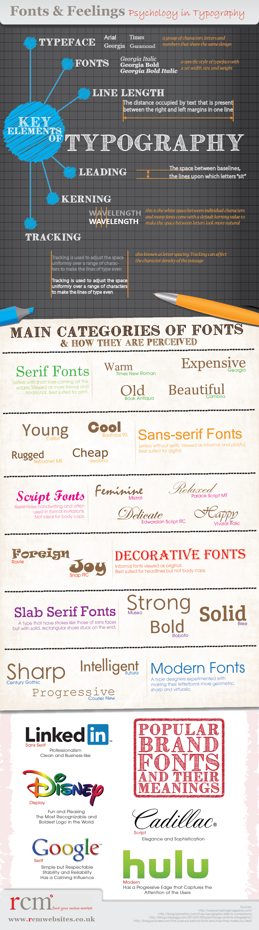
Below is a detailed infographic showing which fonts inspire what emotions. These are in no way the definitive set of fonts to use for your display ads, so I would recommend that you place your money on testing.
Key takeaway #3:
Typography does persuade users to take action. Put time and effort into testing which font and layout works best for your ads.
Further reading: The Effect of Typography On User Experience and Conversions
4. Use colors and size to make your ads stand out
As I mentioned earlier, part of the banner blindness problem is that readers completely fail to see the ads, let alone differentiate them from the content. This is why banner ads need to stand out from the rest of the site elements in order be easily spotted.
But your ads need to stand out in the right way. You cannot force or fool people into clicking on ads—it’s bad practice and your users will hate you for it. It will also render your data unreliable because you don’t know if the user actually intended to click on the ad or not.
Jakob Nielsen opened up about unethical design practices for getting clicks on ads in his article on banner blindness. He admits that the highest click through rates occur as a result of misleading design that imitates system or software components:
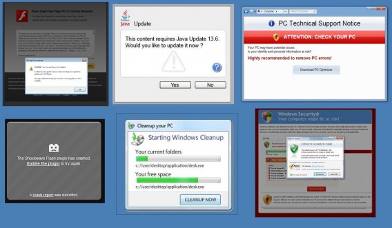
He writes:
I’ve been reluctant to discuss one of the findings from our eye tracking research because the conclusion is that unethical design pays off.
In 1997, I chose to suppress a similar finding: users tend to click on banner ads that look like dialog boxes, complete with fake OK and Cancel buttons. Of course, instead of being an actual system message—such as “Your internet connection is not pptimized”—the banner is just a picture of a dialog box, and clicking its close box doesn’t dismiss it, but rather takes users to the advertiser’s site. Deceptive, unethical, and #3 among the most-hated advertising techniques. Still, fake dialog boxes got many more clicks than regular banners, which users had already started to ignore in 1997.
With these in mind came the advance of native advertising. Native advertising is also important to the new age of advanced internet users who actually do want to click on display ads based on relevance and context.
So instead of telling you how to trick users into clicking, let’s talk about ethical changes you can make to your ads so they stand out.
1. Size
The advantage of having a bigger ad is that it puts the viewer in the line of least resistance. This means that readers don’t have to spend any working memory on differentiating an ad from the content or stay on guard against accidentally clicking on one.
A large ad is clearly and quickly noticeable, which helps the viewer’s brain move on to the next immediate decision; whether to interact with it or not. Larger size helps users actually see the ad.
Google published findings that suggest vertical ad units are the most viewable.
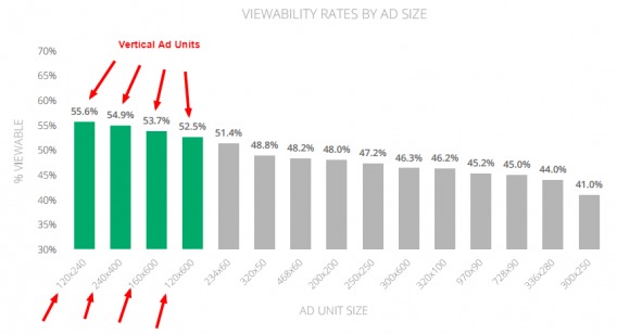
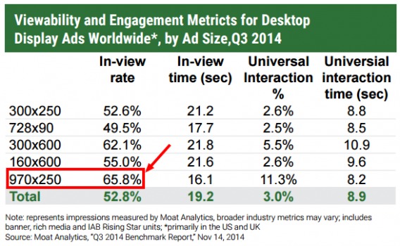
In addition, eMarketer reports that SaaS analytics company Moat Analytics found 970×250 ads, at 65.8%, had the highest in-view rates out of desktop display ads worldwide.
The above ad size recommendations still do not guarantee an increase in CTR because, as Google points out in its study:
Viewability varies significantly across content verticals, with the highest viewability belonging to sites associated with more captive engagement.
Therefore, instead of following best practices, choose an ad size that complements your page and then start testing.
2. Color
Research shows people remember words better due to typography or color.
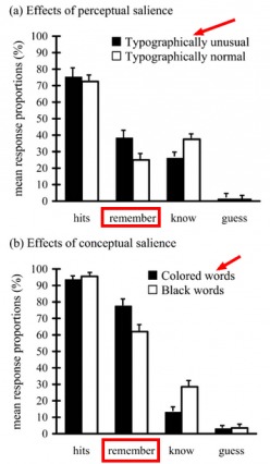
This is probably due to the Von Restorff effect (also known as isolation effect) which says that things that “stick out like a sore thumb” are more easily recalled than others.
That’s why designing ads with contrasting colors is effective. They can create an isolation effect in the ad design.
Color psychology (is it important?)
Now although studies have repeatedly proven the effect of certain colors on emotions after conducting experiments in highly controlled test environments, their results have failed to stay consistent in real life situations.
Which is why it makes for a better decision to design ads based first on principles (contrasting colors), and afterwards worry about specific emotions (e.g., blue is dependable, trustworthy; orange is friendly, cheerful).
I’ll explain this better by breaking down, in my opinion, a very well designed display ad:
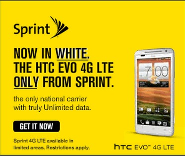
My opinions and observations:
- Contrasting colors used here are yellow and black (which, interestingly, are also implemented in the design of safety signs because, negatively—yellow represents alertness, awareness, safety and black represents caution, death, evil).
- In this particular case, yellow is being used positively to stand for youthfulness and fun; black is being used positively to show class, elegance, power.
- The ad uses yellow dominantly because it is targeting a youth demographic (98% of smartphone users in the United States are in the age group of 18-29). Sprint’s commercial for this campaign complements this insight (the models used are primarily young).
- Sprint’s company logo is also yellow in color, so choosing it as the dominant color in the ad makes sense because color increases brand recognition by up to 80%.
- All of the above helps in maintaining a uniform brand identity through multiple touchpoints (display ads, landing page, commercials, etc).
- A consistent design strategy like this spreads across a brand’s communication channels, evokes trust in consumers and makes it likelier that people will click through (as a result of the mere exposure effect).
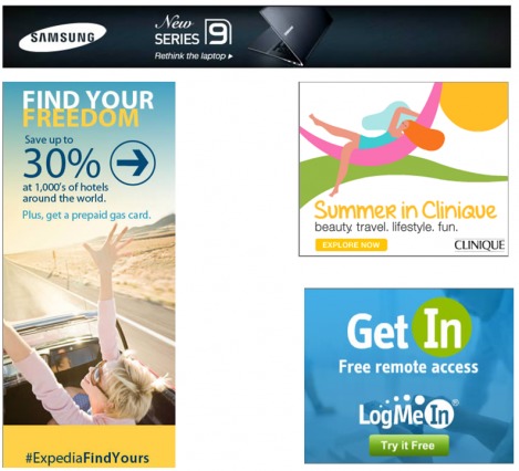
Here are some examples of similar high converting ads that have used color correctly:
Key takeaway #4:
In order to make your ads stand out without agitating your readers, try different sizes of ads (vertical ads are the most viewable) and contrasting colors in ad design.
Conclusion
The four principles to increase the click through rates on ads, summed up succinctly:
- Unconventional ad placement and layout can make your ads more noticeable and user interaction with them more likely.
- Don’t create information overload in your ad. Keep the design snappy by including only what is relevant (headline, image, copy) and a single reason to take action (one offer).
- Typography affects users’ emotions so spend some time to choose a couple that complement the other components of the ad and help with readability.
- To avoid banner blindness, use contrasting colors and vertical ad units.
- Testing beats guessing or plainly accepting ‘best practices.’ What is applicable generally may or may not necessarily work for you.
Is there a principle in here that has worked for you? Or you’d be interested to put to the test? Let me know in the comments below.
Related Posts
-

Single Keyword Ad Groups (SKAGs) are ad groups in Google Ads with just one keyword…
-
When deployed effectively, Facebook ads are among the most effective targeted marketing efforts in history.…
-
With Google processing over 70,000 searches every second and Facebook being a hub for 2.7 billion…
-
Having a well-thought-out plan for A/B testing Facebook ad campaigns is essential if you want to…


Banner ads have been popping up all over the web for years, as we observe and it can be a great digital marketing tool. Even though it is just simply a hyperlink built into a graphic, its value and usefulness in driving sales and traffic is great if used the appropriate size, design and kind of banner.
In this article, I’ve learned how banner ads work and how to make it more effective in the internet marketing world. The design and strategies in banners revolutionize every year to make it simple and more customer-friendly.
To wrap it up, there are tips and strategies shared here and every interested marketer can use it. Thanks for lending a hand. Very informative!
Glad it helped :)
Hey Sujan/Alex,
Banner ads has their best way of optimization. Luckily, these have been revealed in this post. The stats and numbers from authoritative sources shared here are tell a lot about what works and what will not.
I guess its time to get more practical to ensure we get the best from banner ads. Proper positioning especially above the fold readily leads to conversion, however, we can only achieve convertible banners if we carry on with constant and consistent testing!
I left the above comment in kingged.com as well
Hey Sujan,
Great article, thanks for the useful information!
What’s your opinion on the format of the banner when you compare static to animated (gif or flash) banners?