
Quick! How many CRO “best practices” can you name off of the top of your head? I’m willing to bet the number is quite high.
Best practices are merely common practices. That’s why in this post we’re putting another “tried and true” concept to the test, just like we did with social proof.
This time, let’s look at the space above the fold. How important is it to have your call to action above the fold? Is it true that no one scrolls below the fold?
Let’s find out.
Table of contents
What exactly is “above the fold”?
“Above the fold” refers to the content that displays on a site without needing to scroll. This concept originates from the world of print, as it was the upper half of the front page of the newspaper where the top story is typically placed.
The idea is that the story above the fold gets the most attention. While Sarah might not read the entire paper to find out what’s on page 8, she will likely read the front page story (or, at least, the headline).
The best practice states that your call to action must be above the fold because visitors do not typically scroll beyond the fold.
Let’s look at some examples of sites designed for the fold:
Now let’s look at some examples of sites completely ignoring the fold…
What the experts said
So, what have some of the top CRO experts said on the subject? Joanna Wiebe, Oli Gardner, and Brian Massey have all spoken out on the best practice…

Joanna Wiebe, Copy Hackers & Airstory:
“Don’t cram everything above the fold. Countless tests and scroll- / click-tracking studies have shown that visitors are willing to scroll… as long as they know there’s something to scroll down for. (So don’t create a false-bottom.)
Don’t prevent people from exploring your content by making assumptions about their use behaviors.” (via Copy Hackers)

Oli Gardner, Unbounce:
“Placing your CTA above the fold is the most common placement choice. However, this can be expecting too much of someone who has just arrived at your page.
A solution to this is to create a mini landing page experience that contains the critical elements of your page packaged up into a block of content above the fold.
Then, any supporting content can appear below for those who need to read it to be convinced of your page’s purpose.” (via The Unbounce Landing Page Course)

Brian Massey, Conversion Sciences:
“It is a best practice. So the most important parts of the page will usually do best above the fold.
Now the exception is when you’re bringing somebody to take action. So you’ll see the longer forms, sales letter and actually you’re going to see a lot of pages that are long form.
Home pages essentially acting as landing pages. And in these situations, it’s okay to save the call to action until you’ve made some key points.
So if you’re not well known, or if you’re in a new industry and you need to do a little bit of education first. You could test that, but in general we’ll see a bump if we can move that first call to action to the top.” (via Business of Software)
So, it would seem that the experts are in agreement: the fold really does matter, but as with most concepts in CRO, it is not an absolute.
What the data said
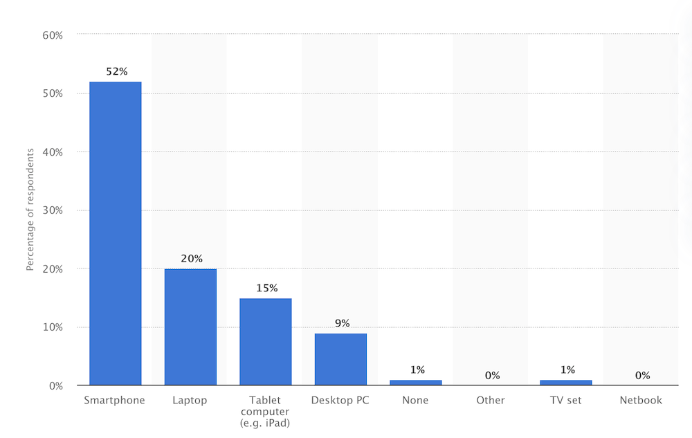
In 2014, Google released a study, The Importance of Being Seen: Viewability Insights for Digital Marketers and Publishers, that demonstrates the impact of the fold.
The study found that, with viewability defined as 50% of the ad’s pixels being on-screen for one second, ads just above the fold had 73% viewability, whereas ads just below the fold only had 44% viewability.
Nielsen Norman Group concluded that “what appears at the top of the page vs. what’s hidden will always influence the user experience—regardless of screen size.” In fact, they found that the average difference in how users treat info above vs. below the fold is 84%.
To summarize Nielsen Norman Group’s findings: “Users do scroll, but only if what’s above the fold is promising enough. What is visible on the page without requiring any action is what encourages us to scroll.”
Once again, the fold does matter. However, it matters because it sets the stage for future content and provides quality expectations, not because of some arbitrary, absolute rule.
When is “below the fold” ok?
So, the content above the fold is viewed more often (duh), but it seems that doesn’t necessarily mean that your call to action must, without a doubt, be above it. In what cases is “below the fold” acceptable?
The content above the fold has two tasks: clearly explain the value proposition and signal that there is more valuable content below the fold.
If your value proposition is crystal clear above the fold, put the call(s) to action where it makes the most logical sense.
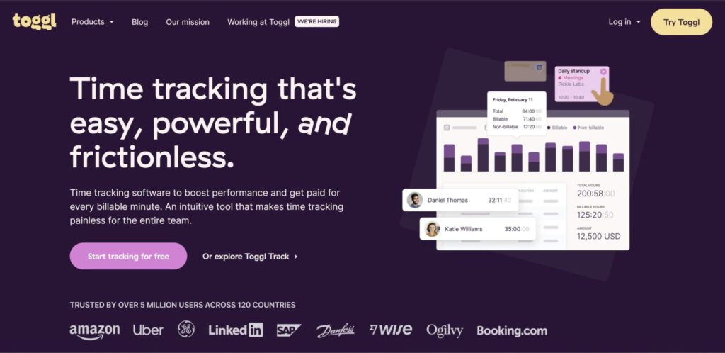
In some cases (e.g., Toggl and Optimizely), the one-line value proposition is clear (and convicing) enough to warrant an immediate ask (e.g., “Sign up”).
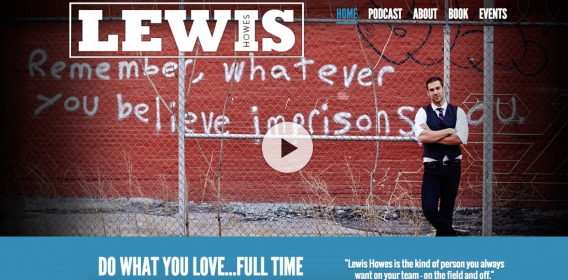
In other cases (e.g., Lewis Howes and Tiny Habits), more copy and creative is required to create a clear (and convincing) value proposition, meaning the ask will be delayed (i.e. below the fold).
Consider the fact that there are only three types of visitors landing on your site…
1. Certain visitors
These visitors are familiar with your brand, they know what you offer and they know it solves a problem they have. They’re going to convert no matter what. As long as you don’t go out of your way to hide your call to action, these visitors will find a way to convert.
It’s most convenient if the call to action is above the fold, but if it’s not, they’ll be willing to scroll to find it.
2. Uncertain visitors, simple value proposition
These visitors aren’t familiar with your brand or your product or service. They aren’t convinced that your product or service is the best solution to their problem yet.
Let’s say you have a simple value proposition, like Discord:

If your value proposition is simple and clearly articulated, it likely doesn’t require much elaboration. How many questions does “A place that makes it easy to talk every day and hang out more often.” raise?
Therefore, you can go ahead and place your call to action above the fold. It’s realistic that a new, uncertain visitor could be convinced and ready to download Discord without additional information.
3. Uncertain visitors, complicated value proposition
Similar to the previous group, these visitors aren’t familiar with your product or service and aren’t yet convinced that it’s the best solution to their problem.
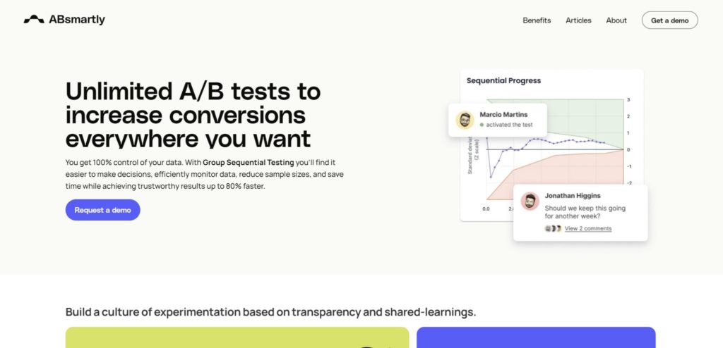
This time, let’s say you have a more complicated value proposition, like Salesforce’s Interaction Studio (previously Evergage):
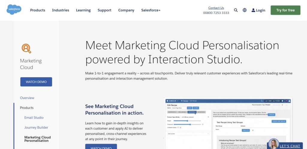
Fewer people are familiar with (and convinced of) the benefits of real-time personalization than the benefits of talking to friends and family around the world for free.
Now, that doesn’t make Interaction Studio’s value proposition less effective, but it does mean elaboration is required. A simple one-liner won’t suffice; visitors are bound to have questions about what real-time personalization is, how it works, how it can work for them, and so on.
Thus, placing an ask at the top of the page, above the fold, doesn’t make much sense. Visitors who are uncertain won’t be ready to take action just yet. They’ll need additional information.
Note the placement of Interaction Studio’s call to demos—it’s present on the sticky sidebar, but also repeats itself towards the middle of the homepage.

The average fold position
Technically speaking, the fold has become more complicated in recent years. First of all, we’re all using multiple devices.
With each device comes a unique screen size and resolution, meaning a unique fold position.
There’s also an easy way to view your site in multiple resolutions, just to ensure your content is being displayed correctly…
Step one: Open a Chrome window, right click and select “Inspect.”
Step two: Click the device icon in the top, left-hand corner of the “Inspect” window.
Step three: Choose a custom screen resolution or select a specific device from the dropdown menu.
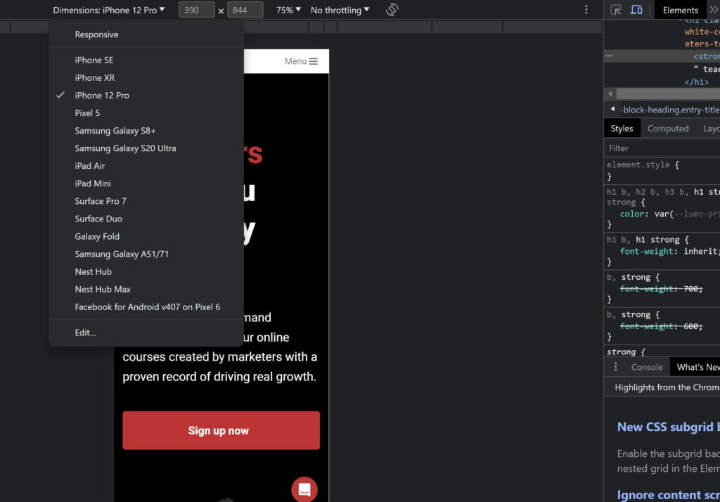
Using this simple process, you can view your fold position on the most common devices to ensure you have all of the necessary content displayed.
Be sure to check all of the devices. Just because you don’t use a Nexus or a Pixel phone, and neither do any of your friends, doesn’t mean your visitors don’t.
Speaking of your visitors, it’s worthwhile to identify what devices they use most often so that you can optimize your design and content efforts for those screen resolutions in particular. Here’s the simple two step process…
Step one: Open Google Analytics 4 and within “Reports”, select “User > Tech,” then “Overview.”
Step two: Below the main graphs, you’ll find “Users by Screen resolution.”
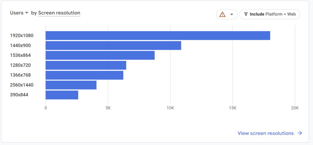
There you have it! And that’s just the top resolutions. There are dozens more, all of which need to be accounted for.
When do people stop scrolling?
So, we know it’s not the 90s anymore and that people can (and will) scroll down the page. But is there a limit? How far down the page do people scroll on average? Is there a section of your site that will get next to no attention?
Let’s look at the facts…
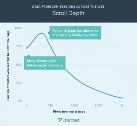
A few years ago, Huge found that regardless of design cues, almost everyone (91-100%) scrolled beyond the fold.
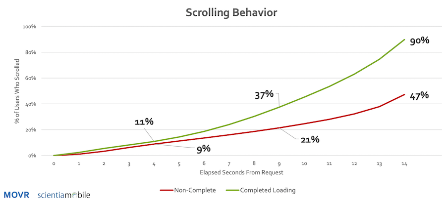
In a MOVR report, it was concluded that 11% of mobile users start scrolling within four seconds when the page has finished loading. If the page has not finished loading, then 9% have still scrolled within four seconds.
If the page loads slowly and takes more than nine seconds, 21% of people have still scrolled. Of the people who scrolled at nine seconds, over 50% of them have scrolled down over 250 pixels.
Note: This means if your mobile site loads slowly, your above the fold content will actually be bypassed.
Tony Haile, CEO of Chartbeat, shared some interesting data with Time Magazine earlier this year. His team has found that 66% of attention on a normal media page is spent below the fold. Here’s the heatmap he shared…
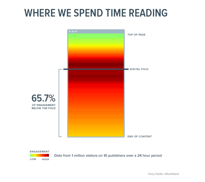
There’s very little engagement at the top of the page, likely because we’re conditioned to know that only branding and navigational cues are located there. Engagement, according to Chartbeat’s research, is highest just above and just below the fold.
In summary, your visitors decide whether your value proposition is interesting to them quite quickly and then begin scrolling until they have enough information to take a next step (e.g., bounce, move to a new page, or convert).
Michael Aagaard is just one expert who has experimented with calls to action below the fold…
“So we all know the golden rule that your call-to-action should always be positioned above the fold. Well, let’s bust that myth right away with this example from a test I ran on a B2C landing page,” he wrote.
In the example, he placed the call to action at the bottom of a very long landing page and conversions increased 304%.
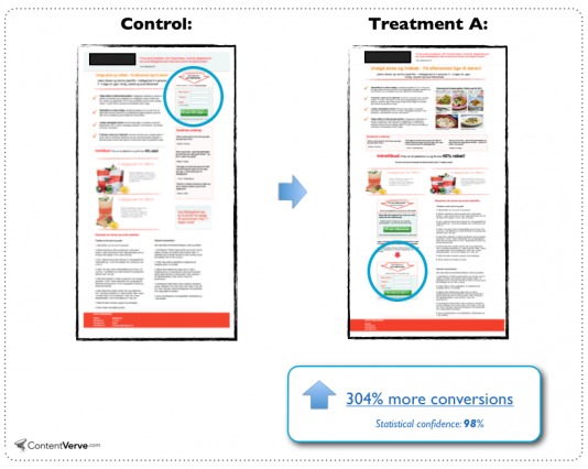
“There are several other things going on in the treatment. So the whole lift can’t be ascribed entirely to moving the CTA below the fold,” Michael notes.
“However, the fact remains that the treatment with the CTA way below the fold outperformed the control variant—something that simply shouldn’t be possible if you subscribe to the best practice rule that the CTA should always be above the fold in order to convert.”
Note that this is just one example to show that best practices are fallible and visitors do scroll. You shouldn’t assume that moving your call to action below the fold will increase conversions over 300%… or at all.
As with all things in CRO, you’ll have to test it for yourself and your audience. The takeaway here is to not be afraid of experimenting below the fold because the idea that visitors don’t scroll is a myth.
How to encourage scrolling
Most people will scroll on your page regardless of design or copy cues, but there are a few things you can do to marginally improve your scroll rate.
1. Craft compelling content
How do you ensure visitors want to read the content below your fold? Make the content above the fold awesome.
Sounds simple, right? There’s little replacement for just crafting genuinely compelling content.
Remember, what’s above the fold is what encourages your visitors to venture below it, so make your case compelling.
2. Avoid false bottoms
Remember the false bottoms we mentioned earlier? These are everywhere…

Check those examples from some startups that have been featured on AngelList in the past.
When you have a false bottom, you don’t give visitors a reason to believe there is something below the fold. As a result, they will attempt to scroll less often.
Avoiding a false bottom is pretty easy…
3. Ask them to scroll
Sometimes, the best way to get someone to scroll is simply to tell them to scroll. Consider subtle directional cues…


And not-so-subtle directional cues…
It’s whatever you can do to make scrolling the obvious choice.
Conclusion
So, let’s get back to the original question: is above the fold really that important? Without a doubt, the answer is yes. However, the reasons why it is important are a little different than the best practice would have you believe.
The content above the fold…
- Sets the stage for future content. Is this product or service interesting? Is there more content?
- Sets a quality expectation. Is it worth reading? Will it be helpful to me?
Everything above the fold helps your visitors decide whether your site is worth reading at all. [Tweet it!]
Here’s what you need to remember about this particular best practice:
- Put your most compelling content above the fold. What makes your product or service interesting and valuable?
- Most people can and do scroll. Don’t be afraid to put content and even calls to action below the fold.
- You can encourage visitors to scroll by avoiding false bottoms and making it obvious that there is more content below the fold.
- Understand the certainty of your visitors and the complexity of your value proposition. Don’t go straight for the ask if your visitors need more information to make a decision.
- Use Google Analytics to find out what screen resolutions your visitors use most often. Design for those resolutions (and check on all of the other resolutions using Chrome).
- Different devices and screen sizes make it difficult to name an average fold position, but here at CXL, we use 600-700 pixels as a guideline.
- Experiment for yourself. There’s weight to this best practice, but nothing is ever absolute in CRO. Test different call to action positions, test different content above the fold. You might just surprise yourself.
Related Posts
-
Do you know who is Ira Glass? You better. He's the host and producer of…
-

In this post I'm reviewing 5 websites, analyzing their home pages - and mostly their…
-
You have an opt-in form on your site and somebody filled it in. Hooray! You…
-
In today's review I'm reviewing 2 different ecommerce product pages. Watch this 5-minute review: Pages…


CRO? What does that mean? I Google’d it, no go, then had to figure out where I left off (it grabbed my attention not at the top, but further down).
IF you ONLY want ppl in a specific field to read and put into practice your great advice, fine. If you really want to reach out to many sincere ppl who happen to not know is “CRO,” the DO NOT USE ACRONYMS.
You write about growing our audience. Well, that applies to people offering advice. CRO? Should I really have to search your site or Google to read your articles? :-(
Hey Jenny,
It is pretty tough to balance explaining the acronyms, vs not. I don’t want to see it explained in every article. You wouldn’t either, once you were familiar with the term. But, there isn’t a right answer here. It is a preference, just as if you like red, and I like blue. But this IS a website about conversion. The chances are, that if you don’t know the lingo, you will be googling quite a bit.
Shanelle: Good food for thought in this article. Thanks.
Thanks for jumping in to explain and also for the kind words. I appreciate it!
CRO = Conversion Rate Optimization I believe
You got it, Tom!
Ah, looking up “CRO” acryonym: Conversion Rate Optimization. TOO hard to mention it at the top for ppl who don’t live in the same space as you?
PS this is GREAT! I had no idea I could preview my site using Inspect Element. Yes, I use Inspect Element all the time when modifying WordPress themes. Woot. Very cool.
Back to reading this … RCO: Collection and Recycling Organization, Check Requisition Order, Customer Resolution Officer … :-)
First of all, thanks for reading, Jenny! I’m so glad you stumbled upon the post and found it helpful.
Since our blog is CRO-focused and we offer in-depth content, it would be quite repetitive for our regular readers if we defined the term in every article (as JC said).
But I do understand where you’re coming from. To learn more about CRO, you might like…
https://cxl.com/5-key-lessons-ive-learned-editor-conversionxl/
https://cxl.com/surprising-conversion-rate-optimization-case-studies/
https://cxl.com/your-design-sucks-copy-continuous-optimization/
Thanks again, Jenny! I really appreciate it.
Great article Shanelle Mullin.
I slightly disagree on the skype part.
For someone who uses skype regularly, it might be obvious. I once tried my father to install skype and he had loads of questions.
The above the fold does not do clarify enough and could even be misleading to non tech savvy people.
How are the calls made? Over the cellular network or internet? Who pays for the data plan if it’s free? Can I also use cellular networks for calls? Is it free for all calls?
Where it can get tricky is if someone who is not familiar with the world of internet apps land on this page. It doesn’t clearly state that the calls are routed through the internet, you need a paid plan for calling mobiles and landlines, and requires compatible hardware.
Thanks Adarsh!
Ah, well, it might be the curse of knowledge. I tried to think of a site my mom, who is as untechnical as they come, was able to understand and navigate herself. Skype was the first one that came to mind.
What example would you have used for #2? Know of any sites with dead simple value props?
Hey Shanelle,
I guess I know little about the impact of above the fold for CTA. The findings of Nielsen is revealing and this forms my best takeaway from this post:
Above the fold is important but it must be created in away that enable visitors get satisfaction whether they scroll down or not!
This post was left in kingged.com as well
Absolutely! Above the fold is important, but that doesn’t mean we have to cram everything up there “just because”. You hit the nail on the head.
Thanks for reading!
A simpler way to work
Dropbox lets you work the way you want, wherever you are, with anyone you choose
Just wanted to thank you for this great article, it’s really, really good. Insta saved it to evernote in case this website ever goes down ;)
I have one thing to mention, and thats the value prop for dropbox.
“A simpler way to work”
Dropbox lets you work the way you want, wherever you are, with anyone you choose
I’m missing some info here. What kind of service do they offer? (It stores all your files) And maybe what it specifically does. IMO, regarding that most people that actually end up on dropbox’ homepage are certainly not the young people where everyone basically knows what dropbox is and want to just proceed to the download. of the client or login.
What do you think?
Thanks Manuel. I really appreciate the kind words.
I see what you’re saying here. I think that applies to the other example given for “Craft Compelling Content” as well.
In both cases, you might not immediately know everything there is to know about the product / service, but the above the fold content is intriguing enough that I am compelled to scroll down.
OK, I actually thought there is nothing to scroll on the Dropbox website. I just checked it, and they actually describe it all above the fold (on a 1080p monitor, there are two boxes of text visible, and the second one actually really explains that you can store your data etc., while the first one gets your attention).
So well done Dropbox. :)
Ah, understood. Thanks for reading! :)