
I’m sure you’ve come across dozens, if not hundreds, of image carousels or sliders (also called “rotating offers”). You might even like them. But the truth is that they’re conversion killers.
So if image carousels aren’t effective, why do people use them? Two reasons:
- Some people think they’re cool. But “cool” doesn’t make you money—at least not this way.
- Different departments and managers want to get their message on the homepage. Web design by committee never fails to fail.
Table of contents
Should you use image carousels and sliders?
Let’s get straight to the point: in 2023, you shouldn’t be using sliders and carousels on your site, and should replace them with static images instead.
This is supported by pretty much any conversion optimization expert that does a lot of tests:
We have tested rotating offers many times and have found it to be a poor way of presenting home page content.
Chris Goward, Wider Funnel
Jakob Nielsen (yes, the usability guru) confirms this in tests. They ran a usability study where they gave users the following task: “Does Siemens have any special deals on washing machines?”
The information was on the most prominent slide, but the users didn’t see it—totally hit by banner blindness. Nielsen concluded that image carousels get ignored.
Notre Dame University tested it, too. Only the first slide got some action (1%!). Other slides hardly got clicked on at all. Are 1% of clicks worth it for something that takes up (more than) half the page?
Rotating banners are absolutely evil and should be removed immediately.
Tim Ash, Site Tuners
Product design guru Luke Wroblweski summed it up like this:
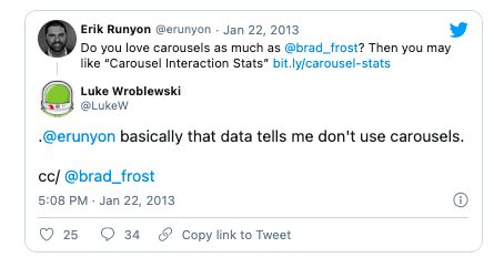
There was a discussion about image carousels on User Experience Stack Exchange as well. Here are some of the things people who tested them said:
Almost all of the testing I’ve managed has proven content delivered via carousels to be missed by users. Few interact with them and many comment that they look like adverts and so we’ve witnessed the banner blindness concept in full effect.
In terms of space saving and content promotion a lot of competing messages get delivered in a single position that can lead to focus being lost.
Adam Fellows
Carousels are effective at being able to tell people in Marketing/Senior Management that their latest idea is now on the Home Page.
They are next to useless for users and often “skipped” because they look like advertisements. Hence they are a good technique for getting useless information on a Home Page (see first sentence of this post).
In summary, use them to put content that users will ignore on your Home Page. Or, if you prefer, don’t use them. Ever.
btw these views are not my own, but are based upon observing thousands of tests with users.
Lee Duddell
In all the testing I have done, home page carousels are completely ineffective.For one, anything beyond the initial view has a huge decrease in visitor interaction. And two, the chances that the information being displayed in the carousel matches what the visitor is looking for is slim. So in that case the carousel becomes a very large banner that gets ignored. In test after test the first thing the visitor does when coming to a page with a large carousel is scroll right past it and start looking for triggers that will move them forward with their task.
Craig Kistler
Here are two main reasons why carousels and sliders don’t work.
Reason #1: The human eye reacts to movement (and will miss the important stuff).
Our brains have three layers. The oldest part is the one we share with reptiles. It’s mostly concerned about survival. A sudden change on the horizon could be a matter of life and death.
Hence, the human eye reacts to movement—including constantly moving image sliders and carousels.

That’s good, right? Not exactly.
Unless the image slider is the only thing on your website (bad idea!), it’s not a good thing. The slider takes attention away from everything else—the stuff that actually matters, like your value proposition, the content of your site, products, etc.
Reason #2: Too many messages equals no message.
Image carousels fall victim to banner blindness, and most people won’t pay attention to them, but even those who do can’t really get the message.
A visitor lands on your site. They see a message on the carousel and start reading: “This fall you get to…” Bam! Gone. Often, the carousels move so fast that people can’t finish reading them, even if they want to.
Focusing on a primary message and action is always more effective.
The user needs to be in control.
Carousels often have terrible usability They move automatically (often too quickly) and have small, if any, navigation icons. A key rule of user interface design is that users need to be in control.
These days, so many ecommerce sites use rotating offers, not because they tested it but due to herd mentality—”Other sites have it, so we should, too.”
Here’s Forever21, guilty as charged. They rotate between three offers that change every four seconds:
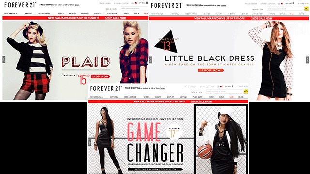
If the very first offer people see is not what they like (i.e. not relevant), then what? What if they don’t like any of the three? That’s not going to improve your customer lifetime value.
To their credit, once you touch the slider arrows, the automatic rotation stops. Not only that, but when you come back to their site at a later time, it opens up the slide that you wanted to see. (Since this article was first written, they’ve ditched the slider altogether.)
I recommend that instead you have a single, static offer. Here’s J.J. Buckley with a static offer—a focus on a single message so that it gets delivered:

(They’ve since switched to an auto-play video. Go figure.)
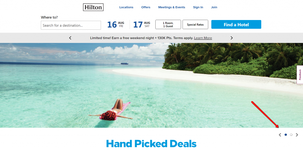
Some former carousel users, like Adobe, Gap, and Hilton, have also switched to static messages.
Adobe:

Gap:

Notice that Hilton has an image slider, but it does not move automatically. If you’re gonna do it, that’s the way to go:
Conclusion
If you can, avoid them. Don’t follow the (waning) fad. Follow the money instead.
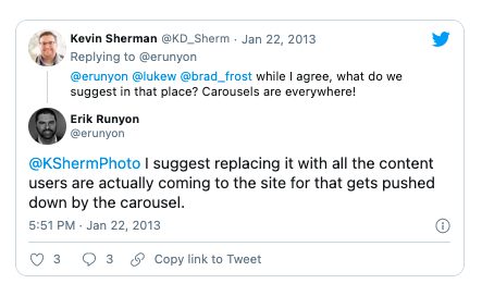
Still, as Brad Frost acknowledged, “Even though carousels aren’t that effective, I somehow don’t think they’re going away any time soon.” Frost wrote this piece on how to make the carousel work better.
If you can ditch your image slider, either use static images or do this:
What’s your experience with image carousels—both as a website owner and a user?
Working on something related to this? Post a comment in the CXL community!
Related Posts
-

The design of your website is more important for conversions than you think. First impressions…
-

Back in 2013, Nielsen reported in its “Trust in Advertising” study that online banner ads…


Peep
I’m a huge fan of sliders but I get your point, because for the simple fact that sliders do move fast; and yes I have gotten to sites while reading whats on the slider boom the content slides away and I would get annoyed.
all these reasons yep sliders definitely can mess up your conversion, but they look good and fancy nonetheless
So the question one needs to ask is “do you want more $$$” or “more fancy looks” ;) Your site can look good without sliders as well, there are plenty around – I’ve seen them myself!
Peep
yes I agree LOL We all definitely need more cash$$$ man. Cash over slider
Or… could sliders be used to give an overview of content. Not everything is a conversion point – sometimes impressions and journey is important. A consideration.
I think on editorial sites… Sliders may have a role to play, in any other context they are the devils spawn and should be avoided at all costs… If you have to dilute your message with a slider… You need to rethink and consider the fact that your message is weak… Have the confidence to stand outside of the shadow cast by JS tech and work on your copy/design and proposition… Failing that you will FAIL!!
I think one aspect of sliders that is being missed in this article is the trend of using them for touch devices. I’m starting to see full screen sliders that lend themselves nicely to being browsed with tablets.
My experience has been the exact opposite. Sliders, especially full screen ones, often run horrendously on my Nexus 7. And a friend of mine complained to me just last week that she couldn’t access a product on the second full-screen slide of the Puma site, because it didn’t work with her iPad. Often this is because they don’t support swiping or the Javascript is not coded with mobile browser support in mind.
Okay, I have learned my lesson. I have been a proponent of the carousels and have been implementing them in as many places as possible. I figured users want something interesting to see when they first visit a site. I guess I’ll have to reevaluate my life.
Sliders are a 1 trick pony. Non-technical clients use a lot of paper. The web can do more than paper. Fatal mistake #1: using hideous, tasteless, unusable sliders just to shock and awe people who don’t know much about interactive design.
The first slider I saw was a novelty for about 5 seconds. After seeing another 1000 or so, every slider I see now reminds me “this site is either a cheap, generic ThemeForest template or an amateur job”.
Grandma finds the internet:
Day 1: “Oh, wow, it’s like paper, but everything is moving around. Think of the possibilities.”
Day 3: “Fcuk these goddamn sliders. It’s my screen motherf*cker! I get to say what moves and what doesn’t.”
Omg I’m cracking up laughing at your comment! So so true..
Some people aren’t using them for sales. They are also being used for digital portfolios, which is nice because it avoids scrolling all over. I would avoid saying “DONT USE THEM” in all situations, as there are some that do apply. Portfolio? YES! Sales? Not so much.
I disagree. I used to use sliders until I studied the metrics. I think a grid of thumbs if far more effective to show a portfolio than a carousel. While carousels seem like a logical width to use, people just don’t use them.
Sliders are fancy “eye candy”, but when done right do drive traffic to your offers.
You can have some fun with 1 image. 1 product. 1 Value proposition. What’s the best seller. Put it there. Running a special just run 1 special. I think the overall idea too is that you don’t have to slam people with so many options. People always think that they have to do EVERY freaking thing for their site to be successful. Not the case. Just do the simple things and split test the mess out of it.
I’ve heatmapped our home page many times, and over and over again what we find is that users have a complete blind spot about the sliders – no matter what we put there. The links in the footer get more click action than the sliders. I’ve tried to convince the rest of the marketing department of this fact, but nobody really knows what else we should put there.
To me the answer is obvious: put the content our visitors really want to see there. The problem with this answer is: nobody really knows what our visitors want to see, because we have so many different kinds of content, and so many different kinds of visitors. It’s a real challenge.
This is quite an interesting post and I agree on your points.
Thinking a bit about sliders the following came to my mind:
– Sliders are in fact a good way to plenty of content in a small space.
– The automatic animation leads to banner blindness.
What if we would use sliders and get rid of the automatic animation and implement a useful navigation (arrow buttons) instead?
Users won’t be irritated through animation, but are still in control to browse through the offers in the carousel. Of course, the content should be prioritized for that!
I think, this could be a nice solution…
If you are going to go down that route, clickable carousel is the way. However if the message on the slider are of any importance, why hide them several clicks away? Show the slide content right up front (without using the slider) for improved usability.
People already scroll your site. While introduce a new navigation paradigm? Mom and Pop customers know how to scroll. They’re probably afraid of breaking a carousel. Even web veterans probably want to get their goddamn moneys worth out of their scroll-wheel.
Exception: tablets and phones — scrolling horizontally on touch devices is nearly as natural as scrolling vertically.
I am a graphic designer-entrepreneur. And I love sliders/carousels because that’s what turns a boring, text-busy pages into something sexy and interesting. That people can’t use my pages on smart-phones, is definitely a dampener to this cool concept. What we need to do is put more thoughtful execution into redefining this cool concept and make it useful. My two cents…
You can’t make a silk purse from a sow’s ear.
They’re not cool, interesting, good or fancy.
They are distracting not only in themselves, they distract the reader away from the other content on the page.
Do your research and don’t use them.
You’re not a designer-entrepreneur. You’re an idiot, if you think that adding a distraction makes something more usable.
It may be that your clients are the people buying web design services rather than end-users. In that case, they might go for a flashy look and you’ve got a quick sale. Well done – fleece them fast, because they won’t be trading for long.
What if your website is to display a photography portfolio, etc? Wedding photographers. Cake decorators. Fashion design portfolio, etc…? When you don’t have any info to attach and it’s just a large group of photos? Are they still bad?
I’ve also always disliked these featured image sliders. I think they’re messy and confusing. I like the way that Pat Flynn has the “Start Here” link which makes it super simple for the user.
Yeah, he’s not using an image slider, so the message he wants to pass on is right there.
i agree, i’ve been a fan of sliders, i’ve implemented them for portfolios but does really suck at conversions, i remember one time that the client want the sliders, headline, signup form and video all above the fold.
It’s often the case that the clients don’t really know the HOW when it comes to achieving their goals online. That’s why it’s far better to ask them the end result, and then use an evidence-based approach to getting it.
@Peep, this is a great response. Clients very often do not know what or how they want their website to do. It is up to use the “web professional” to advise the clients on the best route to take, then split test and show them the numbers. So that they have a good understanding on what works for their brand.
I agree with these points and yet I’m wondering what’s an elegant alternative then if you have several equally important yet completely different customer segments using the same website. The banner offers a chance to highlight attractive offers for both new clients and returning customers who are seeking completely different information.
I’ve been several times in a situation when something from the banner grasps my information while the rest of it leaves me completely indifferent, so I click on the offer that interests me. I’d be very interest to know if someone has done more testing on it, as at the moment using banners sounds like a good way to simplify complicated brands that are not as straight forward as say Pat Flynn’s. I’d completely leave out the automation and just make it clear how to click for the next slide.
Banners are actually pretty terrible for sending messages to different audiences.
Without knowing the details, here’s what I’d do:
1) Build a separate landing page for each different segment, and drive traffic accordingly
2) On the home page, have the user make a choice based on their needs or profile for which content they’re interested in.
Let’s say you have 3 different segments, and an automatic slider with 3 messages. So the displayed message will be irrelevant 66% of the time – and the very first slider will get most of attention.
If the slider is manual, it means you have a huge usability issue and an audience disconnect as the message they should be seeing RIGHT AWAY is hidden behind a click or three.
The messages you want your users to see should be available immediately without them doing any work for it.
Marjam,
The desire to communicate to multiple, equally important audiences is the primary reason why most organizations insist on keeping their carousels. Something that you may want to consider – as an option for how to make sure that all audiences receive the most relevant content – is dynamically targeting your audiences based upon what you know about them.
For instance, if you know that your site visitor has never been to your site before, you would provide different content to them than you would someone who you know has already purchased your product. Also, if your site visitor has searched “support,” you would want to serve a support related message.
By narrowing down your slideshow to one slide that’s most relevant to the visitor, you have the ability to increase conversions.
If you’re interested in a software that can help you do this, I’d recommend checking out Get Smart Content.
Taylor @ Get Smart Content
Most companies who rely on their web presence or can afford to conduct large scale testing have long since replaced their sliders with something actually effective. The remainder (the majority) are still riding out the tail end of a silly fad.
Image sliders are the web equivalent of bell bottoms, only twice as pointless.
I used to be completely against anything that moves on a website and wrote a blog post about it. Since then, I have used sliders a few times. In one instance, a dentist office website, I used the slider to show the team and the office decor. That seemed like an appropriate use and it added a touch of cool that is needed for dentists.
“That seemed like” is your biggest enemy.
Unfortunately most businesses make decisions based on “what it seems like”. So those who rely on evidence based marketing have the upper hand.
Carousels or sliders on a homepage to get information (read promotional) across are most definitely backwards in usability. For some, like doctor/dentist, real estate agent or gardener, a carousel/slider on the homepage containing mostly photos can actually attracted a potential client rather than annoy or drive them away. The problem is the “touch of cool” or the “shiny new object” syndrome that started and continues the trend. Loading them with information just to get it above-the-fold on the homepage makes it more “necessary” in content owner’s eyes and is the reason why we are probably stuck with them. Just like double spaces between sentences – it’s too ingrained at this point to get people to change how they think it should be done.
THANK YOU for writing this well-documented post, Peep! I’m constantly trying to convince designers and developers of the conversion problems with sliders. You’re absolutely right that they’re a fad. Clients ask for them, and because they’re so easy to implement, the designers and developers never question whether they SHOULD be on there; they just take their clients’ orders and throw them in there, which is dangerous. I’m going to share this post with my social networks ;-)
Thanks Theresa!
Sites like ThemeForest, who sell large volumes of low- to average- quality site templates are as much to blame as clients are. Their sales figures are very visible and there’s a huge number of wannabe designers itching to jump on the next band wagon started by whatever that month’s top-seller happens to be.
We are moving away from auto sliders. We have observed a similar horrible experience with it. starting with our own old website. Sliders have a place still but not auto rotating.
Interesting article, I certanly used sliders way too often and this changed my perspective.. However, on one of my websites (for logo design), I use such slider for delivering the same message, service on and on. How about that? (link attached) And thank you for this post!
Just take the banners and use them like headings. Let your viewers scroll at their own pace instead of trouncing them with a “LOOK-AT-ME” style slider.
Interesting research Peep!
It would be relevant to point out that Google Analytics ( http://www.google.com/analytics/ ) has a static version of this. As you suggested with the Hilton example, this is static until the user makes it slide. Now why would they use that version? Makes you wonder??
Hi – do you think this strategy has different impacts for non-ecommerce sites ? In ecommerce sites one knows the slider is trying to sell different products so its a blind spot. However in company sites or brochure sites when a person is coming looking for information, it may serve a useful purpose. Any comments ?
Most definitely. While the majority of my examples here were ecommerce, the type of a site doesn’t matter as long as it has a business objective (e.g. not a news or gossip site).
You want your users to see your main message right away and not distract the user with moving slides.
Sliders? They’re fine, just slow them down.
I’m currently developing a site which uses very large sliders for the homepage to demonstrate how the site works . It is not selling anything, but trying to convey in 3 different ways, that the site is about “being able to video chat live with your followers while a larger audience watches”. What do you think ? Slider is at dev2.freshhangout.com
I just looked at your site, and I didn’t have time to read the whole carousel before the next slide entered.. You have a lot visually going on, and with a short duration I didn’t have time to look closely or read the content.
Arthur,
I just took a quick look at your site, and the carousel is awefull. Way too much information with the message, and all the images crammed into one space, added to that, I didn’t get a chance to even take in the images or text before VROOOOM, next slide… Too fast, and too much per slide.
largest auto slider ever seen: http://www.zara.com/webapp/wcs/stores/servlet/home/de/de/
(don’t miss to open a modal window on this site, great performance experience)
in my opinion, sliders are suitable when a) they have large delays of silence in between _and_ b) they are showing variations of the same thing like product views or reference screenshots
Especially your point (B) … if all the slides are devoted to related items (different types of apples, say) then we will naturally group them as like objects and the slider becomes a useful object, assuming we are interested in apples at all. It’s when people start putting apples, oranges and anything else in the slider that they lose user-benefit.
Peep,
Many of my clients want ‘sliders’. I try and tell them they don’t convert but they don’t believe me. Often they come back a few months later and ask me to remove!
Andrew
Hi,
I think it’s very important your slider not to be irritating. For example the Hilton website that you posted… as I can see the slider moves automatically (you have posted that it’s not but it is) but its moving speed is not high and that makes it not so irritating and suitable for such a website.
I absolutely agree with this. I applied for a job and probably would have won it but probably lost it for arguing against the company’s home page carousel. “Nobody is going to sit in front of their screen and wait for all those images to slide into view,” I said. “It’s distracting,” I said.
I was only trying to show the VP of engineering that I was thinking about such things and noticing them but the forced smile on his face was clear and I knew the interview was over.
Is there a slider plugin that allows you to A/B test a static image vs. a sliding banner. I hate them too…but clients love them and they think it makes their site look legit. lol
This brings up a great point. I agree with almost everything said here, but where are the #’s to back it up? Every site is different…a poor implementation of anything will hurt conversion. This argument becomes infinitely stronger when backed by metrics.
Can you convince Microsoft to stop using carousels?
http://www.microsoft.com/en-us/default.aspx has two images
http://i.microsoft.com/global/ImageStore/publishingimages/FY13/asset/features/Skype_0820_800x470_EN-US.jpg
http://i.microsoft.com/global/ImageStore/publishingimages/FY13/asset/features/BingItOn_0910_800x470_EN-US.jpg
I would also like to see some more definitive A/B tests. Most of this discussion seems very speculative. How do we know that the reason that the drop-off after the first item is so high is because most people just click on the first thing that’s at the top of your homepage? And then after that the few people that still stick around click on the second thing and so on? That would give a steep curve from the first item to the last, but it would actually tell you that the carousel is doing its job (providing progressive amounts of information depending on how long a user is staying on a page), not that only one item is needed.
I would also like to see how this plays differently from editorial content vs. a business website. Users might think they’re seeing an ad on a dentist’s site, but on a blog/magazine homepage they’re expecting to wad through article after article to find all the ones they want to read.
How is this a “fad”? Sliders have been in use on major sites going back five years or more. I find them useful on newsy sites with a lot of content. They don’t make much sense on sites that update infrequently.
That’s what I wonder about too. What about news websites?
News is different. Im talking about conversions
Ah, that makes sense. The sites I run and most of the ones I read are in the news/public policy/information exchange genre rather than sales oriented.
I tend to echo the sentiment regarding sliders, but not all sliders are the same and it would be wrong to clump up all sliders as detrimental to conversion since there are different formats that vary in user friendliness and it also depends on the type of page. (I’m also willing to bet not all slider types have been a/b tested).
When I am using a slider, I implement text navigation, without it I think it’s terrible UI (arrows, buttons or numerals make for shitty navigation imo). I wouldn’t put a slider on a sales page but as a home page it can be quite appropriate, especially on content centric sites (espn.com’s a good example).
Sure, im talking about the effect on conversions. News sites are a different case
This weekend I posted on my blog site some thoughts on these carousels. I agree that when implemented incorrectly these can have little effect on the user — but that is true with most everything. When you do things right, they do work.
Feature carousels are all the rave right now, so if your site doesn’t have one, visitors may think you are behind the curve a bit (yes, they may soon go the way of those Flash “Skip me” introductions that plagued the internet so many years ago.
When you think about the human perceptual system, any the way we work– including the orienting response and habituation and dis-habituation theory–while your designing the dreaded carousal, you can at least attempt to maximize their potential.
http://www.softwarehumanfactors.com/2012/09/30/put-your-best-foot-second/
Please don’t include screenshots of text in your article. Discover copy and paste. It’s much more accessible to people with blindness and partial sight, and to people using small screens. It’s also less annoying to fully sighted people using a large screen like me.
I like this vision. But it needs better argumentation though since the bad examples have clearly got bad usability solutions. The current trend (empowered by the evolution of usability) is to make website more and more static and minimalistic. A carousel is a way to display bigger chunks of content in a handable pocket.
The biggest mistake to make is not to reveal what the carousel contains in advance. Users aren’t likely to click on vague scene numbers or bullets but they would rather if it were content summeries such as texts and images (example: http://www.vi.nl). That’s one improvement.
Another one is the animation time. Sometime a read a usability test article, I think it was from Jacob Nielsen, stating that the optimal transition time is 0,3 seconds and the optimal scene display time is about 8,5 seconds. I use these standards all the time. The transition should be swift and the scene itself readable. Anything below 6 seconds becomes unreadable and thus irritates people. That’s improvement number two. A third one is the minimize the transition animating effect. So rather don’t slide the whole bunch away like as if it was Powerpoint ’95, but do it smoothly and subtly instead. And minor: showing the user when the carousel is going to change is also an advantage.
We released http://www.thevelvetlab.com recently. We haven’t run A/B tests on it yet but I’m convinced that this carousel is quite friendly.
Needless to say: static pages don’t have all these usability challanges so they are preferred above a carousel in general. But if a design solution requires grouped content, a carrousel might still be used in the future.
Anyway, this is only guided by my daily experience, and not based on any facts from test.
I love your examples — especially for The Velvet Lab.
I like how simply you disregard any use of the content sliders for any business in any industry (Just by the way, “news and gossip” website are business websites by definition if they make at least 1 dollar per eternity. And some of them make billions. Just the business goals and KPIs are slightly different to the common e-com or lead gen websites.)
Even though you quoted Tim Ash & Chris Goward (people who obviously ran hundreds if not thousands of tests) the entire conclusion is based on speculations. I would like to see at least one example of an actual A/B test where the content slider is the testing variable. But even seeing this kind of test on one website would not prove anything at all. The benefit of any particular web element will depend on the audience, their motivation, relevancy and 100s of other factors which obviously differ from site to site. Otherwise we all would just copy the Amazon (well, they’ve tested pretty much everything possible already so should be working) Identically looking content slider can be destructive at one website and drive 10% increase on the other. The only correct conclusion after this type of post should be – Test it!
Finally, I think the solution is, as always, in details. You showed some really ugly examples of sliders and I will definitely agree – they suck and perhaps do damage the conversion rate. But at the same time content sliders allowing user to fully control the sliding process and mostly important show them the content they would never normally find might be a great addition to most of the sites.
I built websites.
My clients demand sliders.
They are easy to implement.
Therefore, their websites have them and I have happy clients.
Peep – great post and thanks for quoting me – “The next to useless…” quote. Accreditation always appreciated. :)
Your point about “Different departments and managers want to get their message on the home page” is a good one, and often the reason why carousels are there in the first place (to satisfy multiple departments).
Combining the data from content testing experiments with real users’ reactions from usability test videos is a good way to convince those departments that carousels are just plain wrong. This gives you both statistical proof from the content tests and compelling qualitative evidence from video – nothing beats users verbalising their frustration.
While I agree with your post in general, I’d like to add two “don’t”s of my own:
1. Don’t use floating popup adds which make navigating your site’s comments impossible on a mobile device.
2. Don’t use images to represent quoted text (seriously?)
what about the carousel what stops when your cursor enter its area and than again starts when you leave?
check my http://www.livenation.co.uk/ example
This is unsubstantiated and looks like conjecture. If you are going to make claims of this nature you should show example data from a/b tests.
You should also show the pages in question so that other potential issues and differences can be ruled out.
Sorry if that seems blunt but if you want to present stuff as truth you need to evidence it properly.
I’ve tried to make sites without the rotators as they call them sometimes, but it’s usually requested by someone. I get really tired of them. Every site has them and everyone wants to adjust the number of seconds each huge image needs to show for. Does anyone really have time to wait for all 5 slides, even want to click through? It’s just a way to cram more worthless info on the site at the top.
So are you saying if I run an information based website that a slider could actually be worthwhile? My competitor has one and I have been considering getting one but am undecided now after reading this article.
great post!
Interesting article, but it needs more substance. At the moment it has no quantifiable proof of your accusations, just comments from people.
If you are to publish things like this, please substantiate them, otherwise its just a lot of huff.
Very interesting point of vue with relevant questions. However I really think carousels can be efficient while respecting these 10 usability factors: http://bit.ly/HCteyZ (in French, please use Google Translate or such thing).
Also, if the slider is integrated into the homepage rather than just sitting in a box/widget, it can actually be a good way to display important (but related) information. A recent site design I did has such a slider: http://www.finditproducts.com/
Notice that I made sure to give the slider context with the subhead (“see what makes our products different”) and very clear navigation in the form of large product thumbs so they didn’t have to blindly navigate slides. I did, however, decide to keep this user-initiated rather than auto scrolling.
Its cash over all else :) Whatever brings better conversion numbers, I am all for it. And yes, sliders don’t help conversion at ALL. Unless…. Unless, you give the option to the user to change the slider live you’ve mentioned.
I hate sliders for all the stated reasons and have to regularly fight over this with “designers” and customers who fuck up the UX just because other people do this too. Thanks for your article, it’s just true.
I find this article refreshing. In my experience, sliders are extremely overused. Why? Because they’re flashy and “cool” and they’re the easiest way to add a graphical, high tech feature on a website. Another reason is that everyone else has them so website owners want them as well.
But do they get results? Not from what I can tell. Instead of focusing visitors on a single powerful offer, they distract users by changing every X seconds. Without fail, by the time I’m ready to take action, the slider changes. What good does that do? And if I’m not trying to look at other parts on the page, I get distracted by the slider moving at the top.
So I agree. If people want their site to look “cooler,” whatever that means, and look like everyone else’s site, then sliders are the way to go. But if you’re looking for more conversions and want to focus visitors on a single value proposition, then sliders are not a good idea. They’re easy to employ, but they rarely get good results.
Certainly an interesting article. I’ve never been a fan of Carousels or sliders, but I wouldn’t discount them completely on editorial or eCommerce sites. As much as I can appreciate the article is based upon experience, for a reader to base site design decisions on a blog post would be pretty silly. It’s like when a client asks you for industry benchmarks… they’re pretty redundant to work to as there are so many factors that influence your audience (that’s right YOUR audience!!); best you test the element yourself. It’s really not that difficult to research and action. If cash and conversions are really that important to your business then you’d be doing this anyway; business today is about content strategy and if you aren’t aware of to assess that content’s performance then you’re going to struggle.
I would love to see the Pat Flynn example. I am having trouble finding this example which was posted by Mike From Maine.
Also, I have found tab based manual sliders to be a solid solution for clients that won’t budge on their need for sliders. It allows the user to preview the slide contents and click to which they want to view. An example, of what I am trying to describe can be seen here, http://goo.gl/7WZWP. I have not used this particular slider it is solely being used as an example.
I found it hard to use as it requires you to to control your mouse very accurately if you want to click on a tab. Otherwise it scrolls too fast and you don’t get what you want. Maybe that’s because the flash slider is quite small in this demo.
Immediately wondered how sliders behind a static message (e.g. http://www.blix-bv.com/ ) are seen in this discussion.
I have a theory (untested and unproven) that each of us has an average number of clicks that we’ll give any new website. If you waste 1-2 on a slider it is doubtful you’ll have any to spare for the “big green conversion/more info” button.
Aren’t we missing something here…?
S.E.O.
If your site is optimised correctly then your message won’t be hidden 2 slides behind the homepage default image. The user will enter on the page that’s relevant to them.
Don’t diss homepage marketing messages, for lower ranked index pages it might be the only chance they get to cast a wider net. Improve your SEO and bring punters in where they need to be!
I noticed the Hilton example you gave as one of the ‘good guys’ actually slides automatically for me.
I admit, I like the look of sliders. However looks and conversions are obviously two different beasts.
I’d say those pop ups asking you to subscribe/buy the e-book/find us on Facebook etc are a thousand times more annoying than a slider. Personally, once I get a pop up, I’m out of there. The only reason I’ve ignored the pop up here is because I’d already composed a comment ;)
Would have been nice to have seen some suggestions for what to use instead of a slider…
Hmm, I’ve been toying with the idea of giving up on the rotating banner for a wee while. This has just helped me decide. Thanks very much :)
Totally agree on that.
Not to forget, if you look at SEO: Image sliders can decrease your pageload.
Never been a fan of the sliding thing. Main reason why I don’t like it is.
1. It takes so much space
2. I am not good in making banners or images that can be used on those carousels.
3. On my own testing putting your main content/message works very well than putting a carousel.
Hi Peep,
Really great article on sliders. They are so popular on wordpress themes cause the look pretty and awesome. Your article gave me some new incites on the topic.
Thanks
Hi.
I use a Slider on my Web site.
I and others around feel that this is great, and useful to support the four main bullet points of our initiative.
Regards
Sorry, forgot the Site to see how it works: http://www.neoko.de.
I use one. I don’t have marketing messages on it though, I have testimonials. I’m an SEO Copywriter so I work in an industry full of scammers and the ill-informed. I needed to build credibility when the visitor first arrives at the site – my slides also demonstrate the kind of business that hires me and the variety of work I do – which are both difficult things for me to communicate (SEO Copywriting is still largely misunderstood/unknown so I spend most of my time educating – these slides have filled that role well. I have good conversion rates. I think it depends on how you use them to some extent.
This is a tested and true methodology. I have tested various forms of Sliders on all of my clients with all types of sample sizes and the results are the same. Reason #1 I find to be true in various verticals, we tend to retract our vision from movement.
That being said, for clients that think sliders are a MUST, I have used soft sliders (of no more than 2 or 3 slides) that fade in and out slowly with STRONG call to actions on each slide. This has increased conversion rates in most of the tests I’ve deployed.
I think this is all speculation too. Obviously if a slider changes too quickly, so that you can’t even read what’s on it, it’s not performing its function. I’ve got fading ‘sliders’ on clients’ sites, displaying the two or three products they wish to promote. It’s immediately obvious what each product is, because each ‘slider’ has a picture of the product, and clicking it takes the user to that product’s page.
How else would you suggest promoting three different products in a small area at the top of your homepage?
I think this entire article is just conjecture being posited as proof. It isn’t.
I think there’s is too much focus on the mechanism, not enough on the implementation.
I say that, take an example like NFL.com or ESPN, sport websites that offer contextualised content for different users and power users. I can understand the reasoning of not making it automatic, but if you look outside of the web, automatic playing such as playlists for video/audio content have been very successful in regards to UX and User gratification.
However, there is no reason using modern CSS techniques in which you can utilize automatic sliders to enhance a particular user experience.
Here’s a simple Use Case:
Carousel is a highlight piece of information, when the user scrolls down, it locks into the header still rotating (In text form, small thumbnail). A preview of the next slide counts down with an even smaller thumbnail preview. There’s nothing wrong with implementing a dynamic slider in this manner during a passive time of user interaction. Some may argue this would detract from reading an article, however once completed reading or they want to move on to something else, the option is readily available to them.
I just think we’re too stuck in a ‘web’ mentality, whilst in traditional software design or product development a function like an automated slider would indeed have merit. Is it overused/poorly used? Of course, the tragedy of templates, frameworks etc is the low barrier of entry leads to high level of generalisation and uninspired content platforms.
However, I do not think that statements such as ‘users think they’re ads, so they don’t click them’ is such a speculative and half-measured assumption. People click on ads, ads may sometimes have a much higher click through % then say your About Us page.
Don’t blame the tool, blame the craftsman.
And Nevers forget to adapt pop over for mobile devices http://db.tt/4UI9OYuO
As with everything if it’s done correctly with thought it will work, if you don’t it will fail. You might be able to make a sensationalist headline out of it but just because things are not always used correctly doesn’t mean they are wrong
As a user, I hate automatic sliders, sometimes they switch too fast that u don’t really have the time to read what’s on each slide, and as a non-native English speaker/reader, this is a pain in the neck. And sliders that have no controls at all are even worse. You’ve said it best : Many messages = no messages at all. Interesting post, thank u for writing it. =]
I think you’ve come up with a good argument @Peep. As developers, we sometimes cannot resist the urge to plug in one of the latest jQuery gizmos to make our next site come to life.
I think carousals are attractive to the eye, and if done properly an effective tool in a designers arsenal, but like Peep mentioned, can be misinterpreted as an advertisement if implemented wrongly, ie: too fast or with too random of message.
One must consider his audience and also the ‘product’ whether it be news, a hotel, a fashion label or a service business. Sliders can be elegant and if used wisely, effective at grabbing a users attention, but rules should be followed before just throwing one up willy-nilly on any site.
Things to Consider:
1. Simplify: Can the message be made more direct, trim the fluff from the edges, & concentrate on the strongest messages, this will be result in a more effective slider., or perhaps one is not needed at all.
2. Usability: Like @Peep mentioned many are too fast and the navigation is appalling. If there is text on your slides and they are automatically scrolling, make sure you have given the user ample time to digest what the message is before it animates away.
3. Imagery & legibility: Too many times I see sliders that are really boring and hard to read, hell I’ve created a few. Think about the imagery wisely and match it to the copy, then concentrate on legibility, don’t cloud nice imagery with unreadable text.
4. Responsive: You would be a fool to not consider in this time if your slider works well on all devices, can you touch swipe, is the image and copy still legible, are the images/javascript too heavy for mobile?
In summary, just think before do, the customer/user is why you make a website in the end, not the client. Yes clients can be a pain in the … when it comes to making them believe in what you say, but try to convince the client by showing them their site from the customers shoes.
I’ve seen some awkward stuff these days – an automatic slider that moved to the next slide while a video was playing inside the previous slide. You couldn’t even see the whole video. If you went to the previous slide (in an attempt to see the rest of the content, the video would just start again).
If a slide is static (no video, no animations) you may still be able to go back to the previous slide, although it’s frustrating. But to have a video with a longer length than the slide duration – that’s… reckless.
I never found them to be useful in any way.
Although I agree that navigation off of it is terrible, I think the carousel on the Steam application front page is very effective. Frequently, I start the client to play a game and the carousel catches my eye with a good deal, even on on the 2nd or 3rd position. Beyond that, it becomes a matter of whether or not it got my attention before that. I’m willing to bet I’m not alone in this, considering how long it has been there and how important that page is to Valve’s bottom line.
That’s not to say all carousels are therefore good. I’m just saying that with effective use of the space in the carousel and by designing the rest of your page to fit well with it, a carousel *can* be effective – although I know of no example where it actually increases usability.
I am a front end web designer and this is new news to me so thank you for covering this. I see your point and want to research it further.
One example that comes to mind that a slideshow on the home page works well I think is nba.com. I rely on the slideshow to show me the 5 most relevant stories and highlights. I check it out religiously and then browse down the page.
Also, what if a botanical gardens website rotated some slides of beautiful flowers and on each slide had the same brief message = their hours & contact info for example. Wouldn’t that be a proper form & function use of a slideshow?
Oh… nba.com just got rid of their slider. Ok, I’m really listening now.
Well said, and I agree that it’s a fad.
Sliders are good for news sites to promote the ADHD-like browsing experience, but horrible for business websites. Better to have a laser focus on presenting your relevancy to users, value offering, and call-to-action.
You know what, I BARELY take notice of them as well. I usually see something I like, click on it and that’s that.
What do you think of image sliders-carousels that appear on SECONDARY pages though? Say a slider that reads about FORBES 30 over 30. Should it be a slider or the content just goes down?
I actually like sliders as long as they are done well and pertinent to the content. They usually provide a quick visual synopsis of what you can expect out of the website.
No sliders = more $$$ is bull. Let’s make a brash statement to get people to comment (oh!)….
Badly designed sliders = fewer $$$ is very likely to be true. But, something that is thoughtfully designed and helps (some) users to multiple main offers (that you’re deliberately trying to promote) whilst not distracting other users is likely to help rathe than hinder.
Right on, Marcus! Talking about diamond is hard to find…
Content quality of the slider IS the real matter!
I’m so sorry, Peep. But, this article is as childish as this:
“200 people got stabbed in the kitchen this year…”
Conclusions:
1. Let’s stop using knife in the kitchen.
2. No Knife In The Kitchen! Ever!
3. Let’s get back using out teeth for cutting raw meats & fruits.
Come.. on..
I agree, slider can be distracting. Removing it brings focus to core offering to the website. Thanks for sharing!!
Peep, you are right. Not only it reminds spam banners, it slows down the home page and thus gives negative impression just from the very beginning. Great post.
Glad to see another post pointing out the folly with sliding banners and carousels… and some good discussion here in the comments. Earlier in September I wrote a blog post: That big sliding banner? Yeah, it’s rubbish, where I outline 6 reasons why they fail.
http://beantin.se/post/30991868949/sliding-banner-content-slider-carousel-rotator
There’s also a bunch of references at the end – as you pointed out, there isn’t much large scale research into them, but there are some interesting and relevant pages out there helping highlight the issues with sliders.
One of the problems we face is that clients “order” these giant sliding banners. The more good quality posts highlighting their issues, the easier the task of “educating” clients into a better decision…
Usually when i think something isn’t going well i google it, so i get here looking for pros and cons of using sliders. I think when we work on homepage we must follow the KISS philosophy, we need to implement the best call to action strategy as posible instead of using distractors like sliders, lots of columns, huge menus, kilometric scrolls, priceboxes etc. we need to make our leads can get focus on their left side of their screen with a very catchy an useful information for them, and then redirect them to a huge button that redirect them to a well organized content with all the info they need to buy the website’s product/service/idea, for it we need to study which are the common questions, doubts etc. our focus market has about what the website is selling. To me there is no more for a homepage, but of course we don’t want just plain html like 1999, we have resources as html5, css3, graphic designers, customizable templates and graphics stock websites around to help us on our goals to make a clean but catchy website that converts. Also people doesn’t give a dime how our website looks, but they want a website that guides them for a decision like a salesman in a store. Thanks for your article, very useful =D
Oops! Would appear that the wine site you have listed on here as an example has stopped listening, and is now flooding us with cheap wine and a slider….OH NO!! Sliders…who f#!*ing cares?
There are more than 2 reasons why people use them. They also provide a solution to publish more related content into a smaller area. I believe this was the main reason they gained popularity. Also the point that “user’s mistake these for ads and skip them” sounds like a problem with execution rather than with sliders in general.
It’s not that I don’t agree with your assessment (how could I when much of it is based on testing and data?) but you offer no solution other than to avoid them. What are some other alternatives? What could forever 21 or hilton do to increase conversions and usability but not lose sight of business goals and other requirements.
But some time they make much refferal for you to boost extra traffic especially for new websites that is very benificial, if agree plz comment..
How else would you suggest promoting three different products in a small area at the top of your homepage?
I think this entire article is just conjecture being posited as proof. It isn’t.
Wow, we are guilty as charged. As an eCommerce site (www.onlygrainmills.com), it appears our sliders may be doing more harm than good. Does the same hold true if it is a static “slider” with a prominent arrow that allows the visitor to change it themselves? Or is this putting lipstick on a pig?
Finally found a site to help backup my point about sliders.
I know I am pretty late to this discussion.
I have used the sliders to create HUGE benefit statements.
I give users control over the sliders and turn them into links.
Let me know if you think my sliders are more effective in getting a message across and what you think about them.
check out my slider-
http://www.words-that-sell.com
I like the idea of banner blindness… Is that actually a term?
Do we have the other side of the argument though?
I assume you have made your point over “e-commerce sites.” But there are many other websites which is not designed only for making money.
I believe there are many other websites which get benefit from sliders.
“Don’t kill the messenger” – Remember the golden rule of the web: Content is King. Just because some companies shove advertising type messages in their carousels it doesn’t mean they’re not a good tool for promoting content. You said it in the first paragraph: “While I couldn’t find much large-scale research on the subject…” It’s may however be the end of a trend with designers looking for a new vehicle.
Man, I’m so glad that I’m not the only one who has been hating these stupid things. It’s like playing whack a mole on some web sites. And it is so distracting, you have to ignore it.
by the way: this website is a good example how boring those scientific nerds build their own websites. Enough said….
Great post, Peep! Glad I’ve come across it.
Whenever I see an automated image slider I would scroll up as to not be distracted by it.
Thank you for the post. I needed to see this!
Definitely some good points in here, but I agree with others about this being site specific. The slider as a news ticker can still be very effective, but for a lot of site’s the message gets lost by overwhelming the user.
Good information, personally i dont mind sliders, but i have been annoyed by them lots of times, but i also believe that if you really want one or feel you need one on your site, get one where it is easily customized so that you can set the time it takes, make it stop moving when the customer scrolls over etc.
I have never had the problem of being distracted by them but i also have a strange ability to memorize very small details and take in everything that is going on.
Still a great article though
I think your arguments on this post are all 100% solid, but I think you are missing a big part of the picture, there are times an image slider IS useful and dismissing that in my opinion is as big of a flaw as overusing the feature.
Let me give you some examples of practical sliders.
Lets say you have an image hosting website. People are fully coming to your site for one of a two reasons…. they want to upload images of their own, or they want to see images uploaded by others. In such an instance – a slider is not overlooked, but rather becomes the major feature of the site that is looked at. Sliding between the latest 5 or 10 images can get a lot of exposure. Sure you could add a non-slider based means of doing the same thing, but sliders are animated and large – and thus even if you intentionally look past them, the fact remains you see them!
Another example would be in my line of work – that of marketing. In fact I am having design created where I insist on image sliders. Why? Because I have dozens of partners who will only partner with me if they have ads displaying on the front page of my site. Its not for the sake of the end user, but rather the partnership. If I were to have dozens of ads on my front page in a non-slider, my site would become very confusing and hard to navigate. On top of this many of my partners demand advertising on the very top of my page. So I will be using an image slider that randomly displays a different slide on each pageload. I also have my images rotate very slowly so as not to be an overwhelming distraction to my site content. (in all honestly actually I am going to use div based content sliders that contain both images and content).
My only point to this comment is that….. there are valid uses for image sliders…. but much like when flash first hit the market – its vastly used in all the wrong places simply because as you pointed out…. its a fad.
“Its not for the sake of the end user, but rather the partnership.”
Does anyone else see the contradictory logic here?
Is this circular reasoning or performative contradiction? Oxymoron? The exception that proves the rule?
I’m not sure what the right term is… But I’m totally scratching my head.
As for the post ignoring some of the few possible good uses for carousels… When I saw this, I immediately knew what the post was about. The post is about carousels used for the one thing they are terrible for – presenting content for site navigation. THAT is the fad. That’s why its a fad… because it’s the only possible use for which EVERY web site could use a carousel. Otherwise, it has some pretty narrow applications for which most web sites would not have any need.
Another great post Peep… even though its a little too black and white. Why? Here’s my viewpoint based on experience:
1: Just like any other test idea to improve a website’s conversion rate, don’t just presume it won’t work based on what other people say (even experts). That’s the point of testing – no two websites are the same, and a content slider might actually increase conversion conversions if used well (particularly to highlight unique value proposition). Test it! You might be pleasantly surprised – and remember its only a few weeks to run the test – nothing in comparison to the benefits of a good potential lift.
2: You mention using single image shots instead – unfortunately they are often too generic, and make a HUGE presumption that each visitor is going to care about that one thing you have decided to show them. They result in giving sites a ‘one size fits all’ treatment – bad when you remember that visitors have different needs! Which leads me to my next point…
3: Using targeted content to meet visitors needs better in content sliders usually improves conversions. Use a testing tool to show more relevant content relating to products or content most previously seen by visitors or content geared for first time visitors – if you do this your visitors will engage much more with your content sliders. I have seen this result in amazing conversion rate lifts with clients.
In fact, I wrote a post all about this on my blog if you would like to read more:
http://rich-page.com/website-optimization/how-to-optimize-homepage-content-sliders-to-increase-conversions/
Great provocative post though Peep – I enjoy reading your blog posts and look forward to your next.
Rich Page
Author of ‘Website Optimization: An Hour a Day’
I read this comment to the end expecting an Amway sales pitch. ha ha ha
What I understood, I think I disagree with. I can only imagine that a web site that’s trying to appeal so broadly as to need a carousel for that reason, is probably failing at everything rather than succeeding at anything, and a carousel will just add insult to injury of their hapless visitors.
Great article Peep! Lot’s of useful information in this article that we will consider for websites and mobile websites for our clients. Brian, Mobile Dino
any suggestions on a type of slider and key features to use on our homepage, http://www.mobiledino.com would be appreciated, Brian
We don’t use a slider because most clients within a year pull their slider from lack of conversion compared to prior conversion success before the use of a slider.
we don’t use a slider on our company site, we will build sliders for any client that requests one, and I don’t see that fad going away for a few years or until the next cool gizmo arrives, cheers!
I’m not going to argue this either way… but if your initial analysis was that image sliders are a fad, and here’s the reason why: ” Some of the former carousel-users like Adobe, Gap and Hilton have also switched to static messages.” (You also mention JJ Buckley). Probably using the assumption that they are using detailed testing.
Just checked each site…They all now USE sliders (except Adobe). Is this now evidence that sliders work better?
But you do bring up a good point. Keep the motion to a minimum…it does cause a person to gloss over it.
Personally, I think the static/choice sliders would be best. They don’t move unless asked to, and even better…the consumer has visual choices below the slider on to what they may see next and when they see it.
Just an opinion like 99% others on here.
Art
You can set up a free account at Clicktale.com and watch what happens when you have a slider on your page. I did. Visitors didn’t stick around long enough to view all the slides. In fact, they barely stayed long enough to see the first one.
I think the only way to maximise the usability of a carousel is to give it a scrollbar. The only way to maximise the usability of a scrollbar, is to keep the user’s default scrollbar.
As soon as the user has interacted with the scrollbar, all automated scrolling must be terminated, because the component has switched from passive to interactive.
@”Argh! No! Scrollbars are so ugly!”: Shut up. It’s not scrollbars that are ugly, it’s your operating system’s theme, and as a designer, your user’s theme is quite frankly none of your concern.
OK, if you’re going to make anything that scrolls, but not use the default scroll bar, then don’t pretend you care about usability or accessibility.
I wholeheartedly agree with this article. I can’t stand a site with sliders and almost always move on immediately. It’s too distracting and difficult to get to the meat of the site. I like a clean and simple home page, like http://www.avoxi.com. There is no confusion about what they do and the customer can browse the individual products and services with the easy to use drop down tabs.
What if the content within the slider are just images and move slowly?
This article is extremely miss informing and wrong in many cases. Sliders are amazing for conversion rates if used properly and the images are well designed. You are also ignoring the fact that its not always about conversion rates and more about brand recognition or giving the site a professional feel to it. There are dozens of niche where photography is extremely important and a large slider greatly reduced their bounce rate. I could go on about this for days…
I’m going to have to agree with just about every point made in this piece.
My experience is very similar to what was reported in the post. From managing a site with about 75k visits per month, the homepage slider gets a click about 1% of the time, that’s across all the panels. I think the idea of a static visual & CTA would be ideal in this case.
Our users absolutely want to guide their own experience today and trying to cram as much in one space detracts from the message. That is prime real estate for your visitors, and in my experience, it’s almost wasting the opportunity for conveying the story.
I believe there may be some places where they work well, but I haven’t found that yet. The problem already mentioned above is accurate, often companies use it as a way to get different stakeholders on the home page. I think with the Adobe and other examples outlined above, we may soon see a shift to single messages or at least manually controlled sliders.
I was if having a slider was effective or not. I use the flexibility theme and my states shows that people are clicking on my top offers. When you hit my blog that is the first thing you see so its what catching their attention. http://www.internetadvertisingdeals.com.
I think I am going to switch it to an optin offer of relevance. Right now I am not getting anyone signing up for my newsletter. I am looking at using the D5 corporate and it have this large photo which is 1050 wide. After reading your article I now need an offer.
Great information
“I was if having a slider” and “and my states shows”. Maybe some grammar lessons before you work on a new offer. Just saying.
Here here! Yes, since 1998 the moving banner has attracted excitement by ad agencies “selling” at C level meetings, though clicks have never followed, a point which the ad folks don’t include in their presentation. (Can you tell I’ve been staff?). Art director though, so yes, conversion has been tied to a clear, still message placed higher on the page, since way back then. I’ve needed to beg for no movement for … way too long, often to resistant ad guys and even bonkers execs refuting the anti conversation stats I display. I am still a no-movement fan though. Great article. More folks need to say this out loud! (Thank you for the reminder, actually, as I was scouting around for the moving header plugin just now, eeek! Can you tell I’ve been away from it for a couple years!)
That said, if -need- be, I always like to at least see -labeled- nav options so users can read what they’re missing… give ’em a chance to click there anyway, before they hit their browser’s back arrow. ;)
There’s a typo in Jakob Nielsen’s name (“Jakon”)
BTW, great article!
How does an article posted in September 2012 reference tweets made in January 2013? If there are updates to the post, it would be easier to better follow the point if they are clearly noted or grouped.
As it is, I’m not sure how one should respond.
Excellent article, a much appreciated eye-opener.
I request the pros here to please check out this template and advise if it’s a good option, with its large thumbnail-driven sliders.
http://www.mojo-themes.com/item/evon-premium-html5-theme/
I’m looking to customize this template for a website that will offer web copywriting & SEO services.
Thanks!
Perhaps turning off the automatic will do the job?
See the demo directly here: http://www.mojo-themes.com/item/evon-premium-html5-theme/demo/
And I thought it was just me.
These things have become so prevalent lately I was beginning to think I was in the minority and should perhaps change my long standing aversion to sliders.
Thanks for the timely article and I’ll stick to my old fashioned ways.
I assume you have made your point over “e-commerce sites.” But there are many other websites which is not designed only for making money.
Hi Does anyone know where I can buy slider images or how is the best way to customize your graphics for slider or static view.
Very informative. I lot of my eCommerce clients tend to really like the carousels. Time to test different various layout designs of the layout.
I’ve been saying this for years. Not only about sliders but anything else that distracts from the conversion of visitors into customers. It the same reason I advocate the removal of SM buttons from the page. Do you want people to buy your stuff or look at your facebook page?
Try this: remove all borders, backgrounds, boxes, chrome and pterry imagery from your site and see how it affects bounce and conversions. If you are scared to do this then how do you know if your site is effective?
you seriously advocate removing SM buttons? for many businesses, getting customers to view and like/subscribe to your facebook page = customers buying your stuff…
Thanks so much for providing this information, especially as I’m ambivalent about using a slider on my site’s home page. Instead, I’ve decided to employ a rotating testimonial on the home page (perhaps this serves as a “compromise”) and move the slider to a different page.
Of course, split testing is paramount to see what converts best.
Thanks again for the invaluable insight!
For me the big issue here is not with sliders but with huge images that take up space at the top of a site. They’re what give me banner blindness (and rage). The fact that the waste of space is a carousel is irrelevant by the time I’ve scrolled down past it to get to the thing I actually want – content!
That said, I do think sliders can have a place. While my brain tells me they’re pointless, I can’t help but deny they can look attractive and can make a site look interesting and well decorated.
I have less issue with carousels that sit alongside or beneath useful content. They’re a win-win for me: I get to the content sooner and the carousel can still be there doing its ‘looking pretty’ thing while I read. Carousels are just like dado rails, they look nice but serve no actual purpose.
I’d also add that having thumbnails adds to the usability language of the carousel. If you know there are more images coming up it gives the carousel perspective and each slide some context. The one mentioned above from mojothemes was a good example, although way too large for me to find it acceptable to use.
Great article, btw.
Thanks for sharing your thoughts on data. Regards
I’m building a website where we have four categories on the front page. Each category (and one in particular) has more than one image associated with it, but all are related. It’s either flash or a carousel and I prefer the control of an arrow-driven carousel. Terribly sorry you don’t approve.
great post. i love everything because its easy to understand and i can see the difference of your point of views with others.
Love the commentary/discussion but don’t see anyone putting the user/consumer back in the driver’s seat as suggested way at the top a year ago and most web pages riddled gadgetry.
So, as the token consumer (read victim of all things slider, carousel, and other web page annoyances that twitch, jiggle, squawk and auto launch when I land on a page with content I want to read and spend some relaxed quiet time engaged with) would allow me to freeze the frame or “go static” so I may have some peace and quiet and support and engage the publisher’s content without being assaulted?
I notice and pay attention to the static ads but the presence of the carousels and other audio visual components mean I quickly move on to a less annoying place which these days usually means turning off and away from internet content the same way I did with cable TV.
I side w/Craig’s granny! …..see Oct 24, 2012 05:35:34…Day 3: “Fcuk these goddamn sliders. It’s my screen motherf*cker! I get to say what moves and what doesn’t.” …see Craig, Oct 24, 2012)
And support Peep’s position… my money leaks away, in fact it never even lands in the publisher’s or the advertisers bucket(s) because I’m quickly driven away with annoyance and don’t even think about reaching for my wallet. So, there!!
However, there are several online interfaces available
where one needs to click on different types of options to
send HTML code in email or to generate HTML code.
You might get one or more benefits of outline designer
along with it is the ideal means to unleash the capacities.
We saw earlier that we could, through links to email addresses,
contact directly with an email.
So what’s more annoying? Sliders that at least you cannot look at, or an advertisement that takes over your whole screen or pops up breaking your concentration? Both have happened on this site while trying to read the comments. Sad state of the web when that’s allowed on a post promoting user control.
I totally agree with this article.
I also want to say that I think sliders are crap. In my own testing I’ve shared sites that where in development with my personal friends and family to get design feedback. Almost all of them ask “Why?” in regards to a slider. I have to replay with “Because my client thinks they’re cool”.
I recently decided to turn down a project because I didn’t want to make the crap this person envisioned. They told me (I have 14 years experience) that sliders are a proven way to increase blah blah blah. I told them ‘”No, they are not. But they are proven way to loose leads, sales and get more clicks on the back button”
We argued. I didn’t take the job.
It’s also our job as designers and developers to educated and sometimes argue a point. If you don’t have a backbone and ideology in this industry what are you doing? There are so many fly by night BS designers and developers that sell fancy or shiny or cool things and pass them off as good design or usable. Can’t stand it. Of course we all gotta eat too. It’s tricky.
I’ve been saying no a lot to prospective clients recently because they want to slam their site full of crap. I won’t be a part of that. Great read, good stuff. Just my two cents.
What about a slider/carousel being used as a reveal? For instance: the first one asks a question like “Who has the lowest auto loan rates?”. The next slide says “You do! Click here to get your free quote” with a call to action button.
Hey Chuck,
I think that’s an interesting idea in theory but you have to also consider the short attention span of the user. Are they on your site to wait for a slide to switch to the next slide simply to reveal a message?
Don’t get me wrong I think it’s clever, but I would approach it like this:
Have a slider that entices the user action / conversion “Low rates on auto loans” in a static header image with a nice button that says “Get your free quote” etc etc.
Then on the page that has the form they fill out to receive their free quote (and end up on your newsletter list I hope) you have a page title that can be playful, for example “Looks like someone’s about to save some moolah on their auto loan rates!” Or something else that is fun and attention grabbing.
Most people simply won’t wait for that slider reveal. Because most of us are very impatient online. We get in and we get out. It’s that simple.
I wouldn’t risk a conversion like that. Still though it’s an interesting idea. Just my two cents.
Don’t follow the fad, follow the money…..Say’s it all mate.
I am still thinking about the many points made in the post and the subsequent discussion. However, it seems to me that more important than heat maps, click-thru rates or A/B testing on just a slider vs just an alternative is A/B testing on the conversion rate of a whole page with a slider versus a page without a slider.
As an example, it’s possible sliders have an halo value when we have not heard of a company before –with sliders impressing us overall even though they are not the thing we click specifically. It’s also possible there are other elements that would equally impress us AND provide direct click-thru, but again, what matters is the conversion effectiveness of the entire page. That’s data I would like to see.
Indeed. I have come to the conclusion that sliders shoud be seen as vehicles for building brand image more than anything else. The move to bigger and more beautiful sliders supports this idea, ie: the implicit message is that you have landed on a site that cares about how it presents itself and is investing in giving you a high quality first impression.
J.J. Buckley now uses a carousel :)
Probably CEO’s wife liked it better that way :)
As always great article ! was wondering what were your thoughts on the image slider we are using at http://www.watchmaxx.com ?
One thing that seems to be missing is any commments about sliding images making people feel nauseous. I can’t look at certain automatic sliding images without feeling distinctly ill. I have spoken to colleagues and it seems to be not just me they have this effect on. e.g. I can only stay on this page for a matter of seconds before wanting to shoot myself: http://rdpenetwork.defra.gov.uk/
Using the slider is more attractive i guest, http://royaljellysupplement.com/
Firmly grounded article, new statements for me, quite unexpected, although arguments convinced me, I will try to avoid moving banners in the future.
Hey, is this true for all websites or just ecommerce websites? We do web magazines, so we aren’t “selling” anything except the magazine’s owner. Is there a need to worry about conversions, or just click throughs?
Hey Peep, let me be devil’s advocate. Although I removed slider from my page long ago, I don’t see any solid evidence against them in this article. Have you ever tested the very same web with and without it?
The ND study is quite poor from scientific point of view. Testing four different carousels on different web pages with different content and three of them are static. Without having any reference group. What the hell? So 1%. That number says nothing. If I go on nd.edu, there is one tiny carousel with poor content. If 1% is for that one, damn good result I would say.
And the NN/g Study? I can read there “where one user was attempting the following task…” What a study. One user?
So although I agree with pretty much the rest, I can’t see solid evidence based on real testing.
“Here’s J.J. Buckley with a static offer”
– Nope, there is a slider with auto start!
“Some of the former carousel-users like Adobe, Gap and Hilton have also switched to static messages.”
– Actually Adobe has a slider and Gap has two sliders. Hilton has only one.
“Notice that Hilton has an image slider, but it does not move automatically.”
– Nope, it moves automatically.
Yikes, having read almost every post I can see I will be re thinking my use of sliders! I generally agree with most of the comments regarding conversion and also agree that sliders can be distracting. However on this site http://ickletweats.com I think they work well enough to convey quickly what the site is about and give the visitor the confirmation that they are on a site that can provide a good service. That said I think I would remove the automation and let the visitor browse the slides if they wish too.
Peep,
It’s a good while since you posted this so it’s not surprising the examples you used have changed.
What are your thoughts about using these sliders now?
Each of your examples now uses an automatic slider right now apart from J.J. who use a static slider (I do prefer it this way myself).
Would love to hear your thoughts and why you think all of these brands switched back.
Thanks,
Adam
Number 1 reason for why website changes: the boss likes it! Or the wife.
I’m confident its not because they tested, but because of someone’s personal preference.
Hey peep,
Thanks for your really interesting article
Love your last answer about the boos or the wife, probably right ;-)
I’m right now trying to wireframe new design for our website (without slider)
and I would like to show my boss other websites have done it too.
Thus if you have seen recent examples, it would help me a lot not feeling alone in front of my boss :-)
Thanks !
Hi Peep,
Thank you for a great post!
What is you option on having auto rotating client testimonials in the WP “widget area”?
I hope this isn’t a stupid question but the reason I’m asking is that I think there is a difference between this and showing different promotions on the home page. I think that being able to show multiple testimonials, faces and logos of more then 1 clients serves as trust. Sure, you could list 4-5 client testimonials but that would dominate the page.
Do you have an example site that handles this question well?
Thanks!
Don’t cha know I was just searching for a slider script when I came across your post. Thank you for curing me of my rotational slider malady. Feeling so much better now.
This is by far the best article i have read that improved my online business a lot, i to have tested some rotating banners and come to the conclusion that the user must be in control of the webpage. Removing this carousels has got me more sales on my website, thanks for a great article.
I am a little confused a lot of the static headers shown as ‘good practice’ look like carousels to me (albeit one slide ones)? If people have ‘carousel blindness’ why do they not skip these static images assuming they are adverts/carousels too?
Are we overlooking something here, or over simplifying by saying they are bad, doesn’t context and design come into it somewhere?
I understand that slides after the first one get hit a lot lot less but what this article is suggesting is that event the first slide doesn’t get hit because users ‘know’ its a carousel – even before anything has animated. Looking at the heat maps, this isn’t because they are spotting ‘next/prev’ arrows or ‘slide numbers’ which suggests its the placement or design of the first slide that is making users skip over it, which means its not the mechanism that is bad, its the way its used?
man, I have left 2 reviews in the last 15 years of doing digital work… This article hits it right on the nail. I think this is a by product that evryone can do UX… just google trendy UX and a slider comes up first. I myself have used it quite a few times in projects, just because everyone wanted one.
I’m glad someone else sees how this slider patter is just useless and annoying. Not to mention that hinder accessibilty.
I immediately (during reding this article) moved away our slider and left only 1 image. But in the future webdesign it will go away for sure!
Thanks.
I was a fan of slider images until I read this post. In fact I was thinking of changing my blog’s theme to have these fancy slider images. I think I will remain status quo and just concentrate on delivering great content to my readers.
Cheers, Boon
Carousels are evil… I’am totally ignoring carousels, flashing banners and rest of moving pieces of website, especially in ecommerce… Give user a chance to choose, don’t do anything instead of Him on Your website!
Great article, best regards.
My website is still using automatic slider, after reading your post i think to stop the automatic slider. Thanks for your info
I was taking this article seriously until you hit me with one of my pet hates, the pop-up advert (and it happened twice). In my opinion the pop-up/sign-up sucks 20 times more than the carousel.
But on average they convert around 30% more than when they’re not active.
Great piece. We should not annoy our visitors by adding too much in the same carousel. Or making Ads carousels or anything that makes a clutter. I’ve explained my point here: http://starscontest.com/blog/why-are-image-carousels-not-sexy/
I’m still a big fan of carousels, but not the automated variety. I prefer the Hilton example. I think it’s a great way to leverage design to allow users to uncover different types of content and allows them to easily and quickly explore without forcing more page loads. There are right ways and wrong ways to do it, but the takeaway IMO should NOT be simply “don’t use carousels”.
It’s amazing how so many people just follow fads, without testing the results. I am a newbie to this web design stuff, and I am researching what theme I should use on my new website. There are many themes that use the sliders, but I just had a gut feeling that they may not help with conversions….and this article confirmed my hunch. Thanks so much, even in mid 2014, this article is still so relevant!
Thanks for the great info, I’ve just signed up to learn more about you.
Cheers
Bonnie
http://www.melbourneresumes.com.au
The first thing I do when I come to a website with one of these is leave. They’re annoying and distracting. If I can’t leave — as with a website that has something I need to read — I’ve gone so far as to put post-it notes on the screen so I can actually focus.
Sliders, carousels, or whatever you want to call them, are the worst thing to happen to the internet. Ever.
May I simply just say what a comfort to uncover somebody who actually understands what they’re discussing on the web. You certainly realize how to bring a problem to light and make it important. More and more people must check this out and understand this side of your story. I can’t believe you aren’t more popular given that you surely have the gift.
Yes he has indeed, hasn’t he.
The gift of talking plain rubbish.
And, because he’d done digital marketing for over 15 years, he must know, huh?
Well, McDonalds has been selling hamburgers for over half a century now. Let’s all eat there, because not only must they know how to cook great food, they’re also present in over 100 countries.
You “digital experts” are so dumb, you have no clue.
Update: some of those sites used as examples above to represent no moving slides are now using carousals/slides on their homepage. I suppose they are not aware that looking WOW and creating revenue are too different businesses and a long time has past since this article was first created.
The only reason why I hate and probably can’t stand a site with carousals is that they are CPU hungry javascripts. They add extra weight to the download size of a page thereby making them load slower. I see my CPUpowering up every-time a carousal is run on my web browser.
One place I find them useful is when the message is swift and clear and direct. What I mean is that they need to be telling you a quick message in a very very short time span.
You guys have shared great content on this site. Thanks!
Hi – Wonderfully informative post – great value at the price! Another amazing FREE heatmap tool to consider is SessionCAm – the free version is ok for a small site.
Gross over simplication of visual communication. Effectiveness is not only measured by interaction or a click….how about good old comprehension! Bet you can’t get that metric on your Google analytics report!
What your article says is bad communication doesn’t work! Of course it doesn’t. Bad TV commercials, bad press ads, bad YouTube videos don’t work either. Too many messages, moving too fast, with the wrong message is not the fault of carousel’s per se. It’s just bad communication.
This (extract/quote below) makes sense to me – but surely it also applies to those examples with HUGE screen-filling photos?
“anything beyond the initial view has a huge decrease in visitor interaction. And two, the chances that the information being displayed in the carousel matches what the visitor is looking for is slim.
So in that case the carousel becomes a very large banner that gets ignored. In test after test the first thing the visitor does when coming to a page with a large carousel is scroll right past it and start looking for triggers that will move them forward with their task.”
Sites with little info at first view – typically from a HUGE photo that makes me scroll past – are turn off.
Scrolling is more work and less predictable than linking to another page.
Visitors can be given the option whether to enlarge a picture.
Back to Carousels … the only time (I can think of) when a Carousel makes sense is for a holiday villa/hotel – as long as the first photo is static giving the Visitor control to view more at his/her own pace.
Thanks for this post very interesting. I’ve personally avoided carousels whenever possible.