People make snap judgments. It takes only 1/10th of a second to form a first impression about a person. Websites are no different.
It takes about 50 milliseconds (ms) (that’s 0.05 seconds) for users to form an opinion about your website that determines whether they’ll stay or leave.
This number comes from specific studies. In the first study, participants twice rated the visual appeal of web homepages presented for 500 ms each. In a follow-up study, they reduced the exposure time to 50 ms.
Throughout, visual appeal ratings correlated highly from one phase to the next, as did correlations between the 50 ms and 500 ms conditions. Thus, visual appeal can be assessed within 50 ms, suggesting that you have about 50 ms to make a good first impression with your website.
This first impression depends on many factors: structure, colors, spacing, symmetry, amount of text, fonts, and more. This post:
- Details research on websites and first impressions.
- Shows you how to create a visual design to improve first impressions.
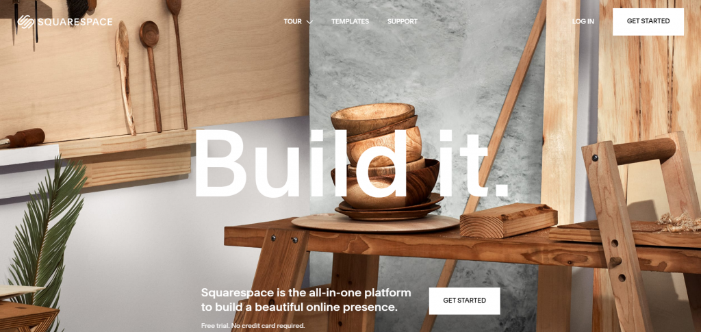
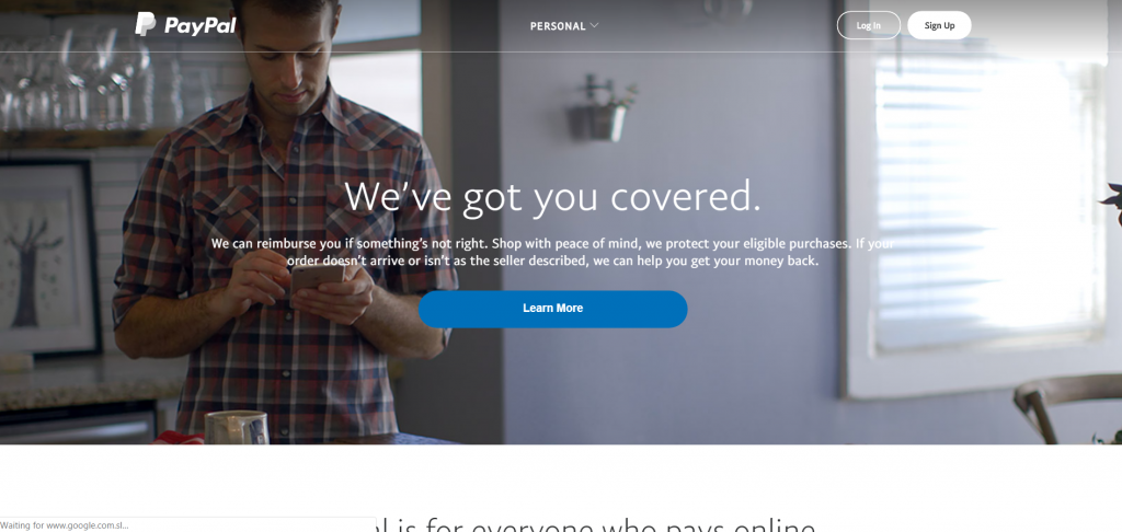
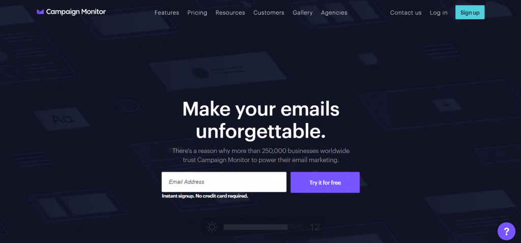
Note: All the website screenshots below are for illustrative purposes only.
Table of contents
Research on websites and first impressions
Users form design opinions in 17 ms.
A few years ago, Google confirmed the 50 ms number in their own research. In fact, according to their study, some opinions develop within 17 ms, though the effect was less pronounced on some design factors.
The key findings from their study were that websites with low visual complexity and high prototypicality (how representative a design looks for a certain category of websites) were perceived as highly appealing.
Key takeaway: Make your web design simple and familiar. Follow conventions. People have a fixed idea of what an ecommerce site should look like. If you go for innovative, unconventional layouts, people are less likely to like them.
Note: See a ton of ecommerce guidelines & testing ideas in our comprehensive report (247 guidelines specifically for ecommerce).
It takes 2.6 seconds for eyes to settle on key areas of a web page.
It takes 2.6 seconds for a user’s eyes to land on the area of a website that most influences their first impression.
Researchers monitored students’ eye movements as they scanned web pages. The researchers then analyzed the eye-tracking data to determine how long it took for the students to focus on specific sections of a page—such as
They discovered that the better the first impression,
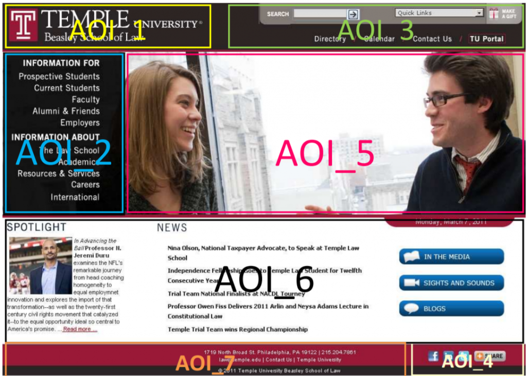
The six website sections that drew the most interest from viewers were:
- The institution’s logo. Users spent 6.48 seconds focused on this area before moving on.
- The main navigation menu. Almost as popular as the logo, subjects spent an average of 6.44 seconds viewing the menu.
- The search box. Users focused for just over 6 seconds.
- The site’s main image. Users’ eyes fixated for an average of 5.94 seconds.
- The site’s written content. Users spent about 5.59 seconds.
- The bottom of a website. Users spent about 5.25 seconds.
Key takeaway: A good first impression leads to a longer visit. Make sure the six elements listed here look great.
First impressions are 94% design related.
British researchers analyzed how different design and information content factors influence trust of online health sites. The study showed clearly that the look and feel of the website was the main driver of first impressions.
Of all the feedback the test participants gave, 94% was about design:
- Complex;
- Busy layout;
- Lack of navigation aids;
- Boring web design;
- Use of color;
- Pop-up adverts;
- Slow introductions to the site;
- Small print;
- Too much text;
- Corporate look and feel;
- Poor search capabilities
.
Only 6% of the feedback was about the actual content. Visual appeal and website navigation had the biggest influence on people’s first impressions of the site.
At the same time, poor interface design was associated with rapid rejection and mistrust of a website. When participants did not like an aspect of the design, the whole website was rarely explored beyond the homepage.
Similar results were found in research for Consumer WebWatch, conducted by Stanford University credibility experts. They found that what people say about how they evaluate the trust of a website and how they really do it are different.
The data showed that the average consumer paid far more attention to the superficial aspects of a site, such as visual cues, than to its content. For example, nearly half of all consumers (46.1%) assessed the credibility of sites based, in part, on the appeal of the visual design, including layout, typography, font size, and color schemes.
Key takeaway: Great design gets people to trust you and to stick around. Poor design creates mistrust and makes people leave.
For first impressions, visual appeal even beats usability.
A study examined the effects of visual appeal and usability on user performance and satisfaction with a website.
Users completed different tasks on websites which varied in visual appeal (high and low) and usability (high and low). Results showed that first impressions are most influenced by the visual appeal of the site.
Users gave high “usability and interest ratings” to sites with high appeal and low “usability and interest ratings” to sites with
Key takeaway: Invest in design. It’s what matters the most for pulling users in. Funny enough, great visual design will lead to higher usability ratings, and actual usability will matter much less.
A positive first impression can increase overall satisfaction.
In an experiment conducted to study the effects of product expectations on subjective usability ratings, participants read a positive or a negative product review for a novel mobile device before a usability test. The control group read nothing.
The study revealed the surprisingly strong effect of positive expectations on subjective post-experiment ratings. The participants who read the positive review gave the device significantly better post-experiment ratings than did the negative-prime and no-prime groups.
This boosting effect of the positive prime held even in the hard-task condition, when users failed most tasks.
Key takeaway: If users “instantly” like your site, they’ll cut you some slack for hiccups down the line. This kind of priming may also work the other way: A n
So if you want to make a good impression, where’s the best place to start?
How to make a great first impression with visual design
1. Differentiate your website (and your company) with your design.
Are you chic, silly, sexy, savvy, smart, classic or what? How are you different from the competition? Do you communicate that as quickly as possible through typography, images, and design on your website?
There’s a balance between avoiding “innovative” design—which can put off consumers—and seeking out a unique visual style. Too often, companies in the same vertical adopt a “me-too” approach in their design aesthetic.
Sometimes, competitive sites are so similar that, if you removed the logo from the site’s header, it’d be nearly impossible to distinguish one site from another.
From what I’ve noticed, this is for two main reasons:
- The internal conversation about design aesthetic devolves into one about features, rather than developing a distinct visual identity.
- The features and aesthetics that “look like they’re working” for the competition are adopted.
Of course, when the new site launches, everyone’s too busy giving each other high fives to notice that the new design is a near carbon copy of a major
If you want to add more distinction to your visual communication but don’t know where to start, check out the Zaltman Metaphor Elicitation Technique and apply it to your qualitative surveys. This can help you design a first impression that speaks to your brand’s core values without alienating visitors.
“Brand Identity” isn’t just some squishy thing to be shuffled off. The Cheskin Research & Studio Archetype found as far back as 1999 that the six-most important factors in building trust with an ecommerce company are:
- Brand;
- Navigation;
- Fulfillment;
- Presentation;
- Up-to-date technology;
- Security logos.
Think about that for a second. If the first impression is that your site is indistinguishable from other websites, why should anyone explore your product pages, let alone choose you over the competition?
Here’s an example: I Googled “leather jacket” to see if visual distinction and overall first impression would be an issue on a random search. These were the first three results:
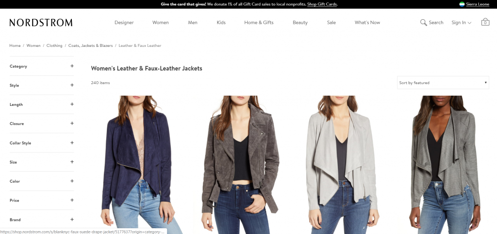
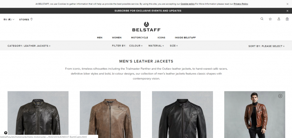
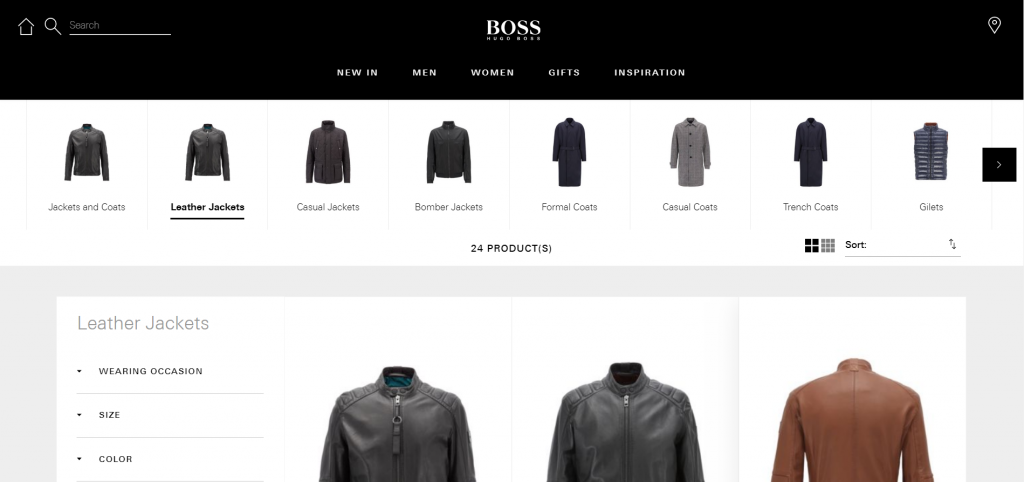
Does anything separate these three sites? Not really, even though they don’t share the same exact demographic.
It took a while of scrolling through search results before I found any site that didn’t look like the ones above, finally stumbling on Bomboogie. There’s no denying that the page is distinct from its competitors:
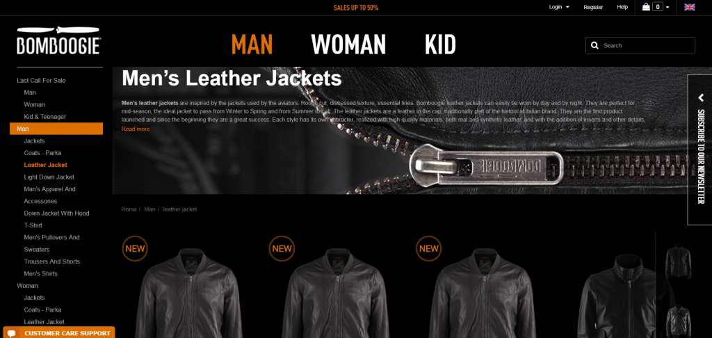
Unlike other sites, the page immediately projects a different feeling—this isn’t a company that makes delicate, high-fashion jackets. Their jackets are “inspired by the jackets used by the aviators,” and the site looks the part.
Years ago, when I first did this research, the most distinct site I found was Schott. Though I would’ve ditched their image slider, soda cap navigation, and many of the fake textures, there was a charm about the design that made a strong first impression, especially given that it’s an old brand.
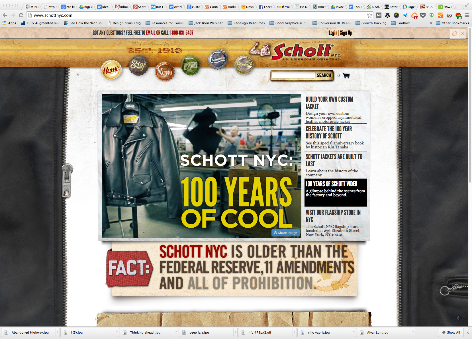
You can feel the character and emotion, and get some sense of whether they’re trustworthy or not, which is what the whole first impression is about.
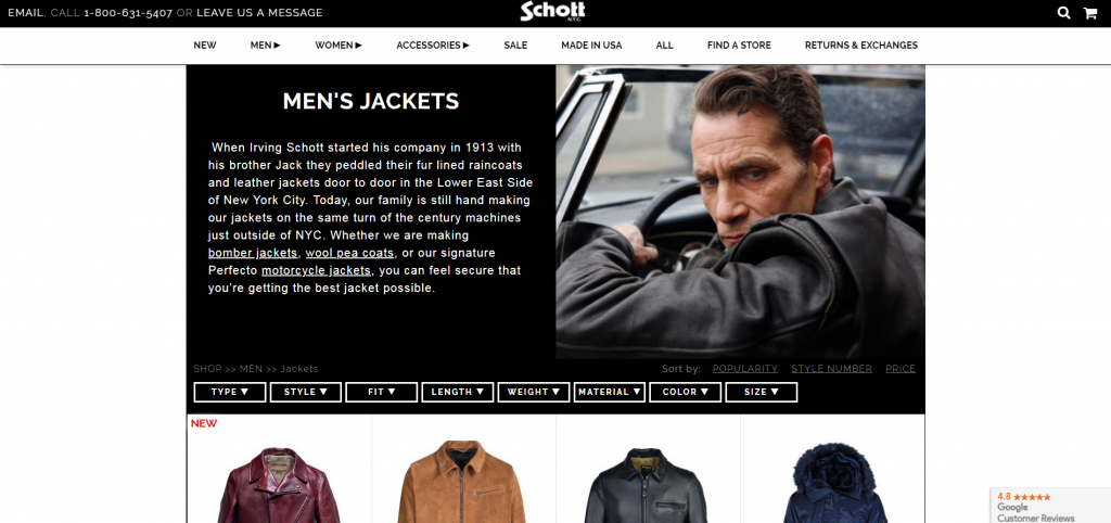
The design trend caught up with them, too, however, and now they look a lot more like every other site out there:
Shopify has created a list of 100 Beautiful ecommerce designs that feature companies with distinct first impressions.
Key takeaway: You can (and should) communicate a unique brand identity without being so innovative as to confuse or annoy users.
2. Inspire site visitors to create a stronger first impression.
A study looking at the role of first impressions in tourism websites found that inspiration-related elements had the greatest impact on
This suggests that visually appealing stimuli are an important tool for getting people to stay longer on a site and, thus, converting more visitors into buyers.
Usability was the second-most significant driver of first-impression formation, followed by credibility.
All in all, this tells us that travelers want to get inspired about a destination (imagery). They don’t want to waste mental energy on figuring stuff out (usability), and they want to be sure that the travel provider is legit (credibility).
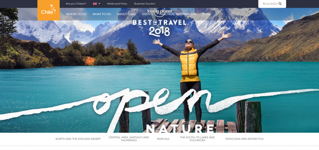
Key takeaway: If you’re selling a dream (e.g. the idea of going on a holiday to Chile), inspiring photography is the leading first-impression creator.
3. Make sure the above-the-fold area rocks.
Over the years, the above-the-fold issue has been hotly debated. Research indicates that people have no problem scrolling and, in fact, prefer it to
Here’s a new way of thinking about the above-the-fold issue: It needs to be the best part of your website. First impressions are formed in 0.05 seconds. Users won’t scroll down in that time.
Hence, what they see immediately without scrolling is what determines whether they ever scroll down. With that in mind…
Pay extra attention to your navigation.
Numerous heatmap studies have shown that navigation is typically among the first- and most-viewed areas of a website. But beyond the typical categories, what should you include
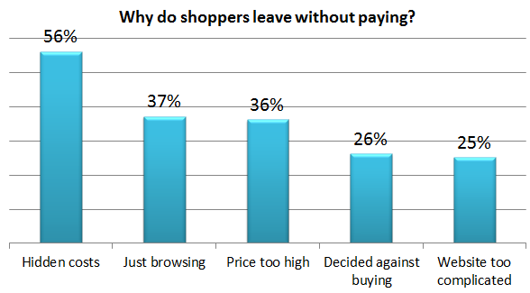
According to a study by Business Insider on why people abandon shopping carts, 25% of people stated that the “website is too complicated” (i.e. navigation is difficult to use), and close to 60% noted “hidden costs” (i.e. shipping costs) as the primary reason they left without pa
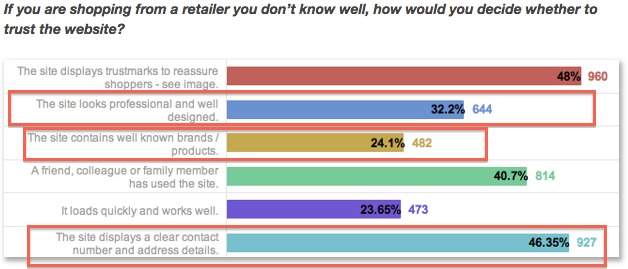
In a different study by eConsultancy, visitors asked about buying from an unfamiliar ecommerce site noted that “professional design,” “the site contains well-known brands,” and “having contact info visible” all influenced their decision to buy (or not buy).
Done well, a site’s navigation can include some or all of the things that, if absent, discourage visitors from buying.
Just look at how much is communicated in the navigation of one of my favorite sites, ThinkGeek, without ever getting into the content of the site:
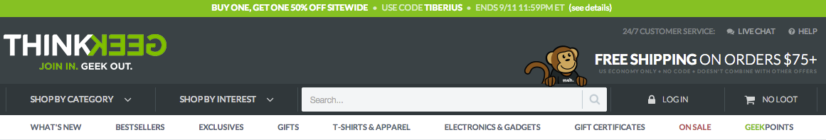
Without having to hunt too much, it’s easy to find:
Time-sensitive promotions;- Multiple ways to navigate deeper into the site (categories, interests, search);
- New, Top, and Exclusive products, as well as a hint of the products they carry (gifts, t-shirts, electronics, gift certificates);
- A rewards program;
- Products on sale;
- Their “Free Shipping” threshold;
- Customer support availability (via “Live Chat” and “Help” buttons).
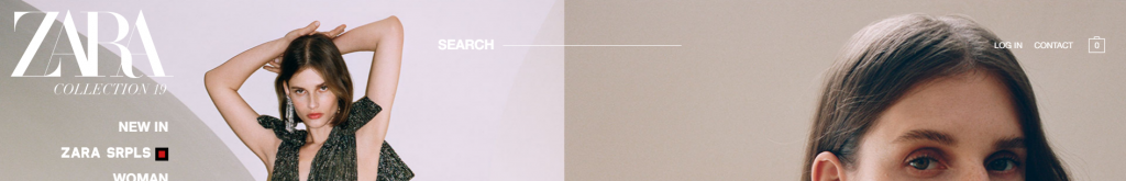
Compare that to an extreme example, like Zara, and you’ll see why this is important:
Case Study: Alight increases site searches 16% and purchases 25%
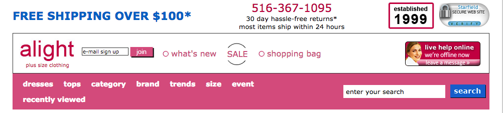
Alight (now CurvyHQ) knew that their site felt dated. The plus-size women’s retailer made their site-wide navigation more modern.
They increased the size of their search bar, removed the trust symbol, incorporated “sale” and “new” categories into the pink navigation area, and clarified their value proposition, among other minor updates.
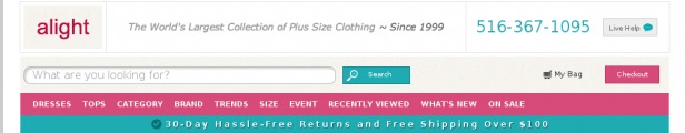
The result was an increase in site searches by 16% and an increase in overall purchases by 25%, all by making the navigation part of a strong first impression.
First impressions—on websites or in the NBA—can last for years.
Research by economists Barry Staw and Ha Hoang looked into the impact of the draft order in the NBA. They observed players’ careers for five years after they were drafted. Five years is enough to prove yourself in many ways, so draft order shouldn’t play a role, right?
Wrong. According to the study, the playing time players get correlates with their draft order. Teams granted more playing time to highly drafted players and retained them longer, even after controlling for players’ on-court performance, injuries, trade status, position played, and other factors.
Every increment in draft number (i.e. getting drafted ninth instead of eighth) decreased playing time by as much as 23 minutes. Incredibly, draft order continued to predict playing time through a player’s fifth year in the NBA, the final year measured in the study. Players drafted in the first round had also longer careers; they played for 3.5 more years than the rest.
Another study looked into the persistence of first impressions. It discovered that new experiences that contradict a first impression become “bound” to the context in which they were made. However, first impressions still dominate other contexts.
Our brain stores expectancy-violating experiences as “exceptions to the rule.” The rule (i.e. first impression) is treated as valid except for the specific context in which it was violated.
Key takeaway: If a first impression is negative, it might prejudice the user against you for years.
Conclusion
Visual appeal matters. A lot. My advice: Don’t try to save money on design, ever. I’ve seen time and again how a “simple” design overhaul resulted in significant conversion boosts.
People form their opinion about your site in milliseconds. The first second on your website might matter more than all the seconds that follow (if any do). Make sure that one second makes a great first impression.
Working on something related to this? Post a comment in the CXL community!
Related Posts
-

Don't design your own website. No, really. It will suck. You might think that since…
-
"Our A/B testing tool's visual editor allows marketers to set up tests without needing developers!" A version…
-
Ghost buttons are transparent calls to action found on websites and apps. Their use reached…
-
Planning to create a promo video to increase conversions? Good idea. Table of contents1. Dollar…


What do you thing about visually appealing splash screens before the main page pops up? I don’t like it but maybe it can work.
“I don’t like” it is irrelevant. Test it – that’s the only way to find out.
Pay attention to 2 measures: bounce rate and subscription rate.
Hi Peep,
Awesome post! I’ll come back to this when we do our planned site redesign.
I’d love to learn more from you on this topic, specifically about how you’d actually go about getting a highly effective design done and how you’d test site design.
Thanks – material for future posts.
I’ll second that. I’d love to read a post about getting a highly effective design done, and where/how you find people who deliver on this front.
Hi Peep
This is my favourite one of your posts so far – great research and insight. As a copywriter I always knew that words have their place when pitted against the instant impact of design – but to discover people spend less than 6 seconds evaluating content is just mindblowing. Owch!
Obviously, this doesn’t mean we should write gibberish, but I’d love to see some research on what happens after a reader decides they like the look of your site – how does this then feed into the attention they give your content going forward?
It really is a stark fact that there might be some genius level writers out there who could blow our minds with their content – but whose work never really gains any traction because it’s published on a crappy looking site. (This is almost like that ‘beautiful people are more successful’ research: http://www.psychologytoday.com/blog/games-primates-play/201203/the-truth-about-why-beautiful-people-are-more-successful)
It seems online as in print – readers always judge a book by its cover. But I’d love to know the correlation between this surface ‘superficiality’ and the connection readers then go on to have with the content published subsequent to these first impressions. For example, do readers think your words are more insightful if you publish them on a stunning blog (even though they aren’t in reality?).
All interesting stuff to feed into the marketing mix.
Good work mate!
Loz
Thanks Loz.
Ultimately it’s about conversions – whatever the desired action might be. It’s easy to measure the impact of great design on sales conversions. In most cases it’s positive.
Thanks – great post
A few months ago we redesigned our site at http://www.PropertyUpdate.com.au, using what we thought was best practice. The more visually appealing site has made a huge difference in conversion of first time visitors to subscribers. You are right. It’s worth spending the time effort and money
Glad to hear!
Hey Peep,
New here. Loved this post to the core. In fact I never spent a penny on design because I know enough CSS and have a good knowledge of designing logos in photoshop. So when I tried my hand, it turned out pretty good and I’m getting positive responses to my blog’s design. The examples you provided here are super super super awesome! Mine is a little blog with a simple design and I’m happy with it. Plus I’m also using a neatly self designed scroll triggered box that I came to know after reading your “ConversionXl is 1 year old” post. It’s converting great!
You’re awesome! Thanks again :)
Aditya
Thanks Aditya
I would also assume this has a lot to do with the visitor’s purpose when arriving on a page. it seems the study results come from having test participants look at websites without any real goal to accomplish, other than completing the test results.
For example, when I recvd your email newsletter with the link to this page, I went to the page to read about this particular topic, thinking “i could have a great website and be rich & handsome if i knew this secret of the importance of great visual design”. LOL. i had a goal to accomplish.
my initial focus was drawn to the large photo of the sports car. i heard the voice in my head saying “ok, nice looking sports car = nice design, this matches the description of the topic, i must be in the right place.” i am here to achieve my goal of reading about this topic. i can continue, rather than close the tab. that could indicate the power of great visual design. my initial impression (17ms) confirmed i was heading toward “accomplishin’ ma goal”. just as the study confirmed, the use of appropriate images is good.
then i quickly scanned the article to see how long it was, to determine if i felt i had the time to read it. i was dismayed at it’s length, and immediately thought, no it’s too long, i don’t have time to read all this. then my next thought was to print it, to read it later. then i thought, no i don’t want to use / waste paper. i better try to read it.
then i skipped to the comments to see if there was social proof. did other readers think this was worth the read, or was it crap? kind of like amazon product ratings. a quick scan told me they thought it was good reading.
next i discovered the section about 17ms, then looking at a logo for 6 seconds. this caused my brain to have a conflict, which i had to stop and re-read again. WAIT! if a site’s importance is determined in 17-50 ms, how and why would a user spend 6 seconds starring at the LOGO? i don’t know if this puzzle was written on purpose to get me to stop and read more of the content and even make a comment, but if it was, then it worked. here i am writing a long comment :)
so the point i’m trying to make is “i came to the site with a goal of reading this content, to find out how to improve a website’s impact by having a great design.” but compared to the article, i did not spend any time looking at the other areas of the website. no logo, no top nav menu, no side areas, etc. i was laser focused on achieving my goal. the only design i cared about was the image at the start of the article, which confirmed i was in the right place. i would probably like this webpage if it was just a plain page with the top article image and a narrow enough body text column to keep my eyes from getting fatigued from too much horizontal scrolling.
now i may be the only one who looks at a website this way. i don’t know. i’m wondering if the additional visual design attributes discussed within the article only apply to people who look at a website without any primary goal to accomplish, as if they are “just looking aka window shopping”, and they decide the website looks trustworthy enough to come in and consume the content offerings? or maybe my brain processed the other design elements subconsciously, and added to the feeling that I was in the right place. it would be neat if we could also measure brainwaves in addition to eye studies.
if you have comments about this i’d like to read them.
btw, i was also annoyed that as i scrolled down, an ad zoomed in trying to get me to signup for the newsletter. “i am already signed up!” i said out loud and clicked the close button. funny and disturbing at the same time. wish the site used a cookie to determine that i was already subscribed.
Hey Steve.
Thanks for the thorough comment. I hear you – definitely user intent matters a lot.
You can’t really make conclusions about the world based on yourself (you are not your customer), but you do make a valid point.
The layout of the page and the content matter a lot. You didn’t pay attention to the logo and stuff since you knew it’s an article – you focused in on the content.
(And long, thorough posts is how I roll).
As for the scroll triggered box – there is a cookie in place. The box is shown 3 times max. Obviously it won’t work if you switch browsers, use incognito mode or delete cookies.
This was a great read. I’ve gone ahead and shared it with our customers at KickoffLabs (who are building their landing pages).
We’ve got some data on our platforms landing pages that may help back this up for you as well if you’re interested.
Thanks,
Josh Ledgard
Founder – http://www.kickofflabs.com (Landing Pages for Everyone!)
Cheers – always interested in good data!
Its really annoying that every time I come here and scroll down, signup form pops up. Im already subscribed.
Sorry to hear that. As I mentioned above, Tthe box is shown 3 times max to a visitor (cookie based tracking). It won’t work if you switch browsers, use incognito mode or delete cookies.
Powerful stuff. I especially like that you backed it up with research from both the industry and the outside the industry. I know from personal experience that visual design and usability are huge for a site. I used to work in the publishing industry and, up until recently, an online literary magazine had a site that looked like it belonged in 1997. They discovered that people who had been in the industry for a long time or were very well connected were the ones submitting to the magazine, but fresh new talent wasn’t interested. That changed once they update their site. For brands that have been around for awhile, only loyal customers will overlook serious design flaws. A great site is essential to gaining and keeping new customers.
I’m currently going through several redesigns for clients and building a few new sites myself. Big thanks for the key takeaways and those important 6 elements.
Thanks!
awesome post peep….
how i do not compltely agree with the idea of sto innovating and follow what is already there and proven..
anyways.. great article with great research.. as always…
Hey
It’s not about stopping innovation – but not taking it too far at the time (e.g. completely changing the idea of how something works)
Hi guys, I loved this. We always struggle with a budget for design. I would love your feedback on my site! Please let me know what you think and how our sites design can be improved. Would love to know.
Naomi
Hey Naomi
Thanks. It looks average – it doesn’t stand out, but also doesn’t hurt the eye.
Great post I’ll apply this to my new blog ..thanks for sharing
Very nice posting. It’s also worth noting the impact between visual design and trust. I tried to explore this in a fun way (Disney references!) in a recent posting too…
http://www.experiencedzine.com/2012/11/16/design-cleanliness-and-trust-dont-leave-pooh-on-main-street/
Great article supported by research studies. Thank you Peep!
Peep, I truly loved this post because of the research you used to support your claim (which I couldn’t agree more with). Thanks for continually pumping out quality content. It doesn’t go unnoticed!
Cheers
I loved this post and I think it’s great information to use when starting a new design or revamp of your website.
One thing that got my attention was the “Above the fold” part. With mobile devices dominating the internet traffic nowadays, how relevant “above the fold” is when the canvas in mobile devices is so limited? Just wondering how this issue can be addressed on mobile devices.
Great job and thank you for this info.
Hi Peep
Awesome article. I think the difficult part, is managing the perceptions of users. ie. how do we know what they are thinking – the brand can be embedded in their mind, but they might not buy until 4 months later.. however the impression is still there and usually won’t be erased from memory.. so imperative to set the benchmark from the outset to manage that perception that best you can.