
Guest post by Pratik Dholakiya.
If you practice CRO, you already know that the debate over small versus long landing pages misses the point. Different products need different landing pages. A beautiful picture and a short description might work for a wrist watch…not so much for a $2,000 software product.
Long and short landing pages both have their time and place, but what if it came down to more than the product? What if it also came down to the person who was looking at the page?
Table of contents
A Double-Edged Sword
It’s no secret that lengthy landing pages can convert quite well, and sometimes much better than their shorter counterparts. Crazy Egg improved their conversion rate by 30 percent by increasing their landing page length 20 times over. Peep Laja can make a killing with them.
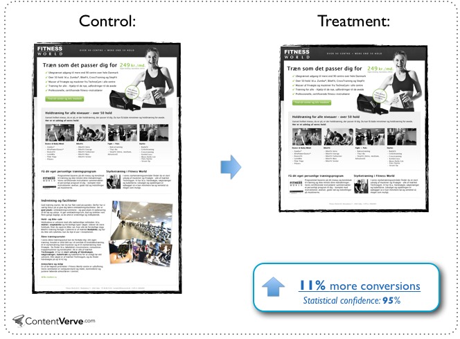
And yet, there’s always a counterexample. For example, Michael Aagaard found that a gym chain’s landing page performed better when it was quite a bit shorter.
This disparity is explained in large part by the product. But there’s actually another element at play: every audience consists of people who would prefer more information as well as people who would prefer less.
This is precisely what a study conducted at Brown University recently demonstrated. The experiment found that there are two kinds of consumers: “explanation fiends” who were more motivated to buy a product when they learned more about it, and “explanation foes” who were actually less willing to buy a product after learning more.
Two Kinds of Consumers
The reason for this difference is that the consumers used two different thought patterns. Those who were more likely to buy with more information were less intuitive thinkers. They were better at choosing the correct answer on a multiple choice test where the wrong answers were more intuitive. The opposite was true for the “explanation foes.”
The study also discovered why these differences occurred. For both kinds of people, they were most likely to buy when they thought they knew the most about the product. It’s just that the more intuitive thinkers thought they understood the product much earlier on. After being presented with more information, they began to realize they didn’t understand the product as well as they thought they had, and they lowered their offering prices.
The researchers demonstrated this by asking half of the participants a question. When “explanation foes” were asked to explain a product after reading the short product description, they realized they didn’t know very much about it, and lowered their prices. In contrast, the “explanation fiends” didn’t change their prices when they were asked to explain the product.
This is why long form landing pages are a double edged sword. For some people, they provide them the information they need to feel confident about their purchase. For others, they actually help people to realize they don’t understand the product as well as they thought they did, and sway they away from a purchase.
What’s a marketer to do about this conflict?
Targeting the Right Audience
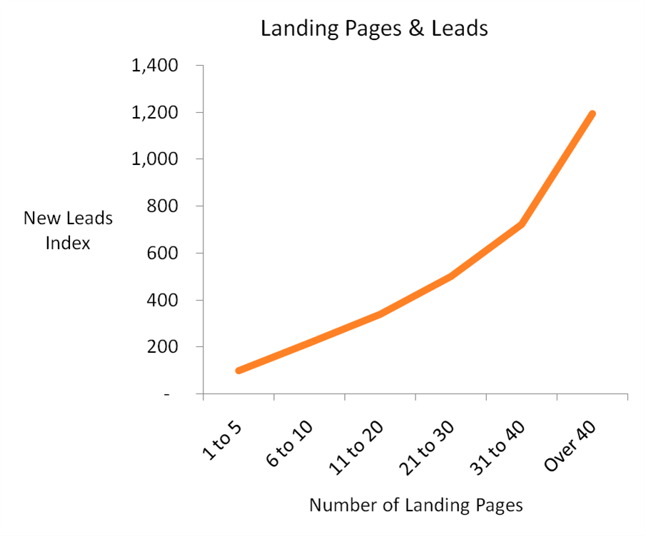
A huge success factor here is the role of targeting. Research by Hubspot has found that businesses with over 40 landing pages generate twelve times as many leads as businesses with just 1 to 5 landing pages. Even businesses with between 31 and 40 landing pages still produce seven times as many leads.
To increase overall leads, you may want to test segments of your audience in order to determine which of them are more likely to respond to a short landing page, and which are more likely to respond to a long landing page. For example:
- Test traffic source: Social media referrals may be more likely to respond to a short landing page than search engine referrals (or vice versa), for example.
- Test ad copy: Different kinds of ads may attract different kinds of visitors. An ad that appeals to more intellectual motivations may be more likely to attract “explanation fiends” than an ad which appeals to gut instincts and emotions.
- Content interests: Among existing audience members, you may want to test segmenting them by their content interests and statistics. Those who tend to click on more instinctual than intellectual email headlines may be “explanation foes” more often than not.
- Behavioral data: If you have access to the behavioral data of your existing audience, you may discover that visitors who spend less time on your site will be more persuaded by short landing pages than by lengthy ones.
- Keyword: Whether you’re targeting specific keywords with SEO or PPC, there’s a good chance that some keywords will be searched for more often by “explanation fiends” and others more often by “explanation foes.” While I wouldn’t advise testing every possible combination of these, it’s worth testing at least a few keywords that are likely to indicate a difference.
Remember: there is more than one type of visitor. Some types of visitors will be more persuaded by a simple page, and others will only be persuaded after learning as much as possible about the product. You can’t maximize your conversions with a single landing page. You need various landing pages, all of them uniquely suited to their targeted audiences, and the length of the ideal landing page is going to be different for all of them.
Why a Short Sales Page isn’t a Superficial One
It’s important to understand that a short sales page can convert, but a “superficial” one cannot. What do I mean by this?
In the Brown University discussed above, we discovered a common thread that all users shared: they were most likely to purchase when they felt that they understood the product the best. The difference is that the people who preferred short landing pages were intuitive thinkers. The added complexity of additional intellectual knowledge was, to them, superficial, and even confusing.
Here’s a great example of this in action over at 37signals:
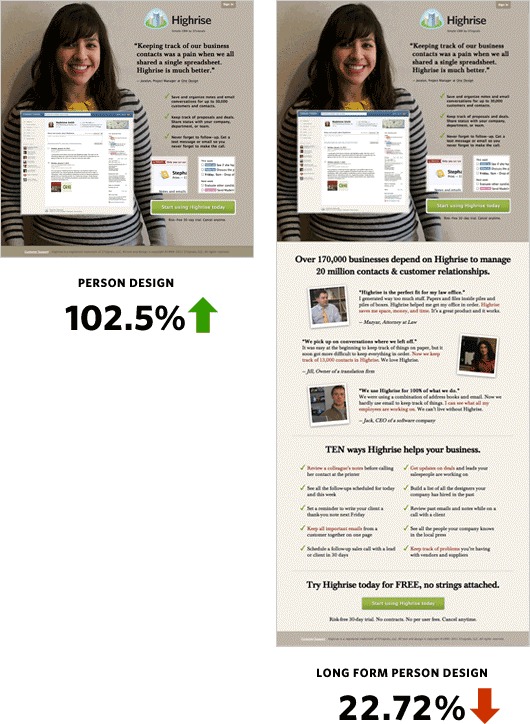
When they replaced their relatively short, informative page with an even shorter page with just a few bullet points and a smiling customer with her testimonial, their conversions went up by 103 percent. But when they expanded on that landing page, the additional information actually made it perform worse than the original.
What Went Wrong?
A quick analysis makes it clear why. The shorter landing page tells a simple story of a customer who is satisfied and smiling about the product, and adds a few simple actionable reasons to use the product. This is what an “explanation foe” is looking for. They want a simple and intuitive understanding of what the product is going to do for them, and how they’re going to feel after buying it.
The additional information, in contrast, isn’t nearly enough to satisfy an “explanation fiend” who would probably want to see screenshots and in depth discussion about how the product works.
At the same time, the larger page ruins the emotional connection that an “explanation foe” would have with the story in the shorter page. It throws additional testimonials and statistics into the mix, and adds more reasons to buy it, but these only complicate the overall message.
For a short landing page to be successful, it must be designed to appeal to the type of consumer who can be persuaded by it. These types of consumers aren’t looking for a list of objective reasons to buy the product. These are intuitive thinkers, and you must appeal to them on an intuitive level, with images, emotions, stories, and gut instincts.
In other words, to an “explanation foe,” lengthy landing pages with detailed knowledge are superficial, while short pages with emotional messages are superficial to “explanation fiends.” Neither is inherently superficial, as long as it’s intentionally created for the intended audience.
Making Long Form Content Work
By now it should be clear that the purpose of a long form landing page is to make sure that the visitor feels as informed as possible about the product so that they can feel justified in opening up their wallet.
This doesn’t mean that “explanation fiends” won’t be persuaded by stories or emotional and instinctual images and copy, but the science does strongly suggest that most of them won’t convert unless they also feel like they understand the product itself in depth.
This is the crucial thing to understand about long form landing pages: they are there to eliminate anxieties and confront objections with concrete information.
In the Crazy Egg case study mentioned earlier, the optimizers based their new landing page on survey and heatmap data. Similarly, when Conversion Rate Experts helped SEOmoz (now Moz) boost sales by 52 percent, they surveyed paying customers, free trial members, members who had cancelled, and even recorded Rand Fishkin trying to sell the product in person.
This is the key that separates blind split testing from successful CRO.
Finally, one of the reasons so many designers hate long form landing pages is the fact that they are so closely associated with ugly, scammy microsites. But the truth of the matter is, there’s no reason long form sales pages have to look that way, or evoke those feelings.
Consider Shopify’s landing page for their new POS system. It looks every bit as good as the landing page for Square, and conveys the same modern, trustworthy tone, but it leaves readers with a deeper understanding of what the product can do, and would have strong appeal to an “explanation fiend.”
Designing for Both Users
As much as we’d like to perfectly segment our audience so that only those who want a short page will land on a short page, and only those who want a long page will end up on a long one. Unfortunately, this isn’t how the world works. For every landing page we design, we have to keep in mind that some users think more intuitively and are more motivated with less information, while other users want as much product information as possible.
One of the smartest ways conversion rate optimizers seem to be tackling this issue is by placing videos on their long sales pages. Peep Laja suggested doing just that in the post I mentioned earlier, the SEOmoz landing page featured a video, and Crazy Egg found that doing so increased their conversions by 64 percent.
There is a strong possibility that these videos improve conversions by appealing to the more intuitive thinkers in the audience, who don’t necessarily feel the need to read everything. Keep this in mind while you are producing your videos.
Of course, lengthy landing pages can appeal to more intuitive visitors by following well known industry practices:
- Plenty of relevant images
- A visual design that conforms to expectations while still being novel enough to stand out
- A heavy helping of subheadings and bulleted lists where they make sense
- Loads of whitespace
- Directional cue that draw scanners to the most relevant parts of the page
Additionally, there are rarely any circumstances where you shouldn’t put a call to action above the fold, even if there is additional copy and another call to action at the bottom of the page.
Designers can also appeal to both user-types by designing short landing pages, but including easily accessible, obvious product pages with all the information an “explanation fiend” will want to see before making a purchase. This fits well with “putting the user in control” after all, a basic tenet of design for usability.
Conclusion
If you’re in this business to make sales, you need to recognize that two fundamentally different kinds of users are visiting your site. Without targeted landing pages, testing, and an understanding of both of them, you will lose sales from visitors who would love to buy your products.
Related Posts
-

If you're selling in a competitive market, you must live & die by the little things…
-
Which is better? Having a long home page with lots of copy, or a short…
-
You know those sales pages that are really, really long? They're great, but they mostly…
-
Don't design your own website. No, really. It will suck. You might think that since…


Amazing explanations. Thank you,Pratik!
Thanks, Chelsea. Glad you liked the post.
Nice. Detailed explanation with examples and research to back it up… actionable content. Very well done, useful and to the point. Time to adjust some campaigns!
Glad to hear that, Mark. Let me know how things work out for you.
this is an application of the principle write until you feel it’s enough. a sales page doesn’t have to be in certain length just what’s enough to send the desired message and get the action required.
Very actionable Tips. Prateek.
All in all testing is the key. Keep changing landing pages and monitoring the behaviours very closely is the key to success.
More than the length what is important is to cover all the important details in a landing page and not adding unnecessary details to make it longer just because your competitors do that.
Thanks for this detailed post.
Really appreciate you sharing this.
Very well written article…appears you backed it up with great data and analytics…there is such a fine line of what works, and what doesn’t…in a very difficult field of email marketing.
Great article
How about a big header saying “Need more information?” or “Got more questions” or “Need further explaining?” and this reveals all the extra stuff (like the 37S long form)
T
I am in the process of converting several long-form landing pages that are chalk full of scrolling text. Less is more. Keep it simple.
“How users read on the web:
They don’t”
-Jakob Nielsen
Hey Pratik! Thank you for this article – I’ve read it with pleasure :) If you’d like to take a look at ours insights to the optimal length of a landing page – here’s a link:
http://www.mavenec.com/blog/landing-page-copy-optimal-length/