
Several years ago, Jeremy Smith wrote, “Traditional optimization is dead, and in its place is arising a brave new world of mobile conversion optimization.”
I have to disagree. Is mobile conversion optimization a “brave new world”? Yes. Is traditional optimization “dead”? Not by a long shot.
Traditional (i.e. web) optimization and mobile optimization are two separate practices, requiring two separate strategies. One is not replacing the other. Instead, optimizers must learn to master both.
Table of contents
What’s the current state of mobile?
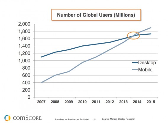
It won’t surprise anyone to learn that the number of global mobile users is growing rapidly. It might not even surprise you to learn that the number of global mobile users has surpassed the number of global desktop users.
Back in 2014, the number of mobile users became higher than the number of desktop users:
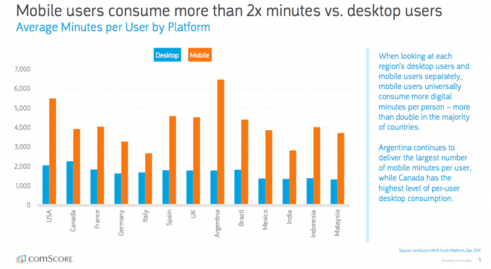
In global markets, mobile users consume more than twice as many minutes as desktop users…
There’s no denying that mobile use is on the rise, but are mobile users converting?
An older study found that 70% of mobile searches lead to action on websites within one hour. Mobile users were engaging with retail sites and taking steps towards conversion.
But when it comes down to it, the data shows that mobile users just don’t convert the way desktop users do—even in 2019.
So, why the discrepancy? Despite the fact that mobile has been “on the rise” for years now, optimizers still haven’t mastered mobile optimization.
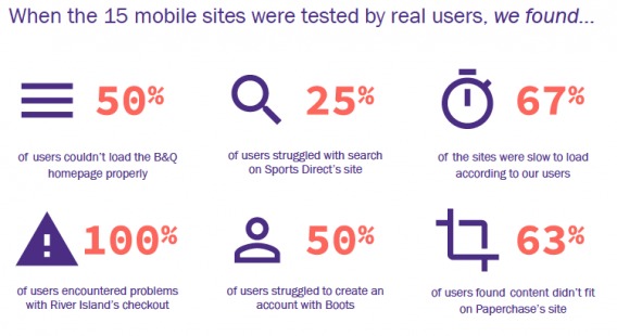
A while back, Econsultancy conducted mobile UX research to find some common issues with mobile optimization…
Optimizers still have a long way to go, it seems. Joel Harvey of Conversion Sciences agrees, adding some controversial statements (read: wake up calls)…

Joel Harvey, Conversion Sciences:
- “Responsive design, as we know it today, is toxic to mobile conversion rates.
- High-performing mobile websites will look more like mobile apps.
- Maximizing screen real estate on small screens isn’t as important as we thought.
- Android and iPhone visitors act differently.” (via Conversion Sciences)
Why doesn’t mobile convert?
There is no one reason why mobile users don’t convert as often as desktop users. A smaller screen, connectivity issues, distraction, etc. cannot be blindly blamed for low conversion rates.
This is as close as it gets to a universal statement: Mobile users are more susceptible to friction.
Why? Because of the nature of mobile. They want what they want when they want it. They want to be able to checkout or signup for a free trial with one hand while they’re shopping for groceries or talking about the weather with their Uber driver.
Mark John Hiemstra defined the two types of mobile friction on the Unbounce blog…

Mark John Hiemstra, Full Stack Copy:
“Friction on your landing page is both real and perceived:
- Perceived friction is the mental block that happens in the mind of a landing page visitor when they come across a mobile landing page with unreadable text, a form with too many fields, or an offer that doesn’t compel them to convert.
- Real friction happens when people struggle to fill in that many fields with their thumbs, or they can’t click the call to action button because it’s too small. Or maybe your page is not optimized for mobile and they have to scroll or pinch and zoom to get to the form.” (via Unbounce)
Perceived friction means that if your mobile site looks hard to navigate, it is. Even if it really isn’t. (Still with me?) Real friction means that your mobile site is actually hard to navigate… Something (often multiple things) prevents your visitors from converting.
Michael Mace, VP Mobile at UserTesting, wrote two in-depth articles on common mistakes mobile eCommerce sites make, How to Make Mobile Convert: The Most Common Mobile Store Mistakes and How to Make Mobile eCommerce Convert: What’s Effect in Mobile Design Right Now. To identify potential points of friction on your site, I suggest reading those articles thoroughly.
Good example: Schuh
A while ago, I found this example of a mobile funnel with limited friction. Here’s what the homepage looked like on mobile…

Note the large buttons, the concise copy, the clearly marked search function, the condensed navigation, etc. I decided to dive in and click the red “Sale Final Reductions” banner…

I was able to select my size upfront so that I don’t waste time looking at shoes they don’t have in my size. I was also able to filter the 266 results even further if I wanted to…

Some visitors will want to filter extensively or search to find exactly what they’re looking for. Some will want to browse around. Schuh does a good job of pointing users in the right direction, but allowing both options.
Here’s what displays once I’ve selected a shoe…

My one critique here would be that since I had already indicated that I wanted size 6, I shouldn’t have to select my shoe size again.
However, notice the size of the “Please select a size” menu. It’s optimized for mobile. Everything you need to know about the product is displayed. The small screen size isn’t even an issue.
Here’s what the basket looks like…

Pretty straightforward, but take a look at the checkout process…

Schuh uses screen space incredibly well. There’s a lot of information here, but none of it seems overwhelming or cluttered.
Here’s step one…

And step two…

Note that you don’t have to write out your full address manually, but you can if you want to. A few years ago, my building was a new construction in a new neighbourhood. My address didn’t exist yet according to most online maps. Do what you can to speed up the process, but don’t assume your time-saving tactics will work for everyone.
Step three…

Again, notice the simplicity and size of key page elements.
The process was completely pain-free. This is one of the best mobile conversion funnels I’ve ever seen. Remember, we went through nine steps just now, but if you notice at the top of the screenshots, it didn’t even take five minutes.
Less taps isn’t always better. Less unnecessary and redundant taps is always better.
It is possible to over-simplify…

Raluca Budiu, Nielsen Norman Group:
“Only a few years ago, IKEA’s mobile site showed a single bed in their list of bedroom-furniture items.” (via Nielsen Norman Group)
How is mobile traffic different than desktop traffic?
Mobile traffic is very different from desktop traffic. Here’s Talia Wolf of GetUplift.co to explain why…

Talia Wolf, GetUplift.co:
“When you approach mobile optimization, you must treat mobile visitors as completely different potential customers that behave differently and require a different strategy. Pay close attention to the mobile visitor’s behavior on Google Analytics, the pages they view, the devices used, their bounce rate, conversion rate, search terms, and the funnel they go through (more mobile metrics you can follow). Every detail matters and will allow you to later create a better experience for them. Whether by changing your copy, creating a dedicated mobile landing page, or simply adding a click to call button, any optimization made for the mobile visitor’s mindset can increase conversions dramatically.
For example, a large ecommerce store in the UK uses Banana Splash’s personalization features to identify mobile visitors who check out specific categories (t-shirts) and arrive from certain geolocations to trigger a personalized call to action. One call to action asks that people signup to their newsletter, another recommends similar products. This sort of personalization creates a unique experience for mobile visitors and addresses their specific needs.”
The differences between mobile traffic and desktop traffic are endless. However, they do fit nicely into three categories: intent, level of distraction, and behavior.
1. Intent
Mobile users tend to have stronger intent, which is why mobile optimization can be such a high value effort. Think about it. Desktop users are sitting at home or the office with time to spare. They’re browsing, they’re checking Facebook, they’re listening to music. Mobile users are on-the-go. They don’t have the luxury of time.
Have you ever thought about buying something, looked it up online, taken one look at their mobile site and thought, “Yeah, I’ll just wait until I get home”? It happens to me all the time. However, if the site were better optimized, I would’ve bought it right then and there. The perceived friction was too high.
2. Level of distraction
Here’s Raphael Paulin-Daigle to explain why mobile users are often more distracted than desktop users…

Raphael Paulin-Daigle, Growth Marketing Expert:
“When people are navigating a website through desktop, most of the time they’ll be sitting at their desks-the context is more stable, but when on mobile, context varies by the second. Are people walking? Are they trying to find something quickly? What are they trying to achieve? Distractions are way more frequent.”
Attention spans on mobile are even shorter than attention spans on desktop. The impact here is two-fold…
- Eliminating distractions on your mobile site is paramount.
- Getting mobile users to the “reward” as quickly as possible is your primary goal.
Of course, there is a compromise. In simplifying and reducing copy / chrome (i.e. design elements), you run the risk of over-simplifying. Your mobile site can’t be a call to action. You have to find the balance between intuitive and restrictive. It’s a surprisingly thin line.
3. Behavior
Dive into your Google Analytics data quickly. Create a segment for mobile users and a segment for desktop users. Go through each section of your dashboard and tell me what you see. I’m willing to bet you see two very different types of behavior.
Document those differences. Understand how mobile users are currently navigating your site. Chances are, they don’t stay long, they bounce more frequently, they visit fewer pages, they stick to one to three pages, and so on.
They don’t behave the same way because their environment and intent is vastly different. Why try to convert them the same way?
But, I have a responsive design…
When asked about responsive design, Talia and Raphael had very similar responses…
Talia Wolf, GetUplift.co:
“Though responsive design is much better than having to ‘pinch-and-zoom,’ it isn’t an optimized experience for mobile visitors. At its core, responsive design makes the desktop experience look good on mobile, but it doesn’t address the specific needs of mobile visitors.”
Take special note of the last line: “Responsive design makes the desktop experience look great on mobile, but it doesn’t address the specific needs of mobile visitors.” Talia hit the nail on the head here. Responsive design is more about the way a mobile site looks than the actual user experience.
Raphael adds that while the basics are nice, they are, well, basic….
Raphael Paulin-Daigle, Growth Marketing Expert:
“These days most are aware they need a mobile responsive website, but what few are aware of is that ‘responsive’ is not always the ideal solution. When our website simply resizes based on our screen size, sure, a website becomes more usable, but we’re not taking in consideration the possible changes in context and environment.
To create a truly efficient mobile experience, we must go further than the basics such as screen size or displaying a phone number instead of a form on a contact page.”
Responsive design doesn’t equal great UX. You can’t make your design responsive and declare that your mobile site is optimized. That just doesn’t make sense.
Example: Slack
Have you tried signing into Slack on your phone yet? Here’s a little preview…

Slack knows that typing a password, especially a long or complex one, on a phone can be frustrating. So, instead, you can have a “magic link” sent to your email, which will sign you in. Now that’s great mobile UX.
Mobile site vs. responsive site
When talking about responsive design, it’s hard to ignore the debate of mobile site vs. responsive site. Should you create a dedicated mobile site or use a responsive design? It’s a question experts are divided on.
Raluca Budiu of Nielsen Norman Group offers an interesting opinion…
Raluca Budiu, Nielsen Norman Group:
“In truth, users don’t care if a site is responsive or not: they simply don’t see any difference between a mobile-dedicated site and a responsive site. For them, anything that does not look the same as the desktop site is a mobile site. And if mobile sites have poor usability, they are not “mobile optimized.” (Only a month ago, a participant in one of our studies complained that the Boston Globe site, one of the more famous sites employing responsive design, was not mobile optimized because the pages were too long and she could not find whatever she was looking for on the page.)
From a usability standpoint, it doesn’t matter how the site is implemented: responsive or mobile-dedicated, they all must obey the same rules of mobile design. Some may argue that content and feature parity is what distinguishes responsive vs. mobile dedicated, but that is not necessarily true: there are responsive sites that do not show the full set of features or content available on the desktop sites, and there are mobile sites that do have content and feature parity. Plus, for many sites, content and feature parity is the right answer, and for others a good mobile experience means trimming down on content and features.” (via Nielsen Norman Group)
So, to summarize…
- No one cares if you have a dedicated mobile site or a responsive design.
- All users care about is an intuitive experience.
- There are misconceptions out there about what a responsive design is and what a dedicated mobile site is.
- There is no right answer, no definitive winner. What matters is that you follow good mobile design practices.
Case study: Marketing Experiments
Marketing Experiments asked an interesting question: Will a responsive or unresponsive design generate more free trial signups?
For most people (including myself), the answer is a responsive site. Is it true?
Take a look at the unresponsive control…

And now here’s the responsive treatment…

Here are the results…
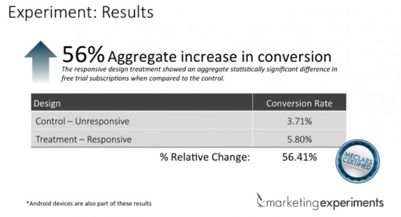
So, it seems that responsive design did, in fact, increase conversions. But let’s take a closer look at the results…
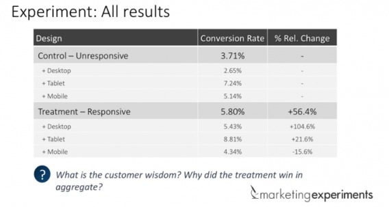
When you break the results down by device, you’ll notice that the results for tablet and mobile users are not significant. Only the results for desktop were able to reach significance. Kind of backwards, right?
Marketing Experiments hypothesized that the reason for this is that the responsive desktop treatment did not appear like a popup, which it does in the unresponsive desktop control.
The lesson here is not that responsive design is useless and never works. This is just one test. The lesson is that responsive design does not work 100% of the time. It might work for you, it might not. But if you think your mobile site is optimized because you have a responsive design, you’re missing out.
4 mobile optimization mistakes marketers are still making
The concept of mobile optimization is not new. Nor is the idea that responsive design and mobile optimization are synonymous. Due to that misconception, optimizers are still making some fairly basic mistakes when it comes to mobile.
1. Fighting mobile weaknesses vs. embracing mobile strengths
If you’ve learned anything so far, it’s that mobile is different and deserves to be treated as such. Unfortunately, that’s an inconvenient truth. Crafting a new strategy for mobile and addressing it separately is a lot of work.
So, instead, some optimizers try to make desktop tactics work on mobile. Instead of embracing mobile’s strengths, they try to fight against mobile’s weaknesses.
For example…
- Small screen size – Don’t try to cram everything from your website into your mobile site. Prioritize your messaging and cut chrome in favor of essential copy.
- Easily distracted visitors – Don’t try to hold visitors hostage on your site. Make it easy for them to return instead. Allow them to save history, send their progress to themselves, etc.
2. Poor tracking
Are you familiar with the concept of cross-device shopping? We’ve already discussed it loosely. Essentially, cross-device shopping is when a single buying experience takes place across multiple devices. So, for example, you find and read about the product on your iPhone. Then, later that night, you buy it on your laptop.
According to research from comScore, this cross-device shopping trend isn’t going anywhere…
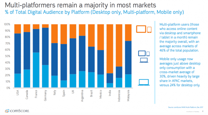
As a result, mobile web analytics can get quite complex. Investing in solid analytics software is definitely worth it.
Here are some suggestions…
3. Mobile copy is a different beast
The opportunity cost of mobile copy is much higher than web copy. Due to the nature of mobile, you’ll need to cut copy to streamline your funnel. But what does it mean for the user if you leave out A in favor of B?
Raluca offers a solution…
Raluca Budiu, Nielsen Norman Group:
“Another important issue that is still not well understood by designers is that mobile content needs to be layered. That does not mean that we need to arbitrarily cut it or hide (which unfortunately is what many do), but rather that we need to prioritize the gist and defer the details to secondary pages.” (via Nielsen Norman Group)
4. Navigation is too complex
Beyond the hamburger menu debate, mobile navigation and filtration has still not been perfected. Lee Duddell of WhatUsersDo explains some of the more common issues for mobile ecommerce sites…

Lee Duddell, WhatUsersDo:
“Since it is harder to scan long lists of items on a small screen device, mobile shoppers expect to be able to filter and sort listings to suit their needs.
Even though all of the sites we tested supported filtering and sorting on product listing pages, retailers need to address two common issues:
- Filtering and sorting did not work reliably on five of the tested sites.
- Users could not filter in the way they wanted.” (via Econsultancy)
Filtration options are often vast and granular. On desktop, that’s an asset. On mobile, it’s a hassle. The same way you must prioritize your messaging, you must prioritize your menu items and filtration.
Conduct qualitative research to find out how people like to filter their searches.
Navigations and menus have problems of their own. Raluca explains…
Raluca Budiu, Nielsen Norman Group:
“And last, but not least, we need to learn how to fit our desktop-based, deep information architecture into a 2-level navigation that is usable on mobile. A deep information architecture (often supported by cascading menus on the desktop) doesn’t translate well on mobile: it often forces the user to take too many steps to reach the content.” (via Nielsen Norman Group)
Conclusion
It’s a brave new world, indeed.
The rise of mobile has presented a whole new set of optimization issues, many of which we’re still uncovering the answers to.
Here’s what we do know: Creating a responsive design and calling your site “optimized for mobile” is a cop-out. [Tweet it!]
Instead, follow these steps to get started:
- Setup your mobile web analytics software of choice.
- Conduct qualitative and quantitative research to better understand the wants, anxieties, points of friction, and motivations of mobile users.
- Prioritize the messaging, calls to action, and chrome on your website.
- Systematically reduce (or layer) the messaging, calls to action, and chrome to suit your mobile audience.
- Evaluate your mobile site from a UX perspective and design a custom mobile conversion funnel.
- Begin running tests to improve your mobile conversion funnel.
Related Posts
-

Google is a strong advocate for responsive design. Mashable named 2013 "The Year of Responsive Design,"…
-
Every once in a while a big debate comes along in the conversion optimization industry.…
-
Don't design your own website. No, really. It will suck. You might think that since…
-
While running A/B tests on all your traffic at once is often tempting, it's best to…


Very helpful information.. Great post.. Thanks for sharing.
Thanks for reading! So glad you liked it.
Wow … as always you deliver.
Loved the headline, and the good versus bad examples ACTUALLY helped me understand the difference.
This will definitely be a go-to resource I send clients who need to grasp the importance of mobile and why responsive does NOT equal optimized.
You’re too kind, Aaron! Thank you.
I’m glad you found it so helpful.
This article offer great and helpful information…Thank you very much for shear this great stuff
And thank YOU for reading. Appreciated.
Wow! Best mobile article I’ve read yet. Thanks for sharing the mobile love :)
Wow! Thanks Jonathan. That means a lot.
Very thorough and informative.
Glad I could help, Mark. Thanks for reading.
Hi Shanelle,
This article is incredibly informative for anyone trying to boost their conversion rates, specifically mobile. It is crucial to have the ability to optimize by device type to make your user’s experience as pleasant as possible.
We’ve written an article relating to this topic. Check it out! Would love to get feedback.
http://blog.undelay.io/2015/09/08/responsive-design-is-todays-motorola-brick/
I will check it out right now, Kaitlyn. Thanks for reading!
Thanks Shanelle! I’ve noticed a lot of people looking for better ways to handle mobile. People recognize that mobile is a driving force today – from SEO to conversion. But I still hear people consider a native app as the mobile version of their website. Or they think responsive design will solve everything without thinking of mobile first.
Absolutely. We all know mobile is a rising star, but we’re still doing the minimum, in most cases. We have to put the effort in.
Thanks for reading, Mandy.
Now that’s a great post Shanelle! Couldn’t agree more that Traditional optimization and Mobile optimization are two different practices. The focus on mobile optimization is so much these days that some tend to pay less attention to traditional optimization practices. Optimizing your website device type is really important for a better user experience.
Probably one of the best mobile articles I’ve come across. Will be sharing it for sure!
Thanks so much. I really appreciate all the kind words.
It’s inconvenient to think that we need to work on them both separately (and extensively), which, I assume, is why many people don’t.
Shanelle you just brought to light some of the most important information about mobile.
App’s are useful but not every company will have one; responsive it’s pretty but won’t solve navigation issues.
Preparing a website to be mobile friendly it’s really important; I’m going a bit further and say that web designers should start their webdesign thinking with mobile, instead of this so much used “desktop first, mobile latter”; would love to know what you think about it (preparing both it’s the ok answer but I want your opinion).
Really glad to read this article, hope to see more like this in the future.
Thanks Vitor. I really appreciate your thoughts.
Since the desired desktop experience and the desired mobile experience are very different, I don’t necessarily think it matters which you think about first. What matters is that you think about them both (and as separate experiences).
Though, you should choose your core design elements / themes beforehand and use them throughout both for consistency, of course.
Apologies if I’ll be tough but frankly I prefer to be frank.
Visit Schuh.co.uk with a mobile diff than ios, the experience is a disaster. Crappy with images overlapping text, hiding other images…
Article full of trivialities and nonsense, so low level…
I just visited the site using Android and the UX was the same. In any case, you hit on the importance of quality assurance.
Really good read shanelle. Responsive design isnt mobile optimised but it ticks a build spec box. Many desktop features are simply awful on mobile. One problem is budget but this is a great insight into a problem which is routinely swept under the carpet.
Thanks for the kind words, Jon! Absolutely. Budget and time / effort are big barriers, but it’s worth it if you have the mobile traffic.
Really good article. Thanks so much!
Thanks Tom! Glad you enjoyed it.
Great article and fantastic examples. Kudos!
Thanks Ben! Appreciated.