Hopefully you have many optimization weapons in your arsenal: digital analytics, A/B testing, click mapping, user testing, etc.
One you may not have thought of (and hence your competitors might not be aware of): eye-tracking and visual engagement analytics.
When you hear the words ‘eye-tracking’ or ‘visual engagement analytics’ you may think these techniques are too expensive or complicated for you to use. With increasingly scalable technology and a decent game plan, however, that’s simply not true.
Adding eye-tracking into your arsenal will increase your understanding of user behavior as well as the usability of your site, and it will arm with your enough (valuable) test hypotheses to last you for a long time.
What is Visual Engagement Analysis
First off, let’s define visual engagement analysis for the sake of this article.
It’s essentially a visual display of the user experience at a scale large enough to infer trends and insights.
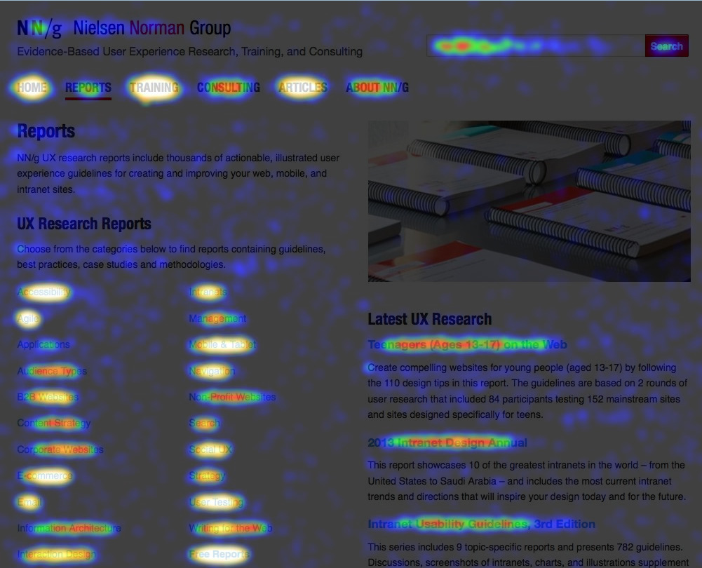
You’re already familiar with a limited form of visual engagement analysis in the form of a heat mapping tool.
While there are many types of visual engagement analysis you can use, eye-tracking offers the most accurate picture of how users actually interact with your site.
Hover maps – heat maps that analyze where users hover their mouse on a page – were actually modeled after the classical usability testing technique known as eye-tracking (following and measuring the gaze of the user).
In the old days, eye-tracking could only be done in a lab, with very expensive equipment and a large time allotment. Essentially, it was resource-heavy and reserved only for the largest companies with the biggest budgets.
That’s why mouse tracking tools introduced hover maps – as a way to democratize this information.
Problem is, the accuracy of mouse cursor tracking is always questionable. People might be looking at stuff that they don’t hover over. They may also be hovering over things that gets very little attention – therefore the heatmap would be inaccurate. Maybe it’s accurate, maybe it’s not. How do you know? You don’t.
In 2010, Dr Anne Aula, Senior User Experience Researcher at Google, gave a presentation where she presented some disappointing findings about mouse tracking:
- Only 6% of people showed some vertical correlation between mouse movement and eye tracking
- 19% of people showed some horizontal correlation between mouse movement and eye tracking
- 10% hovered over a link and then continued to read around the page looking at other things.
So until recently you had two choices: affordable but questionable data or accurate but expensive data.
Now, however, there are a myriad of solutions for remote eye-tracking (including my company, Sticky)
Why Visual Engagement is Awesome
A/B testing is great, but to do it right you need valid and actionable insights. There’s nothing better than seeing specifically how your users are interacting with your sites (and even quantifying that behavior)
With visual analytics, you won’t ever run out of ‘testing ideas.’
Visual analytics measure the user’s experience directly, allowing you to understand both what drives your successes and failures as well as the specific points to address in order to increase performance.
With a combination of both tools, we’ve seen people increase click-through rates 6x, increase conversions, and increase the ROI on marketing spending by 25%.
A/B Testing + Visual Engagement Analytics
A/B testing shows graphs and statistics, mostly at the aggregate level, but it doesn’t show you how users experience your page.
That’s a gap visual engagement analysis can fill.
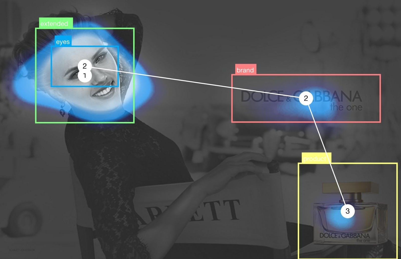
For instance, here is an A/B test where you can infer the ‘winner’ or the ‘loser’ of a test…

A/B testing is awesome, and it’s the only real way to empirically verify performance of specific elements while isolating variables like time.
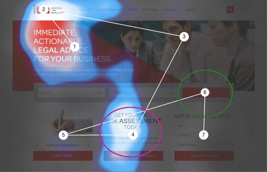
But check out the image below. It comes from a study we ran on ITLALAW’s homepage. The gaze path is presented as a heatmap, ‘SeenMap,’ which shows exactly where and in what order the user looks at the site.
This kind of data gives you the insight to run better A/B tests and win more often (no one likes inconclusive tests).
In the example above, for instance, we noticed that the green circle, ITLALAW.com’s call to action received too little attention. The purple circle received more attention than it deserved, considering that none of its elements are clickable.
The easy implication there is that we could try to switch the content on these two page areas and to run A/B tests on those iterations.
To maximize the efficiency of your testing program, you need user insights.
Like many companies, YoDerm was using A/B Testing to measure the effects of different coupons or offers on their landing page.
However, Ryan Hambley, the VP of Product, noticed something troubling with the tests he was running. “There was often no clear winner,” he said. This is, of course, a common experience (data tends to show that 1/7 tests are winners). Nothing slows the flow of a testing program like a series of inconclusive test results. [Tweet it!]
YoDerm’s developers and designers could sit in a meeting room and guess how people interacted with the site, and then develop test ideas from there. But you already know that’s no approach for a smart optimizer.
That’s where they brought in eye-tracking and visual engagement. To attempt to infer some user behavior trends, and develop tests based on how their users were actually interacting with the site.
How Visual Engagement Analysis Helps
Visual engagement measures where people look and how they feel when they look at each element of your site (yep, it’s possible to measure emotions as well – a benefit not included in most heat mapping tools).
You can draw so many insights from visual engagement:
- If people get stuck on an image or text, you’ll know that they’re most likely confused and that the ideas should be simplified.
- If they’re not looking where you want them to look, these areas should be made more prominent. This knowledge will help you focus your next design iterations.
You can see the raw numbers (like how long people gaze at an element) as well as visual the data (which makes for incredibly effective presentations to your team and executives, by the way).
With emotional engagement measurements, you’ll be able to tell how users feel in real-time while they interact with your site. An algorithm measures facial expressions and correlates different expressions to different emotional responses.
The conclusions you can draw with this data (combined with the heat maps) are endless. For instance, stronger positive emotional responses correlate to a greater likelihood that people share content.
How it Works
Multiple state-of-the-art computer vision tracking algorithms communicate to identify facial expressions and eye movements in 3D, allowing for the most accurate tracking possible, even when people move, lighting changes or the face is partially obstructed.
Eye-tracking data are filtered for quality, aggregated with survey and emotion data, and then made available in the platform’s results page and through the API.
Sticky presents the eye-tracking results in the form of a heatmap.
How to Run a Visual Engagement Study
Running a visual engagement study isn’t as hard as it sounds. First you need to pick a URL to study (perhaps you want to study your homepage). Then you need to choose your study pool and specify different options for Sticky’s crowd of participants. Options include things like age, gender, and country.
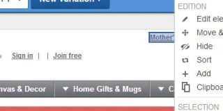
Then you need to mark “Areas of Interest” (AOI) on your page.
You mark these AOIs by moving rectangles over specific page areas. See below:
Move the rectangles at the top of the page into their appropriate position (deleting any that don’t apply to your page). These will be the areas measured for Seen, Read, and the amount of time on the area. See below for an example of the page with AOIs marked.
The participants then interact with your web page as they would normally, and their eye movements are measured. Participant instructions can vary on request, but the standard is “Please interact with this web page as you normally would.”
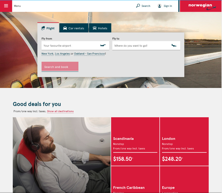
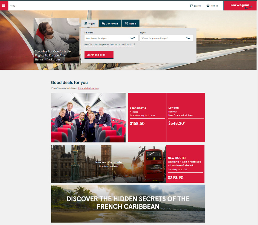
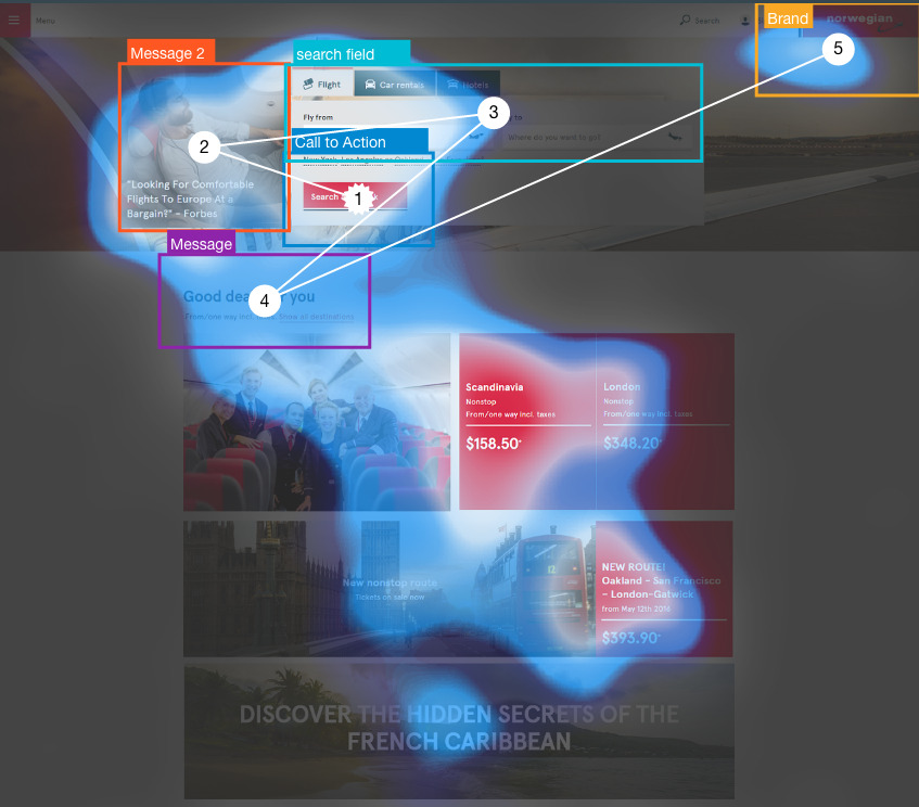
Analyzing Norwegian Airlines’ Visual Engagement
Testing Norwegian Airlines’ site through Sticky’s platform, we noticed some improvements were needed.
Here’s the old site:
The site isn’t bad. It has a good layout and a pretty centralized Call to Action. The problem, however, is that only 71% of people see the Call to Action, it takes them 2.8 seconds to see it, and they only look at it for 0.4 seconds. Check out the SeenMap below:
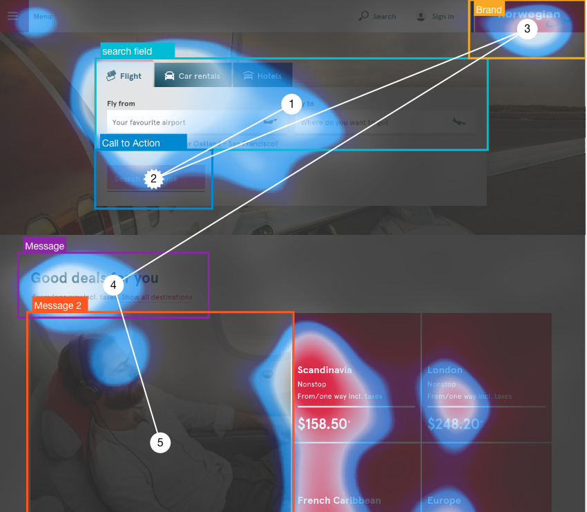
According to this map, there’s too much going on.
The sleeping man in the bottom left, the large and boldfaced numbers in the bottom right – too many things compete for the user’s attention, which starts at number one and is zigzagged along the page rapidly.
People’s attention is never fixed for long.
The improved version includes smaller images and a more prominent call to action. See the updated site below:
This version is a lot sleeker, with less vying for attention. Check out the SeenMap below to understand exactly how the user sees it:
The CTA is now the main focus – the first thing seen.
Now 78% of people see it after only 1.4 seconds and look at it for 0.8 seconds – more people seeing it for twice as long with half the time spent looking for it.
Increasing these metrics is merely correlational with increasing conversion rate. Obviously there’s not a 1:1 relationship between the values. But if you increase the visual attention to an element, there’s a very strong chance you’ll increase the amount of people taking that action.
How much will you increase your chances, exactly? Well, according to a recent study by IDG, “increasing the amount of visual attention on a brand by just 1 second of viewing time can raise the odds of purchase by 44% to 550%.”
People’s attention dictates what they do, so capturing more of their attention in your direction necessarily means you increase the chances they’ll act in that direction as well.
Conclusion: Tying it All Together
Optimizing is never done. There is always more you can do to improve your site.
Visual engagement helps you define the problem, the cause of the problem, and potential sources for variation in order to help you achieve your goal with A/B testing. Combining this with other forms of digital analytics (such as Google Analytics, Amplitude, Heap) and other forms of qualitative data (such as surveys and user testing) can keep your churning out win after win.
Visual engagement studies lower the cost of A/B testing by focusing your design changes on the areas that need it most, making the live-traffic split experiments more effective. They also help communication with your team and executives, and they help you see the space between the numbers on A/B tests – the way that users are really interacting.
Overall, integrating eye-tracking and visual engagement research into your optimization process gives you an edge that most people aren’t even considering yet.
Run your site here for free to see for yourself how useful this information can be.
Related Posts
-

"Our A/B testing tool's visual editor allows marketers to set up tests without needing developers!" A version…
-
When you’re doing conversion optimization, one of the hardest parts is finding opportunity areas to…
-
People make snap judgments. It takes only 1/10th of a second to form a first impression…
-

Learn how to run conversion optimization experiments the right way. In this video, I sit…
Thank you so much for the post, It is incredible how you came up with this.. I would never though about it, I had hear about colors and many ways to engage.
Cesar Avila
Libertyflow101
Awesome! Glad you liked it. Poke around on the site and sign up for a free account to try it out :)
Let me know what you think.
Great article! Ive been using eye tracking through Sticky for a while, and it’s been far more effective than our heat maps. I also liked the case study you shared — I would love to see more of these! I find them useful for inspiring new experiments and discovering new ways to interpret the data. I will keep an eye out for your next articles.
Tracking a users emotional response to copy is awesome.
But what do you tell people in your focus study why there looking at your site being tested to keep all the information unbiased?